On a soft, low-profile cap, the dad Hats Logo Placement guide is less about picking a pretty spot on a screen and more about how the logo survives in the real world. Shift it half an inch and the cap can read polished, crowded, or slightly awkward once the fabric bends, the crown collapses, and someone actually wears it. That is the kind of detail buyers feel immediately, even if they cannot always name it.
Dad hats have a relaxed crown, a curved brim, and a front panel that does not behave like a structured six-panel cap. The fabric gives. The crown slouches a little. The logo has to work with that softness instead of fighting it.
For buyers, the right placement has to solve three things at once: visibility, comfort, and perceived quality. A centered front mark sends a different message than a subtle side hit or a small back placement above the closure. If those choices are compared early, approvals move faster and the finished cap usually looks more deliberate.
Dad Hats Logo Placement Guide: What Changes the Look
The first mistake people make is treating a dad hat like a flatter, softer version of a standard cap. It is not. The low profile changes the visual weight of the artwork, especially from arm's length. A structured cap has a firmer front panel and a more predictable canvas for decoration. A dad hat flexes with the head, so a logo that looked centered in a mockup may sit higher, lower, or narrower once the cap is worn.
That is why the dad Hats Logo Placement guide should start with the silhouette, not the art file. A round icon, a short wordmark, and a tall emblem all behave differently on a relaxed crown. A clean one-color embroidery can still look busy if it sits too close to the brim seam. The same design can look premium with room to breathe. Proportion usually registers before detail does.
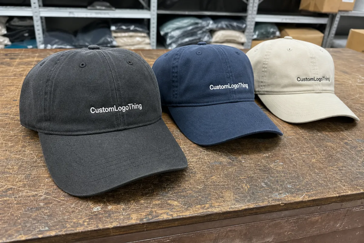
Front, side, and back placements each create a different effect. Front-center is the most visible and the most promotional. Side placement feels quieter and more lifestyle-driven. Back placement, usually above the closure, works well for staff wear, understated branding, and secondary marks that should not dominate the front of the cap. The right answer is rarely the loudest one. It is the one that fits the intended use.
A logo that looks balanced on a flat mockup can feel crowded on a real crown, especially on unstructured cotton twill.
That is why buyers who compare placements before production usually end up happier with the final result. A small logo can feel refined on a dad hat, but the same logo can disappear if the spacing is too loose or the position sits too low in the wearer’s line of sight. The balance is the whole job.
How Placement Works on Low-Profile Caps
Most dad hats have a few familiar placement zones: center front, slightly off-center front, left or right side, and back above the closure. Those zones sound simple, but the construction changes the way each one reads. A front panel may include a seam. The crown may collapse when empty. The brim curve compresses the lower edge visually. A flat layout proof is only the starting point.
Decoration method matters just as much as position. Direct embroidery is usually the cleanest choice for crisp logos and simple shapes, but it has stitch limits. Woven patches can hold finer lines and small lettering better. Leather patches bring a rugged, premium feel, but they work best with bolder art and less intricate detail. On a dad hat, the available space changes depending on whether the design is stitched directly into the crown or applied as a patch.
Some buyers focus only on the visible area and forget the construction around it. That creates trouble later. A seam can break up a logo. A closure can interfere with a back placement. A curved brim can make the lower edge feel tighter than expected. The proof should show the actual hat shape, not just the artwork floating in a rectangle.
During proofing, a good supplier maps the artwork to a cap template first, then adjusts for the panel structure and the stitching or patch area. The goal is not to shrink the logo until it fits. The goal is to place it where it can be made cleanly. That is a different skill.
For packaging and shipping, the placement decision can even influence how the hats hold up in transit. If caps are packed with inserts or packed into cartons that must preserve shape, ISTA methods are useful as a reference for how products behave through distribution. If the program uses paper-based packaging, FSC certification is a practical benchmark for responsibly sourced materials. Neither one changes placement directly, but both matter to the final presentation.
Key Factors That Influence the Best Position
Logo shape is usually the first filter. Wide wordmarks need horizontal breathing room. Tall emblems need enough vertical space to avoid crowding the brim seam. On many dad hats, a compact icon can read cleanly at around 2.0 to 2.5 inches wide. Short wordmarks often land better around 3.0 to 3.5 inches wide, depending on the panel height and the stitch count. Oversizing the logo tends to erase the relaxed personality that makes the hat appealing in the first place.
Visibility comes next. A retail brand putting caps on a shelf usually needs front-center placement because shoppers identify the mark fast. A club, team, or hospitality group may prefer a side hit or a small back placement because the hat needs to feel wearable every day, not promotional. The right decision depends on whether the cap will be seen head-on, up close, or mostly in motion.
Detail level changes the equation too. Fine linework, tiny letters, and thin outlines are the first things to suffer in embroidery if the placement is too small or too curved. Dark thread on dark fabric can look rich, but if the contrast is too low, the design flattens out. Leaving more negative space around the logo often makes the cap feel cleaner than trying to fill every inch of the front panel.
Fabric choice matters more than many buyers expect. Cotton twill holds embroidery differently than brushed cotton, garment-washed fabric, or corduroy. A garment-dyed blank can look softer and more premium, but the surface texture may slightly soften the edges of the decoration. Heavier twills support cleaner stitching. Softer washed cotton can make a patch feel more natural, though it may also show slight puckering if the design sits too close to a seam.
Fit is the last filter, and it is the one that gets skipped most often. A logo placed too high may disappear under the wearer's natural slouch. Too low, and it may fight the brim curve or look bottom-heavy. A placement that works on a sample should still be checked on different head sizes, because dad hats are usually worn loose, tilted, or pulled down more than a structured cap.
One more practical detail: front placements on unstructured caps tend to read a little smaller than they do on paper. The fabric relaxes once the hat is worn, which can make the logo feel more understated than the mockup suggested. Buyers who want a strong brand read often need to go slightly larger than they first expect, but not so large that the cap starts to feel stiff.
Production Steps, Proofing, and Turnaround
A sensible production flow starts with artwork review, then digitizing if embroidery is involved, then a placement mockup, proof approval, decoration, finishing, and packing. Each step sounds small. Together, they decide whether the order moves cleanly or sits in revision. If the file is tidy and the placement is straightforward, the process stays quick. If the logo needs seam-safe adjustments or a second decoration location, the timeline grows.
For standard embroidered dad hats, 12 to 15 business days from proof approval is a realistic planning window once blanks are on hand. More complex orders, especially mixed decorations or multiple placements, can stretch closer to 15 to 20 business days. Digitizing and proofing often take a few additional business days before production begins, and sample requests can add another layer if the buyer wants to approve thread color, patch texture, or edge finish in person.
The most common delays are not mysterious. They usually come from artwork that needs cleanup, a request to move the logo after the first proof, an order with several placement locations, or a queue issue when the factory is already busy. The earlier the front, side, or back decision is made, the easier it is to protect the ship date.
Proof approval is a commitment. It is not the finished decoration, but it is close enough that every change afterward costs time. A strong proof should show the exact size, the stitch or patch type, and where the art sits relative to the crown and brim seam. If that information is missing, the order is still too vague.
That is the point where experienced buyers ask a few blunt questions: How far is the logo from the seam? What happens if the placement shifts by a quarter inch? Is the layout based on the actual cap pattern or a generic template? Those questions sound simple, but they expose whether the supplier is thinking through production or just moving artwork around on a screen.
Cost, Pricing, and MOQ for Placement Choices
Placement affects cost because every additional location adds setup, decoration time, and quality checks. A single front logo is usually the least expensive route. Side or back additions increase labor. On smaller runs, the difference feels larger because the setup cost is spread across fewer hats. For many custom programs, a single-location embroidery may add roughly $2.50 to $5.00 per hat before the blank cap cost, while a leather patch can land around $3.50 to $7.00 per hat depending on size and finish. Two-location decoration pushes the total higher still.
| Placement Option | Typical Use | Relative Cost | Practical Notes |
|---|---|---|---|
| Front center embroidery | Retail branding, giveaways, team caps | Lowest | Best for fast recognition and simple artwork |
| Side embroidery | Low-key lifestyle branding, staff wear | Low to medium | Feels subtle, but still visible at close range |
| Back above closure | Event merch, understated brand marks | Low to medium | Works well for small icons or short text |
| Front patch plus secondary hit | Premium retail, limited drops | Highest | Strong impact, but extra setup raises unit price |
Other costs can matter just as much as placement. Digitizing fees often run about $25 to $75 for embroidery, depending on complexity. Strikeoffs or sample production can add another fee if you want to approve the exact result before bulk production. Rush orders usually cost more because they interrupt the normal queue and may require stock to be pulled ahead of schedule. None of that is unusual. It is how custom headwear is priced.
MOQ is another real constraint. Many programs start around 24 pieces, while others want 48 or 50 depending on the hat style, colorway, and decoration method. Small test runs usually carry a higher per-unit cost because setup is fixed whether you order 24 or 240. Bigger orders lower the decoration cost per hat, but they do not erase the extra time required for additional placements.
Blank quality also shapes the budget. A soft brushed cotton dad hat may cost less than a garment-washed or premium twill version, but the cheaper blank can show more unevenness in stitching if the artwork is too close to the front seam. A slightly better blank often saves money later by reducing rework, especially on branded programs where consistency matters across multiple colorways.
If you are comparing quotes, ask for pricing with the decoration method spelled out line by line. One supplier may quote a lower front embroidery price but charge more for digitizing, while another may roll setup into the unit price. The cleanest comparison is the total landed cost for the same blank, same placement, same quantity, and same turnaround.
Common Placement Mistakes to Avoid
The most common mistake is putting the logo too close to the brim. On a dad hat, the lower edge gets visually compressed by the curve of the bill, so even a good design can feel cramped if it sits too low. If the artwork needs room to breathe, give it room. A clean cap should look relaxed, not squeezed.
Oversized artwork is the other obvious problem. A large front mark may look exciting in a mockup, but on a soft crown it can erase the easy personality that makes dad hats popular. The hat should still look like a cap, not a billboard. That balance matters even more for cotton twill and garment-washed blanks, which already lean casual.
Seams, panel joins, and closure hardware create quiet headaches too. A logo that crosses a seam may pucker or distort, and a back placement can clash with a metal buckle or snap hardware if the measurement is off by even a little. Those mistakes are usually preventable if the proof shows the actual structure of the cap, not just the art in isolation.
Another trap is approving the design without checking it from the wearer's point of view. Look at the mockup head-on, then from the side, then in a worn-low position. If the logo disappears under the curve of the cap or feels too heavy on one side, the placement still needs work. A few extra minutes at proof stage are cheaper than a full rework later.
- Keep clear of the brim seam unless the design is built for that space.
- Scale the artwork to the crown, not just to the artboard.
- Check seam clearance on unstructured six-panel caps.
- Review the cap on-head, not only as a flat mockup.
There is also a common color mistake. Buyers sometimes choose a thread color that matches the cap too closely because they want the logo to feel subtle. Subtle is fine, but invisible is not. On washed navy, charcoal, olive, and sand blanks, contrast needs to be checked under normal indoor light, not just on a bright monitor. A proof can look strong on screen and disappear in hand.
Expert Tips for a Cleaner, Better-Fitting Result
Simple artwork usually wins on dad hats. Strong shapes, bold letters, and limited thread colors tend to survive the curve of the crown better than fine detail. For embroidery, a design that can be read from six to eight feet away usually performs better than one that depends on tiny interior lines. That does not mean the art has to be plain. It means the art has to be translated for stitch, not just copied into it.
Try two or three placement options on the same template if the brand is undecided. A front-center version shows how promotional the cap will feel. A side or back version reveals a more understated tone. That side-by-side comparison is useful for retail teams that need one hat to work for both display and everyday wear. The right choice is often the one that looks most natural on the head, not the one that looks biggest on a screen.
Spacing matters more than most buyers expect. Leaving a little blank space around the logo makes the hat feel intentional, while squeezing the artwork into every available inch makes the cap look crowded. As a rule, if the design is small enough to use a side placement, do not force it larger just to fill the front panel. Negative space is not wasted space. On a dad hat, it often does the heavy lifting.
Patch choice can change the tone without changing the logo itself. A woven patch can sharpen tiny type and preserve thin lines more cleanly than embroidery. A leather patch reduces the need for stitch detail and gives the cap a warmer, more rugged read. A direct embroidery mark usually feels the most classic. The placement decision should match the decoration method, not sit apart from it.
For subtle branding, a left-side or back hit can feel calmer and more wearable than a large center-front mark.
If the cap is for staff uniforms, merch tables, or everyday retail, a low-profile side logo can be a smart middle ground. It keeps the branding visible without turning the hat into a loud promotional piece. That is one reason buyers revisit the dad Hats Logo Placement guide after the first proof: the difference between "fine" and "excellent" is usually not the logo itself, but where it sits.
There is also a quality-control angle that gets overlooked. Before final approval, check the mockup for stitch direction, edge cleanliness, and the relationship between the mark and the crown seam. On a patch, check the border width and whether the edges feel too heavy for the scale of the cap. On embroidery, check for letter closure, clean counters, and consistent spacing between strokes. Those small checks separate a cap that looks mass-produced from one that looks considered.
Next Steps for Choosing the Right Layout
The simplest path is to narrow the choice to two placements, then ask for a proof with measurements before the order is placed. One option should be the most visible version you are considering, and the other should be the more restrained version. That comparison makes it easier to judge brand tone, crown balance, and how the hat will actually be worn.
Before approving anything, confirm quantity, budget, turnaround, and decoration method together. Those four variables affect the final layout more than most buyers expect. A patch that looks perfect on a 24-piece test order may not be the most efficient answer for a 200-piece run, and a back placement that feels refined on one colorway may need adjustment on another because of thread contrast.
If you want the most reliable result, compare one subtle placement and one highly visible placement side by side, then choose the one that matches the brand's real use case. For retail merch, that may mean a front hit. For staff or lifestyle wear, it may mean a side or back mark that feels quieter and easier to wear every day. Either way, the proof should show the cap, the size, and the exact position before production begins.
That is the core of a good dad Hats Logo Placement guide: match the artwork to the crown, respect the seam lines, and approve the layout only after you see it on a real cap template. Get those pieces right, and the finished hat usually looks cleaner, wears better, and feels much more deliberate.
Where is the best dad hats logo placement for a clean, everyday look?
Front center gives the strongest brand visibility, while a left or right side placement feels more understated. For a relaxed everyday cap, keep the logo small enough to suit the low-profile crown and curved brim. If the goal is subtle branding, a side or back placement usually reads better than a large center-front mark.
How big should a logo be for dad hats logo placement?
Most logos need to be scaled to fit the front panel without touching the brim seam or wrapping too far around the crown. Wide wordmarks usually need more horizontal space, while icons can stay compact and still read clearly. The final size should match the decoration method, because embroidery, patches, and print each handle detail differently.
Does logo placement change the price of custom dad hats?
Yes, additional locations usually increase cost because they add setup, decoration time, and quality-control steps. More complex placement can also raise the unit price if the design needs extra digitizing or higher stitch counts. Bigger orders often lower the per-hat cost, but multiple placements still cost more than a single simple front logo.
How long does dad hats logo placement production usually take?
Timeline depends on artwork approval, digitizing, sample review, and how many revisions are needed before production starts. Simple front-only orders usually move faster than multi-location or highly detailed decorations. Rush timelines are possible in some cases, but they depend on stock availability and production queue capacity.
What should I send when requesting dad hats logo placement help?
Send vector artwork when possible, plus your preferred placement, target size, hat color, and order quantity. Include the look you want, whether that is subtle retail branding, team wear, or a more prominent promotional finish. Add your deadline and budget range so the supplier can recommend the best placement option from the start.

