A bucket Hats Logo Placement guide is less about style theory than it is about avoiding expensive surprises. On paper, the crown looks like a neat circle of space. In production, that space is interrupted by seams, stitch direction, brim curvature, and fabric that shifts the moment the hat is worn. The logo that feels centered on a screen can end up tilted, compressed, or simply too low once it is sewn, patched, or printed onto the actual product.
Buyers usually discover this after the first mockup. Front center feels safe, side placement looks more fashion-forward, and brim branding sounds subtle until the brim starts moving and folding in real use. The right answer depends on the hat structure, the decoration method, and the way the hat will be judged from a few feet away, not from a flat file.
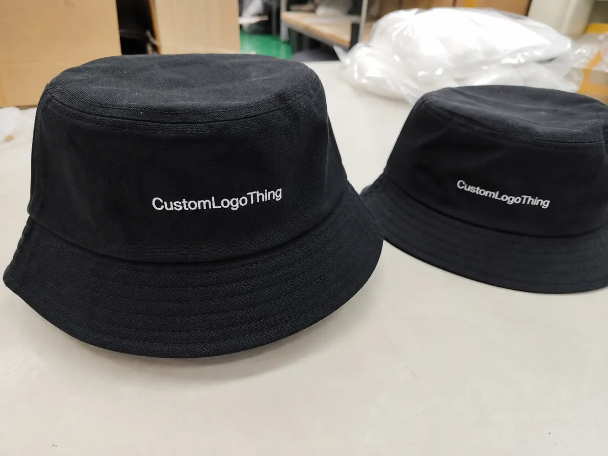
Bucket Hats Logo Placement Guide: What Buyers Miss First
The first thing most buyers underestimate is how little truly flat space a bucket hat offers. The crown is rounded, the brim pulls the eye downward, and the seam layout cuts the front panel into smaller sections than a spec sheet suggests. A logo that looks balanced on a mockup can feel squeezed once the hat is stitched and shaped.
The second mistake is assuming every bucket hat behaves the same way. A structured cotton twill style holds its shape better and gives decoration a cleaner base. A soft washed cotton or nylon version flexes more, which is comfortable but less forgiving for tiny lettering or crowded symbols. If the crown collapses slightly under its own weight, embroidery can tighten visually and print edges can distort.
Most buyers end up choosing from five practical zones:
- Front center - the clearest option for visibility and brand recognition.
- Offset front - a little left or right of center for a quieter, more editorial feel.
- Side panel - useful for lifestyle merch, streetwear, and understated branding.
- Back panel - good for secondary marks, campaign details, or sponsor logos.
- Brim placement - a niche choice that only works well with very small, simple marks.
Choosing the zone before approving the artwork is the part that saves time. Once a sample already looks wrong, the order starts collecting revision fees, extra proof rounds, and avoidable delays. A clean sequence works better: decide the placement first, then size the logo to the hat instead of trying to force the hat into a logo-first template.
If the mark needs explanation at three feet, the placement or the artwork is probably too busy for the hat.
For bulk orders, the most reliable choice is usually the least dramatic one. One placement, one decoration method, one logo version. That approach keeps quotes readable and reduces the chance that the final piece looks overdesigned or underwhelming.
How Logo Placement Works Across the Crown and Brim
Bucket hats are rarely viewed straight on for long. The wearer turns, the brim shifts, light catches the curve, and the logo changes character from one angle to the next. Placement is not just about where the logo sits. It is about how the logo reads while the hat moves.
Front center placement delivers the strongest first read. It suits retail merchandise, event staff, team apparel, and any order where the logo must be understood immediately. The drawback is that it also exposes flaws more quickly. If the front seam runs close to the center line, a detailed logo may split visually or look compressed unless the artwork is deliberately simple.
Offset front placement softens that effect. It works especially well for brands that want the hat to feel designed rather than stamped. Side panel placement goes further in that direction. It is often the best choice for buyers who want brand presence without shouting. The tradeoff is visibility: side marks disappear faster in photos and can get lost if the brim throws a sharp shadow.
Brim placement sounds appealing on a mood board, but the brim is the least stable surface on the hat. It bends, flexes, and catches light unevenly. Small text or a minimal icon can work there, although the design has to be stripped down aggressively. Most buyers get a better result by keeping the logo on the crown and treating the brim as a no-go area unless the concept is intentionally subtle.
Decoration method matters just as much as location. Embroidery adds texture and depth, which works best with bold letters, simple icons, and thick strokes. Woven patches hold sharp edges better and preserve fine details that embroidery would blur. PVC patches create a more dimensional, outdoor-friendly look, but they add cost and are not always the best fit for soft fashion pieces. Printing stays light and can handle color transitions, though it depends heavily on fabric finish and ink adhesion.
Seams deserve more attention than they usually get. A logo crossing a seam can split into awkward sections, and dense stitch fields can create puckering where the fabric resists the needle path. The lower part of the crown often sits in the brim shadow as well, so placing the logo too low can make it compete with the shadow instead of standing apart from it.
Use the eye test, not just the blank template. The best placement is the one that lands where the eye naturally looks first on the finished hat.
Placement Factors That Change the Final Look
Crown depth, brim width, panel count, and fabric stiffness drive most of the outcome. A deeper crown gives more room for a front mark. A wider brim makes the crown area feel lower and smaller. More panels mean more seams, and more seams reduce the number of clean paths available for artwork.
Logo complexity is the next variable, and it is the one buyers most often overestimate. Bold letters, clean icons, and monograms survive a small placement zone. Thin fonts, crowded taglines, and line-heavy graphics do not. On a curved surface, the smallest design details are the first to disappear. If the logo relies on hairline strokes or tight letter spacing, it usually needs simplification before production.
Fabric changes the result too. Cotton twill with a firmer hand holds embroidery well. Washed cotton has a softer drape, which looks relaxed but can make stitching appear less crisp. Nylon and polyester blends can handle printing and patches well, but some finishes need testing before full production because coatings and sheen levels change how a mark sits visually. Corduroy is the most complicated of the common options because the pile can swallow detail unless the decoration is oversized or raised.
Intended use should guide the placement choice. Retail merch needs quick readability and strong photo performance, so front center or offset front usually makes sense. Event giveaways may favor simpler methods and smaller logos because the budget has to stretch. Workwear tends to prioritize durability and legibility, which usually points toward a clean front mark with a sturdy patch or dense embroidery.
Practical size ranges help buyers avoid extremes:
- Front logo width: often 2.25 to 3.5 inches for clear visibility.
- Side logo width: often 1.5 to 2.75 inches for a quieter look.
- Back logo width: often 2 to 3.25 inches if the shape stays simple.
- Brim mark width: usually under 1.5 inches and limited to minimal graphics.
These are guardrails, not rules. A low-profile crown may require smaller artwork. A structured style with a tall front panel can accept more width. If the logo crowds the brim line, it is too large. If the letters close up or lose contrast from a short distance, it is too small. A few steps away is the useful test.
A logo that is legible from a distance but still respects the hat shape usually outperforms a larger design that fights the surface.
Cost, Pricing, MOQ, and Quote Traps
Pricing is driven first by decoration method, then by logo complexity, then by quantity. Simple one-color embroidery is usually the least painful route. Add a patch, multiple colors, or an unusual placement, and the quote rises because setup work increases and the production team has less room for error.
Typical bulk-order ranges can look like this, though exact numbers still move with volume, artwork, and factory tooling:
| Placement / Method | Typical Setup | Approx. Unit Cost at Mid-Size MOQ | Best Use |
|---|---|---|---|
| Front embroidery | Low to moderate | $1.20-$2.80 | Simple logos, brand merch |
| Woven patch | Moderate | $1.40-$3.20 | Fine detail, sharp edges |
| Printed logo | Low | $0.90-$2.20 | Flat graphics, lighter look |
| PVC patch | Moderate to high | $1.80-$4.00 | Bold branding, outdoor use |
Minimum order quantities usually sit in the 100 to 500 range for custom decorated bucket hats, depending on the supplier and the decoration style. Lower MOQs almost always cost more per unit because setup gets spread across fewer hats. That is normal economics, not a hidden surcharge. Digitizing, plate setup, patch molding, and proofing still happen even on a small run.
The quote traps are usually buried in the details:
- Digitizing charges for embroidery files that are not production-ready.
- Extra setup for side placement, back placement, or brim decoration.
- Artwork revisions when the buyer changes font weight, spacing, or logo structure late in the process.
- Special patch fees for PVC, woven, leather, or custom-molded pieces.
Packaging can also affect cost and lead time. If the hats need retail folding, branded inserts, or export-ready carton packing, the job becomes more labor-intensive. For teams that care about sustainability claims, material and packaging questions should be asked early, not after production starts. Reference points such as FSC for paper sourcing and ISTA for transit testing are useful if you want the order and the packaging to survive shipping with less damage and fewer returns.
The simplest way to keep pricing honest is to send one finalized logo, one placement choice, and one hat style before asking for numbers. Anything less invites a quote that will need to be revised later.
Production Process, Timeline, and Turnaround from Proof to Delivery
A normal custom bucket hat order moves through a fairly predictable chain: artwork submission, placement proof, sample or digital mockup review, approval, production, finishing, and shipping. The pace depends on how clean the files are and how quickly the buyer responds. Sewing is not usually the bottleneck. Approval is.
That is because the first proof often reveals issues that the flat artwork never showed. A logo may look centered, but once it sits on the crown it can feel too low. A side placement may look elegant in a sketch and feel too small on a real hat. Every revision adds time, and every new version increases the chance of inconsistent instructions.
Typical turnaround ranges are useful as a planning tool:
- Simple orders: often 12-18 business days after proof approval.
- Moderate orders: often 15-22 business days.
- Rush orders: sometimes possible, but usually at a higher cost and with fewer decoration choices.
Complex placement choices extend the schedule because they require more checking. Front embroidery is usually the most straightforward. A side patch with custom sizing takes longer. Brim placement often adds the most caution, not because it is technically impossible, but because the decoration team has to control the angle and the visible drift with more precision.
Quality control should cover more than the logo itself. Good suppliers check stitch density, color matching, seam alignment, patch adhesion, and crown symmetry before packing. On printed orders, ink laydown and edge bleeding matter. On embroidered orders, the back of the panel should not feel overly stiff, and the fabric should not pucker around the design. If a sample looks too rigid in hand, that is a warning sign for bulk production.
A practical approval checklist keeps the order moving:
- Confirm the exact hat style and fabric composition.
- Lock the placement zone before debating logo size.
- Review both front and angled mockups.
- Check that the artwork clears seams, brim edges, and stitch-heavy areas.
- Match the decoration method to the amount of detail in the logo.
- Approve one final proof after any revision, not three different versions.
If an order is being packed for retail or event distribution, the packaging should be judged under realistic handling conditions. A hat that looks excellent on the worktable can lose shape in transit if it is folded badly or packed too tightly. That is one reason transport-ready packing deserves part of the budget. The product and the package travel together.
Common Mistakes That Make Bucket Hat Logos Look Off
The most common error is placing the logo too low. The brim pulls attention away from the crown, throws a shadow, and can hide part of the mark from certain angles. A logo that sits near the brim line often looks like it is sliding off the hat instead of sitting on it.
Oversized artwork causes a different problem. On a flat screen, a large logo can look assertive. On the curved crown of a bucket hat, that same logo can feel crowded and distorted. Embroidery makes this more obvious because dense stitching can stiffen the fabric and create puckering around the edges.
Thin fonts are another predictable failure point. Tight letter spacing can fill in during embroidery, and narrow strokes can disappear on soft fabric. If the logo depends on small text, the best fix is usually simplification rather than trying to force the original version to work at a tiny scale.
A generic mockup is not enough either. A flat outline does not show the actual seam placement, crown curvature, or how the brim changes the visual weight of the logo. A placement proof on the real hat shape is the minimum standard for a serious order.
Most of the time, the fix is not dramatic. Reduce the size slightly, move the logo higher, or switch from direct embroidery to a patch. Small adjustments often produce a cleaner final result than a full redesign.
Good bucket hat branding uses the structure of the hat instead of fighting it.
Expert Tips and Next Steps Before You Approve the Order
Start with one placement choice, one decoration method, and one logo version. That sounds restrictive, but it removes most of the confusion from the approval process. Buyers who open the brief to multiple placements and multiple methods usually end up with slower quotes and less focused results.
Request three views before approving anything: front, angled, and close-up. The front view checks recognition. The angled view shows how the logo reads as the hat turns. The close-up reveals stitch quality, edge sharpness, and whether the mark still looks balanced at production size.
Vector artwork is the safest file format for this category. AI, EPS, and clean PDF files give the production team better control over scaling, stitch planning, and patch outlines. Raster-only files can still work, but they usually create extra cleanup work and more back-and-forth. If the logo contains small text, simplify it before sending it out. That step alone prevents a lot of problems.
Keep a margin between the artwork and the seams or brim edge. That buffer gives the decoration team room to center the mark correctly and reduces distortion. For embroidery, the buffer matters even more because the needle path can pull fabric toward the densest parts of the design.
One more practical point: ask how the factory checks consistency across the run. A sample can look excellent while the later units drift in placement or tension. A good production team should be able to describe how it verifies stitch count, patch position, and alignment before packing. If the answer is vague, the risk is usually in the final batch, not the sample.
A tight approval sequence looks like this:
- Choose the use case and placement zone.
- Confirm the decoration method that matches the artwork.
- Review the proof on the exact bucket hat style.
- Check price and turnaround after the design is locked.
- Approve the sample, then release production.
Handled this way, a bucket Hats Logo Placement guide becomes a practical buying tool rather than a cleanup exercise. The aim is not just a logo that looks acceptable in a mockup. It is a logo that stays readable on the finished hat, survives production constraints, and lands in a price range that makes sense for the quantity ordered.
What is the best logo size for bucket hat placement?
Front placements usually work best around 2.25 to 3.5 inches wide, depending on crown depth and brim width. Softer hats and wider brims often need the smaller end of that range so the mark does not crowd the lower edge. A proof on the exact hat style is the safest way to confirm the final size.
Is front center or side placement better for bucket hats?
Front center is usually the better choice for brand recognition, retail merch, and photos. Side placement feels more subtle and fashion-driven, but it is easier to miss from a distance. The better option depends on whether the hat is meant to advertise the logo or carry it more quietly.
Does embroidery or a patch work better for bucket hats?
Embroidery is strong for simple logos, bold letters, and clean icons. Patches handle fine detail and small text better, especially on softer fabrics. If the design has thin lines or crowded lettering, a woven or PVC patch often keeps the edges cleaner than direct embroidery.
What affects the price of bucket hat logo placement?
Decoration method, stitch count, logo complexity, quantity, and the amount of setup all influence cost. Multiple placements or unusual zones such as the brim raise the price quickly. Higher order volume usually lowers the unit cost, but only if the artwork is already production-ready.
How long does production take after approving the placement?
Simple orders often take 12-18 business days after proof approval, while more complex runs can take longer. Sampling, revisions, and shipping add time, and rush orders usually cost more. Clean vector art and one approved placement keep the schedule moving fastest.


