If you are ordering in bulk, the custom event Hats Logo Placement guide matters more than most people expect. A logo can look balanced on a screen and still land too high, too small, or too close to a seam once it is built into a real cap. That is the difference between a hat people keep wearing and a hat that gets handed out once, then shoved into a tote bag.
Placement is not only a visual decision. It affects visibility, decoration method, stitch count, setup time, and the final unit price. On event hats, the logo also has a very specific job: be readable fast, survive movement, and still look acceptable in photos taken from awkward angles under bad light. That is a harder assignment than most flat print pieces get.
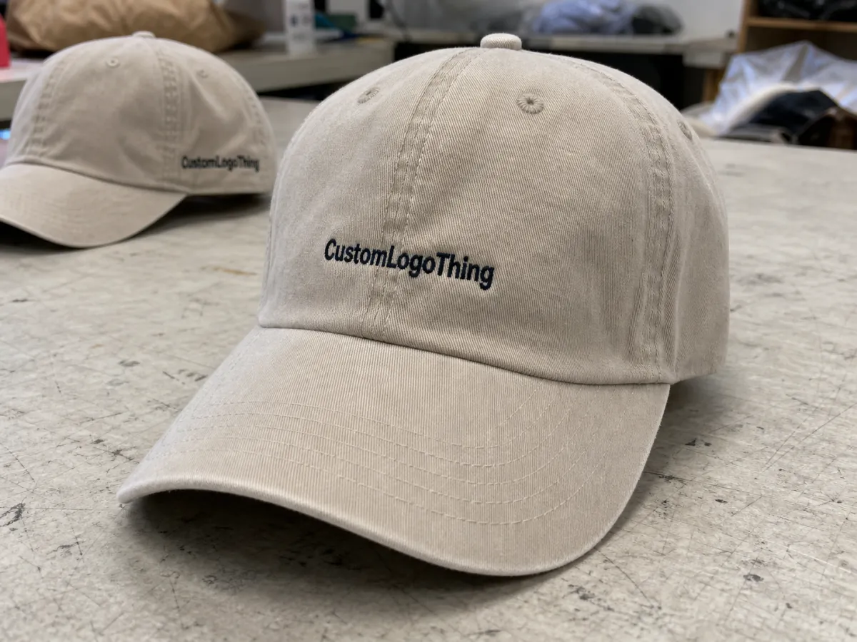
What the custom event hats logo placement guide actually means
The first thing to understand is that placement changes how the art behaves. A hat is not a flat surface with unlimited room; it is a curved object with crown height, panel breaks, seams, stitching, and sometimes a structured front that changes the way decoration sits. A strong logo can lose clarity fast if those details are ignored. That is why any custom event Hats Logo Placement guide has to start with production reality, not just brand preference.
Front-center placement usually gives the strongest read. It is the first location people notice, and it works well for staff caps, sponsor visibility, and giveaway hats that need to carry a message across a room. Front-left or side placement feels quieter and often more wearable, which helps if the hat is meant to stay in rotation after the event ends.
There is also a practical limit to what the crown can handle. A clean icon often fits comfortably, while a long wordmark can crowd the front panel and start fighting the curve of the cap. The same design that looks strong in a square mockup may feel stretched, squeezed, or too busy once it is stitched or patched onto a curved surface.
A hat has very little patience for bad art. If the logo needs too much room to breathe, it probably needs to move, simplify, or switch decoration methods before production starts.
For event hats, speed matters too. People see them in motion, not in a calm product photo. The brand message has to work in a few seconds, which is why small changes in location, size, and angle can make a real difference. That is true for merchandise, crew uniforms, sponsor drops, and any other bulk order where the hat is expected to do part of the branding work on its own.
How hat placement changes visibility on the crown, side, and back
Center front is the obvious choice for maximum brand read. It is usually the best answer for trade shows, registration teams, security crews, and high-traffic events where recognition needs to happen immediately. Front-center placement also gives you the most predictable photo result, which matters more than many buyers realize once the event starts and the hats are being photographed from every possible angle.
Side placement works differently. It usually feels more understated, and that can be a good thing when the hat is meant to be worn casually after the event. A small side mark can carry a sponsor name, a role identifier, or a short secondary line without overpowering the rest of the design. It is not the choice for maximum visibility, but it can be the right choice for a cleaner overall look.
The back has a place, but it is not prime real estate. Back decoration is useful when the front already carries the main brand and you want extra information without crowding the crown. An event name, social handle, or short URL can work there. Long copy usually does not. Hats are not billboards, and back placement gets awkward quickly when the message tries to do too much.
Hat construction changes usable space more than many first-time buyers expect. A structured cap gives you a firmer front panel and usually makes embroidery placement easier to control. An unstructured dad hat is softer, so the same logo may sit lower and read more casual. Foam truckers can handle bigger front graphics, but the foam and mesh combination often pushes the design toward simpler shapes, fewer lines, and larger type.
Panel breaks matter as well. If a seam runs through the logo, the art may split in an ugly way or need to be scaled down to avoid the break. That is why a placement that works on one style can fail on another. A trucker cap, a low-profile dad hat, and a structured five-panel hat may all need separate mockups even when the art stays exactly the same.
For event kits and ship-ready merch bundles, this is also where package branding comes into the conversation. If the hats are arriving alongside shirts, inserts, or other Custom Packaging Products, the visual hierarchy should feel consistent across the whole set instead of fighting itself. One strong placement on the hat can support the rest of the kit, but only if the logo treatment is coordinated from the start.
Cost and pricing: what actually changes the unit price
Price is driven by a few predictable things: decoration method, logo size, stitch count, color count, patch shape, and whether the placement needs extra alignment care. For bulk orders, a small front logo or a simple side mark is often cheaper than oversized front-center decoration. That does not mean the larger option is wrong. It means the production load is heavier, and the quote usually reflects that.
Embroidery pricing is commonly tied to stitch count. A simple 1,500 to 3,000 stitch logo may stay relatively affordable, while a dense 6,000-stitch design can push the unit cost up. One-time setup or digitizing fees may also appear, especially if the art file needs cleanup before it can be stitched. That fee is often modest compared with the total order, but it is still part of the real budget.
Patch decoration changes the math in a different way. A basic embroidered patch can be cost-effective for cleaner artwork, while a custom shape, merrowed edge, or more detailed fill can raise the price. Woven patches handle small text better than embroidery, but they also have their own setup requirements. Print can solve certain problems too, yet not every cap fabric or placement accepts it well.
Quantity matters just as much as design. A run of 50 hats often feels expensive per unit because setup costs get spread across fewer pieces. At 250, 500, or 1,000 units, the per-hat cost usually drops because the prep work is divided more efficiently. That is why buyers sometimes think the vendor “got cheaper” at scale. The real answer is simpler: the order finally has enough volume to absorb the fixed work.
| Placement / method | Best use | Typical unit impact | Main tradeoff |
|---|---|---|---|
| Small front embroidery | Simple logos, crew hats, clean branding | Often the lowest add-on cost | Limited detail and small text |
| Front-center large embroidery | High visibility, event branding | Medium to higher add-on cost | More stitches and more setup care |
| Woven or embroidered patch | Detailed logos, sharper edges | Medium cost, depending on patch type | Patch shape and attachment method affect pricing |
| Multiple placements | Front logo plus side or back text | Highest add-on cost | More production steps and more chances for mismatch |
Ballpark pricing helps buyers make quick decisions. In many bulk orders, a simple embroidered front logo may add roughly $1.50 to $4.00 per hat, depending on quantity and stitch count. Patches can fall in a similar range or run higher if the shape is custom or the order is small. Multiple placements usually move the number up fast. Those are estimates, not guarantees, but they are close enough to keep the conversation grounded before proofs are drawn.
If the hats are part of a larger branded packaging program, compare the hat cost against the whole kit, not just the cap itself. Sometimes it makes sense to spend an extra dollar or two on the hat if the rest of the presentation already creates a clean, premium feel. The hat should support the package, not compete with it.
For sustainability-minded buyers, it is worth checking whether the overall event presentation uses responsibly sourced materials. The Forest Stewardship Council explains FSC certification clearly at fsc.org, and the Packaging Consortium at packaging.org is a useful reference point for broader packaging design practices.
Process and turnaround: from mockup to shipment
The production path is usually straightforward, but only if the buyer supplies usable art and clear placement notes. First comes hat selection. Then artwork cleanup, digital proofing, placement approval, decoration setup, production, quality check, and packing. If any step gets fuzzy, the schedule starts slipping, usually before the first cap is even touched.
Most delays happen before the actual production run. Missing vector art is a classic problem. So are logo revisions that arrive after the proof has already gone out. Another common issue is vague direction like “make it feel stronger” or “place it somewhere clean.” That may be useful in an early design meeting, but it does not work on a production ticket.
A realistic timeline depends on decoration complexity and quantity. Simple bulk embroidery often moves in about 7 to 12 business days after proof approval. More detailed patches, multiple placements, or tightly timed event orders can push that to 12 to 18 business days. Rush orders may be possible in 3 to 7 business days if capacity is open, though rush work usually costs more and leaves less room for revisions.
Good packaging habits help here too. If the hats are shipping as a merch drop or staff kit, clean labeling, consistent counts, and a clear carton spec make the handoff easier. For teams that also need mailers or insert packs, pairing hats with Custom Packaging Products can keep the brand presentation consistent from the box to the cap.
Key factors that decide the best placement for your event hats
Audience distance is the first filter. If the hat needs to be read across a trade show aisle, you need a stronger, simpler placement than if it is for volunteer staff who only need a subtle branded cue. Festival merch can sit somewhere in the middle. You want a mark that feels worth keeping, not just loud enough to exist.
Brand hierarchy comes next. One logo is clean. Two can work if one is clearly secondary. Three or more elements usually start making the hat feel crowded, especially on lower-profile styles. That is where package branding instincts help. The best presentations know what to lead with and what to leave out.
Fine detail is another hard limit. Thin strokes, tiny text, gradients, and complex line art often do not survive embroidery well, especially on curved surfaces. If the logo depends on small copy, a patch or print method may be the better fit. That is not a failure. It is just choosing a decoration method that matches the surface instead of forcing the surface to behave like paper.
Material also matters. Cotton twill holds embroidery cleanly and usually gives a solid, familiar hand feel. Brushed cotton can feel softer but may show thread tension a little differently. Mesh-backed truckers offer more airflow, but the front panel must do the work of carrying the entire mark. Foam-front hats make bold graphics easy to read, though they are not ideal for intricate stitch work. Recycled polyester blends can be a good option for event programs that want a lighter environmental footprint, but they still need the same placement checks as any other cap.
Here are the practical constraints I would check before approving anything:
- Seam location: avoid placing critical detail across a seam unless the vendor has confirmed it will stitch cleanly.
- Crown width: a narrow front panel limits how wide the mark can be without crowding the edges.
- Brim angle: low-profile hats can make front placements feel lower and more compressed.
- Decoration method: embroidery, patch, and print each handle detail differently.
- Use case: staff uniform, sponsor piece, or giveaway hat all call for different visibility levels.
There is also a quality angle that buyers sometimes ignore. If the hats are part of a broader retail packaging or event merchandising program, the decoration should match the rest of the visual system. A sharp logo on the cap but sloppy art elsewhere makes the whole order feel less considered. The same goes for Custom Packaging Products used in the same promotion. The hat does not need to copy everything else, but it should feel like it belongs in the same family.
For buyer teams that care about shipping durability, it is smart to ask how the hats are packed and whether carton testing follows common transit standards. The International Safe Transit Association at ista.org is a useful reference if you are comparing packaging performance, especially for mixed merch orders that need to survive distribution instead of just looking nice on a table.
Step-by-step placement checklist before you approve the proof
Start with the hat style, not the art file. Decide whether the order is going on structured caps, dad hats, truckers, or something else, then choose the primary placement before you argue about colors or decoration method. That order keeps the conversation practical and usually saves a round of corrections later.
- Confirm the hat style: structured, unstructured, low-profile, trucker, or foam-front.
- Pick the main placement: front-center, front-left, side, or back.
- Check the logo at actual size: not zoomed in to 400 percent on a laptop.
- Review the decoration method: embroidery, patch, or print.
- Verify written specs: location, dimensions, colors, quantity, and any size split.
The proof should be treated like a production document, not a sales graphic. If the logo looks nice but the type is too small to read on a curved crown, it is still the wrong proof. Pay attention to the smallest letterforms. They are usually the first thing to fail in embroidery, and they are often the hardest detail to recover once the run has started.
Ask for clarity on consistency across the full order. If the run includes different sizes or different hat bodies, confirm that the placement will remain aligned the same way on each one. Small variation is normal. Sloppy variation is not. A quarter inch may not sound like much, but on a cap it can change the entire visual balance.
One practical rule helps cut through indecision: if you cannot explain the placement in one sentence, it is probably too complicated. “Front-center, 3-inch embroidery” is clear. “Somewhere on the front but not too much” is not.
Keep the final approval in writing and save it. That includes the art file, placement notes, and any special instructions about thread color, patch type, or shipment splits. Reorders go much faster when the first order is documented properly.
Common mistakes that make custom event hats look off
The biggest mistake is placing the logo too low, too wide, or too close to the seam. That is how decent art turns into awkward decoration. On a flat mockup, everything can look balanced. On an actual hat, the curvature changes the spacing and the eye notices it immediately.
Tiny text is another recurring problem. It might survive on a screen or a business card, but it often disappears on a hat. Thin strokes have the same issue. They can stitch poorly, break visually, or look heavier than expected once thread width replaces line width. If the brand mark depends on nuance, simplify it before production starts.
Do not treat every hat like a poster. People wear hats, move in them, bend in them, and see them from odd angles under ugly lighting. Event floors are harsh. Photos are harsher. A placement that survives both is usually the better choice, even if it is not the most dramatic one on paper.
Overloading the hat is another fast way to make it feel cheap. A front logo, side sponsor hit, back website, and extra tagline may sound efficient in a spreadsheet, but the actual hat can end up noisy and hard to wear. Strong branded packaging works for the same reason a strong hat does: the message is clear, not crowded. A little restraint tends to age better than a crowded layout.
Mismatch between hat body and decoration method causes problems too. Thick embroidery on a thin unstructured cap can pucker. A tiny patch on a foam front can look lost. Dense art on mesh can lose definition. Those failures are not dramatic, but they are obvious in person, and they usually could have been prevented with one more proof review.
If the decoration has to do too much, the hat is doing a brand manager’s job and a designer’s job at the same time. That is usually where the trouble starts.
A final mistake is approving art without comparing it to the event use case. A volunteer hat, a sponsor giveaway, and a VIP merch piece do not need the same placement. Same event. Different job. Different answer.
What to do next: lock the art, placement, and order details
The best next step is simple: compare two or three placements against the same proof and pick the one that balances visibility, brand feel, and budget. Not the prettiest option in isolation. The one that will still make sense after a four-hour event, a shipping delay, and a hundred photos taken in bad light.
Send one clean art file, the quantity, the event date, and the preferred hat style together. That gives the vendor enough information to quote accurately and spot production risks early. If you also need matching mailers, inserts, or merch boxes, mention that now so the packaging plan stays aligned with the hat plan.
For buyers building a larger event kit, the hat should fit the same overall package branding system as the rest of the order. That can mean using the same logo treatment on Custom Packaging Products, the same color logic across print pieces, and the same level of restraint in the layout. Consistency does more work than decoration for its own sake.
Once the sample or proof is approved, keep the spec sheet for the reorder. That is the part people skip, then regret. Consistent placement is what makes repeat orders look intentional instead of random. A good Custom Event Hats logo placement guide should leave you with a repeatable decision, not another round of guesswork.
FAQs
What is the best logo placement for most custom event hats?
Front-center gives the strongest read if you want instant recognition. Front-left or side placement works better for a cleaner, more wearable look. The best choice depends on viewing distance, event type, and whether the hat needs to show well in photos.
Is front embroidery usually cheaper than other hat placements?
Usually yes, as long as the logo is simple and the stitch count stays modest. Patch decoration can be competitive for detailed art, but the patch type and setup still affect the quote. Multiple placements usually cost more because they add production steps.
How far ahead should I order custom event hats for an event?
Give yourself enough time for proofing, revisions, and production. Simple orders may move in 7 to 12 business days after approval, while more complex work can take longer. Share the event date up front so the vendor can tell you whether standard or rush timing is realistic.
Can I use the same placement on different hat styles?
Not always. A trucker cap, dad hat, and structured cap each offer different usable space and seam placement. A location that works on one style can sit too high or too close to a panel break on another, so separate mockups are smart for mixed orders.
What if my logo has small text or thin lines?
Small text usually needs to be simplified or scaled up to stay readable on a curved surface. Thin lines can disappear in embroidery, so a patch or print method may be the better fit. Ask for a production proof and inspect the smallest details before approval.

