Printed Snapback Cap Logo Placement for Cosmetics Brands
For cosmetics teams comparing printed Snapback Caps Logo Placement for cosmetics brands, the placement decision is doing more work than it first appears. A logo on a cap is not just decoration. It is a small-format branding system, and on a structured snapback, a change of half an inch can alter how premium the piece feels, how clearly it photographs, and whether it reads as brand merchandise or generic stock.
Beauty brands usually have less tolerance for visual noise than streetwear labels. That does not mean the cap has to disappear. It means the mark has to be placed with discipline. A clean front-left print can feel polished and editorial. A centered front print can still look strong, but it needs restraint in size and color. If the cap competes with the rest of the brand system, it stops supporting the launch and starts looking improvised.
There is also a practical reason buyers care about placement so much: the cap will be judged in photos before it is judged in person. On social content, retail staff, event teams, and influencer kits, the viewer usually sees the front panel first, then the brim line, then any side detail. That order matters. It is the same visual hierarchy packaging teams use when they decide where a carton panel should carry the logo and where white space should be left alone.
Logo placement basics for cosmetic brands
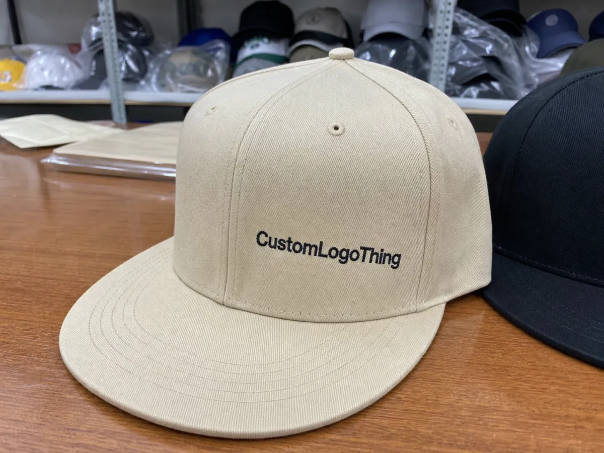
The most common placement choices are front-center, front-left, side panel, and back closure. Each one signals something different. Front-center gives the broadest visibility and works well when the cap needs to read instantly in photos or at retail. Front-left is usually calmer and feels more refined, especially when the logo itself is small, geometric, or wordmark-led. Side-panel placement is the quietest option and can feel unexpectedly high-end if the brand identity is already strong. Back placement is useful for secondary marks, but it rarely carries the main story.
For cosmetics brands, the better choice is often the one that feels slightly restrained rather than the one that fills the most space. Beauty packaging tends to reward controlled typography, measured spacing, and a finish that looks intentional rather than loud. A cap should follow that same logic. If the carton is minimal, the cap should not suddenly behave like event merchandise from a different company.
Print is often the cleaner choice for beauty marks. Thin letterforms, small caps, fine rules, and gradient-heavy logos can lose clarity in embroidery because thread adds thickness and slightly softens edges. That does not make embroidery wrong, just less predictable for detailed branding. Printed decoration keeps the lines tighter, which matters when the cap will be seen at arm's length in selfies, mirror photos, and store displays.
Material choice matters too. Cotton twill is usually the safest surface for print because it accepts ink well and keeps the finish matte. Cotton-poly blends are also workable, but the hand feel and sheen can change the final effect. Polyester can be fine for heat transfer or silicone print, though the fabric surface needs to be checked carefully because a glossy blank can make the logo look more promotional than premium. A good supplier should tell you how the actual blank behaves, not just show the artwork on a perfect mockup.
The smallest useful question is not "where can the logo fit?" It is "where will the logo still look deliberate after the cap is worn, turned, and photographed?"
How structured snapbacks change the layout
A structured snapback is more complicated than it looks on a flat mockup. Most are built with six panels, a stiff front buckram, a flat or lightly curved brim, and an adjustable plastic closure. The front panel is not a flat billboard. It arches over the head, meets seams, and shifts as the cap is worn. A logo that looks perfectly centered on screen can sit slightly high, low, or skewed once it is sewn and pressed into shape.
That is why panel mapping matters. On a standard front panel, a moderate print often sits around 70-90 mm wide for subtle branding, while 90-110 mm gives stronger visibility without filling the entire crown. Side-panel marks are usually smaller, often 35-55 mm wide, because the panel narrows quickly as it approaches the seam. Those measurements are useful starting points, not fixed rules. Crown height, seam angle, and blank shape all change how much space the art can actually use.
If the logo crosses a seam, the layout may need to be simplified or nudged a few millimeters. That is normal. The weak point is usually not the artwork itself but the assumption that the crown behaves like a flat rectangle. It does not. Buyers who ask for a placement mockup on a panel map rather than a flat rectangle tend to get fewer surprises during sampling.
Decoration method changes the reading of the logo as much as placement does. Screen print is best for simple, flat graphics and repeatable color. Heat transfer works well for short runs and more detailed marks. Silicone print adds a slightly raised finish that feels modern and tactile. Patches, whether printed or woven, create more dimension and can help a limited-edition capsule feel more considered. The choice should follow the logo, not the other way around.
There is a quality-control angle here that gets overlooked. Before approving production, ask for a proof that shows the logo from the front, a 45-degree angle, and the side. The front view catches size issues. The angled view catches distortion. The side view shows whether the logo disappears when the cap is worn. That is a small request, but it eliminates a surprising number of expensive mistakes.
For brands shipping caps in PR boxes or influencer kits, transit testing also matters. A decorated cap may hold shape on a desk and still arrive crushed if it is packed too loosely. Standards from organizations such as ISTA are useful because they separate display-ready samples from packaging that can survive real shipping conditions. The cap and the carton should be treated as one system if the goal is a polished unboxing.
Cost, MOQ, and what actually changes the quote
Logo placement affects cost more than many buyers expect. The biggest drivers are print method, number of placements, artwork complexity, sample revisions, and the quantity ordered. A single front print is usually the least expensive route. Add a side mark or a back mark, and the price moves because the supplier needs additional setup, alignment, and inspection time. The cost jump is often small in absolute terms and noticeable in percentage terms, especially on lower quantities.
MOQ changes the equation again. A lower minimum usually carries a higher unit price, but for a cosmetics launch that is testing audience response, that trade-off can be rational. A brand that is still adjusting its visual system may be better off paying a bit more for 100 or 200 caps than committing to 1,000 pieces with the wrong placement. Unsold merch is more expensive than a slightly higher per-unit cost.
| Option | Typical look | Typical add-on cost | Best use |
|---|---|---|---|
| Single front screen print | Flat, clean, easy to read | $0.60-$1.20 per cap | Launch giveaways, retail staff, simple wordmarks |
| Heat transfer print | Sharper details, better for short runs | $0.75-$1.50 per cap | Fine type, small campaigns, quick samples |
| Silicone print | Raised and tactile | $1.10-$2.20 per cap | Premium beauty branding, limited editions |
| Front plus side placement | More brand coverage, more setup | $1.50-$3.00+ per cap | Campaign merch, retail teams, event visibility |
Those ranges move with quantity, artwork size, fabric type, and whether the supplier includes artwork cleanup or charges for it separately. Some quotes look attractive until the proof revisions, setup fees, and sample costs are added. Others look expensive but already include the steps that matter. The only useful comparison is landed cost: decoration, setup, sampling, freight, and any packaging insert work if the caps are being shipped as part of a kit.
There is also a brand-value question hiding inside the pricing. A slightly higher-cost print method can be worth it if it improves legibility or gives the cap a finish that matches the rest of the line. A beauty brand that spends carefully on cartons, labels, and inserts should not let the cap look like a separate procurement item. If the merch is part of the launch story, the logo placement needs to feel like it belongs in the same system.
For reference, a basic blank structured snapback can land anywhere from roughly $1.20 to $3.50 depending on fabric and finish, before decoration. Add a premium print method and the order begins to look less like giveaway stock and more like a branded accessory. That distinction matters when the cap will be judged against lip kits, serum boxes, or skincare launch materials that already carry a polished visual language.
Production steps and realistic timelines
A clean production sequence usually runs like this: brief, artwork review, placement mockup, proof approval, sample production, bulk run, quality check, and shipping. Most delays happen at the handoff points. The decoration itself is often the fastest part once the files are correct.
Vector artwork is the first requirement. AI, EPS, or a properly built PDF gives the production team the flexibility to resize without losing detail. A JPG or PNG can sometimes work for reference, but it should not be the master file if the logo contains fine typography or thin spacing. That is especially true for cosmetics branding, where letter spacing and clean edges are often doing as much work as the mark itself.
Two proofing mistakes appear again and again. The first is sending a logo without specifying a placement preference. The second is asking for too many options at once. Buyers think they are saving time by asking for front-center, front-left, and side-panel versions in parallel. In practice, that usually adds a revision cycle and slows the order. It is faster to choose one direction and then adjust size, not restart the location decision from scratch.
Lead times depend on whether the cap is a repeat order or a new development. A repeat run with unchanged art can often move in about 10-15 business days after approval, depending on factory load and shipping method. A new run with sampling, color matching, or multiple placement options usually needs 15-25 business days or more. Those are working ranges, not promises. Peak season, freight congestion, and artwork corrections can add time quickly.
Good quality control checks should be written into the order from the beginning. At minimum, the supplier should confirm:
- logo size against the actual panel template;
- alignment across the center seam and crown curve;
- color match against a physical fabric swatch, not only a screen;
- print opacity on the chosen cap color;
- finish consistency across the sample and bulk run.
If the cap is part of a larger kit, the schedule should also account for the insert card, outer carton, tissue, and any protective packing. That is where production planning often breaks down. The cap is approved on time, but the kit misses its launch date because the support pieces arrived separately. A supplier who understands packaging workflow can help avoid that, but only if the brief includes the full kit timeline from the start.
Mistakes that make a premium cap look cheap
The easiest mistake to spot is a logo placed too low on the crown. The brim already creates a strong visual break. If the mark sits below that break, it can look detached from the face of the cap and disappear in profile shots. For beauty brands, the top third of the front panel usually gives a cleaner read because it keeps the logo closer to eye level.
Oversized artwork is another common problem. Streetwear can support a louder front graphic. Cosmetics usually cannot. A cap that is trying too hard starts to feel promotional, and promotional usually reads as cheaper. The best-looking pieces tend to be the ones that leave some negative space around the mark. That breathing room matters more on a structured cap than on a softer, unstructured style.
Too many placements can also work against the design. Front print, side print, back tag, and brim art all competing on one cap usually creates clutter. There are exceptions, but they are rare in beauty. Most cosmetics brands get better results from one carefully chosen focal point and a solid color blank than from multiple marks fighting for attention.
Color contrast is another practical issue that mockups often hide. Beige, cream, oat, blush, and stone are popular because they feel controlled and premium. But a soft logo on a soft cap can vanish from three feet away. The print should be tested against the actual fabric swatch under daylight or white light. A digital color name is not enough. Neither is a screen render that looks brighter than the true material.
Finish matters as well. A glossy print on a matte fabric can look out of place if the rest of the brand system is restrained. Likewise, a very tactile silicone print may feel too sporty for a skincare launch that uses delicate typography and clean carton structures. The cap should echo the rest of the product family, not introduce a new tone the brand never intended.
How placement shifts by use case
Placement should change with the job the cap is doing. For retail staff, front-center is usually easiest to read from a distance and photographs cleanly in store lighting. For influencer kits, front-left often looks more premium because it leaves room for the rest of the outfit and does not fight with the unboxing materials. For event crews, back placement can work if the goal is coordination without overwhelming the uniform.
There is no single correct layout for every use case. A launch cap sent to press may need a calmer treatment than a cap worn by retail ambassadors during a product rollout. A limited-edition drop can tolerate a bolder front print if the entire campaign is built around a louder visual language. A serum brand with restrained packaging usually benefits from a smaller, cleaner mark than a color cosmetics line that already uses stronger graphics.
One useful practice is to build a small placement system rather than forcing one cap to do every job. A brand might keep one version subtle for VIP gifting and another slightly more visible for social content and retail floors. That gives the team flexibility without abandoning consistency. It also reduces the temptation to solve every use case with a larger logo, which is rarely the right answer.
Packaging context matters here. When the cap sits inside a larger launch kit, it should feel like the final note in the sequence, not the loudest object in the box. The outer carton, insert card, tissue, and protective wrap all set the tone. If the cap uses the same typography, spacing, and finish logic, it looks intentional. If not, it feels detached from the rest of the package experience.
What to lock before requesting samples
The fastest way to get an accurate quote is to send a brief with the essentials already decided. The supplier does not need a full brand bible. It needs the information that affects placement, cost, and timing. For printed snapback Caps Logo Placement for cosmetics brands, that usually means the exact logo file, preferred location, approximate size, quantity range, target date, and intended use.
Before asking for samples, it helps to lock these items:
- print method;
- panel location;
- logo width in millimeters or inches;
- quantity target;
- use case, such as retail, PR, or staff.
If the artwork includes fine type, ask for a legibility check at actual size. If the cap color is pale, request a contrast review against the exact fabric. If the cap will travel inside a kit, ask how it will be packed so the brim and front panel hold shape during transit. These are small steps, but they prevent the kind of problems that turn a neat mockup into a disappointing bulk run.
One more practical detail: ask whether the sample will be a true production sample or a visual sample. Some suppliers show the right placement but use a different decoration process during sampling, which can make the final bulk result look slightly different. That is not always a problem, but it should be understood before approval. The more the sample matches the final method, the less room there is for surprises later.
For cosmetics buyers, the best cap orders tend to be the simplest ones. One logo, one placement, one clear visual intent. That does not make the cap plain. It makes the cap look planned. In this category, that is usually the difference between a useful branded accessory and a piece that feels like leftover merch from another project.
What is the best printed snapback cap logo placement for cosmetics brands?
Front-center is best when the cap needs immediate recognition and strong visibility in photos. Front-left often feels more refined and works well for premium beauty branding. Side placement is the quietest choice and suits understated collections or staff wear.
How much do printed snapback cap logo placements usually cost?
Pricing depends on the print method, number of placements, artwork complexity, MOQ, and whether the quote includes setup and sample costs. A single front print is usually the least expensive option. Adding a second location increases setup and inspection time, which raises the unit price.
Is print better than embroidery for cosmetics-brand snapbacks?
Print is usually better for thin lines, fine type, and precise brand marks. Embroidery adds texture and a more tactile feel, but it can thicken small details or soften edges. For beauty brands with delicate logos, print often preserves the design more accurately.
How long does production usually take?
Repeat runs can often move in about 10-15 business days after approval. New runs with sampling or multiple revisions usually take 15-25 business days or longer. Freight, seasonal demand, and artwork corrections can add time.
What artwork should I send for an accurate placement quote?
Send vector files whenever possible, plus the desired placement, logo size, quantity range, and target use. It also helps to note the cap color, print method, and whether the order is for retail, events, or influencer kits. Clear instructions reduce proof cycles and make pricing more reliable.


