A snapback Caps Logo Placement guide saves real money because a logo can be perfectly approved and still feel wrong once it lands on a structured crown. Move it a little too high and the cap looks top-heavy. Push it too low and the brim starts fighting the artwork. On a flat-brim snapback, placement is not a cosmetic choice; it is part of the construction brief.
That matters because snapbacks are visually unforgiving. The front panel is usually structured with buckram or a similar stiff support, the brim draws a hard horizontal line, and the six-panel shape exposes alignment problems faster than a relaxed cap does. A design that would pass on a soft dad hat can look noticeably off on a snapback.
Most buyers end up choosing among four practical zones: front panel, side panel, back area near the closure, and low-front placement close to the brim seam. Each one changes how the cap reads from a distance, how it photographs, and how much room the artwork gets before it starts colliding with seams, eyelets, or adjustable hardware.
The useful question is not simply where a logo can fit. It is where it can fit without losing clarity, looking crowded, or forcing the factory to compromise on stitch density, patch size, or thread sequence. That is the real value of placement guidance: it turns a vague idea into a production-ready decision.
A stronger snapback does not always need a larger logo. It usually needs a cleaner location, better spacing, and fewer things competing with the mark.
What a snapback caps logo placement guide helps you decide
The first job of a Snapback Caps Logo Placement guide is to narrow down the visual strategy before anyone starts quoting. Buyers often arrive with one design and three or four places they think it could go. That sounds flexible, but it usually creates more revision cycles than necessary.
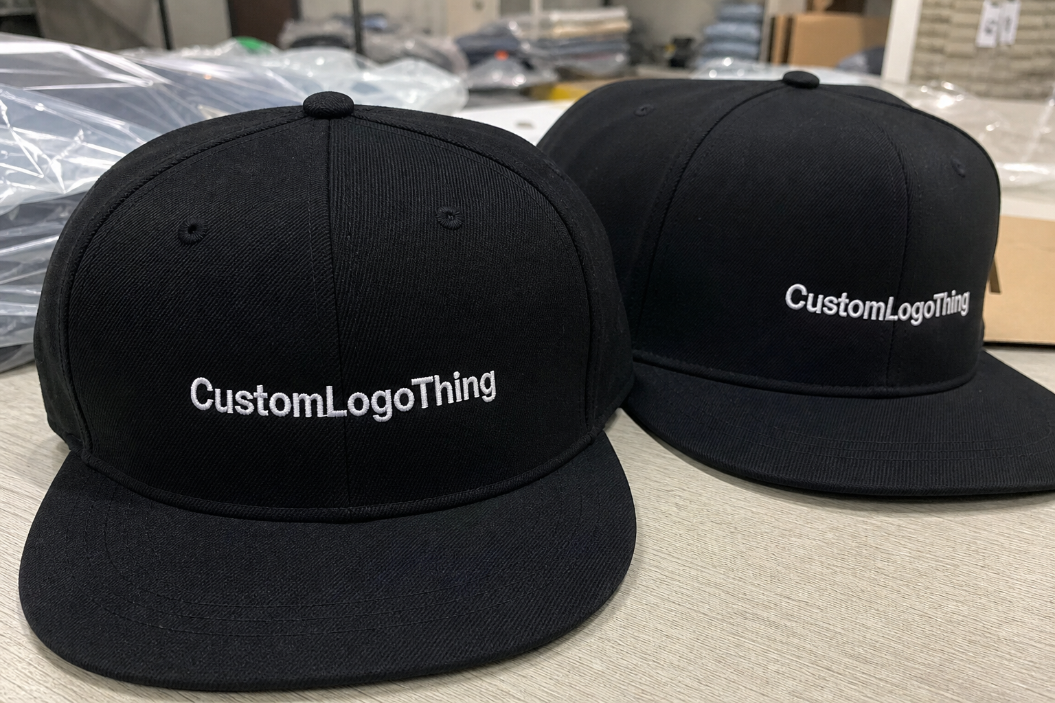
Front-center placement is the most direct option. It gives instant recognition and works well for retail, team merch, and event product where the logo needs to read from across a room. A front mark can carry more weight because the eye expects to find branding there. If the artwork is simple and the cap has a clean center front panel, this is usually the safest choice.
Side placement changes the tone. It feels quieter and more intentional, and it can make a cap look more premium if the front is left open. Many fashion-led buyers prefer this because it avoids the oversized-branded look. Side marks also work well when the front panel already has another feature, such as embroidery texture, a woven patch, or a tonal fabric treatment.
Back placement has a different purpose altogether. It is smaller, but it can handle sponsor recognition, a signature detail, or a limited-edition marker. On an adjustable snapback, the back area becomes tricky if the logo sits too close to the plastic closure or seam lines, so the artwork has to be simplified and tested against the exact hardware.
The cap style itself changes the decision. A 6-panel structured snapback with a solid front panel will behave differently from a 5-panel or mesh-backed style. Polyester caps often accept bolder color contrast, while cotton twill and wool-blend caps tend to look more substantial with embroidered or patch-based logos. Fabric weight, panel stiffness, and the brim profile all affect what placement feels balanced.
There is also a practical buyer angle. Retail brands usually want a hero placement that reads immediately and looks good in photography. Corporate programs often want a calmer mark. Event giveaways need something legible and cost-efficient. A placement guide keeps those goals from colliding inside one production run.
How logo placement reads on the cap
Front-center placement works because the eye naturally goes there first. For most adult snapbacks, a logo sitting roughly 0.75 to 1.25 inches above the brim seam often feels grounded rather than floating. Go much higher and the front panel can look empty below the mark. Go much lower and the brim starts stealing attention from the design.
Size matters as much as location. A front logo around 2.25 to 2.75 inches wide is common for clean embroidery, though the true usable width depends on the shape of the mark. Wide wordmarks, stacked text, and logos with fine internal detail often need more room than buyers expect. A flat artwork measurement on screen is not enough; the cap surface has seams and curves that eat into that space.
Side placement is more selective. It usually works best for simple icons, short wordmarks, or monograms. A left-side logo often photographs well because the cap turns naturally with the wearer’s head, but there is no universal rule. Right-side placement can be better for sponsor visibility or for brands that want the logo to show on a specific viewing angle in group photos.
Seams and eyelets are the quiet troublemakers. If a logo crosses a panel join in the wrong spot, a circle can become slightly oval, a letter stem can break, and the whole mark can look less precise than the file itself. On a snapback, even a small misalignment is visible because the crown is structured and the front panel holds its shape. That is useful for consistency, but it leaves less room for error.
Low-front placement near the brim line creates a different impression. It feels athletic and anchored, especially when paired with bold embroidery or a clean patch. It also leaves more open space above the logo, which can work well for brands that want a restrained, almost editorial look. The downside is simple: the lower the mark sits, the more closely it has to negotiate with the brim seam and the curve of the panel.
That is why placement should be read on the actual cap template, not just a flat mockup. A good mockup shows the visual center, panel width, and seam positions. A better one also shows where the logo will sit once the hat is worn, because the same mark can feel perfectly centered on a table and slightly off once the crown is on a head.
The most useful placement advice is usually the least glamorous: leave more breathing room than you think you need, respect the seam map, and avoid forcing the artwork into a space that does not match its proportions.
Logo placement process and turnaround timeline
A clean production run follows a predictable sequence. First comes artwork review. The supplier checks file format, color count, line thickness, and whether the logo is suitable for embroidery, print, or a patch. Next comes the placement mockup, where the logo is scaled to the cap template and positioned against the front panels, side seams, brim line, and closure area. After that, the supplier creates the production setup, which may mean digitizing for embroidery or building a patch proof for approval.
- Artwork review: vector cleanup, font conversion, and removal of tiny details that will not hold up in production.
- Placement mockup: logo scaled to the real cap shape, with seams, eyelets, and brim placement visible.
- Decoration setup: digitizing for embroidery, art prep for print, or patch construction for sewn applications.
- Proof or sample approval: buyer checks size, spacing, thread colors, patch edge quality, and final location.
- Bulk production: the approved placement is locked and repeated across the full order.
Timeline depends on both the decoration method and the amount of file work needed up front. A simple embroidered front logo can often move through proofing and production in 8 to 15 business days after approval. Patch programs, 3D puff embroidery, or orders with multiple locations usually need more time, often 12 to 20 business days.
The schedule can stretch if the artwork arrives in the wrong format. A low-resolution JPEG might be fine for a conversation draft, but it slows everything once the factory needs clean edges. A vector file, preferably AI, EPS, or PDF, is much easier to digitize and scale. If the logo includes tiny text or thin internal lines, those details may need to be simplified before the placement is locked.
Sample revisions add time too. That is normal, not a red flag. The first proof often reveals things a flat art file cannot show, such as a logo that sits too wide for the front panel or a side mark that is too close to an eyelet. A fast proof cycle is usually the result of clear instructions, not luck.
If a buyer wants to ship a promotional launch on a fixed date, the cleanest path is to approve placement before the decoration method is finalized. Changing the location after digitizing or patch cutting has started often creates rework. In some cases it means a new sample, a new setup fee, or a longer lead time than the original quote suggested.
Cost, pricing, MOQ, and quote factors
Placement changes cost because it affects setup, labor, and the amount of production precision required. A centered one-color embroidery run is easier to quote than a cap with a front logo plus a back mark. Even if the artwork stays identical, adding a second location introduces more stitching time, more QC checks, and a higher chance of revision.
The fairest way to compare quotes is to ask for the exact cap style, exact decoration method, exact logo width, and exact placement. A quote for 300 caps with front embroidery is not comparable to a quote for 300 caps with a woven patch and a side hit. Those are different production jobs, not just different prices.
| Placement | Typical visual effect | Typical added cost per cap | Common setup pressure | Best fit |
|---|---|---|---|---|
| Front-center embroidery | Bold, immediate brand recognition | $0.90-$1.80 | Digitizing, stitch count, thread changes | Retail, team, broad giveaway use |
| Side embroidery | Subtle, premium, design-led | $0.60-$1.25 | Smaller area, exact alignment | Fashion, lifestyle, understated branding |
| Back mark near closure | Small signature detail | $0.45-$1.10 | Tight space, legibility checks | Supporting brand marks, sponsor tags |
| Woven or leather patch | Textured, more finished appearance | $1.20-$2.40 | Patch art, sample review, sewing | Premium retail, higher perceived value |
Minimum order quantities also shift with the placement choice. Standard embroidery often starts around 100 to 300 pieces, though some factories will quote higher if the artwork is intricate or the cap body is a special order. Patch-based programs can carry their own minimums because the patch itself has to be produced before it is sewn to the cap. If the order includes multiple locations, expect the supplier to protect margin by adding setup fees or increasing the minimum quantity.
Common add-ons include digitizing fees of about $15 to $45, sample or patch setup charges in the $25 to $75 range, and 3D puff embroidery, which costs more because it needs extra foam and tighter stitch control. More thread colors can also push the price upward, especially if the logo changes color frequently or uses several small details that require thread stops.
For a better quote, send the same core information every time: cap style, color, quantity, logo file, desired width, decoration method, and placement. If the supplier has to guess what “front logo” means, the estimate will usually be less useful than it should be.
Material choice matters too. A 100% cotton twill cap behaves differently from a polyester or wool-blend snapback. Cotton tends to show texture more clearly, polyester often looks sharper under brighter light, and wool blends can give embroidery a richer, heavier feel. That does not make one better than another; it just changes how the logo reads and how much finishing the factory needs to do to keep it clean.
Step-by-step placement checklist for a cleaner order
Start with a vector file. AI, EPS, or PDF vector artwork gives the supplier room to scale the logo without jagged edges or blurry outlines. If the file is a screenshot, a compressed image, or an old web graphic, the review process becomes less reliable because the artwork itself cannot hold its shape at production size.
Ask for a cap template that shows the seam lines, eyelets, and usable panel width. The front panel on many adult snapbacks can accept a design around 4.5 to 5 inches wide if the logo is simple, but that usable space shrinks fast when the artwork includes stacked type, wide icons, or tall letters. A logo that technically fits can still look cramped if the panel is doing too much work.
- Mark the visual center of the cap before choosing a location.
- Test front, side, and back positions against seams and eyelets.
- Choose the decoration method after the placement is selected.
- Check logo width and height against the smallest usable space.
- Review the proof at actual size, not as a loose approximation.
- Approve spacing from the brim, closure, and panel joins before production starts.
- Save the approved file set and notes for future reorders.
Choosing the decoration method after the placement sounds backward, but it prevents a common mistake. Embroidery needs enough open surface area to preserve detail and stitch quality. A woven patch can fit more comfortably into tighter zones. Print can hold fine artwork, but it has different wear characteristics than thread or sewn-on patch construction. The method should match the logo, not the other way around.
If the order is meant for retail, ask for a sample on the exact snapback style you plan to use. The crown shape, fabric weight, and stiffness all change how the logo sits. A sample on a similar cap is useful, but it is not the same as seeing the mark on the exact production body.
One more practical check: view the cap on a headform or ask for photos worn at eye level. A flat-lay proof cannot show the slight distortion that happens when a cap curves around the wearer’s forehead. That small difference often decides whether the placement looks balanced or just technically correct.
The cleanest orders usually come from buyers who measure first, approve second, and treat the proof as a production document rather than a design suggestion.
Common placement mistakes that make snapbacks look off
The easiest mistake to make is putting the logo too high. It leaves too much empty space below the mark, makes the crown feel taller than it should, and can create a floating effect that looks unintentional. On a structured snapback, high placement is especially noticeable because the front panel stays rigid.
Ignoring seams is another expensive error. A logo can be centered on paper and still look uneven if it straddles panel joins in a way that interrupts the shape. This matters more with fine-line logos, circular marks, and text-heavy designs. Once the seam cuts through the artwork, the eye notices it immediately.
- Too much detail: micro-text, thin strokes, and tiny icons usually blur in embroidery or get lost in small patch sizes.
- Wrong scale: a logo that is too small disappears, while one that is too large crowds the crown and fights the brim.
- Ignoring the wearer view: a cap can look centered on a table and slightly off once it is worn.
- Forgetting the closure area: back branding can collide with adjustable hardware if the layout is not checked carefully.
- Mixing decoration styles without a plan: embroidery, print, and patch work can feel disjointed if the brand system does not support the combination.
Detailed artwork is another trap. A logo that looks rich on a screen can become muddy once it is stitched. If the design has multiple tiny interior shapes, the factory may need to simplify it before digitizing. That is not a sign of poor production. It is how embroidery behaves on curved fabric.
Color contrast deserves a check too. A tonal logo on a tonal cap can look tasteful from a few inches away and vanish in normal use. Stronger contrast helps legibility, especially for retail caps that will be photographed against busy backgrounds or worn outside in mixed light.
Finally, check the cap the way a buyer or customer would. Not just flat. Not just straight-on. Tilted. Worn. Seen from the side in motion. Those are the angles that reveal whether the placement works as branding or only as a mockup.
Expert tips for sharper snapback branding
If the brand system allows it, use one hero mark and one supporting placement. Two placements can feel considered. Three can start to look crowded unless the entire apparel program is built around layered branding and the cap is only one part of it.
For smaller side or back placements, simplify aggressively. Clean shapes, fewer thread changes, and strong contrast usually perform better than fine line work. A compact monogram often reads better than a full wordmark in a 1.5-inch space.
Choose the decoration method for the effect you want, not just the lowest price. Embroidery feels durable and direct. Woven patches bring finer detail and a more finished retail presentation. Leather patches add texture and a rougher premium feel. Print can preserve detail, but it needs a cap style and use case that make sense for printed decoration.
QC should be specific. Good checks include stitch count for embroidery, edge finish on patches, thread tension, symmetry on the front panel, alignment against the brim seam, and whether the logo sits at the same height across the full run. On a 500-piece order, a two-millimeter drift may be invisible in one sample and obvious in a stack of caps. Batch consistency is where production either earns trust or loses it.
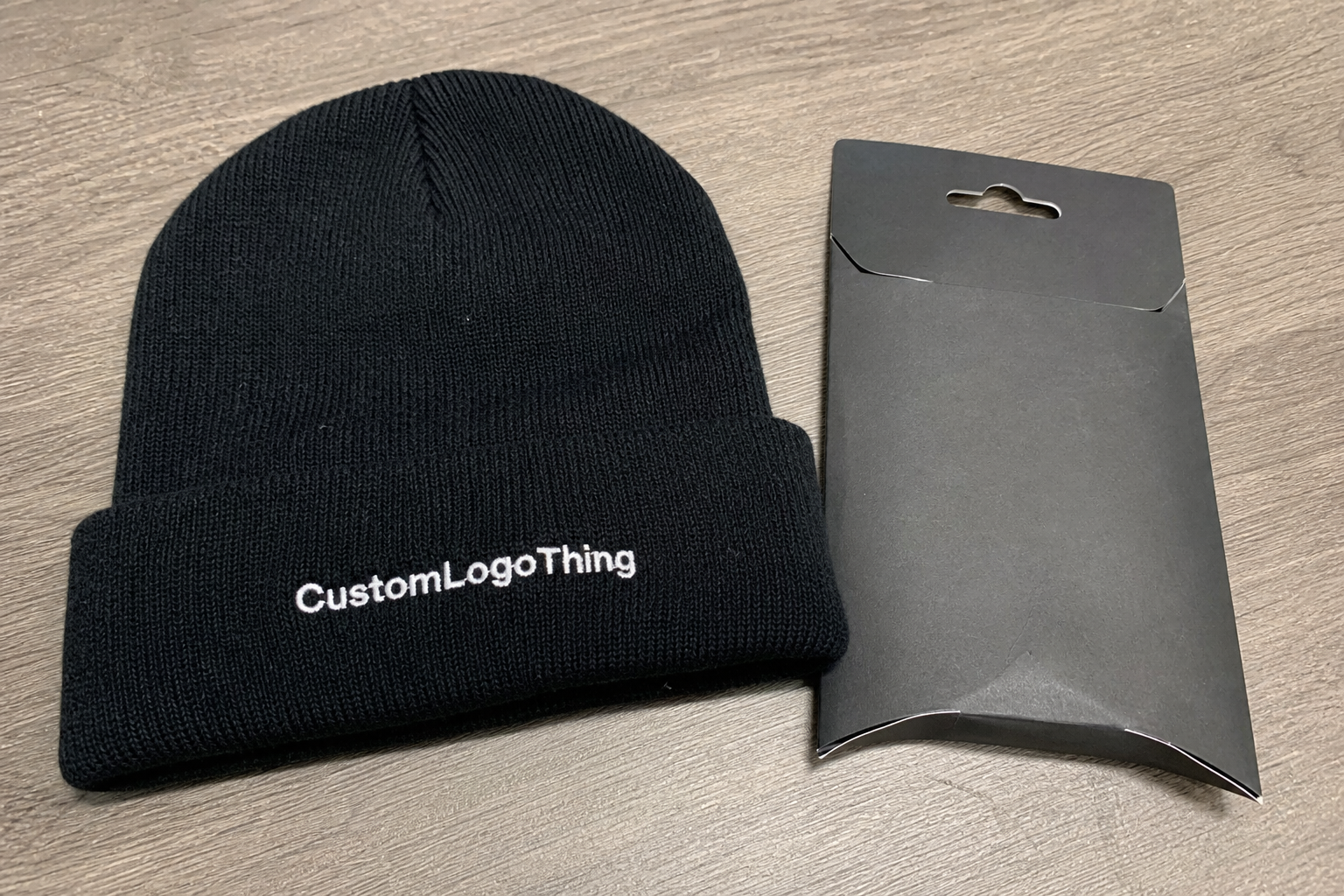
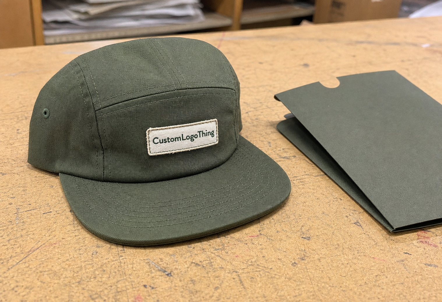
Packaging can also influence how the cap is perceived. If the product ships with hang tags, inserts, or sleeves, the presentation should match the cap’s branding level. Standards used for transit testing, such as the ISTA test protocols, are helpful references when a program includes boxes or inserts that need to survive shipping without crushing the brim. For paper components, FSC-certified sourcing can keep the sustainability story consistent from the cap to the tag.
The best-looking snapbacks are usually the ones where the buyer has been decisive. One clear logo. One clear placement. One production method that matches the artwork. That discipline keeps the cap from feeling overdesigned and gives the brand room to look intentional instead of crowded.
Next steps before you request a quote
Shortlist your top two placements before asking for pricing. If you start with five options, the conversation becomes a design seminar. If you start with two, the supplier can tell you what each choice costs, how each one affects timing, and where each one may need simplification.
Then collect the basics: vector artwork, Pantone references, cap color, target quantity, preferred decoration method, and desired logo width if you already know it. If you do not know the width, ask the supplier to recommend one based on the cap template and the final use case. A retail line does not need the same treatment as a one-off event order.
Ask for a proof that shows the logo at actual size on the actual cap style. That is where a snapback Caps Logo Placement guide becomes useful instead of theoretical. The proof should show more than a centered icon on a blank crown; it should show spacing from the brim, proximity to seams, and any interaction with the back closure or eyelets.
Keep the approved file set and notes together for reorders. It saves time, reduces version confusion, and prevents the most expensive mistake of all: re-litigating the same placement decisions six months later.
Frequently Asked Questions
Where is the best logo placement on snapback caps?
Front-center is usually best for maximum visibility and fast brand recall. Side placement works better if the brand wants a quieter look or the front panel needs to stay open for a patch, texture, or clean fashion finish.
Does logo placement change the price of snapback caps?
Yes. Placement changes cost when it adds setup work, extra decoration zones, or more complex stitch planning. Multiple locations, 3D puff, and patch upgrades usually increase both unit cost and sample cost.
How long does custom snapback logo production usually take?
Simple embroidered orders can often finish in 8 to 15 business days after approval. Patches, multi-location decoration, and revision-heavy artwork often take 12 to 20 business days or longer, depending on quantity and workload.
What artwork do I need for the cleanest placement proof?
Send a vector file, Pantone colors, the exact cap style, your preferred placement, and the target logo width. Include any areas to avoid, such as seams, the brim line, or the back closure.
What are the most common snapback logo placement mistakes?
The biggest mistakes are placing the logo too high, crossing seams without checking alignment, and using artwork that is too detailed for the chosen decoration method. A sample or proof on the actual cap style prevents most of those problems before production starts.
That is the practical value of a snapback Caps Logo Placement guide: it turns a loose art request into a cleaner proof, a more accurate quote, and a cap that reads well before anyone even adjusts the closure.