Woven Labels Material Guide for Pet Treat Brands: What They Are
On a crowded natural pet shelf, shoppers often notice texture before flavor. A neat woven tag on a pouch or carton can catch the eye faster than a copy panel, especially in an aisle full of kraft paper effects, matte films, paw-print motifs, and resealable bags that start to blur together. This Woven Labels Material guide for pet treat brands is designed for buyers who need a label that looks premium without creating trouble around crumbs, oils, moisture, handling, or retail display.
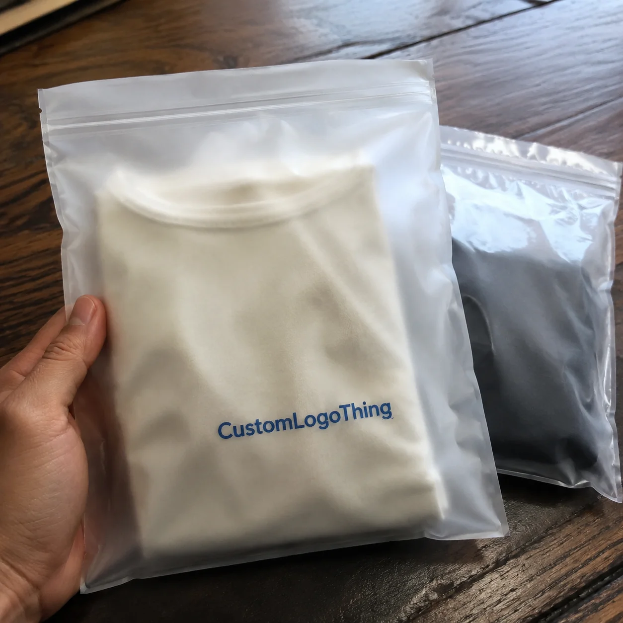
Woven labels are small textile labels made by interlacing threads. They are not printed with ink on paper or film. That construction gives them a dimensional surface and a more permanent feel than a sticker or hang tag. On pet treat packaging, they are usually used as exterior brand elements: sewn to a fabric topper, attached to a gift bundle, heat-applied to an accessory, looped through a closure, or fixed to a pouch as a visual badge.
The exterior part matters. Most woven labels are not intended for direct food contact, and they should not carry regulated information that belongs on the primary package. Their job is narrower and more visual: logo recognition, product family coding, a premium cue, a seasonal marker, or a gift-style detail.
From a packaging buyer’s point of view, the label should earn its place: it needs to look polished, stay put, and not slow the line.
That is where buying decisions can drift. A woven label can lift perceived value, but it also affects application speed, unit cost, durability, and shelf readability. The best choices support the larger packaging system, whether that system uses flexible pouches, FSC certified cartons, corrugated cardboard shipper displays, paperboard sleeves, or recycled materials across the rest of the range.
For broader format decisions, brands often keep label development tied to packaging architecture and review resources such as Case Studies or Custom Labels & Tags while narrowing the options.
How Woven Labels Are Made and Why Thread Choice Matters
The weaving process is more technical than it appears from a finished sample. Artwork is converted into a thread map, then warp and weft yarns are interlaced on a loom so the design is built from colored thread rather than printed on the surface. A slight change in thread count, weave density, or yarn thickness can turn a crisp logo into a soft one.
Polyester is the default material for many Pet Treat Brands because it holds color well, tolerates handling, and supports fine detail better than bulkier yarns. Recycled polyester is a logical next step if the brand already makes recycled-content claims elsewhere in the pack. Ask for documentation, not just a verbal description; recycled yarn content needs to be stated consistently if marketing plans to reference it.
Cotton and cotton-look yarns have a different role. They can make a treat line feel more handmade, bakery-driven, or small batch. The tradeoff is clarity. Softer yarns and looser textures can blur small letters, especially below roughly 6 to 7 points, depending on the weave and typeface. Metallic thread works best as a controlled accent. A full metallic field may look heavy, increase stiffness, and complicate detail.
Compared with printed labels, paper hang tags, or stickers, woven labels bring texture and a sense of permanence. They do not reproduce gradients, ingredient panels, QR codes, tiny legal text, or photographic effects well. Treat them like a signet, not a brochure.
Thread size deserves more attention than it usually gets. Finer yarns and tighter weaves can hold sharper marks. Heavier yarns create a heritage look but soften corners and thin strokes. A label that needs to read from arm’s length on a retail hook has different requirements from a label meant to reward close-up handling during unboxing.
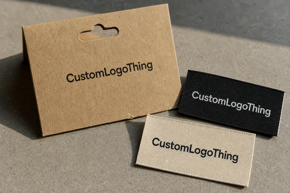
Edge finishing changes both the look and the way the piece behaves. Heat-cut edges are clean and economical for simple shapes. Laser-cutting can create a sharper silhouette, though the material and color need to tolerate the cut without visible darkening. Merrowed borders add a raised stitched frame, useful for badge-style labels. Folded edges work when the label needs to tuck into a seam, wrap around a closure, or sit neatly without exposed cut edges.
If the label will be used near oily treats, freezer packs, high-touch displays, or subscription shipments, review a physical sample. A digital proof cannot show how thread catches light, how bulky a fold feels against thin film, or whether the edge is too stiff for a small pouch.
Material Specs to Check Before You Approve a Label
A useful quote starts with a useful spec. Before approving anything, define finished size, fold type, edge finish, thread colors, weave density, backing, attachment method, tolerance, packing format, and application process. The last point is often the difference between a smart packaging detail and an expensive nuisance.
Fold style is not just decoration. Straight cut labels work for front-facing badges and flat logo patches. End folds are common when the label is sewn into a seam. Center folds create a looped tab. Mitre folds clean up angled ends. Manhattan folds have a tailored appearance that suits premium gift sets, accessory packaging, or boutique pet lines with a more refined presentation.
Backing needs a practical review. Sew-on labels do not require adhesive. Heat-seal or iron-on backing may work for fabric accessories, but not every pouch, carton, or sleeve can tolerate heat, dwell time, or pressure. Pressure-sensitive adhesive can work for certain non-food-contact uses, yet performance depends on surface energy, coating, curvature, storage temperature, and how long the pack is handled before it reaches the customer.
Matte soft-touch coatings, powdery paper stocks, cold-chain conditions, and flexible gussets can all change adhesion. A label that sticks beautifully to a flat lab sample may lift on a filled pouch after the bag flexes in a shipper. For oily treat categories, keep the woven component away from areas likely to pick up residue during filling or consumer handling.
Placement is a quiet design choice with production consequences. Labels near resealable zippers need clearance. Labels on gussets must tolerate bending. Labels placed close to tear notches can interfere with opening or get damaged before the customer notices them. If the package uses a compostable structure or a paper-based sustainability message, the woven label should support that story rather than contradict it visually or materially.
Color expectations need honesty. Woven labels are built from available thread colors, so a Pantone match is usually approximate. Thread has body; it reflects light differently from ink. Cream can read yellow beside a cool white pouch. Navy can look warmer against kraft. Metallic accents can overpower small marks. The safest approval path is a thread card and, for important launches, a woven strike-off.
Keep compliance information where it belongs. Ingredient statements, guaranteed analysis, nutrition panels, net weight, barcode data, lot coding, and required claims should sit on printed packaging or an appropriate compliant label system. The woven label should carry the visual job: logo, flavor family, limited-run badge, premium marker, or brand texture.
References such as the ISTA packaging testing standards can help when distribution stress is part of the discussion. The FSC program is useful when paperboard, hang tags, cartons, and recycled materials are being evaluated alongside textile elements.
One final check: view the woven label beside the full packaging system, not in isolation. Fine detail disappears quickly beside busy corrugated displays, bold pouch graphics, or multi-SKU trays. If the label cannot be recognized in that environment, it is probably too subtle or too complex.
Pricing, MOQ, and Quote Details That Move the Unit Cost
Woven label pricing is driven less by the word “label” than by size, thread count, weave density, color count, shape, finishing, backing, quantity, and inspection requirements. A small two-color logo tab is a different cost problem from a shaped badge with metallic thread, folded ends, adhesive backing, and retail-ready packing.
For quoting, the most useful inputs are finished dimensions, vector artwork, number of colors, material direction, fold or cut style, backing requirement, application surface, estimated annual usage, delivery location, and whether a woven sample is required before bulk production. A clean brief reduces guessing. It also makes competing quotes easier to compare.
MOQ is partly technical and partly economic. Loom setup, artwork conversion, thread preparation, color selection, and finishing create fixed work before the first usable label comes off the line. Unit cost usually drops as quantity rises because that setup is spread across more pieces. A 5,000-piece order often lands far better per unit than a 500-piece run, though the exact breakpoints depend on construction and supplier capacity.
| Construction | Typical Use | Approximate Unit Cost | Buyer Takeaway |
|---|---|---|---|
| Standard polyester woven label | Retail pouch logo, starter line, multipack branding | $0.12-$0.22 at common mid-volume runs | Strong default for crisp detail and stable color |
| Recycled polyester woven label | Sustainability-led treat brands, FSC certified packaging systems | $0.14-$0.26 depending on documentation and finish | Good fit when recycled materials are part of the story |
| Cotton-look woven label | Boutique, handmade, or bakery-style positioning | $0.15-$0.28 based on weave density and edge work | Feels softer, but sample for clarity and fray control |
| High-density or specialty accent label | Premium line marker, gift pack, limited edition cue | $0.18-$0.35 with added finishing steps | Raises shelf value, but can slow application |
These ranges are planning numbers, not promises. Freight, rush timing, sampling, special packing, customs, and unusual finishing can move the total. So can quality requirements: tighter tolerances, more frequent inspections, and stricter color controls add time somewhere in the process.
The cheapest label is not always the least expensive option. If it slows packing, peels during transit, frays at the edge, or forces extra inspection, labor and rework can erase the savings. For premium pet treats, unit cost has to be weighed against line speed, shelf impression, and defect risk.
Ask for good-better-best tiers when the budget is still fluid. A standard polyester version, a recycled polyester option, and a premium high-density or specialty-finish version give marketing, purchasing, and operations a clearer set of tradeoffs. That comparison is especially helpful when the woven piece must sit beside kraft paper cues, matte pouches, paperboard gift boxes, or a more polished unboxing format.
Process, Timeline, and Lead Time From Artwork to Finished Labels
The path from artwork to finished labels usually follows a predictable chain: artwork review, technical setup, thread color selection, proofing, buyer approval, weaving, cutting or folding, backing application if needed, inspection, packing, and shipping. Each step sounds minor. Together, they determine the real lead time.
Clean vector artwork speeds up the front end. Small woven labels need simple paths, solid contrast, and realistic line weights. Low-resolution screenshots, raster logos, distressed textures, and hairline typography often require redraw work before production can begin. That is not administrative friction; it is how the design becomes manufacturable.
A woven strike-off is worth requesting for fine detail, new materials, new backing, or a high-visibility launch. It is a real sample of the construction, not a polished screen image. It can reveal muddy type, thread mismatch, edge bulk, unexpected shine, or a logo stroke that needs to be thickened.
Lead time depends on complexity, quantity, sample approval, production queue, and shipping method. A simple reorder from an approved file is very different from a new badge with revised artwork and special backing. Brands planning a seasonal flavor, retailer reset, subscription box refresh, or holiday bundle should build in approval time rather than treating the label as an end-of-calendar detail.
Application timing matters as much as manufacturing timing. Labels may need to arrive at a sewing contractor, a gift-pack assembly point, a co-packer, a warehouse kitting area, or a facility applying them to finished pouches. If they show up late, the whole packaging calendar can slip, especially when printed pouches, corrugated cardboard shippers, cartons, and display trays are already scheduled.
Maintain a tidy reorder file. Keep the approved spec, artwork version, thread references, fold type, edge finish, backing, tolerance, packing method, and prior purchase order notes in one place. Reorders become expensive when everyone has to reconstruct decisions from old emails and sample photos.
Step-by-Step Selection Guide for Pet Treat Packaging
Start with the job. Is the label meant to signal the brand, identify a flavor family, mark a limited edition, dress up a gift set, tie together a bundle, or brand a reusable accessory? A woven label can do one or two of those things well. It cannot carry the whole pack.
Next, choose placement with the filled package in hand. Measure the real surface. Test whether the label will sit flat on a pouch, wrap around a carton, hang from a closure, sew into a fabric element, or attach to a sleeve. Empty mockups are useful, but filled pouches bulge, flex, and shift in ways that change the label’s behavior.
Then match the material to the positioning. High-density polyester supports a crisp retail finish. Cotton-look labels suggest bakery-style or handmade cues. Recycled polyester fits sustainability-led brands if the documentation is clear. Textured borders and shaped cuts can help a boutique line stand apart, but they should not compete with required pack information.
Edit the artwork hard. Remove tiny copy, thin gradients, distressed edges, and miniature certification-style symbols that may print well but weave poorly. Keep the strongest mark, the clearest contrast, and the minimum number of colors needed to preserve recognition. Woven labels reward restraint.
Choose fold, edge, and backing based on handling, not just appearance. A label can look elegant on a desk and behave badly on a flexible bag after case packing. If the package will be refrigerated, shipped in mixed cartons, displayed on pegs, or handled repeatedly in a boutique setting, the label needs to be tested under those conditions.
Sample under real lighting. Review the label at the packing table, on the retail shelf, and in the unboxing position. Check logo clarity from arm’s length. Feel the edge. Flex the pack. Test placement near closures and gussets. Compare color beside the printed packaging rather than against a white background.
Before bulk production, confirm written approval: final dimensions, tolerance, material, thread colors, fold or edge finish, backing, artwork version, packing method, and application responsibility. A one-page approval record prevents many small arguments later.
Common Mistakes That Make Woven Labels Look Cheap or Fail
The most common mistake is overcrowding. Long taglines, tiny claims, ingredient-style text, and small icons can blur together in thread. The result is oddly expensive and oddly cheap-looking at the same time. Simpler almost always reads better.
Another trap is approving size on screen. A 1-inch label can look generous in a zoomed PDF and feel cramped on an actual pouch. Print the artwork at scale, cut it out, and place it on the package before ordering a strike-off. It is a crude test, but it catches problems early.
Backing mistakes are harder to fix. Buyers sometimes assume every adhesive behaves the same. It does not. Matte coatings, soft-touch films, freezer conditions, oily residue, curved surfaces, and pouch flex all change adhesion. If the pack will travel through distribution, evaluate the label against handling and shipping realities. Guidance from ISTA can help frame those conversations when the label is part of a broader pack integrity review.
Color surprises are also common. Thread is not ink. A woven navy can shift beside warm kraft paper. A cream thread may look dull against a bright printed white. Metallic accents can look refined in a small swatch and loud on a full run. Approve color in context.
Edges and bulk deserve the same scrutiny. Rough cut edges, stiff patches, and heavy folds can snag during fulfillment or look awkward on small treat bags. Labels near zippers, gussets, tear notches, and hanger holes need extra clearance.
Do not ignore the co-packer workflow. A beautiful label that requires slow placement, long heat dwell time, careful alignment, or extra inspection can turn into an operations problem. Premium packaging should not depend on perfect hand placement unless the production budget and schedule allow for it.
One more check for sustainability-led brands: does the woven label support the rest of the package language? If the pouch, carton, or tag emphasizes recycled materials, FSC certified paperboard, or biodegradable packaging claims, the textile detail should feel intentional. A decorative label that appears disconnected from the rest of the system can weaken the message rather than elevate it.
Next Steps: Build a Sample-Ready Label Spec Sheet
Start with the pack in hand. Gather the current pouch, box, sleeve, jar, or bundle material. Mark the intended label position, measure the available area, and photograph the front, side, filled, and display views. Those images are more useful to a supplier than a loose description such as “small premium badge.”
Build a simple spec sheet with finished label size, artwork file, preferred thread colors, material direction, fold or edge preference, backing needs, application method, estimated quantity, launch date, shipping destination, and any storage or handling conditions. Include the packaging substrate if known: matte film, kraft paper label stock, paperboard, fabric, coated carton, or another surface.
Sampling two or three realistic constructions is usually enough. A standard high-density polyester logo label, a recycled polyester version, and a cotton-look boutique label can show the meaningful range without creating decision fatigue. If adhesive is involved, sample the backing on the actual package surface, not on a substitute.
When samples arrive, evaluate them in a practical order. Check logo clarity from arm’s length. Compare thread color beside the printed package. Feel the edge with your fingers. Flex the package. Test placement near closures. Ask the people applying the labels whether the process feels repeatable at production speed.
Document the approved sample with photos and written specs. That archive pays off when new flavors, seasonal runs, retailer-exclusive packs, or bundle formats are added later. The next reorder should not depend on memory.
Used well, a woven label is not just decoration. It is a small material decision that touches shelf appeal, handling, compliance boundaries, line speed, and unit cost. The strongest pet treat packaging details tend to do exactly that: look simple from the outside while quietly solving several production problems at once.
What is the best material for woven labels on pet treat packaging?
Polyester is usually the best starting point because it is durable, holds color well, and supports clean logo detail. Recycled polyester is a good option when recycled materials are part of the brand story and the supplier can document the yarn content. Cotton-look woven labels can work for handmade or bakery-style positioning, but they should be sampled for clarity, edge quality, and fray control.
Can woven labels touch pet treats directly?
In most cases, they should not. Treat woven labels as exterior branding elements rather than direct food-contact packaging components. If there is any chance the label could touch treats, oils, crumbs, or edible product, review food-contact requirements with the packaging supplier and a regulatory advisor. Ingredient, nutrition, weight, barcode, and lot information should remain on the proper printed package or compliant label system.
How much do woven labels cost for pet treat brands?
Cost depends on size, weave density, thread colors, fold or edge finish, backing, quantity, sampling, and shipping. Mid-volume custom woven labels often fall in the broad range of about $0.12 to $0.35 per piece, with specialty finishes or low quantities moving higher. For a useful quote, provide vector artwork, finished dimensions, material preference, backing requirements, application surface, and estimated order quantity.
How long is the lead time for custom woven labels?
Lead time varies by artwork readiness, sampling needs, production complexity, quantity, and shipping method. A project typically moves through artwork cleanup, proofing, sample review, weaving, finishing, inspection, and delivery. Brands working toward a retail launch, seasonal flavor, or co-packer date should confirm the label schedule before locking the full packaging calendar.
What artwork works best for woven labels material selection?
Clean vector logos with strong shapes, limited colors, and readable contrast translate best into thread. Tiny text, thin distressed lines, gradients, photographic detail, and small certification-style marks are better kept off the woven label itself. If detail and premium presentation matter, request a woven strike-off so the final result can be judged in thread rather than on a screen.