For candle brands, Matte Poly Mailers can look refined on screen and still disappoint in hand, which is exactly why the candle Brands Matte Poly Mailers print proof checklist matters before anyone approves a run. Matte film softens contrast, changes how color reads, and can make a logo or scent name feel lighter than expected once the mailer is folded, packed, and handled on a shipping table. A proof is not a formality. It is the point where design, production, and real use finally meet.
That matters more for candles than for a generic ecommerce shipment. Candle lines often depend on scent names, seasonal artwork, giftable presentation, and repeat subscription orders, so a small layout mistake can spread across an entire collection. The checklist should catch more than graphics. It should catch scale, placement, fold lines, shipping visibility, and whether the design still reads when a customer picks it up at arm’s length.
Why matte poly mailers deserve a proof check before print
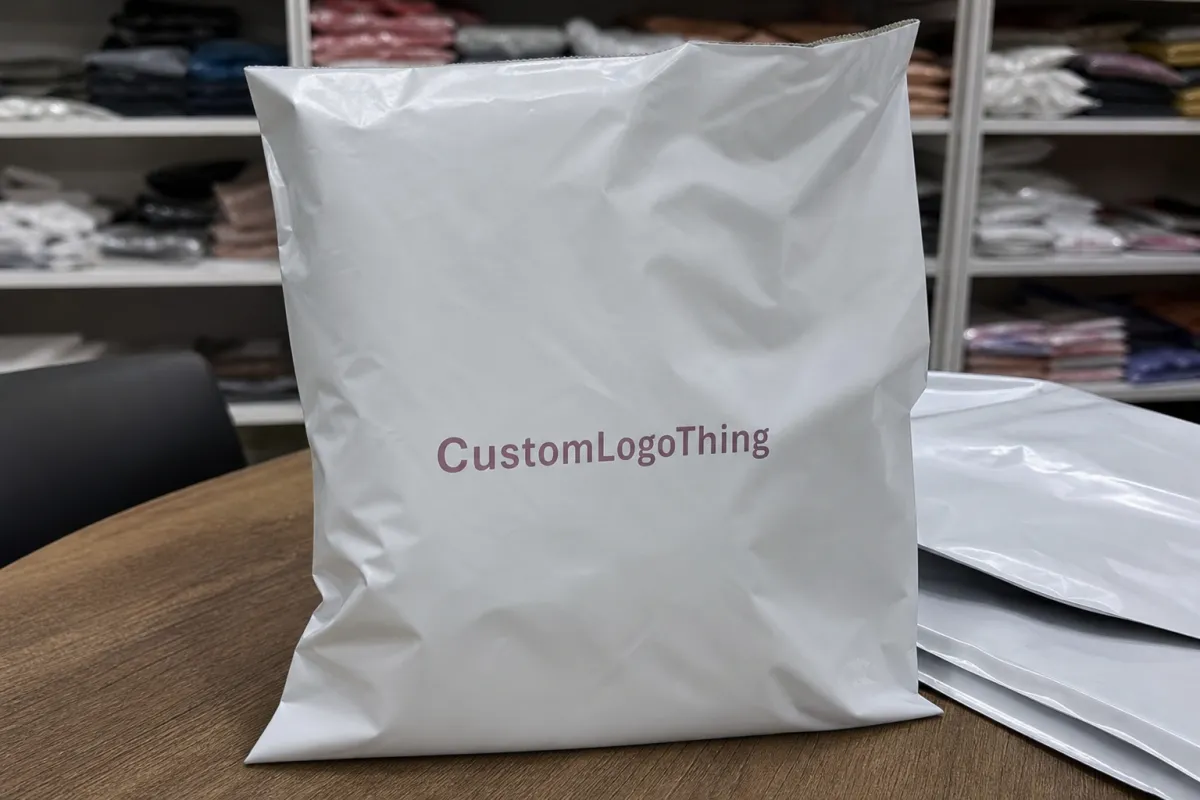
Matte poly mailers behave differently from glossy stock. The finish cuts glare, which helps in transit photos and under retail lights, but it also lowers perceived saturation. A deep navy may read flatter. Fine serif type may lose crispness. Small scent descriptors, especially in light weights, can disappear faster than a brand team expects. That is the practical reason the candle Brands Matte Poly Mailers print proof checklist starts before print, not after the first carton arrives.
A print proof is a preview of the final artwork on the actual mailer size and format. In practice, it is the stage where you see whether the layout, copy, and brand marks still work once the piece is scaled to production dimensions. For candle shipments, that preview matters because the mailer is not just a wrapper. It is the first visible brand surface in the shipping process, and often the only one the customer sees before opening.
There is also more risk in candle packaging than many teams realize. Seasonal launches move quickly, fragrance names change late, and subscription programs can keep the same artwork in circulation for months. If a proof is approved too quickly, one wrong scent name or one awkward barcode placement can repeat across a long production run. The checklist exists to slow that down just enough to catch the things that cost money later.
From a packaging buyer’s point of view, the proof is not only about graphics. It is about whether the artwork survives the actual manufacturing format. That includes edge bleed, seam locations, adhesive closure zones, and where the visual hierarchy lands after the mailer is folded flat. For brands balancing DTC, wholesale, and subscription channels, that is not cosmetic. It is operational.
A matte proof that looks calm and polished on screen can still fail in production if the contrast is too low, the logo is too small, or the main message sits too close to a seal line.
Good teams also think about visibility in shipping. A mailer might pass through labels, scanners, bins, and warehouse handling before a customer opens it. If the artwork is too fragile, too dense, or too close to the edges, the brand impression can break apart under normal use. That is why the checklist should always include shipping visibility, not just visual appeal.
For buyers comparing packaging options, it helps to place the mailer inside the broader packaging system. If you are still deciding on custom packaging, the right starting point may be Custom Packaging Products or a closer review of Custom Poly Mailers. For proof-heavy work, a few packaging references from real projects can also sharpen expectations, which is where Case Studies becomes useful.
How matte poly mailer proofs work from file to approval
The proof sequence is usually straightforward, but each step has its own failure points. First comes artwork upload. Then the supplier or prepress team checks the file for resolution, bleed, line weight, and template fit. After that, you usually get a digital proof, and in some cases a physical sample or production proof. Revisions follow, then final sign-off releases the job to print. The checklist should map to that exact sequence so nothing gets skipped in the rush to approve.
Screen proofs and production proofs are not the same thing, and this is where many teams get overconfident. A screen proof is useful for layout, text accuracy, and general placement. It is not reliable for judging final matte texture, ink density, or the way a chosen color behaves on film. A production proof, or physical sample, gives a truer read on contrast, surface finish, and whether a logo still feels balanced once it is printed at full size. For designs that depend on precise branding, both are worth seeing.
Most suppliers will ask for vector artwork, often in AI, EPS, or PDF format, plus fonts outlined or embedded. If there is a dieline or a mailer template, match it to the correct size before sending files. That sounds basic, but mismatched templates create avoidable delays. A proof is only useful if the proof matches the actual mailer dimensions, seal orientation, and printable area.
For candle brands, the first places to inspect are usually logo placement, return address, scent or campaign name, barcode zones, QR codes, and any warning or handling copy. Keep an eye on small type. On a matte surface, thin type can lose authority fast. If the design uses multiple ink layers or a brand mark with narrow counters, ask for another review. A little patience here is cheaper than a reprint.
There is also a technical distinction between digital printing, offset printing, and flexographic printing. Each process handles color, setup, and repeatability differently. For short runs or proofing, digital printing often gets used because it moves faster and accommodates revisions. Flexographic printing is common in larger production runs and can be efficient at scale. Offset printing is less common for poly mailers themselves, but it still comes up in related packaging work, especially when brands build a broader print system across inserts, cartons, and collateral. The proof needs to reflect the actual print method, because the color behavior will not be identical across all three.
That is also where CMYK and spot color decisions matter. CMYK is flexible and practical for artwork with blends or photographic elements. Spot color is often better when the brand needs a consistent logo tone or a very specific color identity. Matte film can mute both, but it tends to expose weak contrast more clearly when a brand relies on pale tones or thin line art. If the proof is trying to do too much with too little contrast, the finish will show it.
Pricing, MOQ, and unit cost drivers for printed mailers
Cost is never just cost with printed mailers. The main drivers are size, film thickness, number of print colors, total ink coverage, and whether the format is stock or custom. A simple one-color logo on a standard size mailer will usually sit at the lower end of the range. A full-coverage design with multiple spot colors, a seasonal pattern, or precise brand matching will cost more. That is why the proof checklist should sit next to the quote, not only next to the artwork file.
MOQ changes the math fast. A brand testing a new candle scent might only need a few thousand units, but lower quantities usually carry a higher per-unit cost because setup and proofing are spread across fewer pieces. Larger runs can reduce the unit price, though they also raise the financial risk if the artwork is wrong. For smaller candle brands, the most expensive proof is often the one skipped before a full production order.
Here is a practical comparison that buyers often find useful:
| Option | Typical use | Approximate cost driver | Proof risk |
|---|---|---|---|
| Digital proof only | Layout review, copy approval, quick internal sign-off | Lowest upfront cost, often included or lightly billed | Limited color accuracy on matte film |
| Physical sample | Color, finish, and handling review | Sample charge plus shipping, sometimes $25-$100+ | Better for contrast and texture, slower to receive |
| Short production run | Seasonal launch, retailer test, subscription pilot | Higher unit price at lower MOQ, often $0.18-$0.28 per unit at 5,000 pieces depending on coverage | More expensive if revisions are missed |
Those numbers are directional, not universal. Size, print coverage, and supplier geography can move them quite a bit. But they do show the core tradeoff. A cheaper proof stage can prevent a much more expensive production mistake. That is especially true when a design will be repeated across a candle collection, where one bad proof can cascade into multiple SKUs.
Hidden cost items deserve attention too. Plate setup fees can appear in flexographic work. Rush handling can add a premium if the timeline is compressed. Sample shipping is often overlooked until the box has to move across the country. And if artwork changes after review, some suppliers will charge another revision or proof fee. None of that is mysterious. It just needs to be named early, preferably before the order is approved.
For brands building a broader packaging program, it helps to review packaging line items as a system rather than a single purchase. A matte mailer sits beside inserts, labels, and outer cartons. Each one affects the total packaging budget, which is why a careful proof review can save more than a dramatic rush correction later.
Process and timeline for matte poly mailer approval
A realistic timeline usually starts with file prep and supplier review, then moves into proof generation, internal review, revision, and final release. Simple artwork can move quickly if the template is correct and the copy is final. More complex work takes longer. Custom illustrations, layered artwork, metallic effects, or precise alignment across the mailer face tend to add days because the proof has to answer more questions.
The best-case path is clean and boring, which is exactly what you want. Artwork arrives in the right format. The supplier checks the file and issues a proof. Internal stakeholders review it once, gather comments, and return a single revision list. Final approval lands without confusion. In that kind of workflow, the approval stage can move fast. In messy workflows, every small decision becomes a new delay.
Multiple approvers are another common drag on timing. Marketing may want one version, operations may care about handling and barcodes, and retail partners may have their own requirements for visibility or compliance. If the proof has to circulate to all three groups, build in buffer time. A mailer proof is not only a design artifact. It is a coordination document.
Common bottlenecks are easy to name and still surprisingly common: missing art files, vague color references, last-minute copy edits, unclear quantity decisions, and sudden changes in mailer size. A team may also underestimate how long it takes to get a physical proof into the right hands. Shipping a sample to more than one reviewer can add several business days before anyone even comments on it.
For readers who like standards-based thinking, it is sensible to keep packaging testing references close by. The ISTA guidelines are useful when you want to think beyond print and into shipment performance, while the EPA recycling guidance can help teams think more carefully about end-of-life expectations for packaging materials. Not every candle shipment needs formal lab testing, but good packaging decisions usually borrow that discipline.
A step-by-step print proof checklist for candle packaging
Start with the facts that should never be wrong. Verify the brand name, scent name, scent family, and any product claims before you look at decoration details. A beautiful proof is still a bad proof if it prints the wrong collection name or a stale product line.
Next, check the dimensions against the mailer size. Artwork should not drift into seams, seal zones, or any area that may be hidden once the mailer is folded and closed. If the design depends on exact centering, measure it against the dieline, not just the mockup image. That is where the checklist earns its keep.
- Confirm the final mailer size and template.
- Check logo size, placement, and spacing from edges.
- Review scent name, collection name, and any marketing copy for accuracy.
- Test readability at arm’s length, especially on matte stock.
- Inspect barcode, QR code, and return address zones.
- Compare color expectations against the actual print method and finish.
- Look for seam, fold, and closure interference.
- Gather all stakeholder edits once, then approve the final version only after comparing it to the spec sheet.
Color needs special attention. Matte poly mailers can mute saturation and reduce contrast, so the proof should show whether the brand can still hold visual weight once printed. If the design uses CMYK gradients, confirm that the most critical brand colors still reproduce cleanly. If it uses spot color, confirm the reference is explicit and not just approximate. For seasonal candle launches, this matters even more because rich, festive palettes often behave differently on film than they do on paper.
Typography deserves the same discipline. Thin fonts, tight tracking, and long product names can create legibility problems on a matte surface. The same is true for QR codes and barcodes. They should scan cleanly and stay clear of busy art. If the design includes social handles or a short promotional line, make sure that copy still reads without needing a magnifying glass.
Then think about real use. A mailer should be judged as a mailer, not as a flat mockup in isolation. Imagine one unit with a candle order inside, folded flat, stacked in a bin, handled by a picker, and scanned in transit. Does the branding still look intentional? Does the address area stay clear? Does the artwork survive the places where packaging gets touched most?
One more thing: consolidate comments before they go back to the supplier. Mixed feedback from marketing, finance, and operations can create a proof loop that never quite ends. The best approval routine is simple. One owner. One comment list. One final comparison with the spec sheet.
For brands that are building out a broader sourcing plan, the proof review can also sit inside a packaging standards framework. FSC-certified paper inserts, shipping test references, and supplier documentation all help the final package feel more deliberate and less improvised. If sustainability claims are involved, align the artwork with the actual material story and do not overstate anything.
Common mistakes candle brands make before sign-off
The first mistake is approving a digital proof without thinking about matte finish. Screen brightness can flatter a design that will look weaker in production. Low-contrast artwork may seem balanced online and then feel thin on the real mailer. That gap is one of the main reasons the checklist should include a physical sample whenever the design is detailed or color-sensitive.
Another common mistake is designing for beauty at the expense of readability. Seasonal candle artwork often leans decorative, which is understandable. But if a scent name disappears once the artwork is reduced to mailing size, the design has not done its job. The brand may still look attractive, but the package becomes harder to scan, sort, and trust.
Copy density causes problems too. Some teams want to include scent notes, social handles, a brand story, and a promotional line all on the same mailer. On a matte poly surface, that can create a crowded look quickly. If every word is competing for attention, the visual hierarchy is too busy. A cleaner layout is usually more effective, and often cheaper to approve because there is less room for ambiguity.
There is also the late-change problem. A team approves the proof, then tweaks the artwork without asking for a fresh review. Maybe it is a small font change. Maybe a barcode shifted. Maybe the quantity changed and the supplier updated the setup. Small changes are exactly how proof errors sneak back in. Any revision after the proof stage deserves another look.
Finally, too many brands skip a small test order. That is a missed opportunity, especially for candle lines that need to work across wholesale, DTC, and subscription shipments. A limited run shows how the mailer behaves in the warehouse, how the matte finish handles scuffing, and whether the print still feels consistent across the actual workflow. Testing is cheaper than a warehouse full of almost-right packaging.
Honestly, this is where a lot of packaging teams get trapped by optimism. They see the mockup, like the mockup, and move on. The better habit is slower and less glamorous: compare the proof against the spec, test the handling, and check the mailer as if the customer, the picker, and the carrier all have different questions to answer.
Expert tips and next steps after proof approval
Once the proof is approved, the job is not over. Ask for one clean source file set, one approved proof record, and one production spec summary. That combination keeps future reorders consistent, which matters a lot when the same candle design returns across different seasons or replenishment cycles. If the proof disappears into inbox history, the next run may drift without anyone noticing.
It also helps to run a controlled pilot shipment. Not a fantasy sample. A real order. Pack a few actual candles, close the mailer, label it, and watch how it behaves during normal handling. The matte finish may hold up beautifully, or it may reveal scuffing, corner stress, or a contrast problem that only appears after the product is packed. That feedback is worth more than another round of screen viewing.
Create a simple internal sign-off path. Marketing should own brand accuracy. Operations should own usability. Finance should know the cost impact of revisions or rush changes. When those groups all approve different versions, confusion creeps in. A short approval path with one final owner usually works better than a sprawling one.
Before placing the final order, confirm lead time, shipping method, reorder trigger, and whether the approved artwork will be archived. Suppliers vary on how they store job history, so do not assume the file will be easy to recover six months later. Keep your own copy of the approved proof, the spec sheet, and any color notes tied to the run.
For many candle brands, the real win is not just a prettier mailer. It is fewer surprises. Better consistency. Less rework. The checklist is what turns that from a nice idea into a repeatable process. Gather the files, request the right proof format, compare costs, set the timeline, and approve only when every item on the checklist is actually complete.
That is the practical payoff: less guesswork, cleaner approvals, and packaging that still looks like the brand after it has spent a day in transit.
What should candle brands check on a matte poly mailers print proof?
Check logo size, scent name clarity, and any text that must stay readable at arm’s length. Verify that seams, folds, and closures do not interrupt the artwork. Compare the proof against the final mailer size, not just the digital layout.
Do matte poly mailers need a physical proof or is a PDF enough?
A PDF is useful for layout and copy, but it cannot fully show matte finish, ink density, or surface feel. Physical proofs help candle brands judge contrast, color shift, and scuff visibility. Use both when the design is detailed, seasonal, or intended for retail display.
How long does a candle brands matte poly mailers proof usually take?
Simple proofs can move quickly if artwork is ready and the template is correct. Revisions, custom colors, or multiple approvers usually add time before production starts. Physical sample shipping can extend the timeline by several days.
What affects the price of matte poly mailer proofs and final order cost?
Size, print coverage, color count, material thickness, and order quantity are the main drivers. Rush service, sample shipping, and revision rounds can raise the total cost. Lower MOQ often means a higher unit cost, even when the artwork is simple.
What should be approved before production starts?
The final artwork file, dimensions, copy, color expectations, and quantity should all match the proof. Confirm the production timeline, reorder plan, and shipping destination before release. Save the approved proof so future batches do not drift from the original spec.


