Send a beautiful pouch design to prepress and you can still get back a proof that feels off by just enough to cause trouble. A seal line steals a few millimeters, a barcode lands too close to the zipper, or a scent name disappears into a dark matte panel. That is usually where the candle Brands Zipper Pouch Bags artwork proof checklist earns its place: not as a design nicety, but as a practical control point before print money is spent.
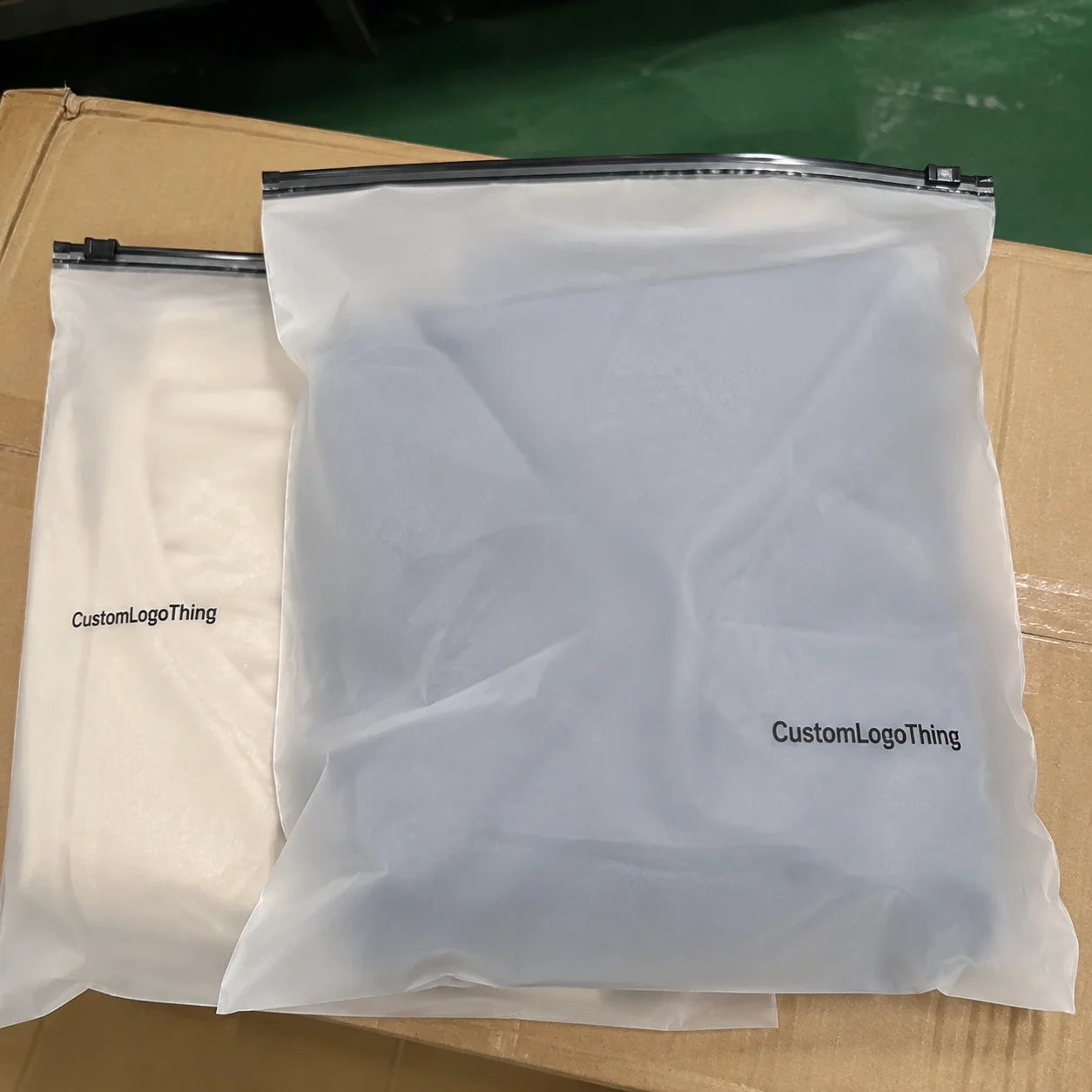
Candle packaging looks straightforward until the artwork has to live on flexible film. Once a pouch has a zipper track, tear notch, gusset, finish treatment, and panel structure, the design is no longer a flat rectangle. It is a wrapped, folded, heat-sealed production surface with limits. Proofing is the moment those limits show themselves.
Brands that move quickly usually do one thing better than everyone else: they treat the proof as a technical document first and a visual document second. That mindset protects launch dates, reduces rework, and keeps the final pouch from looking like it was assembled by committee.
“A pouch can look perfect on screen and still fail on press if the safe areas, seal zones, and finish behavior were not checked early.”
Why candle brands lose time on artwork proofs
The slowdowns are rarely dramatic. More often, they come from small mismatches between design intent and packaging reality. The marketing team wants a clean front panel. Operations needs the fill weight, barcode, regulatory copy, and product identifier. Prepress needs all of that to fit around the pouch structure without crossing a fold, zipper, or seal. One missing detail can trigger another proof round, and another round is where timelines begin to slip.
Candle brands face more content pressure than many other consumer packaged goods categories. A single pouch may need a scent name, fragrance story, net weight, barcode, warning language, batch or lot space, and sometimes retailer-specific requirements. On a compact format, that is a lot of information competing for a small amount of real estate. If the brand is launching multiple scents at once, the pressure multiplies quickly.
The first mistake many buyers make is assuming a proof is just a prettier version of the artwork file. It is not. A proof shows how the design sits on the actual dieline, where the panel breaks fall, how much room remains near the zipper, and whether the back panel still has readable copy after the bag is constructed. On clear, metallic, or heavily matte films, the printed result can differ from the screen image in ways that matter to legibility.
There is also a production reality that gets overlooked. Flexible packaging does not forgive last-minute uncertainty. If the artwork is still changing after approval, the job can lose its place in the press schedule, and any savings from “just one more tweak” vanish fast. That is why experienced packaging buyers prefer to settle content before the proof lands.
How zipper pouch artwork proofs work from file to approval
The workflow is simple on paper. The brand sends the source files, copy deck, and pouch specification. Prepress checks the art against the dieline, marks the safe areas, verifies panel orientation, and prepares a proof for review. The buyer then confirms or requests changes before the project is locked for production.
Even so, the handoff often gets muddled. A design file is the original creative asset. A proof is the production-oriented version that shows where the art will live on the bag. The final production file is the approved artwork locked for print. Once a project reaches that final stage, changes should be limited to genuine corrections. Reopening copy, shifting panels, or swapping colors late in the process usually creates delay and, sometimes, added cost.
Panel structure matters more than many teams expect. A stand-up pouch has a front, a back, and often a bottom gusset. Some formats include side gussets, tear notches, hang holes, or euro slots. A zipper track steals top space. Seal zones steal edge space. The artwork proof has to respect all of that. If a logo is too close to a sealed edge, it may look fine on the proof and still disappear or distort on the finished bag.
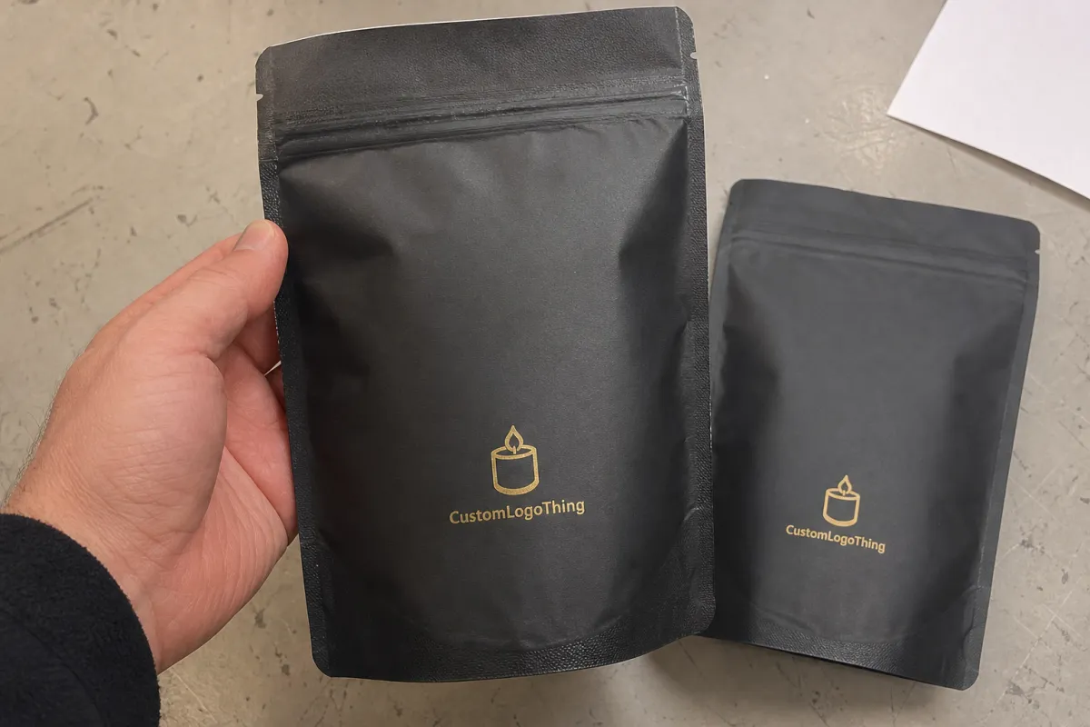
Color management also deserves more attention than it typically gets. CMYK conversion can shift rich blacks, blues, and bright accent tones. Spot colors help when a brand needs tighter consistency across runs, but they have to be planned correctly. White ink underprinting is often necessary on clear or metallic films so that colors do not look washed out. Matte laminations soften contrast; gloss can intensify it. The art may be identical, but the finish changes how the eye reads it.
Here is the simplest way to think about the three stages:
| Stage | What it is | What to check | Typical risk if skipped |
|---|---|---|---|
| Design file | The original creative artwork from your brand or designer | Layout, copy, image quality, brand direction | May not fit the pouch structure or print method |
| Artwork proof | Prepress review mapped to the actual dieline | Safe zones, panel orientation, finish notes, barcode space | Text can land in seals or fold areas |
| Production file | The final approved version sent to press | Only the last confirmed details | Late changes can delay the run or require rework |
That is why the proof stage should never be treated as decorative. It is the point where the brand finds out whether the idea survives contact with the bag.
Artwork proof checklist for candle pouch specs and brand details
A useful checklist starts with fit before it gets near aesthetics. Confirm pouch size, fill weight, closure style, and material structure. A 120 g candle refill pouch, for example, does not share the same panel balance as a smaller wax melt pouch. Add a clear window, foil film, or matte laminate, and the amount of usable space changes again.
After that, verify the mandatory content. For most candle pouch programs, the proof should show brand name, scent name, net weight, barcode space, required warnings, and any ingredient or material statements that apply in the target market. If the product sells through retail, distributor, or private-label channels, there may be barcode placement rules or copy standards that affect the layout more than the creative team expects.
Then move to hierarchy. The logo needs to read from shelf distance. The scent name has to be legible without squinting. Supporting copy should remain clear after the artwork is reduced onto film and wrapped around a pouch panel. Tiny type that looks acceptable in a design app can become fuzzy on textured or matte surfaces, especially when the print run is dense or the background is dark.
Image quality is another checkpoint that gets missed until it is too late. Raster images should be high resolution, typically 300 dpi at final size for print elements where detail matters. Logos, rules, and line art should be vector whenever possible. If the pouch includes a clear window, metallic ink, or a spot varnish effect, that choice must be reflected in the artwork notes. Otherwise, the proof may look correct on a monitor and still print wrong on film.
For internal review, this order usually keeps teams focused:
- Dimensions and safe zones — does the artwork fit the actual pouch?
- Required copy — are all legal and operational details present?
- Brand hierarchy — do logo, scent name, and product description read clearly?
- Finish compatibility — do matte, gloss, metallic, or clear-window effects support the layout?
- Barcode and compliance — is the code sized and placed for reliable scanning?
This sequence matters because visual tweaks are easy to over-focus on while a structural problem sits in plain sight. A pouch proof is a production document, and the safest approvals are the ones that accept that reality early.
If you want to compare how structured packaging projects are usually handled, the Case Studies page can be useful for seeing what changed from the original file to the finished package.
Cost and pricing factors that change the final quote
Pricing for custom zipper pouches is shaped by a handful of predictable variables. Pouch size, material structure, print complexity, number of ink colors, order quantity, and special finishes all influence the quote. A larger stand-up pouch with a metallic base film and four-color graphics will usually cost more than a simple matte bag with one or two colors and no special effect.
Minimum order quantities affect cost more than many buyers first expect. Small runs carry a higher unit price because setup work gets spread across fewer bags. Plate preparation, press setup, and prepress labor do not disappear just because the order is modest. For a 5,000-piece project, rough unit pricing might land around $0.18 to $0.28 depending on structure and coverage. Smaller runs can move higher. That range is not universal, but it is a realistic reference point for basic comparison.
Revisions create indirect cost even when they do not appear as a line item. Each extra proof round takes time, can push the job into a later production slot, and sometimes requires prepress to reopen work that was already nearly finished. If a brand changes copy after approval, especially across a multi-SKU candle line, the schedule can slip far enough to affect launch timing.
Special finishes deserve a hard look because they alter both appearance and workflow. Spot UV, soft-touch lamination, foil effects, custom windows, and heavy ink coverage can change how the bag reads and how much review time the project needs. Buyers should ask for quotes that separate tooling, printing, packaging materials, and shipping. Otherwise, comparing suppliers gets messy fast.
The cleanest quote is the one that states what is included and what is not. If proof rounds, plate charges, or finish assumptions are unclear, those gaps often show up later as added cost or a missed production window.
Process and turnaround: what to expect before production starts
A typical proof cycle moves through file intake, prepress review, proof creation, customer approval, production scheduling, and shipment. If the source files are complete and the copy is final, proofing can move in a few business days. If the artwork needs cleanup, the timeline stretches. Production usually does not begin until approval is in hand, so the proof stage has direct impact on the overall lead time.
Missing fonts, low-resolution images, unsupported color spaces, incorrect dieline placement, and vague copy are the usual causes of delay. None of these are rare. They are routine. A candle brand launching six scents at once may need six nearly identical layouts with variable text blocks, and that creates multiple chances for one panel to drift, one barcode to be swapped, or one warning line to be omitted.
Late revisions are especially disruptive. Even a small wording change can require a new review if it affects legal text, barcode size, or the balance of the layout. Once the proof is approved, most production plans are locked to that version. The safest approach is to resolve every internal question before the final sign-off, not after.
Seasonal collections make this more sensitive. Holiday candle packaging, retailer exclusives, and timed restocks all live on hard deadlines. If the bag has to arrive before a specific retail window, the approval deadline should be earlier than the team thinks it needs to be. One revision round is manageable. Three rounds are how launch dates start moving.
If the pouch is part of a broader shipping or distribution program, it can also help to align validation with recognized testing expectations such as ISTA methods. That is not required for every candle pouch, but it becomes relevant when packaging must survive warehousing, fulfillment, or rough handling on the way to retail.
Common proofing mistakes candle brands should avoid
The mistakes are usually practical, not glamorous. Reviewing a proof from a low-resolution screenshot is one of the easiest ways to miss blur, alignment issues, or panel confusion. Another common miss is spelling, especially on scent names, where marketing copy and SKU naming can drift apart during the design cycle.
Panel orientation causes problems too. Front, back, and gusset panels can be mixed up when the proof is reviewed too quickly, and that can place a logo on the wrong face or push copy into the fold. Seal zones, zipper tracks, and tear notches are not visual borders; they are production constraints. Copy that sits too close may disappear, curl, or distort once the pouch is formed.
Color expectations need discipline as well. A monitor proof uses light, while print uses ink on film. Matte, gloss, and metallic finishes each change contrast and perceived depth. Even a very accurate proof cannot fully show the tactile feel or reflectivity of the final package. If the brand expects an exact screen match, disappointment is almost guaranteed.
Barcodes deserve their own review. A code that is too small, too low-contrast, or positioned where a curve or seal interrupts scanning can fail in use even if it looks acceptable on the proof. That is risky for retailers, warehouses, and any operation that depends on quick receiving.
The most expensive mistake is treating the proof like a brand presentation instead of a production file. Once the team starts reviewing it like packaging, not marketing art, the process gets cleaner and the final pouch usually performs better.
Expert tips for faster approval and cleaner print results
If the candle line uses multiple scents, build one master layout and let only the variable elements change. The logo, product family name, regulatory panel, and core brand marks should stay fixed while scent name, color band, and barcode data shift by SKU. That keeps the line visually consistent and reduces the chance that one version wanders away from the others.
Send clean source files. Vector logos, outlined fonts, and a separate copy deck make prepress work faster and reduce avoidable back-and-forth. A screenshot of final art may be enough for a quick visual conversation, but it is a poor substitute for an editable file. When a font is missing or an image is fuzzy, prepress can identify the problem, not invent the missing data.
Assign one person to own the final approval. Internal review can still include brand, compliance, and operations, but the last decision should come from a single owner. Otherwise, feedback arrives in fragments and the proof can end up stuck between competing edits. That is one of the easiest ways to lose a day or two.
For premium finishes or brand-critical color, request a printed sample or physical color reference if possible. A small reference piece can help everyone judge how soft-touch coating, matte varnish, foil, or a metallic base film affects contrast. It will not replace the proof, but it will reduce the gap between expectation and reality.
Here is how a few approval habits affect the process:
| Approval habit | What it improves | Typical downside if ignored |
|---|---|---|
| One decision-maker | Faster sign-off and fewer conflicting edits | Comments can cancel each other out |
| Vector artwork and outlined fonts | Cleaner setup and fewer file issues | Raster blur or font substitution risks |
| Two-pass review | Better control of technical and visual details | Legal or placement errors can slip through |
| Physical color reference | More realistic finish and color expectations | Screen-only approval can mislead the team |
For brands that care about sustainability claims, material choice should be reviewed with the same discipline as artwork placement. If the pouch program involves recycled content or certified fiber packaging, resources from FSC can help clarify chain-of-custody and claim language. Not every pouch structure will apply, but claim discipline still matters.
Next steps for approving zipper pouch artwork with confidence
Before artwork goes to prepress, assemble one approval packet that includes the art file, copy sheet, dieline, barcode art, finish notes, and any retailer or regulatory requirements. That single step removes a surprising amount of confusion. It also gives the proofing team everything needed to catch problems before they become production delays.
Use a two-pass review. First, verify technical fit and legal copy. Then, review branding and shelf impact. The order matters because a polished layout cannot rescue a bag if the barcode is undersized or the safety copy is trapped under the zipper line. The candle Brands Zipper Pouch Bags Artwork proof checklist works best when function gets checked before polish.
Whenever a proof note is unclear, ask for it in writing. If the comment mentions film type, underprint, panel placement, or finish behavior, make sure the whole team understands the issue before approval. A five-minute clarification can save several days later.
Build your internal deadline with room for one revision round, especially if the project supports a launch date or seasonal restock. If the team can approve early, the pouch can move into production without unnecessary stress, and the final package is more likely to look intentional rather than rushed.
For candle brands, the value of a strong proofing process is straightforward: fewer surprises, cleaner print results, and a shorter path from artwork to shelf. Keep the checklist close, and the packaging decision gets easier every time.
What should candle brands check first on a zipper pouch artwork proof?
Start with pouch dimensions, panel orientation, and safe areas so the design fits the real bag structure. Then verify logo placement, scent name, barcode space, and required warnings before reviewing color and finishes.
How long does the artwork proof process usually take for custom pouch bags?
Simple projects can move quickly if source files are clean and the copy is final. Delays usually come from missing artwork elements, requested revisions, or unclear technical specifications.
Why does the printed pouch look different from the screen proof?
Screens use light, while printed flexible film uses ink on a material surface, so color and contrast naturally shift. Matte, gloss, metallic, and clear-window features can also change how the artwork appears once produced.
What affects the price of candle brands zipper pouch bags artwork proof checklist approval projects?
Pricing changes with pouch size, material, number of colors, special finishes, and order quantity. Extra proof rounds or complex variant layouts can increase indirect cost by extending prepress time.
Can candle brands approve artwork faster without risking mistakes?
Yes, if they organize files well, assign one decision-maker, and review technical details before visual tweaks. A shared checklist helps catch spelling, barcode, and placement issues before the final sign-off.