If you need a skincare Brands Zipper Pouch Bags Artwork Proof Checklist, you are probably already past the pretty part. The design looked good in the mockup. Then the proof arrived and the logo sat too close to the zipper, the beige turned muddy, or a legal line wrapped awkwardly around a seal. That is not a creative failure. It is a proofing failure, and those tend to cost real money.
The point of proof review is not to admire the artwork. It is to catch the small things that become expensive once ink hits film: incorrect dielines, missing bleed, unreadable barcodes, weak contrast, and copy that gets squeezed into a space it never fit in the first place. In pouch production, “close enough” is usually a bad sign.
Skincare packaging is especially unforgiving because the panel space is limited and the copy load is heavy. Ingredients, warnings, claims, symbols, batch areas, and recycling marks all compete with the branding. A pouch can look elegant on screen and still fail on press because the material changes the color, the seal trims the layout, or the white ink layer was never defined clearly. That is why proof review needs to feel technical, not decorative.
Why artwork proofs for zipper pouch bags get messy fast
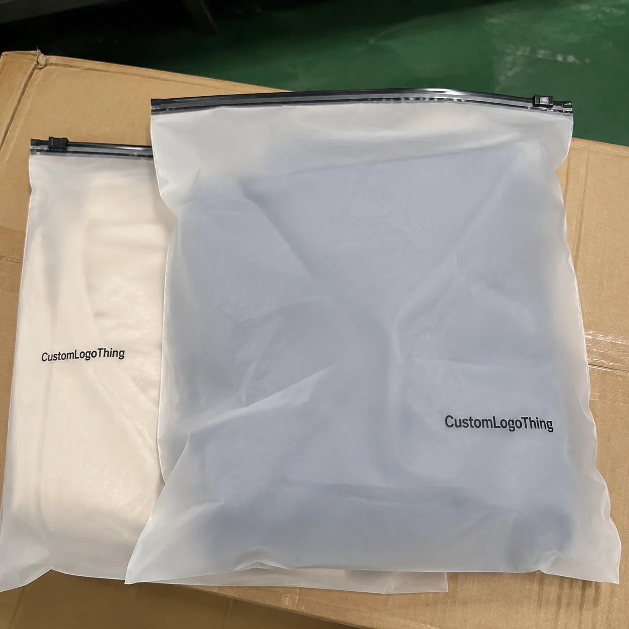
Zipper pouches give you a surprisingly small margin for error. The center panel is not as generous as a box, and the edges are crowded by seals, notches, zippers, and sometimes hang holes. Add a matte finish, a metallic laminate, or a clear window, and the number of variables rises quickly.
An artwork proof is a production map. It shows where the artwork sits, what the printer expects, and where the risky areas are. It is not the final printed pouch unless the supplier explicitly says it is a press-approved sample. A screen preview can be useful, but it will not tell you how a soft-touch laminate changes a dark green or how a metallic film makes warm neutrals drift cooler.
The biggest mistake is assuming proof approval is a design judgment. It is really a manufacturing check. If the barcode is tiny, the copy is too close to a seal, or the brand color depends on a screen match, the issue will not fix itself later.
The cleanest proof approval is the boring kind. No surprise notes, no hidden revisions, no “we thought it would be fine.” Fine is not a print spec.
For skincare, the risk rises because the front and back panels often carry more content than the pouch can comfortably hold. A 100 mm wide pack can look spacious in a PDF and cramped in real life. That gap between mockup and physical format is where many first-round approvals go wrong.
How the proofing process works from file upload to approval
Most pouch projects follow the same general path. You send artwork files, the supplier checks them against the dieline, then a digital proof comes back with notes. After that, you review, revise if needed, approve the final version, and the order moves into production. Simple on paper. In practice, half the delay comes from files that were never ready for press.
A competent supplier usually checks these details during proofing:
- Dieline fit so the artwork lands inside the correct panel dimensions.
- Safe zones so text does not sit too close to seals, zippers, or notches.
- Bleed so edge-to-edge printing does not leave thin white lines.
- Barcode readability because a barcode that looks sharp but will not scan is useless.
- Color limitations based on stock, finish, and print method.
- White ink or knockout areas if the pouch material needs underprinting.
A digital proof is a preview, not a promise. It cannot reproduce every material effect with perfect accuracy. CMYK, spot color, and Pantone references behave differently depending on the substrate and the finish. If brand color consistency is critical, ask how the supplier manages those differences before you approve anything.
File quality is another bottleneck. The logo may be low resolution. The copy may still be under legal review. The barcode number may be “almost final.” Those small uncertainties create repeated revisions, and revision time adds up faster than most teams expect.
File formats buyers should expect
Most pouch suppliers prefer vector artwork: AI, EPS, or print-ready PDF. Layered PSD files can work for some jobs, but only if the supplier accepts them and the file is organized well. Fonts should be outlined or embedded, linked images should be high resolution, and any transparency effects should be checked carefully. A flat JPG with a request to “make it print-ready” is a shortcut that usually slows everything down.
Key artwork and packaging factors that affect print quality
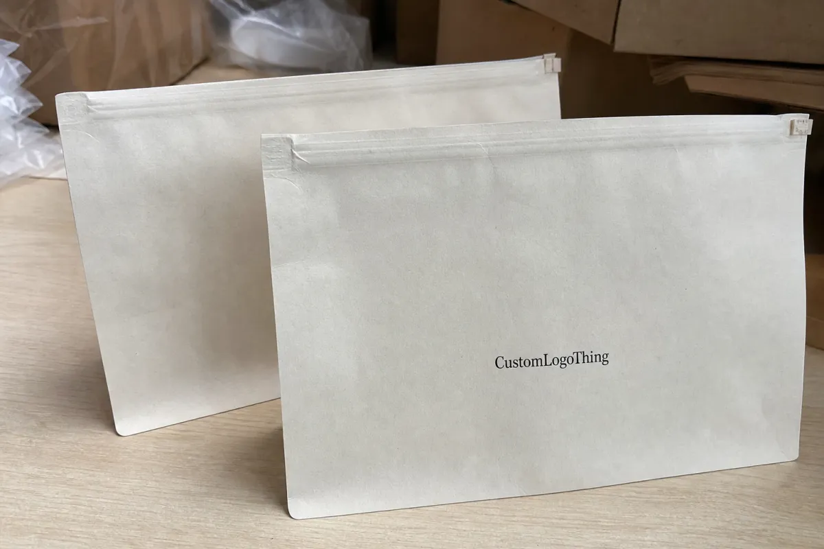
Material matters more than many brands expect. A PE pouch prints differently from a PET or foil laminate pouch. Some films hold ink cleanly. Others shift color or mute fine detail. The same design can look polished on one stock and flat on another.
Finish changes the result too. Matte softens contrast and can dull very thin type. Gloss makes blacks deeper and color richer, but it also shows glare and fingerprints more easily. Metallic films can pull brand colors into unexpected territory. Clear windows are useful, but they complicate the layout because the white ink layer has to be planned carefully.
Structure matters just as much as the artwork. Flat pouches, stand-up zipper pouches, gusseted pouches, and hang-hole styles all change where the usable space actually is. The zipper zone is not a decorative strip. Heat seals and tear notches also eat into the panel. If a headline sits too close to one of those features, the final bag can look clipped even if the proof looked fine.
Color management is where brand teams often become overly confident. Bright neons are difficult. Soft neutrals drift. Dark greens can lean blue. Pantone matching may be possible, but it is not guaranteed across every film and finish. If you need a very specific shade, ask for the supplier’s method and the practical tolerance range, not just a yes or no.
Skincare packaging also carries more regulatory text than many other consumer goods. Ingredients, net weight, warnings, recycling marks, usage directions, and region-specific claims all need room. If a SKU will be sold across markets, check the copy for each region before the layout is frozen. For broader packaging standards and recycling context, the Institute of Packaging Professionals and EPA recycling guidance are useful references.
Practical print factors to watch
- Ink coverage: large solid fills reveal variation more easily than lighter coverage.
- White underprint: needed on clear, dark, or metallic films if the colors must stay true.
- Minimum type size: tiny legal text may print, but readability is a separate issue.
- Resolution: 300 dpi at final size is a sensible baseline for raster images.
- Barcode quiet zone: keep graphics away from it so scanning is not compromised.
Step-by-step artwork proof checklist for skincare pouch approval
Below is the working version of the skincare Brands Zipper Pouch Bags Artwork proof checklist. It is the one that helps prevent reprints, not the polished version that looks neat in a presentation.
- Confirm the dieline and unit size. Make sure the pouch width, height, gusset depth, zipper position, and any special features match the SKU being ordered. A change from 100 x 150 mm to 120 x 180 mm is enough to break a layout that was otherwise fine.
- Check all no-print zones. Verify the zipper, heat seals, tear notch, and hang hole areas. Critical text should stay outside those areas. It is surprisingly common to see a tagline clipped by a seal.
- Review logo placement and margins. The logo needs enough breathing room to look intentional. If it is pushed too close to the top edge or side seam, the pack can look cheaper than the artwork deserves.
- Read every word carefully. Ingredients, claims, warnings, usage directions, and SKU names need a spelling check and a copy check. Spellcheck will not catch a wrong INCI name, a missing line break, or a typo in a claim.
- Check font size and readability. Small text can be technically present and still be hard to read after printing. A practical floor for dense pack copy is often around 5.5 pt to 7 pt, depending on font weight, contrast, and stock. Thin serif fonts tend to degrade quickly on film.
- Verify color references. If the artwork uses Pantone references, confirm how the printer will convert them. If the file is CMYK, ask what color shift is realistic on the chosen material. For launch-critical SKUs, a printed sample is safer than a screen proof.
- Inspect image resolution and transparency. Photos, textures, and gradients need to hold up at final size. Low-resolution files can look acceptable on a laptop and weak in print. Transparency effects should be checked around logos and overlays so they do not create halos or muddy edges.
- Confirm white ink layers. On foil, clear, or dark materials, the white layer often determines whether the final pouch looks premium or compromised. Ask which elements are knocked out, which are underprinted, and where the supplier wants a dedicated white plate.
- Check regulatory content against the target market. Ingredients, claims, symbols, and language may need local compliance review. A layout approved for one market may need revision for another. Packaging law is not a place to improvise.
- Compare proof notes against the brief. Every correction should be recorded in writing. If the proof notes and your internal instructions disagree, resolve it before approval. Ambiguity is how mistakes make it into production.
One practical rule helps a lot: assign one final approver. Not a committee. Not five people leaving comments in different threads. One owner. Otherwise the proof becomes a coordination problem before it becomes a packaging problem.
| Proof option | Typical cost impact | Best for | Main tradeoff |
|---|---|---|---|
| Digital proof only | Usually included or low-cost | Standard SKUs, repeat orders, lower-risk artwork | Color and finish are only approximations |
| Printed sample | Often $40-$150+ plus shipping | Launches, premium lines, color-sensitive branding | Slower, but catches more issues |
| Press-approval sample | Higher, varies by supplier | High-value runs, retail launches, strict brand color control | Adds time and requires more coordination |
Cost, pricing, and MOQ tradeoffs when approving pouch artwork
Artwork decisions affect price more than many buyers expect. More print colors can raise setup complexity. Special finishes, white ink, foil accents, and heavy ink coverage usually increase cost. Extra revision rounds add time, which is another kind of cost. If a quote feels vague, ask for a breakdown. That is not being difficult; it is basic purchase control.
MOQ changes the equation in a very direct way. Lower minimums usually mean higher unit pricing, fewer material options, and less flexibility around color or finish. Higher quantities spread setup cost more efficiently, so the per-unit price drops. A 3,000-piece run and a 20,000-piece run are not the same purchase, even if the artwork is identical.
For custom zipper pouches, pricing varies by size, material, print coverage, and order volume. Small runs can land much higher per unit than larger production runs. If you need a clean estimate, ask the supplier to separate tooling, printing, sample charges, shipping, and revision fees. That makes comparison easier and keeps the quote honest.
Digital proofs are fast and inexpensive, but they reduce only part of the risk. Physical samples cost more and take longer, yet they reveal finish behavior, readability, and color shifts that screen proofs miss. For hero SKUs, launch kits, or premium skincare lines, the sample often pays for itself by preventing a reprint. For more packaging context and buying examples, see Case Studies.
Simple rule: if the artwork is basic and the SKU is low-risk, a digital proof may be enough. If the packaging is premium, color-sensitive, or tied to a major launch, a physical sample is the safer spend. Cheap approval decisions tend to become expensive reorder decisions.
Turnaround, lead time, and production steps that affect launch dates
Lead time is not just production time. It includes file review, proof creation, buyer revisions, final approval, printing, QC, packing, and transit. If one step stalls, the whole schedule moves. Artwork delays are frustrating because they often stay invisible until the launch date is suddenly close.
A practical timeline often looks like this: initial file review in 1-2 business days, proof revisions in 1-3 business days depending on complexity, and production somewhere around 10-20 business days or more depending on quantity, print method, and finishing. Shipping adds another layer. If a retail date matters, build a cushion into the plan.
A single missing detail can hold everything up. If the ingredient statement still needs legal sign-off, or the barcode number is not final, or the claims wording is under review, the proof cannot really be approved. Suppliers print what they receive. They do not print what someone meant to send.
Seasonal demand, raw material shortages, and special finish requests can stretch timelines. Matte laminate, foil accents, custom windows, and unusual pouch structures all make the schedule less forgiving. If the launch depends on influencer seeding or retail photography, assume you need more buffer than the optimistic timeline suggests.
For shipments that will move through rougher fulfillment routes, transport testing can matter too. It is reasonable to ask whether the supplier references ISTA or related transport testing practices. Not every pouch needs formal testing, but high-value programs often benefit from that discussion.
Common proof approval mistakes skincare brands keep repeating
The same errors keep showing up across brands of every size:
- Approving low-resolution artwork because it looked acceptable on a laptop.
- Forgetting that the zipper, seam, or tear notch cuts into the usable design area.
- Leaving legal text until the proof is already close to approval.
- Assuming screen color equals print color, especially on matte or metallic stocks.
- Confusing a visual proof with a production-ready file.
The most expensive habit is the “we can fix it later” mindset. Once the pouch is moving through production, the correction options narrow quickly. You can reprint, scrap, or live with the mistake. None of those outcomes is attractive.
Another frequent miss is overdesigning the front panel and then discovering the back panel has nowhere to hold mandatory copy. The proof may still look balanced as an image, but the package no longer functions as a compliant label. That is not a styling issue. It is a layout failure.
There is also the habit of approving based on one person’s reading of the file. Design may think the layout works. Marketing may want a larger claim. Operations may need a barcode repositioned. Compliance may flag the ingredient block. If those reviews happen late, the revision chain becomes longer and less predictable.
Expert tips and next steps before you hit approve
Set up the approval chain before files go out. Design checks layout. Marketing checks brand consistency. Operations checks SKU logic. Compliance checks claims and regulatory text. Then one person gives the final approval. Fast approvals are useful. Scattered approvals create conflicting edits and slow the project down.
Ask for one marked-up revision round if possible. Keeping corrections in one place reduces email chaos and makes the final proof trail easier to review later. Save the approved file, the final proof, and the supplier notes in a version-controlled folder. Reorders are much easier when no one has to search through old inboxes for the right file.
For important launches, request a printed sample or press-approval sample. That matters most when the pouch uses a special finish, a complex color, or dense compliance text. If the SKU is a hero product, a screen preview is a thin basis for approval.
The shortest useful version is this: audit the files, compare them to the dieline, confirm every technical note, and approve only after every correction is documented. The Skincare Brands Zipper Pouch Bags Artwork Proof Checklist exists to prevent a reprint, a delay, or a launch that looks finished until the package is held in someone’s hand.
What should skincare brands check first on zipper pouch bags artwork proofs?
Start with the dieline size, safe zones, and zipper or seal no-print areas. After that, verify the brand name, SKU, ingredients, barcode, and any compliance text so both the structure and the copy are correct.
How do I know if my skincare pouch artwork is print-ready?
Files should be high resolution, correctly sized, and formatted to the printer’s requirements. Fonts should be outlined or embedded, linked images should be crisp, and nothing should rely on a screenshot or an assumption.
Why do colors look different on the proof than on the final pouch?
Digital proofs are screen previews, not exact physical matches. Material finish, ink system, white underprint, and the substrate color all affect the final look. Matte film, foil laminate, and clear stock can each shift color in a different way.
Can I approve a proof without ordering a physical sample?
Yes, for some standard runs, but it carries more risk for premium launches or complex artwork. A physical sample is the smarter choice when color accuracy, finish, or readability matters a lot.
How many revision rounds should I expect for pouch artwork?
One to three rounds is common when the files are organized and the brief is clear. Poorly prepared artwork or unclear copy can add more rounds and delay production.