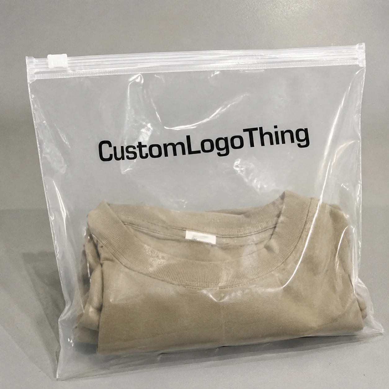
If you are ordering small-format packaging, the candle sample plastic Bags Warning Label guide matters more than the bag itself at first glance. A tiny sample can still create a labeling issue if the plastic sleeve hides a burn warning, scent note, or handling instruction. And from a buyer’s point of view, that is where good packaging either builds trust or quietly causes trouble.
Most problems are not dramatic. They are practical. The warning text is too small. The plastic is too glossy. The adhesive fails during shipping. The bag looks polished on screen, then the real piece reads like a riddle when it arrives. Packaging is not just decoration here; it is the first compliance checkpoint the customer sees, and it can shape confidence before the sample is even opened.
This piece is a buyer’s checklist, not a legal seminar. You will get a clearer picture of what warning labels do, what affects cost, and how to prepare artwork so your sample bags are easier to approve, print, and ship.
What candle sample bags need to say before they ship
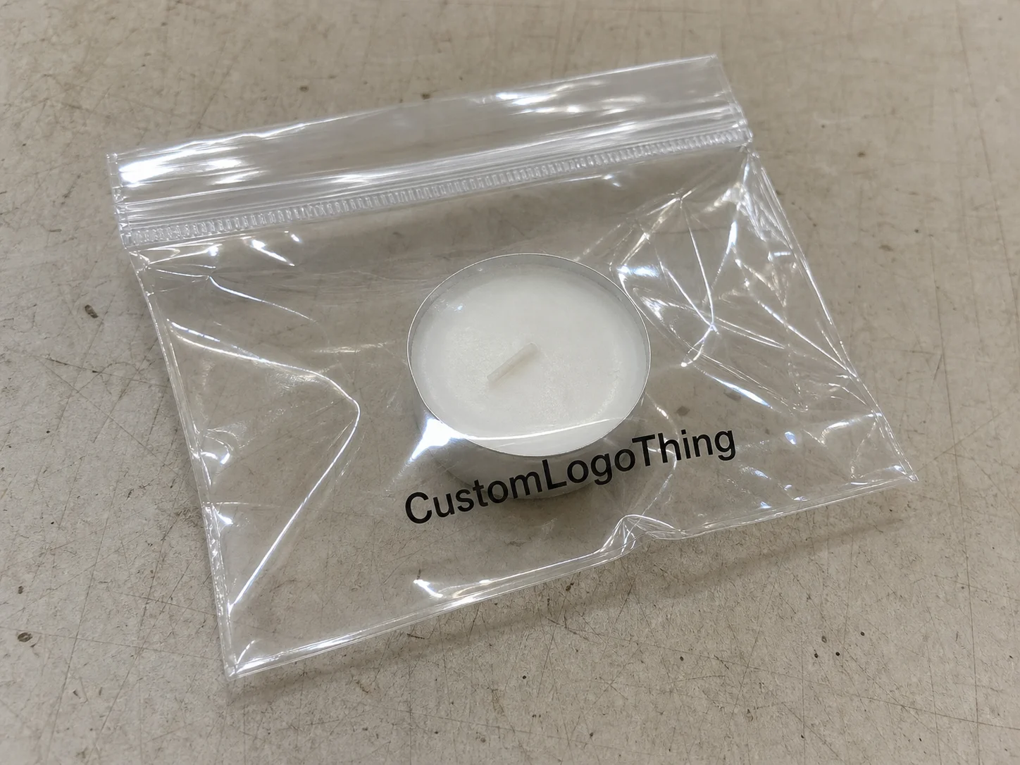
A candle sample can seem harmless because it is small. That is exactly why mistakes happen. A 1.5 oz wax melt, a mini container candle, or even a sealed fragrance sample may still need handling language if the bag obscures information the buyer needs to see quickly. The candle sample plastic Bags Warning Label guide starts with one simple idea: the package must communicate enough to reduce misuse.
In practical terms, a warning label is a clear, legible notice attached to or printed on the bag. It may tell the customer not to leave the candle unattended, to trim the wick, to keep away from children, or to follow basic burn instructions. The exact wording depends on the product, the sales channel, and the market, so this is not a one-size-fits-all exercise.
There is also a difference between branding and safety labeling. Branding says, “This is ours.” Safety labeling says, “Here is how to handle it.” Buyers sometimes blur those two roles, especially when the word sample makes the item feel lower risk. But candle samples can still involve wax residue, fragrance oils, glass, or sharp edges on a small jar. Those details matter.
One useful way to think about it: the bag is the first read, not the final story. If the customer cannot identify the product, the scent family, and the key warning at a glance, the packaging is doing too much of the wrong work and too little of the important work.
“A good sample bag answers three questions immediately: what is it, how should I handle it, and is it safe to use without guessing?”
How warning labels work on plastic sample packaging
The label’s job is simple, but the execution is not. It communicates handling instructions, discourages unsafe use, and helps the consumer identify the product quickly. On a plastic sample bag, that message has to survive glare, folding, stacking, and shipping abrasion. Clear film can look elegant. It can also make text disappear if the contrast is weak.
Placement matters. The most common options are the front panel, back panel, an integrated print area, a hang tag, or an adhesive label applied after bag production. Each choice changes how easily the warning is read. Front-panel labels are visible fast, but they can compete with branding. Back-panel labels keep the front cleaner, but they are easy to miss when the bag is displayed flat. Hang tags add flexibility, yet they increase assembly steps. Adhesive labels are familiar, though the wrong adhesive can lift on slick film.
Readability is usually the hidden issue. A 7 pt font might look acceptable on a PDF, then become unreadable once printed on translucent plastic. Strong contrast helps: black on white, dark ink on frosted film, or white ink on darker substrates. A glossy surface can create reflections that reduce legibility under retail lighting or event lighting, which is why the same design can perform differently in a showroom and in a mailer.
Bag construction also affects the usable area. Heat-sealed edges, zipper tracks, tear notches, and perforated headers all reduce space for text. If the warning sits too close to a seal, it may distort during production. That is a small detail on a dieline and a big problem on a finished piece.
If you are buying, the best label is not the one with the most copy. It is the one that stays readable, stays attached, and fits the way the sample will actually be handled.
Key factors that change label design and compliance
Several product variables push the label in different directions. Sample size is the obvious one. A small melt pack has less panel space than a jar candle pouch. Wax type matters too, because soft wax can create residue that makes a label look dirty faster. Wick count, scent strength, and whether the sample includes a container all affect how much information should be visible on-pack.
Then there is the compliance side. Warning language can vary by market, distributor, retailer, and sales channel. A wholesale buyer may require a different format from a DTC subscription insert. Some retailers ask for more conservative handling language, while others focus on clear product identification and barcoding. Standards from groups like ISTA are often used for shipping and distribution testing, while broader materials and environmental considerations may point buyers toward EPA guidance for packaging decisions that reduce waste or improve recyclability.
Material choice changes the label experience, too. Clear PVC gives a different look than PE or PP. Recycled blends can be a smart branding move, but not every film behaves the same under print and adhesive. Some inks sit beautifully on one substrate and look dull on another. Some adhesives bond well to textured surfaces but fail on low-surface-energy films unless specified correctly.
There is also a tradeoff between brand polish and caution. More warnings can improve safety communication, but too much text can bury the premium feel of the sample. That tension is normal. Buyers tend to underestimate it. A single-color notice is usually cheaper and faster to produce. Multi-color printed bags can elevate shelf appeal, but they usually add setup complexity, proofing time, and a little more risk of revision.
| Option | Typical use | Cost impact | Practical note |
|---|---|---|---|
| Adhesive warning label | Short-run samples, flexible copy | Lower setup, moderate per-unit labor | Good when text may change often |
| Printed-on-bag warning | Higher-volume sample packaging | Higher setup, lower per-unit at scale | Best for consistent recurring runs |
| Hang tag with warning | Premium presentation, display packs | Extra assembly and material cost | Useful when the bag face must stay clean |
| Combined print + label | Retail and wholesale mixed use | Highest design coordination | Works when branding and compliance need separation |
If you want to compare packaging options more broadly, it helps to keep a running spec sheet. Many buyers pair this with Custom Labels & Tags so they can separate decorative elements from mandatory language and keep revisions under control.
Step-by-step process and timeline for ordering
The cleanest orders usually follow a predictable path. First, define the use case: bag size, closure style, whether the sample is loose or boxed, and whether the warning will be printed directly or applied as a separate label. That answer drives almost everything else. A 3 x 4 inch zipper bag has a very different layout from a 5 x 7 inch hang-hole pouch.
Next, prepare artwork with final text, logo files, barcode details if needed, and exact placement measurements. Do not leave the warning copy as a placeholder. That is a common reason projects stall. If your proof still says “TBD warning,” production stops while everyone waits for legal or marketing to confirm language. That delay is avoidable.
Then request a proof and review it like a production buyer, not like a brand deck. Check font size, line breaks, margin placement, and whether the bag still reads clearly when reduced to real dimensions. This is the stage where most delays can be prevented. A good proof catches issues before plates, plates before print, and print before wasted inventory.
After approval, sampling or production begins. The first run should be inspected for seal quality, print alignment, scuff resistance, and whether the warning survives handling. If the bag will ship in cartons, ask for a compression or transit check. For higher-value sample kits, buyers often want distribution testing that aligns with ISTA-style transport expectations, especially if the goods will move through multiple touchpoints.
Typical lead times depend on readiness. If artwork is final and material is in stock, a custom bag order may run in roughly 12–15 business days after proof approval. Add time for special adhesives, custom die-cuts, or multiple proof rounds, and the schedule stretches. That does not mean the vendor is slow; it means packaging is a chain of dependencies.
What helps most? Approve copy early. Keep size specs stable. Avoid changing warning placement after proof. The fewer moving parts, the easier it is to keep the schedule intact.
Cost, pricing, MOQ, and unit cost tradeoffs
Pricing is shaped by more than bag size. Film thickness, print coverage, number of colors, label type, and packing format all affect the quote. A simple clear pouch with one black warning line is easier to produce than a full-color custom printed sample bag with a matte finish and a separate adhesive label. The difference can be meaningful.
MOQ, or minimum order quantity, is where many buyers feel the tension first. Smaller runs often cost more per unit because setup, plate creation, proofing, and press preparation are spread across fewer pieces. For candle sample programs, that matters because sample quantities are often modest by design. The irony is obvious: the smaller the order, the more expensive each unit tends to look.
Here is a realistic way to think about it. A lower-volume order might sit in a range that feels like $0.18–$0.28 per unit for a basic labeled bag at 5,000 pieces, depending on print coverage and substrate choice. At higher quantities, the per-unit number usually drops. But the design and compliance work does not disappear. It still takes time to check text, verify placement, and approve proofs.
Hidden budget items can surprise buyers. Proof revisions add time. Rush production can add fees. Specialty adhesives cost more than standard ones. Carton configuration matters if you want smaller pack counts for fulfillment. Even the way bags are bundled for shipment can affect labor at the warehouse.
Smart buyers compare total presentation value, not just sticker price. A cheap generic bag may save money upfront, but if the warning is hard to read or the packaging feels inconsistent with the brand, you pay later in lost confidence. A custom labeled bag can cost more per unit and still be the better buy if it reduces confusion and supports repeatable launches.
Common mistakes with sample bag warning labels
The biggest mistake is tiny text. It looks clean in a mockup and fails in real life. Once the bag is folded, sealed, stacked, or placed under bright lighting, that 6 pt warning can vanish. The customer should never need a magnifier to understand how to handle a candle sample.
Mismatch is another problem. If the warning label says one thing and the insert card says another, customers notice. So do retailers. Consistency matters more than people think. Even a small contradiction, like different burn times or different handling language, can make a sample seem less trustworthy.
Design choices can quietly undermine a good message. Low contrast, glossy glare, poor adhesive selection, and text placed too close to heat seals all reduce readability. So does squeezing icons around the warning until the layout looks crowded. When everything screams, nothing gets heard.
Skipping the proof stage is still one of the most expensive shortcuts in packaging. It is tempting when the order is small. It is still a mistake. Proofing is where you confirm wording, spacing, and actual label placement. That is especially true if the buyer needs retailer-specific language or channel-specific handling notes.
One more caution: do not overcomplicate the label. Buyers sometimes cram in multiple icons, marketing copy, and disclaimers because they are afraid of missing something. The result is a page of tiny text that nobody reads. Clarity beats volume.
Expert tips for cleaner artwork and safer presentation
Keep the warning concise, high contrast, and placed where the customer naturally looks first. That usually means near the front face or on the reverse side in a predictable panel. A warning that hides behind a fold is not doing much for anyone.
Use hierarchy. Brand name, sample identifier, warning, and handling note should not all fight for equal attention. The order matters. If everything is bold, nothing is bold. A clean hierarchy makes the bag feel more intentional and easier to use.
Request a physical sample whenever possible. Screen proofs are useful, but they can hide glare, opacity, and size issues. A bag that looks balanced on a monitor may feel cramped in hand. Physical review helps you catch scale problems before a larger run is locked in.
Tell the supplier where the sample will live. A trade show handout, a subscription insert, and a shelf sample are not the same packaging problem. The first is handled quickly and often tossed into a tote. The second spends time in transit. The third has to survive browsing. That context changes label durability, bag thickness, and even the preferred closure style.
Here is the packaging insight that often gets missed: the best warning labels feel integrated, not bolted on. When the design, material, and copy all support the same message, the customer reads it instead of ignoring it. That is what you want from a candle sample bag.
Next steps for approving your candle sample bags
Start with a one-page spec sheet. Include bag dimensions, material, closure style, warning text, artwork placement, and any special finishing notes. That single page saves time because it gives design, production, and procurement the same reference point.
Then collect proof-ready assets: final logo files, final copy, barcode details, and any required safety or handling language. If you are still revising wording, pause before ordering. A final proof that changes three times is usually a warning sign in itself.
Ask for a quote that separates bag cost, printing cost, labeling cost, and rush fees. Buyers make better decisions when each component is visible. A bundled number can be fine for final approval, but it is harder to compare options when every service is mixed into one line.
Review the proof on screen, and if available, in physical form. Check the obvious things first: wording, alignment, and legibility. Then check the less obvious ones: glare, ink density, seal clearance, and whether the label leaves enough visual room for the sample itself.
Finally, confirm the production timeline, shipping window, and reorder plan. Consistency matters across launches, especially if your candle line uses repeat sample packs or seasonal scent rotations. If you need help organizing the label layer separately from the bag layer, Custom Labels & Tags can be a useful reference point while you compare formats.
If you keep the candle sample plastic Bags Warning Label guide approach practical, you will make better decisions: clearer copy, cleaner artwork, fewer surprises, and a sample package that feels intentional from the first glance to the final unboxing.
FAQ
What should a candle sample plastic bag warning label include?
Include concise handling or safety language relevant to the sample, plus any brand or product identifier needed for quick recognition. Keep the text readable on plastic by using strong contrast and a placement that will not be blocked by folds, seals, or zippers.
How do I choose the right material for candle sample bags with labels?
Match the material to the print method and handling needs. Clear films help visibility, while thicker films may hold labels better in transit. Ask whether the film supports clean adhesion, legibility, and resistance to scuffing during shipping.
Does a warning label affect the cost of custom sample bags?
Yes. Additional print steps, label application, design time, and proofing can raise unit cost. Higher quantities usually lower per-bag pricing, but setup and artwork still influence the final quote.
How long does production usually take for labeled sample bags?
Timeline depends on artwork readiness, material availability, and whether the labels are printed or applied separately. Fast approvals and final copy can reduce delays; proof revisions are one of the most common reasons lead time expands.
What is the most common mistake buyers make with candle sample bag labels?
The most common mistake is approving tiny or low-contrast text that looks fine on screen but fails in real use. A second frequent issue is forgetting to align the warning language with the exact sample format and sales channel.