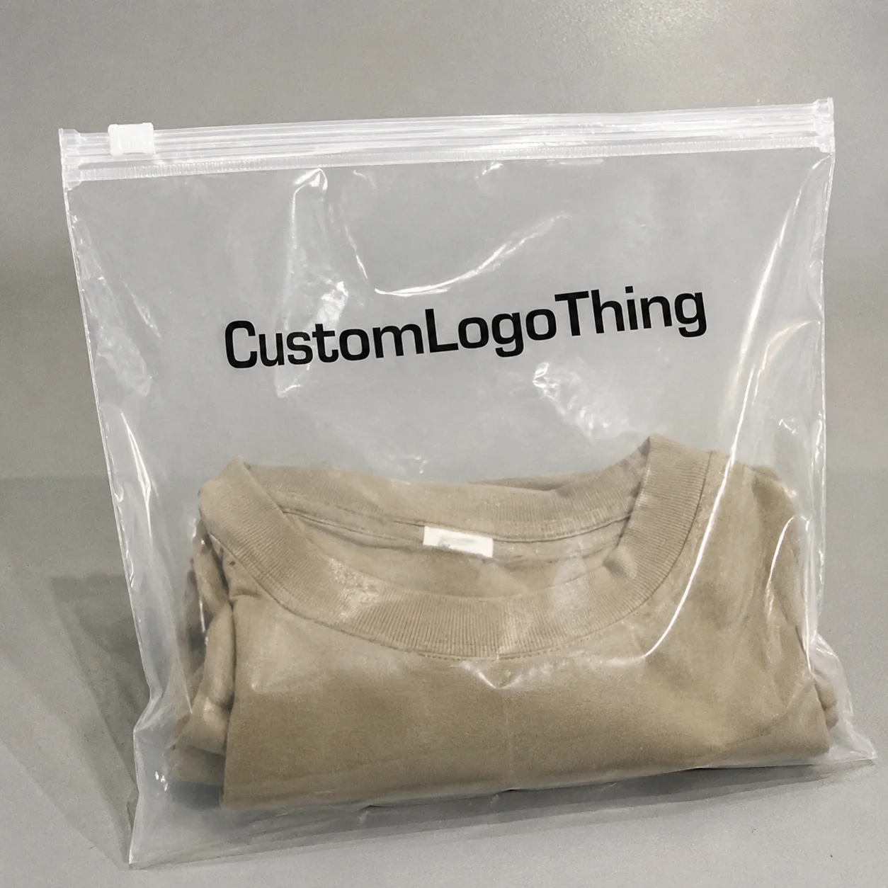
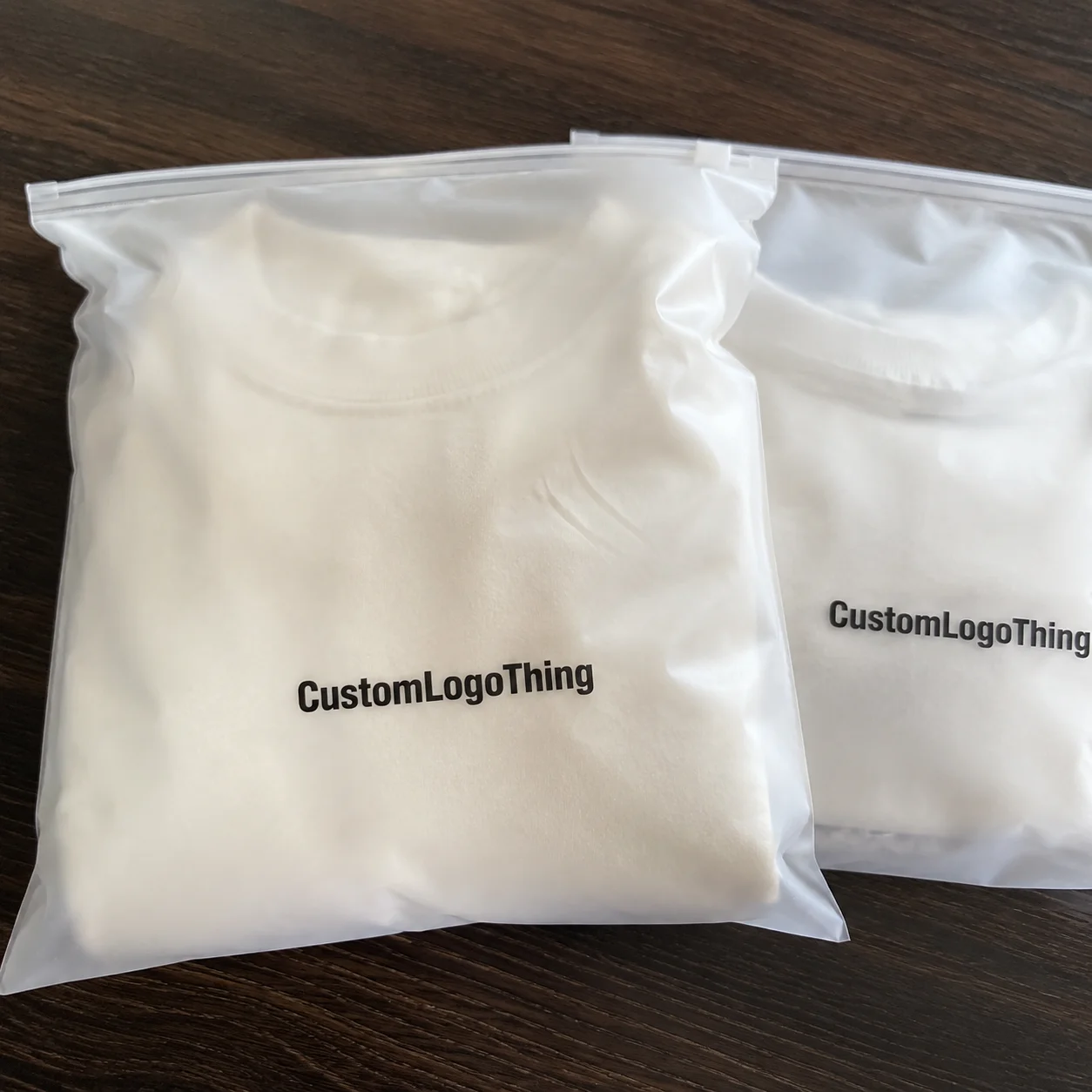
For cosmetics teams, the packaging problem is rarely the bag itself. The real trouble starts at the intersection of regulation, retail display, and a material that shows every shortcut. The cosmetics brands OPP Header Bags warning label guide sounds narrow, but the issues behind it are familiar to anyone who has had to approve a launch under deadline: unreadable copy, glare, label creep, and a proof that looked fine until it met a filled bag and a bright store light.
Opp Header Bags are attractive because they are inexpensive, light, and easy to hang. They are also unforgiving. A warning that is technically correct can still fail if the contrast is weak, the panel is too small, or the label lands across a seal. That kind of failure does not announce itself in a PDF. It shows up later, after packing, shipping, and merchandising, which is why the cost of a bad layout is usually more than the print bill.
The practical goal is simple: make the warning readable, keep the structure stable, and avoid a reprint. Everything below is aimed at that.
Why warning labels fail on OPP header bags
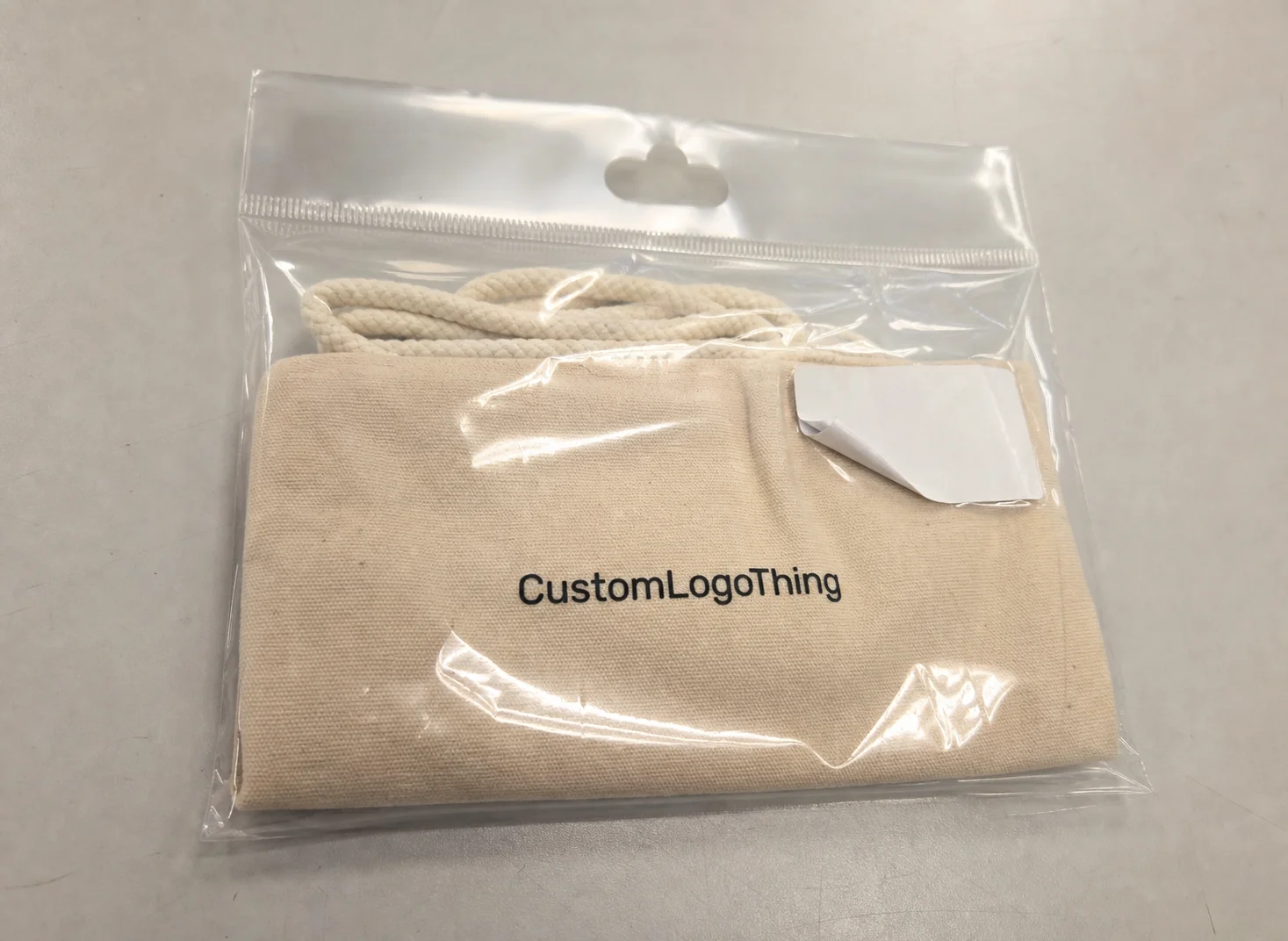
OPP film looks clean on a screen and behaves differently in the real world. It is glossy, reflective, and visually busy once you add product, seals, and a hanging header. A warning label that seemed balanced in the artwork file can lose its clarity once the bag is filled, curved, and placed under retail lighting.
Most failures are not about the wording itself. They come from the physical setup around the wording. A label can be perfectly legible in isolation and still fail because it sits too close to a seam, straddles the hanger hole, or lands on a panel that bends when the bag is packed. The warning text is only one variable. Placement, adhesive, and contrast do most of the damage when they are handled casually.
That matters more for cosmetics than many buyers expect. Cosmetic accessory kits, travel sets, sample packs, bath items, and promotional bundles often carry mixed content and mixed claims. A small warning may need to coexist with ingredient notes, usage language, barcodes, and brand graphics. Compress all of that into a narrow header bag and the package starts fighting itself.
The safest rule is blunt: if the warning is only readable on a flat digital proof, it is not ready.
“A label that survives the art review but fails on a filled bag is not a finished label.”
That sounds obvious until a launch is on the calendar. Then teams start accepting weak spacing, low-contrast text, and rushed approvals because a supplier says the job is “fine.” Fine is not a production standard. Fine is how reprints happen.
There is also a buyer-side trap. Many teams judge the artwork in isolation rather than as part of the finished package. That works for simple cartons. It works much less well for clear header bags, where the product behind the film changes the visual field. White cream product, dark powder, metallic accents, and transparent inserts all affect how the warning reads.
How bag structure changes label visibility
Header bags are built around tension. The top seal, hanging hole, and sometimes a narrow header card leave less usable space than the artwork team expects. Once the bag is filled, the film can bow, wrinkle, or shift a few millimeters. That sounds trivial. On a small warning block, it is enough to change legibility.
Clear OPP has another issue: glare. Under LED retail lights, glossy film can wash out lighter inks and thin type. A pale gray line that looks tasteful in a mockup may disappear in a store. The packaging does not need decorative restraint. It needs contrast.
Two placement habits solve more problems than any design trend:
- Place the warning on the flattest visible panel, not near the hang hole, fold, or seal.
- Leave margin around the copy so the label still reads clearly after filling and hanging.
If the warning has to sit on a curved area or near a structural edge, expect distortion. Even a 1 to 2 mm shift can matter on narrow labels. On larger packs, that shift is noise. On compact header bags, it can cut off part of the message or make the line spacing feel cramped.
This is why a sample in the final structure is worth more than a dozen digital proofs. Hang the filled bag. Check it from arm’s length. Look at it under bright light. Then turn it slightly and look again. If the warning still reads cleanly, you are close. If it becomes faint or uneven, you have a production issue, not a design preference.
The visual hierarchy matters too. A brand may want the warning to feel discreet, but discreet is not the same as hidden. If the type is too small or too close to the background art, the package starts signaling carelessness. On shelf, that reads like a quality miss, even if the actual product is fine.
For cosmetics brands, the structure of the bag is as important as the content of the warning. That is the part buyers often underestimate. They are buying a flat object. The customer sees a hanging object in motion, under light, at a distance.
Specs that make warnings readable and compliant
Start with the exact warning copy. Not a draft, not a placeholder, not a “close enough for now” version. Once the wording is approved, the rest becomes a controlled technical job: font choice, color contrast, safe area, and print method. If the text keeps changing, every downstream decision becomes unstable.
Readability usually improves when the design gets simpler. Black on white or black on clear tends to outperform pale ink on glossy film. Thin fonts are risky. Condensed fonts are riskier. A clean sans serif with enough stroke weight is usually the safest option, especially if the line count is tight.
There is a practical distinction between visible and legible. A warning can be visible from a distance and still be hard to read at the point where a shopper actually scans the package. The goal is not just to satisfy a visual check. The goal is to make the message work in motion, under retail lighting, and in a stack of similar products.
For destination markets with stricter labeling requirements, keep version control tight. Cosmetic lines often split by region, formula, or claim set. One file can hold several versions only if the naming system is disciplined and the approval trail is clean. Otherwise, an older warning can slip into a reorder and sit unnoticed until inventory is already boxed.
The right structure depends on the job. Direct printing on the bag is efficient for simple, high-volume runs. Printed header cards improve readability and can separate the warning from the visual noise of the film. Applied labels are useful when text changes often or when SKU counts are low. Dual placement costs more, but it gives the highest margin of safety for stricter markets.
| Option | Best for | Visibility | Typical risk |
|---|---|---|---|
| Direct print on OPP bag | Simple warning copy and high-volume runs | High if contrast is strong | Misplacement near seams or hang holes |
| Printed header card | Cleaner branding and easier reading | Very high if the card stays flat | Card shift during packing |
| Applied label | Variable text, SKU changes, short runs | Good if adhesive is matched to the film | Lifting on glossy film or in cold storage |
| Dual placement | Stricter market requirements | Highest | Higher cost and tighter artwork control |
Standards and references can help frame the process even when they do not dictate the warning text. For handling and transport checks, some buyers use ISTA methods to see whether the package survives real logistics. For certified paper inserts or support materials, FSC matters if sustainability claims are part of the brief. For broader material context and package design references, packaging.org is useful because it keeps the conversation grounded in actual packaging structures rather than abstract branding language.
The point is not to overcomplicate the job. It is to avoid relying on assumptions. A warning label that works on paper but fails in a packed, hung, lit display is not doing its job.
Production steps and timeline from proof to shipment
Good production starts with clean inputs. A supplier needs the bag dimensions, the warning copy, the target market, the print method, and the expected quantity before a quote means much. If the artwork is missing any of those details, the pricing will be padded, vague, or both.
The usual sequence is straightforward: file review, layout proof, revision round, sample or press proof if the placement is tight, then production. For simple jobs, the proof stage may be enough. For narrow header Bags with Warnings near structural elements, a physical sample is worth the time. It shows whether the copy still reads once the package is assembled and filled.
Lead times vary by method and quantity. A standard run can often move through production in roughly 12 to 20 business days after approval, with more complex jobs landing at the slow end. Separate labels, custom inserts, or additional inspection steps add time. Rush orders are possible, but they come with a price and leave less room to catch mistakes.
That last point is where many teams get burned. A proof can be correct in graphic terms and still be wrong in structural terms. The warning may sit too close to the seal line, or the label may block part of the hang hole once the bag is filled. Approval has to cover both artwork and physical behavior. Anything less is partial approval, which is a polite way to invite problems later.
Version control matters just as much as the layout. If the same bag format supports multiple shades, formulas, or regional SKUs, one master file per market is the cleaner path. Keep the naming obvious. Keep the change log visible. The boring system is the one that protects the launch.
Internal teams can use Case Studies to compare how similar packaging jobs were handled, and Custom Labels & Tags if a separate label route makes more sense than direct printing on the bag.
If a supplier cannot explain the proof stages clearly, that is a useful warning of its own. A capable vendor should know what gets checked, who signs off, and which changes are still allowed after approval. If they cannot describe that process, their internal control is probably weaker than the packaging brief.
Cost, MOQ, and unit-cost drivers
Pricing depends on size, film thickness, print coverage, color count, warning method, and quantity. There is no honest universal rate. A small run with a complicated warning layout will almost always cost more per unit than a larger run with a simple one-color message.
For many buyers, a realistic range for printed header bags can land around $0.18 to $0.45 per unit at 5,000 pieces, depending on size and coverage. Applied warning labels, separate inserts, or dual-placement layouts can push the number higher. Foil, heavier ink coverage, and multiple warning versions usually add cost rather than subtract it.
MOQ is where the real economics become visible. Some suppliers will not split a tiny warning-label job away from the main bag run, especially if the print setup is unique. Others will do it, but the setup charge gets spread across fewer units. On a quote sheet, the per-unit price can look reasonable while the tooling, proofing, and freight quietly absorb the margin.
Ask for a quote that breaks out the following:
- Tooling or setup
- Printing or label application
- Packaging and inserts
- Freight and import handling
- Revision or reproof charges, if any
If there are multiple warning versions, the cost structure changes again. More versions mean more inventory complexity, more changeovers, and more chances for stock to be mixed. That is not just a production issue. It is an operating cost that shows up in storage, rework, and QA time. In many cases, a smaller number of variants is cheaper than a clever but fragmented package system.
The cheapest quote is not always the lowest-risk one. If a bid comes in far below the rest, ask what is excluded. Sometimes the answer is harmless. Sometimes the quote omits proper proofing, adequate QC, or the exact label stock needed for glossy film. A low price that results in a reprint is not low-cost packaging. It is deferred expense.
A useful comparison: a 3 cent increase on a pack can sound trivial until it is multiplied across a full shipment, while one reprint can erase the savings from an entire run. That is why experienced buyers look at the landed cost, not the headline unit price alone.
Common mistakes that trigger reprints
The most common mistake is trying to fit too much text into too little space. Teams do this because the warning copy often grows after the initial layout is approved. The extra line feels small in review and becomes a problem in production. Once the package is physically constrained, that extra line can turn a readable block into compressed clutter.
Low contrast comes next. Pale gray text on clear OPP film may look refined in a deck. Under retail light, it disappears. Thin typography creates the same problem. A label can be technically present and functionally useless if the font is too light to survive glare and viewing distance.
Placement mistakes are just as common. A warning positioned under a seal, fold, or hang hole may look symmetrical in artwork and wrong in the finished pack. Once the bag is filled, the structure shifts. If part of the warning disappears into a seam, the package no longer communicates clearly. That is not a style issue. It is a packaging defect.
Version confusion causes another category of loss. Cosmetic teams often reuse one artwork file for multiple SKUs, then discover that the formula, claim, or market version has changed. A warning that is right for one country may be wrong for another. If the file names and approval trail are weak, the wrong version can move into inventory without anyone noticing until it is too late.
Skipping a physical sample is the fastest way to create avoidable waste. Sample development takes time, which makes it tempting to cut. The tradeoff is simple: a sample is cheap compared with a pallet of printed bags that cannot be used. If the warning is close to a structural edge, sample it. If the launch matters, sample it. If the market is strict, sample it again.
Buyers sometimes treat these checks as excessive. They are not. They are the cost of having a package that still works after the production line, the carton, the truck, and the shelf have all done their part to distort it.
Next steps before you request quotes
Before requesting pricing, gather the exact warning text, target market, bag dimensions, quantity, and the preferred label method. If any of those are fuzzy, the quote will be fuzzy too. That slows down comparison and makes supplier answers hard to judge against each other.
It helps to include one reference image for the look you want and one for the level of clarity you need. They do not need to be polished. They just need to remove ambiguity. A supplier can move faster when the brief shows whether the pack should be minimal, retail-forward, or compliance-first.
Ask for three things in every quote: a proof, a lead-time estimate, and a quantity-based price break. If the warning sits near a fold, seal, or glossy edge, request a sample or press proof. That one request often prevents the kind of placement error that costs more to fix later than it did to produce correctly the first time.
The cleanest buying process is the one that treats the warning as a production component, not a decorative layer. That is the useful lesson in the cosmetics brands OPP Header Bags Warning Label guide. Keep the conversation on structure, readability, cost, and control. The rest tends to follow.
From a buyer’s perspective, the target is not complicated: a label that stays readable, stays put, and survives real retail conditions without drama. That is the actual standard. Everything else is packaging noise.
Do cosmetics brands need warning labels on OPP header bags?
It depends on the product, the claims, the destination market, and any safety or labeling rules that apply to the package. If a warning affects compliance, approve it before print, not after the bags are packed. For multi-market launches, version control needs to be explicit or the wrong text can slip into production.
What is the best warning label placement on a clear OPP header bag?
Use the flattest visible panel and keep the warning away from seams, folds, and the hang hole. The label should stay readable at arm’s length under bright store lighting, not just on a digital proof. If the film is highly glossy, test the placement on a physical sample before approving the run.
How much does custom warning-label printing add to cost?
Cost depends on setup, quantity, print complexity, and whether the warning is printed directly or applied separately. Small runs usually carry a higher unit price because setup is spread across fewer bags. Request pricing at several quantities so you can see the real breakpoints, not just the first quote.
How long does production usually take for labeled OPP header bags?
Proofing may take a few days if artwork needs edits or compliance review. Production timing depends on print method, conversion steps, and order size, with standard runs often landing around 12 to 20 business days after approval. Rush service may be available, but it usually adds cost and compresses the review window.
Can the warning be printed on the header card instead of the bag?
Yes, if the header card stays visible and the finished package still meets the required warning and labeling rules. This approach can improve readability and reduce glare on clear film. Confirm the final structure with the supplier before approval, because the packaging layout changes the way the warning performs.