Stationery Brands OPP Header Bags Warning Label Guide
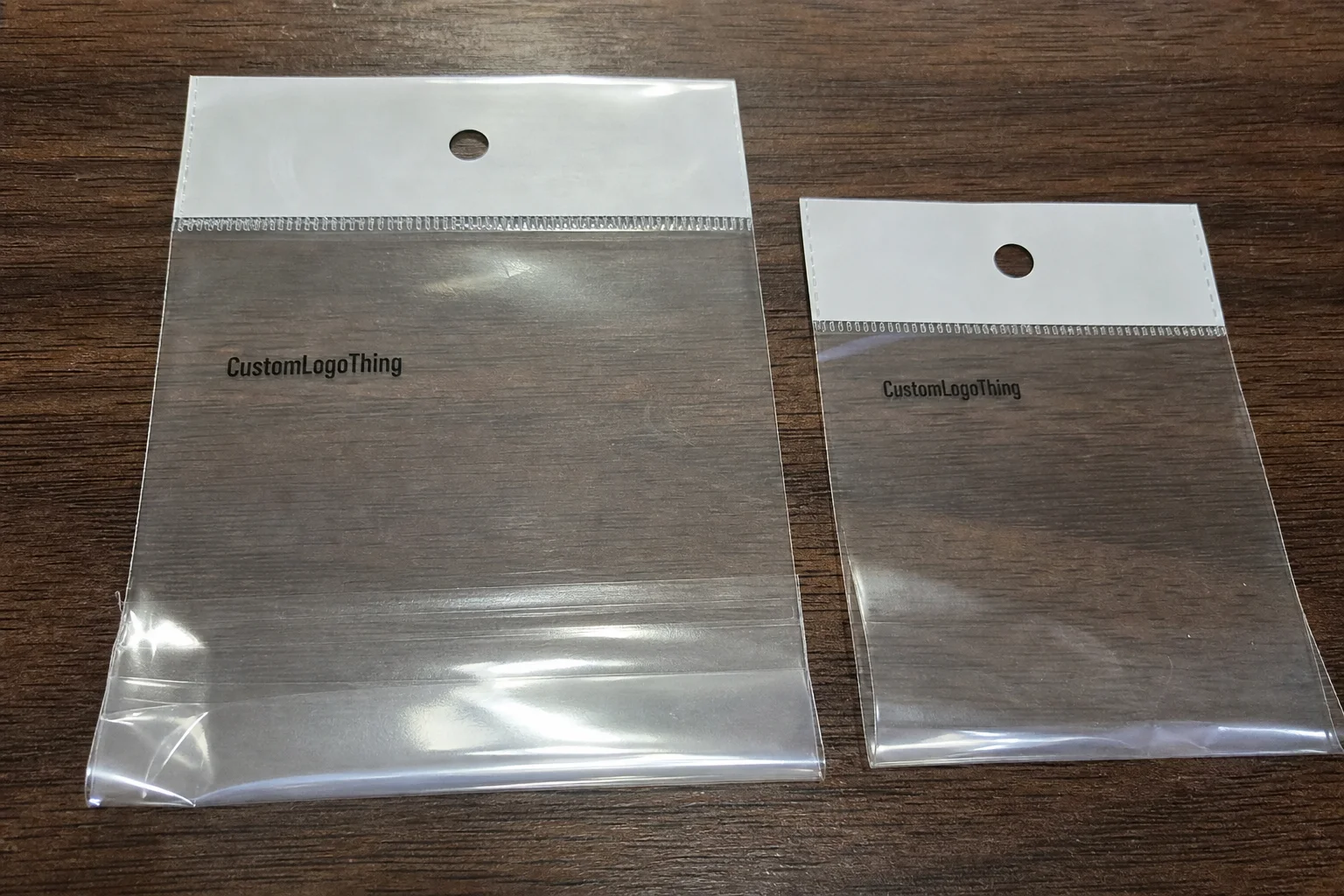
Most warning-label problems in stationery packaging do not start with the film. They start with a placement decision, a copy change that did not get tracked, or a proof that looked correct on screen and failed once the bag was filled. That is the practical reason the stationery brands Opp Header Bags warning label guide belongs in the planning stage, not after the first sample has already been packed.
OPP header bags are common for pens, pencils, refills, stickers, rulers, and small bundled kits because they are light, clear, and economical. They let the product do the selling while the header carries the legal and retail information. The challenge is that the warning label has to remain readable without taking over the front of the pack or fighting the product window.
Retail review teams usually look for the same things: legibility, contrast, barcode space, location relative to the hang hole, and consistency across SKUs. A pack can look polished in a PDF and still fail under fluorescent shelf lighting. That is why the conversation has to include structure, not just copy.
The useful way to approach this is simple. Map the bag zones, lock the exact wording, test the panel on a filled sample, and keep version control tight. Once those pieces are stable, the rest of the run becomes predictable.
“The costly mistake is rarely the OPP film itself. It is the label that lands across a fold, or the proof nobody checked on a filled pack.”
How the Bag, Header, and Label Work Together
An OPP header bag is not one flat surface. It has a clear body, a header area, and a structural edge created by the seal or fold. Each part has a job. The body shows the stationery. The header carries branding, hang features, and warning copy. The edge limits where a label can sit without distortion.
If those zones are treated as interchangeable, the result is usually awkward: the warning is too low, the barcode crowds the copy, or the label crosses a seal. None of that looks dramatic in a design file. It becomes obvious when the bag is filled and hanging on a peg.
Good layouts work with the package geometry instead of against it. The warning should sit on a flat area with enough clearance around the text, and the product window should stay open enough that the stationery still feels easy to shop. In a crowded aisle, the eye moves quickly. A package has a second or two to make sense.
Consistency matters just as much if you are managing several SKUs. A label system that works across pen sets, refill packs, and accessory bundles saves time and reduces late revisions. Standard header widths also make future reorders less painful because the structure stays familiar even when the artwork changes.
- Keep warning copy on a flat zone, away from heat seals and hang holes.
- Leave enough transparent space so the product remains visible.
- Match label size to the header width instead of squeezing text into a narrow block.
Specs That Change Visibility, Adhesion, and Compliance
Small spec changes can alter how a warning label behaves. Film thickness, header finish, adhesive strength, label stock, print contrast, and fill level all affect readability and durability. A 30 micron and a 40 micron OPP film may look close on a sample sheet, but they do not always act the same once the pack is stacked, handled, and exposed to store lighting.
Font size is usually underestimated first. A warning can be technically present and still be functionally weak if the text is too small, too thin, or too dense. On glossy clear packaging, light type fades fast. Black ink on a matte or lightly coated label usually holds up better because it resists glare and gives the eye a stronger edge to lock onto.
Compliance is broader than one warning line. Depending on the market, the pack may also need origin marks, recycling references, language variants, barcode space, or retailer-specific phrasing. The exact wording should be locked before artwork approval. If the copy changes after that point, the label area is often the first place the error shows up.
Surface finish matters too. Gloss can look cleaner on press, but it can also create reflection that makes small text harder to read. Weak adhesive can lift in transit. A busy printed header can bury the warning panel if the contrast is poor. Those are ordinary production issues, not edge cases, and they show up often enough to deserve attention during quoting.
For sourcing and transit checks, two references are useful. ISTA test standards help buyers think about handling and shipping stress. FSC remains a common reference when a paper component or insert needs responsible sourcing language. Neither replaces market-specific requirements, but both help buyers ask more precise questions.
| Label Approach | Typical Use | Strength | Tradeoff | Indicative Cost Driver |
|---|---|---|---|---|
| Separate pressure-sensitive label | Short runs, multi-language copy, fast revisions | Flexible artwork changes | Extra application step | Higher setup on small MOQ |
| Printed warning on header | Stable artwork, larger quantities | Cleaner look, fewer parts | Harder to change after proof | Lower unit cost at scale |
| Hybrid label plus printed panel | Retail packs with evolving copy | Allows SKU-specific updates | More quality checks | Mid-range cost and more QC time |
The best spec stack is usually the least complicated one that still meets the legal and retail requirements. Fancy finishes only earn their place if they do not interfere with legibility or handling.
Production Steps, Proofing, and Lead Time
The production path should be predictable: receive final copy, build the dieline, place the warning, review the digital proof, approve a sample, then release the run. The part that saves the most money is version control. If the wrong file gets approved, every later step becomes more expensive.
Most delays are ordinary. The warning text is still changing. A draft barcode gets used in the proof. Someone approves a flat PDF without checking the fold or the hang hole. The product thickness shifts by a few millimeters and the bag bows enough to move the label out of the ideal zone. None of that is dramatic, but it is enough to stop a launch.
For standard stationery runs, a realistic timeline often lands around 12 to 15 business days after final proof approval. Multi-SKU programs, special finishes, or extra sample cycles add time. Larger quantities can move more efficiently because setup work is spread across more units, but only if the artwork is locked early.
A flat proof tells you what the artwork looks like. A filled sample tells you whether the package actually works. That difference matters because the label can wrinkle, cross a seam, or shift during insertion and sealing. On screen the layout looks fine. On the line it may not.
Good proofing also catches the small failures: glare on a barcode, too little margin near the edge, or a label that looks centered until the pack is filled. Those details are not cosmetic. They decide whether the order clears review in one pass or gets sent back for changes.
Do not release production until packaging, compliance, and operations have checked the filled sample. If sales needs to review shelf appearance, that sign-off should happen before release as well. Late approvals usually cost more than early disagreement.
Cost, MOQ, and Unit Pricing Signals
Price is shaped by more than bag size. The main drivers are dimensions, header complexity, print colors, label count, coating choice, and whether the warning is printed directly or added as a separate label. A one-color warning on a standard clear OPP header bag is usually much easier to price than a multi-language label with extra checks and tighter application tolerances.
MOQ works the same way across most packaging formats. Lower quantities push unit cost up because setup, proofing, and changeovers are spread across fewer packs. Larger runs lower the unit price because the fixed work gets diluted. The useful question is not which quote is cheapest. It is which quote meets the required spec without leaving out labor, revision time, or overage.
For a typical stationery pack, a clean single-SKU order may fall around $0.14 to $0.28 per unit at 5,000 pieces, depending on film gauge, print coverage, and whether the warning is built into the header or applied as a separate label. Smaller custom orders often cost more per unit. More complex programs with multiple languages or special finishing can move beyond that range quickly.
Lead time and price usually move together. Tight schedules add cost because they reduce room for iteration and force the production slot to be reserved earlier. Rush jobs can work, but they are a poor default if the copy is still changing. One or two proof cycles should be part of the budget.
- Tooling: Confirm whether dieline or plate setup is included.
- Proof revisions: Ask how many rounds are covered before charges apply.
- Label application: Check whether it is manual, semi-automatic, or built into the bag run.
- Overage: Verify how many extra units are included for spoilage or QA.
The cheapest quote often hides something. If sample charges, application labor, or overage are missing, the headline number will look better than the landed cost. Compare what is included, not just the bottom line.
Common Mistakes That Trigger Reprints or Delays
The most common failure is simple: the warning label sits where the pack folds, seals, or hangs. Once the usable surface shrinks, the copy stops reading as intended. That is enough for a review team to reject the sample or request a new layout.
Copy errors are next. Outdated warning text, missing retailer language, inconsistent capitalization, and barcode collisions all look minor on a screen. In production they are not minor. A single wrong version can force a reprint if it gets built into the dieline.
Another problem appears when packaging is approved before the final product dimensions are locked. If the stationery set ends up thicker than expected, the bag can bow and the warning panel can shift out of the visible zone. The pack may still close cleanly. That does not mean the message still works.
Single-person approval is also a weak point. Packaging, compliance, operations, merchandising, and sales each see different risks. One reviewer rarely catches all of them. A better process sends the same proof through all relevant owners before anyone treats it as final.
Use this checklist before release:
- Confirm the exact warning text against the final SKU.
- Verify the label clears the fold, seal, and hang hole.
- Check barcode contrast and quiet space on a filled sample.
- Review the pack under bright light, not only on a monitor.
- Lock the version so no draft file can re-enter production.
The best teams are not the ones that avoid every mistake. They are the ones that catch the bad assumption before cartons leave the line.
Expert Checks and Next Steps Before Ordering
Before requesting quotes, build a one-page spec sheet. Include final dimensions, unit count, warning copy, label location, print colors, target quantity, and any retailer rules. That document cuts through vague email threads and prevents pricing noise later.
Ask for both a digital proof and a physical sample if the packs will go through retail. The proof checks copy. The sample checks visibility, glare, seal clearance, and handling. Those are different tests, and a pack can pass one while failing the other.
It also helps to define the sign-off chain before production starts. A practical approval path usually includes packaging, compliance, operations, and sales. If finance or procurement needs to review the order, bring them in early. Small delays usually come from unclear ownership, not from the factory floor.
For multi-SKU stationery programs, a pilot run is often the cleanest next step. Use it to compare the finished pack against the acceptance criteria, then lock the baseline for larger orders and reorders. If the pilot passes, the pricing and lead-time assumptions become much more reliable. If it fails, the problem is still contained.
That is the point of the stationery Brands OPP Header Bags Warning label guide: it turns a messy packaging risk into a controlled checklist. Once the layout, copy, and approvals are stable, the bag becomes easier to quote, easier to print, and easier to repeat.
FAQ
What warning labels do stationery brands need on OPP header bags?
The required copy depends on the market, retailer, and product type. Some packs need a safety warning, others need origin marks, recycling references, or barcode space. The first step is to confirm the exact wording against the SKU and selling channel before artwork is locked.
Where should the warning label go on a stationery OPP header bag?
Place it on a flat part of the header where it is immediately visible and clear of the fold, seal, and hang hole. Avoid crowding it with the barcode or dense graphics. A filled sample is the only reliable way to confirm the placement.
How long does the process usually take?
A standard run often takes around 12 to 15 business days after final proof approval. Multi-language copy, special finishes, or extra sample rounds add time. Rush schedules are possible, but they reduce room for revision.
What affects cost and MOQ most?
Dimensions, print complexity, label method, material choices, and changeovers drive most of the price. MOQ matters because setup costs are spread across the run, which is why smaller orders usually have a higher unit cost.
How can a brand avoid reprints on warning labels?
Use final copy, final dimensions, and final artwork before approving the proof. Check the filled sample under real lighting, and route sign-off through packaging, compliance, and operations before release. That catches most mistakes before they become expensive.