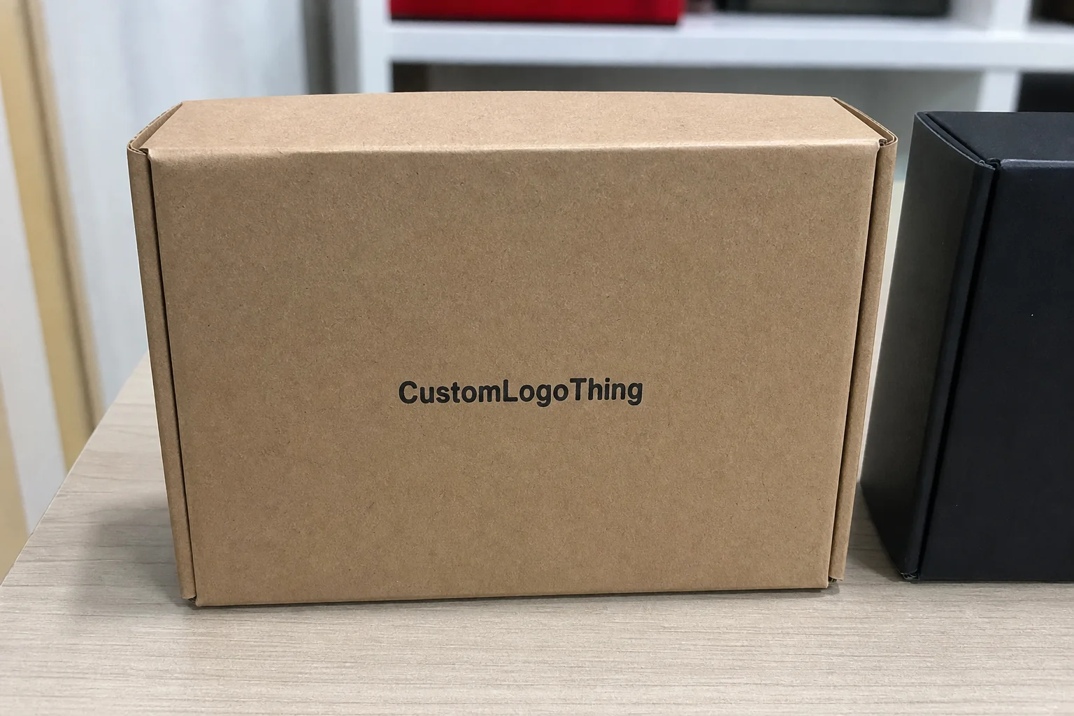
Carton Box Printing: How to Order Boxes That Actually Work
Carton box printing can make a product look sharper, but appearance is only part of the job. Buyers are usually paying for protection, stack strength, shelf impact, and a package that does not slow down packing. A clean print run helps, yet a box that looks expensive and fails in transit is just expensive.
The word “carton” causes more confusion than it should. A shipping carton, a retail carton, a folding carton, and a corrugated mailer are not interchangeable. Each one uses different board, different print methods, and different finishing constraints. That matters because the wrong structure can double the cost of a project before artwork even reaches prepress.
The order of decisions matters too. Structure first. Artwork second. Finish last. Buyers who reverse that sequence usually end up paying for rework, extra proofs, or a dieline that does not match the product inside. A supplier worth listening to will ask about function before they ask about colors.
Carton Box Printing Basics: What Buyers Actually Buy
Most packaging projects start with the design concept, which is understandable and usually backward. In carton box printing, the structure decides whether the job is simple, expensive, or awkward to produce. A small tuck-end carton on paperboard is a very different project from a crash-lock mailer with interior print and a reinforced bottom. The same product may fit both, but the economics will not.
Buyers often underestimate how much the box construction affects cost. A plain-looking carton can be more expensive than a decorated one if it needs custom tooling, a special board grade, or a short production run. Setup costs do not care whether the art is minimal or loud. They care about folding lines, cutting dies, gluing, and finishing steps.
Here is the vocabulary worth keeping straight:
- Shipping cartons are built for transit. Compression resistance matters more than shelf appeal.
- Retail cartons sit in stores or displays and need stronger branding.
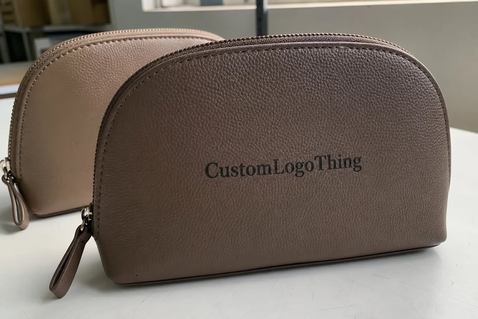
- Folding cartons are paperboard-based and common in cosmetics, food, supplements, and small consumer goods.
- Corrugated mailers combine structure and print, usually for e-commerce or subscription packaging.
That distinction is not academic. A buyer who asks for “a carton” and expects shelf graphics on a heavy-duty shipper is asking for two different packaging jobs in one. Different board. Different press. Different result. The useful question is not “What style do you want?” It is “What has this box got to survive?”
For products that move through retail and distribution in the same lifecycle, that question becomes even more important. Shelf-ready packaging needs a cleaner face, but the same box may still travel through courier sorting, pallet stacking, and warehouse handling. If the package cannot handle the roughest part of the route, the print quality will not matter for long.
How the Process Works From File to Finished Box
Carton box printing follows a predictable sequence, but small errors early on create expensive fixes later. The usual path is brief, dieline setup, artwork prep, proofing, prepress, printing, finishing, cutting, folding, and packing. That sounds orderly because it mostly is. The trouble starts when a project skips the right approval stage.
The first useful document is the brief. Give the supplier the product dimensions, packed weight, shipping method, and any retail display requirements. Then ask for a dieline before finalizing artwork. A flat mockup is not enough. The dieline shows folds, trim lines, glue zones, and quiet areas where barcodes and compliance copy can live without getting crushed by a score line.
The print method changes the whole production approach. Digital printing suits short runs, test launches, variable artwork, and fast turnarounds. Offset printing is usually the better option for larger runs where color consistency and cost per unit matter more. Flexographic printing is common for corrugated packaging and works well for simpler graphics at scale. Screen printing appears less often, but it still has a place for specialty decoration and selective branding.
Color control deserves more attention than it usually gets. CMYK works for most full-color jobs, but brand colors do not always reproduce well from process inks alone. A logo that must look the same across repeat runs may need a spot color. On coated paperboard, the difference is visible. On kraft or uncoated stock, it is even more obvious because the substrate absorbs ink differently. If the supplier cannot explain how they plan to hold color, that is a warning sign.
Three approvals usually matter most: the structure sample, the color proof, and the final production proof. The sample checks fit and closure. The color proof catches shifts in tone and saturation. The production proof is the last chance to verify artwork, barcode readability, panel placement, and legal copy. Skip one of those and you are trusting a print run with a stack of boxes that may already be wrong.
Production files also need practical cleaning before they go to press. Fonts should be outlined, linked images embedded, bleed added correctly, and tiny text checked against the board color. Black type over a rich background can disappear if the file is built carelessly. White type on dark stock can fill in or lose sharpness. These are not rare problems. They show up constantly in artwork that was designed on screen and never checked at press scale.
“A good carton is one the warehouse notices only because it works: it stacks well, prints cleanly, and does not slow the line.”
Board, Ink, and Finish Choices That Change the Result
The board choice influences appearance, strength, and price more than many buyers expect. For lightweight retail cartons, SBS and C1S paperboard are common because they print clearly and fold cleanly. For shipping or e-commerce use, corrugated board provides more crush resistance and better protection. For premium presentation packaging, rigid board or wrapped chipboard delivers a heavier feel and a better opening experience. The product should set the structure, not the other way around.
Ink coverage affects both cost and appearance. A small logo on a light background is simple. A full-bleed black carton with dense solids is not. Heavy coverage, metallic accents, and multiple spot color passes increase setup time and material use. That does not mean they should be avoided. It means they should earn their place. On a lower-priced SKU, the packaging can easily become too expensive for the margin it supports.
Finish choices add another layer of cost and performance. Matte reduces glare and tends to read more restrained. Gloss creates sharper contrast and makes imagery pop. Soft-touch adds a velvety hand feel that signals premium positioning, though it can scuff more easily and costs more. UV coating can highlight panels or protect the surface. Aqueous coating is practical and fast-drying. Lamination gives strong durability but can add bulk and change the feel of the box in hand.
Structural style changes the print layout too. A tuck-end carton is efficient and widely used. An auto-lock bottom speeds assembly and improves load security. A mailer-style box works well for e-commerce because it balances protection with branding. Once the structure changes, the glue areas, scores, and panel proportions change with it. Fancy die lines are not cosmetic. They alter the whole production path.
There is also a less glamorous point: finishes and coatings behave differently on different stocks. A matte coating that looks elegant on bleached board may feel dull on kraft. A glossy laminate can hide minor scuffs but also make fingerprints obvious. Soft-touch can elevate a premium line, but it can also create handling issues if the cartons will be packed, shipped, unpacked, and restacked multiple times. Material samples matter because brochures never show abrasion well.
For Brands That Need a specific shelf identity, the safe move is to test a small set of board and finish combinations before committing to a full run. The cheapest option on paper is not always the cheapest option in use. A carton that survives handling, prints consistently, and requires fewer replacements is usually the real economy choice.
Cost, MOQ, and Unit Price Drivers for Printed Cartons
Pricing for carton box printing usually breaks into setup, plates or digital prep, board, finish, labor, and freight. Buyers often focus on the unit price and ignore the rest. That is how a quote looks attractive until the freight line appears. For bulky cartons, transport can change the landed cost as much as the board choice.
Unit cost drops as quantity rises because setup gets spread across more boxes. A 1,000-piece order may carry much of the same proofing and machine setup burden as a 10,000-piece order. Once the run gets larger, the cost curve starts flattening and the material becomes the main driver. That is why small orders often feel disproportionately expensive even when the box design is ordinary.
The biggest price drivers are usually these:
- Box dimensions and board thickness
- Number of print colors and total ink coverage
- Special finishes such as lamination, soft-touch, or spot UV
- Custom dies, inserts, and complicated structural features
- Order quantity and repeatability
- Freight distance and carton density
Minimum order quantity is where expectations tend to drift away from production reality. Low MOQ is possible, but the unit price usually rises and some finish options become less practical. For runs in the low hundreds, digital printing is often the cleaner choice. For several thousand units, offset printing usually has better economics. For corrugated cartons with simpler graphics, flexographic printing can be the most efficient route.
| Print Method | Best For | Typical MOQ | Relative Unit Cost | Notes |
|---|---|---|---|---|
| Digital printing | Short runs, fast turn, variable artwork | 100-2,000 units | Higher at low volume | Useful for test launches and frequent design changes |
| Offset printing | Retail cartons with tighter color control | 2,000+ units | Lower at scale | Better for larger runs and repeat brand programs |
| Flexographic printing | Corrugated shipping cartons and mailers | 1,000+ units | Moderate | Efficient for simpler graphics and packaging at volume |
For rough planning, small retail carton orders can land around $0.40-$1.20 per unit depending on board, finish, and quantity, while larger runs may come in lower. Special structures, inserts, heavy ink coverage, and premium finishes push pricing up fast. The quote only means something if tooling, printing, finishing, and freight are separated clearly enough to compare one supplier against another.
Freight deserves more scrutiny than it usually gets. Some suppliers include it in the box price. Others separate it out. A few mix it into service fees and leave the buyer to untangle the final landed cost later. That is a weak way to quote packaging. For a bulky item like a carton, freight can erase a margin very quickly. Ask for the landed number, not just the factory number.
There is a practical tradeoff here. A more expensive board or finish may still reduce total cost if it cuts damage, improves shelf performance, or lowers rejection rates. A carton that arrives scuffed, crushed, or misprinted has no real savings attached to it. It is just a future expense.
Timeline, Lead Time, and Approval Bottlenecks
The timeline for carton box printing looks straightforward on paper and slightly inconvenient in practice. A simple digital run can move from proof approval to delivery in roughly 7-12 business days. Offset work or projects with special finishes usually need 12-20 business days. Add custom inserts or complex die lines and the schedule stretches again. Shipping method changes the picture further. Air is faster and more expensive. Sea is slower and more economical. Physics still applies.
Sampling is where many schedules slip. A structural sample can take a few days. A color proof may be quick, unless the artwork still needs cleanup. Then the production proof has to be signed off before the run begins. Buyers who are launching a product with a fixed date should build buffer time around those checkpoints. They are not optional.
The usual delay points are predictable: missing dielines, low-resolution artwork, barcode adjustments, text too close to a fold, and late changes to finishes. If the carton carries compliance copy, ingredient panels, or regulatory marks, that text should be checked early. Small wording changes can trigger a new proof. The same goes for artwork with tiny type on dark backgrounds. It may look acceptable on a monitor and fail on press.
Seasonality also affects lead time. Busy months add queue time, especially for suppliers that run multiple print methods and finishing lines. A launch-critical order should not rely on an old turnaround estimate pulled from a quiet period. Ask for current capacity, then add a cushion. A box that arrives after the product ships is not helpful, even if the print quality is good.
For repeat packaging programs, the best way to shorten the timeline is to freeze the spec. Keep the same board grade, the same finish, the same die line, and the same approved artwork version unless there is a real reason to change them. That consistency reduces color drift, keeps reorders predictable, and cuts the number of questions that slow a second or third run.
Common Mistakes That Make Printed Cartons More Expensive
The first mistake is choosing the box size from the product alone instead of the packed-and-shipped dimensions. The product may fit, but once inserts, clearance, and handling space are added, the box can end up too tight or too loose. Tight boxes can crush the product. Loose boxes waste material and create movement. Neither one is acceptable for a serious production run.
Another common error is building artwork before confirming the dieline. That creates problems with alignment, panel transitions, and glue flaps. Logos can land in the wrong place. Copy can sit too close to a fold. A barcode can end up where the box bends. All of those issues are fixable, but each fix adds time and cost.
Finish is another place where buyers overspend. A heavy black box with gloss lamination and spot UV can look striking, but if the product is a utility item or a lower-priced SKU, the packaging may be doing more work than the economics support. A cleaner board with one or two colors often looks better and costs less. Packaging that consumes margin is a poor trade.
Print distortion is another reality that gets overlooked. On corrugated cartons, text near scores, edges, or glue zones can blur or disappear depending on compression and structure. Critical copy should stay away from folds and glue flaps. That sounds obvious until a logo is split across a seam and everyone involved tries to pretend the placement was intentional.
Approving a proof too quickly is probably the most avoidable mistake of all. Check the dimensions, panel positions, fold lines, barcode readability, and compliance text against the actual product or a realistic sample. A screen mockup is useful, but it is not enough. Packaging is a physical object. The proof has to work as a physical object.
One more issue comes up in reorder programs. Teams sometimes change one part of the spec and assume the box will still perform the same. A small board change, a different laminate, or a revised print file can alter fit, color, and folding behavior. Reorders stay stable only when the original production details are kept intact and documented properly.
“The best packaging decisions are usually the least dramatic ones: the box fits, the print is clean, and the line keeps moving.”
Next Steps for a Cleaner Order and Faster Reorder
If a packaging order needs to move quickly, the best thing a buyer can send is a complete spec sheet. Include product dimensions, packed weight, shipping method, target quantity, and any retail display requirement. Add the artwork file version, the intended print method if it is already fixed, and whether inserts or special coatings are needed. Vague briefs slow quotes. Specific briefs get usable answers.
Ask for pricing that separates tooling, printing, finishing, and freight. That split reveals where the money is going and which choices are actually flexible. It also makes supplier comparisons far more honest. A single blended number can hide an expensive finish, a weak board choice, or freight that was never discussed clearly.
For compliance-heavy packaging, ask for a physical sample or a detailed production proof before mass production. That step costs less than a reprint and usually catches the mistakes that digital previews miss. It also lets the buyer feel the board, inspect the folds, and see whether the printed surface behaves the way the spec sheet promised.
For repeat orders, lock the production spec early and keep it unchanged unless a real issue emerges. Same board. Same finish. Same dieline. Same artwork version. That discipline makes carton box printing more reliable, shortens reorder time, and reduces the odds of color drift or fit issues at receiving. It also turns packaging from a moving target into a controlled part of production.
Good packaging work rarely announces itself. It just shows up on time, fits properly, and prints the way the brand expected. That is usually enough. For traceability and environmental claims, it also helps to keep sourcing aligned with recognized standards such as FSC and transport testing references such as ISTA. Those frameworks do not choose the carton for you, but they keep the conversation tied to real materials and real handling conditions.
What files work best for carton box printing artwork?
Vector files such as AI, PDF, or EPS are usually the best starting point because text and logos stay sharp at press size. Place the artwork on the supplier’s dieline so folds, flaps, and glue areas remain clear. If the design includes photos, keep the resolution high and confirm the color mode before submission.
How much does carton box printing usually cost per unit?
Unit price depends on quantity, board type, print method, finish, and structural complexity. Small runs cost more per box because setup and proofing are spread across fewer units. Freight can shift the real landed cost a lot, especially for bulky cartons that take up truck or container space quickly.
What is a normal turnaround for carton box printing orders?
Simple digital runs can move fast, while offset work or special finishes usually need more time. Artwork approval, sample approval, and shipping method all affect the delivery window. If the order is tied to a launch date, add buffer time for proofs and any corrections that come out of them.
Can I get a low MOQ carton box printing run without a huge price jump?
Yes, but the unit price usually rises because setup costs are spread across fewer boxes. Keeping the structure standard and reducing finish complexity helps control the total. Digital printing is often the better fit for smaller quantities and frequent design changes.
What should I check before approving carton box printing proofs?
Confirm dimensions, fold lines, artwork placement, barcode readability, and compliance text. Check color expectations against a real proof, especially if the board is dark, uncoated, or laminated. Make sure the proof matches the packed product and the shipping method, not just the design mockup.