Why Coffee Shops Need a Cap Proof Before the First Stitch
A cafe orders 144 Performance Golf Caps for patio staff and weekend retail. The logo looks clean in the emailed proof, the invoice is approved, production begins, and the finished caps arrive with the embroidered mark sitting low enough that the apron line and counter height hide half the branding during service. Nothing is technically broken, but the caps do not do the job they were bought to do.
That is the practical reason to use a performance golf caps Artwork Proof Checklist for Coffee shops. It is not paperwork for its own sake. It is the final inspection before a digital logo becomes paid inventory.
Caps are less forgiving than flat packaging. A cup sleeve gives you a smooth wrap. A retail coffee bag usually gives you a rectangular label or a broad printed panel. A cap gives you curved front panels, crown seams, sweatbands, structured foam, visor stitching, and thread or patch material with real thickness. One millimeter on a PDF can feel harmless; repeated across 72, 144, or 288 pieces, that same millimeter can turn into a visible brand consistency problem.
The cap may also be photographed more often than the packaging. Staff wear it on patios, at farmers markets, during catering, around golf outings, and behind mobile espresso bars. Customers see the cap from five feet away, under sunlight, shadow, steam, and movement. The buyer sees a different set of risks: a purchase order, a launch date, a fixed quantity, and a box of merchandise that either supports the cafe identity or makes the mark look slightly off.
A strong proof protects the wearer, the brand, and the budget. The barista gets something comfortable enough to wear through a shift. The customer gets a clear visual cue. The buyer avoids explaining why the cafe mark no longer matches the menu board, loyalty card, retail bag, or cup sleeve.
In production terms, the proof should confirm the cap model, decoration method, logo size, placement, thread or patch colors, safe area, approved file version, and any artwork changes made for manufacturability. Those are the details the production team uses. A beautiful mockup can sell the idea; a properly checked proof keeps the order from drifting.
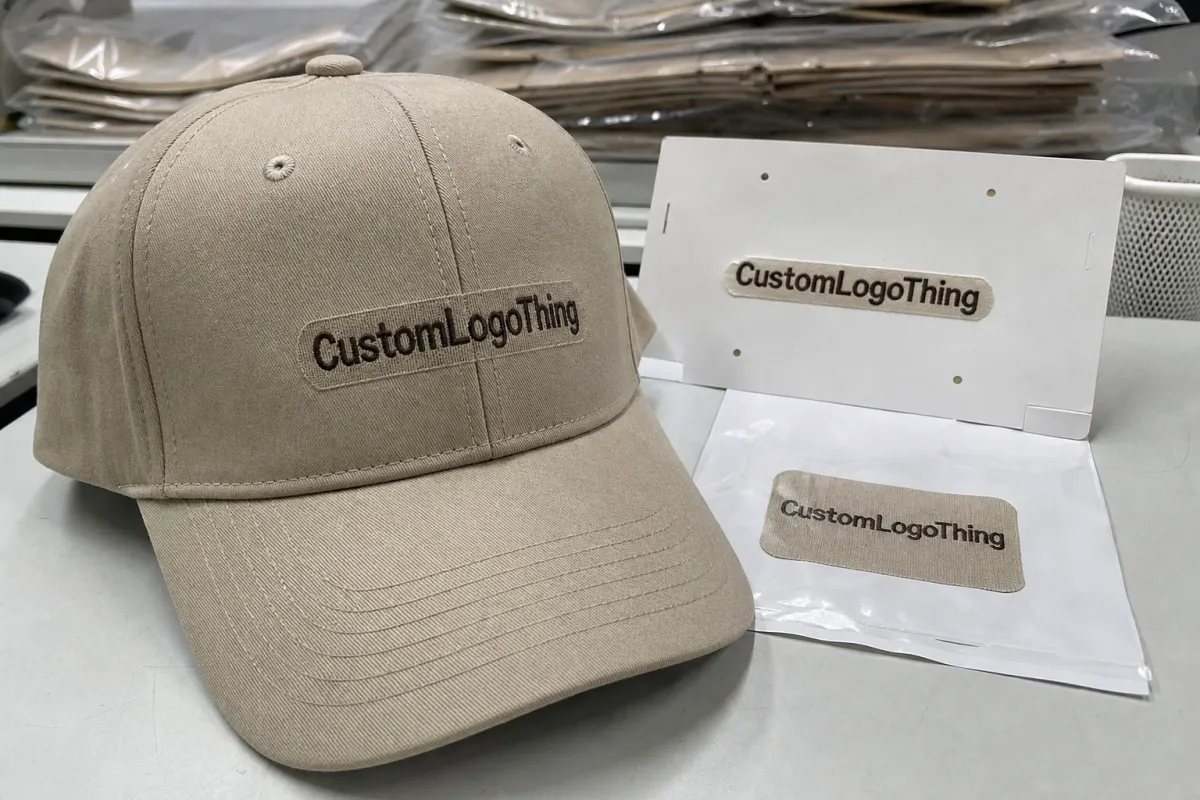
How an Artwork Proof Translates a Cafe Logo Onto Performance Golf Caps
An artwork proof is the supplier’s visual and technical confirmation of what will be produced. It should show the cap style, cap color, logo or text, decoration method, placement, approximate scale, and production notes. A mockup shows what the cap might look like. A production-ready proof documents what the order is meant to become.
That distinction matters. A mockup may show a circular roaster badge sitting perfectly on a clean product image. The proof should tell you whether that badge is 2.25 inches wide, centered on the front crown, placed a specific distance above the visor seam, simplified for embroidery, and matched to a thread library rather than a screen color. Same logo, different level of responsibility.
Coffee shop branding creates its own proofing traps. Fine-line roaster seals, handwritten wordmarks, tiny origin text, steam icons, bean illustrations, neighborhood slogans, and circular badge logos are often built for cups, labels, signage, menus, or digital use. Fabric changes the math. A line that feels elegant on a printed loyalty card may disappear once translated into thread. A slogan that reads cleanly on a 12-ounce bag may become a fuzzy bar at cap scale.
Decoration choice is the first major decision. Embroidery is durable, familiar, and often efficient for simple marks, but it does not preserve every micro-detail. Woven patches can hold smaller text and finer lines better, though they add a visible patch edge and a different hand feel. Heat transfers can carry gradients and complex color, but fabric compatibility, heat settings, stretch, and wash behavior need attention. Silicone and rubber patches can look modern and retail-ready, yet tooling, color limitations, patch thickness, and minimum order quantities may raise the cost quickly.
Cap construction changes the proof as much as the logo does. Lightweight polyester and moisture-wicking panels can pucker if stitch density is too heavy. Perforated panels reduce usable decoration area. Structured crowns usually support front embroidery better than relaxed, unstructured crowns. Snapback, fitted, hook-and-loop, and metal buckle closures each affect what can be done on the back arch or closure tab.
The best proof translates brand standards into production language: logo width, stitch count, thread color, backing type, placement, decoration method, cap style, and file version. Many cap problems start because buyers approve a picture, while the shop floor produces from specifications.
Key Proofing Specs: Logo Size, Thread Color, Placement, and Fabric Behavior
A useful checklist starts with measurable specs. Ask for logo width in inches or millimeters. Confirm the finished height, not just the width. Check center alignment against the crown itself, not only the image frame on the proof. Review the distance from the visor seam when the supplier can provide it. If the artwork sits on a side panel, confirm whether it appears on the wearer’s left or wearer’s right. That mistake is common because proofs are often viewed from the front, while caps are worn in three dimensions.
Small details fail first. Serif type, thin steam lines, coffee bean line art, and slogans below roughly 0.25 inches high may blur, close up, or become unreadable in embroidery. That number is not a universal rule; thread weight, digitizing, fabric, and machine settings all matter. Still, if the proof shows a tiny “single origin espresso bar” line beneath a badge, pause before approving and ask whether the text will remain legible at actual size.
Color is another quiet risk. Pantone, RGB, CMYK, thread libraries, patch materials, and cap fabrics do not match perfectly. A warm cream on screen may stitch closer to ivory. A rust brand color may read orange in direct sun. Tonal black embroidery on charcoal can look refined in a PDF and nearly invisible under a patio umbrella.
Compare colors against physical references whenever possible. A cup sleeve, printed menu, loyalty card, retail bag, apron, or existing merch item gives a better benchmark than a backlit screen. If the supplier provides thread numbers or patch material references, save them with the proof. Reorders depend on those small records.
Performance fabric adds its own behavior. Slick polyester can reflect light and make thread sheen more pronounced. Stretch panels can distort dense embroidery, especially on filled shapes. Perforated backs may limit side decoration. Patch adhesives need enough flat contact area, which can be difficult if the crown has a strong curve or a seam running through the target area.
Proofing rule: view the artwork at actual size before approval. If small text looks fragile on paper at 100 percent scale, it will not become clearer once stitched or pressed onto a curved cap.
For buyers who also manage packaging, think of the cap proof like a dieline check. The artwork is not floating in space. It has edges, tolerances, materials, and production constraints. Standards bodies such as ASTM International publish testing methods across materials and performance categories; a custom cap proof is not a lab test, but the mindset is useful. Define the condition before judging the result.
Process and Timeline: From Artwork Upload to Approved Cap Proof
The workflow is usually straightforward. Choose the cap style. Submit the artwork. Confirm the decoration method. Receive the proof. Request revisions if needed. Approve. Order a pre-production sample when the risk justifies it. Then move into bulk production.
The delays are usually human rather than technical. Missing vector files, unclear logo hierarchy, undecided cap colors, and vague placement notes slow the proof before anyone touches a machine. So do late comments from an owner, manager, designer, or marketing partner who was not included at the start.
Digital proofing commonly takes a few business days after the supplier has usable artwork and a confirmed blank cap. Revisions may add 1-3 business days per round. A physical sample can add 5-10 business days, sometimes longer for specialty patches, non-stock cap colors, or imported components. Bulk production often runs 10-20 business days after approval, depending on quantity, decoration complexity, seasonal capacity, and shipping method.
Coffee shops tend to buy caps for specific moments: patio openings, tournament sponsorships, staff uniform refreshes, farmers market season, roaster collaborations, seasonal merch drops, or new location launches. Work backward from the date the caps must be in hand, not the date the event begins. If the boxes need to be unpacked, checked, counted, tagged, and distributed by Friday morning, proof approval on Monday is usually too tight.
Proof approval is not production completion. It is the green light for scheduling, material allocation, decoration, inspection, packing, and transit. Each step needs room.
Assign one decision-maker. Multiple email threads create contradictory instructions: larger logo from one person, smaller logo from another, cream thread from the designer, bright white from the manager. A clear proof checklist keeps the decision path visible and reduces avoidable revision fees.
Cost, MOQ, and Unit Cost Factors Hidden Inside the Proof
The proof often reveals cost drivers that are easy to miss in the first quote. Stitch count, decoration area, cap style, patch type, number of locations, color changes, artwork cleanup, and sample requirements can all move the final unit price. A simple two-color front embroidery is usually more economical than a woven patch with side embroidery and back strap text on the same cap.
Minimum order quantity deserves a practical reading. A small cafe may want 24 caps for staff. A supplier may price more efficiently at 72, 144, or 288 pieces because setup time, digitizing, machine scheduling, trimming, inspection, and packing spread across more units. The cheapest total invoice is not always the best value; the lowest unit cost often begins at a higher quantity.
| Decoration option | Best for | Typical cost behavior | Proofing risk to check |
|---|---|---|---|
| Front embroidery | Simple logos, initials, bold cafe marks | Often efficient at 72+ pieces; stitch count affects price | Small type, dense fills, puckering on stretch fabric |
| Woven patch | Badge logos, fine lines, small origin text | Patch setup may raise cost, but detail can improve | Patch size, edge color, placement on curved crown |
| Heat transfer | Detailed artwork, gradients, full-color marks | Can be economical for complex color; fabric-dependent | Adhesion, wash behavior, stretch, sheen under light |
| Silicone or rubber patch | Premium retail merch, sporty brand feel | Higher setup costs and MOQ are common | Mold detail, color match, edge thickness |
Setup charges and digitizing fees usually cover the work required to prepare artwork for production. Sample fees cover a physical confirmation before the full run. Rush fees pay for compressed scheduling, not miracles. Revision charges may appear if artwork changes after digitizing or after the proof has already been rebuilt.
Read the quote beside the proof. Verify the cap model, quantity, decoration method, logo size, number of colors, shipping estimate, and whether artwork cleanup is included. A proof showing a 2.5-inch embroidered logo does not match a quote built around a 2-inch logo. That gap can become a pricing dispute or a disappointing finished cap.
For cost control, simplify the artwork without making the brand look cheap. Remove microtext. Use one strong front mark. Choose a stock cap color that supports the cafe palette. Put secondary storytelling on hang tags, retail coffee bags, shelf signage, or packaging inserts where small text belongs. If paper-based tags or inserts are part of the merch program, the Forest Stewardship Council is a useful reference point for responsibly sourced paper materials.
Step-by-Step Proof Checklist Before You Approve Production
A performance golf caps Artwork Proof Checklist for coffee shops should move in sequence. Start with the blank cap, because artwork decisions mean little if the base product is wrong. Confirm the cap model, material, structure, closure, visor shape, and supplier color name. “Khaki” can mean pale sand, warm tan, or greenish beige depending on the line.
- Confirm the cap model and color. Check product code, fabric type, closure, panel construction, visor style, and quantity by color.
- Verify the logo file version. Decide whether the proof should use the primary logo, stacked logo, icon-only mark, roaster seal, or location-specific artwork.
- Check the decoration method. Confirm embroidery, woven patch, heat transfer, silicone patch, or another method before judging fine detail.
- Measure artwork size. Ask for width and height in inches or millimeters, not only a scaled image on a PDF page.
- Review placement. Confirm front center, left panel, right panel, back arch, closure tab, or visor, plus distance from seams where available.
- Approve colors by reference. Use thread numbers, patch material references, Pantone targets, or physical samples where possible.
- Inspect every character. Check spelling, punctuation, accents, city names, social handles, slogans, roast names, and small location text.
- Ask what changed during digitizing. If lines were thickened, details removed, or text simplified, decide whether the brand mark still feels right.
- Save the proof with the quote. Store the approved file, approval date, cap style, logo size, thread references, and decoration notes for reorders.
That last step sounds administrative, but it is a cost-control move. Six months later, a cafe may need 96 more caps for new hires and retail shelves. If nobody saved the approved proof, the reorder becomes guesswork: Was the logo 2.25 inches or 2.5? Was the thread ivory, light khaki, or warm gray? Was the cap structured or relaxed?
Use numbered comments when marking up a proof. “Move logo up 0.25 inches” is useful. “Make it pop” is not. “Use the thread color closest to Pantone 476 C, but prioritize contrast on olive fabric” gives the production team something to act on. Clear language reduces revision loops and protects the schedule.
Common Mistakes Coffee Shops Make When Reviewing Cap Artwork
The most common mistake is approving the proof because the logo looks correct on a laptop. Screen approval is only part of the job. Embroidery, patch material, cap curvature, fabric texture, lighting, and actual viewing distance all change the final perception.
Another common problem is overloading the cap with cafe storytelling. Origin names, tasting notes, neighborhood slogans, establishment dates, tiny icons, and seasonal messages may work beautifully on a coffee bag. A cap crown is a smaller stage. The strongest cap artwork often feels almost blunt: one mark, strong contrast, clean placement.
Color drift deserves special suspicion. Coffee shops often use warm neutrals such as cream, kraft, espresso, rust, clay, sage, oat, and charcoal. Those colors can shift dramatically between a brand PDF, embroidery thread, polyester fabric, and natural light. Cream thread on khaki can vanish. Copper on olive can turn muddy. Tonal black on charcoal may suit a retail display, but staff visibility may suffer.
Do not ignore staff use. Performance golf caps are worn during catering, patio service, outdoor events, delivery runs, and long shifts near heat, steam, sweat, sunscreen, and sunlight. If the cap is mainly part of the staff uniform, durability and readability may matter more than the most delicate decoration option.
Approval by committee creates another quiet problem. Owners, designers, managers, and roasters may each request small changes. One wants the badge larger. One wants the slogan restored. One wants a more “premium” tone-on-tone color. The final proof becomes crowded because nobody is responsible for saying no.
Skipping a sample can be reasonable for a simple reorder with unchanged specs. It is riskier for first-time orders, fine-line artwork, unusual side placement, premium retail pricing, specialty patches, or a new cap model. A physical sample adds cost and time, but it gives stronger evidence than a digital proof alone.
Keep records. Memory gets unreliable after a busy season, especially when the same team is juggling drink menus, packaging, staffing, and local events. A clear proof record shows what was approved, why it was approved, and how to repeat it without starting from scratch.
Build a Proof Packet Your Supplier Can Actually Use
Before requesting a quote, gather the practical pieces: vector logo, brand color references, preferred cap colors, target quantity, delivery date, shipping address, decoration preferences, and budget range. If the caps are tied to a hard event date, say so early. A supplier can plan around a fixed deadline only if that deadline is known before proofing begins.
Create a one-page proof packet. Include the logo file name, desired front placement, maximum logo width, acceptable simplifications, backup cap colors, and one named approver. Add photos of existing touchpoints if they help: menu boards, cup sleeves, retail coffee bags, aprons, loyalty cards, window signage, or merch tags. The cap should feel like part of the cafe system, not a random giveaway ordered in a rush.
Ask direct questions before approval. What is the smallest readable text height for this decoration method? Which method best fits this artwork and cap fabric? Does the proof reflect actual production constraints, or is it only a visual mockup? Are there any artwork details the production team expects to simplify? The answers usually reveal whether the design has been translated into a manufacturable spec.
Give feedback in one organized message when possible. Number each comment. Avoid vague notes such as “bigger,” “cleaner,” or “more premium” unless you define the change. A stronger note would be: “Increase logo width from 2.2 inches to 2.4 inches only if the small text remains readable.” That kind of instruction gives the supplier room to protect the final cap rather than chase a subjective impression.
The goal is not to turn every cafe owner or merchandise buyer into a production technician. The goal is to make approval less subjective. A disciplined proof review turns personal preference into a repeatable buying process, reducing rework, rush charges, color surprises, and off-brand merchandise.
FAQ
What should be included in a coffee shop performance golf caps proof checklist?
Include cap style, cap color, logo version, decoration method, logo width, placement, thread or patch colors, spelling, small-text readability, quantity, sample requirements, delivery date, and final approver name. Keep the approved proof with the quote and invoice so future reorders can match the same specifications.
How small can a cafe logo or slogan be on performance golf caps?
It depends on the decoration method, fabric, thread weight, and artwork shape, but very small text and fine lines often lose clarity in embroidery. Ask the supplier for the minimum readable letter height, then view the proof at actual size before approving. If the text looks strained on paper, it will usually look worse on fabric.
Does an artwork proof guarantee the final caps will look exactly the same?
A proof confirms layout, scale, placement, and production intent, but fabric texture, thread sheen, curved panels, and lighting can make the finished cap look slightly different. For detailed logos, specialty patches, or premium retail orders, a physical sample provides stronger confirmation than a digital proof alone.
How does the proof affect pricing for custom performance golf caps?
The proof reveals cost factors such as stitch count, patch type, number of decoration locations, artwork cleanup, setup fees, and sample needs. Simpler artwork, fewer decoration locations, and larger order quantities usually improve unit cost, although cap style and rush timing can change the final price.
How long should coffee shops allow for cap proofing and production?
Allow time for artwork review, proof creation, revisions, approval, production, quality checks, and shipping. Build extra lead time if the caps are for a grand opening, golf event, seasonal merch launch, or staff rollout. The safest schedule includes a buffer before the date the caps are actually needed.


