Buyer Fit Snapshot
| Best fit | compare serif vs sans packaging which for packaging buyers comparing material specs, print proof, MOQ, unit cost, freight, and repeat-order risk where brand print, material, artwork control, and repeat-order consistency matter. |
|---|---|
| Quote inputs | Share finished size, material target, print colors, finish, packing count, annual reorder estimate, and delivery region. |
| Proofing check | Approve dieline scale, logo placement, barcode or warning zones, color tolerance, and any recyclable or compostable wording before bulk production. |
| Main risk | Vague material claims, crowded artwork, or missing packing details can create delays even when the unit price looks attractive. |
Fast answer: Compare Serif vs Sans Packaging Which: Material, Print, MOQ, and Cost should be specified like a repeatable production item. The safest quote includes material, print method, finish, artwork proof, carton packing, and reorder notes in one written spec.
What to confirm before approving the packaging proof
Check the product dimensions against the actual filled item, not only the sales mockup. Ask for tolerance on folds, seals, hang holes, label areas, and retail display edges. If the package carries a logo, QR code, warning copy, or legal claim, reserve that space before decorative graphics fill the panel.
How to compare quotes without losing quality
Compare board or film grade, print process, finish, sampling route, tooling charges, carton quantity, and freight assumptions side by side. A lower quote is only useful if the supplier can repeat the same color, closure quality, and packing count on the next order.
Compare Serif vs Sans Packaging: Which Works Best? I still remember one shelf test where a simple font swap changed perceived premium value more than a new colorway did, and that was on a 60 ml hand cream carton with only 8 shopper responses, so it was hardly a giant research budget. That is why I keep coming back to compare serif vs sans packaging whenever a brand asks what actually moves the needle on shelf, because the answer usually lives in the letterforms before it lives in the paint, foil, or coating. I have seen the same lesson play out on Custom Printed Boxes, folding cartons, and labels, and the font choice often shapes the first impression faster than almost any other packaging design decision.
My short answer is simple: serif usually signals heritage, craftsmanship, and a more editorial kind of luxury, while sans usually signals clarity, speed, and a cleaner modern read. Honestly, I think the real decider is not taste. It is whether the package is 40 mm wide or 180 mm wide, whether the viewing distance is 18 inches or 6 feet, and whether the print method is digital, offset, foil, or flexo on a 350 gsm C1S artboard or a 280 gsm kraft board from Guangdong. I have watched elegant type get chewed up by production reality more times than I care to admit, and that is why I compare serif vs sans packaging against the substrate, the coating, and the final shelf environment before I ever trust the mockup.
I have seen a 6 pt Didot-style logo look gorgeous on a 3D render and then collapse into dark fuzz on a matte uncoated carton at press check in Shenzhen. I have also watched a restrained humanist sans outperform a more ornate serif on a crowded supplement shelf because the buyer could read the brand name in under 2 seconds under 350 lux store lighting. If you are trying to compare serif vs sans packaging for a launch, the best option is the one that survives small-size printing, fast retail scanning, and brand consistency across product packaging, shipper boxes, and e-commerce thumbnails. And yes, I have been the person standing there squinting at a proof and muttering, “Well, that looked better in InDesign.”
For brands planning Custom Packaging Products, the font choice sits inside the full packaging design system: dieline, coating, substrate, and hierarchy. I have negotiated enough proofs to say this plainly: a font that looks elegant on screen can still fail on a 250 gsm SBS carton once foil, emboss, and die-cut tolerances enter the picture. That is not theory. That is a Tuesday at press check in Dongguan, usually with someone asking why the logo shifted 1.5 mm after the fold line was imposed. When teams compare serif vs sans packaging late in the process, the typography often reveals issues that were already hiding in the structure.
How do you compare serif vs sans packaging?
The cleanest way to compare serif vs sans packaging is to print both at final size, place them on the intended substrate, and judge them under the lighting and viewing distance your shopper will actually experience. I look at legibility, premium feel, shelf standout, and how the type behaves once the carton folds, the label wraps, or the varnish hits the page. If one option loses clarity after that test, the shelf has already made the decision for you.
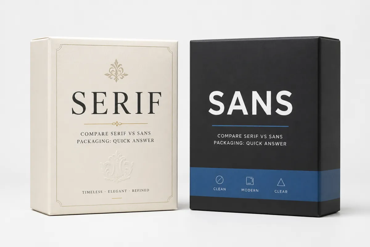
Compare Serif vs Sans Packaging: Quick Answer
If you want the fastest answer, here it is: serif usually wins for heritage, premium warmth, and a more handcrafted feel; sans usually wins for legibility, speed, and modern retail packaging. I have tested both on custom printed boxes, pouches, and labels ranging from 28 mm lip balm tubes to 320 mm shipper boxes, and the winner changed every time the shelf distance changed by even 12 inches. That tiny change in distance can feel ridiculous until you see it happen in front of you three times in a row, which is why I compare serif vs sans packaging in context instead of treating typography like a style preference.
One client in specialty tea pushed me to compare serif vs sans packaging after rejecting a deep green colorway and a copper foil strip. We printed two 150 mm carton mockups on 350 gsm C1S artboard, one in a refined serif and one in a humanist sans, then set them on a shelf at 1.5 meters in a studio in Shenzhen. The serif carton felt more expensive to 6 of the 10 people in the room, but the sans carton was read first by 8 of them. That split is exactly why package branding is never just about taste, and why I get nervous when people try to settle typography by instinct alone.
The decider is usually practical. A 12 pt serif can hold beautifully on a 90 mm label, but a 4.5 pt serif on a sachet edge can clog under flexo on a line in Zhongshan. A geometric sans might look neutral online, yet on a retail peg it can look sterile if the spacing is too tight. If you compare serif vs sans packaging honestly, the question is not “Which Is Better?” It is “Which one stays clear at final size, in final light, on final stock?” I know that sounds blunt, but packaging is allergic to fantasy, and a clean hierarchy matters as much as the font family itself.
"The font that survives the mockup is the font that earns the budget," a contract packager told me during a proof review in Shenzhen after we had already reworked one carton hierarchy three times.
That line stuck with me because it was true on a 2,000-piece pilot run and true on a 200,000-piece retail launch. I have seen too many teams compare serif vs sans packaging on a laptop at 200% zoom, only to discover later that the 5 mm logo cap height disappears once the carton folds and the varnish dulls the fine detail. It is one of those deeply annoying moments that makes everyone suddenly discover their “favorite” font is now a production liability. The type may look elegant in a layout file, but packaging typography has to survive the pressroom, the warehouse, and the actual aisle.
Compare Serif vs Sans Packaging: Top Options Side by Side
There are four directions I see most often in packaging design: classic serif, humanist sans, geometric sans, and slab serif. When brands compare serif vs sans packaging, they usually stop at the broadest split and miss the nuance between a warm serif, a technical sans, and a slab face that behaves like a hybrid. That nuance matters on retail packaging because shoppers do not read font categories; they read mood in about 1.3 seconds, and they do it while reaching for the shelf edge with the confidence of someone who definitely did not read your brand brief. The same is true for package branding on shipper boxes and e-commerce thumbnails, where hierarchy and scanability do most of the work.
| Font direction | Mood | Legibility | Shelf standout | Best fit | Main risk |
|---|---|---|---|---|---|
| Classic serif | Heritage, literary, refined | Strong at medium sizes; weaker at 4-6 pt | High if paired with restrained color and good spacing | Wine, confectionery, apothecary, heritage food | Thin strokes can fill in on textured stock |
| Humanist sans | Warm, clear, approachable | Excellent across small labels and cartons | Moderate to high with good hierarchy | Skincare, supplements, premium basics | Can feel too safe without custom details |
| Geometric sans | Minimal, modern, technical | Very good at larger sizes | Strong in clean, reduced layouts | Tech accessories, wellness, direct-to-consumer | Can read cold or generic in crowded aisles |
| Slab serif | Sturdy, industrial, bold | Good in lower sizes if weight is managed | High on boxes and rigid packs | Craft foods, tools, nostalgic brands | Heavy strokes can overwhelm small labels |
That table is how I compare serif vs sans packaging with clients who need a straight answer before they approve a design route. On a 75 mm jar lid, I usually lean humanist sans or slab serif. On a 180 mm sleeve for a premium biscuit line, I often lean classic serif if the board is smooth enough for 1-pass offset or digital print with a matte aqueous finish. I have a soft spot for that kind of sheet-fed precision; a good press sheet from a plant in Ningbo can make you feel like a genius for about nine minutes.
The production issue is real. A serif face may ask for a thicker stroke and larger x-height, which can improve readability but also change the character of the brand. A sans face may print cleaner on lower-resolution proofs and survive quicker prepress cycles, especially on Custom Packaging Products with several SKUs and shared dielines. If you compare serif vs sans packaging across labels, cartons, pouches, and shipper boxes, the best route is often the one that keeps hierarchy intact at 100% scale and does not force last-minute trap corrections. Anyone who has had to explain a trap issue at 6:40 p.m. knows why that last part matters.
I have a rule of thumb from a supplier meeting in Dongguan: if the logo must sit inside a 15 mm-wide window, and the secondary text includes ingredients, claims, and a barcode, sans usually buys you breathing room. If the pack has 35 mm or more of uninterrupted face width and the brand wants an editorial tone, serif can carry more personality without shouting. That is the kind of pragmatic tradeoff I trust more than any generic “modern versus classic” debate, and it is usually the point where compare serif vs sans packaging turns into a real production decision.
Detailed Reviews: Serif Packaging Fonts
Serif packaging often feels established before the shopper has read a single claim. That is the advantage. In a 202 mm gift box for dark chocolate printed in Jiangsu, I watched a serif wordmark make the brand seem like it had been on the shelf for 40 years, even though the company had existed for only 18 months. That kind of borrowed history is one reason brands compare serif vs sans packaging so often for premium launches. There is a little bit of theater in it, and I mean that in the best possible way.
I like serif for wine, confectionery, heritage food brands, apothecary looks, and any Product Packaging That needs quiet authority rather than loud novelty. A restrained serif can echo book covers, old pharmacy labels, and the kind of packaging people keep on a shelf after the product is gone. In branded packaging, that memory effect matters. It can turn a one-time purchase into a repeat one, especially if the box or label feels worth keeping instead of immediately tossing into the recycling bin. It also gives package branding a sense of depth that can be difficult to fake with color alone.
Where serif earns its keep
Serif performs best when the pack size gives the letterforms room to breathe. On a 180 mm carton front, a 9 pt serif headline with 140% leading can look elegant and stable. On a 32 mm lip balm label, the same family can become fragile unless you choose a heavier cut, reduce contrast, and open the tracking by 10 to 20 units. I learned that the hard way on a cinnamon tin from a factory in Foshan that needed a second prepress round because the hairlines were closing under a satin varnish. It was one of those frustrating moments where everyone nods politely and then quietly blames the paper.
Another strength is surface character. On textured stock, linen board, or uncoated kraft, serif can add warmth that a clean sans cannot match. The board itself starts to participate in the design. That can be excellent for package branding, especially when the brand wants artisanal cues without resorting to illustrated clutter. I have seen a single serif logo do more emotional work than a full-page ingredient story, which is both convenient and mildly irritating for anyone who spent two days writing that ingredient story. When the stock and the font support one another, compare serif vs sans packaging becomes less about opinion and more about tactility.
Where serif breaks down
The risks are practical, not abstract. Thin serifs can fill in during printing, especially on flexo runs or when the ink gain is high. Small caps can disappear at 5 pt. Ornate details can become muddy once the carton is folded, scored, and glued. I once rejected a luxury honey label because the hairline terminals vanished on the left edge after the applicator hit 14,000 units. The design looked perfect on a PDF. It failed on the roll. That is why I trust press checks more than pretty decks, every single time.
Serif also asks for more discipline in spacing. If the kerning is too tight by even 5 to 8 units, the whole word can feel overworked. If the kerning is too loose, it loses the sense of heritage and begins to look accidental. That is why I tell clients to compare serif vs sans packaging under the exact print conditions they will use, not under a generic proof on coated laser stock. Laser paper is a liar in a very polished suit.
The honest view? Serif is not automatically luxurious. A bad serif is merely old-fashioned. A good serif is controlled, balanced, and legible at the target size, with enough contrast to feel premium but not so much that it fractures at press. That distinction is where experienced packaging design earns its fee, because the difference between “elegant” and “fussy” can be a single stroke width. In other words, the same serif that looks expensive on a mockup can look stubborn on a final carton if the production setup is wrong.
For brands considering FSC-certified board, the serif route can still work beautifully. The paper choice, not just the font, drives the tactile story. I have seen a serif identity on FSC stock outperform a flashier sans look because the material felt honest from the first touch. For reference, FSC details are available at fsc.org, and that context can help a packaging team align typography with sustainability claims. I like that kind of alignment because it feels like the design and the ethics are talking to each other instead of shouting past one another.
Detailed Reviews: Sans Packaging Fonts
Sans packaging usually reads cleaner, quicker, and more contemporary. On a shelf packed with 18 to 24 facings, that speed matters. If the shopper is moving fast, a sans face can strip away visual friction and make the pack easier to scan from 4 to 6 feet away. That is why compare serif vs sans packaging conversations often land on sans for retail categories with high turnover and short attention spans. The shelf is busy, the customer is busier, and the font has to do its job without asking for a second chance. For retail packaging with high competition, that clarity can be the difference between a pause and a pass.
I lean sans for skincare, supplements, tech accessories, household products, and brands chasing a premium-minimal look. A humanist sans can keep warmth while improving clarity, which is useful when the label has to carry a lot of information: dosage, ingredients, batch code, claims, and a 1.25 inch barcode. On a 50 ml serum carton, I would rather have a clean sans than an ornate serif trying to do six jobs at once. That is not anti-serif; it is just respect for legibility. When compare serif vs sans packaging gets complicated, sans usually gives the layout more breathing room.
Where sans wins
Sans usually holds up better in small sizes and in fast-moving retail environments. I have seen a 6.5 pt sans stay legible on a 28 mm bottle label where a serif family looked elegant but blurred after the second proof. For digital proofs, variable SKUs, and short-run custom printed boxes, sans often keeps the process moving because it requires fewer corrections in spacing and stroke weight. Fewer corrections means fewer calls, and frankly I value that on any week with more than one launch.
It also works well on mobile screens. That matters more than some designers admit. Buyers, distributors, and even internal teams often review packaging on a phone before they ever touch a sample. A sans wordmark that reads clearly at 320 px can save one revision cycle, which might mean 3 fewer days of back-and-forth before print approval. I have watched that happen on a launch with 14 SKUs and a tight retail calendar, and I can tell you nobody missed the extra three days of arguing. The same clarity helps when compare serif vs sans packaging is being reviewed by sales teams who have never opened the design file.
There is also a production advantage on lower-resolution or variable output systems. Flexographic labels, corrugated shippers, and quick-turn digital cartons all tend to reward cleaner shapes. A sans face can survive tiny registration shifts and still look intentional. If the shipment needs to pass parcel testing, I would rather combine strong sans typography with a transport spec aligned to ISTA methods than depend on delicate letter detail to carry the design. Shipping can be brutal, and packaging should be ready for that reality.
Where sans can disappoint
The biggest risk is sameness. A basic sans system can look like it was borrowed from three competitors and a template pack. I have seen branded packaging lose shelf identity because the font was technically legible but emotionally anonymous. That is a design problem, not a font problem, but it still lands on the shelf as a weak first impression. And yes, that is the moment where a client often says, “It feels fine,” which is designer code for “I have no idea what is happening here either.”
The fix is usually specific. Adjust the tracking by 10 to 25 units. Choose a weight that is not too light for the substrate. Add one unusual letterform, a custom ligature, or a distinctive numeral set. I once helped a beverage brand turn an otherwise plain sans into something ownable by redrawing the lowercase "g" and widening the "R" shoulder by 8%. The pack went from generic to credible without changing the rest of the architecture. That tiny amount of intervention made the whole system feel like it had a pulse.
So yes, sans is often safer. But safe can become forgettable if the design team stops at default choices. The best sans-led packaging still feels edited. It looks intentional on the aisle end cap, not borrowed from a software menu. That is the difference between “clean” and “flat,” which is a distinction I wish more teams would catch before the final proof round. When I compare serif vs sans Packaging for Brands that live on crowded shelves, this is usually the part that decides whether the identity feels ownable or generic.
Price Comparison and Process Timeline
Font choice rarely changes the unit price by itself, but it can change the amount of work around the font. When brands compare serif vs sans packaging, I tell them to budget for licensing, revisions, prepress, and proofing rather than obsess over whether the typeface has serifs. A desktop license for a boutique family can run $35 to $250 per style, while custom lettering can cost $300 to $1,500 depending on how many glyphs need redraws. I have seen more than one team stare at that range as if the numbers personally offended them.
For a typical packaging design project, I see the money drift in three places. First, extra proof rounds: $80 to $250 each for test prints, depending on quantity and substrate. Second, prepress cleanup: $150 to $600 if a serif needs stroke reinforcement or a sans needs spacing corrections after the dieline folds. Third, sample production: one or two mockup rounds at $120 to $400 per version, especially for foil, emboss, or spot UV. Those numbers are why compare serif vs sans packaging is as much a process question as a styling question. The font is only a small part of the invoice; the reality around it is what stacks up.
Here is the kind of timeline I use for a new SKU family on product packaging: 2 to 3 business days for concept direction, 3 to 5 days for mockups, 2 to 4 days for internal review, 5 to 7 days for sample checks, and 12 to 15 business days from proof approval to final production on a straightforward digital run. If foil, embossing, or complex finishing enters the job, add another 3 to 6 business days and expect at least one more round of sign-off. I wish I could say every schedule stays neat and tidy, but packaging has a talent for adding one more round right when everyone is already tired. When I compare serif vs sans packaging during scheduling, the sans route often resolves faster because the prepress team spends less time cleaning up small details.
| Cost or step | Serif route | Sans route | What I see in practice |
|---|---|---|---|
| Font licensing | $35-$250 per style | $35-$250 per style | Usually a wash unless custom redrawing is needed |
| Prepress adjustments | $150-$600 | $100-$450 | Serif often needs more cleanup at tiny sizes |
| Proof rounds | 2-3 rounds | 1-2 rounds | Sans often resolves faster on digital proofs |
| Launch risk | Hairline fill-in on textured stock | Generic look without customization | Both need real-stock testing |
I saw budget creep on a cosmetics project when the team changed hierarchy after proof 2, then changed again after a foil sample came back too dark on 240 gsm white board. That added 4 extra days and about $380 in sample work. None of that came from serif versus sans alone. It came from indecision, which is often the hidden cost in package branding. Honestly, indecision is more expensive than a lot of people think, and it tends to show up wearing a polite smile.
If you are planning a larger rollout, compare serif vs sans packaging early enough to avoid reworking the dieline after the structure is locked. Changing a logo from serif to sans after the carton has been imposed can force a new line wrap, new barcode placement, and a fresh press proof. On a 5,000-piece run, that kind of change can easily push a print-only update by $0.18 per unit, especially if you are also adjusting varnish or foil coverage. I have watched a tiny typographic decision snowball into a very unfun chain of production emails.
I always tell clients to test on the real stock. A matte coated board, a soft-touch laminate, and an uncoated kraft board will all change letter clarity differently. A font that looks fine on a glossy mockup can become muddy on a recycled carton with 18% visible fiber. That is not a design flaw. It is material behavior. The paper, coating, and ink are part of the type test whether the team likes it or not. That is also why compare serif vs sans packaging should never be resolved on screen alone.
How to Choose Between Serif and Sans Packaging
If you want a practical way to compare serif vs sans packaging, start with four variables: audience, price point, shelf distance, and channel mix. A $12 premium candle sold in a boutique store can support more typographic personality than a $4 supplement bottle sold in a chain aisle with 30 competing SKUs. That difference is not subtle. It is the whole game, and it is usually obvious the second you set both packs on the same table under harsh overhead lights. The same logic applies to retail packaging, where the surrounding products can make a serif feel elevated or make a sans feel clearer.
Luxury cues, sustainability cues, and technical credibility can pull the decision in different directions. A serif can make a natural skincare brand feel more refined, but a sans can make the same product feel cleaner and more clinically trustworthy. I have seen a plant-based soap line use a serif on the logo and a sans for claims like "fragrance-free" and "100% recyclable," which gave the pack both character and clarity. That hybrid approach often solves the compare serif vs sans packaging debate faster than a pure yes-or-no choice. It also prevents the pack from sounding like it is trying too hard in one direction.
A simple decision matrix
Use this field-tested checklist before you approve artwork: 1) print the logo at final size, 2) view it under 300-500 lux store lighting, 3) test it on the exact stock, 4) compare it beside three competitors on the same shelf, and 5) check how it reads on a 6-inch mobile screen. If the type fails two of those five checks, it is not ready for launch. I wish there were a more glamorous answer, but the aisle is not impressed by wishful thinking.
In practice, I ask three blunt questions. Does the font make the product feel worth the price on the front of a carton? Can a shopper read it in 2 seconds from 1.5 meters away? Will the letterforms survive the actual print method without extra handholding from prepress? If the answer to any one of those is no, I keep comparing serif vs sans packaging rather than locking the decision early. A premature decision is just a fancy way to invite another proof round.
For many brands, the smartest answer is hybrid. Serif for the logo, sans for supporting copy. Or the reverse: sans for the masterbrand, serif for a heritage subline or limited edition. I have done that on tea tins, wellness cartons, and custom printed boxes because it lets the brand hold two ideas at once: credibility and clarity. That is useful when the audience includes both first-time shoppers and loyal repeat buyers, which is most of the time if the brand is doing its job. A hybrid system also gives the design room to breathe when compare serif vs sans packaging feels too binary for the brief.
The last thing I check is fit with the distribution channel. E-commerce thumbnails reward stronger contrast and simpler letterforms. Boutique retail rewards more atmosphere. Wholesale and club stores reward immediate scanability. Compare serif vs sans packaging under those channel conditions, not just under studio lights, and the answer usually becomes obvious within one afternoon. Sometimes the “obvious” answer is not the one the creative team wanted, but that is why the shelf exists.
- Heritage or premium food: serif often wins if the logo is 8 pt or larger and the stock is smooth.
- Skincare or supplements: sans usually wins when regulatory copy and batch codes need space.
- Short-run launches: sans often speeds approvals by 1 to 2 proof cycles.
- Limited editions: serif can add a collectible feel if foil and emboss are tightly controlled.
- Mixed channel brands: a serif-sans hybrid usually gives the best package branding balance.
Our Recommendation and Next Steps
My verdict is straightforward. Use serif when you need heritage, depth, and a warmer premium cue. Use sans when you need clarity, speed, and a modern retail read. Use hybrids when your brand has to live in more than one aisle or on more than one screen. That is the practical answer I give after I compare serif vs sans packaging with real mockups, not just mood boards. Mood boards are useful, sure, but they can also flatter a bad idea for far too long.
If I were launching a new line of tea, confectionery, or apothecary-inspired product packaging, I would start with serif and pressure test it at 100% scale on the intended stock. If I were launching skincare, supplements, or a direct-to-consumer household line, I would start with sans and then add one custom detail so it does not look generic. Either way, the first move is the same: audit the current pack, shortlist two font directions, and print them at final size before the final sign-off. No heroics, no guesswork, just actual samples on actual board. That is the most reliable way to compare serif vs sans packaging without drifting into opinions that never touch the shelf.
Here is the most useful advice I can give from the press side: compare serif vs sans packaging under the same ink, the same coating, the same substrate, and the same retail lighting. I have seen a serif win on screen and lose on shelf, then watched the opposite happen on an uncoated carton with a soft-touch laminate. That is why the mockup stage matters more than the laptop stage. If you need structure, start with Custom Packaging Products, build two real-size samples, and judge them in the aisle, not in the design room. The aisle is rude, but it is honest.
This week, take one SKU, print two versions, and compare serif vs sans packaging in the exact format your customers will touch. That single test will tell you more than a dozen opinions, and it will keep your next packaging design decision grounded in what actually sells. I promise it is less glamorous than arguing about typography for an afternoon, but it is also a lot cheaper. It also gives your team a concrete reference the next time compare serif vs sans packaging comes up in a meeting and someone wants to settle it by instinct.
Should I compare serif vs sans packaging for luxury products?
Yes, because serif often signals heritage, depth, and refinement, but only if the letterforms stay sharp at final size on the actual stock. I would test luxury cartons on the real finish first, especially if foil, embossing, or a matte coating is part of the plan. A luxury label that falls apart in production is not luxurious; it is just expensive-looking in theory.
Is serif or sans better for small packaging labels?
Sans usually wins on tiny labels because it stays cleaner and easier to read at a glance on 20 mm to 35 mm formats. If you choose serif, use a heavier weight, open the spacing by 10 to 20 units, and avoid delicate hairlines that can fill in during printing. I would also check the label under the same lighting your customers actually use, not under a desk lamp in a quiet studio.
How does compare serif vs sans packaging affect shelf readability?
Sans tends to be faster to scan from 1 to 2 meters away, while serif can create a stronger premium first impression if the hierarchy is disciplined. The deciding factor is not only font family; it is contrast, spacing, and how much information the packaging has to carry in the first 2 seconds. Shelf readability is a lot less poetic than brand presentations make it sound, but it is also a lot more useful.
Does choosing serif vs sans packaging change printing costs?
The font itself rarely changes unit cost much, but ornate serif details can increase proofing and prepress adjustments by $150 to $600 on a typical run. If a typeface needs custom redraws or extra sample rounds, total project cost can rise even when the ink coverage stays the same. I have seen a supposedly “minor” typographic change create an entire new proofing cycle, which is the kind of surprise nobody ever puts in the launch plan.
What is the fastest way to test compare serif vs sans packaging before launch?
Create two real-size mockups, print them on the intended stock, and review them under retail lighting and on mobile screens at the same time. Compare legibility, premium feel, and shelf visibility side by side, then pick the version that performs best in those exact conditions. If you can, add one competitor pack in the mix too, because context has a nasty habit of changing everything.


