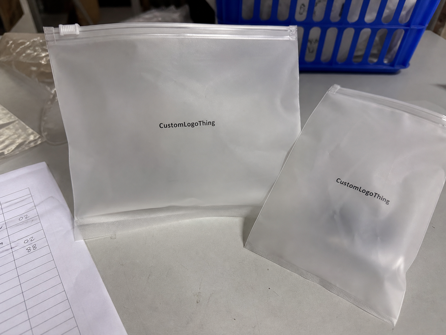
Most buyers stare at the bag and forget the insert. That is how a cosmetics Frosted Zipper Bags packaging insert checklist gets ignored until proofs feel cramped, the copy runs long, and the final pack reads cheaper than the product inside. Frosted zipper bags attract the first glance; the insert has to carry the practical message. If the pack is meant to feel deliberate, the insert needs to guide the customer, support the brand, and keep the contents organized without turning into a tiny poster full of noise.
For sampler kits, mini sets, and launch bundles, one missing line can create confusion fast. Is this a cleanser or a toner? Which item is the hero? Does the customer use it morning or night? That is why the insert checklist should be treated like a production tool, not a design exercise. Start with the content architecture before anyone debates color. Packaging only works when the message is clear enough to survive the real bag, the real product, and the real shipping process.
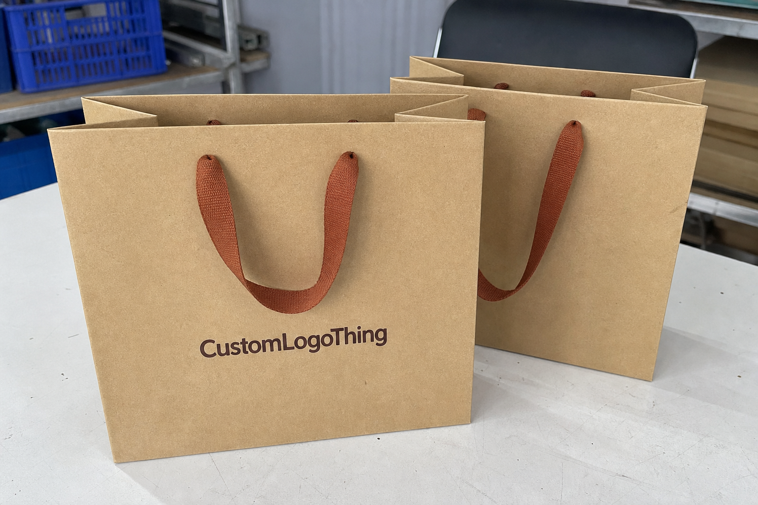
A frosted zipper bag can make product packaging look clean and premium. The insert is what keeps it from feeling random.
Cosmetics frosted zipper bags packaging insert checklist: what buyers miss first
The first miss is usually hierarchy. The insert is doing three jobs at once: it explains use, reinforces the brand, and makes a tight package feel organized. If one job takes over, the other two suffer. In practice, the weak point is rarely print quality alone. It is usually a poor layout, a mismatched format, or copy that tries to do too much in too little space.
Think about a skincare sampler with three vials, a mini spatula, and a folded card. If the card does not explain the order of use, the customer guesses. Guessing is not premium. It leads to questions, returns, and a pack that feels less considered than it should. For that reason, the checklist should begin with the pack contents, move to the customer action, and finish with the brand story. Not the other way around.
There is also the visual reality of frosted plastic. The surface softens edges and reduces contrast, so small type can look weaker than it did on screen. A line that looked crisp in the PDF can feel muddy once it sits behind the bag wall. Simple instructions, short sections, and strong contrast usually outperform decorative clutter. Buyers who work with retail packaging know this already: legibility beats ornament when space is limited.
Use the checklist mindset before you ask for a quote:
- What is inside the bag? List every component, including tools, cards, and bonuses.
- What must the customer know first? Prioritize usage order, warnings, and contents.
- What should the insert do for the brand? Add one strong line, QR code, or contact point.
- How will it fit physically? Check flat, folded, or tucked formats against the real bag size.
That seems basic because it is. The expensive mistakes usually come from skipping the basics. A lot of packaging buyers rush into visual mockups and forget that the insert has to clear the zipper line, respect the gusset depth, and sit comfortably with the actual fill weight. If the bag is already full, a thick insert can bow, curl, or push the contents into an awkward shape. Nobody calls that premium. They call it a production issue.
A good starting point is to define the pack before the artwork. If you are requesting samples or pricing for other branded pieces too, it helps to compare everything as one system. Browse Custom Packaging Products if you need matching materials across the line, then spec the insert to fit the same build logic.
How inserts work inside frosted zipper bag packaging
There are a few common insert formats, and each solves a different problem. A loose card is the simplest option. It works well for a short message, a contents list, or a QR code. A folded sheet gives more room for directions, ingredients, or bilingual copy. A belly band can hold a kit together and add a strong visual frame. A mini booklet makes sense when the set is more complex or the compliance text needs breathing room.
The usable inside space matters more than the outside bag size. That catches a lot of buyers off guard. A 6 x 9 inch Frosted Zipper Bag does not behave like a flat envelope. The zipper steals a little height. The gusset steals some width. The product itself takes the rest. So the right insert size is not the one that looks neat in a template. It is the one that survives pack-out without buckling.
Frosted plastic also changes the reading experience. The surface lowers contrast, and glare can make small type harder to scan under store lights or in photos. Type size, line spacing, and ink coverage matter more here than they would on a rigid carton. A dark, simple layout usually performs better than a busy one. If you are comparing the pack to custom printed boxes, remember that a bag insert has far less room to recover from a weak layout.
Here is a practical comparison:
| Insert format | Best use | Typical strengths | Main tradeoff |
|---|---|---|---|
| Loose card | Simple messages, QR codes, contents list | Low cost, fast to produce, easy to pack | Limited room for instructions or compliance text |
| Folded sheet | Multi-step directions, ingredients, brand story | More room without changing bag size | More folding labor and a higher MOQ |
| Belly band | Gift sets, launch bundles, sampler kits | Strong presentation and a tidy bundle look | Can add manual assembly time |
| Mini booklet | Regulated products, export sets, multi-language packs | Handles more copy cleanly | Higher print and finishing cost |
In some cases, the insert is optional. If the bag holds one obvious item with no compliance burden, a small card may be enough. But for gift sets, promos, regulated cosmetics, or any kit with multiple components, the insert is carrying real weight. It reduces support questions, keeps product packaging tidy, and gives the buyer a cleaner first read. Good branded packaging does not shout. It answers the obvious questions before anyone asks.
Cost, MOQ, and quote math for zipper bag inserts
Insert pricing is predictable once you know where the money goes. The main drivers are paper stock, print sides, color count, coating or lamination, fold complexity, and manual pack-out labor. A simple one-color card on standard stock can be inexpensive. A multi-panel insert with spot UV, soft-touch coating, and a tight folding sequence is a different animal.
For rough planning, a basic insert on decent stock may land around $0.04 to $0.10 per piece at higher volumes. Add more color, more copy, or finishing, and the number can move into the $0.12 to $0.25 range fairly quickly. Smaller runs cost more per unit because setup and handling do not shrink just because the order is small. That is packaging math, not bad luck.
MOQ rises when the insert needs unusual folds, odd sizes, or premium finishes. A layout that looks simple in a PDF can still require slower production and more labor at pack-out. That is especially true in retail packaging, where every folded card has to land the same way in every bag. Consistency costs money. So does rework.
Ask for the quote in pieces, not as one lump number:
- Setup fees for artwork prep, dieline work, or plate creation.
- Proof charges if you need printed or blank samples.
- Print price by quantity and print-side count.
- Folding or assembly cost if the insert is not flat.
- Freight terms so you know whether shipping is included or separate.
That last line matters more than people think. A low unit price can look excellent on paper and still collapse the margin once shipping is added to a bulky packed kit. Ask for landed cost, not only print cost. That is the number that actually affects the product line.
Copy changes after proof approval can also get expensive, especially if plates, layout, or finishing plans are already locked. One line of text may sound harmless. It is not always harmless. If the printer has already imaged plates or scheduled a finish pass, you may pay again for the change. This is where package branding needs discipline. The more polished the design, the more annoying the revisions become.
For companies comparing suppliers, quote the insert with the outer packaging at the same time. If you are ordering other materials through Custom Packaging Products, the supplier may spot a more efficient stock, fold, or finish that fits the bag and the budget better than a piecemeal order.
Process and lead time: from dieline to delivery
The production flow is usually straightforward: brief, dieline, copy review, proof approval, production, packing, and shipment. Straightforward does not mean fast. Lead time depends on how cleanly the project moves through each stage. If dimensions are unclear or the product content keeps changing, the schedule starts slipping before the file even reaches print.
Timing problems are easy to predict. Missing ingredient copy. No warning text. Slow legal review. Endless artwork revisions. Each one adds delay, and the delays stack. If the insert is part of a launch kit, plan it with the bag order instead of after it. Waiting to spec the insert until the outer bag is already approved is a classic way to create bottlenecks. The calendar does not care that the packaging is “almost done.”
Quick-turn digital printing works well for smaller quantities, test runs, and simple layouts. Offset printing usually makes more sense for larger volumes, richer color control, and lower unit cost over time. Specialty finishes add time. They also add risk. If the insert needs a coating or a premium tactile effect, assume a longer schedule than the base print run. Speed is possible, but it usually comes with a price.
For quality checks, ask whether the vendor follows relevant test or material standards. If the insert will ship in a bundled kit, it is reasonable to ask about transit durability and handling expectations. The ISTA test framework is a useful reference point for shipping performance, even if the insert itself is only one part of the pack. For paper sourcing, FSC-certified paper options are worth considering if your brand cares about responsible sourcing claims.
Build in one sample round when the insert carries compliance text, multiple languages, or anything that may trigger a review. A plain white mockup is not enough. You need to see how the card sits inside the actual bag with the actual product. That is the only way to catch fit issues before production. A flat digital proof hides a lot. The bag will not.
Step-by-step checklist for specing the insert
If you want fewer surprises, gather the right information before design starts. The checklist should begin with the physical pack, not the artwork. Give the vendor the bag size, fill weight, zipper location, and whether the insert sits flat, folds once, or travels inside the bag with the product. Those details determine the usable layout area.
Next, lock the copy. Lock it fully. Product name, directions, ingredients, warnings, QR code, batch field, and contact info should all be ready before design begins. Every missing line becomes a delay later. If the product is regulated, do not expect a pretty mockup to solve it. Copy comes first.
What to gather before the quote
- Bag dimensions and fill weight
- Insert format preference: card, foldout, band, or booklet
- Artwork files and brand colors
- Exact text for directions, warnings, and ingredients
- Delivery target and destination
Then pick the format that fits the job. One-panel cards work for simple messages. Folded sheets handle more copy. Multi-language inserts make sense for export sets or market-specific runs. A miniature booklet can be worth it if the product line has usage steps and disclaimers that need room. This is where packaging design should be practical, not ornamental.
Print spec matters too. Decide on paper weight, finish, color target, and trim tolerance early. For many cosmetic inserts, a 128-157 gsm coated sheet or a 14pt card is enough for a clean feel without turning bulky. If the bag is slim, going heavier can backfire. If the insert is meant to hold shape, a slightly thicker stock can help, but only if it still folds cleanly and packs flat.
Finally, approve a physical sample against the actual bag and product. A flat mockup on a white background hides fit problems. The real sample shows whether the insert curls, blocks the zipper, or lands in a visually awkward place. That is the sample that matters. For a launch kit, this step is not optional.
Common mistakes that make cosmetic inserts look cheap
The cheapest-looking inserts are usually not cheap because of the paper. They look cheap because the layout is wrong. Tiny type, low contrast, crowded margins, and poor hierarchy make the piece feel rushed. Frosted plastic makes those problems worse because it softens the print edge. If the customer has to squint, the insert has already lost.
Another common mistake is ignoring bleed, trim, and safe-area rules. Printers are not mind readers. If copy sits too close to the edge, it can get clipped, shifted, or look uneven after folding. That is not a “production surprise.” That is a layout problem. The same goes for mismatched bag size and insert size. A too-large insert buckles. A too-small one disappears. Both look accidental.
People also treat instructions and compliance text like filler. Bad idea. Those lines often carry the most value for the customer and the highest importance for the brand. If the insert is for skincare, fragrance, or any cosmetic product with caution statements, the legal and user-facing copy deserves space and contrast. The fancy headline does not matter if the practical information is unreadable.
Watch out for finishes that fail during folding or insertion. Heavy coatings can crack. Some metallic effects scuff. Soft-touch can lose its appeal if handling is rough. In custom printed boxes, a finish may have more protection. In a bag insert, it gets handled directly. The premium effect should survive pack-out, not only the sample photo.
Here is the short version:
- Use type that reads easily through frosted material.
- Respect trim and fold lines.
- Match insert size to the actual bag and product.
- Keep compliance copy visible, not buried.
- Choose finishes that survive handling.
Expert tips and next steps for cleaner packaging runs
Build one master spec sheet and stop letting every team work from a different version. Sales, design, and production should all quote the same bag size, the same insert format, and the same copy. If one team is improvising from memory, the order gets noisy fast. A clean spec sheet is boring. It also saves money.
Request two pricing options: one for the current insert format and one for a simpler backup. That gives you room to adjust if the budget tightens or if the launch needs to move faster. Sometimes the better option is not the fanciest one. It is the one that lets you ship on time without wrecking the margin.
Test one real pack-out sample and one shipping sample. The first shows fit. The second shows durability. Those are not the same thing. An insert that looks fine in a tray may shift, curl, or rub once the kit gets boxed and handled. That is why it helps to see the piece inside the actual bag, then inside the actual shipper. It is basic, but basic is where the savings live.
Audit the current insert with a hard eye. Check fit, copy, legibility, and finishing. Fix the weakest link before asking for another round of quotes. If the set is trying to support branded packaging and package branding at the same time, the insert has to earn its place. A pretty bag is fine. A readable, well-sized insert is better.
If you are building a new run, use the checklist before placing the order. That one habit prevents most of the avoidable mistakes: wrong size, wrong fold, wrong copy, wrong finish, wrong timing. Packaging does not need to be complicated. It does need to be exact.
What should be on a frosted zipper bag insert checklist for cosmetics?
Include bag size, fill weight, insert format, and the exact product contents so the layout fits the real pack. Add must-have copy early: usage instructions, warnings, ingredients, QR code, and any batch or lot fields.
Do frosted zipper bags need a different insert than clear bags?
Usually yes, because frosted material softens contrast and makes small type harder to read. Use stronger hierarchy, darker text, and simpler layouts so the insert still reads cleanly through the bag.
How do I estimate unit cost for a custom insert in zipper bag packaging?
Ask for pricing based on stock, print sides, fold complexity, finish, and total quantity, not just the design itself. Compare unit cost at multiple volumes because setup charges can change the math quickly on smaller runs.
What slows down lead time for cosmetic insert printing?
Missing copy, slow approvals, and repeated artwork changes are the usual culprits. Specialty finishes, multi-language layouts, and compliance review can add extra days or weeks.
What should I send when asking for a quote on frosted zipper bag inserts?
Send dimensions, quantity, artwork files, preferred finish, and your target delivery date. Also mention whether the insert needs folding, packing, or matching with a specific zipper bag size.