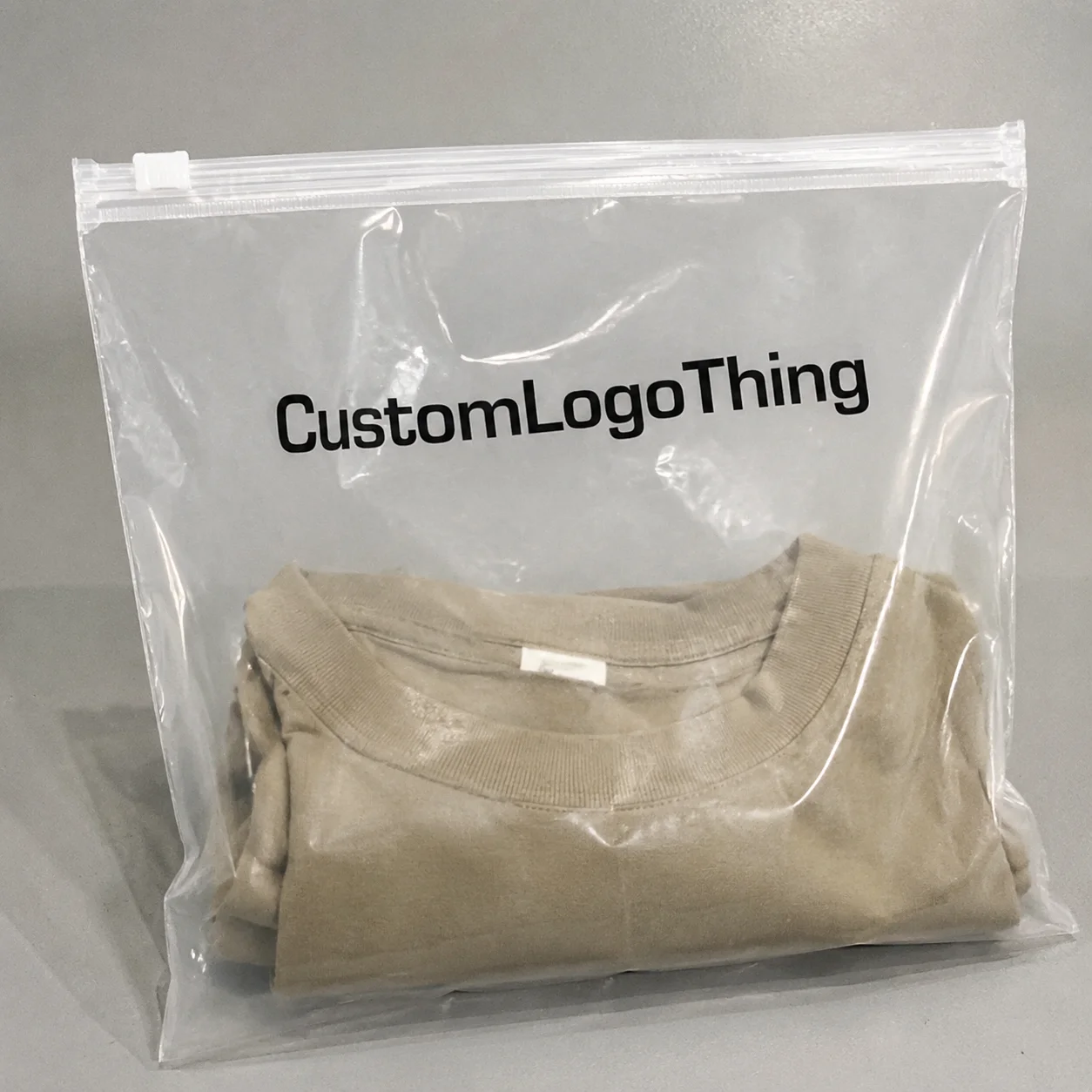
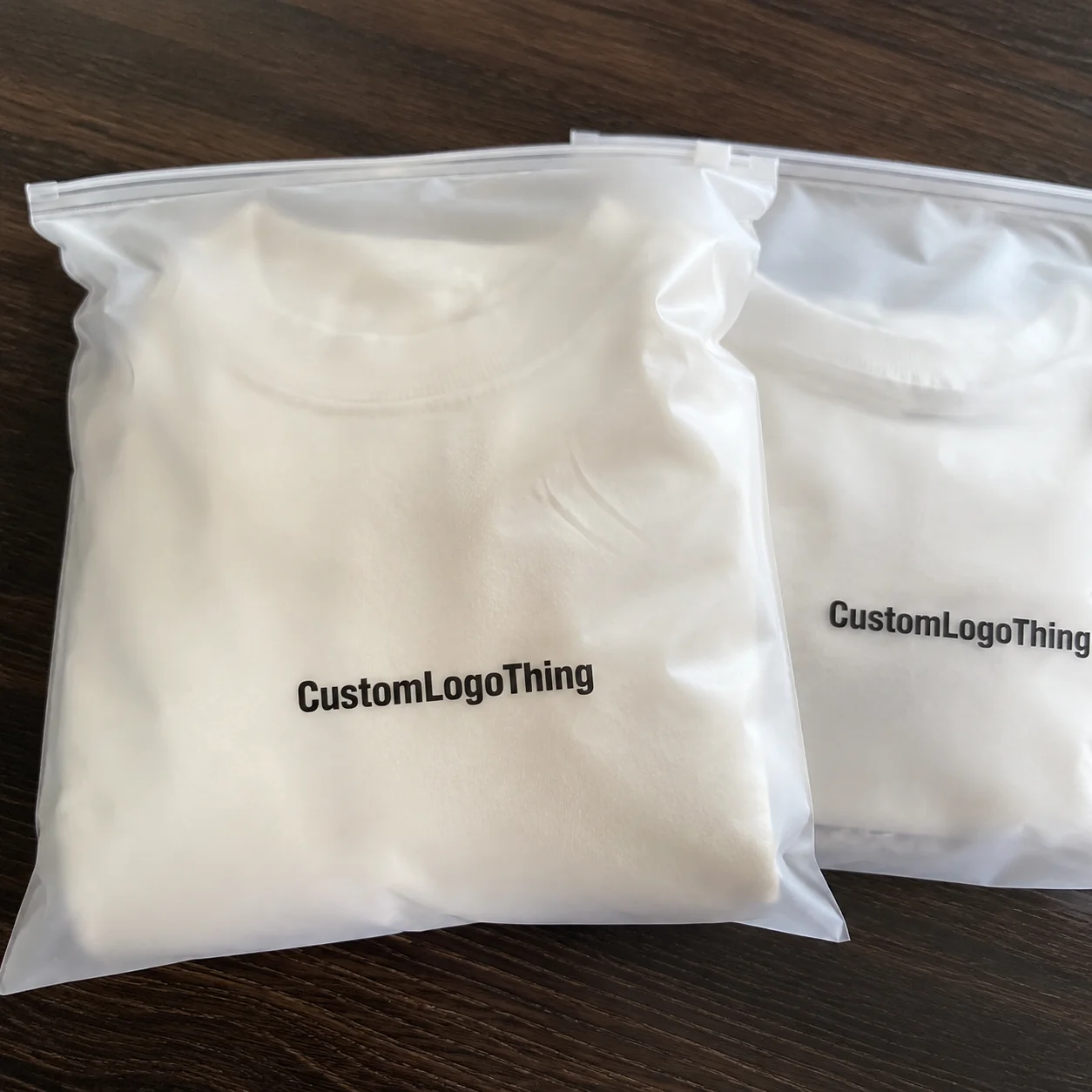
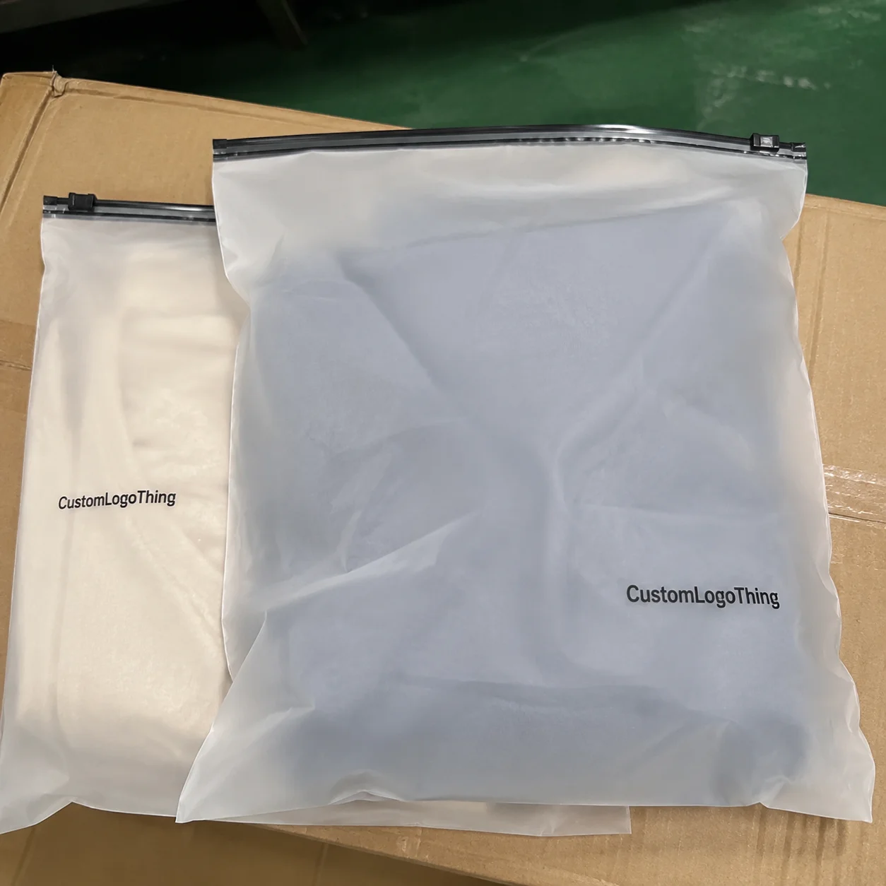
Florists usually spend their energy on stems, freshness, and the right ribbon. Fair enough. But the bag is not just packaging fluff. A Courier Mailer Bags for florists print comparison is really a test of whether your branding survives the trip from shop counter to customer door without coming back scratched, faded, or oddly cheap-looking. If the bag looks weak, the bouquet feels less premium before anyone even opens it.
That’s why “just print the logo on a white mailer” is not a serious buying plan. Print method, film thickness, surface finish, and moisture resistance all affect how the final bag looks in real use. The right choice matters even more when the order is photographed, carried in rain, or stacked with other deliveries. Packaging gets judged fast. Sometimes unfairly. Still judged.
Why print quality matters for florist mailers
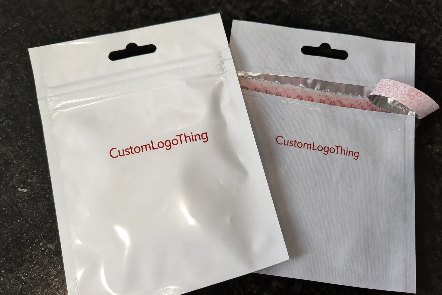
A mailer bag is often the first physical brand touchpoint after the bouquet leaves the shop. Before the customer notices the flower selection, they see the bag. If the logo is blurry, off-center, or too faint to read, the whole package feels less considered. Most customers won’t diagnose the problem. They just notice that something looks off.
In a Courier Mailer Bags for florists print comparison, “good print” is not just about color. It includes edge sharpness, logo consistency, text legibility, and whether the artwork still reads clearly after handling. Fine serif fonts, thin scripts, and tiny taglines are usually the first things to fail on film. If your brand depends on delicate details, the print method has to support that. Otherwise the design gets reduced to a smudge with ambition.
Florist packaging also lives a rougher life than people think. There is condensation from chilled product, damp hands during wrapping, friction from ribbon and sleeves, and repeated handling during delivery. A bag that looks perfect on day one but rubs off after one use is not premium. It is a return visit waiting to happen.
Practical check: if the logo only looks good in the mockup, you do not have a packaging decision yet. You have a pretty picture.
Brand trust is built in small moments. A crisp, durable mailer can make a mid-price bouquet feel more polished. A dull or scuffed one can make an expensive arrangement feel rushed. That is why packaging needs to be treated as part of the product, not a disposable afterthought.
Print method comparison for courier mailer bags
Most florist mailer projects fall into four print methods: flexographic printing, gravure, digital printing, and screen printing. Each has a useful range. Each also has a limit. Supplier samples tend to show the good side and quietly leave out the part where the order becomes expensive or the detail gets muddy. Helpful, if your goal is confusion.
| Print method | Best for | Typical strengths | Common drawbacks | Typical use case |
|---|---|---|---|---|
| Flexographic printing | Medium to large runs | Good unit cost after setup, reliable repeat orders, clean solid colors | Plate setup cost, less ideal for tiny detail than digital | Simple florist logo, one or two colors, recurring seasonal orders |
| Digital printing | Short runs, sampling, artwork changes | No plates, quick turnaround, flexible for test batches | Higher unit price, color depth can vary by film | New shop launch, holiday campaign, limited design test |
| Screen printing | Bold, simple graphics | Strong opacity, good for thick spot-color logos | Poor for gradients and fine detail, slower for complex art | Large logo on a plain bag, high-contrast brand mark |
| Gravure | Very high volume | Excellent consistency, rich coverage, smooth ink laydown | High cylinder cost, harder to justify for small or changing designs | Big-chain florist programs or high-volume packaging |
Flexographic printing is usually the practical middle ground for florists who reorder the same branded mailer. It handles solid fills well, works nicely with spot colors, and becomes cost-effective once setup is spread across a decent run. If the artwork is a clean logo and a few lines of text, flexo is often the best balance.
Digital printing is the easy fit for short runs. If you need 300 or 500 bags for a launch, pop-up, or seasonal test, it avoids plate fees and gives you room to change the design quickly. The tradeoff is unit cost. Convenience is not free, and the quote will remind you of that.
Screen printing works well for bold branding on a simple background. It gives strong ink coverage and can look excellent when the logo is large and uncomplicated. But gradients, photo-style graphics, and tiny lettering are weak points. If your florist brand uses a minimal mark, screen printing can be a good choice. If the logo has a lot of thin detail, it is usually the wrong tool.
Gravure is usually the overbuilt option for florist packaging. The print quality can be excellent, but the cylinder cost and setup complexity make it hard to justify unless volumes are high and the design stays stable. Most independent florists do not need that kind of machinery doing overtime.
One more comparison trap: ask whether the supplier is describing the actual bag print or just the outer packaging system. Some vendors mix in other packaging lines and use the same sales language for everything. If the bag itself is PE film, focus on the method used directly on that film. Offset printing can appear in broader packaging discussions, but it is not the main benchmark for a printed courier mailer bag comparison.
Bag specs that change print performance
Print method matters. Bag construction matters just as much. A sharp logo on weak film is still a weak package. In a Courier Mailer Bags for florists print comparison, material choice and finish can change the final result more than buyers expect.
Film thickness is one of the first specs to check. For florist mailers, 50–70 microns is common for lighter-duty packaging, while 70–100 microns gives more body and better resistance to puncture and abrasion. Thicker film often feels sturdier in hand, and it helps the print sit more cleanly on larger solid areas. It is not magic. It just gives the bag more structure to behave with.
Opaque white PE film usually gives the strongest color contrast and the cleanest logo visibility. That matters a lot if your brand uses light colors or a small mark. Translucent film can make pale branding look washed out. Colored film can work, but it needs to be tested against the exact logo colors so the result does not look muddy or flat.
Finish changes the way the packaging is perceived. Gloss tends to make colors look brighter and more energetic. Matte usually feels more restrained and premium, but it can soften the appearance of color a little. If the brand leans on deep black, red, or green, matte often needs stronger ink coverage to keep the design from looking tired.
Then there are the practical specs that decide whether the bag survives use. Seal strength, tear resistance, and moisture resistance are not decorative details. Florist deliveries are not dry cardboard shipments. They deal with condensation, chilled product, and handling that can be rougher than the packaging team would like to admit.
A useful field check is to test the bag against the conditions it will actually see:
- Wet hands after flower wrapping
- Condensation from chilled stems or cool storage
- Stacking in delivery vehicles
- Rubbing against ribbon, kraft sleeves, or box corners
- Repeated handling at the counter
For buyers who want a more formal check, packaging standards such as ISTA testing are useful. Not every florist needs lab-style validation. Still, the idea is simple: if the print scuffs or the bag deforms in normal handling, the spec is too optimistic.
Print finishing also matters. A protective layer or surface treatment can reduce abrasion, but it may change the feel, the appearance, and the cost. This is exactly where samples earn their keep. Catalog photos are helpful for sales. They are not helpful for deciding how a film behaves under real handling.
Price, MOQ, and unit cost tradeoffs
The lowest quote is not always the best quote. It just looks nice until the extra charges show up. Plate fees, freight, proofing costs, and reprint issues have a habit of appearing after the order is already underway. That is not a surprise. It is a pattern.
For florist mailers, pricing is driven by bag size, film thickness, print colors, total print coverage, and order volume. A one-color logo is usually cheaper than full-coverage artwork. Metallic inks, gradients, and multiple print passes push the price up. Nothing mysterious there. More complexity costs more money. The universe remains committed to this rule.
Typical unit pricing for custom printed PE mailers can look like this:
| Order volume | Simple 1-color print | 2-color or heavier coverage | Notes |
|---|---|---|---|
| 500 units | $0.45–$0.85 each | $0.60–$1.10 each | Digital or small-run flexo is common; setup costs matter most here |
| 1,000 units | $0.28–$0.55 each | $0.38–$0.75 each | A useful level for testing repeatability |
| 3,000 units | $0.18–$0.38 each | $0.25–$0.52 each | Often where flexographic printing starts to look attractive |
| 5,000 units | $0.14–$0.30 each | $0.20–$0.42 each | Better unit economics if artwork stays unchanged |
These are practical ranges, not promises. Freight, dimensions, and print area can move the final number. Still, the table is useful for spotting nonsense. If a supplier quotes unusually low at 500 units with heavy coverage and multiple colors, something is being left out. It may be setup. It may be quality. It is rarely nothing.
MOQ matters too. Lower minimums help smaller florists and seasonal testers, but the unit price usually climbs. Larger runs reduce the per-bag cost only if the design stays stable. If your packaging changes every month, a large order can turn into overstock with good intentions.
For comparison work, ask for pricing at 500, 1,000, 3,000, and 5,000 units. That shows the break point more clearly. Also ask for the full landed cost, not just ex-factory pricing. Freight, plate fees, and proof charges can shift the real number enough to change the decision.
If your floral business also ships gifts, candles, or add-ons, it can be worth comparing the mailer quote with Custom Poly Mailers for non-floral orders or bundled ecommerce packaging. Sometimes a consistent packaging family makes more sense than a one-off order that never quite matches the rest of the brand.
Artwork, proofing, and production timeline
The production process is where vague orders get punished. Start with clean artwork. That means a vector logo, correct brand colors, safe margins, and the supplier’s bag template or dieline. A random JPEG sent with “please make it nice” is not a file spec. It is a cry for help.
Color matching should be discussed early. Ask whether the supplier works in CMYK, spot color, or both. CMYK can be fine for many designs, but spot color is usually better when the brand needs a tight match or a strong one-color logo. If the florist identity depends on a specific green, blush, or burgundy, do not assume the printer will recreate it identically on PE film every time.
Proofing should confirm placement, bleed, seal zones, and whether small text survives folds or gussets. It should also confirm where the print is applied. Surface treatment, film layer, and print side can affect durability. Ask directly. That saves everyone from finding out too late that the logo sits in the wrong place or wears faster than expected.
Sampling is worth the time. A digital proof does not show how ink actually behaves on the film. A physical sample or pre-production sample lets you check whether the logo looks crisp in shop lighting, holds up at cooler temperatures, and still reads well beside the bouquet. That is the real test.
Typical lead times depend on the print method and whether the bag is stock or custom-made:
- Digital printing: often 5–10 business days after proof approval
- Flexographic printing: often 10–15 business days after approval
- Gravure: often longer, especially if cylinders must be made
If the supplier already has the size and thickness in stock, production moves faster. If they need to source a specific film, color, or seal style, add time. Seasonal floral peaks are the worst time to discover that your order is sitting behind everyone else’s holiday panic.
For buyers with sustainability requirements, verify recycled-content or sourcing claims carefully. If a supplier mentions certified sourcing, ask for documentation and check it against recognized references such as FSC when relevant to the broader packaging program. Vague green language is cheap. Documentation is not.
Mistakes that skew print comparisons
Most mistakes are not dramatic. They are small, annoying, and expensive, which is somehow worse.
Choosing the prettiest mockup instead of the method that reproduces the artwork cleanly. A polished render can make any print process look premium. Real film behaves differently. Always compare the actual production method, not the sales image.
Ignoring contrast. A dark logo on a dark bag can disappear fast. The brand should still be readable from a few feet away, under store lighting, and in delivery photos. If it is not, the design is working too hard to be mysterious.
Picking a finish without testing abrasion. Gloss can scuff. Matte can mark if the coating is weak. Neither is automatically better. It depends on handling. Florist packaging is touched by wet hands, tape, ribbon, and impatient delivery schedules. That is not a gentle environment.
Skipping physical tests. Put a bouquet in the bag. Add moisture. Carry it. Set it down. Rub it against another carton. If the print still looks clean after that, the spec is probably usable.
Not confirming the print side or layer. On some constructions, print placement affects wear resistance. If the artwork is exposed to the wrong side of the film or the wrong treatment, it can look worn before the customer even opens the order.
Forgetting fit. A bag has to fit the product without crushing stems or straining the seal. If the bouquet bends the mailer too much, the print comparison is irrelevant. The package failed before the branding could even be judged.
How to compare suppliers cleanly
If you want a supplier comparison that actually helps, keep the variables tight. Same bag size. Same thickness. Same print area. Same quantity. Same artwork file. Otherwise you are comparing quote structure, not packaging value. That usually leads to a lot of spreadsheet activity and very little clarity.
- Request quotes using identical specs.
- Ask for printed samples or photos of similar work on PE mailers.
- Compare unit cost, MOQ, setup fees, lead time, and reprint policy side by side.
- Check whether the supplier offers spot-color matching or only approximate CMYK.
- Test one sample with a real bouquet before ordering full volume.
Also ask about run-to-run consistency. If your brand uses seasonal campaigns, the ability to repeat the same green, blush, or black matters more than one perfect sample. The first bag is easy. The fourth reorder is where print discipline shows up.
For florists, the best choice is usually the one that balances brand impact, durability, and total landed cost. Not the cheapest quote. Not the fanciest finish. Not the supplier with the best-looking render. The bag has to work in a damp shop, on a moving delivery route, and in customer photos. That is the real job.
In practice, flexographic printing often wins for repeated branding. Digital printing is better for short runs and test campaigns. Screen printing can be strong for simple bold logos. Pick the process based on how the bag will actually be used, not just how it looks on a screen. That is the cleanest way to buy with less regret.
Which print method is best for courier mailer bags for florists print comparison?
For simple, repeated branding, flexographic printing is usually the best balance of cost and consistency. For small runs or fast artwork changes, digital printing is easier, but the unit price is often higher. For bold logos with minimal detail, screen printing can work well.
What bag material gives the sharpest print for florist mailers?
Opaque white PE film usually gives the strongest color contrast and the clearest logo visibility. Gloss finishes make colors look brighter, while matte finishes feel more premium but can soften the visual impact slightly. Thin or translucent films can make print look less crisp, especially with light-colored logos.
How do I compare pricing for printed courier mailer bags?
Compare the same bag size, film thickness, print colors, and quantity across suppliers. Ask for a full landed price, including setup, freight, and any plate or proof fees. Check the price at multiple quantities because unit cost can drop fast after certain volume thresholds.
How long does production usually take for custom printed florist mailer bags?
Lead time depends on print method, artwork approval, and whether the bag is stock or custom-made. Sampling and revisions add time, so build that into the schedule. If you have a busy floral calendar, order early so the schedule does not become a problem later.
What should florists test before placing a bulk order?
Test whether the bag fits your bouquet sizes without crushing stems or stressing the seal. Check print visibility in real shop lighting and delivery conditions. Confirm moisture resistance, seal strength, and whether the artwork rubs off during handling.