Create Custom Clothing Tags that do more than hang from a seam. The right tag changes how a garment is read before the customer inspects the fabric, the stitching, or the cut. A small rectangle of board can make a plain tee feel considered, or make a premium jacket look underdeveloped. That effect is not mysterious. Texture, proportion, print quality, and attachment all alter perceived value in the first few seconds of contact.
That is why tags should be treated as part of the product system, not as a separate print job. They support pricing, reinforce positioning, and help the package tell one consistent story. If the apparel is meant to feel elevated, the hang tag cannot look disposable. If the brand is trying to signal durability, the tag needs the same discipline in material and print quality that the garment has in construction.
Create custom clothing tags that change first-touch perception
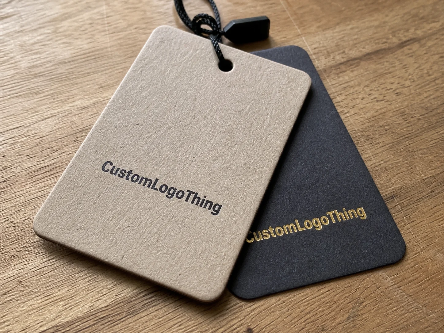
Shoppers notice details long before they can explain them. A tag’s stiffness, edge quality, type clarity, and finish all contribute to that first impression. A smooth, heavily coated card with crisp foil reads differently from an uncoated stock with a simple black mark, and each choice pushes the product into a different price tier in the buyer’s mind. That is one reason two garments made from similar fabric can feel dramatically different at retail.
The tag also plays different roles depending on the channel. In DTC fulfillment, it may arrive inside a shipper box and share space with tissue, inserts, and the rest of the packaging stack. In retail, it has to survive handling, hanger friction, lighting, and repeated scanning by staff and shoppers. In wholesale, it often needs to stay legible after the item has been moved, folded, or restocked more than once. Those conditions change how the tag should be built.
For brands selling into boutiques, department stores, or their own online storefront, the best tags do three things at once. They identify the item, support the visual identity, and fit the product tier without trying too hard. That balance matters. Too plain, and the piece feels unfinished. Too decorated, and the tag starts competing with the garment for attention.
“A tag that looks generic on a premium garment creates friction. The customer may not articulate it, but they feel it immediately.”
Practical packaging teams usually think about tags alongside boxes, inserts, tissue, and labels rather than in isolation. That is the right approach. A tag with the same tone and structure as the rest of the branded packaging feels intentional. A tag that seems borrowed from another product line feels like a compromise.
It helps to define the role before the design starts. Is the tag mainly an identity piece? Does it need barcode space? Is it carrying pricing, product details, or a short brand statement? The answer determines the layout, and the layout determines whether the tag reads like a retail tool or a branded accessory.
What custom clothing tags are and how they work
People often use the word “tag” to describe several different components, but the distinctions matter. The external hang tag is the branded piece attached to the garment. The care label sits inside the clothing and carries fiber content, washing instructions, and origin information. Size labels are functional identifiers. When a brand wants to create Custom Clothing Tags, it is usually focused on the external piece, but the same design logic should extend to the rest of the labeling system.
The tag moves through the supply chain in stages. It may be printed, finished, packed, shipped to a fulfillment center, attached at the factory, or applied later by a warehouse team. Once the item is on the rack or in the box, the tag changes again. It becomes a merchandising tool, a pricing signal, and a proof point that the product belongs in its category.
The four variables that shape the final result are size, material, print method, and attachment. Size controls how much information fits without crowding. Material affects stiffness, durability, and tactile feel. Print method determines color accuracy, edge sharpness, and the clarity of small type. Attachment determines how the tag behaves in the hand and how it sits against the garment.
Content hierarchy is another place where brands either solve the problem or make it worse. A tag can carry a logo, product name, SKU, price, barcode, size, country-of-origin data, and a short message. That does not mean all of it belongs on the front. The cleaner solution is often to split the information across two faces or use a fold style that gives room for both branding and utility. If every line competes for attention, nothing is easy to scan.
For brands building a broader system across Custom Labels & Tags, consistency matters as much as the individual tag design. The hang tag, woven label, printed care label, and outer carton should feel like part of the same visual family. If they do not, the packaging looks assembled instead of designed.
Material, finish, and attachment choices that change the result
Material is the first decision that changes how the tag feels in the hand. Coated paper gives sharp print and strong color reproduction. Uncoated stock feels warmer and less polished in a good way, especially for brands that want a natural or heritage tone. Kraft stock pushes the message further toward earthy and low-frills. Textured board adds depth without depending on heavy ornament. Recycled paper works well when sustainability is part of the brand story, although it usually prints with a softer, less saturated look than a coated stock.
For apparel tags, thickness matters as much as surface. A flimsy tag can look cheap even if the print is excellent. Many buyers start in the 14pt to 18pt range for paperboard, though heavier stock may be right for luxury goods or giftable items. The right weight depends on the garment, the finish, and how much handling the tag will take before the sale.
Finish changes both the visual signal and the practical reading experience. Matte coating cuts glare and helps text stay legible under store lighting. Gloss makes color feel brighter, but it can flatten small type if the layout is already crowded. Soft-touch lamination creates a velvety surface that often reads as higher-end, though it can mute fine details if the artwork is too delicate. Foil stamping, embossing, and spot UV can create hierarchy, but each one raises setup complexity and increases the risk of registration problems if the art is not clean.
Attachment hardware deserves the same attention. Cotton twine feels familiar and works across many product categories. Waxed cord adds a slightly more polished look. Recycled paper string keeps the presentation aligned with a natural or sustainability-focused brand. Plastic loop pins are efficient in volume and useful when speed matters more than presentation. Safety-pin styles are more common in accessories or hardgoods than in polished apparel programs. The choice is not about using the fanciest option. It is about matching the hardware to the garment, the brand tone, and the way the item will be handled.
In practice, the best-performing combinations are usually simple. A thick uncoated stock, one or two ink colors, a clean die cut, and a well-chosen cord can look more expensive than a crowded tag with multiple finishes. The restraint is part of the signal. Premium rarely needs to shout.
Here is a practical comparison of common tag builds:
| Option | Typical Use | Cost Impact | Visual Effect |
|---|---|---|---|
| Coated paper | General apparel, bright logo work | Low to moderate | Sharp, clean, commercial |
| Uncoated or textured board | Premium basics, heritage brands | Moderate | Tactile, understated, refined |
| Kraft stock | Natural, eco-positioned lines | Low to moderate | Organic, earthy, casual |
| Soft-touch with foil | Higher-ticket apparel, giftable items | Higher | Luxurious, strong shelf presence |
| Recycled specialty stock | Sustainability-led branding | Moderate to higher | Natural, credible, modern |
The economics are direct. A premium finish raises perceived value, but it also adds proofing, setup, and handling costs. A $28 tee usually does not need foil and soft-touch unless the rest of the product story supports it. A $120 jacket can carry that treatment more naturally because the tag is reinforcing a higher margin and a more deliberate presentation. The tag should fit the price architecture, not fight it.
For brands that care about sourcing claims, the FSC standard is a useful reference for paper provenance. If the tag needs to survive shipping abuse or heavy retail handling, ISTA guidance is a better benchmark than guessing at durability from a digital proof. A good mockup can hide weak construction. A printed sample cannot.
Production steps and turnaround for custom clothing tags
Tag production is straightforward on paper and slower in reality if the brief is incomplete. The usual sequence is spec collection, artwork submission, proof review, approval, printing, finishing, and packing. The friction appears between proof and approval. That is where missing barcode data, low-resolution logos, die-line mismatches, and impossible fold placements show up. A small oversight can delay an otherwise simple order.
A standard run for custom clothing tags often takes about 10 to 15 business days after proof approval when the job uses common stock and standard finishing. Custom die shapes, foil, embossing, multiple folds, or hand assembly can push the timeline into the two-to-three-week range. If paper stock is backordered or the order needs a rush window, that window can expand further. Rush work is possible, but it narrows material choices and usually raises cost.
The fastest way to keep the schedule tight is to lock the details before the quote is finalized. Quantity, trim size, stock, finish, attachment method, barcode data, delivery destination, and copy all need to be settled early. If the team is still deciding whether the tag should be square or narrow, or whether the barcode belongs on the front or back, the printer has to hold the job in limbo. That costs time.
File readiness matters more than many buyers expect. Vector artwork is the baseline, not a premium extra. Logos should be supplied cleanly, type should be outlined or embedded correctly, and all color references should be consistent. If the tag will be coordinated with Custom Packaging Products, the branding system should be built from the same logo set, color target, and type hierarchy. Otherwise the tag may look right in isolation and wrong beside the carton or insert.
Quality control is not just a final inspection. It begins at the proof stage. Check spelling, trim margin, fold positions, barcode quiet zones, and the consistency of any repeated elements. Confirm that the attachment hole does not cut into critical copy. If the piece includes a QR code, scan it from a printed sample, not just a screen proof. If the tag uses specialty finish, verify that the finish still leaves the text readable at arm’s length.
Packaging teams sometimes treat tags as low-complexity items because they are small. That is a mistake. Small formats compress the risk. There is less room for layout errors, less room for color drift, and less room for sloppy typography. When the format is small, the quality has to be cleaner, not looser.
Custom clothing tag pricing: unit cost, MOQ, and quote drivers
Pricing usually comes down to fixed setup cost versus run size. That is why a 500-piece order can feel expensive per unit, while a 5,000-piece run often looks far more efficient. For standard paper tags, buyers commonly see larger-volume pricing around $0.12 to $0.35 per unit, depending on size, print coverage, stock, and finish. Specialty effects move the number upward quickly. Foil, embossing, and unusual shapes are the usual cost accelerators.
MOQ exists because every order carries fixed production work. A custom die has an upfront cost. A proof may be included or billed separately. Assembly can be manual if the tag includes string, loop pins, multiple layers, or a folded configuration. None of that is unusual. It is simply how printed packaging works when it is built to spec instead of pulled from stock.
The main quote drivers are easy to list and easy to overlook:
- Size and shape, especially if a custom die is required
- Paper weight and surface texture
- Ink coverage and number of printed sides
- Special finishes such as foil, embossing, and spot UV
- Attachment hardware and manual assembly
- Proofing, variable data, and rush scheduling
Line-item comparison matters more than headline price. One supplier may quote a lower unit cost but add charges for die cutting, stringing, proofing, packing, and freight. Another may show a higher unit price and include the same work in one figure. Those quotes are not equivalent. If the buyer only compares the first number on the page, the real cost can be misleading.
Minimum order quantity should also be read in context. Some vendors can produce smaller test runs with digital print or simplified finishing, but the unit cost will be higher. That can still be the right move if the garment line is new, the market is untested, or the design is likely to change after launch. A small pilot run often costs less than correcting a full order that misses the brand tone.
For Brands That Sell across both retail packaging and direct-to-consumer channels, the tag budget should be viewed alongside the rest of the packaging stack. If the garment margin is thin, the tag needs to earn its place by supporting conversion, not just by looking nice in a spec sheet. If the item is giftable or positioned as premium, the tag can do more work in establishing value and making the package feel complete.
Common mistakes and expert tips that keep tags readable
The most common mistake is crowding the layout. Too much copy, too many type sizes, too many finishes, and too many competing messages create a tag that looks busy before it looks clear. A clothing tag is a small communication surface. Hierarchy matters more than ornament. The customer should see the brand, the product, and any essential information without hunting for them.
Low contrast is another frequent problem. Pale gray text on tan stock may look elegant in a design file and disappear under store lighting. Thin script fonts can break down once trimmed or folded. Metallic foils can look refined in a mockup and become hard to read if the background is similarly reflective. The cleanest test is still the oldest one: step back. If the key details are not readable from arm’s length, the layout needs adjustment.
Technical tolerance also matters. Barcodes need quiet zones. Bleeds need enough margin to survive trim variation. Fold lines should not cross product names or care statements. If the tag includes a QR code, test it on paper. If it includes a matte finish, verify that the code still scans cleanly. If the item will be packed with inserts, stickers, or tissue, make sure the tag does not clash visually with the rest of the package.
Those checks sound basic because they are basic. The difference is that experienced Buyers Actually Use them.
- Confirm final size and orientation before artwork starts.
- Keep the logo in vector format and outline fonts.
- Leave clear safe margins around text, barcode, and fold lines.
- Approve one color reference so matching stays consistent.
- Review a printed proof whenever finish or substrate changes.
There is a simple rule worth keeping in mind: readability beats novelty. A tag that communicates clearly will support the garment for longer than a tag that only looks decorative. That holds whether the item sits on a boutique rack, moves through an ecommerce return box, or ships as part of a larger branded packaging set.
Next steps before you request a quote
Before asking for pricing, gather the production details that actually drive the job. Quantity. Trim size. Stock preference. Finish. Attachment method. Deadline. Copy requirements. If the tag needs compliance information, include that too. A complete brief gets a cleaner quote and fewer revision cycles.
Artwork should be production-ready, not conceptual. A vector PDF or AI file is the safest format for print. Include logos, color references, barcode files, and any sample references that show the intended finish or tone. If the brand is comparing two directions, send both. That gives the printer a clear basis for pricing the correct build instead of guessing at a compromise.
A pilot run makes sense when the design is new, the finish is complex, or the garment line is still being tested. That run is not only about print quality. It checks feel, legibility, assembly, and whether the tag behaves properly beside the actual product. It is especially useful when the tag needs to sit alongside Custom Labels & Tags and broader Custom Packaging Products without looking mismatched.
The larger point is simple. The tag is not an accessory in isolation. It is part of the packaging system, part of the merchandising story, and part of the customer’s first physical contact with the brand. If the brief is handled with discipline, the result is usually better on press and better in the customer’s hand.
That discipline shows up in the final product. Fewer revisions, fewer delays, cleaner print, and a tag that fits the garment instead of fighting it. That is the difference between a piece of paper with a hole in it and a branding element that actually earns its place on the product.
How do I create custom clothing tags with a low minimum order?
Use standard sizes, common paper stocks, and simple shapes to keep setup costs down. Avoid specialty finishes and manual assembly if the goal is a smaller MOQ and a lower unit price. Digital or short-run production is often the best fit for test launches and seasonal runs.
What file do I need to create custom clothing tags for print?
A vector PDF or AI file is the safest option because it keeps logos and type sharp. Outline fonts, keep images high resolution, and build in bleed and safe margins. If the tag includes a barcode or QR code, include the final data in the file package so it can be checked before print.
How long does it usually take to make custom clothing tags?
Standard printed tags are often completed in about 10 to 15 business days after proof approval. Custom shapes, foil, embossing, folds, or manual assembly can extend that schedule into the two-to-three-week range. Clean artwork and fast proof approval usually make the biggest difference.
Which materials make custom clothing tags look more premium?
Heavier uncoated stock, textured board, and soft-touch finishes usually feel more upscale than thin coated paper. Foil, embossing, and spot UV can add presence when used with restraint. The right choice depends on the garment price point, the brand tone, and how much handling the tag will get.
How can I compare quotes without missing hidden costs?
Ask whether setup, dies, proofing, finishing, assembly, packing, and shipping are included. Compare each quote line by line so you are looking at the same scope. The cheapest unit price is not always the lowest total cost once the extras are added.