Cuffed Knit Beanies Logo Placement Guide: What Buyers Notice First
A cuffed beanie looks easy until the logo goes on it. Then the “simple winter hat” becomes a folded, stretchy, ribbed product with a brand mark fighting gravity, yarn texture, fold depth, and human heads. Delightful.
That is why a practical Cuffed Knit Beanies logo placement guide matters. Buyers do not need a pretty mockup that only works on a flat screen. They need a logo that looks centered, readable, and intentional after the beanie is folded, packed, worn, adjusted, and washed.
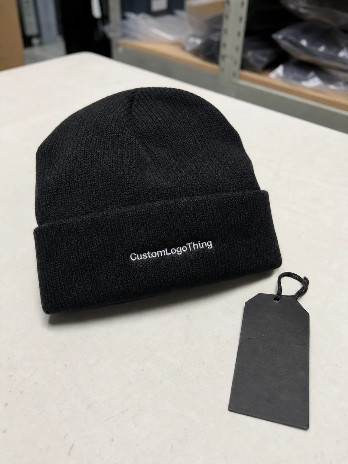
The cuff is the folded band at the bottom of the beanie. It is the most common decoration area because it gives the logo a visible frame, keeps branding above jackets and scarves, and usually provides enough depth for embroidery, woven labels, and leather-style patches. Many standard cuffs measure about 2.5 to 3.5 inches high when folded. Shallow fashion cuffs and deeper workwear cuffs can sit outside that range, so do not assume. Measure the actual blank.
Logo placement gets tricky because the cuff is not a flat cap panel. Acrylic rib knits, wool blends, cotton blends, recycled yarns, and chunky constructions all behave differently. The ribs open when stretched. The fold can relax in packing. The bottom edge may roll forward if the beanie is handled loosely or the cuff is shallow.
There are three centers worth checking: measured center, visual center, and worn center. Measured center is what the ruler says across the folded cuff. Visual center is what looks balanced in a product photo. Worn center is what looks right on a head after the knit stretches and the cuff settles. Good placement balances all three. Bad placement worships the ruler and ignores the wearer.
The goal is not to make every beanie mathematically perfect. Knit goods have tolerance. The goal is to control the variables that can be controlled: logo size, vertical position, decoration method, fold depth, artwork detail, and inspection standard.
How Logo Placement Works on a Folded Cuff
Most cuffed beanie logos sit at the front center of the cuff. It is familiar, balanced, and easy for buyers to approve. It works for corporate programs, school spirit, outdoor crews, team merchandise, staff uniforms, and most promotional orders.
That does not make it automatic. A snug beanie stretches the logo area more than a slouchy beanie. A short cuff gives less vertical space than a deep folded cuff. A chunky rib may make tiny lettering look broken. A wide wordmark can wrap too far around the head and lose impact from the front.
Front-center placement is the safest default. Off-center front placement can look more retail, especially with a small woven label or tonal patch. Side cuff placement works when the brand wants subtle visibility. Back cuff placement is less common, but it can make sense for event staff, low-key retail branding, or a secondary mark.
For direct embroidery, the logo is usually centered left to right on the cuff and positioned with breathing room above and below the stitched area. That spacing matters. If a 2-inch tall logo is forced onto a 2.5-inch cuff, the finished piece will look cramped even if the machine can technically sew it. “Technically possible” is not the same as good.
A tall logo needs a taller cuff. A wide logo may need a shorter horizontal version. Long wordmarks often work better with reduced height and simplified details. Detailed emblems may reproduce more cleanly as a woven label, printed patch, faux leather patch, or debossed leather-style patch. Dense embroidery across ribbed knit can look heavy and may reduce stretch in that area.
Orientation also needs a quick check after folding. The decoration must read correctly when the cuff is turned up, not when the beanie body is unfolded on a production table. This sounds obvious. It still gets missed.
For most adult cuffed beanies, a centered logo around 2 to 2.5 inches wide is a reasonable starting point. Smaller icons may sit closer to 1.25 to 1.75 inches. Larger patches can work on deep cuffs, but the patch should not crowd the fold line or the lower edge.
Key Factors That Decide the Best Beanie Logo Position
Cuff height comes first. A shallow cuff may only support a small emblem, short wordmark, or narrow woven label. A deeper cuff can handle a larger embroidered logo or patch without looking squeezed. Many embroidery layouts on standard cuffs stay under 1.5 inches tall. Width often lands between 1.5 and 2.75 inches, depending on the logo shape.
Logo shape comes next. Square and circular marks usually sit well at front center because they balance naturally on the cuff. Long wordmarks need more control. If the logo gets too wide, it starts wrapping toward the side of the head. From the front, only the middle of the mark reads cleanly. That is not branding. That is a partial sentence.
Small text deserves suspicion. Taglines, registration marks, thin outlines, tiny dates, and legal copy often close up in thread. Thread has physical thickness. Ribbed knit has valleys. Combine the two and fine detail can disappear fast. If the artwork needs a magnifier on the proof, it probably needs simplification before it goes near a beanie.
Material changes the result. Acrylic knit is common because it is warm, affordable, and generally decorates well when the logo is sized properly. Cotton blends can feel softer but may stretch and recover differently. Wool blends add warmth and a more premium hand, though the surface texture can make small details less crisp. Chunky rib knits look great on the shelf, but deep ribs are not friendly to tiny lettering.
Decoration method should follow the artwork, not the buyer’s first impulse. Direct embroidery gives a classic sewn look and works well for bold marks. Woven labels hold fine detail and sharp edges better. Faux leather patches add structure and a premium outdoor or workwear feel. Printed patches help with full-color artwork, gradients, and logos that would become too dense in thread.
| Decoration Method | Best Use | Typical Buyer Consideration |
|---|---|---|
| Direct embroidery | Simple logos, bold lettering, one to six thread colors | Often priced by stitch count; dense fills can add cost and stiffness |
| Woven label | Small text, fine lines, retail-style branding | Good for crisp detail; label size must fit the cuff height |
| Faux leather patch | Outdoor, workwear, premium gifting | Needs clean stitch space; custom shapes may add setup cost |
| Printed patch | Full-color logos, gradients, complex artwork | Preserves color detail; edge finish affects durability and appearance |
Use case matters too. Corporate giveaways usually need centered placement and strong readability. Retail brands may choose a side cuff, smaller mark, or tonal patch because subtle branding can feel more wearable. Outdoor crews, school programs, and event staff often need higher contrast so the logo reads from a distance.
Brand guidelines still apply, but they may need a beanie-specific version. Minimum clear space, approved simplified marks, thread color references, and Pantone targets all help. If the only approved logo contains a tiny tagline under a delicate icon, ask for an alternate mark before production starts. Protecting the brand sometimes means using less of it.
Practical rule: choose the decoration method that makes the logo legible on ribbed knit, not the one that looked best on the original brand deck.
Step-by-Step Placement and Proofing Process
Start with the artwork file. Vector art is preferred for logos: AI, EPS, or a clean PDF with outlined fonts. A low-resolution PNG may be fine for a rough mockup, but it is not enough for accurate embroidery digitizing or patch production. If the file is fuzzy on screen, it will not magically become sharp in thread.
The first review should answer three questions. Is the small text necessary? Does the logo need simplification? Should the mark be embroidered directly, converted into a patch, or built as a woven label?
Next, measure the cuff before decoration decisions are locked. Check the folded cuff height, available flat width, fold depth, and any seam or construction feature that could interfere with placement. Some beanies have a rear seam that changes how the cuff lays. Some have wide ribs that require adjusted stitch density or underlay. Some fold beautifully on a table and shift once worn. Useful information, unfortunately.
Choose the decoration size from the actual beanie proportions, not the screen mockup alone. A logo that looks modest on a desktop proof can feel huge on a narrow cuff. On many cuffed beanies, a front logo between 2 and 2.5 inches wide is a comfortable starting point, but logo shape and cuff depth can change that quickly.
The proof should show the logo on the folded beanie with measurements from the cuff edges and centerline. A vague mockup is not enough. A useful proof might specify: logo centered horizontally on front cuff, sized to 2.25 inches wide, placed 0.5 inch above the lower cuff edge, with the cuff folded to 3 inches high. Now production has instructions, not vibes.
Sampling protects the order. An embroidery sew-out or physical pre-production sample is especially useful for fine detail, high quantities, premium retail programs, unfamiliar beanie styles, and strict brand standards. Knit goods can reveal puckering, density problems, patch stiffness, color contrast issues, and alignment shifts that a flat PDF will never show.
Review the sample from several angles. Check centering, readability, thread density, puckering, patch stitching, edge finish, and color contrast. Then put it on a head form or an actual wearer. Flat approval is only half the job. The worn view shows whether the logo sits where people will actually see it.
Approve production only after confirming placement, size, thread or patch color, logo orientation, fold style, packing presentation, and tolerance. A small amount of variation is normal on stretch knit fabric. What you want is controlled variation, not a surprise box of almost-right hats.
Cost, Pricing, MOQ, and Unit Cost Considerations
Logo placement by itself usually does not drive cost as much as decoration method, stitch count, patch material, order quantity, color count, sampling, and handling. A front-center logo and a side-cuff logo may price similarly if the setup is standard. A custom-shaped patch, metallic embroidery thread, or dense 12,000-stitch logo will matter more.
Direct embroidery pricing is often tied to size and stitch count. Larger fills take more machine time. Multiple thread colors add changeovers. Metallic thread can require slower running speeds. Dense designs may need more careful hooping to reduce distortion. For ordinary promotional beanie orders, decoration might add roughly $1.25-$3.50 per unit depending on quantity, stitch count, and supplier setup. Specialty patches, premium blanks, and complex packing can push the total higher.
Patch and label costs follow different math. Woven labels can be efficient for small detail once the label is set up, especially at larger quantities. Faux leather patches create a premium look at moderate cost, but custom shapes, debossing, laser engraving, edge finishing, and stitch-down labor all affect pricing. Printed patches can preserve full-color logos, though buyers should review durability, finish, and edge treatment before approving them.
MOQ means minimum order quantity. It depends on the blank beanie, decoration method, custom materials, and whether the project uses stock colors or fully custom knit production. Stock beanie programs may support lower quantities, often around 48-144 pieces depending on the supplier and decoration type. Custom knit colors, custom labels, special patch tooling, or private-label packaging may push MOQ into several hundred pieces or more.
Low MOQ usually means higher unit cost because digitizing, setup, sampling, and handling are spread across fewer pieces. That is not a conspiracy. It is arithmetic. A 72-piece order and a 1,000-piece order may need similar art review and machine setup, but the larger order spreads those fixed costs more efficiently.
Before requesting a quote, prepare the beanie style, quantity, logo file, preferred placement, decoration method, number of colors, target delivery date, packaging needs, and sample requirements. If sustainability claims matter, ask for documentation. Recycled content, FSC-certified paper hangtags, and reduced packaging can be useful, but claims should be specific. The Forest Stewardship Council is a good reference for paper-based packaging claims, and the EPA recycling resources can help buyers understand recovery and disposal language.
The cheapest quote is not always the best quote. If it skips proofing, ignores logo size limits, or never mentions cuff stretch, the beanie may cost less and still look cheaper than the savings justify.
Timeline, Lead Time, and Production Steps to Plan Around
A typical beanie branding timeline includes artwork review, decoration recommendation, quote approval, proof creation, optional sew-out or sample, production, quality check, packing, and shipping. Stock beanie orders with simple embroidery can move faster than custom patch programs or fully custom knit projects. Approval speed matters more than buyers like to admit.
Seasonality matters too. Cold-weather promotions, holiday gifting, winter retail launches, outdoor events, school programs, and team orders often stack up during the same production windows. If you need several thousand units packed, labeled, and shipped to multiple locations, build in more time than a single-address order.
Artwork preparation can add days before production begins. Embroidery digitizing, thread matching, small-type cleanup, patch artwork setup, and label layout all need review. A clean vector file with a simplified logo may move quickly. A flattened image with tiny text, unclear colors, and no brand guidance will create back-and-forth before the first proof is even useful.
Sampling adds calendar time, but it can save a larger order. A physical pre-production sample can catch a logo that sits too low, a patch that feels too tall for the cuff, or embroidery that pulls into the ribs. For high-volume or retail-facing orders, that sample is often cheap insurance.
Approval bottlenecks are common. Delayed artwork files, unclear logo versions, last-minute placement changes, and repeated proof revisions can stretch a schedule fast. If five people need to sign off, decide who has final authority before the proof arrives. Otherwise the beanie becomes a committee project, and nobody wants that.
Packing deserves attention. Beanies are soft goods, so they can be folded inconsistently if instructions are vague. Buyers may need poly bagging, paper belly bands, retail hangtags, carton labels, size or color separation, kitting with other promotional items, or barcoded cartons. Those steps take labor and should appear on the quote if required.
- Choose the beanie style first, including cuff height, fit, yarn, and material.
- Finalize the decoration method second, based on the logo and use case.
- Approve a measured proof third, with placement notes and logo size.
- Lock the production timeline around capacity, quality check, packing, and freight.
Common Logo Placement Mistakes on Cuffed Beanies
Oversized logos are the mistake buyers underestimate most often. A big mark can crowd the top and bottom of the cuff, distort during wear, and make the beanie feel like a billboard. Proportion still matters. Especially if people are expected to wear the thing voluntarily.
Placing decoration too low creates another problem. The logo may sit near the edge, curl forward, or disappear when the wearer adjusts the fold. If the bottom of the cuff rolls even slightly, a low logo loses its clean frame.
Placing decoration too high has the opposite issue. The mark may run into the fold line, look cramped, or become partly hidden if the cuff depth changes. On a shallow cuff, even a half-inch shift can be noticeable.
Using cap embroidery artwork without adjustment is risky. Caps have structured panels. Knit beanies have stretch, ribs, and a folded surface. Stitch density, underlay, text sizing, and logo simplification often need a different approach. A design that works on a twill cap front may fail at the same size on ribbed acrylic knit.
Fine text, thin outlines, and tiny registration marks are frequent trouble spots. Stitches can sink into the yarn or lose sharp edges across the ribs. If the buyer needs legal text, a website, or a long tagline, a woven label may be cleaner than direct embroidery.
Ignoring contrast is another quiet failure. Tonal branding can look polished, but only if the buyer understands that subtle means subtle. Black embroidery on charcoal knit may look refined up close and nearly invisible in event photos. That may be fine for retail. It is not fine for staff identification.
Inconsistent folding during production or packing can make a correctly placed logo look crooked. The cuff should be folded to the approved depth before inspection and shipment. For retail presentation, carton packing instructions should protect the visible logo face, especially if the beanies are going straight to shelves, kits, or event tables.
Skipping the worn-view check is the final miss. A placement guide should never stop at a flat proof. Check the logo on a head form or wearer, because that is where alignment, stretch, and visibility become real.
Next Steps Before You Approve a Beanie Order
Before approving a beanie order, run through a short checklist. Confirm the cuff height, logo width, decoration method, front or side placement, thread or patch colors, proof measurements, and fold style. These details sound small. They are also the difference between a smooth production run and a carton of beanies that looks slightly off.
Send both the primary logo and a simplified version if you have one. The simplified mark may produce a cleaner result on a small cuff while still protecting brand recognition. A stacked logo with a tagline might become an icon plus brand name for embroidery. A detailed crest might become a woven label instead of dense thread. A full-color mark might need a printed patch rather than six thread colors forced into a tiny space.
Ask for a placement proof with measurements, not only a lifestyle mockup. The proof should identify final logo size, horizontal centering, vertical position, fold depth, decoration method, and color references. If the order has strict retail requirements, ask what placement tolerance is normal for that beanie and decoration method.
Decide what the beanie is meant to do. Retail products, staff uniforms, giveaways, outdoor events, premium gifting, and school spirit programs do not need the same decoration style. A quiet tonal faux leather patch may be right for a retail drop. A high-contrast embroidered logo may be better for a field crew or event team.
Ask about sampling when the logo has small text, the quantity is high, the deadline allows it, or the order needs to match strict brand standards. You do not always need a full pre-production sample, but a sew-out or patch sample can answer questions that a PDF proof cannot.
The useful version of a cuffed knit Beanies Logo Placement guide turns creative preference into measured production decisions before the order is approved. Choose the decoration method that fits the artwork. Size the logo for the actual cuff. Check the worn view. Give production clear placement details they can repeat across the full run. That is how a simple beanie ends up looking intentional instead of almost finished.
FAQ
What is the best logo placement for cuffed knit beanies?
Front center on the cuff is the safest and most common placement because it keeps the logo visible and balanced when the beanie is worn. Side cuff placement works for fashion brands or subtle retail branding, but it should still be measured from the fold and checked on a worn sample. The best placement depends on cuff height, logo shape, decoration method, and fit.
How large should a logo be on a cuffed beanie?
Most cuff logos should leave clear space above and below the decoration. Many front logos land around 2 to 2.5 inches wide, with embroidery often kept under 1.5 inches tall on standard cuffs. Wide wordmarks may need to be reduced or simplified. Final size should be approved on a measured proof and, when possible, checked with a sew-out or physical sample.
Is embroidery or a patch better for cuffed knit beanie logo placement?
Embroidery gives a classic sewn look and works well for bold logos. It can struggle with tiny text, thin lines, and detailed artwork on ribbed knit. Woven labels and patches are often better for small detail, sharp edges, full color, or a more structured presentation. Leather and faux leather patches add a premium feel, but they need enough cuff height and clean stitching space.
Does logo placement affect the cost of cuffed knit beanies?
Placement usually affects cost less than stitch count, patch type, logo size, color count, sampling, and order quantity. Unusual placements can increase handling time if the beanies require special folding, extra alignment checks, or nonstandard decoration setup. A clear quote should list decoration method, logo size, placement, setup charges, sample costs, MOQ, and unit cost.
How do I approve a cuffed knit beanies logo placement proof?
Check the proof for logo size, horizontal centering, vertical position on the cuff, fold depth, color accuracy, and decoration method. Ask for measurements from the cuff edges instead of approving only by visual appearance. If the logo has fine detail or the order is large, approve a physical sample, patch sample, or embroidery sew-out before full production.


