Custom Address Labels for invitations do a practical job, but they also carry visual weight. Before anyone opens the envelope, the label sets an expectation: formal or casual, polished or improvised, coordinated or assembled at the last minute. That impression is formed in seconds, often from a glance across a table or mailbox slot.
For buyers, this is one of the smaller print items with one of the largest perception effects. A good label cleans up inconsistent handwriting, keeps an invitation suite visually aligned, and gives the outer envelope the same level of finish as the card inside. A poor one does the opposite. It can make even a carefully designed invitation feel rushed.
Why custom address labels for invitations change the first impression
An invitation is judged before it is read. The envelope is the first surface people touch, and the address area is the first thing they register. If the typography looks cramped, the spacing looks uneven, or the label is obviously sized wrong for the envelope, that flaw becomes part of the experience. A neat, deliberate label does not ask for attention, but it quietly signals that the rest of the mailing was handled with care.
That is why printed labels show up across weddings, showers, gala mailers, corporate events, and holiday campaigns. They bring consistency across a batch of envelopes, which matters whether you are sending 25 pieces or 2,500. Hand-addressing still has a place in very small mailings, especially where a personal look matters more than uniformity. Once the quantity grows, though, even good handwriting drifts in slant, spacing, and pressure.
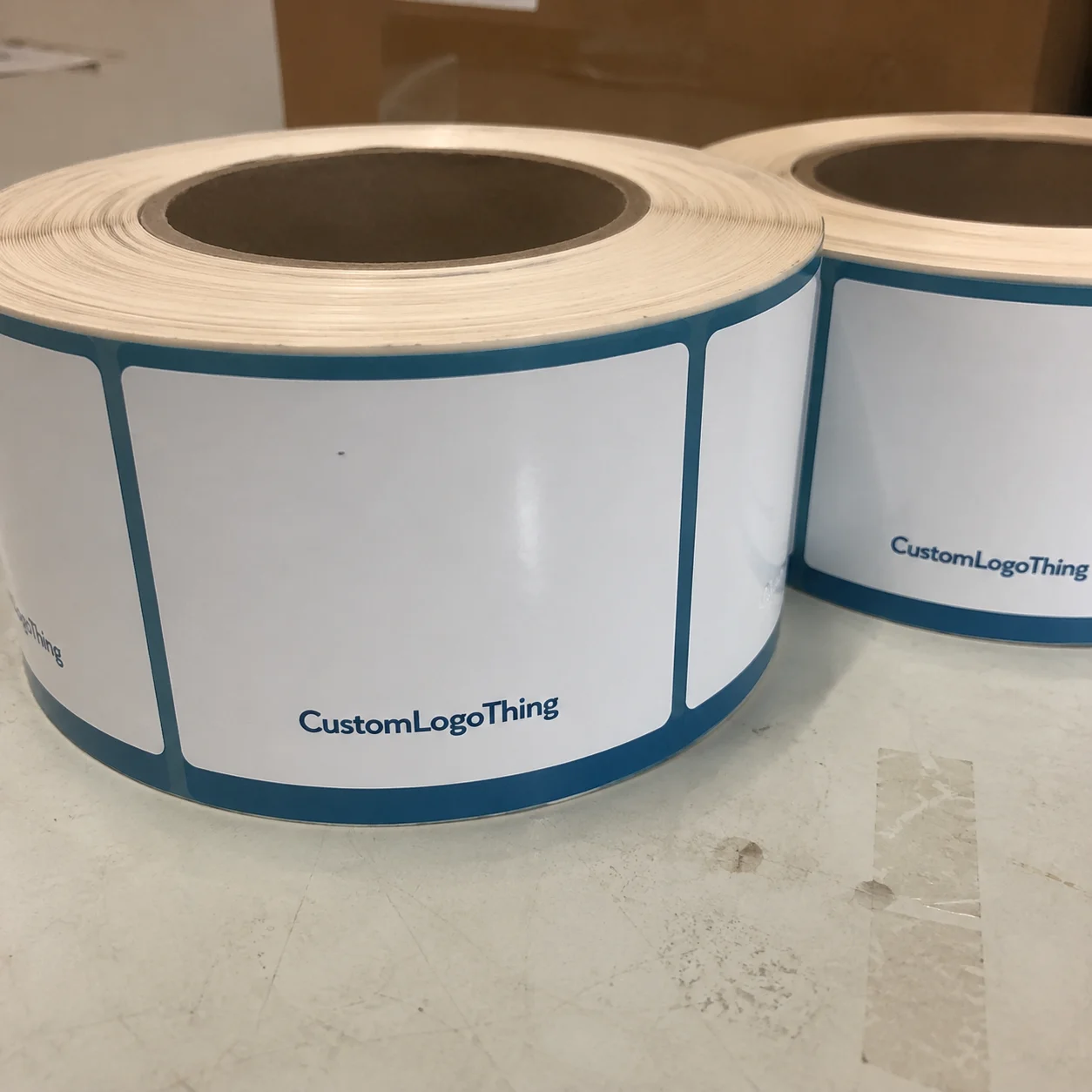
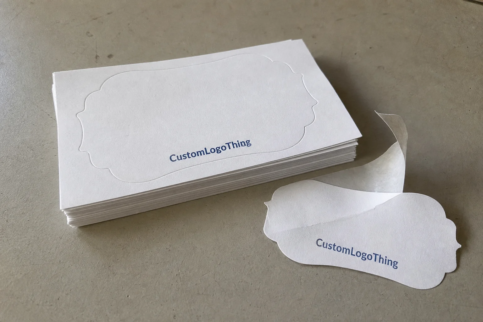
In production terms, these labels are small adhesive print pieces supplied as sheets, rolls, or individually cut units. Most are rectangular because that shape fits the available envelope real estate cleanly. Rounded corners and decorative silhouettes exist, but they work best when the invitation suite itself has a clear visual direction. A label should echo the package, not compete with it.
The strongest invitation labels are almost invisible in the right way: clear at a glance, stable on the envelope, and restrained enough to let the invitation remain the focal point.
Use case matters more than style trends. A formal wedding suite usually benefits from a quieter serif treatment, smaller type, and a matte finish. A shower invite can tolerate more personality. A corporate mailing often needs absolute consistency, fast application, and easy sorting. In that setting, the label is part of a broader mailing system, not just decoration.
For buyers thinking beyond one event, labels should be considered alongside the rest of the printed set. That is the same logic used for Custom Labels & Tags inside branded stationery or event packaging: typography, color, and finish should belong to the same family.
How the label production process works
Most jobs begin with file cleanup. That part sounds ordinary, but it is where many delays start. Names, titles, apartment numbers, and line breaks need to be standardized before anything goes to press. A list that mixes “Apt. 4B,” “#4B,” and “Unit 4B” will print exactly as supplied unless someone normalizes it first. The same problem appears with capitalization. All caps, title case, and lowercase records do not feel like the same mailing list once they are printed.
Next comes proofing. A proper proof should show the actual label size, text placement, font hierarchy, and spacing so the buyer can verify whether the information fits cleanly. This is not a formality. It is the point where a long surname, a second address line, or a narrow envelope width can still be corrected without waste. Proofing also exposes issues that are easy to miss on screen, especially with colored envelopes or thin letterforms.
The print method depends on volume and complexity. Small and mid-size runs often use digital printing because it handles variable data efficiently and keeps setup simple. When every label has a different recipient address, digital variable-data production is usually the most practical method. Larger quantities may still use digital equipment, but the economics improve as setup is spread across more pieces.
Finishing comes after print. Labels may be sheeted, kiss-cut, or rolled depending on how they will be applied. Sheet labels are easy for hand assembly and suit smaller teams. Roll labels are faster for higher-volume application. Individual units can make sense when the presentation matters as much as the mail function. The important point is not the format itself. It is whether the format matches how the labels will actually be used.
Release and adhesion matter just as much as ink density or color accuracy. A label that tears on removal, curls at the edges, or grabs the liner too aggressively slows down the mailing process. On textured envelopes, that effect becomes more obvious. Even a well-printed label can look wrong if it starts lifting after handling.
That is why the spec sheet should reflect real use conditions, not just how the item appears in a mockup. A beautiful sample that fails during application is a production problem, not a design win.
Cost and pricing factors that affect your quote
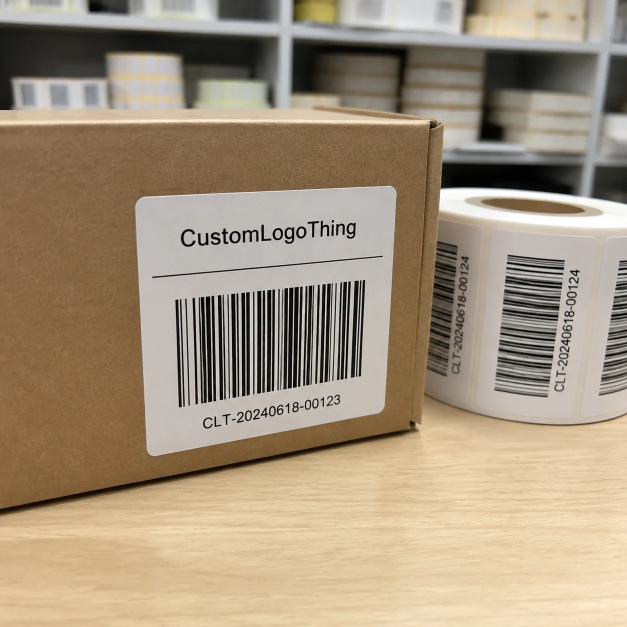
Pricing is usually driven by quantity, label size, stock, finish, and whether the job uses variable data. A repeated return-address design is straightforward. A list of unique recipient addresses requires data ingestion, proof review, and a tighter QC process. That added handling costs money even when the labels themselves are small.
Short runs have a higher per-label price because setup gets divided across fewer pieces. Larger runs reduce the unit cost, which is why a 5,000-label order can look much better on paper than a 250-label test. Still, the lowest unit price is not always the best buy. Total cost also includes setup fees, revision time, spoilage allowance, and the risk of reprints if the data is wrong.
Material choice changes the quote as well. Standard paper labels are the most economical for invitation mailings that stay indoors and move quickly through the mail. Synthetic film costs more, but it offers better moisture resistance and tougher surface performance. Specialty finishes such as gloss, soft-touch, or metallic effects can push pricing higher, especially if they require additional manufacturing steps.
| Option | Typical Use | Approx. Unit Cost at Medium Volume | Pros | Tradeoffs |
|---|---|---|---|---|
| Paper label on sheet | Standard invitation mailings | $0.12-$0.22 | Economical, easy to apply, sharp print reproduction | Less resistant to moisture and rough handling |
| Synthetic label | Higher durability or variable handling conditions | $0.18-$0.32 | Tougher surface, cleaner release, better resistance to scuffing | Higher material cost, less stationery-like feel in some designs |
| Premium finish label | Formal suites and branded mailers | $0.24-$0.40 | More refined appearance, stronger visual presence | Not necessary for every project, higher quote |
The most useful question is not which label is cheapest. It is which label produces the fewest compromises for the actual mailing. If the invitation suite is part of a larger packaging design system, the label should support the same visual language as the inserts and outer materials. That matters even more in branded packaging or event collateral where consistency carries real value.
For buyers who need sustainability documentation, paper-based stocks can often be specified with FSC-certified sourcing. The FSC framework is a useful reference point when reviewing paper claims. For broader packaging education and industry context, The Association for Packaging and Processing Technologies remains a solid technical resource.
Process, timeline, and turnaround expectations
The order flow is familiar: Request a Quote, submit the artwork or mailing list, review the proof, approve the layout, then move into print, finishing, and shipment. Straightforward jobs can move quickly. The part that usually stretches the schedule is not the press time itself. It is the cleanup work before approval.
Most delays start in the data file. Missing apartment numbers, inconsistent honorifics, mixed abbreviations, and awkward line breaks all create extra proof rounds. That can add several business days, especially during peak season or when a production queue is already full. A buyer may think the addresses are “good enough,” but production sees every inconsistency that the naked eye skips over.
A realistic planning window for Custom Address Labels for invitations is often 12-15 business days from proof approval for a standard order. Simpler jobs can move faster. Variable-data runs, specialty finishes, and heavy file cleanup take longer. Holiday mailings and the wedding season can stretch the calendar further. If the RSVP date is fixed, the buffer has to sit before assembly begins, not after.
Rush service is sometimes available, but it narrows the options. Premium stocks, multiple revisions, and complicated data work do not fit comfortably into compressed schedules. That is not a sales posture; it is a production constraint. Time pressure reduces room for correction.
For projects that also include custom printed boxes, inserts, or other event collateral, the label schedule should be tied to the full mail plan. It is common for the invitation body to be approved first, only to discover later that the label format or mailing count needs a different setup. Avoiding that fork is simpler than repairing it later.
Choosing the right label stock, adhesive, and finish
Stock, adhesive, and finish determine both appearance and performance. Paper stock is the default starting point for most invitation mailings because it prints cleanly and feels natural in stationery applications. Synthetic stock makes sense when extra resistance is needed. Unless there is a specific handling issue, film is easy to over-specify for a simple invitation job.
Adhesive choice is more important than many buyers expect. A permanent adhesive is standard for mailing because the label needs to stay put through sorting and transit. But envelope texture changes the equation. A smooth vellum envelope and a textured kraft envelope do not behave the same way. On rough stock, the adhesive may need more contact area, or the label may need a slightly different construction to stay flat.
Finish influences both style and readability. Matte is usually the safest choice for stationery-style work because it keeps the surface soft and easy to read under indoor light. Gloss creates more brightness and can help color fields stand out, but it can also feel too commercial for a formal suite. On dark envelopes, contrast becomes the real issue. A pale label on charcoal paper can look elegant if the type weight is strong enough to remain legible.
The right specification matches the invitation, the envelope material, and the handling environment. Formal sets usually call for restraint. Modern invitations often benefit from simpler typography and a cleaner edge treatment. There is no universal answer here, only a match between the label and the rest of the mailing.
For buyers managing a wider label family, it often helps to keep recipient and return labels in the same typographic system while adjusting scale and information hierarchy. That keeps the set coherent without making every piece look identical. The same principle applies across stationery and retail packaging style collateral: the system should feel related, not repetitive.
Common mistakes that make invitation labels look cheap
The most common problem is bad input. Low-resolution artwork, uncleaned address files, and inconsistent capitalization make even decent materials look careless. The press reproduces those flaws accurately. It does not hide them.
Size errors are another frequent issue. Oversized labels dominate the envelope and make the mailing feel more like shipping than invitation. Undersized labels disappear into the envelope front and look accidental. A good label needs white space around the text and enough proportion to feel deliberate.
Typography can also work against the project. Decorative scripts often look elegant in a proof but become difficult to read once reduced to actual label size. Thin strokes disappear on textured stock. Weak contrast, especially on colored envelopes, lowers readability quickly. If the design depends on delicate letterforms, it should be reviewed at actual size, not only in a mockup.
Placement mistakes matter as well. The recipient address and return address should not compete visually. If both are on the same envelope, and the spacing is inconsistent, the whole piece feels assembled instead of designed. Standardizing the layout before print is one of the simplest quality controls available.
Skipping the proof is the most expensive mistake. One missed apartment number or one broken line can multiply across the entire run. On a short order, that is annoying. On a larger mailing, it becomes avoidable waste.
Expert tips for better results on every order
Start with the address list. Clean it before pricing and proofing begin. Consistent abbreviations, correct honorifics, and matched capitalization save time and reduce the chance of rework. If the mailing list comes from a spreadsheet, check for hidden spacing errors and duplicates. It is tedious. It is also one of the highest-value steps in the whole order.
When the envelope surface is new or unfamiliar, request a sample or a proof on the exact stock whenever possible. That matters for textured papers, metallic envelopes, or any surface where adhesion and contrast might shift. Screen previews are useful, but they do not show how the label will behave once handled.
Leave enough margin around the text. Labels that are too tight feel crowded, and crowding reads as haste. A little white space gives the eye room to rest and makes the piece feel more intentional. On a small format, that detail carries more weight than most people expect.
Match the label style to the invitation language. A classic suite usually benefits from a serif family with restrained spacing. A contemporary invite can support a cleaner sans serif and simpler framing. The goal is not to make the label the star. It is to make it belong to the suite.
It can help to separate the return address treatment from the recipient address treatment. The return label can be smaller or simpler, while the recipient label carries the visual emphasis. That gives the job more flexibility without forcing one design to do everything.
For broader packaging systems, the same logic applies to labels on custom printed boxes and other event collateral. One element can carry the expression, while another stays quiet and functional. That balance usually reads better than trying to compress every design decision into one small label.
From a handling standpoint, invitation labels do not need industrial testing, but they still need the basics done well: stable adhesion, clean cut quality, and strong print contrast. If the mailpiece will sit for several days before posting or travel through sorting equipment, those fundamentals matter more than decorative extras. For more demanding shipping environments, standards from organizations like ISTA can be a useful reference, even if invitation labels themselves are simpler than parcel packaging.
Next steps before you place an order
Measure the usable space on the envelope front before deciding on size. That one measurement keeps the label from crowding the design or looking underscaled. Then clean the mailing list so every record follows the same formatting rules. This is usually where proofing time is won or lost.
Decide what matters most. If price is the priority, standard paper stock and a matte finish usually make the most sense. If presentation matters more, a premium stock or more tactile finish may be worth the cost. If speed is the real constraint, the design should stay simple and the revision cycle should stay short. Those tradeoffs are normal, and they should be made deliberately.
Always review a proof with the exact address set that will be mailed. Check spacing, line breaks, hierarchy, and readability at actual size. If the proof is right, keep it as the reference for future reorders. That gives later batches a consistent baseline and reduces friction on repeat jobs.
Custom Address Labels for invitations work best when they are treated as part of the mailing system, not as a last-minute fix. Size, stock, adhesive, finish, and data handling all shape the result. Get those decisions right, and the envelope feels finished before the invitation is even opened.
What size are custom address labels for invitations usually made in?
Most are sized to fit the envelope front without crowding the design, often in compact rectangular formats. The right size depends on the envelope dimensions, the amount of address text, and whether the look should feel formal or modern. A proof or mockup is the easiest way to confirm the balance before production starts.
Are custom address labels for invitations better than handwritten addressing?
They are usually more consistent, especially when the mailing list is long or the invitation suite is formal. Printed labels reduce variation in slant, spacing, and ink density, which helps the full mailing look cohesive. Handwriting still works for very small, personal mailings, but labels are generally faster and more uniform.
How long does it take to get invitation address labels printed?
Turnaround depends on proof approval, list cleanup, quantity, and the production method used. Simple orders can move quickly once artwork is approved, while variable-data runs or specialty materials take longer. The safest approach is to build in buffer time before assembly and mailing begin.
What affects the price of custom address labels for invitations?
Quantity is usually the biggest factor, followed by material, finish, size, and whether each label uses different address data. Specialty stocks and premium adhesives increase the quote, but they can improve appearance and handling. A full price should include setup, printing, finishing, and any revision work needed before approval.
Can I use the same design for return and recipient address labels?
Yes. Many buyers use a matching design system for both label types to keep the suite coordinated. The return-address label can be smaller or simpler if the recipient label is meant to carry the main visual style. Keeping both in the same typographic family usually gives the most polished result.