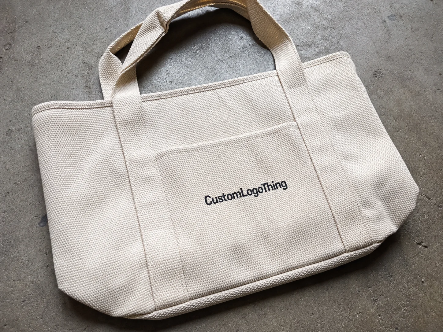
A custom black tote bag looks plain at first glance. That plainness is part of the appeal. Black reduces visual clutter, hides handling marks better than lighter colors, and gives the logo a stronger stage. The result can feel sharper than a brighter bag that shows every scuff, crease, or shipping rub.
Buyers use these Bags for Retail giveaways, event kits, boutique packaging, corporate welcome packs, and merch programs. Most of the time, the bag is not just a carry item. It is part packaging, part brand signal, and part reusable surface that may stay in circulation long after the original purchase. That makes the spec more important than the color alone. A black tote can look premium. It can also look tired fast if the material, print, and handle design are mismatched.
The real decision is not whether black works. It is whether the bag should feel disposable, reusable, or premium. That choice changes the material gauge, print method, handle construction, and even the artwork you send.
Why a Black Tote Looks Simple but Still Wins Attention
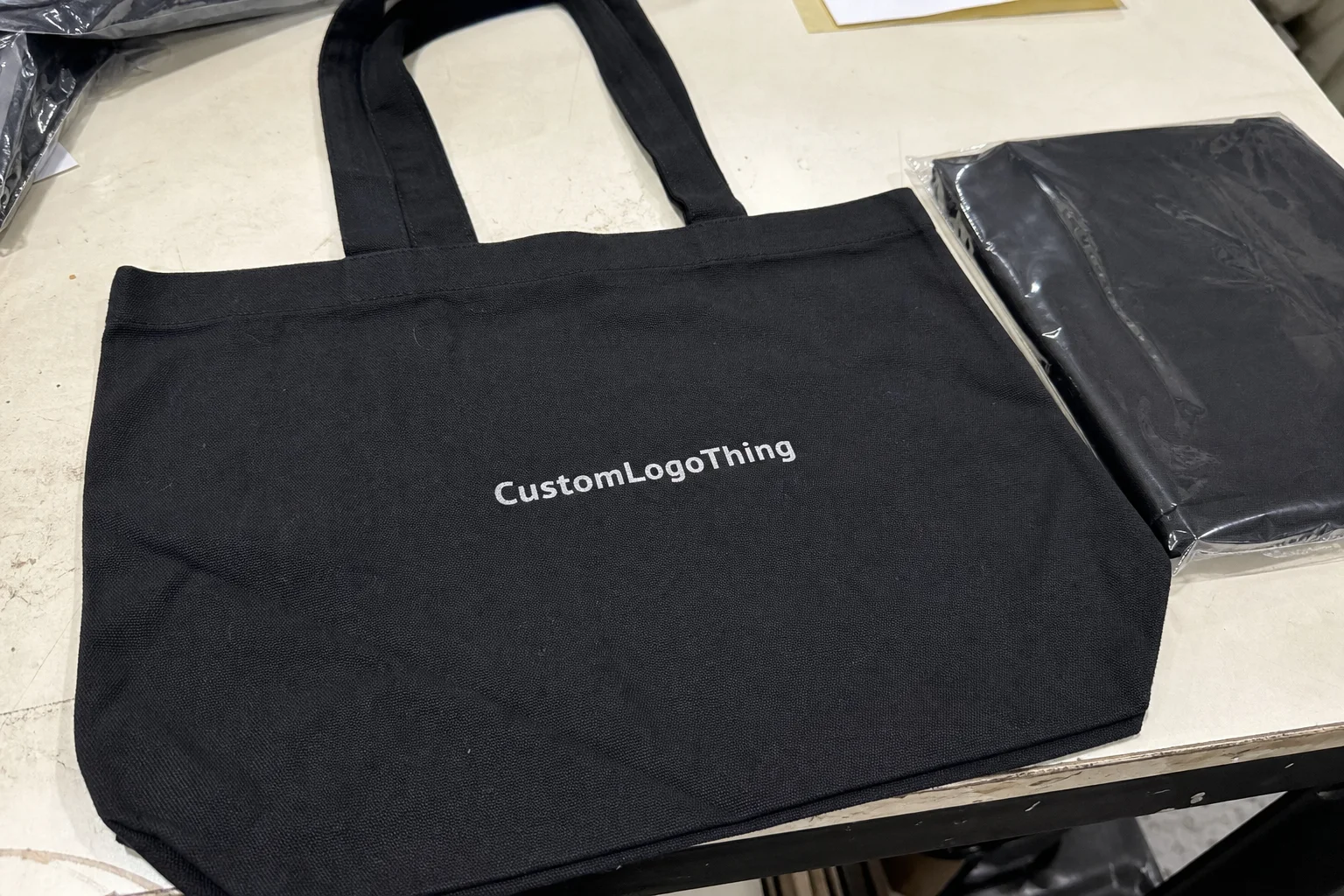
Black works because it removes distractions. A logo on a black surface gets a cleaner read than the same mark on a busy or translucent bag. It also tends to survive real-world handling better. A white bag can look marked up after one event. A black one often still looks deliberate.
There is another practical advantage: black usually makes branding decisions easier. If you have one strong logo and not much else, the bag does not need extra graphics to earn its keep. One crisp imprint can carry the whole design.
That said, black is not forgiving of weak contrast. Dark ink on black material disappears, and tiny details become noise. If the logo depends on thin strokes, gradients, or subtle color shifts, it needs to be simplified before production. A good proof should make this obvious. A bad proof can hide the problem until the order is already paid for.
From a packaging buyer’s point of view, the bag is often doing a retail packaging job even if nobody labels it that way. It is carrying products, framing the first impression, and extending the brand beyond the checkout counter. If you are using it alongside Custom Packaging Products such as boxes, inserts, or sleeves, the tote should match the same level of finish. A premium box next to a flimsy bag creates a visible break in the system.
Black totes tend to work best in a few settings:
- Retail giveaways where reuse is likely and the bag will be seen in public.
- Corporate kits that need a clean and restrained presentation.
- Boutiques that want the bag to carry part of the brand identity.
- Conferences and events where fast recognition matters more than decorative detail.
- Merch drops where the bag is part of the overall product story.
“A black tote only looks premium if the print holds its contrast across the order. Weak ink on dark material reads like a production shortcut.”
That is usually the hidden divider between a bag that feels intentional and one that feels cheap. The difference is rarely the idea. It is the execution.
How the Bag, Material, and Print Method Work Together
Most custom black tote bag orders fall into a handful of material categories. HDPE is thin, crisp, and typically the most economical option. LDPE is softer, smoother, and more flexible, which makes it a better fit for reusable shopping-style bags. Thicker reusable plastics sit above both in durability and structure. Suppliers may describe thickness in mils or microns, and that number matters more than many buyers expect.
For light giveaways, a thinner material may be enough if the bag is only carrying brochures, samples, or a few small items. For heavier loads or repeated use, the bag needs more body. If the handles stretch or the sidewalls collapse after a single use, the order saves pennies and loses value. That trade is hard to justify once the bags are in circulation.
Black material changes print behavior. White ink is usually the cleanest answer because it gives the strongest contrast. Bright spot colors can also work, especially if the logo is bold and simple. Fine-line art can be risky unless the print process lays down enough ink to preserve detail. A logo that looks tidy on screen can break down quickly on a dark substrate.
Common constructions and what they mean
| Bag type | Typical feel | Best use | Tradeoff |
|---|---|---|---|
| HDPE | Thin, crisp, lightweight | High-volume giveaways, light retail packaging | Lower carry strength and a less premium feel |
| LDPE | Softer, smoother, more flexible | Reusable merch bags, corporate kits | Usually costs more than basic HDPE |
| Thicker reusable plastic | Stiffer, more durable, better structure | Boutiques, premium branded packaging | Higher unit cost and sometimes a higher MOQ |
Print method affects more than appearance. It changes setup cost, detail tolerance, speed, and the level of opacity you can expect on black. Flexographic printing is commonly used for higher-volume runs because it becomes economical once the setup is spread across enough units. Screen printing is often a good fit for bold graphics and heavier ink coverage. Digital methods can handle more variation, but not every factory runs them on this product and the unit cost can rise quickly.
If your artwork includes tiny text, hairline borders, or detailed shading, ask whether the method can actually hold it. A proof that looks acceptable on paper is not enough. On black material, registration, ink density, and line thickness all matter at the same time. That is where a lot of orders go wrong: the logo is technically printed, but not readably printed.
Construction details also affect the final feel. A flat bag is usually cheaper and simpler. A gusseted bag carries more and looks more like real retail packaging. Handle style matters too. Die-cut handles, loop handles, and reinforced handles each have different cost and load implications. If the bag is supposed to feel upgraded, the handle should not be the first place you cut corners.
Cost, Pricing, and MOQ Factors That Move the Quote
Pricing for a custom black tote bag usually comes down to five variables: quantity, material thickness, number of print colors, print coverage, and any specialty inks or unusual construction. The relationship is predictable. Higher quantity lowers unit price because setup costs get distributed across more bags. Simpler artwork also helps keep the quote grounded.
For a basic one-color logo on a standard reusable plastic tote, small orders may fall around $0.35 to $0.80 per unit, depending on supplier, size, and spec. Larger runs can move lower. Heavier material, larger print areas, white ink on black, or custom dimensions can push pricing into the $0.90 to $1.60+ range. Those ranges are practical, not guaranteed. Once the artwork, quantity, and build details change, the quote moves quickly.
MOO matters because it shapes both cost and flexibility. A lower MOQ helps when you do not want excess inventory sitting in storage. A higher MOQ often unlocks better unit pricing and, in some cases, more printing options. If the tote is for a single event, a smaller run can make sense even if the per-unit price is not attractive. If it is going into recurring retail packaging or an ongoing promotion, a larger order usually pays back in the unit economics.
There are also costs buyers tend to leave out of the first comparison:
- Setup charges for plates, screens, or file preparation.
- Shipping, which can be significant because bags are bulky.
- Proofing or pre-production sample fees.
- Rush fees if the deadline is compressed.
- Packaging add-ons such as carton labels, bundling, or inner packing.
Ask for a quote that separates unit cost from the rest of the spend. Otherwise the number may look attractive until freight and setup are added later. A clean quote should show the bag spec, print spec, quantity, and any extra charges. If it does not, the missing detail is usually hiding somewhere in the total.
How price changes by order profile
| Order profile | Unit cost trend | Why it changes | Good fit for |
|---|---|---|---|
| Low quantity, simple print | Highest | Setup costs are spread over fewer bags | Small events, design testing |
| Mid quantity, one-color logo | Moderate | Better balance between setup and volume | Retail giveaways, corporate kits |
| High quantity, limited colors | Lowest | Economies of scale improve the quote | Recurring promotions, packaging programs |
| High quantity, specialty print | Higher than expected | Complexity offsets the volume advantage | Premium branded packaging |
For context on packaging and material choices, the Institute of Packaging Professionals is a solid industry reference. EPA guidance on packaging waste and source reduction is also useful if sustainability is part of the decision. Those references do not replace a supplier quote, but they help anchor the discussion.
Production Steps, Lead Time, and Approval Timeline
The production flow is usually straightforward. Request a Quote. Review artwork. Approve the proof. Run production. Ship the order. Delays almost always start when the buyer skips the detail stage and assumes the factory will interpret the design correctly on its own. That assumption costs time.
- Request a quote with quantity, size, print colors, and deadline.
- Send artwork in vector format if possible.
- Review the proof for size, placement, and contrast.
- Approve production only after the proof matches your intent.
- Run production and confirm shipping method.
Standard lead time often lands around 10 to 20 business days from proof approval, though that depends on stock, print complexity, and the factory schedule. Rush orders are possible, but they usually cost more and leave less room for corrections. Peak seasons can stretch timelines as well. There is nothing mysterious there. Production queues only move so fast.
The fastest way to reduce back-and-forth is to send complete information up front:
- Logo file in vector format, ideally AI, EPS, or PDF.
- Exact dimensions or a clear target size.
- Quantity and acceptable MOQ range.
- Print colors and whether white ink is required.
- Deadline and ship-to location.
A sample is worth the extra time in a few situations. If the tote is part of retail packaging, if the logo has delicate details, or if the print quality is central to the brand presentation, a pre-production sample can save the order. A digital proof shows intent. It does not show how the print sits on actual black material, or how the bag feels in hand. For a straightforward one-color giveaway, a proof may be enough. For a branded packaging piece with real visibility, the sample can remove a lot of risk.
If the order needs to survive shipping abuse or heavier use, ask whether the supplier follows relevant strength or handling standards. ISTA testing guidance is a practical reference point in that case. It is useful when the bag has to arrive intact and still look good after transit.
How to Spec a Custom Tote Without Guesswork
A good spec sheet saves money because it reduces interpretation. A vague spec does the opposite. The first question is functional: what will the bag actually carry? A giveaway bag, a retail carrier, a kit component, and a reusable merch bag do not need the same construction.
Once the use case is clear, set the basics:
- Size: small, medium, or large based on the contents.
- Material thickness: lighter for giveaways, thicker for reuse and heavier loads.
- Handle style: die-cut, loop, or reinforced handles.
- Print location: front only, front and back, or gusset.
- Artwork format: vector preferred; raster only if there is no alternative.
Artwork should be chosen with black material in mind. Bold logos with clear outlines usually print the cleanest. White, silver, and brighter brand colors tend to read well from a distance. Dark colors on black can work if there is enough outline or contrast support, but they are not the safest choice. Small details are usually the first thing to disappear, so a design that depends on fine lines should be simplified before production.
The simplest way to decide between budget and premium is to ask how much abuse the bag will take. If it will be reused, hold weight, or sit inside a premium packaging program, spend more on strength and print clarity. If it is a short-life event bag, the spec can be lighter. That does not mean careless. It just means the bag does not need to be built like a retail carrier that will stay in use for months.
If the tote is part of a broader packaging system, spec it like a product rather than a disposable promo item. That means clear artwork, enough thickness to hold up under use, and a print method suited to black material. A bag that supports the package story is doing useful work. One that collapses, stretches, or fades too quickly undermines the rest of the program.
Common Mistakes That Make the Bags Look Cheap
The first mistake is weak contrast. Dark ink on black material disappears, and then the design is forced into a kind of accidental minimalism. It is not minimalism. It is just unreadable.
The second mistake is under-specifying thickness. If the bag creases badly, stretches at the handle, or splits under a modest load, the whole impression changes. A reusable bag that behaves like a throwaway bag misses the point.
The third mistake is assuming a small run will be as economical as a larger one. Setup costs do not shrink just because the quantity is low. If the bag is likely to be used again, a slightly higher order quantity often gives better value and a better finished result.
The fourth mistake is approving a proof too quickly. Check placement, finished size, safe area, and any bleed or registration notes. A logo that looks a little too small in proof usually looks even smaller once the bag is printed. Proofs exist to catch those issues before the run starts.
Other common problems show up often:
- Using a raster logo that becomes fuzzy when enlarged.
- Choosing a print method that cannot hold fine detail.
- Assuming every black tone looks identical across materials.
- Forgetting that bag volume affects freight cost.
The most expensive mistake is usually buying on price alone. A cheap quote on the wrong spec is not a savings decision. It is a delayed correction.
Expert Buying Tips and Next Steps Before You Request a Quote
Before requesting pricing, gather the essentials: a clean logo file, target quantity, size preference, and deadline. That alone cuts a large amount of back-and-forth and gives you a quote that can actually be compared.
Then ask for two options. One should be the lowest unit cost. The other should be the best-value durable version. That comparison often reveals where the real tradeoff sits. Sometimes the better bag adds only a small amount per unit and improves the impression significantly. Other times the heavier spec pushes freight and storage enough to make the budget version the smarter pick.
Ask to see the proof on a black background, not only as a floating logo on white. You need to see contrast, scale, and placement in context. A proof that ignores the bag color is incomplete. It may look polished, but it does not answer the real question.
If the order is tied to retail packaging, product packaging, or a larger branded packaging program, check that the tote matches the tone and quality of the rest of the set. The bag does not need to outshine the box. It does need to belong next to it. That is where package branding either stays coherent or starts to fray.
Before committing to a supplier, verify these points:
- MOQ and whether it can be adjusted.
- Lead time from proof approval, not from inquiry.
- Print method and whether it fits your artwork.
- Total cost, including setup, freight, and add-ons.
For buyers who care about sustainability, ask whether recycled content is available and verify any material claims carefully. If the tote is one part of a larger packaging program, Custom Packaging Products can help keep the look consistent across the set instead of treating the bag as a separate purchase with its own visual language.
The short version is simple. Spec the bag for real use, not wishful thinking. A custom black tote bag can look sharp, hold up well, and stay inside budget if the material, print, and quantity are chosen with care. Get the details in writing, review the proof with a skeptical eye, and pick the version that fits the actual job. That approach avoids most of the expensive mistakes.
FAQ
What is the best print method for a custom black tote bag?
White or light ink usually gives the best contrast on black material. Bold logos print more cleanly than fine linework, and the right method depends on quantity, detail level, and budget. For simple designs, a high-opacity one-color print is often the most reliable choice.
How much does a custom black tote bag usually cost?
Pricing depends mainly on quantity, material thickness, print colors, and print coverage. Small runs cost more per unit because setup fees are spread across fewer bags. A proper quote should show the bag spec, print spec, and any added fees so suppliers can be compared fairly.
What MOQ should I expect for a black plastic tote order?
MOQ varies by factory and print method. Smaller custom runs are usually more expensive per unit, while higher MOQ often improves pricing and can expand printing options. Ask for the lowest viable run and the best-value tier so you can compare both.
How long does production take for custom black tote bags?
Lead time depends on proof approval, stock availability, and print complexity. Revisions add time before production begins. Standard orders often take about 10 to 20 business days from approval, while rush work usually costs more.
What artwork works best on a custom black tote bag?
Bold logos, high-contrast colors, and simplified layouts are easiest to read. Avoid tiny details unless the print method can hold them clearly. Vector files usually make proofing and production smoother, especially when contrast against black matters.