For clothing brands, custom BOPP labels often do more work than people expect. They sit on a box, a polybag, or a tissue wrap for only a short time, yet that brief moment can decide whether the packaging feels considered or unfinished. A sharp label can make a modest garment presentation feel retail-ready; a crooked or wrinkled one can make even strong packaging design look rushed.
That is why BOPP keeps showing up on better branded packaging. BOPP stands for biaxially oriented polypropylene, a film-based label stock that resists moisture, stays dimensionally stable, and holds fine detail well. In practical terms, it is a durable plastic label material that keeps its shape better than many paper alternatives when packaging passes through humid storage, shipping, and repeated handling. Clothing packaging rarely lives in ideal conditions. Warehouses get warm and damp. Mailers scuff. Boxes are stacked, slid, and reopened. Labels that look fine on a sample sheet can behave very differently once they are attached to real packaging.
If you are deciding whether custom BOPP labels fit your line, the real question is not simply whether they look good. It is whether they will work on your actual surface, survive your shipping flow, and stay readable across the life of the package. That matters even more if you use Custom Labels & Tags across multiple SKUs, because a label system only stays efficient when the construction, adhesive, and size are chosen with the packaging in mind. Start with the substrate. Then build the artwork around it.
Why custom BOPP labels show up on better apparel packaging
A label is often the first thing a customer touches before the garment itself is unfolded. That sounds small, but in apparel packaging the first touch carries real weight. If the label is crisp, aligned, and consistent, the package reads as deliberate. If it is low-contrast, smeared, or poorly sized, the whole presentation feels cheaper than it should.
BOPP earns its place in apparel because it is durable without looking industrial. It comes in gloss, matte, clear, and white face stocks, and it supports high-resolution print reproduction. Small type, logo marks, barcodes, and simple care-copy blocks can stay readable if the artwork is prepared correctly. On folded tees, polybags, retail boxes, tissue wraps, and bundled sets, custom BOPP labels usually hold up better than coated paper labels in storage and transit.
That durability also gives clothing brands more consistency across fulfillment runs. One month a label may go on a corrugated mailer. The next it may need to adhere to a coated carton or a plastic bag. A well-specified BOPP construction can handle that range better than a brittle paper label, especially when the brand wants a premium look without adding complexity to the packaging line.
“The label is not just decoration. On apparel packaging, it is part of the product story, part of the logistics, and sometimes the only branding the customer notices before opening the box.”
For brands that also order Custom Packaging Products, the advantage is in keeping the label system flexible. The same visual language can carry across mailers, inserts, and boxes while only the size, finish, or adhesive changes. That is a practical benefit, not just a design preference.
How the label material, adhesive, and finish work together
Most label issues start with a narrow focus on print quality alone. In production, the label has three parts that work together: the face stock, the adhesive, and the liner. The face stock is the printable top layer. The adhesive controls how firmly the label grips. The liner is the backing that gets peeled away during application.
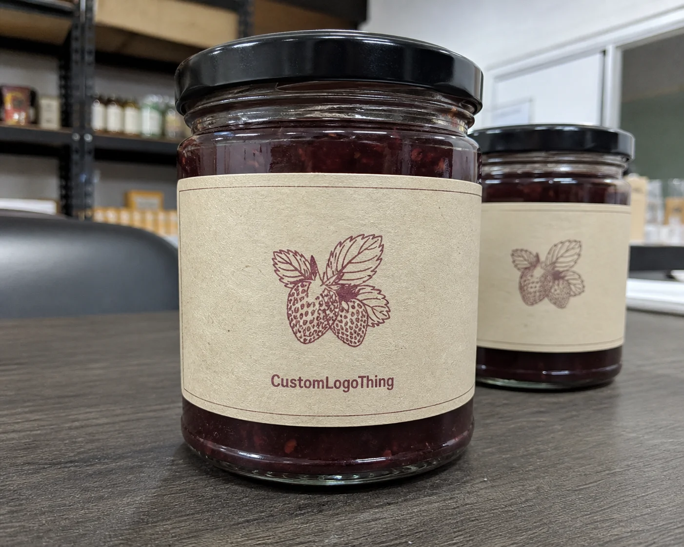
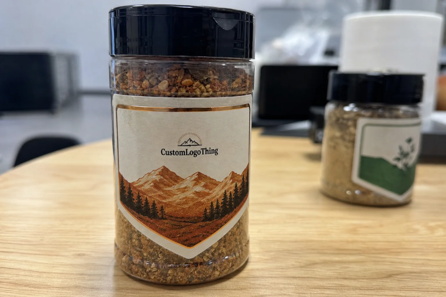
The finish changes the customer’s first read immediately. Gloss tends to brighten color and create a reflective, polished look. Matte softens glare and often makes text easier to read under store lighting or in product photography, which matters more than many apparel teams realize. Clear BOPP can create a floating effect on packaging, while white BOPP gives stronger contrast and more predictable color on logos, barcodes, and smaller details.
Adhesive selection is where many buying mistakes begin. Clothing brands place labels on paperboard cartons, coated boxes, plastic polybags, tissue wraps, and textured materials, and those surfaces do not behave the same way. A permanent adhesive is common for shipping and retail integrity. A removable adhesive may be better for seasonal bundles, return workflows, or temporary promotions. If your packaging uses low-energy plastics, ask for an adhesive formulated for that surface. A standard adhesive that performs well on paper can fail on film, especially if temperatures fluctuate during storage or shipping.
Barcode readability and small text depend on both print method and finish. A high-gloss label on a reflective package can make scanning harder if the contrast is not planned carefully. That is not a theoretical concern. Poorly matched gloss, color, and surface texture can slow receiving teams and create unnecessary rework.
If your brand is comparing materials, a quick shorthand helps:
- Gloss BOPP for vibrant color and a polished retail look
- Matte BOPP for lower glare and a softer premium feel
- Clear BOPP for a minimal look on clean surfaces
- White BOPP for the strongest legibility and broadest print compatibility
If sustainability messaging is part of your packaging language, keep the claims precise. BOPP is a plastic film, so it is not the same thing as recycled paper labels or FSC-certified board. If your broader packaging uses FSC-certified materials, the label can still fit into the system, but the terminology should stay accurate. For packaging standards and material references, the Packaging School and packaging industry resources and the FSC site are useful references.
Key specifications that determine durability and brand impact
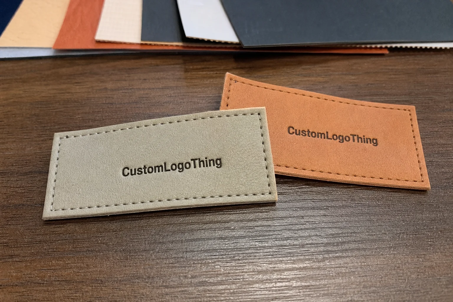
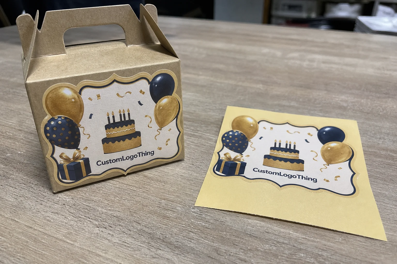
Size and shape are not cosmetic details. They determine how the label sits on the package, how much information fits, and whether the design looks intentional or cramped. Straight rectangles are efficient and economical. Circles and ovals can feel softer and more branded. Rounded-corner die-cuts often reduce edge lift and give a cleaner finish. If your packaging leans premium, a custom silhouette can help, but only if the artwork still reads quickly at actual size.
Thickness, or caliper, affects both feel and handling. A slightly thicker label stock tends to feel more substantial in hand and may feed more predictably during application. That said, thicker is not automatically better. Some automated applicators prefer a narrower spec window, while hand application on small production teams can run faster with a medium-caliper roll that releases cleanly.
Color management deserves more attention than it usually gets. BOPP can reproduce bold brand colors well, but transparency changes the result dramatically. Transparent labels on dark tissue, navy boxes, or patterned mailers can mute color unless white ink is used beneath the artwork. White ink adds cost, but it can prevent the design from looking muddy or washed out. Foil accents can also work, though they are usually better for limited areas than for heavy coverage, especially if the label needs to carry small regulatory copy or barcodes.
For clothing brands, content requirements often include care instructions, SKU numbers, barcode data, fiber content references, and origin details when needed. If the label is going onto a retail pack, the layout should leave room for those elements without squeezing them into a corner. Too often, teams design the visual first and then discover that the practical text has nowhere to go.
Application details that buyers forget
Roll direction, core size, label spacing, and finishing format matter more than most first-time buyers expect. If you are hand-applying labels to polybags, a wider gap between labels can make peeling faster and reduce misalignment. If the labels go through a dispenser, the core and unwind direction should match the equipment. Sheets can work for low volume, but rolls are usually better when output is steady and the packing line needs speed.
One more operational point: if your packaging includes both folded garments and shipped units, standardizing label dimensions where possible can reduce reorder errors. A label that is 2 x 3 inches may fit both a mailer seal and a folding insert better than a scattered collection of one-off sizes.
| Label style | Best use | Typical strength | Watch-outs |
|---|---|---|---|
| Gloss white BOPP | Retail packaging, bright logos | High color pop, strong contrast | Can reflect glare under lights |
| Matte white BOPP | Minimal branding, text-heavy layouts | Low glare, readable copy | Less visual shine |
| Clear BOPP | Minimalist boxes, premium bundles | Floating effect, clean look | Needs careful color and surface planning |
| Custom die-cut BOPP | Signature branding | Distinctive shelf presence | Usually higher setup cost |
Cost, pricing, and MOQ factors buyers should compare
Price on custom BOPP labels is driven by a handful of predictable variables: size, quantity, adhesive type, print coverage, finish, and whether the design needs Custom Die Cutting. More colors usually mean more complexity. White underprint, specialty inks, and foil touches can add cost. So can unusual shapes. A plain rectangle in a standard size will usually be cheaper than a label with a custom silhouette and heavy ink coverage.
MOQ matters because setup cost gets distributed across the run. Lower quantities usually carry a higher unit price. Larger runs improve per-label economics, but only if you actually need the volume. For a small apparel launch, a test order can make sense even if the unit cost is higher. That is often less expensive than committing to 20,000 pieces and discovering the adhesive is too aggressive for your mailer or the matte finish feels too flat against your brand palette.
Here is a practical buying range to use as a reference point, not a guarantee: a 3 x 4 inch custom BOPP roll label in a standard shape might land around $0.06-$0.14 per unit at 10,000 pieces, while a smaller quantity like 1,000-2,500 pieces can move closer to $0.18-$0.40 per unit, especially if white ink or a specialty finish is involved. Exact pricing will vary by supplier, quantity, and print method.
Hidden costs can change the comparison quickly. Watch for setup fees, plate or die charges, proofing costs, freight, and packaging format. Rolls may cost more than sheets up front but save labor during packing. On the other hand, sheeted labels can make sense for very small teams or limited release products where hand application is the norm.
When comparing quotes, insist on apples-to-apples specs. Same dimensions. Same adhesive. Same finish. Same quantity. Otherwise you are not comparing prices; you are comparing different products.
- Request the same artwork version on every quote
- Confirm whether freight is included
- Ask if the quoted price includes proofing
- Check whether the label is supplied in rolls or sheets
Production steps and turnaround: from proof to shipment
The production flow is usually straightforward, but delays tend to appear at the handoff points. A typical job starts with artwork submission and spec confirmation. Then comes proofing, approval, printing, finishing, quality control, and dispatch. If the files are final and the specs are clear, the process moves faster. If the artwork is low resolution, the dieline is missing, or the brand changes adhesive and finish midstream, the schedule stretches.
For apparel brands balancing launch calendars or seasonal drops, lead time matters as much as unit price. A common benchmark is 12-15 business days from proof approval for standard production, though specialty materials, custom cutting, or rush capacity can change that. Rush service may shorten the calendar, but it can also limit finish options or increase the price.
Sampling is not wasted time. It is insurance. A label that looks great on screen can behave differently on a textured carton or a plastic mailer. If the packaging is part of a launch, build buffer time for internal approvals and physical receipt. Shipping delays are frustrating. Reprinting labels because a barcode was placed too low is worse.
For quality frameworks, packaging teams sometimes borrow thinking from transportation testing standards. The ISTA testing organization is a useful reference point if your labels are part of a broader package that must survive handling and distribution. Labels themselves are not usually ISTA-certified, but the packaging system around them often benefits from the same discipline.
Common mistakes when ordering durable apparel labels
The first mistake is choosing a finish because it looks good in a mockup. A glossy label on white artboard may be perfect in a digital proof. Put that same label on a dark matte mailer and the contrast story changes. What reads as premium on screen can become harder to read on the actual package surface.
The second mistake is approving artwork without checking it at real size. Tiny legal text, care symbols, and barcodes are unforgiving. If your design lives inside a 2 x 3 inch label, every millimeter matters. A slightly simpler layout is usually better than a cramped one that looks busy and scans poorly.
The third mistake is ignoring adhesive compatibility. Coated cartons, textured paper, and plastic bags all behave differently, especially in colder storage or humid environments. A label can look perfect one day and then begin lifting at the corners if the adhesive and surface do not match.
The fourth mistake is forgetting how the labels will be applied. Hand application is slower than many teams expect. If the pack line is managed by two people during a peak drop, a poor label format can create a genuine bottleneck. The fifth mistake is ordering on price alone and ignoring rework, waste, and inconsistent branding. Cheap labels that peel early are not cheap. They are future labor.
From a practical buying point of view, the wrong label spec usually costs more than the right one. It just takes longer to show up on the invoice.
Expert tips for better results on your next label order
Start with the packaging surface, not the artwork. That sounds backward, but it is the right order. The substrate determines adhesion, contrast, and how much visual weight the label needs. Once that is clear, the design decisions become easier.
Ask for a proof that reflects the real production setup, including finish and color profile. A PDF on screen is useful, but it will not tell you how a matte black logo behaves on clear BOPP or whether a barcode remains clean after print conversion. If your order is tied to a launch, that proof is worth the wait.
If your clothing line uses multiple package types, standardize dimensions wherever possible. One size for boxes. One size for bags. One version for seasonal promotions. That kind of discipline makes reorder management much cleaner and helps package branding stay consistent across channels.
Keep a master spec sheet. It should list size, material, adhesive, finish, roll direction, core size, artwork version, and any variable data fields. Store it where both marketing and operations can find it. It sounds basic. It prevents a surprising number of problems.
Also, think ahead to future SKUs. A label format that leaves room for a new colorway, a different barcode, or a revised care note can save you from redesigning the entire system later. That is especially useful for fast-moving apparel lines that refresh packaging often.
- Surface first, artwork second
- Proof at production settings
- Document specs for reorders
- Plan room for future SKUs
Next steps for choosing the right label spec
Begin by auditing your current packaging. Where do labels peel? Where do they smudge? Where does the print disappear against the surface? Those are not design complaints. They are spec clues. Once you know the failure points, it becomes much easier to narrow the right label construction.
Then shortlist the format that matches your surface, environment, and brand look. If you ship mostly in coated mailers, your adhesive priorities may differ from a label used on folding cartons or retail boxes. If your packaging is part of a premium unboxing experience, you may want a finish that feels more intentional under the customer’s fingers.
When you Request a Quote, give exact dimensions, quantity, adhesive preference, finish, and print details. If you need the labels for retail packaging, subscription shipments, or fulfillment cartons, say so clearly. Those use cases are similar, but not identical. A label that works well in one can be the wrong fit in another.
Before launch, ask for a sample or proof. Then create a reorder checklist so future runs stay consistent in color, size, and application behavior. That checklist should live beside your packaging design files, not in someone’s inbox. For brands that want dependable custom printed boxes and matching labels, consistency is the real luxury.
If you want the simplest takeaway, it is this: custom BOPP labels are a strong choice when you need durable, clean-looking branding that holds up better than paper alternatives. Used well, they improve package branding without making the system harder to run. Used carelessly, they become just another line item. The difference is in the spec.
Are custom BOPP labels good for clothing packaging that may get handled a lot?
Yes. BOPP is valued for durability, moisture resistance, and strong print clarity. It is a solid choice for apparel boxes, mailers, and polybags that are touched during packing, shipping, and receiving.
What is the difference between gloss and matte custom BOPP labels for apparel brands?
Gloss usually creates brighter color and a more reflective, premium look. Matte reduces glare and can make text easier to read under retail lighting or in photo-heavy workflows.
How do I know which adhesive to choose for custom BOPP labels on clothing boxes?
Match the adhesive to the surface. Paperboard, coated cartons, plastic, and textured packaging all behave differently. If the label may need to come off later, ask for a removable option. For shipping and retail integrity, permanent is more common.
What affects the price of custom BOPP labels most?
The biggest cost drivers are quantity, size, adhesive type, finish, and whether the design needs special cutting or inks. Unit cost usually drops as volume increases, but setup and proofing can matter more on smaller orders.
How long does it usually take to produce custom BOPP labels?
Timing depends on artwork readiness, proof approval, quantity, and finishing requirements. The fastest projects are those with final files ready and clear specs, while revisions and special materials extend lead time.