Buyer Fit Snapshot
| Best fit | Custom Box Design projects where brand print, material claims, artwork control, MOQ, and repeat-order consistency need to be specified before quoting. |
|---|---|
| Quote inputs | Share finished size, material target, print colors, finish, packing count, annual reorder estimate, ship-to region, and any compliance wording. |
| Proofing check | Approve dieline scale, logo placement, barcode or warning zones, color tolerance, closure strength, and carton packing before bulk production. |
| Main risk | Vague material claims, crowded artwork, missing packing details, or unclear freight terms can make a low unit price expensive after revisions. |
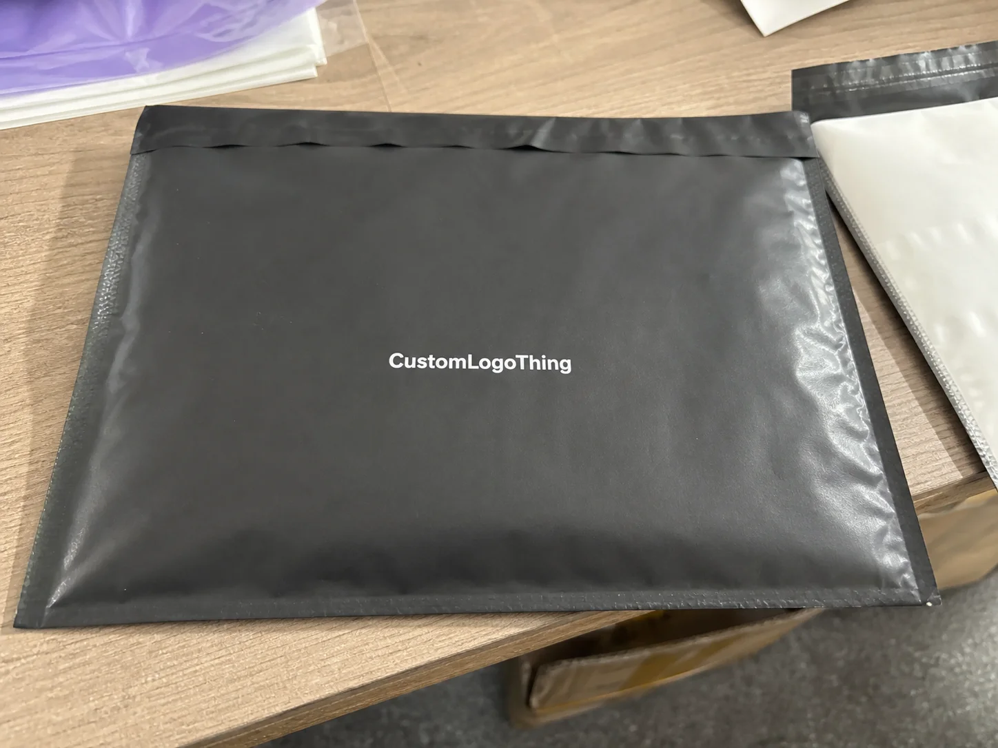
Fast answer: Custom Box Design: Board, Finish, Dieline, and Unit Cost should be specified like a repeatable production item. The safest quote records material, print method, finish, artwork proof, packing count, and reorder notes in one written spec.
Production checks before approval
Compare the actual filled-product size with the drawing, then confirm tolerance on folds, seals, hang holes, label areas, and retail display edges. Reserve space for logos, QR codes, warning copy, and material claims before decorative graphics fill the panel.
Quote comparison points
Review material grade, print process, finish, sampling route, tooling charges, carton quantity, and freight assumptions side by side. A quote is only useful when the supplier can repeat the same color, closure quality, and packing count on the next order.
Custom Boxes Design Tips matter a lot more than most brands think. I learned that the expensive way, standing on a factory floor in Dongguan while a client’s “simple” logo placement turned into a 12,000-piece reprint because the fold line ate half the product name. That mistake cost them about $4,800, and all because nobody checked the dieline before approving artwork. Good custom boxes design tips save money, protect the product, and make branded packaging look intentional instead of improvised. If you are quoting a run of 5,000 units, even a $0.15 per unit mistake becomes $750 fast.
Custom boxes design tips are not just about making a box look pretty. They cover structure, graphics, material choice, print finish, and how all of that behaves once ink hits board. I’ve watched a matte black carton look premium on screen and look muddy on press because the file was built wrong. I’ve also seen a plain kraft mailer outsell a fancier design simply because the hierarchy was clean and the product name was readable from three feet away. Funny how that works, especially when the box is made from 350gsm C1S artboard in a plant near Shenzhen or a corrugated line in Foshan.
Honestly, I think the biggest mistake brands make is treating packaging like a final polish instead of part of the product itself. It is not wrapping paper. It is not a cute afterthought. It is the first physical thing your customer touches, and people judge fast (rude, but true). If you want product packaging, retail packaging, or package branding to pull its weight, the box has to do more than sit there and look expensive. A $14 serum in a $1.80 rigid box with soft-touch lamination communicates something very different from the same serum in a plain mailer printed one-color on kraft.
If you care about product packaging, retail packaging, or package branding, this is where the money is made or lost. A box can raise perceived value by $10 in the customer’s mind while only costing $0.42 more to produce. Or it can blow up your margin with foil, soft-touch lamination, and a box size that needs twice the freight space. That’s why I’m blunt about custom boxes design tips: they have to work in the real world, not just in a mockup that looks great on a designer’s laptop. I’ve seen freight from Ningbo to Los Angeles add $1,100 to a container because the carton dimensions were 8 mm too wide for efficient pallet stacking.
Custom Boxes Design Tips: What They Are and Why They Matter
At the simplest level, custom boxes design tips are the rules I use to combine structure, graphics, material, and finish into packaging That Actually Sells. Not “sell” in a vague marketing-speak way. I mean the box gets opened, remembered, shared, and reordered. In one client meeting, a cosmetics brand wanted to spend $1.10 more per unit on silver foil everywhere. I told them to keep the foil only on the logo and save the money for a better inner tray. Their final box looked cleaner, cost less, and increased repeat purchase feedback because the unboxing felt controlled rather than flashy. The box ran on 1200gsm greyboard wrapped with 157gsm art paper, and the supplier in Guangzhou turned the approved spec around in 14 business days after proof sign-off.
That’s the part most people miss. Packaging is not decoration. It affects shelf appeal, shipping protection, perceived value, and repeat purchases. A box that dents in transit kills trust faster than a bad ad campaign. A box that looks cheap tells the customer the product inside might be cheap too. Good custom boxes design tips help you avoid both problems. I’ve watched a $0.28 change from E-flute to B-flute corrugated save a fragile candle line from breakage on a route from Yiwu to Melbourne.
I’ve walked through enough corrugated and folding carton plants to know tiny layout choices can create huge reprint costs. One time, a brand used a 2 mm bleed on a rigid box panel that needed 4 mm because the trimming tolerance was wider than their designer assumed. The press run was fine. The trim wasn’t. That was a $6,200 lesson in why custom boxes design tips are really about production discipline. The plant was in Dongguan, the proof was approved at 9:40 a.m., and the mistake still took two extra days to rework.
So what are we aiming for? Boxes that look good, print correctly, fit the product, and stay inside budget. That’s the whole point. If you want premium-looking custom printed boxes without burning cash, the design choices have to be strategic from the first sketch. No drama. Just fewer mistakes and fewer awkward phone calls from the printer. A clean spec sheet with exact dimensions, material callouts, and finishing notes usually saves 1 to 2 revision rounds, which can trim a week off the schedule.
“The cleanest box I ever approved had fewer graphics, tighter structure, and one less finish than the client wanted. It also sold better. Customers don’t award points for trying too hard.”
For brands that need deeper production context, the Custom Packaging Products page is a useful starting point for comparing box styles before you lock artwork. I always tell clients to see the physical options first. Screen mockups lie. Paperboard doesn’t. If you are ordering from a supplier in Shenzhen, ask for real samples on the actual substrate, not just a JPEG with fake shadows and a smug render.
How Custom Boxes Design Tips Work in the Real World
The production flow is usually: concept, dieline, artwork setup, sampling, prepress approval, production, and delivery. Sounds tidy. It rarely is. Every stage has ways to go sideways, and most of them start with something a designer assumed instead of something the supplier confirmed. That’s why custom boxes design tips need to be tied to the actual manufacturing sequence. In a typical plant in Dongguan, a folding carton order moves from file check to sampling in 2 to 4 business days, then into mass production after sign-off.
First comes the concept. You decide what the box must do: protect a product, support retail display, ship safely, or all three. Then the supplier sends a dieline. That file is the skeleton. It shows fold lines, glue areas, trim areas, and safe zones. Ignore it, and you get logos cut in half or barcodes shoved onto a seam. I’ve seen that happen on a 24,000-unit skincare order. The printer wasn’t “being difficult.” The art just didn’t respect the structure. The SKU was supposed to sit 6 mm from the edge, not 1.5 mm into the fold.
Next is artwork setup. This is where custom boxes design tips become technical. You need bleed, safe margins, the correct color mode, and images at the right resolution. For offset or digital print, I usually want vector logos and raster images at 300 DPI at final size. Anything lower starts looking soft on close inspection. If you’re printing on corrugated with heavy ink coverage, the stock behavior matters too. Kraft liner absorbs differently than coated white board. Same artwork. Different result. On 350gsm C1S artboard, for example, a saturated navy can hold a cleaner edge than the same color on uncoated stock from a factory in Guangzhou.
Then comes sampling. A digital proof shows layout and copy. A physical prototype shows actual board thickness, fold behavior, and fit. A production sample shows what the real run should match. These are not interchangeable, no matter how much a rushed buyer wants them to be. If you skip sampling, you’re gambling with freight, inventory, and launch dates. I’ve seen that bet lose more often than win. And yes, I’ve also watched someone wave off a sample because “it looks fine in PDF.” That one aged about as well as milk in July. Physical samples usually cost $65 to $180 depending on complexity, and that is still cheaper than a reprint in Suzhou.
One more reality check: different substrates behave differently. Corrugated shipping cartons handle compression and rough transit. Folding cartons are better for shelf presentation. Rigid boxes bring a higher-end feel, but they also punish sloppy art because every edge is visible. Good custom boxes design tips account for these differences instead of treating “box” like one generic thing. A 32 ECT corrugated mailer is not the same animal as a 2 mm greyboard rigid box with a wrapped insert.
If you want the industry language behind all this, the Packaging Institute and ASTM references are useful for testing and material expectations. For transit durability, ISTA standards are the real conversation, not “I think it’ll be fine.” See ISTA and The Packaging Institute for more formal context. If your factory is in Shenzhen, Dongguan, or Ningbo, ask them which ISTA drop test they use before you approve a carton for export to the U.S. or EU.
Custom Boxes Design Tips: Key Factors That Change Cost
People ask me what drives price the most. Easy answer: box type, size, material thickness, print coverage, ink count, finishes, and order quantity. That’s the pricing spine. If you change three of those at once, don’t act shocked when the quote jumps. A clean set of custom boxes design tips starts with knowing where the money goes. On a 5,000-piece run, a simple design shift can move pricing from $0.38 to $0.61 per unit without any change to the product itself.
Size is a bigger cost driver than most founders expect. A box that is just 15 mm wider can increase board usage, pallet count, and freight cost. Larger boxes also chew up storage space. I once negotiated with a supplier in Shenzhen who showed me how a small dimensional reduction on a mailer saved a client $0.07 per unit in board and $0.03 in freight. On 50,000 units, that is $5,000. People obsess over a $0.02 foil upgrade and ignore the box footprint. Wild, but common. The supplier had the caliper charts on the desk and the freight quote on a clipboard, which made the savings hard to argue with.
Print coverage matters too. A single-color kraft box can come in at roughly $0.18 to $0.35 per unit on medium quantities, depending on size and quantity. A full-color folding carton might land around $0.42 to $0.95 per unit. Add foil stamping, embossing, or soft-touch lamination, and you can easily move into a much higher bracket. These are not exact quotes for every plant, because paper prices swing and tooling differs, but they are realistic enough to plan around. In Wenzhou, I recently saw a 10,000-piece quote for a four-color sleeve printed on 300gsm C2S paperboard come in at $0.24 per unit before shipping.
Here’s a simple comparison I use when helping brands balance cost and appearance:
| Option | Typical Cost Range | Best For | Main Tradeoff |
|---|---|---|---|
| Kraft mailer, 1-color print | $0.18–$0.42/unit | Starter brands, shipping boxes | Less shelf impact |
| Folding carton, 4-color print | $0.42–$0.95/unit | Retail packaging, cosmetics, supplements | Needs tighter artwork control |
| Rigid box with soft-touch lamination | $1.20–$3.80/unit | Gift sets, premium product packaging | Higher tooling and labor cost |
| Premium box with foil and embossing | $1.80–$5.50/unit | High-margin branded packaging | Finishes can slow production |
Finishes are where brands get emotional and budgets get weird. Matte lamination is usually safer and cheaper than soft-touch. Foil can look gorgeous if you use it sparingly. Embossing and debossing add tactile value, but they only make sense when the design has enough open space to support them. I’ve seen a founder insist on foil across every panel, then wonder why the box looked busy and the margin vanished. You do not need to shout with every surface. A 0.3 mm emboss on just the logo can feel premium without pushing the box into a higher tooling tier.
My rule is simple: upgrade finish only if it supports the product’s price point or shelf competition. A $14 serum may justify soft-touch and foil. A $6 accessory probably doesn’t. That kind of decision is part of smart custom boxes design tips, not penny-pinching. If the carton is going to sit in a retail chain in Chicago or Toronto, it needs to read well from 4 to 6 feet away, not just look pretty in a render.
Step-by-Step Custom Boxes Design Tips for Better Results
Step 1: define the product, shipping method, and customer experience. Before touching artwork, decide whether the box needs to survive parcel shipping, sit on a retail shelf, or create a gift-style unboxing moment. A shipping box and a retail box are cousins, not twins. If the product is fragile, the insert, board grade, and closure style matter just as much as the outside graphics. That’s one of the easiest custom boxes design tips to follow, yet it gets ignored all the time. A phone accessory in a 32 ECT mailer needs very different treatment than a candle in a rigid box with EVA foam.
Step 2: Choose the Right box style and request a dieline from the supplier. I always ask for the dieline before design starts. Always. The dieline tells your designer where the folds, glue flap, and trim lines sit. If you don’t have one, you’re designing blind. In one negotiation with a carton vendor, I got them to send three dieline options for the same product: tuck-end, auto-lock bottom, and sleeve. The sleeve cost more, but it reduced assembly time by 19 seconds per unit. Multiply that across 30,000 units and the labor savings become real money. The supplier in Dongguan even showed me the glue flap width, which was 12 mm on one version and 15 mm on another because of the machine settings.
Step 3: build the design with bleed, safe margins, and resolution checked from the start. Bleed is usually 3 mm, though some suppliers ask for 5 mm. Safe margins vary by structure, but I avoid crowding text within 2.5 to 4 mm of any fold or trim edge unless the plant confirms otherwise. Keep logos vector-based. Keep photos sharp. Do not stretch low-res art to “make it work.” It never works. Good custom boxes design tips keep production specs in the file from day one. If the file is going to a plant in Shenzhen, package it with fonts, linked images, and one PDF proof with crop marks and a notes page.
Step 4: proof colors, finishes, and copy carefully. I’ve watched “light beige” become “sad gray” because nobody checked the paper stock under the right lighting. Spot colors, CMYK builds, and finish effects all behave differently in print. If your brand color is sacred, ask for a press reference or physical sample. Check the tiny stuff too: barcode placement, recycling marks, country of origin text, and SKU codes. One missing digit can delay a pallet by a week. I once caught a mismatch between “Made in China” and “Product of China” for a Canadian retailer in Vancouver; the fix took 3 days, and the client was not amused.
Step 5: approve a sample or digital proof before production. I know, everyone wants to save time. Fine. But spending 48 hours on proof review beats spending two weeks fixing 20,000 bad boxes. If the supplier offers a prototype at $65 to $180 depending on complexity, take it seriously. That cost is cheap insurance. When I visited a rigid box factory in Shenzhen, the QC manager showed me a stack of rejected lids where the magnet position was off by just 1.5 mm. Those were all caught at sample stage. Good. Because fixing them after production would have been absurd. The same factory quoted 12 to 15 business days from proof approval to completed goods, which is normal for a standard premium run.
Step 6: review final production specs, carton counts, lead time, and inserts. Confirm master carton pack-out, units per carton, outer carton dimensions, and whether inserts ship separately. Packaging plans fall apart when nobody checks the boring details. The boring details are what pay the bills. A master carton of 24 units instead of 36 can change shipping quotes from Ningbo to the West Coast by several hundred dollars on a full pallet.
Here’s a quick decision framework I use with brands comparing two directions:
- Pick the box style that protects the product first.
- Choose one visual focal point, not five.
- Limit print complexity unless your margin can absorb it.
- Request a sample before you approve mass production.
- Lock the specs and stop changing them every two days.
Those five moves keep custom boxes design tips practical instead of theoretical. They also keep your supplier from quietly hating your inbox. If you want a real-world shortcut, ask your plant for a photo of a finished box assembled on the line in Suzhou or Dongguan. That image tells you more than a polished presentation deck ever will.
Custom Boxes Design Tips: Process, Timeline, and Sampling
For most projects, the timeline from artwork approval to delivery depends on structure and finish. A basic printed folding carton can take 10 to 15 business days after proof approval. A custom rigid box with inserts may need 18 to 30 business days, especially if tooling or specialty lamination is involved. If someone promises a fully custom premium run in five days, I’d ask what they’re skipping. Usually the answer is quality control. A supplier in Zhejiang once quoted me 14 business days for a standard tuck box, but the moment we added embossing and a magnetic closure, the lead time jumped to 24 business days.
Sampling adds time, but it also removes risk. A digital proof may take 1 to 2 business days. A physical prototype can take 3 to 7 business days. Production samples, if required, may extend the schedule another few days. That may sound annoying. It is. But it’s less annoying than reprinting 8,000 units because a closure tab was sized incorrectly. One supplier once told me, “The sample is where cheap mistakes become expensive habits.” He wasn’t wrong. In practical terms, a prototype on 2 mm greyboard with a printed wrap can catch fit issues before you approve a 20,000-piece run.
There are three proof levels worth knowing. A digital proof checks layout, copy, and general placement. A physical prototype checks fit, structure, and tactile feel. A production sample is the closest thing to final output before the full run begins. In my experience, brands that skip the physical prototype are the ones calling me later, asking why the inner product rattles around or why the lid lifts during shipping. One beauty brand in Los Angeles skipped the sample on a 10,000-piece order and paid for it twice: once in the reprint, once in express freight.
Here’s a simple planning framework I give clients:
- Week 1: finalize product dimensions and brand assets.
- Week 2: review dieline, structure, and artwork draft.
- Week 3: approve digital proof and request sample.
- Week 4: test sample with product, inserts, and shipping method.
- Weeks 5-7: lock production and schedule delivery buffer.
Buffer matters. If your launch date is fixed, back up at least 7 to 10 business days for revisions, shipping delays, or QC surprises. That’s not pessimism. That’s packaging experience. One late font file can wreck a production calendar faster than a bad dieline. Good custom boxes design tips always include time for reality. If the plant is in Dongguan and your freight is moving to Rotterdam, add another few days because ports do not care about your marketing calendar.
Common Custom Boxes Design Mistakes That Waste Money
The worst mistake is designing before confirming box size. I’ve seen teams build a beautiful layout around the wrong dimensions, then spend extra on revisions, new plates, or a second prototype. Measure the product, measure the insert if you use one, and confirm clearance for packing by hand. If your box fits on paper but not in a real warehouse, it is not a good box. I watched a client in Hangzhou lose an entire approval round because their bottle height was 2.5 mm taller than the spec sheet said.
Low-resolution art is another classic. It looks okay on a screen. Then the printer enlarges it, and suddenly the image is soft, the logo is fuzzy, and everybody starts pretending the “vintage effect” was intentional. It wasn’t. Keep your files clean. The same goes for fonts. If you don’t outline them or package them properly, prepress may substitute type and change the feel of the whole design. A 72 DPI hero image on a folding carton is a bad joke, not a design style.
Fold lines get ignored more than they should. Tiny text near a crease disappears, and critical elements near a flap get distorted. Dark full-bleed backgrounds can also expose imperfections in coating or board edges. I’ve seen a deep navy carton look luxurious in a PDF and look uneven in production because the press required extra ink coverage. That kind of problem is avoidable if your custom boxes design tips respect the material. On coated board from a factory in Suzhou, a rich black often needs a more careful build than the designer expects.
Cluttered layouts make packaging feel cheaper. Too many claims, too many badges, too many icons. The customer doesn’t read a box like a legal brief. They scan it. If the hierarchy is messy, the eye gives up. Strong packaging design usually has one main message, one support message, and the necessary compliance info. That’s it. I’ve seen brands cram six badges, a QR code, three ingredients panels, and a lifestyle photo onto one panel that was only 80 mm wide. Predictably, it looked like a flyer got trapped in a cardboard accident.
Skipping samples is the most expensive “shortcut” in the category. A sample may cost $65, $120, or more, but a reprint costs thousands. I’ve watched a small bath brand lose a two-week launch window because they approved artwork from a screenshot instead of a physical proof. No one got a medal for saving time. They got delayed inventory and a very awkward investor call. Their replacement run came from a plant in Dongguan and still needed 13 business days, because production does not care about excitement.
When I talk to brands, I usually remind them that custom printed boxes are not just a print job. They are a manufacturing object. Treat them like art and you’ll get surprises. Treat them like engineered packaging and you get control. That distinction matters whether the box is a $0.22 mailer or a $3.20 rigid set with a foam insert.
Expert Custom Boxes Design Tips You Can Use Right Away
Here’s the hierarchy I recommend for most boxes: logo, product name, benefit, legal info. In that order. If you invert it and lead with six claims, the box feels desperate. If you lead with a clean logo and one clear product promise, the box feels confident. That difference matters on shelf and in unboxing videos. It also makes retail packaging easier to read under bad lighting, which is a more common problem than people realize. A box on a store shelf in Toronto or Chicago is usually seen for less than 2 seconds.
Use one strong visual idea instead of trying to cram everything onto the panel. I had a client in personal care who wanted botanical illustrations, ingredient callouts, lifestyle imagery, and a QR code all on the front face. I told them to pick one hero element. They chose the illustration. The box looked better, and the QR code moved to the side panel where it belonged. The packaging felt more expensive immediately. That’s one of my favorite custom boxes design tips, because it costs nothing. It also cut the front-panel clutter by roughly 40 percent, which made the product name easier to read at arm’s length.
Match the finish to the category and price point, not your personal taste. High-gloss UV can work for snack packaging and promotional boxes. Soft-touch is strong for premium cosmetics and electronics accessories. Kraft with minimal ink fits artisanal or eco-conscious brands. If your product sells for $9.99, a $2.50 rigid box with heavy embellishment may be a bad business decision unless the margin is exceptional. Brutal? Sure. True? Also yes. A lot of brands in Guangzhou and Shenzhen learn this only after they see their landed cost go from $0.84 to $2.31 per unit.
One practical trick I picked up during a supplier negotiation: confirm ink limits and finish compatibility before you finalize the artwork. Some coatings dull color. Some dark inks crack on folds. Some foil shapes are too fine for certain board grades. The plant may know this, but if you don’t ask, they may assume you do. That’s a very expensive assumption. On a 5000-piece run, a $0.06 per unit correction becomes $300 before you even count the time lost in reproofing.
Another quick win: print a mockup at actual size and test it at arm’s length. I mean physically. Put the mockup on a desk, hold it out, and read it. If the product name disappears at 24 inches, it will disappear on shelf. If a barcode sits too close to a seam, move it. If the box looks crowded without product photography, simplify it. These are the kind of custom boxes design tips that turn average packaging into usable branding. I do this with clients in person whenever I can, because a laptop screen never tells the whole story.
For sustainability-minded brands, check whether the board is FSC certified and whether the coating or laminate affects recyclability. The details vary by market and material, so don’t make claims you can’t support. If you need an official reference, FSC is the place to start for certification context. Also, if you’re comparing eco claims, the EPA’s packaging waste resources are worth a look at EPA. I’ve had clients ask for “eco-friendly” packaging when they really meant “less plastic.” Those are not the same thing, and the difference can affect both cost and compliance. A paper mailer made in Qingdao with water-based ink is not automatically greener than a coated carton from Vietnam, either.
My last factory-floor anecdote: in a carton plant near Guangzhou, a press operator showed me how a 1 mm shift in layout meant the difference between an ugly seam and a clean front face. One millimeter. That’s all. Packaging people obsess over the big ideas, but the small alignments are where the box either looks premium or looks cheap. Good custom boxes design tips respect that reality. The operator pointed to the steel rule die and said, “If it is off, customers notice.” He was right.
Next Steps for Applying Custom Boxes Design Tips
Start with three things: product dimensions, brand assets, and packaging goals. That means length, width, height, logo files, color references, copy, and the actual use case for the box. If you send a supplier a vague note like “we need something premium,” you’ll get vague results. If you send exact specs, you’ll get better quotes and fewer revisions. That’s not magic. It’s just better input. A supplier in Shenzhen can quote a folding carton in 24 hours if they have the real numbers, but it can take three days if they have to guess.
Next, compare at least two box styles and ask for dielines, material options, and sample pricing. I usually recommend getting one economical version and one upgraded version. Then compare them side by side for cost, shelf appeal, and shipping performance. Sometimes the cheaper option wins by a mile. Sometimes the premium one earns its keep. The point is to decide with data, not adrenaline. If one version uses 300gsm C1S artboard and another uses 2 mm rigid board, the price difference will tell you a lot before design ever gets pretty.
Build a proof checklist before you approve anything. Check color, text, barcode placement, finish choice, panel alignment, and any legal marks. Then test the sample with the actual product, not an empty shell. If there’s an insert, use it. If the box is for shipping, put it through a real handling test. That’s how you catch the problems before they become returns. I usually recommend a 10-drop test for mailers and a compression check for stacked cartons when the run is going into export freight.
My final advice is simple: approve one direction, set a deadline for sampling, and lock the specs before ordering. Every change after that costs time and money. Good custom boxes design tips are really about discipline. Not glamorous. Very effective. And if you want your next run of custom printed boxes to look premium without wasting money, that discipline is exactly what gets you there. Most suppliers in Dongguan or Ningbo will respect a buyer who signs off once and stops moving the goalposts every afternoon.
What are the best custom boxes design tips for small businesses?
Start with a simple layout that puts the logo, product name, and one clear benefit first. Choose a box size that fits the product tightly so you do not pay for wasted board or filler. Use standard finishes first, then upgrade only if the packaging needs more shelf presence or a better unboxing feel. If you are ordering 1,000 to 3,000 pieces, ask for pricing on both a kraft mailer and a folding carton so you can compare unit cost before you spend on embellishment.
How do I keep custom boxes design tips within budget?
Limit the number of print colors and avoid expensive finishes unless they support the brand story or price point. Use one box size across multiple products when possible to reduce tooling and inventory complexity. Request quotes for multiple quantities so you can compare unit cost against storage, cash flow, and reorder plans. In Shenzhen or Dongguan, a supplier may give you a 5,000-piece price and a 10,000-piece price that differ by 18 to 25 percent per unit, which makes volume planning much easier.
What file format should I use when following custom boxes design tips?
Use print-ready vector files whenever possible, usually PDF, AI, or EPS with outlined fonts. Keep images at proper resolution and work in the color mode your printer requests. Always design on the supplier’s dieline so folds, flaps, and trim lines stay accurate. If you are sending files to a plant in Guangzhou, include both an editable source file and a flattened proof PDF so prepress can check the layout without guessing.
How long does the custom boxes design process usually take?
Expect time for dieline setup, artwork revisions, proof approval, and sample review before full production. Simple projects move faster; custom structural changes or specialty finishes add extra steps. Build in buffer time so launch dates are not wrecked by one correction or a missing asset. For a basic folding carton, 10 to 15 business days from proof approval is common; for a rigid box with magnets and inserts, 18 to 30 business days is more realistic.
What makes custom boxes design tips different for shipping boxes versus retail boxes?
Shipping boxes need stronger structure, clearer handling considerations, and more attention to durability. Retail boxes usually care more about shelf impact, branding, and premium finish choices. The best design balances both appearance and function so the box survives transit and still sells the product. A corrugated mailer for warehouse shipping may use 32 ECT or 44 ECT board, while a retail carton might use 350gsm C1S artboard or 300gsm C2S depending on the look and the product weight.