Custom braille stickers make packaging and signage more accessible. Learn materials, raised-dot specs, pricing, timelines, and ordering checks Before You Buy.
What Custom Braille Stickers Actually Need to Do
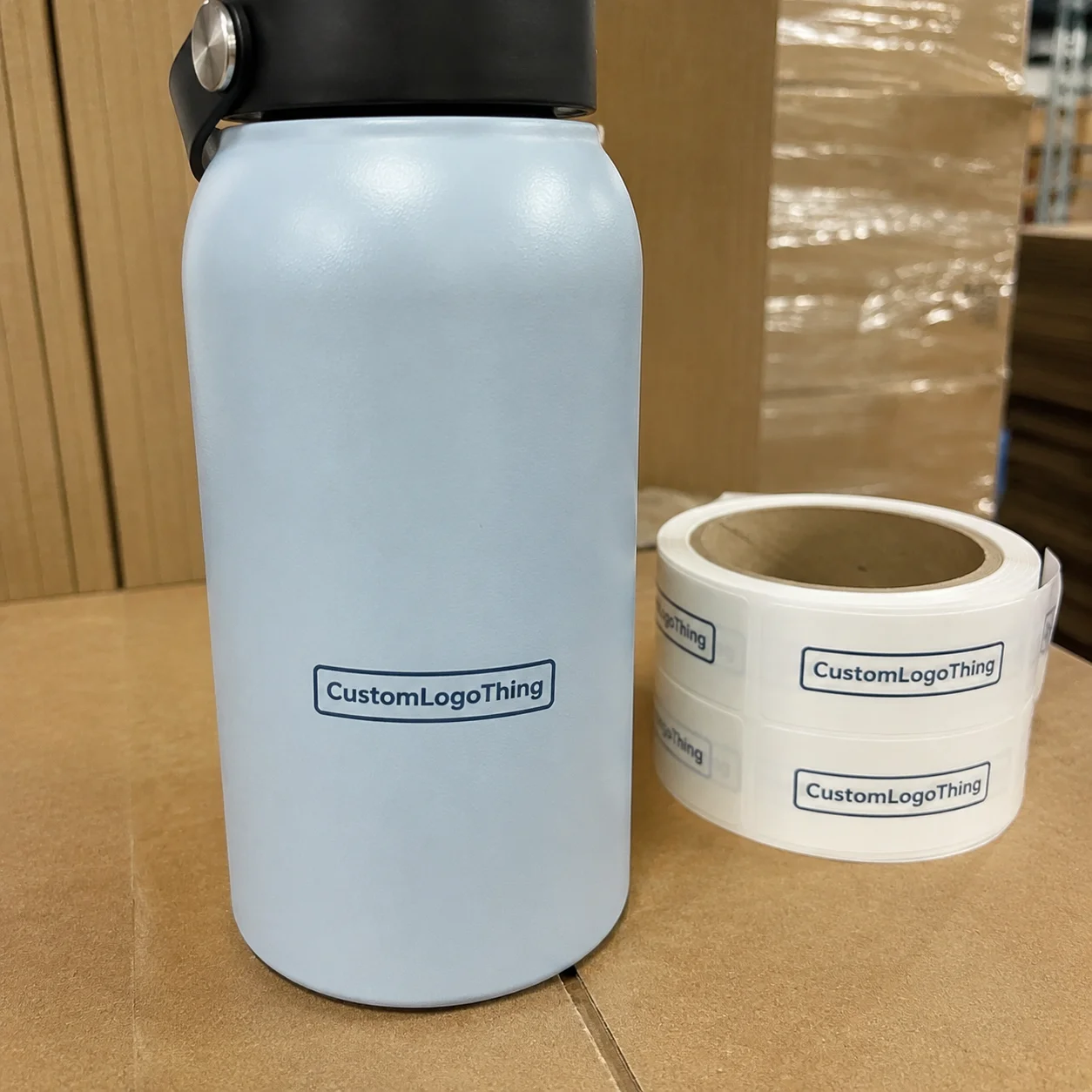
A customer can spot a beautiful label instantly. If the braille dots are too flat, crowded, soft, or placed where fingers never land, the sticker is decorative. Nice accessibility theater. Custom braille stickers are adhesive labels with raised tactile dots used on packaging, product labels, doors, equipment, menus, shelves, and wayfinding surfaces.
The job is easy to describe and harder to execute: give someone useful tactile information in a predictable place. That may mean a product name on retail packaging, a room number on a temporary sign, a warning label on equipment, or a flavor variant on a jar. The sticker has to stay attached, stay readable, and survive the environment where people actually touch it.
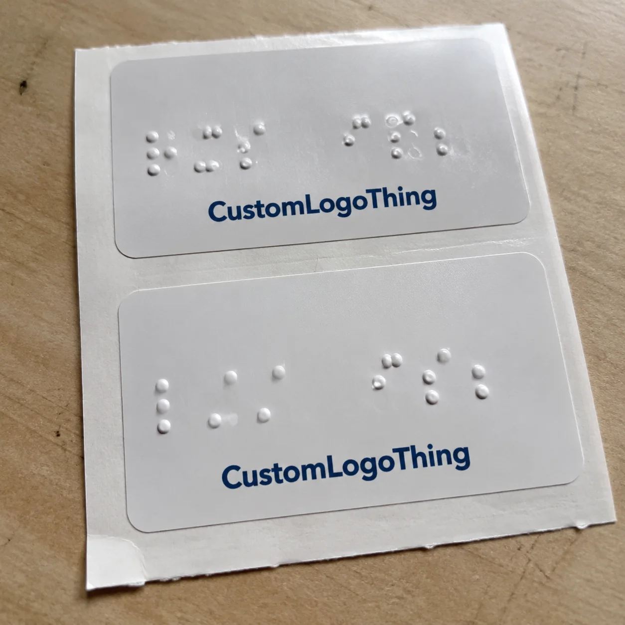
Functional braille is not a printed braille graphic. A dot pattern that looks correct on a screen does not help a reader if the dots are not raised enough to feel. Tactile braille needs clean dot height, consistent spacing, durable material, and placement that makes sense. Fingers read patterns. They do not read your brand mood board.
Most buyers use braille stickers for one of five reasons: adding accessibility without reprinting every package, updating existing signage, marking product variants, supporting compliance efforts, or improving usability for blind and low-vision customers. The first two are especially common because stickers can be added to finished packaging or installed over existing surfaces without rebuilding the whole system.
Set expectations early. These are not normal stickers with bumps slapped on top. Dot height, adhesive, surface texture, laminate, ink coverage, cleaning exposure, and temperature all affect whether the finished label works. If the label goes on a cold bottle, a textured carton, or a frequently cleaned restroom sign, the spec needs to be tougher than a basic paper label. Shocking, I know: real surfaces behave badly.
How Raised Braille Labels Are Made and Read
Raised braille labels can be produced several ways. Common methods include clear raised UV varnish, tactile resin, embossed films, screen-printed raised dots, and specialty tactile printing. The right method depends on volume, substrate, durability, dot height target, and handling. A short-run indoor label may use a different process than a high-touch public sign or a refrigerated package overlay.
A braille reader moves their fingers across cells, not isolated bumps. Each braille cell can contain up to six dots arranged in two columns and three rows. Consistent spacing matters more than dramatic height. Dots that are too low disappear. Dots that are too tall or blobby can feel muddy. Dots that drift out of position become tiring fast.
Grade choice matters. Grade 1 braille spells words letter by letter. Contracted braille shortens common words and phrases, which can save space and speed reading for people who use it regularly. Do not guess here. Product names, abbreviations, medical language, ingredient terms, room names, and directions should be reviewed by someone who understands the intended audience and use case.
Visual print still has a role. Many tactile labels include ink text, icons, arrows, color coding, QR codes, or product information for sighted users and staff. That is good packaging design: tactile and visual cues supporting each other instead of fighting for space. For branded packaging, a clear overlay can preserve existing graphics while adding raised braille, but busy artwork underneath can make the visual side harder to read.
Braille translation needs care. Automated tools are useful for drafts, not final approval. Brand names, capitalization, hyphenation, dosage terms, ingredient abbreviations, and directional wording can create errors if nobody reviews them. A PDF proof only tells you what the layout looks like. It does not tell you whether the dots feel right.
Practical buyer rule: if the label is tactile, ask whether a physical sample is available before full production. A digital proof cannot simulate dot height, edge sharpness, adhesive grip, or finger feel. Procurement teams love skipping samples. Then everyone acts surprised when the label fails.
Material, Adhesive, and Surface Factors That Matter
The base material affects durability, flexibility, clarity, and price. Vinyl is popular because it handles curves and general wear well. Polyester is stiffer and strong against abrasion, making it a good fit for equipment, panels, and long-term signage. Polypropylene is common for product labels where moisture resistance and cost control both matter. Paper can work for short-term indoor use, but it is usually the wrong move for wet areas or heavy handling. Clear films are useful when buyers want subtle overlays on existing package branding.
Adhesive choice is just as important as face stock. Removable adhesive works for temporary signage, event labeling, and short-term shelf markings. Permanent adhesive is better for packaging, equipment, and labels expected to stay put through distribution. High-tack adhesive helps on textured surfaces, low-energy plastics, and certain coated cartons. Freezer-grade or moisture-resistant adhesive is needed for cold-chain, bathroom, refrigeration, or food-service use.
Surface compatibility decides whether the label behaves. Smooth glass, coated cartons, plastic jars, metal panels, and laminated menus usually accept braille stickers well. Rough corrugate, dusty shelves, raw wood, fabric, heavily curved containers, and flexible seams need testing. Adhesives hate chaos. They also hate powder, oil, silicone coatings, condensation, and people applying labels with one thumb while rushing a retail reset.
Finish options change usability. Matte finishes reduce glare, which helps sighted users in bright retail or facility lighting. Gloss can match existing retail packaging, but it may show fingerprints and reflect light. Clear overlays can preserve custom printed boxes or printed labels, but they need enough contrast if visual text is included. Protective laminates can help ink last longer, but they must not flatten or bury the tactile dots.
| Material | Best Use | Watchouts | Typical Buyer Fit |
|---|---|---|---|
| Vinyl | Flexible packaging, jars, indoor signs | Can stretch during application if handled roughly | Durable all-purpose option |
| Polyester | Equipment, panels, high-touch surfaces | Less flexible on tight curves | Longer-life labels with better abrasion resistance |
| Polypropylene | Product labels, retail packaging, moisture-prone items | Adhesive must match container surface | Good cost-to-performance balance |
| Paper | Short-term indoor labeling | Poor around water, oils, and repeated touch | Budget use only, not my first pick |
| Clear film | Overlays on existing graphics | Busy artwork can reduce visual readability | Brands preserving current packaging design |
Size and placement deserve real attention. Braille should sit where fingers naturally search, not under a flap, around a corner, buried near a barcode, or placed on a flexible seam. On product packaging, that often means a flat front or top panel with enough open space around the tactile cells. On signs, consistency across locations matters. Readers should not have to hunt like they are solving a scavenger hunt designed by a committee.
Environmental exposure changes the spec. Outdoor use, UV light, cleaning chemicals, hand oils, refrigeration, and repeated touch can all push the buyer toward stronger films, better adhesives, and more durable raised-dot systems. If your product ships through rough distribution, ask about package testing standards from groups like ISTA. For paper-based packaging programs, FSC-certified materials may also matter; the Forest Stewardship Council explains chain-of-custody certification for responsibly sourced paper products.
Cost, Pricing, MOQ, and Unit Cost Drivers
Pricing for custom braille stickers depends on size, material, adhesive, number of colors, tactile method, dot coverage, order quantity, proofing needs, die shape, and whether the design needs braille translation or setup support. Anyone offering one universal price without asking those questions is either guessing or selling a very narrow product.
Small custom runs usually cost more per piece because setup, proofing, file prep, and machine time are spread across fewer stickers. A pilot order of 100 to 250 pieces might land in a higher unit range because tactile setup does not disappear just because the order is small. Larger orders can reduce unit cost once setup is absorbed, but the savings depend on the process. A simple rectangular label at 2,500 pieces behaves differently from a custom-shaped clear overlay with dense tactile coverage.
For rough planning, basic tactile label projects may start around $0.45 to $1.25 per piece at moderate quantities, while small specialty runs can run $2.00 to $6.00 per piece or more. Larger roll-label jobs may drop below $0.40 per piece if the spec is simple and the quantity is high enough. Setup fees can range from $50 to $250 for straightforward layouts, while custom screens, plates, tooling, color matching, samples, or rush work can add more. These are planning ranges, not gospel. Real quotes depend on the production method and supplier.
MOQ varies. Some suppliers accept low minimums for digital or UV-raised labels, especially for standard shapes. Specialty tactile production may require higher quantities to make the job efficient. If you need 50 labels for a pilot, say that clearly. If you need 10,000 for launch packaging, request quantity breaks at 2,500, 5,000, and 10,000 so you can see where the price curve improves.
Setup fees are not automatically a ripoff. Braille layout, screen setup, die cutting, custom shapes, sample production, translation review, and rush scheduling all take labor or equipment time. The trap is not the fee. The trap is approving the wrong file, changing the braille text after production approval, and paying for the same prep twice. That one stings because it is avoidable.
Hidden cost traps show up in boring places: ordering too few and reordering every month, choosing paper for a wet environment, skipping samples on a curved bottle, or using weak adhesive on textured plastic. Another classic mistake is designing a beautiful label that covers required legal copy, barcodes, warnings, or opening instructions. The reprint will not care how nice the concept deck looked.
To get accurate quotes, provide finished size, quantity tiers, surface type, use environment, artwork, braille wording, shipping destination, deadline, and whether the sticker is indoor, outdoor, wet, cold, or frequently touched. If you already source Custom Labels & Tags or broader Custom Packaging Products, keep the braille spec tied to the same packaging files so placement does not turn into guesswork later.
Process, Timeline, and Production Steps Before You Order
A clean ordering process saves time. Start by defining the use case: packaging overlay, temporary sign, permanent marker, equipment label, shelf tag, menu update, or product variant label. Then choose the finished size and surface location. Confirm the braille wording before artwork gets polished. Prepare visual art. Request a Quote. Review a digital proof. Approve a tactile sample if the job needs one. Then move into production.
Typical timelines vary by complexity. A simple repeat order may move in 5 to 10 business days after proof approval, depending on queue and quantity. A first-time tactile job often needs 12 to 20 business days because translation, material selection, tactile proofing, and approvals add steps. Accessibility labels are not the place to sprint blindfolded. That is how mistakes get printed in bulk.
A good proof should include visual layout, braille placement, dot pattern, finished size, material, adhesive type, color, cut line, orientation, and notes about the application surface. If the label goes on a carton dieline, the proof should show the panel. If it goes on a bottle, show the label area and curvature. If it goes on a door or wall sign, show height and orientation requirements.
Sample testing is worth it for cleaning exposure, refrigeration, outdoor use, frequent touch, textured packaging, or curved containers. A sample can expose adhesive lift, cracking, dot wear, poor readability, edge curl, glare, or application problems before money gets lit on fire. Test samples under real conditions: cold storage, wipe-down chemicals, hand oils, stacking pressure, and the actual packaging surface.
Approval checkpoints should be deliberate. Have the braille text reviewed before art approval. Confirm placement with packaging, facilities, or fulfillment teams. Check that the final label does not cover legal copy, expiration dates, ingredients, warnings, barcodes, QR codes, tamper seals, or opening instructions. For product packaging, run the placement past whoever handles pack-out because they know which panels get touched, stacked, taped, or hidden.
Leave buffer for artwork revisions, tactile sampling, production, quality checks, and shipping. Product launches, retail resets, events, and compliance deadlines all punish late decisions. If the braille sticker is part of a larger packaging design update, align it with the carton, label, pouch, or insert schedule so the tactile label does not arrive after the product has already shipped. Yes, that happens. No, it is not charming.
Common Mistakes That Make Braille Stickers Fail
The most common failure is dots that look raised in photos but are too low, soft, or inconsistent to read by touch. Pretty bumps do not equal braille. If the tactile surface wears down after a week of handling, the label has failed even if the artwork still looks fine.
Translation mistakes come next. Buyers use unreviewed automated braille, misspell brand or product names, mix grade systems, forget capitalization rules where relevant, or abbreviate text in ways readers may not expect. Short text still needs review. Actually, short text needs extra review because there is less context to recover from a bad choice.
Placement mistakes are painfully common. Labels get placed too high, too low, too close to an edge, around a curve, under shrink wrap, on a flap that gets torn off, or behind merchandising displays. On retail packaging, a braille overlay should sit on a stable panel where fingers can find it before the package is opened. On signage, consistency across the facility matters more than creative placement.
Material mistakes are just as expensive. Paper labels in wet areas fail. Weak adhesive on textured plastic fails. Clear stickers over busy artwork become visual clutter. Glossy finishes in high-glare spaces annoy people. Thin films wrinkle during application, especially if staff are applying hundreds by hand. None of this is mysterious. It is just ignored until the invoice is paid.
Information overload also hurts usability. Braille labels have limited tactile real estate, so prioritize useful text: product name, variant, room number, direction, warning, or key instruction. Nobody needs a full brand manifesto in braille dots. If your message takes three paragraphs, it probably belongs in another accessible format, not on a tiny tactile sticker.
Skipping end-user feedback is the mistake procurement teams love to rationalize. If the label is meant for accessibility, a blind or braille-literate reviewer can catch usability issues that designers and buyers miss. That review does not have to slow the entire project if it is planned early. It absolutely will slow the project if it happens after 20,000 labels are printed.
Next Steps: Build a Print-Ready Braille Sticker Spec
Before requesting a quote, gather the practical details suppliers actually need. Start with the application surface, indoor or outdoor use, expected handling, cleaning exposure, finished size, quantity, adhesive type, material preference, visual artwork, braille wording, and deadline. That list may feel basic. It is also the difference between a useful quote and three rounds of email archaeology.
- Surface: coated carton, glass, plastic jar, metal panel, laminated menu, shelf edge, wall, door, or another material.
- Environment: dry indoor, wet indoor, refrigerated, freezer, outdoor, high-touch, cleaned daily, or short-term event use.
- Size: finished sticker dimensions, usable tactile area, corner radius, and any die-cut shape requirements.
- Message: exact braille wording, visual text, icons, arrows, color coding, and translation review status.
- Quantity: pilot run, launch quantity, and expected reorder quantity.
- Deadline: proof date, sample date, in-hand date, and shipping destination.
Choose a starting spec based on the job. For indoor product packaging, consider a durable film with permanent adhesive and raised UV or tactile resin. For temporary signs, removable adhesive may be smarter because nobody wants residue cleanup after a two-week program. For wet, cold, or frequently cleaned surfaces, test synthetic materials and stronger adhesives before ordering the full run.
Create a simple placement map using product photos or packaging dielines. Mark exactly where the tactile label should sit so production, fulfillment, retail teams, and installers are not guessing. Guessing is how labels end up under a tamper seal, across a barcode, or wrapped halfway around a curved shoulder. Use arrows, measurements, and panel names if the package has multiple sides.
Ask for quantity breaks. A quote at 250, 1,000, 2,500, and 5,000 pieces can show whether the unit cost drops enough to justify a larger order. For a new product, a small pilot run may be smarter than filling a warehouse with labels before the surface, placement, and wording are proven. For repeat retail packaging, a larger run may make sense once the spec is stable.
Approve braille text before approving art. Then request a sample if the job involves a new surface, high visibility, regulatory sensitivity, outdoor exposure, refrigeration, cleaning chemicals, or heavy touch. If the label supports product packaging, custom printed boxes, or broader package branding, keep the tactile label tied to the main artwork files so future revisions do not break the accessibility layer.
Custom braille stickers work best when they are treated like a real packaging component, not an afterthought. Gather the specs, confirm the wording, test the surface, review the tactile sample when needed, and Request a Quote with enough detail to avoid delays. Accessibility deserves better than “we added bumps.” So do your customers.
FAQ
Are custom braille stickers compliant with accessibility requirements?
They can support accessibility, but compliance depends on use case, location, braille accuracy, placement, size, contrast, and applicable rules. ADA signage has specific requirements for permanent rooms and spaces, so buyers should confirm whether a sticker is appropriate or whether a compliant sign is required. For product packaging, the goal is usually usability and inclusion rather than ADA room-sign compliance, but accurate braille and durable dots still matter.
What materials work best for tactile braille label stickers?
Vinyl, polyester, and polypropylene are common because they handle touch, moisture, and abrasion better than basic paper. Paper can work for short-term indoor use, but it is a poor choice for wet areas, cleaning exposure, or long-term handling. The best material depends on the application surface, environment, adhesive needs, and how often the label will be touched.
How much do raised braille stickers cost?
Cost depends on size, quantity, material, adhesive, tactile printing method, color count, setup, and proofing requirements. Small runs have higher unit costs because setup and production prep are spread across fewer stickers. For accurate pricing, request quantity breaks and provide the surface type, use environment, artwork, braille wording, and deadline.
Can custom tactile stickers be added to existing packaging?
Yes, they are often used as overlays when brands want to add braille without reprinting boxes, jars, pouches, or labels. The sticker must be tested on the actual packaging surface, especially if the package is curved, textured, coated, cold, or flexible. Placement should avoid seams, flaps, legal copy, barcodes, tamper seals, and areas that customers are unlikely to touch.
How long does it take to produce custom braille labels?
Timeline depends on artwork readiness, braille translation, proof approvals, material availability, sampling, quantity, and shipping. Repeat orders are usually faster because the braille layout, material, and tooling have already been approved. First-time orders should allow extra time for tactile samples and surface testing, especially for launch packaging or public-facing signage.