Custom Christmas Return Address Labels That Actually Hold Up in Use
custom christmas Return Address Labels do a modest job with outsized effects. They keep holiday mail moving, reduce the friction of handwriting the same information over and over, and add a finished look to envelopes, gift boxes, and seasonal mailers. The value is not abstract. It shows up in how fast a stack gets assembled, how consistent the sender block looks, and how the envelope reads before anyone opens it.
The strongest labels usually do three things at once: they fit the address cleanly, they survive handling, and they look like they belong with the rest of the package. That sounds simple. It is not. A label that is too decorative becomes hard to read, while a label that is too plain can look accidental on an otherwise thoughtful card or box. The best versions sit in the middle and do their work without drawing attention to the fact that they are doing work.
For households, that means less time spent on repetitive handwriting during December. For small businesses, it means a consistent sender block across customer gifts, thank-you notes, and outer packaging. For both, the appeal is partly visual and partly practical. A good label saves minutes at the table, then keeps saving time as the mailing batch grows.
Why custom christmas return address labels punch above their weight
The return address is small, but it is not minor. It is one of the few pieces of information that appears on nearly every outgoing envelope or parcel, which makes it a surprisingly useful place to improve both efficiency and presentation. Handwriting the same address 50 times sounds manageable until the addresses get long, the line breaks shift, or the batch stretches across several evenings. At that point, the value of a preprinted label is obvious.
There is also a consistency problem that does not get enough attention. Handwritten return addresses vary from envelope to envelope. Initials change. Apartment numbers drift onto a second line. A line that looked centered on the first envelope sits slightly high on the next one. Labels remove that variability, and the whole set looks more deliberate as a result.
That is why these labels matter for holiday use in particular. December mail is often assembled in batches, sometimes across different days, sometimes by more than one person. A printed label keeps the presentation stable across the whole run. If the project includes cards, tissue wrap, gift bags, or customer shipments, it also helps the sender block feel like part of the design system instead of a last-minute afterthought.
There is a branding angle, but it only works when the design stays restrained. A monogram, a small seasonal icon, or a simple border is usually enough. If the label tries to do too much, the address loses legibility and the package starts to look crowded. Holiday mail is one of the few places where restraint reads as confidence rather than emptiness.
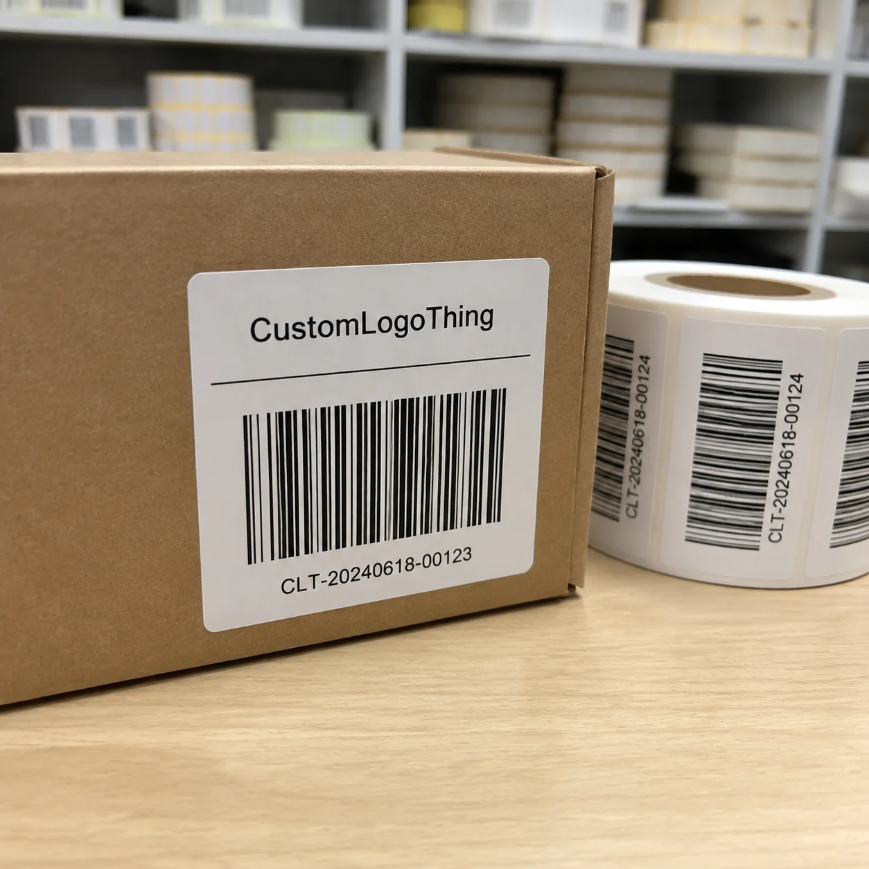
For buyers who are comparing return address labels with other printed finishing pieces, the same logic applies to Custom Labels & Tags and similar packaging details. Small printed elements are easy to dismiss until they are missing or poorly executed. Then the whole package feels less controlled.
Durability matters as much as appearance. A label that looks perfect in the proof but lifts at the corners on coated stock is not finished. Likewise, a label that smears after a little moisture or rubbing is a problem if it is used on parcels rather than only on envelopes. Packaging references from organizations such as ISTA can help buyers think through handling, abrasion, and transit exposure when the label has to do more than sit on stationery.
The useful label is the one you stop thinking about after application. It reads clearly, sticks cleanly, and leaves the rest of the design alone.
Process and turnaround: from address list to shipped labels
The production path is simple enough on paper: finalize the address, choose the size and format, approve the proof, print, finish, and ship. The actual schedule depends less on the press than on the quality of the input. Clean copy moves quickly. A shifting address file does not.
Long apartment lines, inconsistent capitalization, and multiple versions of the same sender address are the usual delay points. A spreadsheet can look orderly and still produce a cramped layout when the text is set into a small label. That is why proofing exists. It is the stage where spacing, line breaks, and hierarchy get checked before they become a stack of misprints.
Typical turnaround depends on quantity and production method. Small digital label runs often ship in 2 to 4 business days after proof approval. Larger orders, specialty stocks, or die-cut jobs can take 5 to 8 business days. Shipping adds its own window, commonly 1 to 5 business days depending on service level and destination. Rush options exist, but they make the most sense when the mailing date is fixed and moving the date is not realistic.
The substrate and adhesive deserve more attention than many buyers give them. A matte face stock is usually easier to read on kraft envelopes and uncoated paper. Gloss can intensify color and make festive accents look sharper, but it also reflects more light and shows fingerprints more easily. Adhesive selection matters too. Coated boxes, recycled envelopes, and cold surfaces do not behave the same way, so it is better to ask what adhesive was tested for the exact use case than to assume a general-purpose stock will work everywhere.
| Format | Best for | Typical unit cost | Strengths | Tradeoffs |
|---|---|---|---|---|
| Sheets | Home mailings, hand application, smaller holiday batches | $0.14-$0.38 at 250-1,000 units | Easy to store, easy to peel, useful for low-volume orders | Slower for larger runs, more manual handling |
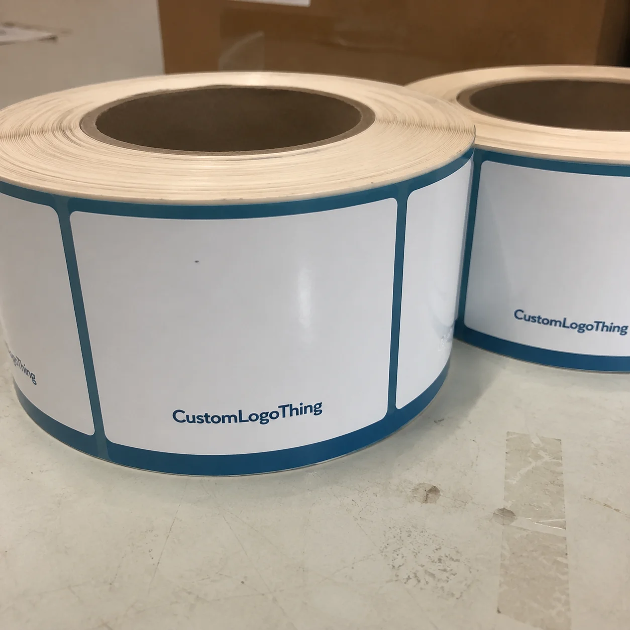
| Rolls | Higher-volume use, faster application, small business pack-out | $0.06-$0.24 at 1,000-5,000 units | Efficient for repeat labeling, compact storage, fast dispensing | Less convenient if you only mail occasionally |
| Custom die-cut labels | Brand-led mailers, matching holiday sets, premium presentation | $0.18-$0.45 depending on shape and finish | Strong visual impact, better fit for unique packaging design | Higher setup cost, more proofing attention required |
Those ranges explain why two quotes can look far apart even when the label dimensions seem identical. Quantity, finish, die shape, adhesive choice, and revision count all affect the number. The fairest comparison comes from matching the specification line by line. Otherwise, one supplier is quoting a basic paper label and another is quoting a more durable stock with a cleaner trim and tighter print control.
If the labels are part of a broader seasonal program, it helps to think beyond the envelope. Custom Packaging Products can keep card inserts, outer packaging, and the sender label visually consistent. The value is not just aesthetic. A unified package reduces decision-making during production, especially when multiple pieces need to ship in the same window.
Cost, pricing, and unit cost: what actually changes the quote
Unit cost usually falls as quantity rises, but total spend can still climb fast if the job gets complicated. That is the basic math of custom print. A 250-label run tends to look expensive on a per-piece basis because setup gets spread across fewer units. A larger run may be cheaper per label, yet still cost more overall if the buyer adds foil effects, specialty stock, unique shapes, or extra proof rounds.
Five variables drive most quotes: quantity, material, adhesive, shape complexity, and print coverage. A simple black address on white matte stock sits near the lower end of the range. Add a die-cut holiday silhouette, a metallic effect, a dense border, or a richer color build, and the cost rises. Variable data can also increase price if each label includes different names, departments, or suite numbers.
There are a few cost items that buyers often miss. Setup fees can appear on custom jobs, especially when artwork needs to be adjusted for a new die line. Shipping is easy to underestimate when the order has a fixed deadline. Reprints are the most expensive surprise of all. A missing apartment number or a wrong line break can turn a cheap job into a second purchase, which is why a careful proof usually pays for itself.
Comparing suppliers only by headline price is a weak method. A better comparison includes the underlying spec and the operational details:
- Material spec - face stock weight, finish, and adhesive type.
- Production speed - proof turnaround, print time, and transit time.
- Revision policy - how many proof edits are included before extra fees apply.
- Use case fit - envelope mail, gift boxes, or product packaging.
- Durability - resistance to rubbing, moisture, or coated surfaces.
If sustainability claims matter, ask about FSC-certified stocks rather than assuming they are standard. Certification does not change print quality on its own, but it can matter for procurement rules, brand messaging, and material traceability. The FSC framework gives buyers a clearer reference point when paper sourcing is part of the decision.
Price also needs to be weighed against fit. A label that is fast and cheap but clashes with the card design or package surface does not really save money. The better buy is the one that stays legible, sticks properly, and matches the rest of the presentation without additional fixes.
Design choices that affect readability and gift appeal
Holiday labels work best when they are readable first and decorative second. That is the opposite of what some buyers assume. The design is not competing for attention. It is supporting a mailing task. Thin script fonts, pale inks, and crowded borders often look charming on screen and fail in print, especially at small sizes.
Contrast is the starting point. Dark type on light stock remains the safest choice for most envelopes and parcels. If the same label will move between white envelopes, kraft mailers, and glossy gift packaging, the design needs enough contrast to survive all three surfaces. Good packaging design has to work under handling, not just in a mockup.
Seasonal cues are fine, but they should stay out of the address block. A narrow wreath line, a restrained snowflake, or a small ornamental border can suggest the season without interrupting the sender details. More decoration is not necessarily better. In practice, heavy ornament tends to age quickly, while cleaner labels remain usable long after the holiday window closes.
Finish changes both look and usability. Matte stock feels calmer and reads more reliably under indoor light. Gloss can deepen color and sharpen details, but it also makes glare and fingerprints more visible. If the label will be stored in a car, applied in damp weather, or used on outer shipping materials, a more durable face stock may be worth the added cost.
There is a useful rule for mixed-surface packaging: the busier the envelope or box, the simpler the label should be. A patterned card, metallic wrap, and glossy outer mailer already carry a lot of visual weight. The label should anchor the composition, not compete with it.
Step-by-step order checklist for holiday mailers
Start with the sender information and finalize it before design work begins. Decide whether the label should show a household name, a business name, or a department line. If the address includes a suite, apartment, or PO box, lock the line order before the proof stage. Small changes at that point are easy to miss and expensive to correct later.
Then choose the format. A small envelope label does not need the same dimensions as a shipping label or a gift sticker, and the whitespace around the text matters just as much as the text itself. If the layout feels tight in the proof, it will look tighter once printed.
- Collect the final return address copy.
- Confirm quantity and add a small buffer for damaged or late-use pieces.
- Choose the size, shape, and finish that match the surface.
- Review the proof for spelling, line breaks, and capitalization.
- Set the approval deadline and the required in-hand date.
That order keeps the job moving and reduces avoidable back-and-forth. If the labels are part of a larger seasonal kit, ask whether the same visual system can be adapted for cards, inserts, or custom printed boxes. Reusing the same typography and motif across several pieces usually produces a more coherent result than designing each item separately.
One practical habit makes a large difference: work backward from the mailing deadline. Proof review can take a day or two if edits are needed. Printing takes its own window. Shipping adds another buffer. If the cards need to go out on a specific date, build the schedule around that date, not around the day you place the order.
Common mistakes that delay proofing or create misprints
The most common error is assuming the first layout will fit without adjustment. Long addresses are usually the problem. A business return address with a department line, suite number, and city-state-zip can run too long for a small label, especially if the typeface has decorative flourishes. The solution is usually a larger size or a tighter hierarchy, not forcing the text into the same box.
Low-resolution artwork causes a different kind of trouble. A logo downloaded from a website may look fine on a monitor and break apart in print. Thin strokes disappear. Small ornaments blur. If the label includes a logo or graphic, the file should be prepared cleanly from the beginning rather than rescued later by the production team. That matters even more for custom Christmas Return Address Labels used on customer-facing mailers, where the sender block is part of the brand presentation.
Outdated mailing information creates unnecessary reprints. Households move. Businesses rename departments. Suite numbers change. If the label is being produced for a team or shared office, confirm the address with the person who owns the mailing list instead of assuming last year’s version still applies. Verifying the address costs almost nothing and avoids a far more expensive mistake.
Skipping the proof review is another common failure point. A missing comma, an extra space, or a poor line break can send the order back into production. In packaging terms, this is the equivalent of approving a carton dieline without checking the fold lines and glue tabs. It looks small until the printed inventory arrives and the error becomes real.
A proof is not a courtesy step. It is the last chance to check how the label will read on screen, on paper, and in the hand.
One more problem is overdesign. Holiday labels are small, and small surfaces have limited tolerance for visual noise. If the label already includes a busy border, a script font, and a logo, the sender details can become harder to read than they should be. That is a design failure, not a style choice.
Next steps before you place the order
Before requesting a quote, gather the final address copy, quantity, preferred size, and a rough visual direction. If you already know the envelope color, mailer finish, or gift wrap stock, include it. That gives the supplier a better basis for recommending the right contrast and finish. If the label needs to coordinate with other brand materials, say so early. It helps the artwork stay aligned with the rest of the package rather than drifting off on its own.
Ask for the details that determine whether the job can actually hit the deadline. What is the proof turnaround? How many revisions are included? What is the production window after approval? Which shipping methods are available, and what is the realistic in-hand date? Those questions are more useful than vague speed claims because they expose the real schedule.
For higher-stakes mailings, request a digital mockup before production begins. That is especially helpful if the label will sit on holiday cards, gift packaging, or retail packaging where the rest of the presentation is already locked in. A mockup can reveal a text block that is too tight, a border that feels heavy, or a color that disappears on the chosen surface.
The simplest path is usually the most reliable one: keep the address list clean, keep the layout restrained, and allow one proof cycle before print approval. If those three things are handled well, custom christmas Return Address Labels become a quiet production asset instead of a seasonal problem. They arrive on time, they read clearly, and they do exactly what they are supposed to do.
How many Christmas return address labels should I order for holiday mail?
Order based on your mailing list, then add a buffer of 10 to 15 percent for address changes, damaged labels, and later use. If you send cards in waves, the extra quantity helps you keep the same look for gifts and follow-up packages without starting a second print job.
What format works best for custom Christmas return address labels?
Sheets are usually easiest for home mailings and hand application. Rolls make more sense if you are labeling a higher volume of envelopes or packages and want faster application. Choose the format that matches how the labels will be stored, peeled, and applied.
How long does the production timeline usually take?
It depends on proof approval, quantity, print method, and shipping speed. Clean artwork moves faster. If the mailing date is fixed, ask for the in-hand estimate before ordering so production does not become the bottleneck.
Do I need a proof before printing holiday return address labels?
Yes. A proof catches spelling errors, missing apartment numbers, awkward line breaks, and spacing problems that are easy to miss on screen. It matters even more when the address is long or the design uses decorative type.
Can small businesses use custom Christmas return address labels on packaging?
Yes. They work well on mailers, inserts, tissue wrap, and gift boxes when the sender information needs to stay consistent and polished. Keep the design readable and aligned with the rest of the package so it feels like part of the system, not an afterthought.