Holiday mail puts a lot of pressure on a small piece of print. Paper choice, adhesive strength, font size, proof timing, and surface compatibility all affect whether the result looks polished or ends up needing a reprint. Personalized Christmas Return Address Labels sit at the center of that workflow: they need to look seasonal, stay readable, and hold up on the envelope or package you actually use.
The practical test is simple. The label should make the mailing look finished without creating handling problems. That means good contrast, sensible typography, and a stock that adheres cleanly to the chosen substrate. A design can be festive and still fail if it is too decorative, too small, or incompatible with the envelope stock.
For buyers handling cards, gift packaging, or seasonal business mail, the main decisions are not about whether the label can be customized. They are about what level of customization still fits the budget, lead time, and required quantity.
Personalized Christmas Return Address Labels: Why They Stand Out
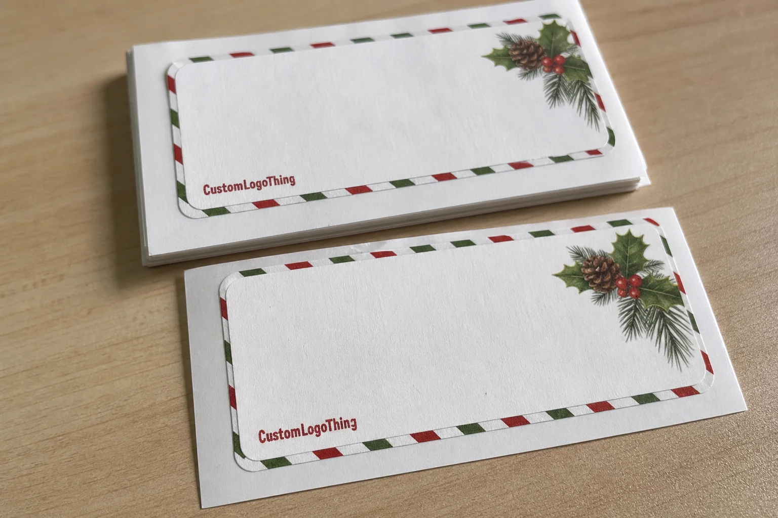
A return address is functional, but during the holidays it becomes part of the presentation. Personalized Christmas Return Address Labels can carry a family name, business name, monogram, or seasonal graphic, and that small change affects how the envelope feels before it is opened.
The value is consistency as much as decoration. If you are addressing 40 envelopes by hand or 4,000 pieces for a seasonal mail run, a printed label keeps spacing, typography, and punctuation uniform. That consistency is one of the clearest signs of a professional-looking result.
Readability still has to lead the design. A return address that is too ornate can crowd the envelope and make postal handling less efficient. The better structure is usually clear: sender name first, street line second, then city, state, and ZIP in a size that stays legible at a glance. Seasonal graphics should frame the address, not compete with it.
“A holiday label works when the festive element supports the address, not when the address is squeezed around the festive element.”
These labels also work beyond envelopes. Many buyers use them on gift bags, tissue wrap, thank-you notes, small boxes, or branded inserts when they want the same seasonal look across a set of materials. For projects that need that kind of continuity, Custom Labels & Tags can be paired with the holiday mailer so the visual system stays aligned.
The strongest labels usually feel simple on first glance and deliberate on second glance. That is harder to achieve than it sounds because simple layouts expose weak spacing, poor contrast, and bad trim quickly.
How the Ordering Process Works From Proof to Press
Most label orders follow the same sequence: gather the address data, choose the format, build the layout, review the proof, approve the file, then move into production. The proof stage is where most problems are either caught or missed.
Proofing is not a formality. Mailing copy is unforgiving. A suite line that sits too close to the city line, a name that is set too large, or a script font that looks good on screen but fails at actual size can all make a label feel crowded or hard to read.
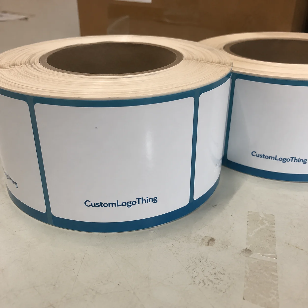
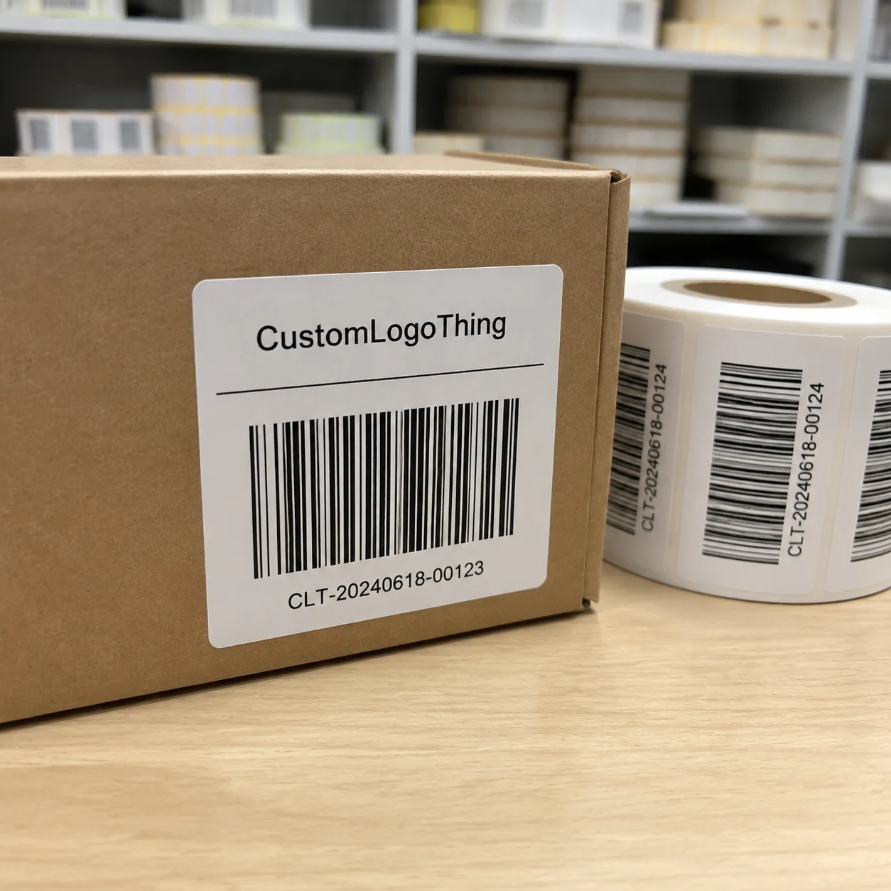
Format affects workflow. Sheet labels are efficient for smaller holiday runs and easy to store flat. Roll labels are better for larger quantities or repeated application in a packaging workflow. Individual cut labels can look refined for presentation pieces, but they usually carry more handling and a higher cost per piece.
Short-run digital production is often the fastest path for small seasonal jobs. Custom Die Cuts, specialty finishes, and multiple address versions usually add setup time. Holiday schedules compress everything, so even a small revision can matter if it lands late in the process.
Review the proof at actual size, not only as a thumbnail. Open it on a larger screen, verify alignment, and check whether the seasonal artwork leaves enough breathing room around the address block. If the design uses borders or icons, confirm that the trim line will not cut into them.
Material, Adhesive, and Finish Choices That Affect Readability
Material choice affects both appearance and performance. Matte stocks usually produce the clearest read because they reduce glare under indoor light and photography. Gloss finishes can brighten color and make artwork pop, but they reflect light more aggressively, which can make small text harder to scan. Textured stocks can feel premium, though they are not always the best choice for very fine copy.
Adhesive selection deserves the same attention. A standard permanent adhesive works well on most smooth paper envelopes and many cardstock surfaces. Recycled paper, lightly textured mailers, and coated packaging can be less forgiving. On those substrates, a stronger tack or a stock designed for that surface usually performs better.
Finish and surface are linked. A glossy label on a matte kraft envelope can look intentional and premium, or it can look mismatched depending on the artwork. A soft matte label on a metallic invitation envelope may disappear visually. Readability depends on contrast, but it also depends on context, including lighting and paper texture.
Size and shape matter as much as finish. A label that is too small forces the address into a tight block, and a label that is too large can dominate the envelope. For standard holiday mailings, most buyers need enough room for the full return address plus a modest decorative element. For boxes, gift bags, or inserts, the design can usually be more generous because postal scanning is not the main constraint.
- Matte finish: best for readability and low glare.
- Gloss finish: brighter visual impact, but more reflective.
- Textured finish: good for premium presentation, less ideal for very small text.
- Permanent adhesive: suited to standard paper envelopes and most card stock.
- Stronger tack adhesive: safer on recycled, coated, or lightly textured surfaces.
If sustainability is part of the brief, check the stock, liner, or paper source rather than assuming the label is automatically eco-friendly. Certifications such as FSC can help with that review, though certification alone does not guarantee a better print result. For broader packaging references, the Packaging Machinery Manufacturers Institute is a useful industry source, and FSC guidance is available at fsc.org.
Cost, Pricing, and MOQ: What Buyers Need to Budget
Pricing depends on quantity, size, shape, finish, artwork complexity, and the amount of setup required. The basic pattern is predictable: smaller runs cost more per piece, while larger quantities spread setup across more labels. That is why a modest order of custom holiday labels can feel expensive relative to the size of the product.
MOQ becomes more visible when the job needs a custom die, a specialty finish, or a nonstandard shape. A small custom-cut order can carry almost the same setup burden as a larger run, which raises the unit price. That does not mean the quote is inflated. It means press time, cutting, proofing, and waste are being divided across fewer pieces.
For budgeting, it helps to think in tiers. A simple sheet-label order with standard stock sits at the lower end. A roll label with a clean one-color or two-color holiday design usually lands in the middle. Specialty finishes, layered effects, and die-cut shapes move into the higher-cost tier quickly, especially at low volume.
There are hidden cost drivers as well. Additional proof rounds, layout changes after approval, rush production, split shipments, and revised artwork files can all change the total. Shipping matters too, especially in the holiday period when carriers are already under pressure. A lower per-unit price is not always the best final cost if the turnaround is too tight.
| Order type | Typical setup | Common unit cost trend | Best for |
|---|---|---|---|
| Small sheet-label run | Low setup, standard stock | Higher per unit | Home use, small mailing lists |
| Mid-volume roll labels | Moderate setup, faster application | Lower per unit | Batch mailings, office use |
| Custom size or finish | New die or specialty stock | Highest per unit at low volume | Premium presentation, branded packaging |
The best savings usually come from simplicity and timing. Keep the artwork straightforward, approve the proof without delay, and order before the holiday rush compresses the production window.
Step-by-Step Guide to Ordering Holiday Address Labels
Start with the exact address. Confirm the sender name, street format, apartment or suite line, and preferred postal abbreviations before any layout work begins. If you are ordering personalized Christmas Return Address Labels for more than one sender, decide which version belongs in the order before the proof is built.
- Gather the data. Finalize the return address and determine whether the household name, family name, or business name comes first.
- Choose the format. Sheet labels suit small batches; roll labels suit larger or repeated application.
- Select the finish. Matte, gloss, or textured stock should match the envelope surface and the design style.
- Review the proof. Check spacing, punctuation, line breaks, and the size of the address block at actual scale.
- Approve carefully. Do not move forward until the layout reads cleanly and the artwork sits inside safe margins.
- Plan the application. Make sure the label format fits the packaging or envelope surface you will actually use.
Open the proof on more than one device if you can. A phone screen can hide alignment issues. A desktop monitor usually makes it easier to spot whether the return address sits too close to the border or whether a decorative icon is crowding the ZIP line.
Think through the final substrate before placing the order. Smooth stationery, kraft envelopes, coated invitation paper, and padded mailers all behave differently. If the label is going onto a box or gift bag, test one sample before committing to a full batch. Adhesion problems rarely show up in a proof; they show up after the label has been peeled and pressed.
Common Mistakes That Cause Delays or Messy Results
The most common production mistake is low-resolution artwork. A screenshot of an address or a file pulled from a social graphic often looks acceptable on screen but prints soft at label size. Vector text or properly prepared print files are safer. Crisp edges matter more on small labels because there is less room for blur to hide.
Another common problem is choosing the wrong finish for the surface. A high-gloss label can look sharp, but it may reflect light too strongly on dark envelopes or show wear faster on rough mailers. A matte label can look understated and elegant, yet disappoint if the design depends on shine or metallic effects.
Last-minute edits are expensive in practice, even when the change seems minor. A corrected street name, a different apartment number, or a revised company suffix can trigger a new proof cycle or a reprint. Near the holidays, that sort of delay hurts more because shipping windows are already tight.
Overdesigned layouts cause a different kind of failure. Script fonts are often the first thing buyers want for a seasonal label, but they can become difficult to read if the stroke weight is too thin. Decorative borders, snowflakes, holly, or other seasonal icons can work well if they frame the address. Once they start competing with the text, the label stops being a label and starts becoming a miniature poster.
A few checks consistently catch problems before production starts:
- Review the proof at 100% size instead of relying on thumbnail previews.
- Check line breaks around apartment, suite, and ZIP code lines.
- Compare the label against the actual envelope or packaging surface.
- Confirm that the artwork stays inside trim and safe areas.
- Test one sample label on the final substrate before full application.
For larger mailing programs, package testing logic is worth borrowing from shipping standards. ISTA publishes handling and distribution testing protocols that are useful as a mindset even for labels: if a product cannot survive handling, stacking, friction, and temperature shifts, it is underspecified.
Expert Tips and Next Steps for a Smooth Holiday Order
Keep the hierarchy clean. The sender name should be obvious, the address should be easy to scan, and decoration should stay in the margins unless it has a functional reason to be there. That structure prints better and looks more composed across different envelope colors and sizes.
Separate use cases before you place the order. Personal holiday cards, business mailings, and gift packaging rarely need the exact same treatment. Mixing them into one layout often forces compromise. A clean master version is easier to approve and easier to reuse than a file that keeps being bent to fit different jobs.
Build in a timing buffer. Proofing, material sourcing, shipping, and holiday volume all slow down at the same time. Even a straightforward order benefits from a few extra business days. That cushion is usually cheaper than rush charges and less stressful than waiting on a reprint while cards are already being mailed.
If you want the labels to match a broader seasonal packaging system, keep the same tone across cards, tags, and insert pieces. Consistency in font choice, border weight, and color palette makes the whole mailing set feel intentional. Buyers who already use Custom Labels & Tags for packaging often find it easier to keep holiday labels within the same approval process and material family instead of treating them as a separate project.
The cleanest results usually come from a narrow set of decisions made early: correct data, a readable layout, a finish that suits the envelope, and enough lead time to check the proof properly. That is the formula behind well-made personalized Christmas Return Address Labels. The product is small. The consequences of getting it wrong are not.
How far in advance should I order personalized Christmas return address labels?
Order early enough to allow for proof review, small edits, and shipping. Holiday production windows tighten quickly, so a short buffer is usually more valuable than a slightly lower quote with a risky turnaround.
What material works best for Christmas return address labels on envelopes?
Matte or low-gloss stocks usually read best because they reduce glare. For recycled, textured, or coated envelopes, choose an adhesive designed for that surface rather than assuming a standard permanent adhesive will hold equally well everywhere.
Can personalized Christmas return address labels be used on gift packaging?
Yes, as long as the adhesive suits the surface. Gift bags, boxes, and note cards can all work, but coated or textured packaging should be tested first so the bond and appearance are both acceptable.
What affects the price of custom holiday return address labels?
Quantity, size, material, finish, shape, and setup complexity drive the price. Small runs and specialty cuts usually cost more per piece, while larger orders lower the unit cost by spreading setup across more labels.
How do I make sure my personalized Christmas return address labels print cleanly?
Use a high-resolution or vector file, keep the address layout simple, and review the proof at actual size. Check line breaks, margins, and contrast before approving production.