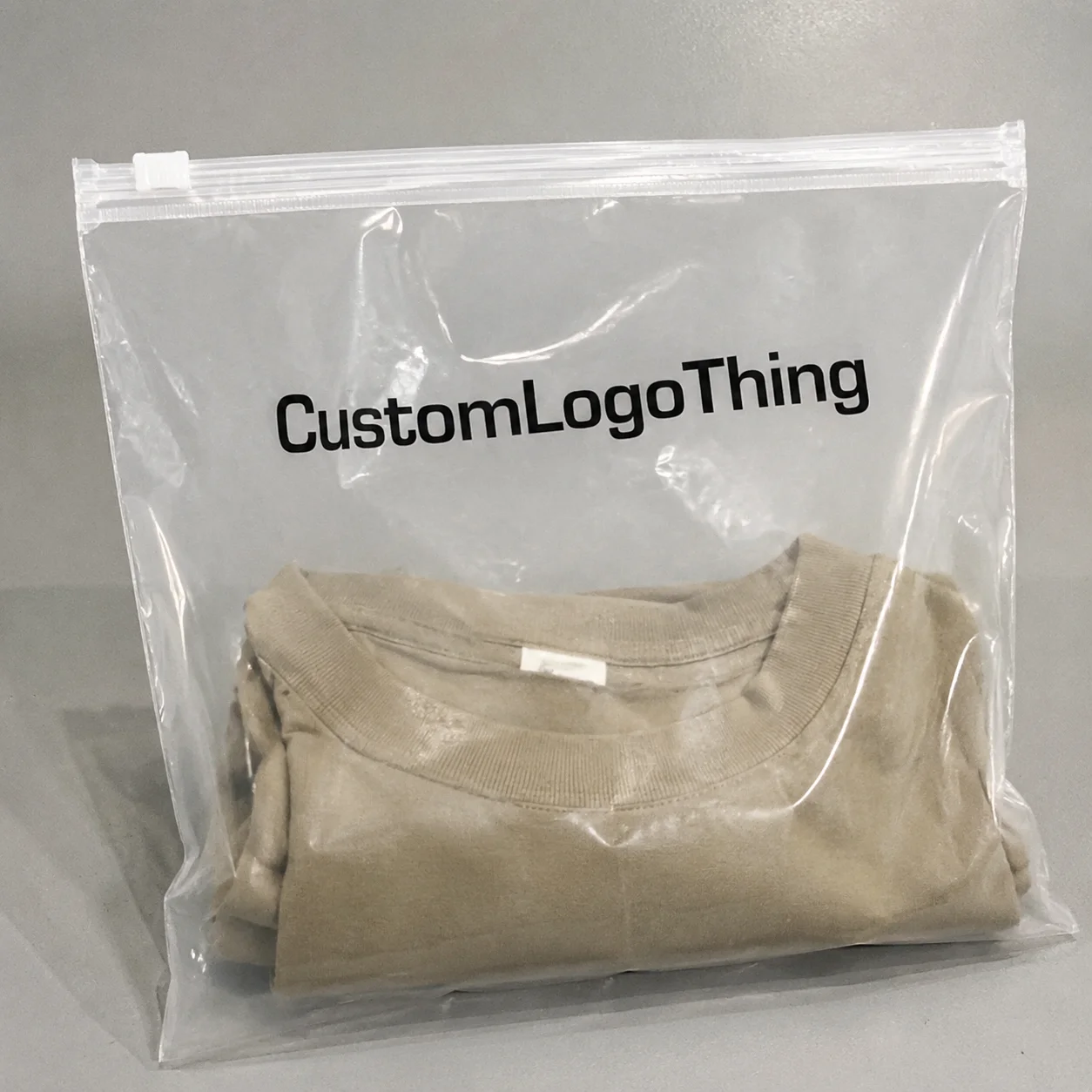
Clear Return Address Labels personalized for a brand do a small job with a surprisingly large effect. They identify the sender, obviously, but they also shape the first impression a parcel makes before it is opened. On a plain poly mailer or a rigid carton, the right label can make the whole package look considered instead of improvised. That matters in apparel, beauty, subscription kits, and any business where the package is part of the product experience.
The appeal is practical, not decorative fluff. A clear label lets the package color show through, so the surface does some of the visual work. A white paper label can be perfectly functional, but on a matte black mailer it can read louder than necessary. A handwritten sticker is faster for one-offs and usually weaker for anything with volume. Clear Return Address Labels personalized with a clean layout split the difference: orderly, low-profile, and easy to standardize.
For teams that source labels alongside other print packaging, a broader catalog helps keep size and finish decisions consistent. A label program rarely lives alone; it sits next to tags, insert cards, and shipping materials. That is why many buyers compare options from the same packaging source, such as Custom Labels & Tags, before they lock in the final spec. Consistency across those pieces saves time later.
Why clear labels make shipping look more finished
Clear stock removes one visual layer from the package. That sounds minor until you compare it to the effect of a thick white rectangle sitting on top of an otherwise restrained mailer. Clear labels feel lighter. They keep the substrate visible and let the package finish do part of the branding work.
That effect is useful on light kraft, soft gray poly, frosted sleeves, and printed tissue wrap. It is less forgiving on very dark or patterned surfaces, where contrast can collapse if the artwork is too thin. Clear Return Address Labels personalized with simple typography usually look best because they rely on legibility rather than ornament. The more detail you try to squeeze in, the more the label starts to fight its own material.
There is also a quality signal baked into the layout. If the edges sit flat, the type is balanced, and the return address reads quickly at arm’s length, the package feels controlled. If the label curls at a corner or the ink looks faint, the whole thing feels unfinished. People notice that faster than they admit.
The rough comparison is easy to see:
- Clear labels blend into the package and work best on smooth, clean surfaces.
- White paper labels create stronger contrast but look more obvious.
- Handwritten labels are fast in low volume, though they often look inconsistent and can smear.
Design restraint helps here. A return address does not need a logo lockup with multiple fonts, thin lines, and decorative borders. In fact, that usually makes clear stock harder to read. A strong label often uses a single weight family, a few line breaks, and enough empty space to keep the information legible. That is the tradeoff: fewer visual tricks, better real-world performance.
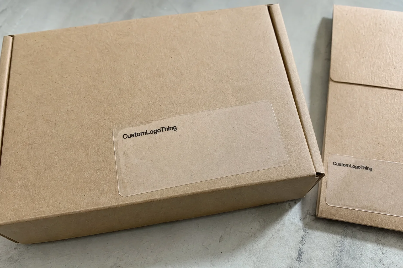
There is a second, quieter benefit. Clear labels reduce the sense that packaging was assembled from mismatched parts. For a brand shipping in low-cost materials, that matters. The package can still be economical without looking cheap.
How clear return labels are printed and applied
Production starts with artwork, but the proof stage is where most mistakes are caught or missed. Clear film behaves differently from white paper stock. Light type can vanish. Fine rules can blur. Margins that look generous on screen may feel cramped once the label is placed on a real parcel. Clear Return Address Labels personalized for shipping need the proof to show more than just placement; it needs to show contrast, opacity, and the relationship between the printed area and the transparent border.
Most suppliers will check resolution, font outlines, and file dimensions before print. That check is useful, but it does not guarantee the label will read well once applied. For clear stock, the actual question is simpler: can the address be scanned visually at a glance? If the answer is no, the layout should be revised before the first run.
Application is just as important as print quality. A label that lands on a clean, smooth surface usually performs well. Smooth poly mailers, flat paper envelopes, wrapped tissue, insert sleeves, and low-texture cartons are the easiest substrates. Curves, seams, dust, oil, and heavy texture all reduce adhesion. A label that bridges a fold will eventually lose grip at the edge. One that lands on a dusty mailer may fail within days, even if the adhesive itself is strong.
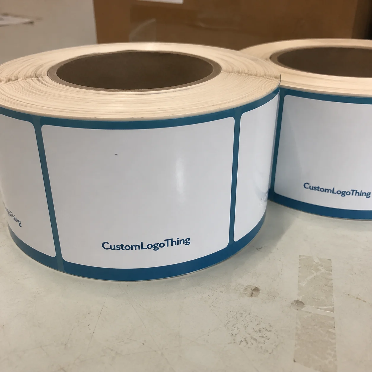
Roll and sheet formats serve different workflows. Roll labels suit higher-volume packing stations because they feed faster and are easier to keep organized beside a printer or applicator. Sheets work fine for smaller operations or hand-application setups. A business shipping 20 to 100 parcels a day usually values simplicity more than speed. A brand shipping hundreds a day starts to feel every second spent peeling and placing labels.
The material choice also interacts with application. A label that looks good on the sample sheet may still behave poorly on a glossy or low-energy plastic mailer. That is why a physical sample on the real package is worth far more than a clean digital mockup. The package itself is the test surface, not the render.
If the proof looks polished but the label does not sit cleanly on the actual mailer, the design is not finished.
Material, finish, and adhesive choices that affect performance
For shipping, clear film is usually the safer choice. Clear BOPP, or biaxially oriented polypropylene, is a common face stock because it resists moisture and scuffing better than paper-faced alternatives. In practical terms, it holds up better in transit, in humid storage, and on the doorstep after a damp delivery route. A parcel may move through sorting equipment, stack against other boxes, and still need to look presentable at the end. Film is built for that abuse.
Clear paper-faced stock has a place, but it is more vulnerable to abrasion. It can work for short runs or lower-risk applications, yet it tends to lose the premium feel faster. Once the surface gets rubbed, paper-based clear labels show wear more quickly than film. For apparel mailers and direct-to-consumer parcels, film usually justifies the small premium.
Finish changes the look and the reading experience. A gloss finish gives more pop, but it can throw reflections under warehouse lighting and make small type harder to scan. A matte finish reduces glare and often reads better on plain packaging. If the brand uses compact copy or a small logo, matte is usually the safer call. If the outer package is already glossy, stacking gloss on gloss can make the result look busy instead of refined.
Adhesive choice is where many buyers underestimate the system. Standard permanent adhesive covers most clean mailers and cartons. Temperature swings, refrigerated handling, and rough transport call for more caution. If the parcel is packed in a warm room and delivered into colder conditions, or if the surface is low-energy plastic, test first. Stronger adhesive options exist, but they should be matched to the substrate rather than assumed. A label that sticks aggressively on one mailer can still fail on another with a slightly different coating.
There are also simple physical constraints. Thicker face stock usually lays flatter and feels more substantial, but it can cost more. Thin stock may be cheaper, though corners can lift more easily if the adhesive bond is not strong enough. For clear return Address Labels Personalized for branded shipping, flat is the goal. Bulky edges and visible lift undermine the effect very quickly.
For buyers who care about sustainability across the packaging system, the label should be considered alongside the carton, mailer, and inserts. Labels are only one component, but they still need to fit the same sourcing logic as the rest of the pack. If the outer box is paper-based and certified, the label choice should not quietly work against that strategy. Compatibility matters even when the label itself is a small line item.
Clear return address labels personalized: cost, pricing, and MOQ
Pricing comes down to a few predictable variables: size, quantity, finish, print complexity, and whether the shape is standard or custom. A simple rectangle with one color of print is the cheapest route. Add a die-cut shape, a logo, multiple text blocks, or a specialty finish, and the quote climbs. Nothing mysterious there. Setup time and material use are what move the number.
For clear return address labels personalized in common shipping sizes, unit cost usually drops hard once quantity rises. The difference between a short run and a larger reorder can be meaningful enough to affect packaging budgets for the quarter. Typical planning ranges look like this:
| Quantity | Typical unit range | Best fit |
|---|---|---|
| 500 to 1,000 | $0.28 to $0.55 each | New brands, seasonal runs, layout testing |
| 2,500 to 5,000 | $0.16 to $0.34 each | Regular apparel shipping and repeat orders |
| 10,000+ | $0.08 to $0.20 each | Higher-volume packing and steady reorder cycles |
MOQ changes the economics. A lower minimum order quantity gives flexibility, which is useful if the brand is still refining packaging or expects the return address to change. The downside is predictable: the unit price rises. Larger orders lower cost per label but create inventory risk if the layout changes or the address changes. That is a real operational tradeoff, not a theoretical one. A lot of packaging waste starts with overordering a design that was only partly ready.
Shape is another lever. Straightforward rectangles are less expensive than custom silhouettes because they need less tooling and produce less waste. Die-cut labels have a place if the brand mark depends on the shape. For a return address label, though, the shape should usually stay restrained. The label’s job is to read cleanly and stay flat, not to perform a branding stunt.
Ask for quotes in layers rather than taking a single headline number at face value:
- Price at multiple quantities
- Any setup or plate fees
- Proof or sample charges
- Reorder pricing after the first run
That comparison usually reveals the real cost structure. A supplier with a slightly higher first-order price may be more competitive on reorders. A supplier with a cheap headline quote may hide setup charges or force a larger minimum. Buyers who compare the full picture make better decisions than buyers who chase the lowest starting number.
For teams sourcing labels and tags together, keep the same pricing discipline across the broader packaging stack. A related page such as Custom Labels & Tags can be useful for comparing dimensions, finishes, and order quantities before you commit to a final spec.
Production steps, timeline, and turnaround expectations
A clean timeline begins with clean files. If the logo is vector, the address is final, and the size is defined, the proof moves quickly. If the file needs reconstruction, if fonts are missing, or if the address block is still being edited, everything slows down. Clear stock adds one more point of attention because the design has to stay legible against transparency rather than white paper.
The usual flow is straightforward:
- Artwork review and size confirmation
- Digital proof approval
- Print production
- Cutting or roll finishing
- Packing and shipment
Standard turnaround often lands in the 7 to 15 business day range after proof approval. That window can tighten if the order is simple and stock is on hand. It can stretch if the label uses a custom die line, special adhesive, or a finish that requires additional checks. Rush work is possible in some cases, but only when the file is already production-ready. Speed depends on fewer decisions, not just more pressure.
Three things slow orders more than almost anything else:
- Low-resolution or incomplete artwork
- Address edits after proofing has started
- Custom shapes or specialty finishes that need extra approval
Buyers should also ask whether they are getting a digital proof, a physical sample, or both. A digital proof is usually enough for a simple layout. A physical sample matters more if the label has to work on a specific packaging material or if the package surface is unusually glossy, textured, or dark. The sample stage catches problems that screens hide: edge lift, weak contrast, and the way the transparent label disappears or overpowers the substrate.
In practice, the most reliable packaging teams think in use cases rather than artwork alone. If a label must survive normal parcel handling, it should be tested on the exact mailer, carton, or wrap it will touch in production. That is the same logic behind formal transit testing, even if the order itself never goes through a certification program.
Common mistakes that make labels fail in real shipping
The first mistake is oversizing the content for the label. A return address block needs space, and clear stock is less forgiving than white paper if the layout gets crowded. If the size is too small, the text wraps awkwardly, the logo compresses, and the result becomes hard to scan. Compact is good. Cramped is not.
Low contrast is the second failure point. Clear stock on a dark mailer can look excellent on a mockup and then disappear in real use if the type is too thin or the ink is too light. A pale gray font on charcoal packaging is a common bad choice. Tiny decorative type is another. The more transparent the label, the more the layout needs to behave like a sign, not a poster.
Surface prep is the next weak link. Dust, oil, and rough texture all reduce adhesion. A label stuck across a seam will eventually pull. A label placed on a curved corner will fight gravity and handling from the first day. If the packing station is moving quickly, the application step needs a consistent routine. Labels should go on clean, dry, flat areas. That is basic, but it is also where many failures begin.
Another common error is skipping real-substrate testing. A label that looks fine on a sample sheet may fail on a glossy poly bag or a slightly rubberized envelope. The only reliable test is the real package under real handling conditions. One sample run can prevent a lot of wasted inventory, especially when the order volume is high enough that mistakes scale quickly.
Packaging failure is usually a chain of small compromises. The file was a little crowded, the surface was a little dusty, the adhesive was assumed rather than tested, and the result was a label that peeled at the corner before the parcel finished its route. No single issue is dramatic. Together, they are expensive.
The package is not the proof. The package is the proof.
That line sounds blunt because it is. Real shipping introduces friction, pressure, heat, cold, and hurried handling. A label that only works in a mockup is not ready for a shipping floor.
Next steps for ordering labels that fit your packaging
Start with one package type, one label size, and one address format. That keeps the variables small enough to judge. If the label reads clearly and stays put on the actual package, the rest of the rollout gets much easier. If it fails, the cause is easier to isolate.
Have the order details ready before requesting a quote:
- Quantity
- Label dimensions
- Finish preference
- Packaging surface type
- Logo file and exact return address text
Then ask for a proof that shows scale against the real package layout. A generic proof without dimensions or surface context is not enough for a transparent label. The proof should make it obvious how much of the package color remains visible, how much whitespace surrounds the address, and whether the line spacing holds up at actual size. That matters more than a polished render.
If the brand ships multiple package types, avoid forcing one label to cover every surface. A clear label that performs well on a matte mailer may behave differently on a glossy carton. Keep the first system narrow. Expand after the test run, not before. That is less dramatic than ordering in bulk from a nice-looking mockup, but it is how fewer mistakes get made.
The best results usually come from treating the label as part of the packaging system rather than a sticker added at the end. Match the stock, size, adhesive, and finish to the package surface and the pace of the packing line. Clear return address labels personalized the right way can sharpen the entire shipping presentation without adding much cost per parcel, and that is exactly why they keep showing up in sensible packaging programs.
Are clear return address labels personalized a good fit for clothing mailers?
Yes. They work especially well on poly mailers, tissue wrap, and minimal apparel packaging. The main variable is contrast. On a dark or patterned surface, the type needs enough weight and spacing to stay readable after handling.
What size should personalized clear return address labels be?
Many apparel brands use 2 x 1 inches or 2.5 x 1 inches for a return address. If the layout includes a logo or a second line of contact information, a larger size is usually better than shrinking the text until it strains readability.
Do clear labels stay on during shipping and handling?
They should if the adhesive matches the surface and the package is clean and dry when the label is applied. Heat, dust, and texture are the usual reasons labels lift early. A quick test on the actual mailer catches most of those problems before a full order is printed.
How much do custom clear return labels usually cost?
Price depends on size, quantity, finish, shape, and print complexity. Small runs usually cost more per label than larger runs, so it helps to compare pricing at multiple quantities. That makes the cost curve visible instead of guessing from one quote.
What files do I need to order personalized clear return address labels?
A vector logo file is best, plus the exact return address text and any font or color notes. If the design is simple, a clean text layout is often enough for the first proof. Accurate input reduces revision cycles and keeps production moving.