Buyer Fit Snapshot
| Best fit | Custom Clear Stickers for Boxes projects where brand print, material claims, artwork control, MOQ, and repeat-order consistency need to be specified before quoting. |
|---|---|
| Quote inputs | Share finished size, material target, print colors, finish, packing count, annual reorder estimate, ship-to region, and any compliance wording. |
| Proofing check | Approve dieline scale, logo placement, barcode or warning zones, color tolerance, closure strength, and carton packing before bulk production. |
| Main risk | Vague material claims, crowded artwork, missing packing details, or unclear freight terms can make a low unit price expensive after revisions. |
Fast answer: Custom Clear Stickers for Boxes: Uses, Costs, and Fit should be specified like a repeatable production item. The safest quote records material, print method, finish, artwork proof, packing count, and reorder notes in one written spec.
Production checks before approval
Compare the actual filled-product size with the drawing, then confirm tolerance on folds, seals, hang holes, label areas, and retail display edges. Reserve space for logos, QR codes, warning copy, and material claims before decorative graphics fill the panel.
Quote comparison points
Review material grade, print process, finish, sampling route, tooling charges, carton quantity, and freight assumptions side by side. A quote is only useful when the supplier can repeat the same color, closure quality, and packing count on the next order.
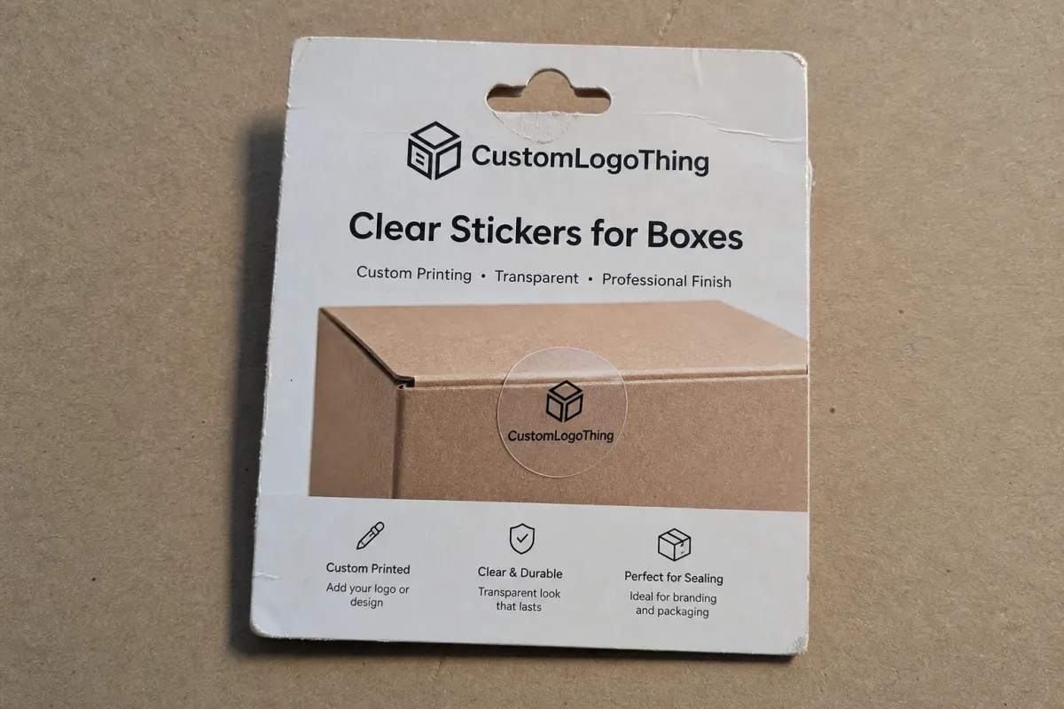
Custom Clear Stickers for boxes solve a narrow packaging problem with unusual elegance: how do you add branding, sealing, or product information without hiding the carton itself? That choice can carry more weight than it first appears. A transparent sticker can make a box feel more considered precisely because it leaves the kraft texture, printed artwork, or corrugated structure visible.
For a packaging buyer, that visibility is the point. You get brand visibility without turning the carton into a billboard. You also keep the box in the design conversation, which matters in branded packaging and leaner product packaging programs where every surface earns its keep. Used well, clear labels feel restrained, premium, and practical in the same breath.
Below, I break down what these stickers do, how they are built, what they usually cost, and how to order them without guessing. If you are building a broader packaging program, it can help to compare them with other formats in Custom Packaging Products and with other label styles in Custom Labels & Tags.
A clear sticker is not invisible. It is a deliberate choice that asks the box to carry more of the visual weight.
What custom clear stickers for boxes actually do
Custom clear stickers for boxes usually do three jobs: they brand, they seal, and they signal. The list looks short. The consequences are not. A brand seal on a mailer flap has different needs from a logo label on a bakery carton, and both differ again from a tamper-evident closure on a skincare kit. Size, material, and print method change the result more than most first-time buyers expect.
Transparent stickers often make a box feel more premium because they do not compete with the package. A kraft carton with a black logo on clear film reads as calm and deliberate. A full-color illustration on a clear label can look crisp on white board. Even a simple seal can suggest care and control. That matters in retail packaging and in direct-to-consumer shipments, where the unboxing moment carries part of the brand story.
Several common use cases show up again and again. Subscription boxes use clear stickers to keep the exterior clean while still adding a logo mark. Bakeries use them on pastry boxes so the kraft board stays visible. Skincare and cosmetic kits often use them as closures that also act as branded touchpoints. Event packaging uses them for invitation boxes and favor cartons that need a polished finish without visual clutter.
Compared with opaque labels, clear stickers are lighter-touch. Compared with tape, they usually look more intentional. Compared with full Custom Printed Boxes, they cost less and give you more flexibility when carton sizes change or order volumes fluctuate. That last point matters. Many brands are not ready to commit to custom printed boxes across every SKU, but they still want the package to look coordinated. Clear stickers often sit right in that middle ground.
They also serve a functional role. A seal can help show whether a carton has been opened. An instruction label can tell a customer to refrigerate, recycle, or keep the item upright. A logo seal can improve shelf presence or keep mailers consistent across a line. The trick is to match the sticker's job to the packaging line, not the other way around.
What sits under the sticker matters just as much as the sticker itself. Clear film over white board behaves differently from clear film over brown corrugate. Over kraft, the box color becomes part of the artwork. Over a printed carton, the underlying graphics can either support the design or make it harder to read. Clarity is not just a visual feature; it is tied to legibility, adhesion, and surface compatibility.
| Option | Best use | Typical look | Common price range | Tradeoff |
|---|---|---|---|---|
| Clear stickers | Branding, seals, light-touch labeling | Minimal, clean, carton stays visible | $0.06-$0.28 per piece depending on size and quantity | Needs stronger contrast on dark or textured surfaces |
| Opaque labels | High contrast, full coverage, barcode-heavy use | Bold, more uniform color | $0.05-$0.24 per piece depending on print and finish | Covers the box surface |
| Packaging tape | Sealing cartons and reinforcing closures | Functional, often utilitarian | $0.03-$0.12 per application equivalent | Less polished as a brand element |
| Custom printed boxes | High-volume brand presentation | Most integrated and premium | Higher upfront tooling and print cost | Less flexible for changing SKUs or small runs |
For buyers comparing these options, the real question is not which one is best. It is which one fits the box, the order volume, and the role of the package. A good label decision follows the packaging system, not a generic preference for the cheapest or flashiest material.
How custom clear stickers work on boxes
Most clear stickers are built from a transparent film face stock, an adhesive layer, and a release liner. The face stock is usually polypropylene or polyester, although paper-backed clear options exist in some markets. The adhesive can be permanent, removable, or specialty-grade for cold, moist, or difficult surfaces. The liner keeps the sticker flat before application. The structure is simple on paper, yet each layer changes how the label behaves in the real world.
Printing changes the look in a major way. Dark artwork on a clear sticker can feel sharp and modern, especially on white cartons. A single-color logo in black or deep navy often looks stronger than a busy multicolor file. Light-colored artwork is trickier. Without a white underprint, pale text can disappear on brown corrugate or printed board. Many printers use white ink beneath the artwork to create contrast, and that layer can be flood-filled or spot-applied depending on the design.
That detail is easy to miss in proofs. On screen, a logo can look perfectly visible. On transparent stock, the carton underneath becomes part of the reading experience. A designer who understands packaging design will account for that by increasing type weight, simplifying lines, or using a white base where needed. The result is less flashy, but it reads better.
Placement also shapes performance. Clear stickers often go on flap seals, corner marks, brand marks, instruction areas, and tamper-evident closures. On mailer boxes, they may sit across the opening flap so the package stays closed until the customer opens it. On bakery cartons, they may go on the front panel or top flap. On skincare kits, they may be centered to reinforce order and symmetry. Where the label lands can change the entire look of the package.
Surface finish matters just as much as print. Smooth coated cartons usually give the best bond because the adhesive contacts evenly. Rough recycled board can still work, but the bond may be less aggressive or less consistent. Dust is a bigger problem than many teams expect. So is humidity. So is a carton that has sat folded in a warehouse for too long before use. A label can only perform well if the surface is ready for it.
For shipping performance, many teams look to parcel testing. The ISTA shipping test standards are often referenced when brands want a disciplined way to check whether the package survives vibration, compression, and handling. That matters because a seal that looks perfect on a table can behave differently after a few miles in a delivery network.
There is also a practical user experience angle. Good clear stickers should peel cleanly, apply without bubbles, and stay readable under normal storage and shipping conditions. If a sticker twists during application, clouds at the edges, or lifts after a temperature shift, it stops being a branding asset and turns into a production headache.
In practice, the best results usually follow a simple rule: start with the box surface, then build the sticker around it. Not the reverse. That single shift can improve legibility, application speed, and the final appearance of custom clear stickers for boxes.
Production steps and turnaround for box stickers
Ordering box stickers is usually a short chain of decisions, but each one affects lead time. The process normally starts with file review. The printer checks dimensions, bleed, line weight, transparency choices, and whether the artwork needs white ink. After that comes proofing, where placement and visual behavior are confirmed before anything goes to press. Then the print method is selected, production begins, finishing happens, and the labels are packed for shipment.
The path looks linear. Timing rarely is. White ink setups can add production time because they may require an extra layer or a more careful print pass. Special die cuts can slow converting. Revisions to color or shape can push a job back into the queue. Rush orders are possible in many shops, but a rush does not erase setup time if the artwork is still changing.
Standard lead times are usually more predictable when the order is simple. If the size is standard, the artwork is ready, and the adhesive is straightforward, many jobs move quickly. A more complex order, such as one with a custom shape, multiple SKUs, or variable data, needs more planning. A buyer launching a new SKU should treat the sticker as part of the critical path, not as a last-minute add-on.
The proof stage is where mistakes are cheapest to catch. It is the place to confirm exact size, transparency, logo placement, and any white-ink requirements. This is also the point where box color should enter the conversation. A proof that looks perfect on a white mockup can read very differently on kraft. If the carton is textured or recycled, that should be obvious before production starts. A physical sample tells the truth better than a digital file for any label meant to work on a real carton under real light.
Typical timing can look something like this:
- Artwork review: 1-2 business days if the file is ready and dimensions are clear.
- Proof approval: 1-3 business days depending on internal sign-off speed.
- Production: often 5-10 business days for standard clear stickers, longer for specialty features.
- Shipping: usually 1-5 business days depending on destination and service level.
Those are practical ranges, not promises. A short run may move faster. A complex run may take longer. If the packaging launch date is fixed, the safest move is to build slack into the schedule and approve artwork before the calendar gets tight.
There is also a sourcing angle that can help keep the wider packaging program aligned. If your cartons are paper-based, it can be worth tracking board sourcing through FSC certification where applicable. Clear stickers themselves are usually film-based, but the package is judged as a whole, and buyers increasingly look at the carton, label, and insert together as one branded system.
For teams managing multiple SKUs, a repeatable spec sheet is worth the effort. Record sticker size, adhesive type, application location, carton stock, storage conditions, and approval date. That makes reorders easier and lowers the chance of a label changing accidentally between runs. In packaging operations, small documentation habits often save more money than fancy features.
Cost and pricing factors for custom clear stickers for boxes
The biggest pricing driver is quantity. That is true across most printed packaging, but it shows up especially clearly in stickers because setup costs are spread across the run. A 500-piece order may cost noticeably more per piece than a 5,000-piece order, even if the artwork is identical. Buyers sometimes compare unit prices without looking at the setup logic behind them, and that can lead to false conclusions about value.
Size comes next. A larger sticker uses more material and often increases converting time. Shape matters too. Simple circles, squares, and rectangles are usually more economical than intricate die-cut contours. Once the cut line becomes complex, the production and finishing steps become more demanding. That is not just a manufacturing detail; it also affects whether your labels arrive on time.
Print complexity can change the quote just as much as size. A one-color logo on clear film is usually simpler than a full-color design with gradients, fine type, or a white underprint. Specialty finishes can also raise price. Matte or gloss topcoats, metallic elements, variable data, and extra versions for different SKUs all add work. The more the label has to do, the more carefully the price needs to be read.
Adhesive choice is another hidden lever. Permanent adhesive is common for box sealing and brand labels because it holds well under shipping. Removable adhesive may cost more in some situations because it is formulated for clean release. Freezer-safe or moisture-resistant options are more specialized still. If your boxes travel through cold chain storage, humid loading docks, or warm delivery vans, the adhesive choice can matter more than the print effect.
Here is a practical way to think about value. The cheapest sticker is not always the best one. If a low-cost label wrinkles during application, leaves residue, or fails after a temperature swing, the reprint and labor cost can erase the savings. A slightly higher unit price can be the better purchasing decision if it reduces scrap, protects shelf appeal, or keeps the seal intact during transit.
The table below is a rough budgeting guide, not a quote. Actual pricing depends on vendor, quantity, region, and specification details.
| Specification | Lower-cost range | Mid-range range | Higher-cost range | Why it moves the price |
|---|---|---|---|---|
| Small round logo sticker | $0.03-$0.06 | $0.06-$0.12 | $0.12-$0.20 | Simple geometry and low material use keep cost down |
| Clear seal for mailer box flap | $0.05-$0.09 | $0.09-$0.16 | $0.16-$0.28 | Adhesive strength and size affect production and hold |
| Custom die-cut branding label | $0.07-$0.12 | $0.12-$0.22 | $0.22-$0.40 | Custom shape, setup, and finishing increase converting time |
| White ink plus full-color print | $0.09-$0.15 | $0.15-$0.30 | $0.30-$0.50+ | Extra layers and tighter registration add complexity |
For buyers, the smartest move is usually to price the sticker as part of the package system, not as a standalone line item. If the sticker improves application speed, reduces the need for printed cartons, or extends the life of a flexible box program, the real savings may show up elsewhere. That is especially true in seasonal retail packaging, where order volumes and artwork needs can change quickly.
One more budgeting point: minimum order quantities can matter as much as unit price. A low unit price with a high minimum may create inventory you cannot use before a design refresh. A slightly higher unit price with a smaller minimum may actually be more economical if your packaging changes often.
Key factors that affect clarity, adhesion, and durability
Clarity is not just about how transparent the material looks in a sample. It is about how the finished sticker interacts with the carton beneath it. On a clean white box, clear film can look almost invisible except for the printed artwork. On brown kraft, the same sticker becomes more visible because the base color changes the way the ink reads. On a heavily printed carton, the label may need more contrast to avoid visual noise. Clarity is contextual.
Adhesion depends on several variables that often get underweighted in early planning. The first is surface condition. Dust, oil, moisture, and carton fibers can all interfere with bond strength. The second is texture. Smooth boards usually perform better than rough recycled stock. The third is temperature. If the room is cold, the adhesive may not grab as well during application. The fourth is pressure. Labels applied with consistent hand pressure or a dispenser usually hold better than labels slapped on quickly during a busy shift.
Durability matters because cartons are not static objects. They get stacked, rubbed, tossed into vehicles, and compressed in transit. A clear sticker on a mailer box may also need to survive repeated handling at the consumer end, where the package is opened, photographed, stored, or recycled. If the film is too thin or the adhesive too weak, the label can lift at the edges. If the film is too rigid for the box fold, it can crack or wrinkle. Balance matters.
Readability is another hidden variable. Thin fonts, pale gray text, and narrow line work can disappear on transparent stock. Logos that look elegant on a screen sometimes need to be simplified for print. Stronger type weight, larger type size, and more deliberate spacing usually improve the result. A barcode or QR code needs even more caution. If the code is meant for scanning, the contrast must be high enough for machines as well as people.
Technical references can help here. Packaging buyers often consult the Institute of Packaging Professionals for education and industry context, while parcel testing programs associated with ISTA are used to evaluate physical performance before a rollout. The point is not to over-engineer a sticker. The point is to know what good enough really means for your route to market.
Compliance may also enter the picture. If the label carries handling instructions, lot codes, or tamper signals, it has to remain intact and legible after normal shipping and storage. That is especially true for food, beauty, and health-related cartons where a missing instruction or unreadable code creates friction. A sticker that looks elegant but fails operationally is not a win.
From a packaging buyer's point of view, the best outcome is often a label that behaves quietly. It should not curl, fog, slide, or distract. It should do its job in the background while the carton carries the design. That is the sweet spot for clear film on boxes.
Step-by-step guide to ordering the right clear sticker
The cleanest orders start with a clear definition of the job. Is the sticker branding only? Is it sealing the box? Is it carrying instructions? Is it doing all three? The answer determines shape, size, adhesive, and print setup. Many problems begin when a team tries to make one label do a role it was never sized for.
- Define the function. Decide whether the sticker is a logo mark, a seal, a tamper indicator, an instruction label, or a combination.
- Measure the target area. Check flap width, panel depth, or corner placement so the label fits the box instead of crowding it.
- Choose the surface logic. Match the adhesive to the carton stock, storage temperature, and shipping conditions.
- Prepare the artwork for transparency. Strengthen contrast, simplify small details, and confirm whether white ink is needed.
- Request proofing on the actual box. Test color, visibility, and adhesion on the real carton before a full run.
- Plan the reorder path. Save the approved size, material, and placement notes so future orders stay consistent.
Step 2 deserves extra attention. Labels often look wrong not because of print quality, but because the size is off by a little. A sticker that is too small may look accidental. A sticker that is too large can overwhelm the box or interfere with the fold. The right proportion gives the impression that the package was designed as a system.
Step 3 is where many teams save money or create pain. A permanent adhesive is usually a safe default for shipping cartons, but not always. A box stored in cold conditions or exposed to humidity may need a different formulation. If you know the exact carton stock, share it with the printer. If the carton surface is lined, printed, recycled, or coated, say so early. Those details change the recommendation.
Step 4 is where design and manufacturing meet. On a transparent surface, the color that appears in a file may not be the color that reads in practice. White ink can help, but it is not a cure-all. Sometimes the right answer is to enlarge the logo, simplify the artwork, or avoid ultra-light tones. The best files are the ones built with the carton in mind from the start.
Step 5 is not optional if the packaging is unusual. A digital proof can confirm dimensions, but it cannot fully predict how transparency will read on a real box in daylight. If your box has embossing, a rough finish, recycled fibers, or a strong print pattern, ask for a physical sample. The sample may take longer to arrange, but it can prevent a costly mismatch later.
If the sticker is only one element in a larger rollout, think about the full package system. Maybe the carton uses one spec, the insert another, and the label a third. That is normal. The goal is not sameness. The goal is coherence. A sticker that aligns with the box and the insert can make even modest packaging feel deliberate.
Common mistakes and expert tips for better results
The most common mistake is designing for white paper and then applying the same file to clear film. On a screen, the logo may look perfect. On a transparent sticker, weak contrast can vanish. Thin gray text, delicate outlines, and small type are the first things to suffer. If the brand system was built for opaque labels or white cartons, the artwork usually needs adjustment before it lands on a clear base.
Another mistake is ignoring carton texture. A proof on smooth board can give false confidence. Recycled corrugate, embossed panels, or dusty warehouse stock can all behave differently. The sticker may still work, but the visual result changes. Edge adhesion may also be weaker. That is why box samples matter. Packaging is physical, and physical surfaces are never perfectly interchangeable.
A third mistake is over-specifying the first run. Teams sometimes order the most expensive combination of shape, print layers, and adhesive before they have tested the packaging environment. That can be fine for a mature program, but it is risky for a new launch. Start with the function you truly need. If the box seal only needs to look clean and hold the flap closed, do not pay for features no one will notice.
Here is a practical expert tip: ask for a sample on the exact carton stock and test it under the conditions the box will actually see. That means more than sticking it on a table. Apply it during the same shift length, temperature, and handling pace your pack line uses. Then check whether the seal stays down, whether the edge lifts, and whether the artwork still reads from arm's length. The result is closer to reality than any mockup.
Another useful check is application speed. A label that takes too long to align slows the line and adds labor cost. A well-sized clear sticker should place cleanly with minimal fiddling. If your team needs to reposition it constantly, the format may be wrong. Small changes in size or orientation can cut application time noticeably across a run.
Also, think about photography and social sharing. Clear labels can look excellent in product images because they do not interrupt the box surface. They can also pick up glare if the lighting is harsh. If the package will be photographed for ecommerce or retail marketing, test it under a few light conditions. That is a simple step with outsized value for package branding.
Finally, do not forget the operational side. If the label is meant to act as a tamper seal, it should break visibly when opened. If it is meant as a removable mark for internal use, it should come off cleanly. Those are different adhesive goals, and confusing them leads to complaints later. A sticker that looks great and behaves wrong is still the wrong sticker.
For buyers balancing design and efficiency, the best results usually come from clear specs, a real sample, and a sober look at how the box moves through the warehouse and the customer's hands. That process may feel slower upfront, but it prevents the expensive kind of surprise.
If you are evaluating other formats at the same time, compare sticker performance with your broader custom printed boxes plan, your inserts, and your outer mailers. The most effective package systems usually keep each element narrow in purpose and strong in execution.
Frequently Asked Questions
Are custom clear stickers for boxes better than opaque labels?
They are better when you want the carton, kraft texture, or printed artwork to stay visible. That is why they often feel more premium on minimalist packaging. Opaque labels still make sense when you need maximum contrast, full coverage, or a more uniform color field. For very light artwork, opaque stock can sometimes be easier to read than clear film.
What affects the cost of custom clear stickers for boxes most?
Quantity usually has the biggest effect on unit price because setup costs spread across the run. After that, size, die-cut shape, white ink, and specialty adhesive choices move the quote. Short runs cost more per piece because the production overhead is divided across fewer stickers. If you want the cleanest budget picture, ask for pricing at two or three quantities instead of one.
How long does production usually take for clear box stickers?
Simple orders can move quickly if the artwork is ready and the spec is standard. Custom shapes, white ink, proof revisions, and specialty finishing can add days to the schedule. The safest planning move is to ask for lead time before you approve artwork, especially if the stickers are tied to a product launch or a seasonal restock.
Do custom clear stickers work on all box surfaces?
They perform best on clean, smooth, and dry cartons. Rough recycled board, dusty surfaces, heavily coated stock, or moisture exposure can weaken adhesion. If your packaging uses textured or variable cartons, test the sticker on the exact box stock before you place a full order. That is the simplest way to avoid surprise failures in transit.
What should I check before ordering custom clear stickers for boxes?
Confirm the size, placement, and purpose of the sticker on the box first. Then check whether your artwork needs white ink or stronger contrast to remain readable on transparent film. Ask for a proof or sample and test it on the real carton, not just on screen. If the sticker is part of a larger packaging program, make sure it aligns with the carton spec, insert design, and application method.
For brands that want package branding without covering the carton, custom clear stickers for boxes often land in the right place. They can look restrained, help a box seal properly, and keep the packaging surface visible instead of buried. The best results come from treating them as a functional packaging choice: match the adhesive to the carton, build contrast into the artwork, and test the sticker on the actual box stock before approving volume production.

