Custom clothing labels for coffee brands
Custom Clothing Labels for coffee brands do more than identify a garment. They turn a sweatshirt into retail merchandise, make an apron feel like part of a deliberate uniform program, and help a subscription box or launch bundle look finished instead of improvised. Coffee customers notice consistency quickly, especially when the apparel, packaging, and in-store presentation all point in the same direction.
If the label looks cheap, the whole product feels cheaper. That is not a branding slogan; it is a practical buying habit. The useful part is that a good label spec is not complicated. Choose a material that suits the garment, keep the artwork legible at actual size, and match the attachment method to the fabric and use case. Done well, the label supports the rest of the brand system rather than fighting it.
For coffee businesses, that matters because merch often sits beside other branded touchpoints: bags, cups, tote inserts, swing tags, and custom printed boxes. A label should feel like it belongs in that system, not like a separate decision made after the fact.
Why custom clothing labels for coffee brands matter when merch starts selling
Coffee brands usually start with the essentials: bags, cups, aprons for staff, maybe a few tees for events or giveaways. Then the merch starts moving. A hoodie sells out faster than expected, aprons become retail items, and the label on the inside of the garment suddenly matters because customers are paying real money for it. That is the point where Custom clothing labels for coffee brands stop being a finishing detail and become part of the product experience.
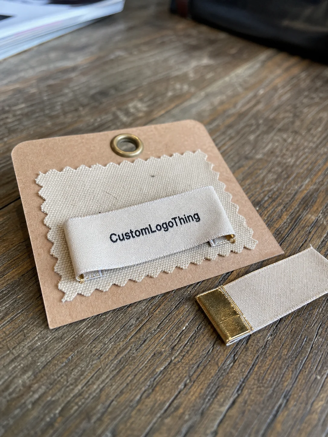
A clean woven neck label, a soft printed care label, or a small brand patch can make apparel feel retail-ready in the same way good packaging makes a bag of beans feel considered. The label does not need to shout. It just needs to read clearly, survive use, and support the perception that the item was made with care.
Typical uses go beyond apparel alone:
- Employee uniforms for cafes and roasteries
- Retail tees, hoodies, sweatshirts, and hats
- Aprons for baristas, trainers, and event staff
- Subscription box inserts and bundled merchandise
- Wholesale programs for partner cafes
- Limited-run giveaways tied to seasonal launches
That range matters because coffee brands rarely need one label in isolation. They need a format that works across soft goods and retail Packaging Without Looking stitched together from different suppliers. A good spec should fit the garment, the color palette, and the amount of wear the product will see. For a coffee business, that usually means strong contrast, earthy neutrals, and materials that hold up through washing, steam, and regular friction.
If the label only looks good on a mockup, it is not ready. It needs to read clearly on the actual fabric, at actual size, under real use.
The decision framework is simple: material, construction, cost, quantity, and timing matter more than a fancy logo file. Good package branding is consistent. The same rule applies here.
How the label production process works
The production flow is more predictable than most buyers expect. It usually begins with artwork submission, then a supplier checks dimensions, color count, fold style, and attachment method. After that comes a proof or mockup for approval. Once approved, production starts, followed by finishing, quality control, and shipping. If the job includes special folding, backing, or individual packing, the schedule gets longer. Nothing mysterious there. Each added step takes time.
For a clean first run, send a vector logo file, Pantone references or visual color references, the desired label dimensions, and clear notes on how the label will be used. If the label needs care instructions, fiber content, or size marking, those details should be final before proofing starts. Small layout changes can affect legibility, stitch density, and where the fold lands.
There are a few construction types that come up most often:
- Woven labels for durability and a tidy retail look
- Printed satin labels for a softer hand-feel and small text
- Care labels for washing instructions and fiber content
- Size tabs for apparel sorting and inventory handling
- Patch labels for heavier, more visible branding
Attachment changes the outcome as much as the material does. Sewn-in labels are standard for tees, hoodies, and aprons. Heat-applied options can work on certain products, but fabric compatibility matters, especially on textured or low-melt synthetics. Loose labels are useful when the brand wants to apply them in-house or include them with folded garments. Before approving a run, test the label against the real fabric. A proof on white paper tells you very little about how a label sits on brushed fleece, canvas, or apron twill.
Quality checks should be practical, not decorative. Check edge finish, stitch accuracy, color registration, fold consistency, and text readability at the size you will actually use. If the design includes a QR code, tiny legal copy, or care symbols, verify them at print scale. Small mistakes are easy to miss on screen and obvious in hand.
For durability references, suppliers often use industry testing methods such as those discussed by ISTA. If the label includes paper components or FSC-certified packaging inserts, the FSC system is worth understanding too. Different components call for different standards, and that is normal.
Cost, pricing, and MOQ basics
Pricing for Custom Clothing Labels for coffee brands comes down to the same variables that shape most packaging quotes: size, material, color count, quantity, finishing, and turnaround. More colors add complexity. Larger dimensions use more material. Special folds and individual packing add labor. Rush work costs more because it interrupts the production schedule. None of that is hidden; it is just how manufacturing works.
Unit cost drops as quantity rises. That part is predictable. The less obvious part is that setup, shipping, and revision cycles can make very small orders feel expensive. A test run can still be the right decision if the brand is validating a new merch line, but it should be treated as a test run, not a bulk order with bulk pricing expectations.
For rough planning, the following ranges are common for mid-to-higher quantities and standard specs, though actual quotes vary by supplier and finish:
| Label type | Typical use | Approx. unit cost | Best fit |
|---|---|---|---|
| Woven label | Neck labels, side tabs, brand marks | $0.10-$0.30 | Durability and a retail look |
| Printed satin label | Care info, soft-touch branding, small text | $0.08-$0.22 | Fine detail and softer garments |
| Care label set | Fiber content, wash instructions, compliance info | $0.12-$0.28 | Apparel sold through retail channels |
| Patch label | Heavy branding on hats, outerwear, aprons | $0.25-$0.70 | Visible branding and tougher applications |
Those numbers are starting points, not promises. A 1,000-piece order usually costs more per unit than a 5,000-piece order. Add custom packaging, special folds, adhesive backing, or individual bagging, and the quote changes again. Buyers should compare line by line: same size, same material, same fold, same backing, same delivery window. Comparing a woven label to a printed label is not useful unless the specs match.
For coffee brands, the budget question should stay practical. Is the label going on a giveaway, or on retail merchandise that sits next to a $34 hoodie and a branded tote? If it is retail, the label needs to support the perceived value of the garment. A weak label can drag down the whole product, including bundled sets that include custom printed boxes or other branded packaging pieces.
Choosing the right material, size, and finish
Material choice should follow use, not style preference alone. Woven labels are usually the safest option for coffee apparel because they hold up well and keep edges clean. Printed satin works better when the art includes small type, fine lines, or a softer hand-feel. Patches are useful when the brand wants the label to act like a visible badge rather than a hidden tag. None of these is universally better. Each one solves a different problem.
Size matters more than many buyers expect. Too small, and the logo turns into noise. Too large, and the label starts competing with the garment. A neck label usually needs a compact layout. An apron chest patch can be larger because the viewing distance is longer. The mistake is trying to fit a full URL, a tagline, and a detailed logo into one tiny tag because the mockup made it look possible.
Fold style changes both appearance and function:
- End fold for a clean sewn-in presentation
- Center fold for neck labels and seam insertion
- Loop fold for hanging or wraparound placement
- Straight cut for labels that are sewn flat or packaged separately
Color strategy should be practical. Coffee brands often lean on brown, cream, black, olive, and muted neutrals. That is fine. Contrast still matters more than the mood board. A warm beige label with tan thread can disappear on a canvas apron. A black woven label with cream lettering will usually read better. This is one of the most common misses in merch work: people choose “artisanal” colors that look good on screen and vanish on fabric.
Durability is the final filter. These labels get washed, ironed, rubbed, and exposed to steam. Aprons are especially rough on trim because they see constant movement around the bar. If the label frays after a few laundry cycles, the product feels tired before the garment does. That is a labeling problem with a packaging consequence.
Premium does not need to mean shiny. For specialty coffee, a matte woven finish or a low-gloss printed label usually feels more credible than something loud or overly decorative. Clean, legible, durable. That is the target.
Process and timeline: from proof to delivery
The usual sequence is straightforward: quote, artwork review, proof approval, production, finishing, quality check, and shipping. The part that slows projects down is usually not manufacturing. It is decision-making. If the logo is still changing, the label dimensions are still open, or the attachment method is undecided, the order stalls before production begins.
For standard labels, proofing can move quickly if the artwork is clean. Complex jobs take longer because someone has to check stitch count, legibility, edge thickness, and any small text that will be unreadable once the label is reduced to real size. That review is not busywork. It prevents waste.
A practical lead-time mindset helps:
- Simple standard labels are fastest
- Custom folds or special finishes add time
- Higher quantities usually extend production windows
- Rush shipping changes transit time, not factory time
If the labels are part of a merch drop, plan backward from the launch date. If they are tied to seasonal cafe uniforms, leave room for proofing and a second review. If they are needed for wholesale or a subscription box, do not wait until the garments are already on the press table. That is how deadlines get expensive.
One more practical rule: if the label is going with other branded items, such as swing tags, custom printed boxes, or insert cards, the full package should be planned together. Separate timelines create mismatched arrivals. Mismatched arrivals create repacking. Repacking creates cost. It is a simple chain of events with a predictable outcome.
Brands that want a smoother order should browse Custom Labels & Tags and compare the label spec with the rest of the merch stack. If the product mix is broader, Custom Packaging Products can help align the label with the broader retail packaging plan.
Common mistakes coffee brands make with label orders
The most common mistake is a beautiful mockup that becomes unreadable at actual size. That happens constantly. Thin scripts, tiny URLs, detailed line art, and low-contrast thread choices can look elegant on a screen and muddy on fabric. The garment does not care about the concept board.
Another issue is ordering a label before the product is final. A label that works on a tee may be too stiff for a hoodie and too small for an apron. Coffee brands often use the same logo across different products, but the execution should change with the item. One spec rarely works for every use case.
Other mistakes are more mechanical:
- Trying to fit too much text into one label
- Using too many thread colors
- Skipping a fabric check before approval
- Choosing one label format for every product type
- Changing quantities after proofing and resetting the job
There is also a hidden trap in assuming the cheapest quote is the best one. It is not. If a lower quote sacrifices readability, edge quality, or durability, the brand pays for it later in returns, reorders, or products that look weaker on shelf. That is especially true for retail packaging programs where the label sits beside a stronger visual system and has to hold its own.
The cleanest orders usually come from buyers who think like merch managers. They define the garment, the use case, the expected wash cycle, and the visual priority before asking for a quote. That is a more reliable way to order Custom Clothing Labels for coffee brands than sending a logo and hoping the supplier fills in the gaps.
Expert tips for a cleaner, more premium result
Simplify the art before you simplify the budget. A cleaner logo almost always weaves or prints better. Thin lines, tiny icons, and delicate gradients are the first things to fail in small-format production. If the logo can be reduced to a strong mark and still read instantly, the label will usually look better on the garment too.
Use a system, not a series of one-off choices. For example: one woven brand tab for apparel, one printed care label for the inside seam, and one patch for heavier outerwear or apron fronts. That kind of consistency makes the entire merchandise line feel intentional. It also makes reorder decisions easier because the spec is already defined.
These rules tend to hold up in practice:
- Keep contrast high enough to read from a normal viewing distance
- Choose a finish that suits the garment texture
- Match the attachment method to how hard the product will be used
- Do not add a feature unless it earns its place
A strong label is usually restrained. Not sterile. Just disciplined. One signature fold style, one consistent color family, and one clear placement strategy can make a coffee merch line feel much more premium than a crowded label with too much happening at once. That is especially true if the brand already has strong product packaging and needs the apparel to match, not fight it.
One final point: ask about care compatibility. If the garment is going through hot washes, tumble drying, or heavy apron use, the label should be built for that environment. Fancy does not matter if it falls apart in laundry. Practical wins.
Next steps for ordering the right label spec
Before requesting a quote, decide what the label needs to do. Is it for retail appeal, durability, compliance, or all three? Then choose the garment type and where the label will sit. Neck seam, side seam, chest patch, apron strap, and hem tab all create different visual results. Placement affects size, fold, and how the label reads in photos and in person.
Gather the basics before sending an inquiry:
- Vector logo file
- Preferred dimensions
- Approximate quantity
- Finish or material preference
- Target delivery date
- Where the label will be used
Then compare two or three spec options side by side. A woven label, a printed satin label, and a patch can all serve the same brand in different ways, but they do not price or perform the same. Side-by-side comparison keeps the decision honest and prevents vague back-and-forth. If you are building a new merch line, start with a small test run, learn from the first round, and scale after the design proves itself.
For approval, check four things: readability, contrast, fold style, and attachment method. If any of those are weak, fix them before production. That one review step saves more money than most people expect. It also keeps the label aligned with the rest of the brand system, including custom printed boxes, inserts, and other branded packaging pieces.
For coffee brands that want the cleanest result, the next move is simple: Request a Quote with final dimensions and a realistic timeline, then approve the proof only after checking it against the actual product. That is how custom clothing labels for coffee brands stop being an afterthought and start doing real work.
FAQ
What are the best custom clothing labels for coffee brands with apparel and aprons?
Woven labels are usually the strongest all-around option because they hold up well and present cleanly. Printed labels are better when the artwork includes small text or fine detail. Aprons often need a sturdier attachment because they see more friction and washing than a standard tee.
How much do custom clothing labels for coffee brands usually cost?
Price depends on label type, size, color count, quantity, and finishing. Unit cost drops as the order gets larger, but setup and shipping still affect small runs. The cheapest quote is not always the best value if it hurts readability or durability.
What is the usual turnaround for custom clothing labels?
Turnaround depends on proof approval speed, quantity, and complexity. Standard orders move faster than highly detailed or specialty-finish labels. Build in extra time if the labels are tied to a product launch or seasonal drop.
Can custom clothing labels be made for small coffee roasters or first merch drops?
Yes. Small runs are common for testing a new apparel line or cafe merch program. Smaller quantities usually cost more per unit, so the design should be finalized before ordering. A limited run is useful when the brand wants proof of demand before scaling.
What should I prepare before requesting a quote for coffee brand labels?
Have a vector logo, preferred dimensions, quantity, and target delivery date ready. Decide whether the labels need to be woven, printed, satin, or patch style. Share where the label will be used so the supplier can recommend the right spec.