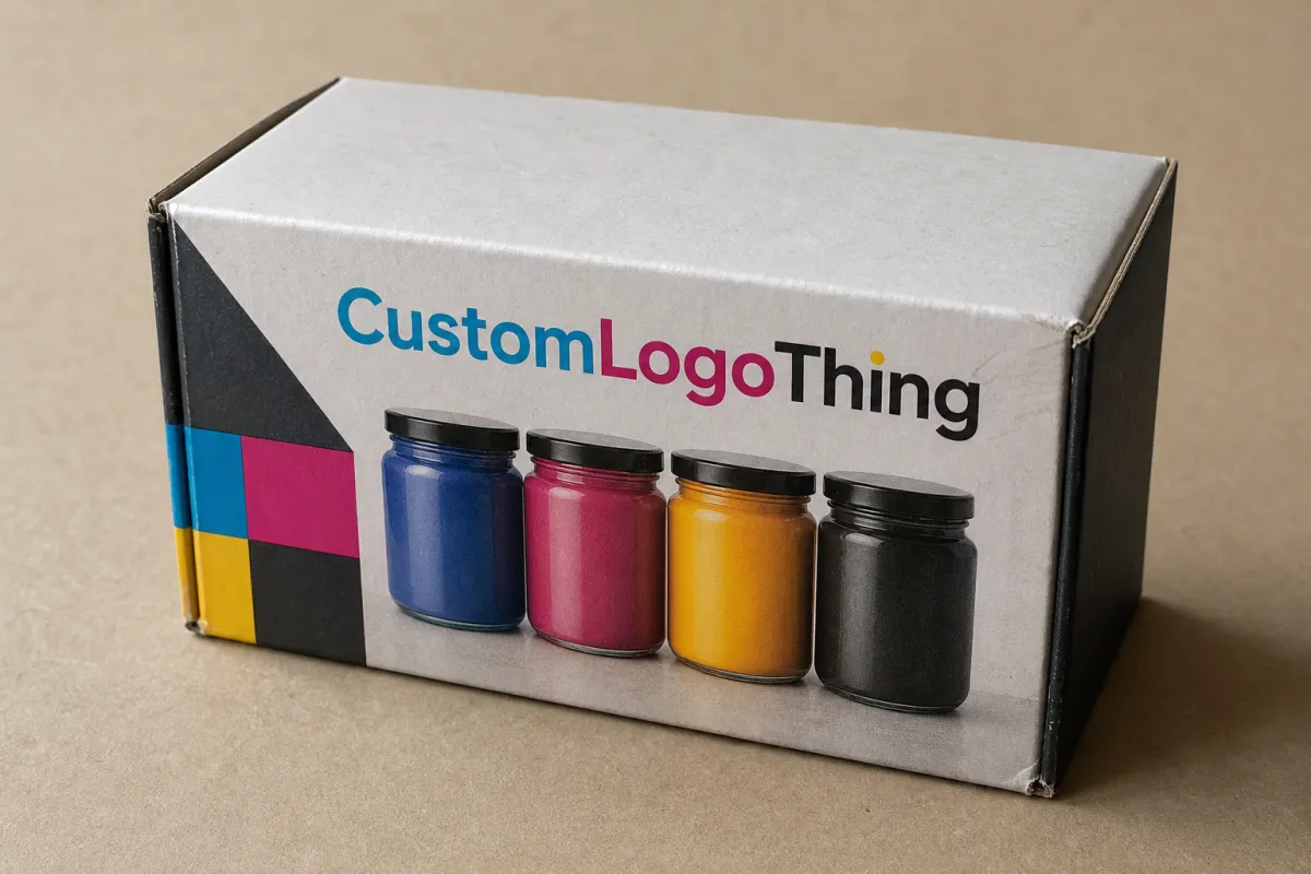
Buyer Fit Snapshot
| Best fit | Custom CMYK Labels for Jars projects where brand print, material claims, artwork control, MOQ, and repeat-order consistency need to be specified before quoting. |
|---|---|
| Quote inputs | Share finished size, material target, print colors, finish, packing count, annual reorder estimate, ship-to region, and any compliance wording. |
| Proofing check | Approve dieline scale, logo placement, barcode or warning zones, color tolerance, closure strength, and carton packing before bulk production. |
| Main risk | Vague material claims, crowded artwork, missing packing details, or unclear freight terms can make a low unit price expensive after revisions. |
Fast answer: Custom CMYK Labels for Jars: Color, Cost, and Performance should be specified like a repeatable production item. The safest quote records material, print method, finish, artwork proof, packing count, and reorder notes in one written spec.
Production checks before approval
Compare the actual filled-product size with the drawing, then confirm tolerance on folds, seals, hang holes, label areas, and retail display edges. Reserve space for logos, QR codes, warning copy, and material claims before decorative graphics fill the panel.
Quote comparison points
Review material grade, print process, finish, sampling route, tooling charges, carton quantity, and freight assumptions side by side. A quote is only useful when the supplier can repeat the same color, closure quality, and packing count on the next order.
Custom CMYK labels for jars can look polished on a screen and still behave unpredictably once they meet glass, curved walls, condensation, and store lighting. The same file may look vivid on a proof, flatter on amber glass, and slightly washed on a matte white jar because the container changes how process color is perceived. That shift is not cosmetic trivia. It can change whether a product reads premium, ordinary, or simply hard to notice.
Jar packaging is judged in layers. The label has to work with the product inside, the shape of the container, the reflection of overhead lights, fingerprints, cold storage, and the friction of shipping and stocking. A brand gets one chance to make those parts feel intentional. Artwork, stock, adhesive, finish, and application all shape the result. Treating custom cmyk labels for jars as a packaging decision, not a decorative finish, usually separates the packages that hold up from the ones that quietly fall apart.
The economics tell the same story. A label that costs a few cents more can prevent a run of peeling, reprints, and shelf presentation problems. A label that looks rich on a monitor can turn muddy on clear film or lose contrast against a dark product. The real test begins after the labels leave the press.
Custom CMYK Labels for Jars: Why Color on Glass Changes Fast
CMYK builds color from cyan, magenta, yellow, and black dots. That makes it a strong choice for gradients, photographic artwork, subtle shading, and designs that need more nuance than a few spot inks can provide. On a digital file, the logic feels tidy. On a jar, the result depends on what sits behind and around the print. Clear glass lets the product color and the background influence the eye. Amber glass warms the palette. Frosted and matte containers cut reflection and can make saturated color feel quieter.
That shift shows up quickly in food, beauty, candle, and wellness packaging. A honey label on amber glass can look richer than the same file on white polypropylene. A minimalist skincare label may feel clinical on a white jar, then look more premium on clear glass once the product tint, label opacity, and lighting interact. Designers often imagine color as fixed. Packaging proves otherwise. Color moves with the substrate.
Retail conditions make the problem more visible. Shelf light is rarely flattering. It bounces off curved glass, competes with neighboring packaging, and changes again when a shopper lifts the jar. A label that reads well in a PDF can still fail the five-second scan on a crowded shelf. That matters because many purchasing decisions happen quickly. A jar label has to survive that glance and still make sense up close.
Custom cmyk labels for jars also need to hold together while the product is handled, rotated, stacked, and sometimes chilled. A package cannot ask the customer to stand in one exact lighting condition to work correctly. The goal is consistency. The design should read clearly on a wooden shelf, in a refrigerator door, and on a bathroom counter with steam in the air.
A jar label gets judged four times: on press, in packing, on shelf, and in the customer’s hand. If it only works in a digital proof, the job is not finished.
Packaging teams that already manage Custom Printed Boxes or secondary cartons should think about the label as part of the same visual system. Matching color families across the jar, the outer box, and any Custom Packaging Products keeps the line coherent. That coherence does more than look neat. It builds recognition, especially when a brand sells across channels and the product meets shoppers in different settings.
How Custom CMYK Labels for Jars Work
At press level, custom cmyk labels for jars are usually produced through digital or offset printing. Both methods lay down process-color dots, but they serve different production realities. Digital printing is often the better fit for short runs, frequent revisions, test launches, and multi-SKU orders because it avoids plate setup. Offset printing can become the stronger choice as quantity rises, especially when the design is stable and the economics improve with volume. The right method depends less on habit and more on run length, artwork complexity, and application method.
Material choice can affect the label as much as the print method. Paper stock often suits dry goods, limited runs, and products with shorter shelf exposure. Film stocks such as BOPP and polyester usually handle moisture, oils, abrasion, and refrigeration better. Clear film can create the no-label look that premium skincare and specialty beverages often want. White film gives the most predictable color base because CMYK inks sit on a more stable surface. Textured stocks can add a refined feel, though they can soften very small type and fine lines if the artwork is too delicate.
Opacity changes both appearance and readability. A transparent label on glass can look elegant and expensive, yet pale copy can vanish if the underlay is wrong or missing. White ink underprint is useful in many workflows because it gives process colors a solid base, especially on darker jars or designs that rely on light tones. The finish on top matters too. Gloss tends to deepen saturation and make color feel crisper. Matte reduces glare and can make a line feel more restrained or natural. Soft-touch adds tactile appeal, but it needs to fit the product environment. A soft-touch label that feels luxurious on a dry shelf may not be the right choice for a jar that will live near water, oil, or frequent hand contact.
Jar shape changes the math. Straight-sided jars are forgiving. Tapered jars require more discipline because the label sits on a changing diameter, which can distort artwork if the dieline is not built carefully. Narrow jars magnify tiny errors. A seam that would disappear on a larger container can stand out immediately on a small-diameter jar. Safe zones around logos, ingredients, and regulatory copy matter for that reason. A good dieline is not only a prepress file. It protects the print.
Label design also carries a practical job. It has to tell the customer what the product is, which variant they are holding, how much is inside, and why it differs from the item beside it. That requires hierarchy. The product name has to lead. The scent or flavor cue should follow. Legal copy and barcodes need to remain readable after application, not just on the designer’s monitor. A packaging team that tests readability in the real context avoids a common retail trap: beautiful labels that do not communicate quickly enough.
Brands that need exact color targets should ask early about tolerance, substrate behavior, and the proofing method being used. A signature green may be easy to define in a brand guide and harder to hold across glass, film, and paper. CMYK is flexible, but it is still process color. If a product depends on a very specific brand hue, a spot color or a hybrid build may be the safer route.
Multi-size product lines benefit from planning upfront. A 4 oz jar, an 8 oz jar, and a tall display jar should not always share one stretched layout just because the art can technically fit. A slightly adjusted version for each container usually reads cleaner and feels more deliberate. That kind of tailoring keeps the family consistent without making every piece look forced.
Key Factors That Affect Color, Adhesion, and Shelf Life
Material behavior is where jar labels prove whether the design team understood the brief. Glass, PET, polypropylene, coated jars, and other surfaces all interact differently with adhesive. Surface energy changes how well the label grabs, and that difference can be dramatic. A label that clings neatly to smooth glass may lift from a lower-energy plastic if the adhesive was not chosen for that exact surface. If the product is oily, refrigerated, washed, or handled often, adhesive choice is not a side detail. It drives performance.
Condensation creates a large share of the trouble. Cold-fill sauces, refrigerated desserts, spa products, and anything stored in humid air can challenge an otherwise strong label. Moisture works along the edges first. Once a corner starts lifting, the rest of the label often follows. A moisture-resistant stock and a compatible adhesive usually cost less than a failed run, even if the upfront unit price looks slightly higher.
Finish changes the label’s lifespan as much as it changes the look. Lamination adds abrasion resistance and helps guard against fingerprints, scuffs, and light wear. Varnish is lighter and sometimes sufficient, though it usually will not match laminate when the jar needs longer durability. Matte finishes cut glare. Gloss finishes intensify contrast and make saturated colors feel cleaner. The right choice depends on where the jar lives, how often it gets touched, and whether the brand wants the package to feel polished, natural, technical, or luxury-driven.
Storage and shipping deserve more attention than they usually receive. A jar label may move from hot trucks to cool warehouses to refrigerated retail displays. That temperature swing can expose curl, shrinkage, edge lift, and adhesive fatigue. For products traveling through distribution centers or e-commerce fulfillment, a basic transit test can reveal failures early. Packaging test standards from groups such as ISTA give brands a more disciplined way to think about vibration, drop, and shipping stress.
Shelf life is not the same as product life, and the label has to match the actual timeline. A candle label that sits in a dry home environment has a far easier job than a jar of salsa in a refrigerator or a lotion jar in a steamy bathroom. There is no virtue in overbuilding a label for a gentle application, and there is no sense in underbuilding for a rough one. Matching construction to use case usually beats chasing the cheapest quote.
Brands making sustainability claims should also look at the paper and liner story. FSC-certified papers can support responsible sourcing goals, and the FSC system gives procurement teams a recognizable framework for chain-of-custody expectations. That does not make every paper label automatically greener. It does provide a clear sourcing reference when paper-based materials are part of the plan.
Most strong jar label programs end up following the same hierarchy:
- Surface fit: The label has to suit the exact jar material and curvature.
- Environmental fit: The stock and adhesive need to withstand moisture, oil, cold, or heat.
- Visual fit: The finish should protect the artwork without flattening it.
- Brand fit: The design must stay consistent across SKUs, sizes, and related packaging.
That sequence sounds basic, yet it catches most of the mistakes that turn a promising packaging concept into weak shelf presence. The most expensive label is often the one that looked perfect in isolation and failed everywhere else.
Production Steps and Timeline: From Proof to Finished Labels
Clean production starts with clean inputs. Before artwork goes to press, the supplier needs jar dimensions, a dieline, the label quantity, stock preference, adhesive requirements, and finish details. Safe margins matter because type and logos placed too close to the edge can get clipped visually once the label is wrapped. Tapered jars and shoulder transitions should be accounted for at the file stage, not corrected later with guesswork and revision notes.
Proofing saves money because it catches what the screen can hide. A digital proof is useful for layout, copy, barcode placement, and overall composition. A physical proof is better when color accuracy matters or when the design depends on a specific label stock. A blue that looks balanced on coated paper can shift on film. A pale highlight may disappear once the label sits on a clear adhesive base. On a jar, that difference can be enough to change the whole read of the product.
After approval, the job usually moves through printing, drying or curing, finishing, die cutting, rewinding, inspection, and packing. Each step adds time. A straightforward digital run with a standard shape can move quickly. Add laminate, specialty varnish, custom die work, or unusual material, and the schedule widens. None of those details are exotic. They just require coordination. Good print management keeps the sequence tight so the press is not waiting on a missing decision halfway through the job.
Lead times vary by supplier and demand, but a standard planning window often sits around 12-15 business days from proof approval for straightforward jobs. Specialty builds, new tooling, and careful color matching can extend that. Brands with multiple SKUs should plan for extra proof rounds. Three labels may not take three times as long to produce, but they often take more than one review cycle, and that time belongs in the calendar from the start.
Speed usually comes from preparation, not pressure. Jobs with complete artwork, confirmed jar specs, a final finish decision, and a responsive approval chain tend to move with far fewer delays. Missing dimensions, late copy changes, and last-minute shifts from paper to film create bottlenecks. The press is usually not the main problem. The delay is more often in the handoff between design, compliance, and production.
That is one reason many teams connect label development with broader packaging planning. If the jar label, the carton, the shipper, and any display materials are all changing together, the color strategy has to stay aligned. The same identity system that shows up on Custom Labels & Tags should carry through the rest of the package set instead of fighting it.
A simple pre-press checklist prevents most avoidable surprises:
- Confirm jar diameter, height, and label wrap area.
- Lock the dieline before final artwork work begins.
- Set the file in the correct color space for production.
- Keep barcodes, ingredients, and legal text inside safe zones.
- Approve stock, adhesive, and finish before printing starts.
- Build in enough time for at least one proof review.
That short sequence catches more problems than a dozen back-and-forth emails after the order is already in motion.
Cost and Pricing: What Drives MOQ, Quote, and Unit Cost
Pricing for custom cmyk labels for jars comes down to a few main variables, and quantity usually sits at the top. Larger runs spread setup and prep costs across more labels, which lowers the unit price. Smaller runs carry less scale, so the per-label cost rises even when the artwork is simple. After quantity, the biggest cost drivers are label size, material, number of SKUs, adhesive strength, finish, and die complexity.
MOQ, or minimum order quantity, deserves a real look rather than a shrug. It shapes cash flow, storage, and reorder timing. A brand using a few hundred labels a month may not want a large order that sits in inventory for a year. A fast-moving SKU may benefit from a smaller MOQ and faster reorders, even if the unit cost is a little higher. The right answer depends on whether the artwork is stable and how often the jar changes.
Two labels that seem similar can price very differently. A small 2 inch by 3 inch label on basic white paper with no special finish may be inexpensive. A label of nearly the same size on premium film, with moisture-resistant adhesive, soft-touch lamination, and a custom die line, can land much higher. Surface area matters, but the material stack often matters just as much. In label pricing, the invisible layers are usually the expensive ones.
Here is a useful ballpark comparison for a run around 5,000 labels. These numbers are illustrative, not promises, because finish, shape, and press method can move the quote, but they show the general pattern.
| Label Option | Typical Use | Approx. Unit Cost Trend | Performance Notes |
|---|---|---|---|
| Paper CMYK label | Dry goods, short-life products, low-moisture jars | Lower, often around $0.04-$0.10 each | Good for cost control, but less durable around condensation and abrasion |
| White BOPP or similar film | Sauces, cosmetics, bath products, handled retail jars | Mid-range, often around $0.06-$0.14 each | Stronger moisture resistance and steadier color on many containers |
| Clear film with white underlay | Premium glass jars, no-label look, high-end branding | Mid to higher, often around $0.07-$0.16 each | Beautiful on glass, but requires careful contrast planning and exact application |
| Laminated premium label | Products with heavy handling, scuff risk, or longer shelf exposure | Higher, often around $0.08-$0.18 each | Better protection and finish control, but added material and process cost |
Cost can often be controlled without stripping the design of personality. Standardizing jar sizes reduces the number of label versions. Using one family of shapes across a line cuts tooling complexity. Limiting special finishes to hero SKUs keeps the shelf impact where it matters most. Sometimes the smartest savings come from matching the label build to the actual environment instead of overengineering every unit as if it were headed into harsh conditions.
Brands with mixed product families usually ask whether everything should share one premium label construction or whether different products should use different builds. There is not a universal answer. A skincare line may need the same premium film and finish across every jar so the line feels luxurious. A food brand may split constructions between shelf-stable and refrigerated products. That decision belongs to packaging strategy as much as procurement.
Common Mistakes When Ordering Jar Labels
The most common sizing mistake is designing for the flat face and forgetting the curve. A jar is not a carton. A label that looks centered on a screen can land slightly skewed, compressed, or wrinkled once it wraps around the container. On a small jar, a few millimeters can change the visual balance enough to make the package feel off. Real measurements beat estimates every time.
File quality causes another round of avoidable headaches. Low-resolution art, RGB color files, and unseparated graphics can produce muddy color or fuzzy type on press. Production teams can solve some problems, but not all of them. Once the file is locked, the ability to correct bad artwork gets limited fast. A clean print-ready file protects both schedule and brand standards.
Adhesive mistakes are expensive because they often appear late. A label that holds on a dry shelf may fail in a cold warehouse or humid bathroom. Products carrying oils, lotions, food residue, or frequent handling need adhesives and finishes chosen for those conditions, not chosen because they looked fine on a desk sample. Decorative strength and functional strength are not the same thing.
Inventory planning trips up a lot of teams. Ordering too little creates emergency reprints and rushed approvals. Ordering too much leaves the brand sitting on obsolete labels after a flavor change, ingredient update, or packaging refresh. Seasonal products make this even trickier. A holiday candle or giftable food item needs a different reorder rhythm than a core SKU that moves all year.
Some brands also disconnect the jar label from the rest of the package system. If the product ships in custom printed boxes, a mailer, or a retail display, the label should support that visual world. Color mismatch between the jar and the outer packaging can make a strong product look less polished than it is.
These are the mistakes that show up most often:
- Choosing a label size before confirming the jar curve and usable wrap area.
- Sending art built for screens instead of print production.
- Selecting a finish for appearance alone and ignoring moisture or handling needs.
- Ordering a quantity that ignores likely formula, size, or compliance changes.
- Skipping a physical proof when the brand color needs to be exact on glass or film.
None of those errors are rare. They are simply easier to avoid when the label is treated as a functional part of the package rather than decoration pasted on after the fact.
Expert Tips and Next Steps for Better Custom CMYK Labels for Jars
The strongest move is also the most practical one: test early on the actual jar. Even a rough mockup reveals more about fit, readability, and color behavior than hours spent staring at a digital screen. If the container is already in hand, apply a sample label and inspect it under the same lighting where the product will sit. That one step can expose contrast problems, seam placement issues, and edge visibility before a full order is committed.
Then match the build to the product’s life. A jar stored in a dry pantry does not need the same construction as a refrigerated sauce or a bath product that will sit in steam and moisture. If the product travels through rough handling, the label should be built for that. If the brand wants a luxury look, the finish should support that look without burying legibility. Matte and soft-touch can feel premium, but only if the label still reads clearly and resists wear where it matters.
A short pre-press checklist helps keep the brand from relying on memory or one person’s inbox. Include jar dimensions, quantity, finish, product environment, compliance copy, and approval timing. That kind of shared process keeps the project moving and gives the team one reference point instead of five versions of the same answer. The same habit helps with broader branded packaging programs, where one missing detail can slow down every related component.
Brands selling across multiple channels should think about consistency, too. A label that works beautifully on a retail shelf may need a slightly different build for direct-to-consumer shipping or club-store handling. The identity can still feel unified if the typography, hierarchy, and color logic stay stable. Good packaging design does not force every container to be identical. It gives each piece of product packaging a clear family resemblance.
When comparing options, ask for a clean quote structure and a clear proofing path. Know how the price changes with material, quantity, and finishing instead of looking only at the final total. Side-by-side build options make the tradeoffs visible and easier to discuss with design, purchasing, and operations.
For most brands, the next moves are straightforward:
- Measure the jar carefully and confirm the label area.
- Choose the finish and material based on the actual use environment.
- Request a proof and review it on the physical container.
- Compare pricing across standard and premium build options.
- Plan reorders with enough buffer for artwork changes and seasonal demand.
Handled this way, custom cmyk labels for jars deliver strong color, dependable adhesion, and a cleaner shelf story than many brands expect on the first run. The practical takeaway is simple: match the print method, stock, adhesive, and finish to the jar itself, then verify the design on the actual container before committing to volume. That is the difference between a label that merely looks good in a file and one that earns its place on the shelf.
FAQ
Are custom CMYK labels for jars better than spot-color labels?
CMYK usually makes more sense when the artwork includes photos, gradients, soft shadows, or multiple color blends that would be awkward to build with separate inks. It gives the designer more flexibility and can be more practical for product lines with several variants. Spot colors still have a place when a brand needs a very specific ink match or a tighter, simpler palette.
For a line with rich artwork and several SKUs, custom cmyk labels for jars often offer the best balance of flexibility and efficiency.
What jar materials work best with custom CMYK labels for jars?
Glass and coated plastics are both common, but the best result depends on the adhesive, surface texture, and how the jar is used. Smooth glass usually gives predictable application, while some plastics need a more carefully chosen adhesive because their surface energy is lower. Clear and matte finishes also change the way the label reads on each material.
If the jar holds oils, moves through refrigeration, or faces condensation, choose a stock and adhesive built for that environment instead of assuming a general-purpose label will hold.
How do I keep custom CMYK labels for jars from peeling?
Start with the right adhesive for the jar surface and the storage conditions. Clean, dry application matters too, because dust, moisture, and residue weaken the bond before the label ever reaches the shelf. If the product will be chilled or handled often, ask for a construction made for that use case.
Testing a small batch is a smart move. A few jars checked over several days can show edge lift, adhesive weakness, or finish issues before a larger run goes out.
What affects the price of custom CMYK labels for jars the most?
Quantity is usually the biggest driver, followed by label size, material, finish, and the number of SKUs in the order. If the job needs premium film, special lamination, or a Custom Die Cut, the price rises. Color complexity and proofing requirements can also move the quote.
A smaller premium label can cost more than a larger basic label if the build is more demanding, so it helps to compare construction options instead of judging by size alone.
How long does it take to produce custom CMYK labels for jars?
Lead time depends on proof approval, material availability, finishing, and order size. Straightforward jobs with complete artwork can move fairly quickly, while specialty labels need more time for review and production. A common planning window is about 12-15 business days after proof approval for standard work, though that can shift with workload and complexity.
If color accuracy matters, allow extra time for a physical proof or test print on the actual label stock. That step often prevents expensive surprises later.
For brands that want the label to support the larger product story, custom cmyk labels for jars deserve a place at the center of the packaging plan, not the end of it. The best results come from matching the print method, stock, adhesive, and finish to the jar itself and the environment it will live in.

