A shopper gives a coffee bag about three seconds. Maybe less if the shelf is crowded. That is why this Custom Coffee Paper Bags logo placement guide starts with the part people prefer to ignore: a good logo can still fail if it sits too low, runs into a fold, gets clipped by a valve, or disappears into the shadow of a side gusset.
Coffee packaging is small, upright, flexible, and handled more roughly than the mockup suggests. Logo placement is not just a design choice. It is a production decision. Bag structure, material texture, print method, fill weight, valve position, sealing style, and shelf stance all decide whether the finished bag actually looks like the approved proof.
A clean dieline helps. It is not the finish line. The real test is the printed, filled, folded bag standing next to competitors under retail lighting. That is where weak placement gets exposed fast.
Custom Coffee Paper Bags Logo Placement Guide for Shelf Impact
On most coffee paper bags, the primary logo belongs on the front face, usually in the upper-to-middle visual field. That position gives shoppers a fast brand read while leaving space below for the roast name, tasting notes, net weight, roast level, and a few certification marks if needed.
If the logo sits too close to the top, the fold-over area, tin tie, zipper, tear notch, or heat seal can squeeze it visually. If it sits too low, the bottom gusset expansion can make the mark feel like it is sliding off the bag. Very glamorous. Very avoidable.
Before artwork starts, name the print zones clearly. The main zones are the front face, back face, side gussets, bottom gusset, fold-over area, tin tie zone, degassing valve clearance, label panel, zipper or closure area, and heat-seal allowance. Each zone behaves differently after filling.
The front panel should carry recognition. The back panel is usually better for origin notes, brewing guidance, roast profile, barcode, certifications, storage instructions, and required product information. Side gussets can support the brand system, but they should not carry anything the shopper must read in one glance.
The common mistake is treating the front panel like a flat poster. Coffee bags are not posters. A 12 oz whole bean bag can bulge through the center, curve along both side edges, and lose visible height once the top is folded or sealed. The center of the dieline and the center of the finished bag are not always the same place.
Factory-floor rule: keep the brand mark away from anything that folds, seals, vents, creases, or gets handled repeatedly. Those areas always look cleaner on screen than they do after filling, packing, and shipping.
Use placement notes before requesting dielines, proofs, or production quotes. Mark the preferred logo panel, target width, safe area, valve clearance, and acceptable movement range. A supplier can work with clear instructions. They cannot read minds, despite what some quote requests seem to assume.
How Logo Placement Works on Coffee Paper Bag Structures
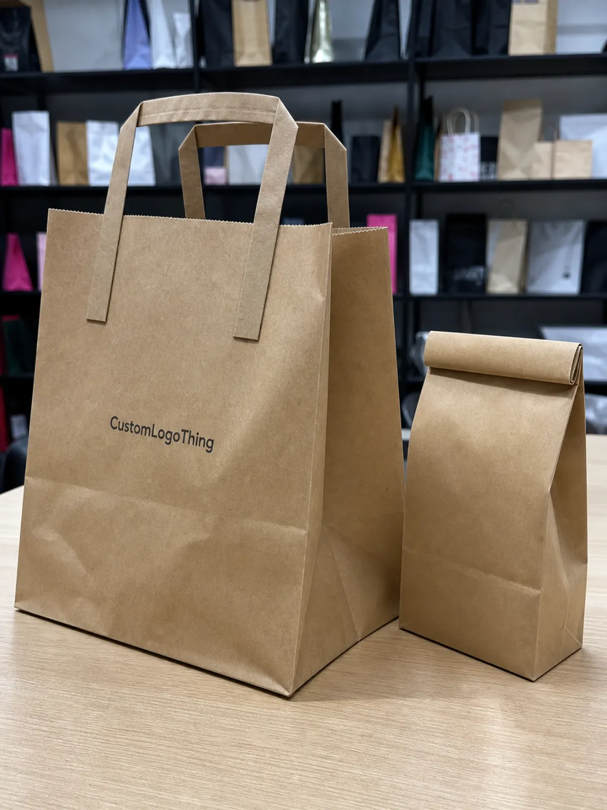
Different bag formats create different “good” logo locations. A flat bottom bag gives you a broad, box-like front panel and a strong shelf stance. It usually handles centered logo placement well because the front face stays relatively stable after filling.
A side gusset bag often has a narrower face. It can look classic and efficient for larger fills, but the visible front may be tighter than expected. If the logo is too wide, the edges start to wrap into the gusset crease and lose sharpness.
Stand-up pouches with paper layers give a familiar retail profile, especially for specialty coffee. Block bottom paper bags feel sturdy and square. Tin tie coffee bags add a hand-packed look, but the fold-over zone needs discipline. Do not put the logo where the customer or packing team will fold it into submission.
A flat artwork file becomes a three-dimensional package after forming, filling, sealing, folding, and shipping under weight. A logo centered on the dieline may not look centered on the filled bag. Beans push the front face outward. Bottom expansion can lift or drop the visual balance. Paper stiffness creates highlights and shadows that never appear in a PDF proof.
Safe Area, Bleed, Folds, and Seals
The safe area is where important logo details, small text, and critical marks should stay. The bleed extends beyond trim so ink reaches the edge after cutting or forming. Fold lines show where the bag bends. Seal areas are heat-pressed or glued zones where artwork can distort, darken, or disappear into construction.
Gusset transition zones need extra caution. These are the angled or creased areas where a flat face turns into a side or bottom panel. Fine type, thin logos, small icons, and foil details can break visually across those folds.
Degassing valves deserve early attention on whole bean coffee. If the valve sits on the front panel, give it room. A 0.5 to 0.75 inch clearance around the valve is a common starting point, though the exact requirement depends on valve diameter, applicator tolerance, bag size, and supplier equipment. A valve cutting through a logo mark looks accidental because it is.
Review mockups as filled, standing bags, not only as flat rectangles. A 3D render helps, but a printed paper mockup folded by hand can reveal scale problems in five minutes. For larger runs, ask about a filled sample or production sample. Paper texture, laminate stiffness, seal location, and bottom expansion all affect the final read.
Key Factors That Decide the Best Logo Position
Start with hierarchy. Brand logo first. Roast or blend name second. Weight, roast level, certifications, QR codes, and required details third. If a shopper has to read tasting notes before identifying the brand, the front panel is doing too many jobs.
Bag size changes the answer. A 4 oz sample bag may only have room for a 1.5 to 2.25 inch wide logo before it feels crowded. An 8 oz bag can usually carry a stronger mark. A 12 oz coffee bag often supports a bold front-panel logo plus roast name and a short flavor line. On 1 lb and 2 lb bags, the same logo file may need to scale up by 15% to 35% so it does not look weak on a larger face.
Material affects sharpness. Natural Kraft Paper has warmth, but it absorbs ink and lowers contrast. White kraft gives cleaner color, especially for black, navy, forest green, or other dark logos. Matte laminated paper softens glare and tends to look more premium. Gloss laminated paper increases shine and color pop, but it also shows reflections under store lights.
Barrier structure matters too. Foil-lined paper bags protect aroma and improve shelf life, but they can change stiffness and sealing behavior. Compostable or recyclable paper-based structures may come with different print, heat-seal, and finish limits. Ask for the minimum line weight, minimum reverse type size, and recommended barcode size for the exact material. Not the “usual” material. The one you are buying.
Print Methods and Detail Limits
Flexographic printing is efficient for larger runs, but plates, registration, ink gain, and trap tolerance matter. Thin strokes can thicken. Small reverse text can fill in. Tight multi-color registration can drift slightly, especially on textured or absorbent paper.
Digital printing is useful for short runs, test launches, and multiple SKUs because setup is lighter and artwork changes are easier. It is not magic, though. Heavy coverage, color matching, and fine details still need proofing. Hot foil stamping can make a simple logo feel premium, but delicate foil gaps may close if the mark is too detailed.
Spot UV, embossing, and debossing add touch and contrast. They also need accurate registration. If a raised logo lands a hair off the printed logo beneath it, everyone will see it. Labels are flexible and cost-friendly, especially for small batches, but the label edge becomes part of the package design. Pretending it will disappear is wishful thinking.
Functional features are not decoration zones unless the design is built around them. Tin ties, zipper closures, tear notches, hang holes, degassing valves, heat seals, and folded tops should be treated as no-logo or low-detail areas. For grocery shelving, prioritize fast front-panel recognition. For subscription coffee, unboxing, side gusset storytelling, and back-panel education may carry more value because the buyer spends more time with the package.
If the coffee bag is part of a broader product line, related Custom Packaging Products can help align bags, mailer boxes, inserts, and custom printed boxes under one brand system.
Step-by-Step Process and Timeline for Approving Placement
A tight approval process prevents most placement mistakes. Choose the bag style and fill size first. Then confirm material, barrier layer, closure, valve position, and print method. After that, request the supplier’s dieline for that exact structure and size.
Place artwork inside the safe areas, then send it for prepress review. Check the digital proof for panel location, fold lines, seals, bleed, valve clearance, barcode position, and SKU consistency. For high-value runs, approve a physical sample before full production. Yes, it adds time. So does reprinting 10,000 bags with a logo hiding under a fold.
Timelines vary by production path. Stock paper coffee Bags with Custom labels may be ready in roughly 5 to 10 business days after artwork approval, depending on label stock, order size, and supplier capacity. Direct digital print on stock bags often runs around 10 to 18 business days after proof approval. Fully Custom Printed Paper coffee bags can take 20 to 40 business days or more if plates, rollstock, special finishes, or custom materials are involved.
Freight adds time, especially for carton-packed orders. Coffee bags ship as packaging, not air. Bulky cartons take space, and space costs money.
Your supplier needs practical files before placement can be checked accurately: vector logo files, Pantone or CMYK references, bag dimensions, valve preference, closure style, roast lineup, barcode size, regulatory copy, and finish instructions. For coffee sold in the United States, confirm label requirements against current FDA guidance and your legal advisor. For sustainability claims, be specific and conservative; the U.S. Environmental Protection Agency has useful background on materials, waste, and environmental claims.
Proofing Stages That Matter
- Flat dieline proof: checks panel location, bleed, fold lines, valve clearance, seal zones, and barcode position.
- 3D mockup: checks front-panel balance, side visibility, logo scale, and how the bag reads standing upright.
- Physical sample: checks real folding, ink color, paper texture, finish, stiffness, and shelf stance after filling.
Approve placement only after reviewing the bag at actual size. Zoomed-in screen reviews are useful for spelling, edges, and alignment, but they hide scale problems. A logo that looks restrained on a large monitor may feel huge on a 4 oz sample bag. The reverse happens on 2 lb formats.
Cost, MOQ, and Quote Details Affected by Logo Placement
Logo placement can affect cost when it changes print area, panel count, ink count, finish complexity, or setup method. Printing only the front panel is usually more economical than printing the front, back, and both gussets. A higher-cost layout may still make sense if the brand depends on origin storytelling, subscription presentation, or strong shelf blocking across several roast varieties.
| Packaging Path | Typical MOQ | Approximate Unit Range | Best Use | Placement Flexibility |
|---|---|---|---|---|
| Blank stock coffee bags with custom labels | 100-500 units | $0.18-$0.45 for label only, plus bag cost | Launches, seasonal roasts, small batches | High, but label size limits the logo area |
| Stock bags with direct digital print | 250-1,000 units | $0.35-$0.95 per bag, depending on coverage | Short retail runs and multiple SKUs | Good, usually strongest on front and back panels |
| Fully custom printed coffee paper bags | 5,000-10,000+ units | $0.18-$0.55 per bag at volume, depending on structure | Established retail lines and consistent branding | Excellent, including gussets and repeat systems |
Those ranges are not promises. Size, material, print coverage, finish, freight, supplier setup, and market conditions all move the number. A 12 oz matte kraft flat bottom bag with a valve, zipper, and two-color flexographic print will price differently than a simple tin tie paper bag with a one-color front logo.
Buyers usually save more money by giving complete quote details early than by chasing the lowest unit cost through three vague revision rounds. Include bag size, order quantity, material preference, number of SKUs, ink colors, logo size, desired panels, valve requirement, closure style, finish, shipping destination, and target in-hands date.
If FSC-certified paper matters to your retail buyers, ask for documentation and chain-of-custody information; the Forest Stewardship Council explains certification basics clearly. If compostable, recyclable, or post-consumer recycled content claims are part of the design, ask what proof the supplier can provide before printing the claim on the bag.
Moving a logo after proof approval can trigger extra prepress time, new proofs, production delays, or plate changes. In flexographic production, even a quarter-inch shift may require updated plates or a new approval cycle. Finalize placement notes before releasing the order, especially for multi-SKU retail packaging where every roast needs to align.
Common Logo Placement Mistakes on Coffee Paper Bags
The most common mistake is placing the logo too close to the top fold. Tin tie bags are the repeat offender. The design looks balanced while flat, then the filled bag gets folded twice and the top half-inch of breathing room vanishes.
Another problem is centering artwork on the flat dieline instead of the filled front panel. Bottom gussets expand. Beans push the face outward. The visual center shifts. A logo placed mathematically in the middle may look low once the bag is standing upright.
- Valve interference: a degassing valve too close to the logo interrupts recognition and can cover fine lettering.
- Fine detail on rough kraft: thin serif text, small reverse type, and delicate badge marks can soften from ink gain and paper texture.
- Weak contrast: tan ink on natural kraft or muted gray on matte white may look refined on screen but weak under retail lighting.
- Front-panel clutter: origin notes, tasting notes, QR codes, certifications, and roast scales can force the logo to compete for attention.
- One-size artwork: a logo balanced on a 12 oz bag may dominate a 4 oz sample bag or look undersized on a 2 lb format.
Small reverse type is especially risky. On kraft paper, reverse text should stay bold and simple, often no smaller than 7 or 8 pt depending on the print method. For flexographic print on absorbent paper, ask the printer for minimum line weight and trap tolerance before approving a delicate mark.
Barcodes need the same respect. Do not shrink them into a corner because the front panel wanted more breathing room. Put the barcode on a flatter back panel with enough quiet zone and contrast for scanning. A pretty bag that fails at checkout is not premium. It is a problem with nice typography.
Test the design at actual size. Print it, tape it to a comparable coffee bag, and stand it on a shelf next to two competitors. You will see crowding, low contrast, and poor logo scale faster than you will in a conference call.
Expert Tips for Cleaner, More Premium Print Results
Build the front panel around a clear vertical axis. The logo should sit high enough for fast recognition, but low enough to avoid the top seal, tin tie, tear notch, zipper, and fold-over area. On many 12 oz coffee bags, the top of the logo begins roughly 1.25 to 2 inches below the finished top edge, though the right distance depends on closure and bag height.
Leave more whitespace than feels necessary on screen. Filled coffee bags have curves, highlights, shadows, and shelf clutter around them. Tight artwork gets tighter in real life. A calmer front panel often looks more expensive than one packed edge to edge with copy.
Use vector artwork for logos. Keep key line weights above the supplier’s minimum print tolerance, especially for kraft paper, flexographic printing, foil stamping, and small roast labels. If metallic foil is part of the plan, simplify the logo mark and avoid hairline gaps. Foil likes clean shapes.
Color needs production thinking too. Rich black, dark green, deep brown, and navy often hold better on kraft than pale neutrals. White ink underprinting may be needed for bright colors on brown kraft, and that can affect cost and registration. Metallic inks and foils can look sharp, but they should support the logo rather than rescue a weak layout.
Using Gussets Without Losing Readability
Side gussets are useful for secondary branding. Repeat a small logo. Add a roast category. Print origin icons. Use a vertical brand mark. Avoid putting critical information there because the gusset may crease, face sideways, or sit partly in shadow on shelf.
The main logo should still live on a flatter, more readable panel unless the bag style is intentionally designed around a wraparound identity. Wraparound designs can work beautifully, but they need careful proofing across the front, side, and back transitions. The folds will not politely move out of the way.
Separate permanent brand elements from changeable SKU details. Keep logo placement, brand color, and core layout consistent across blends, then allow roast names, tasting notes, labels, or stickers to change. That structure saves time and reduces prepress risk when a seasonal roast gets added later.
For high-volume runs, request a one-up printed sample or production sample, especially with dark ink coverage, soft-touch lamination, embossing, spot UV, or a new paper stock. A premium finish can elevate the bag, but it can also expose alignment errors. Tiny movements matter. Shifting a logo up by 0.25 inch can clear a valve, improve shelf readability, or keep the brand mark away from a heat seal.
If the coffee line also ships in mailers or gift sets, align the bag identity with related Custom Packaging Products so the customer sees one consistent brand system from outer carton to inner coffee pouch.
Next Steps Before You Send Artwork to Production
Before artwork goes to production, run a simple preflight. Confirm bag size, fill weight, closure, valve, material, print method, logo file format, color targets, barcode size, safe areas, and the panel where the primary logo should live. If one detail is undecided, mark it clearly instead of assuming the supplier will guess correctly.
Print the dieline at actual size. Fold it roughly into shape. Place it next to a current coffee bag with a similar fill weight. This low-tech check catches more placement issues than people expect, especially on 4 oz and 8 oz bags where every quarter inch feels large.
Prepare two or three placement options instead of one fixed layout. A slightly higher logo, a narrower mark, or a valve moved to the upper corner may solve a production issue without rebuilding the full design. Give supplier feedback with panel names, measurements from edges or fold lines, preferred logo width, acceptable movement range, and alignment rules across SKUs.
- Send final vector logo files, not flattened screenshots.
- Include dieline notes showing safe areas, valves, seals, folds, and gussets.
- List all SKUs, quantities, materials, finishes, and barcode files in one package.
- State the target delivery date and shipping destination before quote review.
- Confirm whether placement must match across 4 oz, 8 oz, 12 oz, 1 lb, or 2 lb formats.
For a broader product packaging program, compare coffee bags with cartons, inserts, and retail displays through Custom Packaging Products so the logo system scales beyond one bag.
A Custom Coffee Paper Bags logo placement guide is useful only if it turns design intent into production-ready instructions that can be measured, proofed, printed, and repeated. That is the difference between a nice concept and a coffee bag that still looks good after filling, packing, shelving, shipping, and sitting in a customer’s kitchen.
FAQ
Where should the logo go on custom coffee paper bags?
For most retail coffee bags, the primary logo should sit on the upper-to-middle front panel, safely below the top seal or tin tie and away from valves, fold lines, and gusset transitions. Check the exact position on the filled bag shape, not only on the flat dieline, because bottom expansion and product weight change how the front panel reads.
How large should a logo be on coffee paper bags?
The logo should be large enough to read at shelf distance without crowding roast names, weight, or required information. A 12 oz bag can often carry a stronger front-panel logo than a 4 oz sample bag, while larger 1 lb or 2 lb bags usually need the logo scaled up so it does not look underpowered.
Can the logo be printed over the side gusset of a coffee bag?
Yes, but side gusset printing works best for secondary branding, repeat marks, vertical text, or simple icons rather than the main logo. Gussets fold, crease, and face sideways on shelf, so fine details and required information should stay on flatter, more readable panels.
Does valve placement affect logo placement?
Yes. Valve placement is one of the most important production details for whole bean coffee bags because it can interrupt the front-panel design if not planned early. Keep clear space around the valve, or position the valve as part of the layout so it looks intentional instead of dropped on at the last minute.
What files are needed to confirm coffee bag logo placement?
Suppliers typically need a vector logo file, the chosen bag dieline, color references, bag size, closure style, valve location, SKU details, barcode, and required copy. If the bag uses foil, embossing, spot UV, or multiple print panels, separate artwork layers and clear placement notes help prepress check the design faster.

