Buyer Fit Snapshot
| Best fit | custom cosmetic sleeves with cmyk for sustainable packaging for packaging buyers comparing material specs, print proof, MOQ, unit cost, freight, and repeat-order risk where brand print, material, artwork control, and repeat-order consistency matter. |
|---|---|
| Quote inputs | Share finished size, material target, print colors, finish, packing count, annual reorder estimate, and delivery region. |
| Proofing check | Approve dieline scale, logo placement, barcode or warning zones, color tolerance, and any recyclable or compostable wording before bulk production. |
| Main risk | Vague material claims, crowded artwork, or missing packing details can create delays even when the unit price looks attractive. |
Fast answer: Custom Cosmetic Sleeves with CMYK for Sustainable Packaging should be specified like a repeatable production item. The safest quote includes material, print method, finish, artwork proof, carton packing, and reorder notes in one written spec.
What to confirm before approving the packaging proof
Check the product dimensions against the actual filled item, not only the sales mockup. Ask for tolerance on folds, seals, hang holes, label areas, and retail display edges. If the package carries a logo, QR code, warning copy, or legal claim, reserve that space before decorative graphics fill the panel.
How to compare quotes without losing quality
Compare board or film grade, print process, finish, sampling route, tooling charges, carton quantity, and freight assumptions side by side. A lower quote is only useful if the supplier can repeat the same color, closure quality, and packing count on the next order.
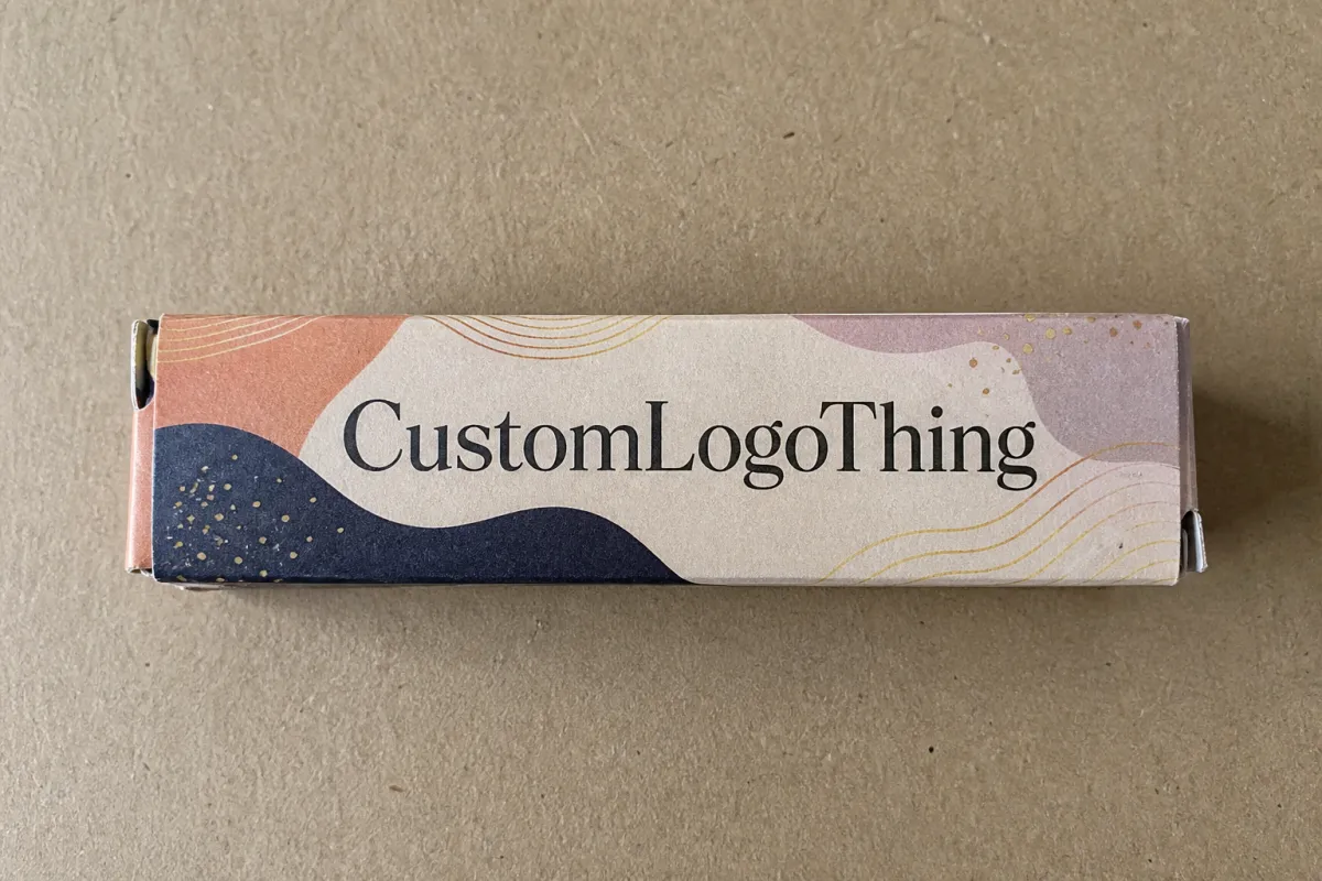
Custom Cosmetic Sleeves With CMYK for Sustainable Packaging
A plain jar, tube, or bottle can look like a completely different product once custom cosmetic sleeves with CMYK wrap around it. The sleeve adds color, structure, and brand presence without forcing a full redesign of the primary container. For beauty brands juggling multiple SKUs, seasonal drops, and retail deadlines, that matters more than people like to admit. A sleeve can turn ordinary packaging into something polished and retail-ready while staying lighter and less cumbersome than a full printed carton.
That practical side is a big part of the appeal. A sleeve can carry full-color imagery, batch-specific messaging, ingredient callouts, and a clean brand story across skincare, makeup, haircare, and gift sets. It uses less paperboard than a traditional box, which puts it in a useful middle ground between a label and a rigid carton. The result is product packaging that looks premium without turning into a production headache.
CMYK gives designers room to work. Skin tones, gradients, editorial layouts, soft neutrals, and photographic art all print well in process color. That range matters because package branding often lives or dies on small visual decisions. A sleeve can feel refined on shelf and still support a sustainability story, as long as the spec stays honest about coatings, substrate, and what the pack actually needs to do. Paper alone does not make a job responsible. The details do.
Why custom cosmetic sleeves with CMYK change the shelf story
Picture a simple white jar sitting in a crowded skincare aisle. On its own, it reads as functional. Add a sleeve with a bold color field, a tactile finish, and a few sharp lines of copy, and the same container starts looking like a premium launch. That shift is why brands keep asking for custom cosmetic sleeves with CMYK. They are quick to adapt, easy to vary across SKUs, and strong enough to carry a full visual story without rebuilding the whole package.
A sleeve is not a full box, and the difference matters. A carton encloses the product. A sleeve wraps the existing pack, usually across the front, centerline, or face while leaving the container visible. That makes sleeves useful for skincare jars, mascara tubes, lotion bottles, lip treatments, and promotional gift sets where the product already does part of the visual work. Less board is often involved too, which can reduce material use compared with a custom printed box.
CMYK opens up the design side. Process color is especially useful for beauty photography, gradients, natural ingredients, soft textures, and neutral palettes that would lose depth if handled too aggressively. Brands that want a magazine-like look usually get there faster with CMYK than with spot colors alone. It also helps with product families. One visual system can stretch across several sizes and formulas without forcing a new structure every time the assortment changes.
Sustainability should be part of the spec from the first sketch. A sleeve can create shelf presence with less board than a rigid carton, but that does not make every version equally responsible. The best result usually comes from matching substrate, coating, and print coverage to the actual use case. A modest aqueous coating on recycled board may fit one launch. Another product may need a heavier coated stock because the pack will get tossed, stacked, and handled by everyone except the person who designed it.
A sleeve should do three jobs at once: protect the look of the pack, tell the brand story clearly, and stay honest about what it costs in material, finishing, and end-of-life handling.
For brands building a full product line, sleeves also make launch planning less painful. Instead of retooling every component, a team can keep the container consistent and rotate the sleeve graphics for shade names, limited editions, or seasonal offers. That keeps inventory easier to manage and helps a line feel unified on shelf even when the assortment changes often.
How the CMYK process turns artwork into a finished sleeve
CMYK printing separates artwork into cyan, magenta, yellow, and black components, then rebuilds the image on press so the eye sees one finished design. Simple idea. Slightly less simple execution. The final sleeve depends on how carefully the file is prepared before production starts. A printer can reproduce a lot. It cannot rescue artwork that ignores folds, glue zones, or the way a sleeve wraps around a curved container.
Good file prep starts with the dieline. The dieline shows cut lines, fold lines, glue areas, and the finished shape of the sleeve. It is part of the artwork, not a side note. Type too close to a fold can disappear into the seam. A product image can vanish at the edge. A barcode dropped into the wrong zone can become unreadable, which is a thrilling way to waste time. In practice, a clean dieline is one of the most important tools for getting custom cosmetic sleeves with CMYK approved without endless back-and-forth.
There is a real gap between what a screen shows and what paper can hold. Bright RGB blues often shift in CMYK. Deep blacks can look rich on one stock and muddy on another. Soft grays, blush tones, and skin tones can move in ways that matter a lot to beauty packaging because subtle color judgment is often the whole point. A buyer who understands that early can save time by asking for a press target or material sample before the file gets too far down the road.
Proofing is where expectations stop being theoretical. A digital proof is useful for layout, copy, and placement, but it does not always show the final paper feel, ink lay, or coating. A hard proof, or a press match on similar stock, gives a better read on the finished result. Small shifts are normal, especially on uncoated or recycled board where ink absorbs differently. Proofing is not there to promise a perfect screen match. It is there to show whether the job sits inside an acceptable visual range before the full run starts.
Finishes that change the look and feel
Finish choices change both the visual tone and the handling performance of the sleeve. Matte coating softens color and pushes the design toward a more contemporary feel. Gloss sharpens contrast and makes full-color art feel brighter. Soft-touch creates a velvety surface that many beauty brands love for premium skincare or gift sets, though it can add cost and may not fit every recyclability goal. Aqueous coating is often the practical middle ground because it gives protection without the weight of a film laminate in many applications.
For a brand working with packaged cosmetics, those choices are not decorative extras. A sleeve that rubs inside a carton or gets handled on a store floor needs surface protection. A finish that looks beautiful but scuffs at the first pass is a retail problem waiting to happen. Heavy finishing can also make recycling harder or muddy the brand's sustainability message. The right answer depends on the container, the route to market, and how much abuse the pack will take before a customer ever opens it.
If the launch also includes inserts, cartons, or display pieces, the print team may use the same visual standards across the set so everything feels coordinated. That is where digital printing and offset printing each earn their keep. Digital printing is useful for short runs, test batches, and variable work. Offset printing usually wins on higher quantities and tighter unit cost control. Both can produce strong branded packaging if the files are built well and the substrate is matched to the job.
Materials, finishes, and sustainability factors to compare
Material choice shapes everything that follows: how the sleeve feels in hand, how well it folds, how it prints, and how the customer sees the product before opening it. For custom cosmetic sleeves with CMYK, paperboard is usually the base material, but not all board behaves the same. A lighter stock can work for short-run promotions or secondary packaging. A heavier board creates more substance for premium retail packaging. Recycled content can support a lower-impact position, as long as the board still runs cleanly through print and conversion.
Here are the main material factors most buyers should compare:
- Board weight: lighter board lowers material use, while heavier board improves stiffness and shelf presence.
- Surface finish: coated stocks usually hold richer ink detail, while uncoated or recycled sheets can soften the image and reduce glare.
- Recycled content: a useful sustainability marker, though the exact percentage should be verified by the supplier.
- Coating choice: aqueous coatings often balance protection and recyclability better than film-heavy options.
- Structural design: a compact sleeve with clean folds and minimal waste can lower material use without looking cheap.
Design can cut waste in ways that are easy to miss at first glance. A sleeve that uses a standard width across several SKUs may reduce setup complexity. A shape that avoids extra flaps may trim board use. Window cutouts can look smart, but they deserve scrutiny because they affect both material usage and pack appearance. In some cases, a simple die-cut reveal does the job. In others, the product benefits more from a full wrap that keeps the visual story tighter and cleaner.
CMYK coverage interacts with the substrate, and that interaction should guide the art direction. Heavy coverage can look strong, but it may increase drying time and the risk of scuffing, especially on uncoated stocks. Very light tints can look elegant, yet they may pick up variation from the paper tone underneath. A good packaging design team tests those combinations early instead of assuming the same values will behave identically across different boards.
Sustainability claims need care. It is fine to say a sleeve uses paperboard, recycled content, or FSC-certified sourcing when those facts are documented. It is not fine to pretend a sleeve is automatically green just because it is paper-based. Coatings, inks, glue seams, and laminate choices all matter. For brands that want a clearer framework, the Forest Stewardship Council explains certification and responsible sourcing standards at fsc.org, and the EPA's resources on paper recycling are useful for understanding end-of-life assumptions at epa.gov.
That kind of careful language builds trust with buyers, retailers, and regulators. It also keeps package branding honest. A sleeve can support a cleaner supply story, but only if the material spec, coating, and print plan match what the brand says publicly.
Cost, pricing, MOQ, and quote factors to watch
Pricing for custom cosmetic sleeves with CMYK is driven by a few predictable variables, and the more clearly those variables are defined, the easier it is to compare quotes. Size is one of the biggest drivers because a larger sleeve uses more board and usually needs a larger die. Print coverage matters too, since full-bleed art, dense photos, and dark backgrounds often increase ink use and can affect press setup. Finishes, especially soft-touch or specialty coatings, can move the price more than many first-time buyers expect.
MOQ, or minimum order quantity, changes the math in a very practical way. Short runs often carry a higher per-unit cost because setup, proofing, and conversion are spread across fewer pieces. Larger quantities improve efficiency once the job is locked in, which is why offset printing often becomes more attractive as volume rises. Digital printing can be a better fit for smaller runs, pilot launches, or seasonal tests where flexibility matters more than the lowest possible unit price.
A good quote should not hide the details. It should clearly state whether the price includes dieline creation, prepress, proofing, finishing, conversion, and packing. Freight should be called out separately, or clearly defined if it is included. If the supplier is also handling sampling or prototype revisions, that should be visible too. This is where a careful buyer saves money: not by chasing the lowest line item, but by comparing the total project cost with all the pieces in view.
| Option | Typical Use | Approx. Unit Cost | Notes |
|---|---|---|---|
| Digital printing, short run | Launch tests, limited editions, small SKU counts | $0.45-$1.10 | Good flexibility; higher unit cost at low quantities |
| Offset printing, mid to high volume | Core line packaging, retail rollouts | $0.12-$0.38 | Better unit economics once setup is spread across volume |
| Premium finish package | Luxury skincare, gift sets, prestige beauty | +$0.05-$0.20 | Soft-touch, specialty coating, or heavier board can add cost |
| Simple matte aqueous finish | Clean, recyclable-minded branded packaging | +$0.02-$0.08 | Usually a practical choice for balance of look and function |
Those ranges are planning numbers, not promises. Final cost depends on sleeve dimensions, paperboard selection, quantity, and finishing complexity. A sleeve with narrow tolerances and a special fold may need more attention than a simple band. A job with heavy image coverage or multiple versions for several products may also cost more to keep sorted and packed correctly.
There are hidden costs that show up late if the job is rushed. Last-minute artwork changes can trigger new proofs. Specialty coatings may need longer drying and handling time. A structural revision after approval can restart prepress. Even a copied barcode in the wrong place can create delays if the file needs to be rechecked from top to bottom. A strong brief helps prevent those problems by locking the variables before the press run begins.
If budget is tight, there are still smart ways to protect the look of the package. Many brands can simplify coverage without losing identity, standardize a few sleeve sizes across similar SKUs, or choose one premium finish instead of layering several. That decision-making usually beats trying to shave pennies from board weight and ending up with a sleeve that feels flimsy on shelf.
For teams building a wider packaging program, it can help to browse a supplier's broader range of Custom Packaging Products so sleeve specs, cartons, and support pieces stay visually aligned. Coordinated product packaging often looks more expensive than a pile of one-off items, even when the material choices stay modest.
Process and timeline: production steps from dieline to delivery
A clean production timeline starts with the sleeve dimensions. The printer needs the container size, the wrap area, the front panel position, and any tolerance limits before the dieline can be finalized. From there, artwork is placed onto the flat template, then reviewed for bleed, safe zones, seam alignment, and any elements that may disappear in the fold. This stage solves a lot of packaging design problems before they turn expensive.
The full sequence usually looks like this:
- Confirm container dimensions and sleeve style.
- Create or approve the dieline.
- Place artwork, copy, and barcode details.
- Review proofs for color, layout, and finish notes.
- Approve materials and sign off on the job.
- Print, coat, and convert the sleeves.
- Inspect, pack, and prepare freight.
Lead time can stretch at several points. Custom dielines take time to validate. Complex artwork may need more proof cycles. Specialty coatings, foil accents, or heavy coverage can slow finishing. Shipping windows add another layer of timing, especially if the sleeves need to arrive before a filling or assembly date. A simple job can move fast. A beauty launch with multiple SKUs and exact color expectations usually needs more room than the first estimate suggests.
In many plants, the schedule is easiest to manage if the artwork is locked before the production slot opens. Late copy changes create avoidable friction, especially if claims, ingredients, or usage directions have already been proofed. It also helps to confirm the target stock and color reference early. If the brand has a previous carton or label that performs well, that sample can serve as a useful benchmark for the new sleeve instead of starting from zero.
Timing should be clarified in writing. Ask for proof turnaround, production capacity, and whether the quote includes final delivery or only ex-works completion. That sounds basic, but it prevents the most common scheduling mismatch: a buyer expecting the sleeves to land in the warehouse while the supplier priced only the print run. Clear communication here is part of responsible purchasing, not just admin busywork.
Brands that are also ordering other components can improve coordination by aligning sleeve approval with broader printed collateral, especially if they are running a launch with Custom Printed Boxes, insert cards, and secondary packaging. Keeping those items on the same review calendar makes it easier to hold color consistency across the full set.
For projects that need extra control in transit, ask whether the pack-out will be checked against shipping expectations. If sleeves are being shipped flat to a co-packer or distribution center, the outer cartons and freight handling should be considered part of the package design plan. If the pack must survive pallet movement or repeated transfers, performance references from organizations such as ISTA can help frame the testing discussion. The test method will depend on the route, but the principle is simple: the sleeve is not finished until it survives the trip and still looks right on the shelf.
Common mistakes with custom cosmetic sleeves and CMYK
One of the most common mistakes is sending RGB artwork and expecting the colors to translate perfectly. Screen color is built for light, while print color is built for ink. Those are not the same language. Bright blues, saturated reds, and intense greens are especially vulnerable to shift if the conversion gets left until the last minute. Good file prep includes a CMYK conversion review before proofing, not after production has already started.
Layout causes problems too. Small type placed too close to a fold can become hard to read, and design elements that cross a glue seam can break the visual flow. A sleeve around a curved cosmetic container behaves differently from a flat carton, so what looks centered in the file may appear slightly off once wrapped. The safest route is to reserve quiet space near folds and keep critical information away from seams and edges.
Sustainability missteps happen as well. Some brands choose a heavier board than they actually need because it feels more premium on a sample table, then discover the added weight does nothing useful for the product. Others select a beautiful film laminate that makes recycling harder even though a simpler coating would have delivered the same retail look. A responsible sleeve spec should weigh appearance, scuff resistance, and end-of-life handling together instead of optimizing one piece while damaging the rest.
Testing gets underestimated a lot. A sleeve can look good in a PDF and still fail under store lighting, shipping abrasion, or repeated handling by consumers. If the pack scuffs too quickly, opens too easily, or sits awkwardly on the container, the launch will feel less polished than the art file suggested. That is why a sample on the actual board is worth asking for whenever the budget and schedule allow it.
Speed can create its own mess. Rushing to meet a launch date often means fewer proof rounds, less time to catch copy errors, and more corrections during production. The final bill can rise because the project absorbs extra prepress labor or rework. A better planning habit is to lock the sleeve details early, then protect a realistic review window so the team can make decisions without panic.
Those mistakes are avoidable, but only if the brief is clear. The strongest jobs begin with a realistic file, a clean dieline, and a shared understanding of what the sleeve has to do for the retail shelf, the warehouse, and the customer experience.
Expert tips and next steps for a cleaner launch
If the goal is a smoother launch, start with the basics that drive every quotation: container dimensions, target quantity, finish level, and a dieline-ready art file. That gives the supplier enough information to build a useful estimate instead of a rough guess. It also makes it easier to compare quotes on equal footing, which is the only fair way to judge value in custom cosmetic sleeves with CMYK.
Ask for a proof on the actual board whenever possible. Cosmetic packaging sells through touch, color, and shelf presence, not just the dimensions printed on a spec sheet. If the board feels different in hand, the brand perception changes with it. A proof on the intended stock gives you a much better read on color, contrast, and surface feel than a monitor ever will.
A short spec sheet is one of the simplest tools a buyer can use. It should list the substrate, coating, expected ink coverage, sustainability goals, launch date, and any special handling notes. That one document reduces confusion, supports faster quoting, and helps different vendors respond consistently. It also makes it easier to keep package branding aligned if the line later expands into other formats.
Compare options on total value rather than the lowest unit price. A slightly better board, a cleaner timeline, or a more accurate proof can protect the launch, reduce waste, and make the final retail packaging look more deliberate. For beauty brands, that usually matters more than saving a few cents and then fighting a color or fit problem after the product is already in motion.
If you are building out a larger range of product packaging, use the sleeve project as a template for future jobs. A strong spec now can be reused for matching cartons, display pieces, or promotional components later. That kind of repeatability makes the packaging program easier to manage and keeps the visual system consistent as the line grows.
For brands that want to move from concept to production without unnecessary detours, custom cosmetic sleeves with CMYK offer a practical path: strong shelf impact, flexible artwork, and enough room to support a thoughtful sustainability story. The key is to treat the sleeve as a real packaging component, not just a decorative wrap, and to choose materials and finishes that fit the product, the route to market, and the long-term brand promise.
Frequently asked questions
What files should I send for custom cosmetic sleeves with CMYK printing?
Send a print-ready PDF or a native design file with fonts outlined and images placed at print resolution, usually 300 dpi or better. Include the dieline, bleed, trim, safe zones, and any fold or glue areas so the printer can verify placement before production starts. If color matters a lot, include brand swatches, previous packaging samples, or a short note about the exact shade range you want to preserve.
How long do custom cosmetic sleeves with CMYK usually take to produce?
Timing depends on proofing, quantity, finishing, and shipping, but the work usually moves through prepress, approval, production, finishing, and delivery in that order. Simple runs can move quickly, while custom dielines, special coatings, or artwork revisions can add several days. Ask for a full timeline early so the launch date, packaging arrival, and assembly plan stay aligned.
Are custom cosmetic sleeves with CMYK a sustainable packaging choice?
They can be, especially when the sleeve uses responsibly sourced paperboard, right-sized dimensions, and a finish that supports recyclability. CMYK printing itself is only one part of the footprint; substrate choice and coating matter just as much. A good sustainability plan balances appearance, protection, and end-of-life handling instead of relying on a single green claim.
What MOQ should I expect for custom cosmetic sleeves with CMYK?
MOQ depends on the printer, sleeve size, and print method, so there is no single universal number. Short digital runs are often better for testing or limited launches, while larger offset runs usually lower unit cost as the setup is spread across more pieces. Ask for tiered pricing so you can see where the numbers improve as quantity increases.
Can CMYK match bold brand colors on cosmetic sleeves?
CMYK handles full-color images and many brand colors well, but very bright neons, metallics, and some deep brand tones may need special handling. The substrate changes the result, so a color that looks clean on screen may print differently on coated or recycled board. A press proof or material sample is the best way to confirm the final look before the full run.
For beauty brands that want clear shelf impact without overbuilding the package, custom cosmetic sleeves with CMYK remain one of the most practical ways to combine visual detail, cost control, and smarter material use. If the sleeve is spec'd carefully, it can support the product story, the retail presentation, and the sustainability conversation all at once, which is exactly where good packaging should land. The most useful next step is simple: collect the container dimensions, quantity bands, target stock, finish preference, and a reference sample before requesting quotes, so the spec is strong enough to avoid guesswork.

