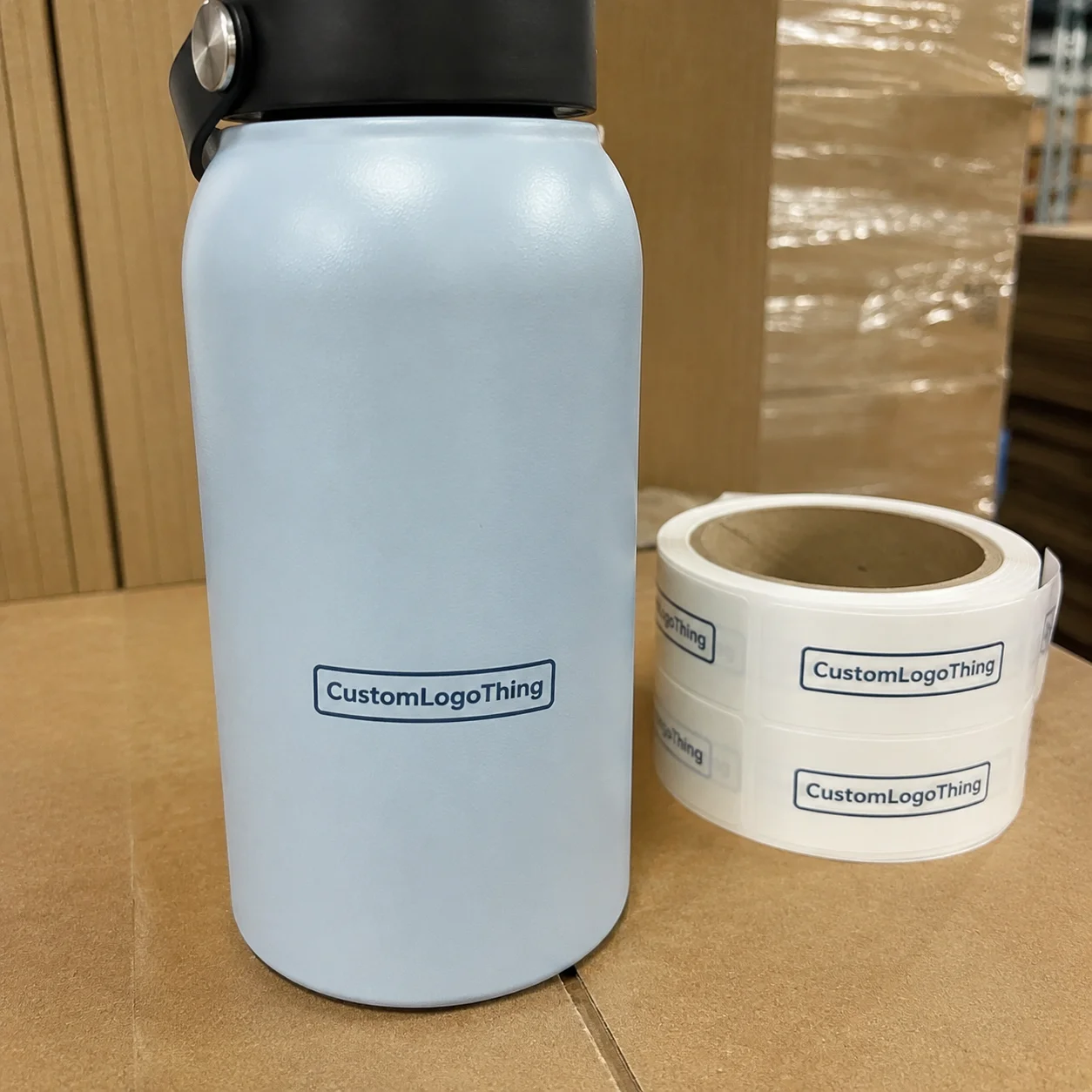
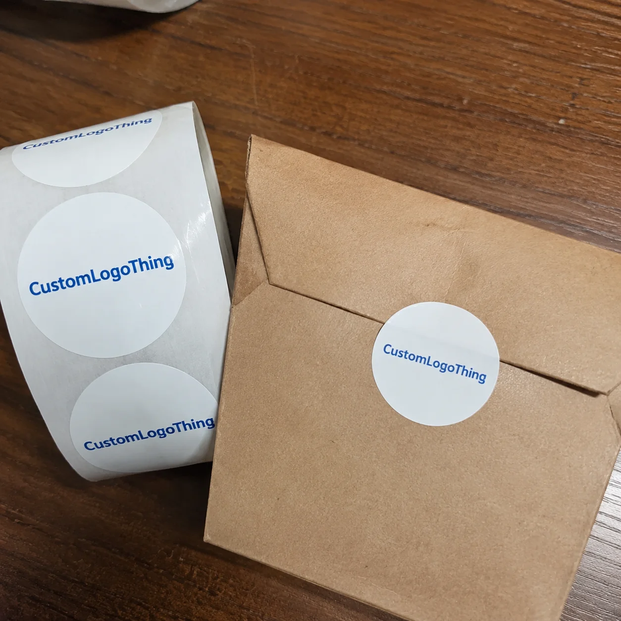
The Small Sticker That Changes a Daily Payment Habit
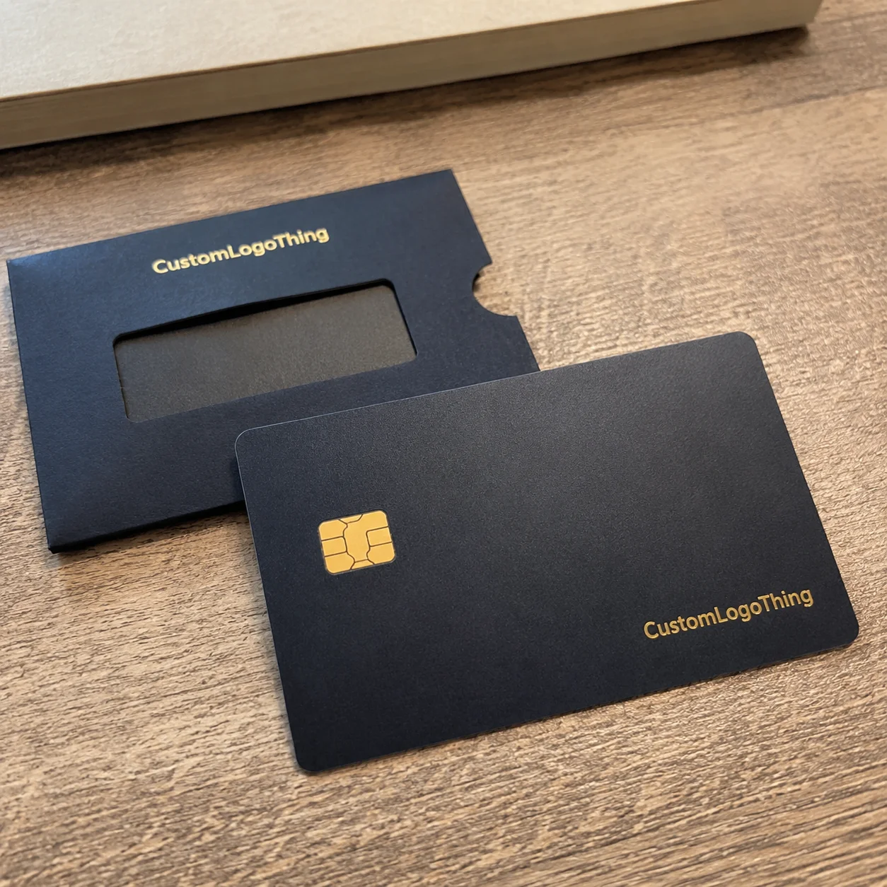
A debit card gets handled constantly. More than a keychain. Often more than the branded insert tucked into a wallet. Yet at checkout, most cards still look nearly identical: bank logo, chip, muted color field, printed numbers, and very little personality. Custom debit card stickers are thin adhesive covers made to personalize the visible face of a debit card without blocking the card’s basic functions.
The appeal is obvious once you think about the card as a daily object. A buyer may want a card skin that matches a brand kit, graduation gift, fandom drop, event theme, boutique aesthetic, or retail packaging system. But the card still has a job. The chip, magnetic stripe, signature panel, printed numbers, contactless behavior, and issuer-required details cannot be treated like blank decoration. Some are functional. Some are contractual. Some are both.
Terminology matters here. A decorative card skin is not the same as a random novelty decal. A full-face sticker may cover most of the card front, while a partial overlay may only frame a logo, background field, or non-functional area. The safest designs respect hardware, card-reader access, and bank compliance limits. If the issuer requires a detail to stay visible, the artwork needs to move around it.
From a packaging buyer’s point of view, these stickers behave like miniature product labels with unusually strict tolerances. The surface is tiny. The handling is constant. Material choice, adhesive behavior, cut accuracy, and print finish often matter more than the artwork concept itself. A strong design that shifts 1 mm on a bank card can look crooked. A laminate that feels premium on a jar label may be too thick for an ATM slot.
Practical rule: treat the debit card as functional equipment first and a design surface second. The best-looking result is the one that still works without drama.
That distinction keeps the project grounded. Card stickers can be clever, polished, and commercially useful, but they need production discipline. The details that decide the final result are not glamorous: film thickness, chip-window registration, adhesive tack, edge lift, backing release, and whether the user can apply the sticker without stretching it.
How Custom Debit Card Stickers Work Without Disrupting Card Use
The structure is simple, but every layer does work. Most debit card covers include a printed film, an adhesive layer, a protective laminate or coating, and a kiss-cut backing that lets the user peel and apply the piece cleanly. Typical finished thickness often falls around 3 to 6 mil, depending on the film and laminate. Thinner constructions conform better. Thicker ones can feel more substantial, but they may create trouble inside tight wallets, dip readers, or ATM slots.
The sticker usually belongs on the front face of the card. Back-side coverage is riskier because the magnetic stripe and signature panel sit there. Front-only designs still need discipline: avoid chip contacts, embossed numbers if the card still has them, printed numbers that must remain visible, issuer marks, security details, and any area the bank identifies as required. A clean partial overlay is often safer than an ambitious edge-to-edge design with too many cutouts.
Adhesive selection deserves more attention than it gets. A removable adhesive reduces residue risk and gives the user a small window for repositioning during application. A stronger permanent adhesive may survive more pocket friction, heat, and edge picking, but it is harder to remove cleanly. Neither version solves every problem. Card surface coating, temperature, sticker age, and handling habits all affect removal.
Print finish changes both appearance and usability. Matte laminate reduces glare and fingerprints, which helps when the design includes small text, line art, or a subtle logo. Gloss pushes saturation and makes photographs feel sharper. Soft-touch has a more expensive hand feel, though it can scuff faster in rough wallets. Holographic, metallic, clear, and textured films can look impressive, but they punish weak artwork. High sparkle plus tiny typography usually turns into low readability.
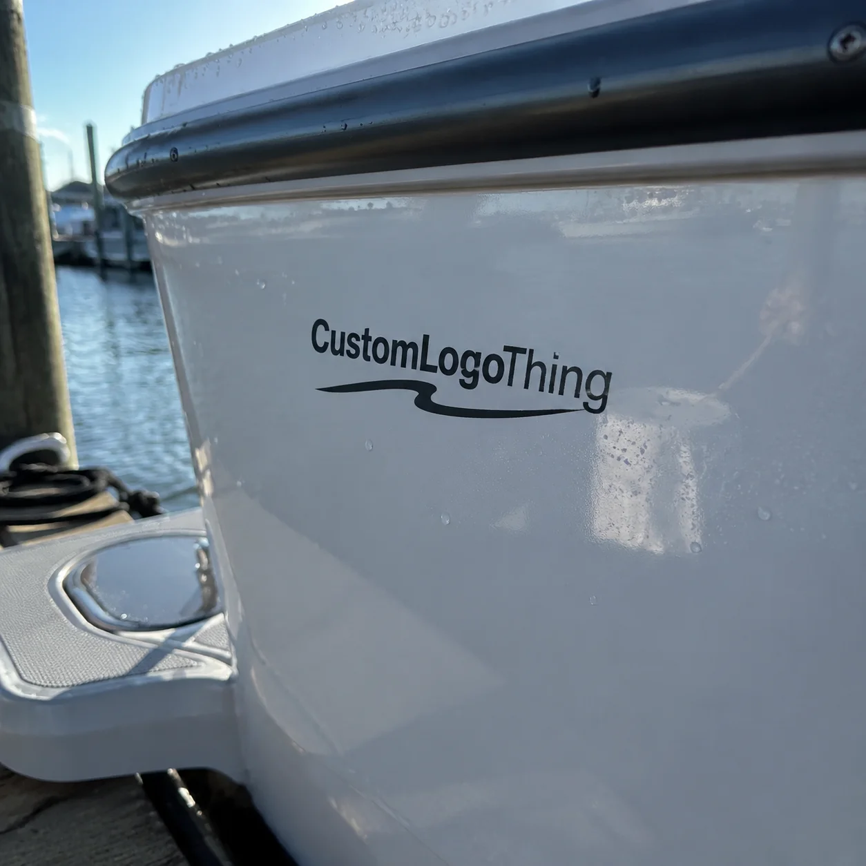
A useful comparison sits in broader packaging design. The same questions asked for Custom Labels & Tags apply here: what is the surface, how often is it touched, what must remain legible, and how will the adhesive behave over time? On a debit card, the margin for error is smaller because the object has to pass through payment hardware.
No card sticker should be positioned as improving security, changing bank features, hiding identity, or modifying payment behavior. Personalization is the point. Functional modification is not.
Design Specs That Decide Whether the Sticker Looks Premium
Premium-looking card stickers start with unglamorous measurements. Confirm final card dimensions, corner radius, chip position, safe area, bleed, and whether a number window is needed. A common debit or credit card size is about 85.60 mm by 53.98 mm, known as ID-1 format under ISO/IEC 7810. That standard does not make every front layout identical. Chip placement, printed numbers, logo position, contactless symbols, and cardholder-name treatment vary by issuer and card program.
Bleed is the quiet hero. For small-format stickers, 1.5 to 2 mm of bleed is usually sensible, while a 2 to 3 mm safe zone keeps important artwork away from cut edges and hardware windows. If a border runs close to the edge, a tiny cutting tolerance can make one side look heavier than the other. On a card, people notice. They see it every time they pay.
Artwork that performs well at card scale tends to be bold. Clean illustrations, monograms, high-contrast logos, gradients, marble textures, simple geometric patterns, and branded color systems usually print better than dense photo collages. A 0.25 pt hairline may look elegant on a large monitor and nearly vanish after print, lamination, and daily handling. Tiny QR codes create the same problem. Unless the code is sized and tested carefully, laminate glare and slight curvature can make scanning unreliable.
Finish selection is not a decoration added at the end. Matte feels understated and helps readability. Gloss makes saturated colors louder. Holographic film creates movement under retail lighting, but it can reduce contrast. Clear stickers need careful white ink planning because colors printed without white backup may look washed out against the original card underneath.
| Finish | Best Use | Trade-Off |
|---|---|---|
| Matte laminate | Minimal designs, logos, subtle patterns | Less color pop than gloss |
| Gloss laminate | Bright artwork, photos, bold gradients | More glare and visible fingerprints |
| Soft-touch laminate | Premium gift kits and brand drops | Can show scuffs with heavy wallet use |
| Holographic film | Events, fandom designs, limited releases | Small text may lose contrast |
| Clear film | Partial overlays and minimalist skins | White ink planning is often required |
Accessibility belongs in the same conversation. Keep required card details visible. Avoid graphics that imitate official bank marks, security badges, or payment network branding. Use enough contrast that the card remains easy to identify in a wallet, under a checkout light, or during a quick tap-to-pay moment.
Color control also needs a reality check. Digital proofs show layout, not a perfect prediction of ink on film under laminate. If brand color is critical, provide Pantone references, CMYK values, or previous printed standards. For metallic and holographic stocks, expect the substrate to influence the final color. A deep navy on white vinyl and the same navy on reflective film are not the same visual object.
Cost, Pricing, and MOQ Factors for Card Sticker Orders
Pricing for custom debit card stickers usually comes down to quantity, size, material, finish, adhesive type, die-cut complexity, proofing needs, and how many designs are combined in the same batch. The unit price is only one part of the calculation. Setup, press calibration, material waste, cutting, inspection, and packing all have to be covered somewhere.
MOQ means minimum order quantity. In plain terms, it is the floor that makes production economically sane. A straightforward matte vinyl card skin may have a lower MOQ than holographic film, metallic effects, textured laminates, or individually variable artwork. Very small runs can be produced by some shops, but the per-unit cost often jumps because the same prepress and cutting work is spread across fewer pieces.
As a planning range, simple printed vinyl card stickers might land around $0.18 to $0.45 per unit at 5,000 pieces, depending on print coverage, laminate, cutouts, and packing format. Smaller orders can easily sit above $0.75 to $1.50 per unit. Specialty films, individual backing cards, retail-ready sleeves, barcodes, or multiple designs in one production run can push costs higher. These are planning ranges, not guaranteed quotes; actual pricing depends on equipment, material sourcing, labor, and workload.
Complexity raises cost indirectly. A custom chip window requires tighter registration. A detailed contour cut takes more setup and quality checks. Multiple artwork versions may need separate proofs, sorting, and labeling. If every sticker needs to be packed on its own branded carrier card, the order becomes a small product packaging project rather than a basic sticker run.
| Order Scenario | Typical Cost Driver | Planning Notes |
|---|---|---|
| Simple matte vinyl, one design | Lowest material and setup complexity | Often best for events, internal teams, or low-risk tests |
| Gloss or soft-touch laminate | Added finishing step | Better perceived value for gift kits or branded inserts |
| Holographic or metallic film | Specialty substrate and stricter artwork control | Strong visual impact, but proofing matters more |
| Multiple designs in one batch | Extra proofing, sorting, and possible material waste | Useful for fandom sets, subscription boxes, or segmented campaigns |
| Retail-ready presentation | Backing cards, sleeves, barcodes, packing labor | Moves the project closer to full retail packaging |
Unit cost drops as quantity rises, but over-ordering can backfire. Banks reissue cards. Layouts change. Campaign artwork expires. A design tied to a short promotion may not be useful six months later. Better math includes expected distribution, spoilage, replacement needs, and the risk of obsolete inventory.
Before requesting a quote, prepare the basics: quantity, finished size, number of designs, finish preference, adhesive preference, packaging format, delivery deadline, and whether the sticker must be removable. A buyer who sends those details usually gets a sharper estimate than someone asking only for a price on card decals.
Process and Timeline From Artwork to Ready-to-Apply Stickers
A normal production path has several checkpoints: inquiry, quote, artwork review, digital proof, approval, printing, lamination or coating, cutting, quality control, packing, and shipping. For standard materials, many sticker jobs run in roughly 7 to 12 business days after proof approval. Specialty films, complex cutouts, retail packing, or physical samples can push that to 15 to 25 business days. Transit is separate.
The buyer’s role is more active than many people expect. Provide card dimensions, confirm chip placement, identify printed numbers or issuer marks that must stay visible, approve color expectations, and check all spelling or logos before production begins. If the design uses brand colors, send Pantone references or CMYK values. Digital print can be consistent, but it cannot infer missing specifications.
Proof approval is the timeline hinge. Delays often happen while teams debate small artwork details after the quote is already approved. A supplier can prepare a digital proof quickly; a five-person internal review can still sit for three days over whether the logo should move 0.8 mm. That sounds minor until the event date is fixed and freight has to be upgraded.
Physical samples are not always necessary. For a one-time internal giveaway, a digital proof may be enough. For a retail launch, influencer drop, paid merchandise item, or premium package insert, a sample or short test run can be worth the cost. It lets the buyer check color, edge behavior, film feel, backing release, and application before thousands of pieces are produced.
Quality control should include more than counting finished pieces. On small die-cut stickers, inspection should look at registration around the chip window, edge cleanliness, laminate defects, adhesive ooze, color consistency, and whether the kiss cut releases without tearing the liner. Standards from groups such as ISTA are more relevant to transit testing for packed goods than to a single card skin, but the mindset is useful: design for the journey, not just the press sheet.
Work backward from the launch, mail date, or event. Add buffer for proof revisions, supplier questions, material availability, production, packing, and shipping. A comfortable schedule beats an expensive rush order almost every time.
Common Mistakes That Ruin Fit, Finish, or Card Reader Access
The most expensive mistake is designing from a generic template without checking the actual debit card layout. A card may look standard until you compare chip position, corner radius, printed number placement, issuer logo, and embossing. One template cannot safely cover every bank, card program, or card generation.
Covering functional details is the second big failure point. Chip contacts, magnetic stripe areas, signature panels, holograms, bank names, card numbers, and security markings may be needed for identification or machine reading. A sticker that blocks them may look good in a photo and fail in use. Bad trade.
Material errors are quieter. A film that is too thick can catch at wallet edges or make the card feel jammed in a tight slot. A rigid material may lift at the corners. A very glossy laminate may look premium for the first hour and then show every fingerprint. An overly aggressive adhesive may be fine for a permanent decal, but wrong for a user who wants a removable card skin.
Edge-to-edge artwork without bleed is another giveaway. Cutting equipment has tolerances, even on well-run jobs. Without bleed and safe zones, tiny shifts can create white slivers or uneven borders. On Custom Printed Boxes, a 1 mm variation may hide along a fold or panel. On a debit card sticker, that same shift can sit directly beside a chip cutout and announce itself.
Artwork can collapse at scale. Low-resolution screenshots, tiny text, heavily filtered photos, and crowded collages often look impressive on-screen but messy after printing. If the design needs a microscope to be appreciated, it is probably not a strong card design.
Application errors finish the list. Users should clean and dry the card first, align around the most important cutout, press slowly from one edge to the other, and avoid stretching the film. Trying to reuse a removed sticker rarely ends well. Dust, skin oil, and adhesive distortion usually win.
- Check the real card: measure it and photograph the front before final artwork.
- Respect hardware: keep chips, numbers, and required markings clear.
- Choose thin film: especially if the card will go into ATMs or tight wallets.
- Use bleed: small cuts still need production tolerance.
- Test application: one clean card can reveal alignment issues fast.
Next Steps Before You Request a Quote or Place an Order
Before asking for pricing, gather the facts. Measure the debit card, photograph the front layout, note chip and number placement, choose full-face or partial coverage, and decide whether removable adhesive matters. If several card layouts will be used, treat them as separate designs unless a supplier confirms one cut works safely for all of them.
Create a short design brief. It does not need to be fancy. Include target look, brand colors, finish preference, quantity, deadline, packaging format, and whether each sticker needs individual backing or retail-ready presentation. If the stickers will be inserted into kits, subscription boxes, or Custom Packaging Products, explain that early. Packing format affects labor, Cost, and Lead Time.
For campaigns tied to package branding, consistency matters. A matte black card skin may look excellent beside a soft-touch mailer but feel mismatched next to glossy product packaging. A holographic sticker may shine in a merch drop and feel too loud in a financial wellness welcome kit. Many buyers underestimate this because the object is small. The debit card sticker still participates in the brand system.
Evaluate supplier responses carefully. The best quote is not always the lowest unit price. Look for questions about cutouts, adhesive, laminate, material thickness, and production tolerance. A supplier who asks for the exact card layout is doing the responsible thing. A supplier who immediately quotes a generic full-card decal may still be capable, but the buyer should ask more questions before approving production.
If the sticker will be sold, gifted in bulk, included in a subscription box, or used for a branded campaign, order a proof or sample. Keep one clean test card available for application checks before distribution. Test under normal handling: wallet insertion, light bending, finger pressure around edges, and a few payment attempts where allowed by the card issuer and merchant setup.
There is also a sustainability angle, though it is not always tidy. Small vinyl stickers are difficult to recycle after use, especially with adhesives and laminates. If environmental claims are part of the brand position, be careful. The EPA’s sustainable materials management guidance is a useful reminder that source reduction and right-sized ordering often matter more than a vague “eco” label. Order what can actually be used.
The smartest custom debit card stickers order starts with accurate specs, realistic timing, and a finish that matches daily handling. Get those three right, and the design has a much better chance of looking sharp after checkout, not just on the proof.
FAQ
Are custom debit card stickers safe to use on real cards?
They can be safe for decorative use when they do not cover the chip, magnetic stripe, signature area, card numbers, issuer logos, or required security markings. Use thin materials and confirm the sticker will not interfere with ATMs, dip readers, tap-to-pay behavior, or wallet fit. If you are unsure, check your card issuer’s terms, especially for business, prepaid, or metal cards.
Can custom card skins damage a debit card when removed?
Removable adhesive is designed to reduce residue and surface damage, but results depend on the card coating, sticker age, heat exposure, and removal technique. Permanent adhesive may last longer, but it is harder to remove cleanly and may leave residue. Peel slowly from one corner and avoid scraping the card surface with sharp tools.
What material is best for debit card sticker covers?
Thin vinyl with a protective laminate is a common choice because it balances flexibility, print quality, and handling durability. Matte laminate resists glare and fingerprints, while gloss adds stronger color impact. Specialty films such as holographic or metallic can look premium, but they require careful design so logos and small details stay readable.
How much do custom debit card decals usually cost?
The unit price depends on quantity, material, finish, adhesive, cutout complexity, number of designs, and packaging requirements. Small orders usually cost more per sticker because setup and proofing are spread across fewer units. For an accurate quote, provide quantity, artwork, size, finish, deadline, and whether you need removable adhesive.
How do I apply a debit card sticker without bubbles or crooked edges?
Clean and dry the card first, then align the sticker around the chip or most important cutout before pressing it down. Apply from one edge to the other using slow pressure to push air outward. If the sticker uses removable adhesive, reposition gently before full pressure is applied, and do not stretch the film.