Buyer Fit Snapshot
| Best fit | Custom Display Boxes for Branding projects where brand print, material claims, artwork control, MOQ, and repeat-order consistency need to be specified before quoting. |
|---|---|
| Quote inputs | Share finished size, material target, print colors, finish, packing count, annual reorder estimate, ship-to region, and any compliance wording. |
| Proofing check | Approve dieline scale, logo placement, barcode or warning zones, color tolerance, closure strength, and carton packing before bulk production. |
| Main risk | Vague material claims, crowded artwork, missing packing details, or unclear freight terms can make a low unit price expensive after revisions. |
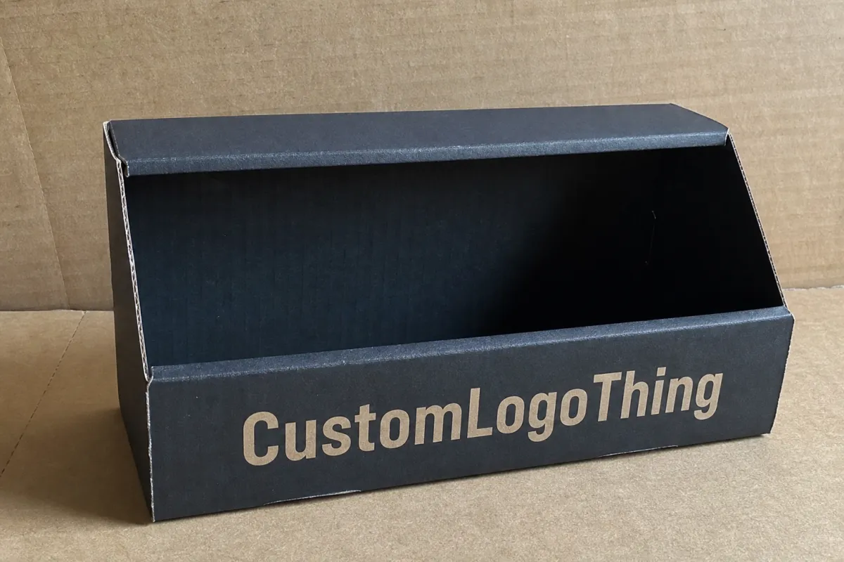
Fast answer: Custom Display Boxes for Branding: Board, Finish, Dieline, and Unit Cost should be specified like a repeatable production item. The safest quote records material, print method, finish, artwork proof, packing count, and reorder notes in one written spec.
Production checks before approval
Compare the actual filled-product size with the drawing, then confirm tolerance on folds, seals, hang holes, label areas, and retail display edges. Reserve space for logos, QR codes, warning copy, and material claims before decorative graphics fill the panel.
Quote comparison points
Review material grade, print process, finish, sampling route, tooling charges, carton quantity, and freight assumptions side by side. A quote is only useful when the supplier can repeat the same color, closure quality, and packing count on the next order.
Custom display Boxes for Branding are not decorative extras with a logo added at the end. They are working pieces of retail space. A shopper sees them, sorts them, and decides in seconds whether the product deserves a hand, a basket, or a complete pass. That speed matters. A plain tray can hold stock. A smart display box has to hold attention, shape perception, and make a brand feel worth a pause. In crowded aisles, a pause is valuable.
From the buyer side, the brief often sounds simple: make the shelf sell more. Good retail packaging protects the product, but protection is only the starting point. The display also has to signal value, format, flavor, strength, or specialty without forcing the shopper to decode a wall of text. That is why structure, print method, finish, and delivery format need to be considered together. You can compare options in Custom Packaging Products, browse real examples in Case Studies, or coordinate the display with Custom Labels & Tags when the full presentation needs to feel connected.
Plainly put, a display that cannot interrupt a glance is just expensive cardboard.
Why a Plain Box Loses the Shelf Fight in 3 Seconds
Walk through a store and watch how people actually shop. They do not stand still and study each package line by line. They sweep across the shelf, catch one visual cue, and decide whether to slow down. That is the whole battle. Custom display boxes for branding exist to break that scanning pattern and make a product feel easier to choose than the items beside it.
A plain tray can carry inventory. It rarely carries a story. A branded display box uses color, shape, hierarchy, and message to turn a small patch of shelf into a billboard. That matters most in categories built on quick decisions: snacks, cosmetics, supplements, accessories, trial sizes, and seasonal gifts. The product may be excellent. The packaging still has to announce that fact at arm's length, under retail lighting, while competing with a dozen other claims.
The shelf fight is usually won before touch. A shopper may give the display two or three seconds, sometimes less. During that window, the box has to explain what the product is, why it matters, and why this brand deserves trust. That is the core job of package branding. Without that clarity, even a strong product can disappear into visual noise.
Display boxes also carry a second responsibility that standard cartons often miss. They store product and present product at the same time. That sounds obvious until the design has to survive transit, sit neatly in a store, and still look intentional after the goods are loaded. A structure that ignores any one of those jobs starts to feel like a shipping compromise pretending to be marketing. Retailers notice that immediately. So do shoppers.
Used well, custom display boxes fit countertop placements, aisle ends, pop-up events, trade shows, and product launches that need to look organized on day one. They are common in:
- Countertop impulse-buy displays near cash wraps
- Seasonal promotions with short sell-through windows
- Sampler packs and launch kits
- Floor displays for higher-volume launches
- Retail packaging systems where multiple SKUs need a shared look
That last point is easy to underestimate. A brand with six flavors or colorways can look scattered fast, or it can look intentional. The display box becomes the visual glue that pulls the range together. That is how branded packaging starts to read like a system instead of a pile of unrelated products. Consistency does not have to be dull. In retail, it often reads as confidence.
"The box does not need to tell the entire brand story. It needs to make the right shopper stop and understand the offer fast."
How Custom Display Boxes for Branding Work on the Shelf
A display box is not one fixed format. It can be an open-face countertop tray, a slotted floor display, a pallet-ready unit, or a compact shipper that becomes a merchandising piece after the outer carton is opened. The structure depends on how the retailer receives it, where it sits, and how much handling it will see. A box that fights the store environment ends up looking fragile, even if it arrived in perfect shape. A box that fits the environment feels almost invisible in the best possible way.
The branding mechanics are simple to describe and hard to execute. Color hierarchy determines the first thing the eye catches. Logo placement tells shoppers who made it. Product windows or cutouts reveal the item itself. Shape can push the display toward premium, playful, sturdy, or mass-market. Good packaging design uses all of those cues to reduce friction. The point is not decoration. The point is speed.
That friction point deserves more attention than it usually gets. If a shopper has to think too hard, the chance of purchase drops. The display should answer the basic questions before anyone reaches for the item: What is this? Why should I care? Which version is this? Is it a premium item, a deal, or a trial size? A well-built display box puts those answers on the surface, where they can be read in a glance instead of a conversation.
There is also a difference between selling one product and building a product system. A single SKU can survive a loud, one-off display. A growing brand cannot. Once several products need to sit together, the display box has to unify them. That is where custom printed boxes earn their place. They create consistency across typography, shape language, color blocks, and icon treatment. The shelf starts reading the way the brand wants it read.
Consider a snack brand with three launch campaigns across the year. One core countertop structure can carry all three. The base format stays the same, which helps with retailer familiarity and tooling. The graphics shift by flavor or season: red for heat, green for savory, gold for holiday. Cosmetic brands do the same with creams, lip products, or minis. The structure carries the brand; the artwork carries the campaign. That split keeps the system flexible without turning it into chaos.
For brands running several channels, that flexibility matters even more. The same family of displays can be adapted for club stores, boutique retail, and event sampling without rebuilding the entire packaging program from scratch. That is especially useful when the display has to feel consistent across brand identity while still speaking to different buyers in different spaces. A warehouse club does not browse like a beauty boutique, and the display should not pretend otherwise.
Authority matters here too, because display packaging is not only visual. If the unit has to travel, stack, or survive rough handling, it helps to look at transit testing guidance such as the International Safe Transit Association's resources at ISTA. If your program includes fiber sourcing claims, look at FSC for certified board options. Those details are not side notes. They shape performance, and performance shapes how a brand is judged at the shelf.
Cost, Pricing, and MOQ: What Drives Your Quote
People ask for price first because price is easier to ask about than structure. Fair enough. Yet with display packaging, a single number is rarely useful on its own. The quote depends on board stock, print coverage, finish, size, structural complexity, and quantity. A clean, simple custom display box may be affordable at scale, while a heavier unit with coatings, inserts, and multiple die-cut elements can rise quickly. The same shape can behave like two different products once the materials and finishes change.
As a rough buying range, a simple countertop display box in corrugated board might land around $0.35-$0.85 per unit at higher volumes, while small runs can sit closer to $0.90-$2.50 or more depending on setup and finishing. That is not a promise and not a quote. It is a working range. Once specialty laminations, foil, embossing, inserts, or extra reinforcement enter the picture, the number shifts. Corrugated, SBS paperboard, and rigid board all sit in different cost brackets for a reason. Material thickness, print surface, and load-bearing strength are not interchangeable.
MOQ changes the entire equation. A 500-piece run does not behave like a 10,000-piece run. Tooling, die setup, make-ready waste, and press time get spread across fewer units, which pushes unit cost up. That is normal. Buyers sometimes react as if the math is negotiating with them. It is not. The press still needs setup, the die still needs cutting, and the line still needs labor. Small runs ask more of every step.
Here is the cleanest way to compare options before committing:
| Option | Best For | Typical Cost Range | Tradeoff |
|---|---|---|---|
| Simple corrugated countertop display | Impulse-buy items, seasonal promos, light to medium product loads | $0.35-$0.85 at higher volumes | Lower cost, less premium feel |
| Printed paperboard display | Light products, cleaner graphic presentation, short retail runs | $0.40-$1.10 depending on quantity | Better print surface, less load-bearing strength |
| Reinforced corrugated floor display | Heavier items, larger launches, long aisle visibility | $1.25-$4.00+ | More stable, higher freight and material cost |
| Premium finished display with coating or specialty effects | Gift sets, cosmetics, premium retail packaging | Varies widely by finish and quantity | Higher perceived value, higher budget pressure |
There are hidden costs too, and they have a habit of appearing only after the main quote is approved. Sample rounds, art fixes, freight, storage, and assembly labor can all move the total. If the display ships flat and needs to be assembled at the store, the retailer may carry more labor. If it ships pre-packed, your fulfillment plan has to absorb that work instead. Either way, the packaging line item is only part of the real cost.
Request pricing at multiple quantities before you decide. The jump from 500 to 1,000 pieces, or from 2,500 to 5,000, often says more than a single quote ever will. Sometimes a slightly larger run lowers unit cost enough to justify the extra inventory. Sometimes it does not. The only sane way to decide is by looking at sell-through, shelf life, and reorder plans together. Optimism is not a stocking strategy.
For brands balancing budget and impact, the tradeoff is blunt: do you want more graphic complexity, or do you want more units at a lower price? Usually, both cannot rise at once without pushing the other side down. That is the honest math behind custom printed boxes. Good packaging buying is less about chasing the cheapest number and more about Choosing the Right combination of cost, visibility, and durability.
Process, Timeline, and Lead Time: From Brief to Finished Box
The production flow is usually more orderly than buyers expect, provided the brief is complete. It starts with product dimensions, target quantity, retail environment, and brand goals. From there, the supplier creates or adapts a dieline, places artwork, proofs the file, samples the structure, and moves into production after approval. Shipping comes last, though freight delays have a nasty habit of acting like they deserve the spotlight.
Delays usually come from a handful of predictable places. Unclear dimensions are a classic. Late artwork changes are another. So are finish approvals and structural revisions after the first sample. Every time the design changes, the clock can reset. That does not mean the project is broken. It means the schedule now includes more back-and-forth, and back-and-forth is where launch plans start to wobble if nobody is watching the calendar closely enough.
Realistic timing depends on structure and quantity, but a common pattern looks like this:
- Dieline and brief review: 1-3 business days if information is complete
- Artwork proofing: 2-5 business days, longer if legal or brand approvals are slow
- Sampling: often 5-10 business days, sometimes longer for structural testing
- Production: roughly 10-20 business days after final approval, depending on complexity and capacity
- Freight: varies by method and destination, and can easily add several days
That means the quoted lead time is not the same thing as total turnaround. It is just the production window. If the display needs sampling, freight, or retailer sign-off, the real calendar gets longer. Buyers who plan around only the print run often find themselves surprised by the final delivery date. A packaging delay can stall a campaign faster than a marketing delay because the goods literally have nowhere to go.
If the display is tied to a promotional launch, ask for a timeline that breaks out every stage. Do not settle for a vague promise with no structure. You want to know when the proof is due, when the sample arrives, when production starts, and when freight leaves. Otherwise, you are managing a launch with a guess and a smile. That is not a plan. That is a gamble with a calendar.
This is also the point where packaging standards stop being abstract. If the box is going to travel through distribution instead of sitting quietly on a shelf, ask about compression resistance, transit testing, and stacking performance. The EPA has useful guidance on packaging waste and material considerations, especially for teams balancing sustainability claims with operational reality. Pretty language does not replace a display that survives shipment, store handling, and a few impatient hands from shoppers.
Step-by-Step: Choosing the Right Display Box for Your Product
Start with the product, not the artwork. That is the biggest mistake in packaging design. People get excited about colors and finishes before they know whether the product fits, how much it weighs, or where it will sit in the store. The structure has to be built around the physical item first. Everything else follows after that. A beautiful display that cannot carry the product is still a failure.
Step one is measurement. You need product dimensions, pack count, unit weight, and whether the display will hold loose items, cartons, bags, bottles, or blister packs. A 12-ounce jar behaves differently from a pouch. A stack of lip balms behaves differently from a single heavy bottle. The structure needs to match the load, or the display begins to sag, bow, or split at the seams. Those failures rarely look dramatic. They just make the package feel tired, which is worse.
Step two is channel choice. Countertop displays work well for impulse purchases and smaller footprint requirements. Floor displays make more sense for larger campaigns where visibility matters from several feet away. Compact units fit better when the retailer has limited space or strict planogram rules. In a tight store, a smaller footprint often wins because it is easier for the retailer to accept and easier for the shopper to approach. Convenience matters as much as graphics.
Step three is material selection. Lightweight products may do fine in paperboard. Heavier products usually need corrugated board with more strength, such as E-flute or B-flute depending on the design. If the display is shipping with product inside, the board grade matters even more. Humid environments, refrigerated areas, or repeated handling all change the performance picture. A box that looks fine in a climate-controlled sample room may behave differently in a real store aisle near a loading dock.
Step four is graphic hierarchy. The brand name should be readable from a few feet away. The product type should be obvious second. Then comes the flavor, variant, benefit, or promotion. If every element fights for attention, nothing wins. Good retail packaging lets the shopper's eye move in a clean order, almost like a path has been laid out in advance. That path should be short.
Step five is compliance and logistics. Barcodes should be easy to scan. Warning copy should not be buried where nobody can find it. If the retailer wants the display pre-packed, the shipment plan needs to support that. If the display needs to arrive flat, the warehouse or store needs a reliable assembly process. Do not design a beautiful mess and assume operations will clean it up later. Operations will notice, and they will remember.
For some brands, the best format is a hybrid. A shipper box can convert into a display after opening, which reduces handling and simplifies stocking. For others, a pre-built countertop display is better because it presents more cleanly at the point of sale. The right answer depends on the product, the retailer, and the budget. There is no magic structure that fixes a weak retail plan. Packaging can support a strategy, but it cannot rescue one that was never clear.
That said, if you want better results from custom display boxes for branding, the winning sequence is usually product fit, retail fit, graphic hierarchy, then finish. Not the other way around. Fancy foil on a box that tips over is still a bad box. So is a beautiful display that takes three people to stock. Practical first. Pretty second.
Common Mistakes That Kill Branding Impact
The first mistake is too much copy. Brands love copy because they know the product better than anyone. Shoppers do not need the whole sermon. They need one sharp message they can understand instantly. If the display is packed with claims, feature lists, and paragraph-length text, it starts to look like homework. Nobody buys homework at the checkout stand.
The second mistake is choosing a structure based on the mockup instead of the actual load. A box can look excellent on screen and still fail in use. Maybe the product is heavier than expected. Maybe the base bows. Maybe the front lip folds after a few touches from customers. Testing the physical sample matters because real-world handling is rude. Stores are not gentle places, and shoppers are not paid to be careful with your packaging.
The third mistake is ignoring retailer rules. Shelf depth, counter size, planogram requirements, and shipping carton specs all matter. If the display is too tall or too wide, it gets rejected or shoved into a corner where it does nothing. A retailer does not owe your brand a premium spot. That space has to be earned by designing for the space, not against it.
The fourth mistake is overdesigning the graphics. This shows up often in branding projects because everyone wants the package to feel exciting. Too many colors, accents, and competing fonts create noise. Strong brand identity usually looks clearer, not busier. A restrained display with one strong message often outperforms a loud one with five weak messages. Clarity reads faster than spectacle.
The fifth mistake is treating the display as disposable. It is not just a box. It is a repeatable merchandising asset. If the structure is built well, it can support new launches, promotional refreshes, and restocks without a full redesign. That is especially valuable for brands planning seasonal drops or ongoing retail expansion. A useful display should earn its keep more than once.
Here are the errors I see most often, in plain terms:
- Designing before measuring the product
- Choosing finishes that look nice but add cost without improving shelf impact
- Skipping a real sample and trusting a rendering
- Forgetting freight, assembly, and retailer handling
- Using the same copy hierarchy for every product, even when the buying trigger changes
If the display is for a premium category, another trap is trying to shout luxury instead of showing it. Premium usually comes from restraint, cleaner structure, better material feel, and tight print control. It does not come from piling shiny effects onto the surface until the box looks like a confused holiday ornament. Luxury is often quieter than people expect. Retail can hear that quiet if the design is disciplined.
Expert Tips and Next Steps for a Smarter Launch
If you want custom display boxes for branding to pull real weight, start with one clear visual message. Not three. Not six. One. The fastest way to look premium is often restraint, because it makes the important parts easier to read. That is why stronger retail brands usually rely on a clean layout, a limited palette, and a deliberate focal point rather than crowding every available inch with claims. Empty space is not wasted space if it helps the message land.
Ask for a physical sample or hard proof before production if the structure has any risk. Screen mockups do not tell you how a box behaves under product weight, how the front edge holds up after handling, or whether the opening angle makes stocking miserable. A sample is cheaper than a full production mistake. That is not philosophy. It is arithmetic with less drama. The sample reveals what the rendering politely ignores.
Match the finish to the environment. Matte can feel grounded and premium under bright retail lighting. Gloss can make graphics pop and can work well for high-energy promotions. Soft-touch coating feels expensive, but it should be reserved for products and budgets that can justify the tactile upgrade. On a low-margin item, a premium finish may do more for the supplier than for the brand. That mismatch shows up fast in the margin sheet.
Build a launch checklist before you approve anything. The checklist should include final dimensions, board choice, print files, quantity, sample approval, packing method, delivery date, and retailer requirements. If you cannot answer those questions clearly, the project is not ready. A packaging program gets smoother when branding and operations stop acting like separate departments from different planets. They are part of the same launch, whether they talk to each other or not.
For brands that want the whole package to feel connected, think beyond the display box alone. The outer packaging, inserts, labels, and shelf display should speak the same visual language. That is where product packaging stops being a container and starts acting like a sales tool. Custom printed boxes, custom display boxes for branding, and matching accessories like tags and labels can create a stronger retail presentation than any one piece can do alone. The shelf rewards that kind of coordination.
One useful habit is to measure sell-through after the launch. Did the display move faster than the standard shelf stock? Did the retailer keep it in a good location? Did the graphics communicate the product fast enough? You do not need a research department to ask those questions. You only need the discipline to look at the result instead of assuming the packaging worked because the proof looked good. The shelf is less polite than the design review.
Before you place the order, audit your shelf space, collect the product specs, request quotes at multiple quantities, test a sample, and confirm the delivery window. That is the practical path. Not glamorous. Very effective. If the goal is stronger custom display boxes for branding, the point is not to make a prettier carton. The point is to make the shelf do more selling for you, with less effort from the shopper and fewer surprises from the supply chain.
FAQs
What are custom display boxes for branding used for in retail?
They hold products in a shelf-ready format and help shoppers notice the item faster. They are common for countertop displays, seasonal launches, sample packs, and impulse-buy products. They work best when the structure and graphics are readable from a few feet away, because that is the distance where most purchase decisions begin.
How much do custom display boxes for branding usually cost?
Pricing depends on size, board stock, finishes, structural complexity, and quantity. Lower quantities usually cost more per unit because setup costs are spread across fewer boxes. The most useful way to compare options is to request quotes at multiple quantities and material choices, then compare the unit cost against the display's actual role in the store.
What is the usual turnaround for custom display boxes for branding?
Turnaround usually includes design approval, sampling, production, and shipping, so the full timeline is longer than the print run alone. Samples can add time if the structure needs revision after testing with real products. If you are on a launch deadline, ask for a stage-by-stage lead-time breakdown so the schedule is based on reality instead of assumption.
Which materials work best for custom display boxes for branding?
Corrugated board is common when the display needs strength, stackability, or protection during shipping. Paperboard can work well for lighter products and a cleaner premium presentation. The right choice depends on product weight, retail environment, and how much structure the display has to carry without losing shape or stability.
How do I make custom display boxes for branding work in a small space?
Use a compact countertop format or a vertical design to save footprint without losing visibility. Keep the message simple: brand name, product type, and one clear benefit usually beat a crowded layout. Check retailer dimensions before design so the display fits the space instead of forcing exceptions that slow approval.

