Custom Five-Panel Caps for coffee roasters work because the front panel gives a logo room to breathe. That sounds simple. It is. But simple is often what sells. A cap that reads clearly on a merch table, behind a bar, or in a quick phone photo does more for a roastery than a fancier style that turns the logo into a seam puzzle.
The real value is practical. Five-panel caps tend to look cleaner from a distance, and coffee brands live and die by quick visual recognition: bag art, roast labels, tasting room signage, espresso menus, shipping boxes, staff uniforms. A good cap should feel like part of that same system, not a random add-on someone ordered because there was budget left over.
There is also a blunt reality here: people will wear a cap if it looks good and feels decent. If it sits awkwardly, scratches the forehead, or crowds the logo into the seams, it will get left in a drawer. That is not a branding problem. That is a product problem.
Custom Five-Panel Caps for Coffee Roasters: What They Are
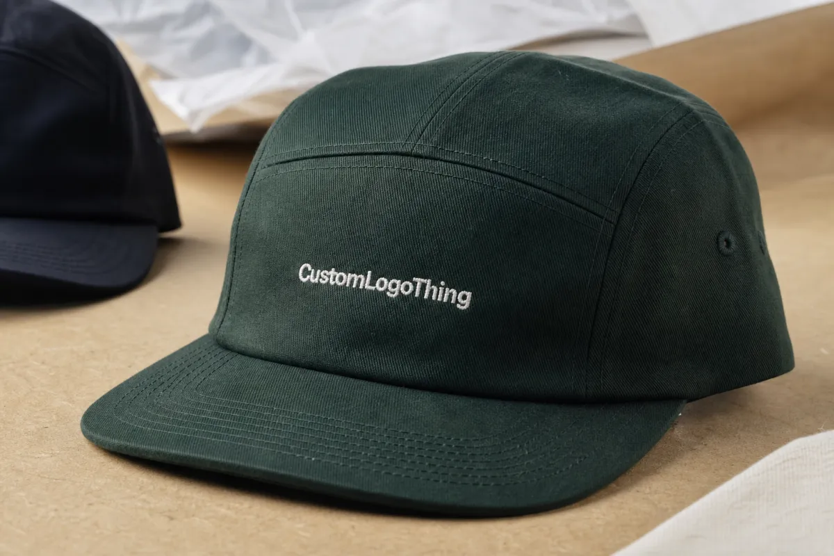
A five-panel cap uses one continuous front panel instead of the two front panels found on a classic six-panel cap. That single panel is the reason the style gets used so often for branded merchandise. It gives artwork a flatter surface and fewer interruptions, which usually means better logo placement and cleaner production.
For custom five-panel caps for coffee roasters, that front panel can make a wordmark feel sharper or let a small emblem sit in a more intentional way. The cap does not need to scream. Coffee branding usually works better when it feels considered, restrained, and a little utilitarian. Loud can work, sure. But loud also ages badly.
The rest of the structure is straightforward: crown, visor, closure, sweatband, and internal seams. What matters is how those parts interact. A structured front panel helps embroidery stay crisp. A softer crown feels more casual but can make detailed artwork look less stable. A flat bill reads more streetwear, while a curved bill feels more daily-use and staff-friendly. There is no universal correct answer. There is only the version that matches the rest of the brand.
One useful way to judge the format is to ask a basic question: does the logo still look good after the cap is put on a head and seen from six feet away? If the answer is no, the artwork is too busy, too small, or too dependent on perfect mockup lighting. Mockups are helpful, but they are also polite liars.
A cap sells faster when the logo reads in one glance. If the artwork needs a caption, the structure is probably working against it.
This is why the style fits coffee roasters so well. Roasters already think in packaging systems. The bag, label, insert card, apron, and cap should all share the same visual logic. When that happens, the merch table feels edited instead of assembled from leftovers.
How the Cap Structure and Decoration Process Works
Once the shape is chosen, decoration becomes the next decision. Custom five-panel caps for coffee roasters can be finished with flat embroidery, 3D puff embroidery, woven labels, stitched patches, PVC patches, leather patches, or screen print. Each option changes how the cap reads, how much detail survives, and how premium the finished product feels in hand.
Flat embroidery is the most common starting point because it is clean, durable, and easy to understand. It works best for bold logos, short wordmarks, and simplified marks. Puff embroidery adds volume, but it only behaves well with simple shapes. Fine lines and puff are not friends. They will disagree in public.
Woven labels and stitched patches are better when the artwork has small text, thin outlines, or multiple elements that would get crushed in thread. A patch also gives a more editorial look, which can work well for brands that lean into tactile packaging and restrained color palettes. PVC patches are tougher and more dimensional, but they can feel more technical than artisanal. That may be fine if the brand wants a sharper, modern edge.
Material and construction affect decoration more than most buyers expect. A firm front panel keeps embroidery neat and helps patches sit flat. A softer, unstructured crown can feel relaxed, but the fabric may ripple if the logo is oversized or heavy. The front panel on a five-panel cap is generous, but it still has limits. Fill the space well. Do not flood it.
The production flow usually goes like this: artwork cleanup, digital proof, sample or pre-production approval if needed, bulk decoration, quality check, packing, and shipment. The cleanup step matters. Production files often need tiny adjustments because vector art that looks fine on a screen may be too detailed for stitches or too fragile for a patch border. A good vendor will flag those issues early instead of pretending the machine will magically fix them. It will not.
For roasters that already use custom printed boxes, labels, and merch inserts, the cap should be reviewed with the same eye used for packaging. The decoration style, type weight, and color contrast should sit comfortably alongside the rest of the line. If the cap needs to live beside other branded items, browse Custom Packaging Products and compare finishes before locking the art direction. The goal is consistency, not sameness.
If the order includes tags, sleeves, or hang cards, think about those as part of the cap system rather than extras. A cap with a clean patch and a branded insert feels much more intentional than the same cap dumped into a plain poly bag. Presentation is not a luxury detail. It is part of the product.
Cost, MOQ, and Pricing Drivers for Roaster Orders
Pricing for custom five-panel caps for coffee roasters usually comes down to four variables: blank cap quality, decoration method, quantity, and any custom material requests. Change one of those and the cost moves. Change three and the quote starts living in another neighborhood.
Small roasters usually feel MOQ pressure first. Stock blanks with simple decoration may start around 50 to 100 pieces. Once the order includes custom-dyed fabric, custom closures, specialty trims, or fully branded interior details, minimums can rise to 300, 500, or more. That is not a sales tactic. It is the cost of setup, sourcing, and production planning.
| Order Type | Typical MOQ | Typical Unit Price | Best Fit |
|---|---|---|---|
| Stock blank + flat embroidery | 50-100 pcs | $4.00-$6.75 | Staff wear, small merch launches, event runs |
| Stock blank + woven or stitched patch | 50-100 pcs | $4.75-$7.50 | Artwork with fine lines or small type |
| Custom-dyed body + embroidery | 300-500 pcs | $6.00-$10.00 | Core retail line, repeat replenishment |
| Custom trim run + patch combination | 500+ pcs | $8.00-$13.00 | Premium wholesale, seasonal launches, gift programs |
Those ranges are working estimates, not guarantees. Stitch count moves price. Patch construction moves price. Color count moves price. A dense embroidery file takes longer to run than a simple mark. A leather patch costs more than a woven label. A specialty buckle or premium sweatband adds cost too. None of that is mysterious. It is just the math of production.
Packaging and freight should be counted as part of the landed price. A low unit price can look great until shipping, sampling, setup, and any insert cards are added. Then the quote is no longer the quote. It is the quote plus reality, which is usually less charming.
There is a second cost question that matters for coffee brands: what is the cap supposed to do? If it is staff wear, comfort and durability matter more than display packaging. If it is retail merch, shelf appeal matters more. If it is for wholesale gifting, presentation and consistency matter most. The right spec changes depending on the job.
Production Timeline, Proofing, and Lead Time
Production for custom five-panel caps for coffee roasters usually follows a predictable path: spec review, artwork cleanup, proofing, sample approval if needed, bulk production, inspection, packing, and shipment. Predictable does not mean fast. It just means the delays are usually visible if the order is planned properly.
For a simple stock blank order with one-color embroidery, a realistic lead time is often 12 to 18 business days after proof approval. If the order needs custom materials, special trims, or applied patches, 20 to 30 business days is a more honest expectation. Add more time if the order lands near holiday season, a trade show, or a major product drop. Everyone thinks their deadline is the urgent one. The factory calendar does not care.
Proofing is where good orders stay good and bad orders get exposed. Thread colors can shift under different lighting. Patch borders can look thicker once stitched. A logo that seems centered in a mockup may sit too high or too wide on the real crown. The proof should be checked for size, placement, type legibility, color matches, and whether the artwork still works on a curved surface. If any of those are vague, the final cap will be vague too.
Sampling is worth the extra time when the decoration is complex or the finish matters to retail presentation. A sample can add 5 to 10 days and may include a fee, but that is cheaper than discovering too late that the logo is too small or the patch border feels heavy. For a launch tied to a new coffee release, a sample is not indulgent. It is insurance.
Quality control should also be specific. Check crown symmetry, stitch count, logo placement, thread tension, color consistency, brim shape, and closure function. If the cap includes a label or patch, inspect the edges for fraying or lifting. Simple items still need inspection. Especially simple items. That is where mistakes hide.
If the cap is part of a larger rollout, align the timeline with the rest of the merchandising schedule. The cap should land with the boxes, bags, or apron program, not after the launch photos have already gone live. Coordinating the schedule this way makes the whole release feel more deliberate and less like a pile of unrelated SKUs.
Materials, Fit, and Brand Details That Matter
Material choice changes the entire feel of custom five-panel caps for coffee roasters. Cotton twill is the dependable default. It wears well, takes decoration cleanly, and feels familiar to most customers. Washed cotton has a softer hand and a more relaxed look. Nylon feels sharper and handles heat or moisture better, which can help for staff wear or warm climates. Blends can balance structure and comfort, but the exact result depends on the fiber mix and finish.
Fit deserves the same attention as the front logo. Crown height changes the silhouette. A low-profile cap sits closer to the head and feels understated. A higher crown gives more presence and more room for structure. Closure type matters too. Strapbacks feel a little more heritage. Snapbacks feel casual and easy to size. Fabric closures can feel quieter and more refined. None of these are just styling choices. They affect how the cap behaves on real people.
The brim is another decision that gets rushed too often. A flat bill gives a sharper, more modern look. A gently curved bill is usually easier for everyday wear and staff use. If the cap is meant for a merch table, the bill style should match the rest of the brand tone. There is no point making something beautiful if the people who buy it do not want to wear it.
Inside details are not invisible. They are felt. A decent sweatband, tidy seam tape, and a clean interior label all contribute to the sense that the cap is finished rather than just decorated. Buyers do not always describe those details, but they notice them. That is true for hats, and it is true for packaging. The hand knows before the customer does.
Color discipline matters more than enthusiasm. A strong contrast can help a logo read from across a room, but too much contrast can make the cap feel disconnected from the rest of the brand. Tone-on-tone stitching is quieter and can feel more premium. If the packaging already uses warm neutrals, charcoal, or muted earth tones, the cap should stay in that lane unless there is a deliberate reason to break out of it.
For hang tags, belly bands, and insert cards, paper stock matters as much as print. If the line leans into responsible sourcing, FSC paper is an easy way to keep the printed components aligned with the rest of the product story. If the cap sits beside coffee bags and gift sets, the label stock should feel like it belongs in the same room. Mixed materials with no visual connection usually look cheaper than they are.
Step-by-Step Ordering Plan for a Coffee Brand
The cleanest way to Order Custom Five-Panel Caps for coffee roasters is to start with what already exists. Gather the logo files, decide whether the cap needs the full mark or a simplified version, and choose the base cap before asking for pricing. Too many buyers price decoration first and then discover the cap shape does not suit the artwork. That is backwards.
- Confirm the artwork. Use vector files if possible, and decide whether the full logo or a cap-specific version makes more sense.
- Choose the base cap. Set the crown height, closure type, brim shape, and fabric before comparing decoration options.
- Select the decoration method. Flat embroidery, woven label, stitched patch, or PVC patch each changes the look and cost.
- Define the color plan. Match body, thread, patch, and interior label colors to the rest of the brand palette.
- Request tiered pricing. Ask for at least two or three quantity levels so the real cost break is visible.
- Review the proof carefully. Check placement, size, thread colors, and the way the logo reads on the front panel.
A short spec sheet helps the quote stay accurate. Include cap style, front logo placement, closure preference, bill shape, color references, packaging needs, sample requirements, and target delivery date. If the caps will be used for staff and retail, say so. Those are not the same order, even if they use the same logo.
If the roastery already has packaging standards, use them here. The cap should sit comfortably next to the bags, boxes, and insert cards already in the market. That is where Custom Packaging Products become useful as a reference point rather than a separate category. You are building one brand, not a collection of unrelated objects.
Common Mistakes When Ordering Branded Caps
The biggest mistake is asking too much of the front panel. A logo designed for a bag or website header may not survive cap production without simplification. Fine serif type, tiny origin copy, layered graphics, and narrow spacing can all turn muddy once stitched or patched. That does not mean the brand has to be dumbed down. It means the cap needs its own version of the mark.
Another common error is judging the cap only by the mockup. Mockups lie politely. The real cap does not. A design can look balanced on screen and still sit too high on the forehead, feel too stiff, or look too wide once the crown curves. The only honest test is how it behaves as a physical object.
Comfort gets overlooked more than it should. If the sweatband feels rough, the crown sits too tall, or the closure is awkward, the cap will not get worn. Then the branding stops working. A cap that looks fine but lives in a drawer is just inventory with opinions.
Repeat ordering is another weak spot. A first run may sell through quickly, then the next order has to be rebuilt from scratch because no one saved the approved color codes, cap style number, or final proof. That creates color drift and avoidable delays. Save the spec. Future you will not regret it.
The cheapest quote is also not the smartest quote. A low number can hide thin fabric, sloppy stitching, weak communication, or a lead time that drifts every time a question gets asked. For a coffee brand, consistency usually matters more than saving a few cents per cap. Especially if the caps are going to sit beside better-built packaging and merch.
If the cap only looks good in one lighting setup and one photo angle, it is not ready.
Expert Tips and Next Steps Before You Place the Order
The smartest approach is to treat the cap as part of the full brand system. Custom five-panel caps for coffee roasters work best when the shape, texture, and decoration method match the rest of the visual language. If the packaging is warm and tactile, the cap should not suddenly turn glossy and aggressive. If the bags use strong graphics and crisp geometry, the cap can borrow that structure without copying it exactly.
Before approving production, ask for two quantity tiers, one alternate colorway, and one backup decoration method. That gives a clearer read on value and shows where the cap fits: staff wear, retail merch, or wholesale gifting. Different use cases justify different specs. A premium patch on the merch table might make sense, while a simpler embroidered version is better for internal uniforms.
Confirm the launch date, proof deadline, packaging preference, and reorder plan before the run starts. Build backward from the public release date, not forward from the purchase date. That gives room for proof corrections, sampling, and freight without turning the order into a panic. Rushing hats is not a creative strategy.
If the artwork is still in flux, start with the logo files and request pricing across a few cap styles. Compare embroidery and patch options side by side. Check how each one handles the front panel, and ask for a sample if the logo is detailed. Once the material, fit, and decoration line up, the right choice usually becomes obvious. A good cap should look like it belongs in the brand, not like it was borrowed for a photo shoot and never returned.
Done well, custom five-panel caps for coffee roasters become a small but solid extension of the product line. Not hype. Not filler. Just one more piece of branded merch that carries the same discipline as the bags, boxes, and labels customers already trust.
Are custom five-panel caps for coffee roasters better than six-panel caps?
Five-panel caps usually give a flatter front panel, which makes logos easier to place and read. Six-panel caps can still work well if the brand wants a more traditional shape or a segmented crown. The better choice depends on the artwork, the fit you want, and how the cap will be worn.
Which decoration method works best for coffee roasters on five-panel caps?
Flat embroidery is a strong choice for bold logos with limited detail because it is durable and easy to read. Woven or stitched patches are better for fine lines, small text, or multi-element artwork. The best option depends on logo complexity, budget, and whether the cap is meant for retail or staff use.
What affects the price of custom five-panel caps for coffee roasters the most?
Quantity, decoration method, and the base cap material drive most of the cost changes. Multi-color artwork, dense stitch counts, specialty closures, and custom trim all push pricing up. Shipping, sampling, and setup also affect the final landed cost.
How long does production usually take for custom five-panel caps?
Simple stock blank orders can often move in 12 to 18 business days after proof approval. More detailed orders, custom materials, or sampled runs usually take 20 to 30 business days or more. Proofing, revisions, and transit time should all be built into the schedule.
What should I prepare before requesting a quote for roaster caps?
Have vector logo files ready, along with your target quantity, preferred colors, decoration style, and delivery date. Include packaging needs, sample requests, and whether the cap is for retail, staff, or wholesale gifting. Ask for tiered pricing so you can compare quantity breaks before you commit.

