Buyer Fit Snapshot
| Best fit | Custom Foil Stamped Mailer Boxes That Elevate Branding projects where brand print, material claims, artwork control, MOQ, and repeat-order consistency need to be specified before quoting. |
|---|---|
| Quote inputs | Share finished size, material target, print colors, finish, packing count, annual reorder estimate, ship-to region, and any compliance wording. |
| Proofing check | Approve dieline scale, logo placement, barcode or warning zones, color tolerance, closure strength, and carton packing before bulk production. |
| Main risk | Vague material claims, crowded artwork, missing packing details, or unclear freight terms can make a low unit price expensive after revisions. |
Fast answer: Custom Foil Stamped Mailer Boxes That Elevate Branding should be specified like a repeatable production item. The safest quote records material, print method, finish, artwork proof, packing count, and reorder notes in one written spec.
Production checks before approval
Compare the actual filled-product size with the drawing, then confirm tolerance on folds, seals, hang holes, label areas, and retail display edges. Reserve space for logos, QR codes, warning copy, and material claims before decorative graphics fill the panel.
Quote comparison points
Review material grade, print process, finish, sampling route, tooling charges, carton quantity, and freight assumptions side by side. A quote is only useful when the supplier can repeat the same color, closure quality, and packing count on the next order.
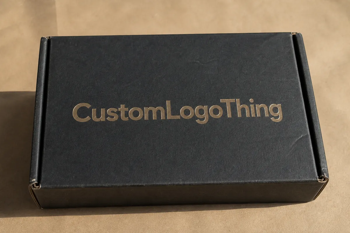
Custom Foil Stamped mailer boxes can turn a plain delivery into something people actually remember. Foil catches light before the customer reads the copy, checks the return address, or even reaches for the tab. That tiny flash matters in ecommerce, subscription programs, influencer sends, and gift kits, where the outer box does part of the selling before the product gets a chance.
From a packaging buyer's point of view, the appeal is not just visual. A mailer box already gives you structure, closure strength, and shipping protection. Foil stamping adds a premium cue without turning the carton into a noisy billboard. Done well, Custom Foil Stamped mailer boxes support branded packaging, reinforce package branding, and make the unboxing feel more deliberate without making production messy.
Foil also keeps the design honest. It does not rescue weak layout. It exposes it. Because the finish is usually limited to a logo, border, symbol, or short line of copy, the rest of the box has to carry its weight through hierarchy, spacing, and material choice. That is why custom foil stamped mailer boxes work best with restrained artwork, clear structural planning, and realistic expectations about cost, lead time, and print limits.
A small foil mark in the right place usually does more for perceived value than decoration across every panel.
Custom Foil Stamped Mailer Boxes: What They Are
A mailer box is a sturdy carton built to ship, protect, and present a product in one package. Most versions use corrugated board, often E-flute or a similar lightweight structure that balances stiffness with manageable weight. Foil stamping adds a second visual layer by pressing a metallic, pigmented, or specialty reflective film onto selected areas of the surface. The box stays a box; the foil gives the logo, pattern, or message a sharper role.
That distinction matters. Foil stamping is not full ink coverage. A printed box can cover nearly every panel with imagery, backgrounds, and copy. Foil works more selectively. It pulls the eye to the brand mark, a border, a symbol, or a brief message, which is why it often reads as more refined. The viewer gets one clear focal point instead of several competing effects.
Brands choose custom foil stamped mailer boxes for a few straightforward reasons. They want packaging that holds up in transit. They want the outer box to carry the same care as the product inside. They want a presentation layer that feels strong enough for retail packaging, gifting, seasonal sets, or launch kits. A mailer format makes those goals easier to hit than a thin folding carton because the structure already does some of the heavy lifting.
Foil finish changes the tone too. Gold usually reads warm and classic. Silver feels sharp and technical. Black foil can look quiet and high contrast on a light substrate. Holographic or tinted foils bring more motion and energy, which can fit beauty, media, accessories, or youth-focused product packaging. The finish should match the brand voice, not just the mood board.
The strongest custom foil stamped mailer boxes do not try to turn every panel into a feature. They use foil to support the structure, not fight it. A clean top lid, a logo on the front flap, and a restrained interior message can be enough to create a premium feel. That often beats piling on more ink and calling it design.
If you are building a wider packaging program, the box should fit into that system, not sit off by itself. A foiled mailer might pair with inserts, labels, or a secondary shipper, and it can sit alongside other formats such as Custom Packaging Products or a lighter secondary shipper like Custom Poly Mailers for different order profiles.
How Custom Foil Stamped Mailer Boxes Are Made
The process usually starts with the base structure. For most mailer boxes, that means corrugated board that gets cut, scored, and folded into a locking carton with tuck-in or tabbed closure points. The board choice affects durability and finish quality. A smoother surface usually shows foil more crisply, while a rougher liner can soften small details or make fine artwork less consistent.
Once the structure is set, the foil stamping step begins. A metal die, usually brass for longer runs or magnesium for simpler jobs, is engraved with the artwork. The die is heated and pressed against the foil film and the packaging surface. With the right heat, pressure, and dwell time, the foil transfers only where the die makes contact. The result is a crisp metallic mark sitting on top of the printed or coated surface.
The settings matter more than many buyers expect. Too little heat can leave patchy fills or weak edges. Too much pressure can crush the surface or distort the board. If the die stays in contact too long, the foil can blur at the edges. That is why a supplier will usually ask for clean artwork, a proper dieline, and a clear idea of how large the foil area needs to be before production starts.
File setup deserves attention too. Simple shapes, solid fills, and strong spacing usually work best. Very fine reversed text, crowded lines, or micro-details can fail during stamping, especially on corrugated material where the surface is not perfectly smooth. A packaging designer should treat foil as a tool for strong marks, not as a shortcut for a fully printed illustration.
Foil stamping pairs well with other finishes. Matte lamination can make metallic detail stand out. Soft-touch coating can add a velvety feel that contrasts with the shine. Spot varnish can pull certain areas forward without changing the whole panel. Embossing and debossing add depth by raising or lowering the surface, which helps when a brand wants a more tactile presentation.
That combination of structure and finish is part of why custom printed boxes with foil accents often feel more expensive than the material stack alone would suggest. The eye reads the box in layers: shape, contrast, shine, then texture. Good production gives each layer a clear job.
There is also a practical boundary here. Foil is a surface treatment, not structural reinforcement. If the carton needs to survive a rough carrier network, stack under other packages, or hold a heavy product without bowing, the board spec should be chosen for the load first. The decoration comes after that. Cute packaging that collapses in transit is not premium. It is expensive trash.
Key Factors That Shape the Final Look and Performance
Several decisions determine whether a foil-stamped mailer looks polished or just busy. Board selection comes first. A tighter surface usually gives better foil definition, especially for logos with small counters or thin outlines. Corrugated mailers built with a smoother liner can deliver a cleaner result than a more rustic kraft surface, though kraft can still look strong if the design is bold and the foil color has enough contrast.
Foil style is the next big choice. Gold still carries the strongest luxury association for many brands, but that is not always the right answer. Silver can feel modern and clinical. Copper can feel artisanal or upscale without going formal. Black foil can be surprisingly effective on white or pastel surfaces because it creates a sharp, quiet contrast. Holographic foil needs restraint, since it can take over the composition if everything else is too loud.
Artwork placement matters just as much as color. A small center logo can work on a compact box, but a larger mailer may need side-panel treatment, a border rule, or a repeating symbol to avoid looking empty. Good placement usually follows the customer's viewing path. If the lid opens upward, the top panel is often the first visible area. If the box gets photographed for social sharing, the front edge and top face may matter more than the interior print.
Structural details create their own limits. Foil across a score line is risky because repeated folding can crack the finish or make the line look uneven. Glue tabs and hidden seams should usually stay free of foil unless the design has been built around them. Inserts, partitions, and locking features also need room to function without rubbing the decorated area during assembly or transit.
The inside of the box matters too. Customers notice the opening sequence immediately. A clean reveal, a tidy insert, and a calm interior often create a stronger premium signal than extra artwork on the outside. That holds especially true for subscription packaging and launch kits, where the reveal itself is part of the brand promise.
Environmental and compliance choices can sit in the decision set as well. FSC-certified board may fit brands that want a more responsible sourcing story, and it can support broader packaging design goals around documented material selection. For shipment durability, it helps to think in performance terms too. Organizations such as the International Safe Transit Association and references from the Forest Stewardship Council can help frame what a carton should do, what the board should support, and how much testing makes sense for a given program.
For brands shipping heavier contents, it helps to keep the box honest. A beautiful foil panel does not make weak board stronger. If the package must handle compression, drop risk, or longer transit distances, the structure should be specified around the shipping load first and the decoration second. That order of priorities makes sense for product packaging that has to look good and arrive intact.
One more detail tends to get overlooked: how the box will look after a few handling cycles. Some foils hold crisp edges beautifully; others can show scuffing faster, especially on high-touch areas like the front flap or opening tab. If the box is meant to survive more than one use, keep the stamp out of the wear zones unless you actually want that distressed look. Most brands do not.
| Foil Approach | Best Use | Typical Visual Effect | Cost Pressure |
|---|---|---|---|
| Small logo stamp | Minimal branding, clean ecommerce mailers | Focused, sharp, subtle premium signal | Lower |
| Large front-panel stamp | Launch kits, gift boxes, presentation packaging | Strong first impression, more visible shine | Moderate |
| Multi-panel foil accents | Luxury branding, retail-ready mailers | High contrast, more design complexity | Higher |
| Foil with emboss or deboss | Prestige packaging, signature logos | Tactile depth plus reflective detail | Highest |
Custom Foil Stamped Mailer Boxes Process and Timeline
A good production flow starts before anyone touches a press. The first step is concept review: what the box needs to say, how it will ship, and where the foil should appear. After that comes structural specification, where the supplier confirms the board style, dimensions, closure type, and any insert requirements. Only then should the artwork move into dieline work and foil placement.
The dieline stage matters because a mailer box is not a flat poster. Panels wrap, fold, tuck, and lock. A layout that looks balanced on a PDF can land awkwardly once the folds become real. This is where the supplier and the brand should agree on safe areas, glue zones, and where the foil can live. A clean dieline prevents later revisions from becoming expensive surprises.
Tooling adds another layer of planning. The foil die has to be made from the approved art, and that takes time. Depending on artwork complexity, sampling, and press scheduling, the first physical proof often arrives after the die is made and the finish settings are tuned. That is why foil work should never be treated as an afterthought tacked onto the end of a print order.
A typical schedule often breaks down like this:
- Concept and quote review: 1 to 3 business days if the box size and art direction are already defined.
- Dieline confirmation and file prep: 1 to 5 business days, depending on whether the artwork is ready for production.
- Die creation and sampling: often 5 to 10 business days, sometimes longer if there are multiple foil areas or a need for embossing.
- Production run: commonly 10 to 20 business days after proof approval, depending on quantity and finishing complexity.
Those ranges move. A simple single-color foil logo on a standard box can move quickly. A larger run with inserts, special coatings, and a multi-step finish sequence will take longer. Rush orders can work in some situations, but they usually go better when the design is simple and the supplier has room in the schedule.
Proofing is where the schedule either stays under control or drifts. A physical sample is ideal because it shows how the foil catches light, how the board folds, and whether the logo still reads clearly after assembly. A digital proof is useful for placement and copy checks, but it cannot show the reflective quality of the finish. For custom foil stamped mailer boxes, that difference is worth the extra step.
Clients who prepare well usually bring final copy, exact dimensions, product weight, and the intended shipping path from the start. That helps the supplier recommend the right board, estimate the right quantity, and avoid the back-and-forth that turns a clean job into a long one. If you want a broader view of supply options, compare carton styles, inserts, and alternative mailers in one planning session rather than scattering those decisions across separate quotes.
A realistic timeline also leaves room for one thing people often try to skip: approval discipline. If marketing, operations, and procurement all need to sign off, get those decisions lined up before the die is cut. A delayed sign-off after tooling is underway is how a tidy two-week project turns into a four-week headache.
Cost and Pricing for Custom Foil Stamped Mailer Boxes
Pricing for foil-stamped mailers is driven by more than size. Quantity, board type, foil coverage, number of colors, coating, insert design, and tool complexity all affect unit cost. The shape of the box matters too. A simple rectangular mailer with one foil logo is much easier to produce than a custom structure with extra folds, windows, or multiple decorated zones.
Minimum order quantity has a big effect because setup costs get spread across fewer units on short runs. That includes press prep, die creation, test pulls, and finishing adjustments. If the order is small, the per-box price rises fast. Larger quantities usually bring the unit price down, but only if the design stays consistent and the run does not require special handling.
Foil coverage is another key lever. A small top-lid stamp typically costs less than a full front-panel design or a box with multiple foil colors. More foil means more tooling, more press time, and more chances for alignment checks. The same thing happens with mixed finishes. Embossing, spot varnish, and specialty coatings add value, but they also add steps that affect the quote.
For planning, a simple foil accent on a standard mailer might add roughly $0.10-$0.30 per unit over a plain printed version at moderate quantities, while broader coverage or combined finishes can push that premium higher, sometimes into the $0.25-$0.75 range or more depending on size, die count, board choice, and finishing sequence. Those are planning ranges, not promises, but they help early budget conversations stay grounded.
Here is a practical comparison of common choices:
| Option | Relative Price | What You Get | Good Fit For |
|---|---|---|---|
| Plain printed mailer | Lowest | Basic brand impression and shipping protection | Utility-first ecommerce |
| Single foil logo | Low to moderate | Premium focal point without overdesign | Subscriptions, gift sets, launch kits |
| Foil plus soft-touch or matte lamination | Moderate to higher | Stronger tactile contrast and richer finish | Beauty, apparel, direct-to-consumer brands |
| Foil plus emboss and custom insert | Highest | Premium reveal, depth, and product protection | High-value product packaging |
That comparison points to a simple truth: the most expensive option is not always the most effective. A restrained foil accent can do more for brand recall than an elaborate finish stack that nobody notices after the first unboxing. Buyers usually get better value by selecting one or two high-impact touchpoints and keeping the rest of the box clean.
There are hidden costs to watch too. Special dies, custom insert cavities, unusual sizes, or late-stage artwork revisions can all push the quote upward. Rush scheduling can do the same. If you are comparing suppliers, ask them to break out what is driving the price so you can tell the difference between material cost, tooling cost, and finishing cost. Clear pricing is easier to evaluate than a single lump sum.
For brands managing a broader packaging program, it helps to think in tiers. Use the foiled mailer for the moments that matter most, and reserve simpler structures for lower-value shipments or replenishment orders. That approach can protect margin while still giving the customer a premium experience where it counts.
If you are balancing packaging spend across several channels, compare the cost of the decorated mailer against the value of the moment it creates. A box used for first orders, press mailings, or high-margin sets can justify more finish than a plain replenishment carton. That is not theory. That is how real packaging budgets stay alive.
Common Mistakes to Avoid Before Ordering
The first mistake is designing foil that is too small. Hairline strokes, tiny type, and crowded details may look elegant on screen, but they often fail to stamp cleanly in production. On corrugated material, the surface and pressure behavior are less forgiving than on a smooth premium sheet. If the design depends on delicate detail, simplify it before the die gets made.
The second mistake is weak contrast. Foil needs a background that lets it stand out. Gold on warm kraft can work if the logo is large and the brand is confident, but gold on a similar tan tone may disappear. The same issue shows up with black foil on dark packaging or silver foil on a reflective coated stock. Strong packaging design starts with visibility, not just style.
Another problem is placing foil across folds, glue tabs, or heavy score lines. Those areas move during assembly, shipping, and opening. A design that ignores the box mechanics may look fine right after production and then fall apart visually once the carton is used. That matters even more for mailers that will be opened and reclosed, since repeated motion can wear down the surface finish.
Skipping samples is a costly habit. A PDF proof can confirm the layout, but it cannot show how the foil reacts under real light or how the box closes with actual product inside. A sample also reveals issues with board stiffness, insert fit, and the alignment of the stamped area. If the packaging will represent the brand in front of customers, that proof step is worth protecting.
Late changes are the last major trap. Moving the logo, changing the insert size, or altering the box dimensions after tooling has started can force a reset. That often means extra cost and a longer schedule. It can also affect the final appearance because the art was originally balanced for a different panel size.
It is easy to treat foil as decoration alone, but the best results happen when the box is engineered as a complete system. The structure, print, finish, and opening sequence should all support one another. If one part is out of balance, the whole experience feels less polished, even if the foil itself is excellent.
There is also a common misconception that more shine equals more premium. Not always. A busy mailer with oversized foil, multiple colors, and every surface fighting for attention often looks cheaper than a simple box with one well-placed mark. Taste usually wins. The invoice does not care, but your customer will.
- Keep foil artwork bold enough to reproduce cleanly.
- Check contrast against the actual stock, not just a mockup.
- Avoid folds and glue areas for stamped detail.
- Request a sample before approving the full run.
- Lock dimensions and insert specs early.
Expert Tips and Next Steps for Better Results
Start with one hero element. A logo, a monogram, a short line of copy, or a thin border can create a focused premium effect without crowding the carton. In many programs, that restraint makes the box feel more confident. It gives the eye one place to land instead of asking the viewer to decode too many features at once.
Think about the unboxing path, not just the closed box. Where does the customer see the surface first? What shows as the lid lifts? Which panel sits under the hand during opening? Those questions matter because foil is strongest where light and motion meet. A design that follows the reveal path usually feels more memorable than one that spreads decoration evenly across every face.
Choose finishes with purpose. Matte backgrounds can make foil look sharper, while soft-touch coatings can make the box feel warmer and more tactile. A glossy surface can work too, but it tends to compete with the foil instead of supporting it. The finish stack should serve the message, not just pile on effects.
If the goal is a premium signal, decide where the eye should go first, then build the foil around that moment.
Before requesting quotes, gather a short production checklist. Confirm exact dimensions, product weight, insert needs, preferred foil color, shipping method, and target quantity. Add your ideal timeline and whether you need a sample first. That information helps a supplier quote accurately and cuts down on revision cycles later.
It is also smart to compare the foil-stamped mailer against other package types in your line. Some products may do better in a higher-protection shipper, while others only need a presentation carton. If the shipment profile changes by season or customer tier, you may want different formats for different jobs instead of forcing one box to carry everything. That is where a broader packaging plan, not just one box spec, starts to pay off.
For example, if you need a premium presentation box for launches but a lighter option for repeat replenishment, you can keep the branded reveal in the center of the program and simplify the everyday shipper. That kind of tiering often gives a better margin profile than decorating every carton equally. It also keeps custom printed boxes from becoming overdesigned in places where they do not need to carry the brand story.
Finally, be honest about the customer moment you want to create. A high-end beauty kit, a corporate gift, and a subscription box may all use foil, but they should not use it the same way. One may need polished restraint, another a more celebratory shine, and another a subtle emblem that feels editorial. The best custom foil stamped mailer boxes make that choice clear: the branding feels premium, the structure still protects the goods, and the whole package supports the product instead of competing with it.
For brands that want a cleaner, more memorable, and more credible packaging presentation, custom foil stamped mailer boxes remain one of the most useful tools in modern retail packaging. They combine structure, brand expression, and practical shipping performance in a way that is hard to beat when the goal is stronger product packaging and a better first impression.
The practical takeaway is simple: choose the box structure first, then put foil only where it earns its keep. If the artwork stays bold, the stock has enough surface quality, and the finish matches the customer moment, custom foil stamped mailer boxes do exactly what they are supposed to do. They make the package feel considered before the product is even seen.
FAQ
What are custom foil stamped mailer boxes used for?
They are used for ecommerce shipments, subscription kits, luxury samples, influencer mailings, and gift packaging where presentation matters as much as protection. The foil detail helps the box feel more branded and memorable without requiring full coverage printing. They work especially well when the outer carton needs to create a premium first impression before the product is even opened.
Are custom foil stamped mailer boxes better than standard printed mailers?
They are better when the goal is a stronger premium signal, a more tactile finish, or a higher-value unboxing moment. Standard printed mailers can be more economical for simple shipping needs, but foil stamping adds visual hierarchy and brand emphasis. The right choice depends on whether your priority is cost efficiency or a more elevated presentation.
How much do custom foil stamped mailer boxes cost?
Pricing depends on quantity, board material, foil coverage, box size, inserts, and any special finishing steps. Smaller orders usually have a higher unit cost because setup and tooling are shared across fewer boxes. A supplier quote should break out the major cost drivers so you can compare options fairly.
What is the typical turnaround for custom foil stamped mailer boxes?
Turnaround varies based on sampling, die creation, artwork approval, and production capacity. Projects move faster when final dielines, print-ready files, and foil placement are approved early. If you need a rush schedule, ask whether the design can be simplified to reduce tooling or proof cycles.
What files do I need to start a custom foil stamping order?
Provide a dieline, vector artwork, logo files, and any notes about foil placement or finish preference. Use clean vector paths for the foil areas so the tooling process can reproduce the artwork accurately. If you are unsure about file setup, ask the packaging supplier to review your art before production starts.
Can foil stamping be combined with other finishes?
Yes. Foil often pairs well with matte lamination, soft-touch coating, spot varnish, embossing, or debossing. The main question is whether the extra finish actually improves the box or just adds cost. A good supplier should be able to explain the tradeoff in plain language, which is rarer than it should be.

