Choosing Custom Hang Tags for candle brands print finish comparison options sounds like a design decision, but it behaves more like a packaging decision. The finish affects how a candle reads on a shelf, how it photographs, how it holds up in transit, and whether the tag feels aligned with the fragrance story or slightly out of place.
That matters because candle buyers do not separate the jar from the tag in their heads. They experience the product as a single object: label, vessel, string, hang tag, box, and all. If one part feels luxe while another feels flat or flimsy, the mismatch is noticeable even when nobody can explain why.
A tag also carries practical information. Fragrance name, burn time, safety details, ingredient claims, SKU codes, and seasonal cues often compete for space on a surprisingly small surface. Finish choice can help that information feel readable and intentional, or it can turn it into glare-heavy clutter.
Why Candle Hang Tag Finishes Shape First Impressions
Retail packaging works fast. A shopper may see a candle for only a few seconds before deciding whether it looks giftable, handmade, modern, or premium. On a table display or in an ecommerce image grid, the hang tag is often one of the few elements that can signal brand personality without changing the jar itself.
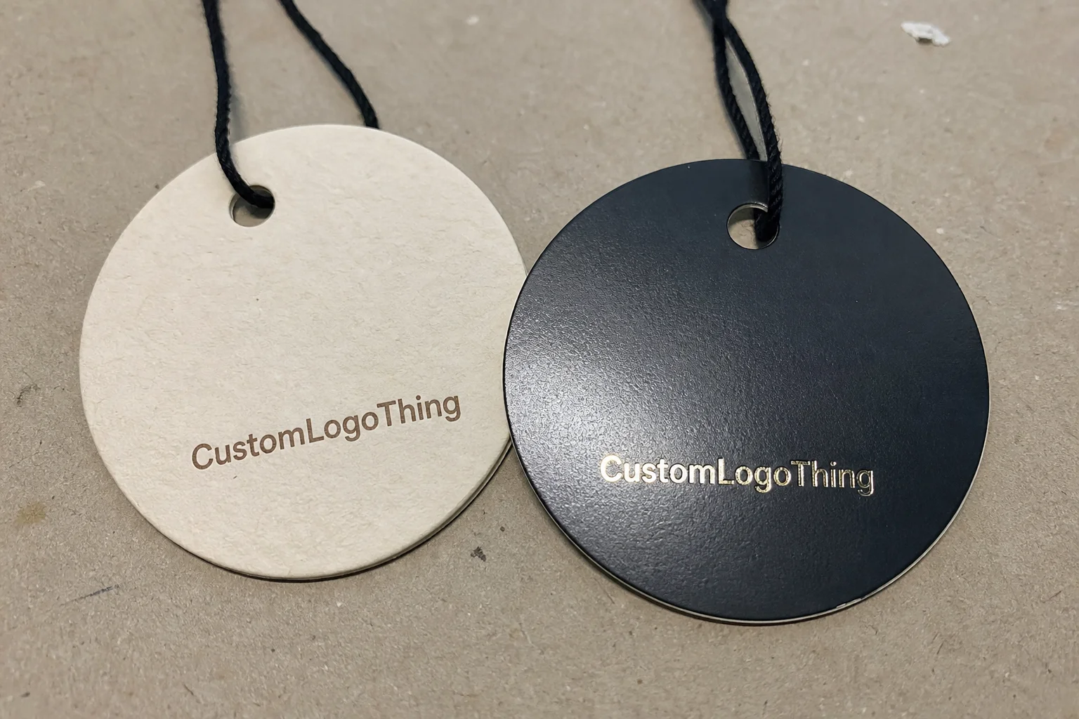
Finish changes how light behaves. Gloss reflects sharply and makes color feel louder. Matte spreads light more gently and usually makes typography easier to read. Soft-touch reduces visual noise while adding a tactile cue that feels closer to a premium stationery piece than a basic insert. Foil introduces contrast immediately, which is useful when the brand needs a small detail to do a lot of work.
That is why the same artwork can feel dramatically different across finishes. A botanical candle with linen notes can look thoughtful in matte stock, while the same design in a high-gloss finish may feel too energetic for the scent story. A holiday clove candle can support foil better than a minimal unscented line, because the finish matches the mood rather than fighting it.
Buyers usually ask for the “most premium” option first. That is understandable, but premium is not a universal look. A finish should reinforce positioning, not simply increase shine. For a serene home fragrance line, a restrained surface often sells better than an ornate one.
“The right finish does not announce itself first. It supports the candle, then disappears into the overall impression.”
How Hang Tag Finishes Are Built
Most Custom Hang Tags follow the same production sequence: select the stock, print the artwork, add a coating or lamination, then apply any specialty decoration such as foil, embossing, or spot UV. The process sounds simple, but the substrate and finish have to work together. A coating that looks clean on coated cardstock may behave very differently on kraft or uncoated recycled paper.
Coated cardstock is the easiest starting point for crisp graphics, fine lines, and solid color blocks. It usually supports offset printing or digital printing well, especially when the design includes small typography or precise logos. Uncoated stock gives a warmer, softer impression, but it absorbs ink differently and can make pale colors or subtle gradients less predictable. Kraft paper adds a handmade, earthy look, though bright color accuracy is harder to maintain unless the artwork is planned with that limitation in mind.
Finish is not only about appearance. It affects rub resistance, fingerprint visibility, and how a tag survives in fulfillment. Tags often move through packing tables, shipping cartons, tissue wrap, ribbon ties, and retail handling. Edge wear shows up quickly on thin or delicate surfaces. If the tag is tied to a jar with twine, the contact points can scuff long before the candle reaches a shelf.
That is one reason brands that ship seasonal gift sets or bundled candle packaging often choose a protective coating even when the visual difference seems small on screen. A tag that arrives looking clean is doing a better job than one that looked perfect in proof form but lost its finish during packing.
Another practical issue is contrast. Deep blacks, navy blues, and rich burgundies can look expensive, but they also expose tiny registration shifts, scuffs, and ink inconsistencies. The darker the palette, the more the surface quality matters. That is one of those production realities that only becomes obvious once you compare samples under real lighting rather than in a PDF.
What Actually Should Drive the Finish Decision
The finish decision should start with brand positioning, then move to handling conditions and cost. A luxury spa candle, a rustic soy candle, a holiday release, and a fragrance-led boutique line do not need the same surface treatment. The finish should match the shelf story and the way the product is sold.
Readability comes first more often than brands expect. Candle packaging is photographed under warm retail lights, cool studio lights, and window daylight. Gloss can create glare. Metallic finishes can obscure small text. If fragrance notes, warnings, or burn time are tightly set, a reflective finish may make the tag harder to read from a normal viewing distance.
Size matters in a very literal way. Small hang tags with dense copy have less room for visual drama because the card already needs to carry information cleanly. Larger tags can support more decorative treatment, but even then too many effects can make the layout feel crowded once the hole punch, string, and rounded corners are added.
Material choice also affects the finish outcome. A heavy flood coat on a coated tag will behave differently from the same art on an uncoated sheet. Duplex board can provide more rigidity for embossing, but it adds cost and weight. Recycled paper may fit a sustainability story, though its surface texture can limit how sharply fine details reproduce.
For most candle brands, the real filter is simple: does the finish suit the candle’s price point, fragrance story, and handling environment? If it does not hold up under those three questions, the sample may still look nice, but the final packaging probably will not feel right.
Print Finish Comparison: Gloss, Matte, Soft-Touch, Foil, Embossing, and Spot UV
Each finish solves a different problem. Some add shine. Some calm the design down. Some create a focal point without requiring a full redesign. The most useful comparison is not “which one looks best” but “which one works for this candle line, this budget, and this production schedule.”
| Finish | Look and Feel | Best Use | Typical Cost Impact | Durability Notes |
|---|---|---|---|---|
| Gloss coating | Bright, reflective, color-forward | Bold seasonal collections, colorful branding | Usually low to moderate | Shows fingerprints and glare more easily |
| Matte coating | Soft, modern, low reflection | Everyday premium lines, minimalist designs | Low to moderate | Better readability, fewer visual distractions |
| Soft-touch lamination | Velvety, tactile, upscale | Luxury, spa, wellness, and gift packaging | Moderate to higher | Can scuff on edges if handled roughly |
| Foil stamping | Metallic highlight on selected artwork | Logos, initials, fragrance names, holiday cues | Higher due to setup | Strong visual payoff, best with restrained artwork |
| Embossing/debossing | Raised or recessed texture | Heritage cues, craft brands, premium marks | Higher due to tooling | Needs heavier stock for clean definition |
| Spot UV / aqueous | Selective shine or protective surface | Contrast details, logo emphasis, added protection | Moderate | Useful middle ground for mixed needs |
Gloss coating is the easiest way to make a design feel brighter and more saturated. It can be useful for a retail line that needs immediate shelf pop, especially if the candle artwork is built around vivid colors. The drawback is predictability: gloss can look energetic on press proofs and then become too reflective under store lighting or in product photography.
Matte coating tends to be the most adaptable choice. It softens the overall presentation, makes type easier to scan, and usually feels more controlled. For many candle brands, matte becomes the safe default because it supports both premium and natural positioning without overpowering the jar or label.
Soft-touch lamination adds a tactile premium cue that is hard to fake with design alone. It works especially well for boutique candles, wellness lines, and gift sets where the customer is expected to handle the package before purchase. The caveat is practical: it costs more, can show edge wear if the tag is packed tightly, and sometimes needs careful testing if the design includes dark solids or heavy handling.
Foil stamping creates instant focus. Gold, silver, copper, black foil, and muted colored foils can all elevate a small logo or fragrance title. Used sparingly, foil often gives the highest perceived value per square inch. Used too broadly, it can flatten the hierarchy and make the tag feel decorative rather than intentional. Foil also works best when the art is simplified, because thin lines and tiny copy are more likely to suffer during tooling.
Embossing and debossing offer depth instead of shine. That makes them useful for brands trying to communicate craftsmanship, heritage, or restraint. These effects usually need a heavier stock, often around 16pt to 18pt or a comparable rigid board, so the impression holds cleanly without warping the tag. Very fine details can lose definition if the artwork is too intricate.
Spot UV and aqueous coatings sit in a useful middle zone. Spot UV can make a logo or pattern stand out without changing the entire surface, while aqueous coating adds protection with less visual disruption than lamination. For candle brands comparing custom Hang Tags for Candle Brands print finish comparison options, this is often the most practical compromise when the goal is contrast, not drama.
If the tag is part of a larger packaging system, the finish should stay consistent with inserts, labels, and Custom Labels & Tags. A soft-touch tag next to a low-quality label can make the label look weaker than it is. Packaging works as a set; mismatched finishes break that illusion fast.
For teams that need to think about sustainability claims or paper sourcing, the FSC and EPA sustainable materials guidance are useful references. They do not choose the finish for you, but they help frame stock selection and recovery expectations more responsibly.
Cost, MOQ, and Unit-Cost Tradeoffs
The lowest-cost finish on paper is not always the lowest-cost option in practice. A simple matte tag may have a lower unit price than a soft-touch tag with foil, but if the cheaper version looks plain, scuffs too easily, or undercuts a higher-margin candle line, the savings disappear quickly.
As a rough market range, a basic printed matte hang tag in a 5,000-piece run may fall around $0.18 to $0.28 per unit, depending on size, paper stock, number of colors, and whether the artwork is printed on one or both sides. Add soft-touch lamination, and the number rises. Add foil or embossing, and the price moves again because each additional process adds setup time, tooling, and handling.
MOQ rules also shape the decision. Specialty finishes often need higher minimums because tooling and setup have to be spread across more pieces. Simpler tags can sometimes run at lower quantities, which matters for brands testing a fragrance launch or releasing a small seasonal collection. If a line includes twelve scents with unique foil accents, the total spend can escalate quickly unless some design elements are standardized.
One practical way brands manage cost is by tiering finishes across the line:
- Core line: matte or gloss with clean typography and limited effects
- Gift line: matte with foil or spot UV on the logo or fragrance name
- Seasonal line: soft-touch or embossing for limited-run releases
That structure keeps the product family coherent while protecting margin where it matters. It also helps when hang tags are ordered alongside custom printed boxes or matching inserts, since the print program can be planned as one system rather than three separate buys.
Wholesale brands tend to look at value per impression, not just raw cost. If a tag adds twenty cents to the pack but supports a higher retail price, the math may still work. For ecommerce-only brands, the calculation is often tighter because every added cent affects margin more directly. A good packaging supplier should be willing to discuss that tradeoff in plain numbers, not just push the most elaborate finish.
Production Steps, Timeline, and Quality Checks
A typical production flow starts with artwork review and dieline confirmation. Then comes stock selection, color approval, finish confirmation, printing, post-press work, die cutting or punching, and final inspection. The process is straightforward on paper, but delays usually happen before the first sheet runs through the press.
Missing dielines, low-resolution artwork, vague Pantone references, and last-minute finish changes are the usual troublemakers. If a brand approves a proof and then decides it wants a glossier surface or a different foil tone, the schedule may need to shift because coating, drying, or tooling requirements change. Those changes are manageable, but they are not free in time.
Special finishes almost always extend lead time. Standard matte or gloss tags can move faster than foil stamping or embossing, which require additional setup. For many runs, a realistic window is often 12 to 15 business days after proof approval for standard work, with specialty builds taking longer depending on quantity, materials, and plant load.
Quality control should be more than a final glance. Good checks usually include color matching against approved references, foil alignment, registration on small type, punch placement, edge cleanliness, and surface testing for rub marks. If the tag has dark coverage, the inspection should also look for scuffs and inconsistencies that may not show up on lighter designs.
Another thing that gets missed: the finished tag should be checked in context. A sample that looks perfect on a table may not behave the same once tied with cord, placed beside the jar, or packed against tissue and inserts. Brands shipping gift bundles or subscription sets should ask for the tag to be evaluated the way it will actually be used.
For teams coordinating larger packaging programs, aligning the hang tag schedule with Custom Packaging Products helps avoid timing conflicts. It is usually easier to synchronize one production calendar than to repair one component after another arrives out of sequence.
If transit testing matters, references such as ISTA can be useful for shipping environments that involve vibration, compression, or repeated handling. That is especially relevant for candle sets sold in mailers or inner cartons where the tag must survive movement without showing premature wear.
Finish Mistakes Candle Brands Keep Making
The biggest mistake is equating shine with quality. A glossy or foil-heavy tag can be right for one line and completely wrong for another. Rustic soy candles, minimal wellness candles, and botanical fragrances often need restraint more than spectacle.
Brands also overload small tags. Gloss, foil, embossing, dense copy, and multiple type sizes can crowd the space quickly. Once the hole punch and cord are added, the usable area shrinks further. If the tag starts to feel like a sample board, the hierarchy is probably broken.
Handling is another blind spot. Tags tied with ribbon or twine rub against lids, jar rims, packaging inserts, and shipping materials. Soft-touch can scuff. Corners can fray. Edges can curl if the stock is too light or the finish is too delicate for the supply chain.
Photography causes trouble as well. A finish that looks elegant in person may flare under studio lights or become too reflective in an ecommerce image. Since candle sales depend heavily on mood, anything that creates visual noise can reduce the overall effect.
One more common error: approving the tag by itself instead of reviewing it beside the jar, lid, outer box, and insert card. Finish decisions should be made within the full package system. The strongest branded packaging usually comes from coherence, not from one dramatic effect isolated on one component.
Practical Selection Tips for Candle Brands
Start with the scent profile and the brand voice. Calm botanicals, clean linen, and wellness-oriented lines usually feel better in matte or soft-touch. Warm spice, winter collections, and celebratory scents can carry foil more comfortably because the finish matches the energy of the fragrance story.
Request samples and inspect them under more than one light source. Warm indoor lighting can amplify gloss and metallic reflection, while daylight reveals paper texture and color shifts more honestly. If possible, compare the tag directly against the actual jar, lid, and box. A surface can feel elegant in isolation and wrong in context.
Use contrast carefully. A restrained base with one premium accent often feels more refined than a fully decorated tag. A matte black logo on a soft-touch base, or foil limited to the brand mark, usually reads more considered than a design that uses every effect available. Strong packaging rarely comes from adding more.
Keep the production environment in mind. If the tags are being packed with fulfillment inserts, tied onto jars in high volume, or stored before a launch, choose a finish with enough durability to survive handling. The tag has to look good not just on approval day, but after printing, trimming, bundling, packing, shipping, and shelf display.
The best finish is usually the one that supports the candle without competing with it. That is the part brands sometimes miss when comparing custom Hang Tags for Candle Brands print finish comparison options. The goal is not to prove the tag can dominate attention. The goal is to make the candle look more believable, more coherent, and more worth picking up.
What finish works best for custom hang tags for candle brands?
Matte is usually the most reliable all-around choice because it improves readability and gives a polished look without glare. Soft-touch and foil work well for premium or giftable candles, while gloss is better for brighter, more colorful branding.
Are soft-touch hang tags worth the extra cost for candle packaging?
They are worth it when the candle is positioned as premium, spa-like, or gift-oriented and the tactile feel supports the brand story. They are less useful when the line is budget-sensitive or likely to face heavy handling.
How do I choose between gloss and matte for candle hang tags?
Choose gloss if you want stronger color saturation and a more attention-grabbing shelf presence. Choose matte if you want less glare, better readability, and a calmer, more refined finish.
Do foil and embossing increase lead time for candle tags?
Yes. Both usually add setup steps and tooling, which extends production time. They also need cleaner artwork and more careful stock selection, so planning ahead reduces delays.
How can I keep unit cost down without making the tags look cheap?
Use a simple base finish and reserve one premium detail, such as foil on the logo or spot UV on the brand mark. Standardize sizes where possible, avoid unnecessary effects, and keep specialty finishes for the highest-margin candle lines.
For candle brands, the right finish is not the flashiest option on the sheet. It is the one that fits the fragrance story, matches the handling conditions, and stays within the economics of the line. Approached that way, Custom Hang Tags for candle brands print finish comparison becomes less about decoration and more about packaging discipline, with the tag working in step with the jar, label, and the rest of the package instead of competing with them.