Custom Hang Tags for Cosmetics Brands: Prototype Sample Approval
For a cosmetics launch, the hang tag is small enough to be overlooked and visible enough to cause trouble. A design can look perfect in a PDF and still miss the mark once it is printed, cut, drilled, and tied to an actual bottle, jar, or gift set. That is why Custom Hang Tags for Cosmetics brands prototype sample approval is not a box to tick. It is the point where color, texture, legibility, and attachment method either confirm the packaging direction or expose the problems that would have turned into a reprint.
Cosmetics packaging is judged fast. A shopper may spend three seconds scanning a shelf, and a buyer may form an opinion even faster if the piece feels off in the hand. A dull coating can flatten a prestige design. A hole that lands slightly off-center can make a whole run look sloppy. A tag that curls, fingerprints easily, or clashes with the carton finish can weaken the presentation of the entire line. None of that shows up reliably on screen.
Why sample approval saves reprints
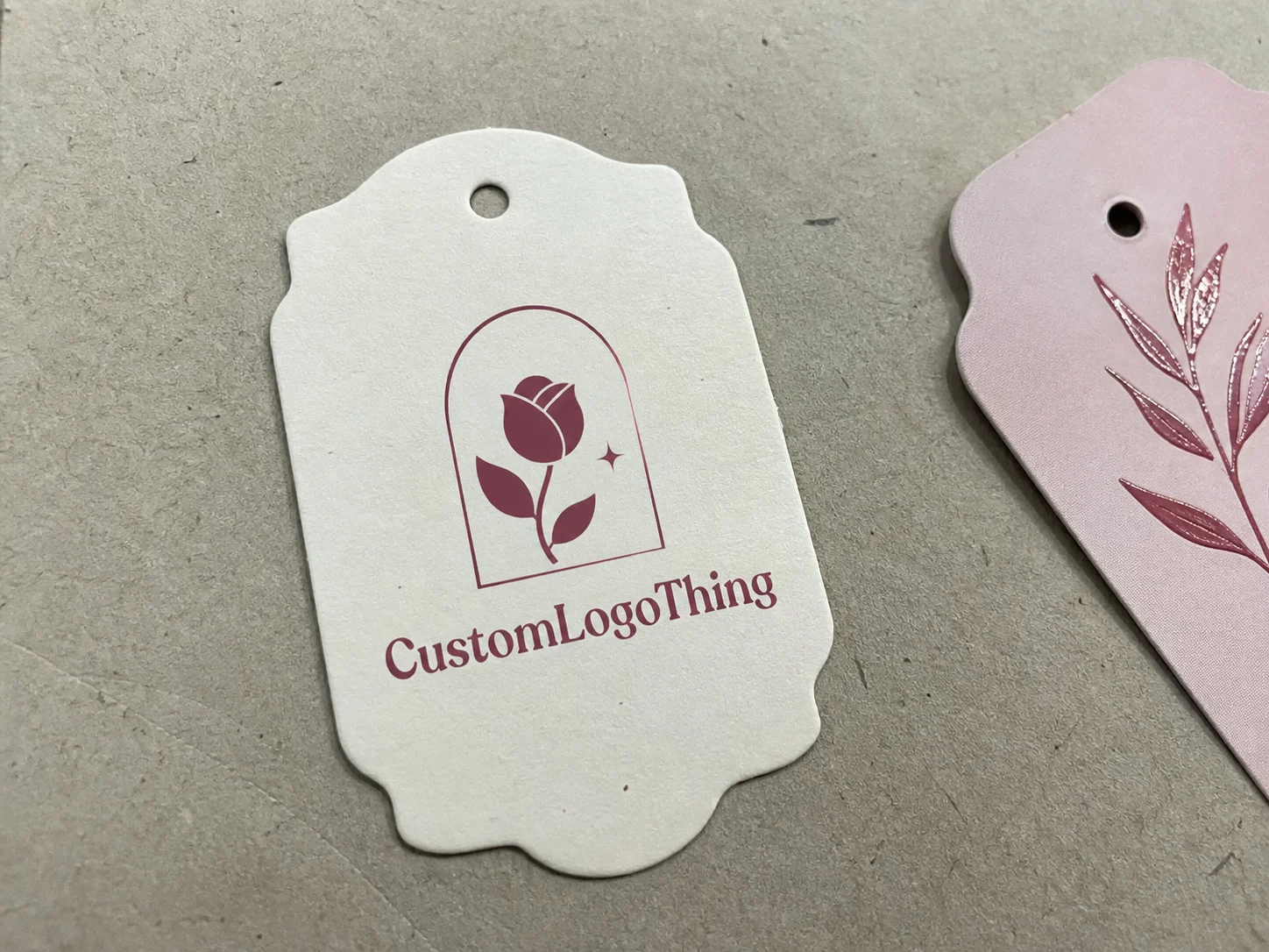
Buyers do not approve a hang tag as a paper rectangle. They approve a brand detail that has to work with the product, the box, the label, and the way the item will be displayed. The sample shows whether the stock suits the price point, whether the finish behaves as intended, and whether the tag still looks balanced once it hangs from the package.
That matters because packaging decisions are amplified in cosmetics. A lipstick or serum bottle may be excellent, but a mismatched tag can make the whole set feel improvised. In a category where perception drives margin, the sample stage is cheap insurance. A corrected foil tone costs far less than a full reprint. A hole placement error is easier to fix before production than after 5,000 pieces are cut and assembled.
The practical value is simple: sample approval reduces uncertainty. It also creates a record of what was agreed before the press run begins. For brands managing seasonal launches, private-label lines, or retailer-specific packaging, that record is often the difference between a clean launch and a scramble for replacements.
If the tag only exists as artwork, the team is still guessing about stock behavior, finish response, and how the piece reads beside the actual product.
What the sample needs to answer
A useful sample answers a narrow set of questions very well. It should confirm dimensions, paper or board choice, finish, color behavior, hole placement, and the way the tag sits on the package. If it cannot answer those questions, it is closer to a concept mockup than a production sample.
There is a difference between a digital proof and a physical prototype. A PDF is useful for copy, layout, and dieline review. It can catch a missing bleed or a typo. It cannot tell you whether a metallic foil looks warm or cold under store lighting, whether a soft-touch laminate darkens the artwork, or whether the tag swings too low once it is attached. That is why Custom Hang Tags for cosmetics brands prototype sample approval usually needs both steps when the design is premium or the packaging system is tight.
For cosmetics, the sample should also be checked in context. A hang tag that looks elegant on a desk may look weak next to a heavy glass jar. A tag that reads perfectly against a white carton may disappear against a patterned pouch. The sample is where the pairing gets tested.
Practical questions worth answering during review:
- Does the stock match the intended price point?
- Does the finish hold color the way the brand expects?
- Is the hole centered, clean, and sized correctly for the fastener?
- Does the tag hang straight on the actual product?
- Are small text elements still readable at shelf distance?
Process and timeline
The approval process usually starts with a dieline and final artwork. After that comes a proof, then a physical sample, then sign-off. The sequence sounds plain because it is. The complexity lives in the details: stock substitutions, finishing setup, color matching, die cutting, drilling, and assembly. Each step can introduce variation.
A common timeline looks like this. A digital proof may take 1 to 3 business days if the files are clean. A functional mockup often takes 3 to 6 business days. A press-matched prototype with custom finishes usually takes 7 to 12 business days, sometimes longer if the board is specialty stock or the artwork needs multiple corrections. Those ranges are normal. A foil-stamped sample with a custom die and a unique string or loop attachment is slower than a flat printed card, and it should be.
Most delays come from avoidable issues: missing fonts, low-resolution logos, incomplete copy, or a late decision to change the stock after the proof is already underway. Once the substrate changes, the color response changes too. Uncoated board absorbs ink differently from coated stock. Soft-touch laminate can mute brightness. Metallic foil can appear richer or flatter depending on the surface beneath it.
Sampling works best when the team already knows the target finish. Matte, gloss, soft-touch, uncoated, foil, embossing, spot UV, or a combination of those options all produce different visual and tactile results. The more complicated the effect, the less useful vague feedback becomes. “Make it more premium” is not a production instruction. “Reduce gloss, deepen the black, and shift the foil from cool silver to warm champagne” is.
For broader packaging coordination, teams often compare the tag against the carton and outer pack at the same stage. If the hang tag is part of a launch bundle, it can help to review it alongside other packaging systems from the same supplier, including Custom Labels & Tags and Custom Packaging Products.
Materials, finishes, and design details
Material choice changes more than cost. It changes how the brand feels. A 350gsm coated board with soft-touch laminate gives a very different impression from a 16pt uncoated card or a textured art paper. In cosmetics, that difference is not cosmetic in the trivial sense. It is part of the positioning.
Clean-beauty brands often do better with restraint: lower gloss, softer contrast, and a surface that feels calm rather than flashy. Prestige skincare or fragrance-adjacent lines may need foil, embossing, or richer stock to sit comfortably with the rest of the line. Neither direction is automatically better. The right answer depends on the bottle, the carton, the retail channel, and how the customer will handle the package.
Several details can change the sample in ways that surprise buyers.
A larger hole can shift the visual balance and make the tag hang lower than expected. Rounded corners can soften the design, but they can also make a small logo feel less sharp. Heavy ink coverage on thin stock can cause curl. Dark solids on porous paper can lose clarity. If the design carries compliance copy, ingredient text, or barcode information, those elements should be checked on the sample rather than assumed to reproduce cleanly after scaling.
Texture matters too. A tag with a silk-like finish can feel luxurious, but the same finish may dull a pastel palette. An uncoated stock can feel honest and natural, yet it may need tighter color control and more careful handling during production. That tradeoff is easy to miss if the team only looks at renderings.
For a cosmetics line, the sample should verify the following:
- Stock weight and stiffness so the tag does not flop or crease too easily.
- Finish response so matte, gloss, foil, or spot UV behaves correctly under light.
- Edge quality so die cuts and rounded corners feel clean, not rough.
- Hole size and placement so attachment is stable and the design stays centered.
- Color drift so brand colors still read as intended on the final substrate.
- Legibility so text remains clear at the distance of retail viewing.
If the hang tag is part of a gift set, the interaction with tissue, seals, inserts, and the carton matters as much as the print itself. A nice-looking tag that scratches a soft-touch box or crowds a close-up product photo is solving the wrong problem.
Cost, pricing, and MOQ factors
Sample pricing is tied to how close the prototype needs to be to the final production build. A digital proof is inexpensive because it uses no real materials. A functional mockup costs more because it involves stock, cutting, and handling. A press-matched sample with foil, embossing, or specialty board costs more again because setup time and material consumption are real, not theoretical.
Typical sample ranges, in practice:
| Sample type | Typical price | Typical turnaround | Best use |
|---|---|---|---|
| Digital proof | $15-$40 | 1-3 business days | Copy, layout, and dieline check |
| Functional mockup | $45-$95 | 3-6 business days | Size, fit, and attachment review |
| Press-matched prototype | $120-$260 | 7-12 business days | Finish, color, and final sign-off |
These figures are not fixed. Specialty papers, custom dies, short lead times, and multiple revisions can push the price higher. That is normal. What matters is whether the sample is good enough to prevent a production mistake. A $200 prototype that avoids a 5,000-piece reprint is not expensive. A cheap mockup that creates false confidence is.
Minimum order quantity also shapes pricing. The lower the order quantity, the more setup cost gets spread across each piece. A 250-piece launch kit will always have a higher unit cost than a 5,000-piece production run. Buyers sometimes read that as a markup problem. It is usually a setup problem. The machine time, die setup, and finishing work are the same whether the run is short or long.
Another cost issue is version control. If the brand changes stock after the sample has already been approved, the finish and color may shift enough to require a second round. That is how small decisions become expensive. The sample process is cheapest when the spec is stable before the first proof is requested.
Checklist for approving the final sample
The cleanest approval process is consistent. Review the same checkpoints in the same order so the discussion does not drift into personal taste before the production facts are settled. For cosmetics, the most reliable sequence is dimensions, color, copy, logo placement, finish, hole alignment, attachment method, and pack-out compatibility.
View the sample under the light it is most likely to encounter. Warm lighting can make cream-colored stock look yellower. Cool showroom light can flatten metallics. Photograph the sample if the package will be sold through e-commerce or social media, because camera response sometimes reveals issues the eye misses. A soft-touch black that looks rich in person can turn gray on a screen. A reflective foil that feels elegant in hand can blow out under flash.
A practical sign-off routine usually includes three perspectives:
- Brand review for look, tone, and shelf fit.
- Production review for print accuracy, cutting, and assembly.
- Compliance review for regulated text, barcode placement, or market-specific copy.
That split matters because a sample can be attractive and still fail in use. It may block a bottle neck, cover a seal, collide with a label seam, or hang awkwardly against a curved container. Cosmetic packaging has to work in motion, not just on a flat table. A tag that touches the wrong spot every time the bottle is picked up will become an annoyance fast.
Common mistakes that delay approval
The most frequent mistake is approving the artwork before the actual stock is tested. A foil effect that looks sharp in a mockup may read darker on soft-touch board. A matte palette can look elegant in hand and still appear too flat under retail lighting. The sample stage exists to expose those mismatches before the press run begins.
File control causes a second cluster of problems. Missing bleed, low-resolution logos, or multiple versions of the same copy line slow the process down. The best approval cycles are boring in a useful way: one final artwork file, one copy deck, one change owner. When instructions are split across email threads, the prototype becomes a moving target.
Usability issues are easy to miss if the review is too visual. The tag may look refined but interfere with a product photo angle. It may cover a warning panel. It may fold against a curved surface in a way that looks accidental rather than designed. In package branding, those are not minor defects. They change how the product is understood.
Another error is skipping the physical sample for a premium line. Higher price points reduce tolerance for inconsistency. Customers notice weight, texture, and surface behavior more quickly than brands sometimes expect. A sample helps confirm whether the hang tag belongs to the line or looks imported from a different one.
Common material tradeoffs worth keeping in mind:
- Gloss stock increases contrast, but it can feel too loud for clean-beauty positioning.
- Soft-touch laminate feels premium, but it can mute bright colors and deepen dark tones.
- Uncoated board has a natural feel, but it needs tighter color control and cleaner handling.
There is no universal best choice. There is only the choice that best supports the product, the market, and the intended price point.
Building a better request package
The smoother the request, the faster the sample approval. Send the final artwork file, the dieline, the quantity target, the stock preference, the finish notes, and the attachment method in one package. If the hang tag must coordinate with cartons, inserts, or outer packaging, include those references too. A supplier can judge the system more accurately when the full context is visible.
Brand standards help. So do reference images. A color target from one launch, a print sample from another, or a packaging spec sheet can clarify whether the new piece should prioritize color accuracy, softness, restraint, or visual impact. Without that context, “premium” can mean five different things to five different people.
It also helps to assign internal ownership early. One person should approve visual direction. Another should approve compliance or product copy. A third should confirm packaging fit. If those approvals happen one after another with no deadline, the sample can sit untouched. If they happen in parallel, the process moves faster and the decisions are cleaner.
For most cosmetics brands, the real goal is not just to approve a tag. It is to approve a repeatable standard that can be carried through future runs with fewer surprises. That is where sample approval becomes a production tool rather than a one-time check.
For teams comparing options across the full packaging line, Custom Hang Tags for cosmetics brands prototype sample approval should be treated the same way as carton sampling or label review: as a controlled step that protects color, consistency, and launch timing. The extra effort up front is usually what keeps the run stable later.
FAQ
How many prototype rounds are normal for custom hang tags for cosmetics brands prototype sample approval?
One round is often enough when the artwork is final, the stock is fixed, and the only question is fit or finish. A second round is common if the first sample reveals color drift, finish mismatch, or copy changes after the physical proof is seen. More than two rounds usually means the brief is still moving, which is a sign to lock the specification before requesting another sample.
What should I check on a hang tag sample before I approve it?
Check color, text accuracy, logo placement, paper feel, hole placement, and whether the tag hangs correctly on the actual product. Verify barcode readability, ingredient text, warning copy, and any market-specific wording if they are part of the design. Review the sample in the lighting where it will be sold or photographed, because that is where finish issues tend to appear.
Does the sample need to match the final production material exactly?
For a premium launch, it should match as closely as possible. If the goal is only to confirm layout and size, a functional mockup may be acceptable, but it should not be mistaken for a color-accurate approval piece. The closer the sample is to the final spec, the lower the risk of surprises in mass production.
How does prototype sample approval affect pricing and turnaround?
Sampling adds time because the supplier must set up materials, print, finish, cut, and inspect a physical piece before production begins. Specialty finishes, custom dies, and premium papers increase the sample cost because they add setup and material use. That said, a careful sample cycle usually lowers total cost by avoiding reprints, rework, and launch delays.
What files should I send for faster approval on a cosmetics hang tag sample?
Send print-ready artwork, the dieline, final copy, brand colors, quantity target, and notes about finish or attachment method. Include reference images or a packaging spec sheet so the supplier can match the intended look more accurately. If compliance text is involved, send the approved wording separately so it can be checked before the sample is made.
In cosmetics, the hang tag does more than identify the product. It carries texture, tone, and a small but visible piece of the brand story. That is why the sample stage matters so much. It is the place where the design becomes a real object that can be held, inspected, photographed, and compared against the rest of the line. If that object is right, the final run is far more likely to be right too.