For a luxury garment, the hang tag is never just a card tied to a sleeve. Custom Hang Tags for luxury apparel are usually the first physical brand touchpoint a shopper handles after the product itself, and that first contact has to communicate quality, restraint, and intention before a single line of copy is read. If the stock feels thin, the print looks muddy, or the edge finish feels rough, the presentation drops a level immediately.
From a packaging buyer’s point of view, a good tag does several jobs at once: it supports package branding, carries legal and care information, reinforces collection identity, and gives the product a more considered retail presentation. Done well, it becomes part of the garment’s perceived value. Done poorly, it can make even an excellent piece of clothing feel underdeveloped. That is why buyers treating Custom Hang Tags for luxury apparel as a real packaging decision usually get better results than those treating it as a last-minute print add-on.
Why luxury hang tags change the first impression instantly
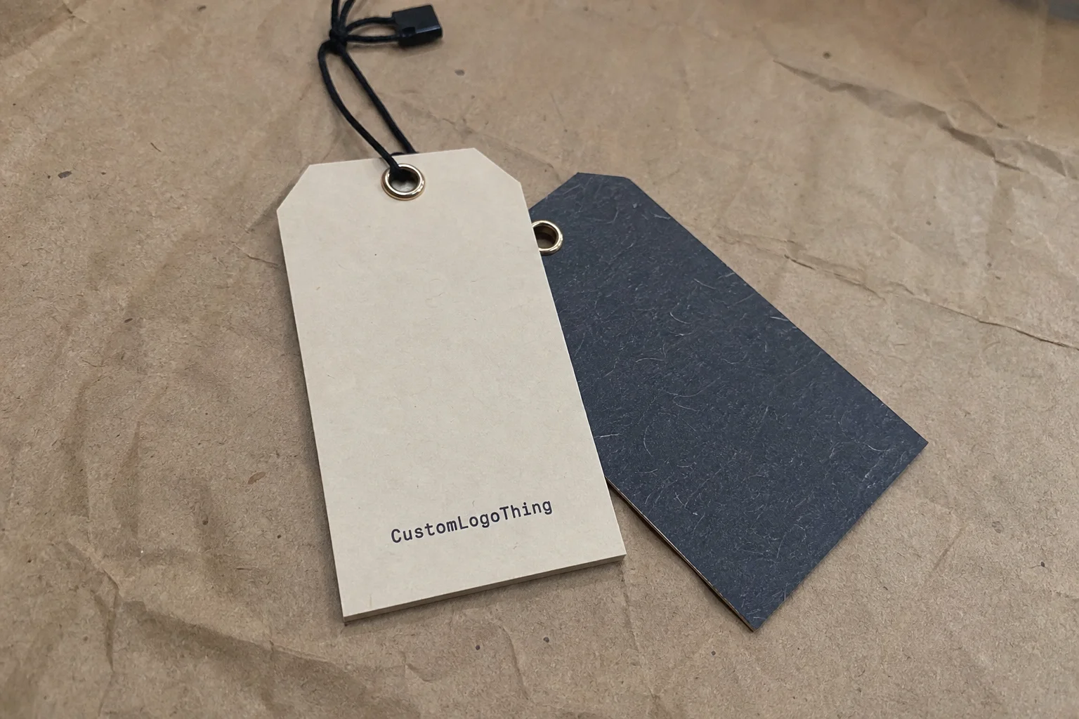
The tag is small, but the impression is not. A shopper notices paper weight, print clarity, cut accuracy, and whether the tag hangs cleanly on the garment. That matters because luxury is communicated through control more than noise. A 400gsm cotton paper with a clean die cut and one foil accent feels far more premium than a crowded tag full of effects that have no visual hierarchy.
Luxury apparel buyers also use tags as a compact storytelling device. A hang tag can communicate authenticity, collection name, size, product code, care instructions, and origin details without overwhelming the layout. The best examples feel calm and deliberate, with enough white space to let the garment breathe. That restraint is one of the biggest differences between basic retail packaging and premium retail packaging.
There is also a practical side. A basic price tag often exists to get scanned, displayed, and removed. A luxury hang tag is expected to survive handling, look good against the product, and support the brand’s visual language in store and during unboxing. That means the material choice, print method, and finishing details all affect the presentation, not just the information printed on the card.
“Luxury does not usually shout. It feels precise, balanced, and expensive because the details are controlled.”
That is especially true in apparel. A silk blouse, a tailored coat, and a premium knit do not ask for the same tag treatment. A delicate garment often needs a lighter visual touch and a softer attachment, while structured pieces can carry heavier board and more assertive typography. The tag should feel like it belongs to the product category, not like it was borrowed from another brand tier.
How custom hang tags for luxury apparel are made
The production flow is straightforward, but each step affects the final look. It usually starts with artwork setup and dieline confirmation, then moves into proofing, printing, finishing, die cutting, hole punching, and finally stringing or assembly. If the project includes multiple SKUs, variable data, or separate size runs, the setup stage matters more because a small artwork mismatch can create costly rework.
Material selection comes first in most luxury jobs. Common choices include cotton paper, textured specialty stock, soft-touch laminated board, recycled specialty paper, and rigid tag stock. Each behaves differently. Cotton papers feel natural and upscale, textured papers add depth without needing extra decoration, and soft-touch laminated boards create a velvety hand feel that pairs well with minimal branding. Recycled specialty papers can still look premium if the fiber blend and print contrast are well controlled.
After print comes finishing, and this is where the tag often earns its premium character. Foil stamping, embossing, debossing, spot UV, foil edging, rounded corners, and edge painting are all common in luxury tag work. None of them is required, and piling on too many finishes often makes the result feel busy rather than expensive. One strong tactile effect plus disciplined typography is usually enough.
Attachment details matter too. Hole placement needs enough margin so the stock does not tear under retail handling. Wax cord, cotton twill, ribbon, or security fasteners each create a different visual signal. A wax cord feels classic and slightly tailored; satin ribbon reads softer and more fashion-driven; cotton twill can feel artisanal; and security fasteners are often chosen when theft resistance or traceability matters. The knot style, cord color, and end finish should all feel intentional.
For buyers building a larger branded packaging system, it helps to keep the tag aligned with the rest of the Custom Labels & Tags program and the broader Custom Packaging Products lineup. A tag that matches sewn labels, tissue paper, and outer cartons gives the whole customer experience a more coherent look, especially when the garments are sold alongside custom printed boxes or other premium product packaging.
There is a production reality that is easy to miss: a tag that looks excellent in a flat proof can behave differently once it is punched, folded, or strung. Heavy board can crack at tight folds. Soft-touch coatings can show scuffing if packed loosely. Fine linework can disappear on textured stock. Those failures are not dramatic, but they are visible, which is exactly why mockups alone are not enough for a luxury program.
Key material, size, and finish choices that define premium quality
The feel of a tag begins with thickness and surface texture. A 16pt stock can work for simple retail programs, but luxury pieces usually look better in heavier paper or board, often in the 24pt to 32pt range depending on the construction. The heavier material helps the tag stay flat, hold crisp edges, and resist curling after finishing. Coating also matters: uncoated stock gives a softer, more organic feel, while coated or laminated surfaces can sharpen print and protect the face under handling.
Size should support the brand story, not fight it. Slim vertical tags work well for understated fashion labels, square tags look clean and contemporary, fold tags provide more room for story, compliance, or multi-language information, and oversized statement tags can create impact for limited editions or runway-inspired collections. In practice, many luxury buyers settle around a 2 x 3.5 inch or 2.5 x 4 inch format because it offers enough real estate without feeling heavy on the garment.
Typography and layout are just as critical as material. A luxury hang tag should usually have a clear hierarchy: logo, product or collection name, then supporting information in smaller type. Keep margins generous. Give the logo room to breathe. Limit color choices so the tag feels composed rather than crowded. Black, ivory, warm gray, deep navy, and muted metallic accents tend to age better than loud fashion colors, especially if the tag needs to coordinate with seasonal collections.
For finishing, one or two details is often the sweet spot. A foil stamp on a matte uncoated sheet, for example, can feel elegant and controlled. Embossing gives depth without using ink at all, while spot UV can highlight a logo on a soft-touch laminate. Edge painting is a strong option when the brand wants the tag to feel considered from every angle, though it requires good color control and clean trimming. Rounded corners can soften the look and help reduce edge wear during retail handling.
Matching the tag attachment to the brand voice
String choice should not be an afterthought. Wax cord is practical and durable, but it also reads more tailored than plain plastic fastener loops. Cotton twill works well for artisanal or sustainable positioning. Ribbon can be elegant, though it may not be right for every product category because it can catch or twist in transit. If the tag must survive long retail cycles, choose attachment hardware that balances appearance with durability, and make sure the hole size and board thickness are compatible so the string does not cut through the stock.
The hole itself deserves more attention than it usually gets. A hole that is too close to the edge can tear once the garment moves through packing and merchandising. Too large, and the tag starts to look improvised. The cleanest-looking tags usually leave enough margin to protect the punched area while keeping the layout visually balanced. That small spacing decision often separates a polished tag from one that feels rushed.
| Option | Typical feel | Best use | Relative cost |
|---|---|---|---|
| 24pt uncoated stock | Clean, understated | Minimal luxury basics | Lower |
| Soft-touch laminated board | Velvety, premium | Fashion-forward apparel | Medium |
| Cotton paper with foil | Natural, tactile, upscale | Heritage or boutique brands | Medium to higher |
| Rigid specialty board with embossing | Weighty, high-end | Signature or limited editions | Higher |
Cost, pricing, and MOQ factors to plan before quoting
Pricing for Custom Hang Tags for luxury apparel is driven by a few clear variables: material, quantity, print coverage, finishing steps, die shape, and assembly. A simple premium tag might land in a range such as $0.12 to $0.25 per unit at higher volumes, while a more elaborate build with foil, embossing, edge painting, and stringing can move well above that. For smaller runs, setup costs matter more, so the unit price rises quickly.
MOQ is one of the biggest levers. A run of 1,000 tags often costs much more per piece than 5,000 or 10,000, even if the total spend feels lower at the smaller quantity. That happens because prepress, plates, die cutting, and finishing setup get spread across more units as volume increases. Buyers often focus only on unit cost, but the better question is how much the tag program costs per collection and whether the spec makes sense for the expected sell-through.
There are also hidden cost drivers that show up after the quote if they are not discussed early. Multiple SKUs add setup and sorting time. Variable data or serialized numbering adds complexity. Custom shapes need die tooling. Rush production often means special scheduling, which can raise cost. Bundling tags with cords, labels, or packaging inserts also adds handling time. If the project includes branded packaging for multiple product lines, the overall production plan should be reviewed as one system, not as isolated parts.
A practical buying mistake is assuming that more decoration always equals more perceived value. In reality, luxury buyers usually get better results by upgrading the substrate first, then adding one finish that the customer will feel or see immediately. A thicker paper with a good foil accent usually looks more expensive than a thin tag overloaded with effects. That holds up across most apparel categories.
- Spend first on stock thickness and clean printing.
- Then choose one meaningful finish, such as foil or embossing.
- Only add extras if they support the garment tier and margin.
There is also a practical minimum for premium work. Extremely low quantities can still be produced, but the economics change fast. Once setup, proofing, and special finishing are involved, a small order can feel surprisingly expensive. That does not make it wrong, but it does mean the spec should be tied to the launch plan, not chosen in isolation.
Process, timeline, and production steps from concept to shipment
The timeline usually begins with a brief: garment type, quantity, size, finish, legal copy, and target ship date. After that comes artwork review and dieline confirmation. If the files are clean and the specification is final, proofing can move quickly. If the layout still needs design work, approval loops tend to stretch the schedule, especially when several people need to sign off on the same tag.
In practice, standard hang tag projects often take around 10 to 15 business days from proof approval, while more complex builds can run longer, especially when specialty finishing, custom die work, or multiple SKUs are involved. If the project requires matching a specific brand color, expect some back-and-forth. Metallic foils, deep blacks, and soft-touch coatings can all shift appearance slightly depending on the substrate and lighting.
Buyers should prepare a few things early so production does not stall: a final dieline, logo artwork in vector format, exact copy, barcode requirements, fiber content, country of origin, care instructions, and any packaging notes for bundling or insertion. If the tag needs to fit alongside sewn labels, tissue, or garment bags, the size should be tested against the actual product instead of guessed from a screen.
For brands that care about sustainability and compliance, it also helps to check whether the materials align with recognized standards or sourcing goals. For example, FSC certification can support responsible paper sourcing, while general packaging and material choices should be reviewed with local recycling realities in mind. Packaging design decisions that look good on paper can still cause problems if they are difficult to recover or sort in the real world.
If shipping performance matters, especially for tags packed with cords or assembled in sets, it is smart to think about how the finished pieces move through the supply chain. Organizations such as the ISTA publish test methods that help buyers understand transit risks for packaged goods. That matters even for smaller components, because bent corners, crushed edges, or tangled strings can reduce the perceived quality of the finished retail package.
One more timeline constraint is color approval. If a brand is sensitive to shade, metallic brightness, or the warmth of a black ink, physical sampling is often the only reliable way to judge the result. Screens flatten those differences. Press sheets do not. The earlier that comparison happens, the fewer surprises appear at shipment.
Common mistakes that make luxury tags look less premium
The most common mistake is choosing flimsy stock because it saves a little money. Thin paper moves too much in the hand, and that softness reads as low value in a luxury context. Another frequent issue is overcrowding. A tag crammed with copy, icons, legal text, and decorative graphics loses its elegance immediately. Luxury packaging works better when information is structured and the negative space is respected.
Color mismatch is another subtle problem. A brand may approve a deep black on screen, then receive a warmer or flatter black on press because the proof was not checked carefully. The same goes for metallics, which can look very different across foil types and light conditions. If the tag has to match a garment shade, a sewn label, or a box, ask for a physical proof or sample wherever possible.
Attachment errors can also drag down the look. A mismatched cord color, a hole punched too close to the edge, or a weak adhesive spot on a folded tag can make the piece feel unfinished. Excellent designs lose their polish quickly when assembly details are treated as secondary. For premium retail packaging, that kind of mistake is expensive because it undercuts the garment’s value signal.
And then there are compliance gaps. If a market requires country of origin, fiber content, care instructions, or barcode placement, those details need to be planned into the layout early. A beautiful tag that fails compliance is not a win. The same goes for durability: a tag must survive store handling, packing, and shipment without fraying, tearing, or curling. Style alone is never enough.
Another common issue is overfinishing. Foil, embossing, spot UV, edge paint, and specialty board can all be excellent choices, but they are not automatically better together. When every surface is trying to attract attention, the result becomes busy rather than luxurious. A restrained tag with one focal point usually feels more expensive than a tag that tries to prove its value through decoration.
Expert tips for stronger branding and smoother production
One of the smartest things a brand can do is build a tag system instead of reinventing the wheel for every collection. A core line can use one base format, seasonal capsules can vary color or foil detail, and limited editions can introduce a special stock or shape. That keeps the brand visually consistent while still allowing each launch to feel fresh.
Ordering a press proof or physical sample is especially useful when the project uses textured paper, heavy board, or tactile finishes. A screen mockup cannot tell you how a 32pt stock folds, whether the foil sits cleanly, or whether the tag feels too stiff against the fabric. When the garment is expensive, the sample is cheap insurance.
Manufacturing limits should also guide the design. Tiny text disappears quickly on certain stocks, and foil lines that are too thin may not hold cleanly. Safe margins around holes and edges should be generous enough to protect the tag in handling. If the layout includes a barcode, keep enough quiet space around it for scanning. These are small production realities, but they prevent a lot of headaches later.
Finally, think about the whole presentation. The hang tag should speak the same visual language as the sewn labels, tissue paper, garment bags, and outer cartons. That is how branded packaging feels intentional rather than assembled from separate parts. If the product arrives in a custom box, the tag should not feel like an unrelated insert. A coherent system strengthens the brand story without adding clutter.
There is a useful rule for luxury tags: every detail should have a job. If a finish does not improve legibility, tactility, or brand recognition, it may be decorative but not effective. Buyers who work this way usually end up with cleaner artwork, fewer revisions, and a better final piece.
Next steps for choosing the right luxury hang tag spec
The clearest path is simple: define the garment tier, Choose the Right material feel, select one or two finishes that fit the brand voice, then confirm quantity and timing. That sequence keeps the spec grounded in the actual product instead of in abstract decoration. For Custom Hang Tags for luxury apparel, the best result is usually the one that looks effortless because the details were carefully decided in advance.
Before requesting quotes, gather the artwork, required legal copy, preferred size, target quantity, and a realistic budget range. If possible, compare the concept against actual fabric swatches or a finished garment sample. That one step often reveals whether the tag feels right in scale, color, and handling. It can also expose problems with contrast, gloss, or cord choice before production begins.
My practical advice is to check the final spec against the launch date, replenishment needs, and retail handling conditions before release. A luxury hang tag should support the garment, not compete with it, and it should be durable enough to survive the journey from packing table to store floor without losing its polish. That is the standard worth aiming for with custom hang tags for luxury apparel.
Brands that plan for the realities of print, finishing, and handling tend to avoid the expensive fixes that come after launch. The details are small. The effect on perceived value is not.
What materials work best for custom hang tags for luxury apparel?
Thick cotton paper, textured specialty stock, rigid board, and soft-touch laminated papers are common choices because they feel substantial in hand. The best material depends on the brand position, print method, and whether the tag needs to survive heavy retail handling.
How much do custom luxury apparel hang tags usually cost?
Cost depends on quantity, stock thickness, finishing choices, die shape, and whether the order includes stringing or other assembly. Simple premium tags can stay efficient at larger quantities, while foil, embossing, and custom construction raise the unit cost.
What is a typical turnaround for luxury hang tag production?
Standard projects are often faster than highly finished orders, but approval speed has a big impact on the final timeline. Complex builds with specialty finishing, samples, or multiple SKUs usually need more lead time than straightforward printed tags.
What information should be printed on a luxury apparel hang tag?
Most brands include logo, product name, size, price or SKU, care guidance, origin information, and any legally required fiber or compliance details. The layout should stay clean so the luxury look is not lost in a crowded block of text.
How can I make custom hang tags for luxury apparel feel more premium?
Choose a heavier stock, keep the layout restrained, and use one or two high-impact finishes rather than layering too many effects. Coordinate the tag with the garment, label system, and cord or ribbon so the whole presentation feels intentionally designed.