Buyer Fit Snapshot
| Best fit | Custom Insert Cards for Jewelry projects where brand print, material claims, artwork control, MOQ, and repeat-order consistency need to be specified before quoting. |
|---|---|
| Quote inputs | Share finished size, material target, print colors, finish, packing count, annual reorder estimate, ship-to region, and any compliance wording. |
| Proofing check | Approve dieline scale, logo placement, barcode or warning zones, color tolerance, closure strength, and carton packing before bulk production. |
| Main risk | Vague material claims, crowded artwork, missing packing details, or unclear freight terms can make a low unit price expensive after revisions. |
Fast answer: Custom Insert Cards for Jewelry: Design, Cost, and Fit should be specified like a repeatable production item. The safest quote records material, print method, finish, artwork proof, packing count, and reorder notes in one written spec.
Production checks before approval
Compare the actual filled-product size with the drawing, then confirm tolerance on folds, seals, hang holes, label areas, and retail display edges. Reserve space for logos, QR codes, warning copy, and material claims before decorative graphics fill the panel.
Quote comparison points
Review material grade, print process, finish, sampling route, tooling charges, carton quantity, and freight assumptions side by side. A quote is only useful when the supplier can repeat the same color, closure quality, and packing count on the next order.
Custom Insert Cards for jewelry do more than keep a pair of earrings from rattling around in a box. A good card changes the first impression. The piece opens cleaner, looks more finished, and stops feeling like loose product tossed into packaging at the last minute.
That matters because jewelry is small, fragile, and easy to make look cheap. A plain chain in tissue reads like inventory. The same chain on a well-sized insert card reads like retail packaging with a point of view. Better fit. Better display. Fewer headaches.
A card can look perfect on a table and still fail in transit. If the jewelry shifts, tangles, or bends the card before it reaches the customer, the packaging missed the mark.
If you are comparing card inserts with other pieces of Custom Packaging Products, the job stays pretty simple: hold the jewelry, support the brand, and survive handling. Everything else is detail work. Detail work is where packaging either earns its keep or quietly burns budget.
Custom Insert Cards for Jewelry: What They Actually Do
Custom insert cards for jewelry sit inside boxes, sleeves, pouches, and hang-sell packs to keep a piece in place and present it well. The concept sounds basic because it is basic. The trick is that simple packaging done well feels expensive, while simple packaging done poorly looks unfinished.
These cards solve three problems at once. They stop movement. They create a clean surface for a logo, product name, or care note. They make the item easier to photograph, display, and ship. A tiny cardstock insert can do more brand work than a much larger outer box if that outer box is just a box.
Placement changes with the format. In a rigid jewelry box, the insert may sit in a die-cut cavity or under foam. In a pouch, the card often becomes the display backer. In hang-sell packaging, the card carries the product on the peg. Different setup, same job: the insert supports the item without fighting it.
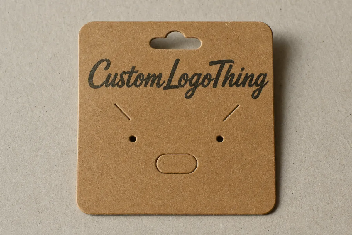
A quick example makes the point. A pair of stud earrings on a 14pt card with two tight slits stays aligned, avoids rubbing, and photographs cleanly for a product page. The same studs in tissue might arrive intact, but they will not look retail-ready. Buyers notice. Customers do too.
That is why jewelry brands care about insert cards even when the card looks tiny. The card is not filler. It is part of the package branding. It shapes the first impression, and first impressions are annoying to fix after the sale.
- Display: keeps studs, chains, and rings positioned so they look intentional.
- Protection: reduces tangling, scuffing, and movement inside the pack.
- Branding: gives you a controlled surface for logo, typography, and color.
- Retail readiness: helps the item move from storage to shelf with less handling.
For simple lines, a clean matte card is enough. For premium lines, a heavier stock, foil accent, or soft-touch finish may be worth the spend. The right choice depends on the value of the jewelry, the packing method, and how much handling the piece sees before the customer opens it. If the brand sells direct-to-consumer and ships every order individually, that handling profile matters more than it does for a display-only retail pack.
Process, Timeline, and Production Steps for Custom Insert Cards for Jewelry
The production process is not complicated, but vague instructions make it annoying fast. Start with a brief that covers jewelry type, card size, quantity, print colors, finish, and whether the card needs slits, holes, folds, or a custom cut. Bad briefs create bad quotes. Bad quotes create bad approvals. Then everyone pretends the problem appeared out of nowhere.
Here is the usual flow for custom insert cards for jewelry:
- Brief and spec check. The supplier reviews the jewelry dimensions, packaging format, and artwork needs.
- Dieline setup. A card template is created or adjusted so the print and cut line up with the actual product.
- Proof review. You check layout, size, bleed, text placement, and any cutouts before production starts.
- Printing. The cards are printed on the chosen stock using offset, digital, or another suitable process.
- Cutting and finishing. Cards are die-cut, corner-rounded, foil-stamped, laminated, or otherwise finished.
- Packing and shipment. Finished cards are counted, packed, and shipped flat or assembled, depending on the order.
Timelines depend on the spec, but a realistic range looks like this: one to three business days for artwork and dieline work, one to three days for proofing, eight to fifteen business days for standard production, and a few more days for shipping. Physical samples or specialty finishes can stretch that timeline. So can indecision. Packaging indecision has a talent for turning one week into three.
Special finishes add time. Foil, embossing, custom die-cuts, and unusual slit layouts need more setup than a plain printed card. If the art team keeps changing the layout after proof approval, the clock starts over. Nothing dramatic. Just math.
A clean handoff saves time and money. If you are ordering from a vendor that also offers Custom Packaging Products, send one complete spec sheet instead of a trail of half-matching emails. Packaging teams can fix a lot. They cannot guess the size of your box from a logo file and vibes. They also cannot infer how a necklace sits from a render that never shows the chain.
Useful information for the brief includes:
- Final artwork in vector format, usually AI, EPS, or PDF.
- Exact card dimensions, plus bleed and safety margins.
- Jewelry type and how it sits on the card.
- Pack format: box, pouch, sleeve, mailer, or hang-sell card.
- Print side count: front only or front and back.
- Any special finish, such as soft-touch coating, foil, or embossing.
If your cards need to survive shipping as part of a retail kit, ask whether the packaging should be checked against an ISTA-style handling test. The International Safe Transit Association publishes packaging test procedures that are widely used for distribution testing, and they are useful reference points even for small jewelry packs: ISTA. For paper sourcing, especially if you want to support sustainability claims, FSC certification is worth confirming: FSC. If a supplier makes a recycled or FSC claim, ask for the certificate details instead of taking the phrase at face value.
Cost, Pricing, MOQ, and Unit Cost for Custom Insert Cards for Jewelry
Price comes down to a few predictable things: size, stock thickness, print coverage, front-and-back printing, die-cuts, coatings, and how the cards are packed. The card itself may be small, but the setup is not free. Small format jobs still need a dieline, a press setup, and finishing work. Printers do not smile politely and waive those steps.
MOQ matters because it changes the math fast. Lower quantities usually push unit cost up because setup gets spread across fewer pieces. Larger runs pull the per-card price down, but they also raise the upfront spend. That is why a buyer who only needs 300 cards often pays more per unit than a brand ordering 5,000. The reverse also happens when a large run gets overdesigned and carries expensive finishes no one asked for.
For ballpark planning, simple custom insert cards for jewelry often land in these ranges:
| Card Type | Typical Specs | Best For | Approx. Unit Cost at 1,000 | Approx. Unit Cost at 5,000 |
|---|---|---|---|---|
| Basic uncoated card | 14pt to 16pt, 1-color or 2-color print | Simple studs, everyday SKUs, budget lines | $0.16-$0.30 | $0.06-$0.14 |
| Full-color cardstock | 16pt to 18pt, CMYK print, front and back | Branded retail packaging, mixed product lines | $0.22-$0.42 | $0.08-$0.20 |
| Soft-touch or laminated card | 18pt, coating, optional foil | Premium lines, giftable packaging, luxury looks | $0.45-$0.90 | $0.20-$0.45 |
| Kraft-style card | Heavy kraft stock, simple print | Natural, artisan, or eco-leaning branding | $0.18-$0.35 | $0.07-$0.18 |
Those are planning numbers, not fixed quotes. A custom die-cut, foil edge, embossed logo, or unusual insert shape can push the price up. So can a rush turnaround. If you need a complex card in a tiny quantity, the per-unit price can jump faster than most buyers expect. That is normal, not a vendor trick.
Watch the line items in the quote. Ask for unit price, setup or tooling charges, proof fees, and shipping separately. If the supplier will assemble the jewelry into the cards, ask whether insertion labor is included. That one detail can change the total by a surprising amount.
- Setup or tooling: often a one-time charge for dies or custom cutting.
- Proofing: may be included or billed separately for physical samples.
- Finishing: foil, lamination, embossing, and rounded corners add cost.
- Packing: flat-packed cards are usually cheaper to ship than pre-inserted kits.
For luxury pieces, the right finish is usually worth it. A velvet-feel coating, foil logo, or heavier board can raise the perceived value of a ring or necklace by more than the card costs. For everyday product lines, a clean matte card with strong typography often does a better job than an overdesigned card trying too hard. The best-looking card is not always the best-selling one.
Key Design Factors That Make Jewelry Insert Cards Work
Design is where most of the value lives. The card has to fit the jewelry, fit the box, and fit the brand. Miss one of those and the card becomes a fancy piece of waste. Pretty waste, maybe. Still waste.
Start with dimensions. The width and height need to match the outer package cavity or the display format. A card that is even a few millimeters too wide can buckle in a tight box. A card that is too small can look sloppy and leave awkward gaps around the product. If the piece folds, leave enough allowance on the fold line so the print does not crack and the card opens cleanly.
Slit placement matters more than people think. Earrings need slit spacing matched to the post style and backing type. Necklaces need anchor points that keep the chain from sliding or knotting. Rings may need a smaller presentation zone, often with a tighter visual hierarchy so the ring does not disappear on the card. Design the cut for the product, not for the mood board. A beautiful layout that does not hold the piece is decoration, not packaging.
Stock choice changes the whole feel. Lightweight paper can work for very simple inserts, especially when the card sits inside another box. Heavier cardstock gives better structure and helps the card survive handling. Coated stock improves color accuracy and keeps bright brand colors from sinking into the paper. Kraft stock works if the brand wants an earthy, natural look, but the print and logo need to stay readable. If the brand colors are pale, test them on kraft before you approve the run. Weak contrast is a very common regret.
Here is a practical comparison:
| Stock / Finish | Look and Feel | Tradeoff | Best Use |
|---|---|---|---|
| 14pt uncoated | Simple, matte, easy to write on | Less rigid, can feel plain | Budget inserts, care cards, simple studs |
| 16pt to 18pt cardstock | Stiffer, more polished, better structure | Slightly higher unit cost | Most retail packaging and branded packaging |
| Soft-touch laminate | Velvety, premium, tactile | Costlier, can show scuffs if handled rough | Luxury necklaces, gift sets, premium lines |
| Kraft stock | Natural, warm, handmade feel | Color limits, print contrast matters more | Artisan jewelry, eco-minded product packaging |
Typography matters too. Jewelry cards are tiny, which means type size and contrast need discipline. If the logo is too small, nobody reads it. If the text is too bold, the card turns into a billboard. Good package branding usually sits in the middle: one clear logo, one readable line of copy, and maybe a care note or social handle if space allows. A short line about metal type or cleaning instructions can be useful, but only if it stays legible.
Rounded corners can soften the look and reduce dog-earing. Foil can sharpen the brand, but it needs restraint. Embossing works well for premium looks, although deep embossing may shift fine typography a little. Soft-touch coatings feel upscale, but they also pick up fingerprints. Every finish has a tradeoff. That is not a defect. That is production reality.
If the card has to survive shipping, retail handling, and being pulled in and out of a drawer, durability should beat decoration. A beautiful card that scrapes, bends, or flakes in transit is a bad investment. A simpler card that stays sharp can do more for product packaging over time.
Step-by-Step: How to Order the Right Insert Card
The cleanest orders start with the jewelry, not the artwork. Measure the product first. Then build the card around it. That sounds obvious, which is usually how packaging mistakes hide in plain sight.
-
Identify the jewelry type and package format.
Earrings, necklaces, bracelets, and rings each need different support. A pair of studs may need two precise slits, while a necklace may need a top anchor and a lower stop point to keep the chain centered.
-
Measure the real item and the cavity.
Use the actual product, not the prototype drawing. Measure the jewelry plus the box, pouch, or sleeve it must fit into. Leave room for tolerance, because production is not a perfect math exercise.
-
Choose stock and finish.
Match the material to the brand and the handling conditions. A premium line may justify soft-touch laminate or foil. A fast-moving everyday SKU may only need a clean matte card with a strong logo.
-
Send artwork and request a proof.
Ask for a dieline, confirm bleed, and verify the exact placement of slits, holes, and fold lines. Print a proof or sample if the insert is critical to the launch. A flat file on screen is not enough when the product has to sit in a real package.
-
Test the fit with actual samples.
Insert the real jewelry. Close the box. Shake the pack gently. If the card flexes or the piece shifts too much, fix it before production. One adjustment now costs less than a reprint later.
If you also need outer packaging, keep the full system aligned. Card size, box cavity, insert orientation, and print style should all point in the same direction. That is how Custom Printed Boxes, inserts, and labels stop fighting each other and start working like one package.
A simple checklist helps avoid back-and-forth:
- Final logo files in vector format.
- Exact card dimensions in millimeters or inches.
- Jewelry dimensions, including backing, clasp, or chain length.
- Print side count and any care text.
- Finish choice and any special cutouts.
- Whether the cards ship flat, pre-slotted, or assembled with product.
Common Mistakes That Waste Time and Money
The first mistake is obvious: people design the card before they measure the jewelry. That leads to awkward spacing, slits in the wrong place, and reprints that should never have happened. Jewelry is small, so the tolerance is unforgiving. A few millimeters matter.
The second mistake is choosing a stock that looks nice but bends too easily. A flimsy card can curl in transit, collapse under the weight of a chain, or look tired after one handling cycle. The card does not need to be armor-plated, but it does need enough structure to stay flat and presentable.
The third mistake is adding too much text. For jewelry, clarity usually beats cleverness. The card needs the brand name, the piece name if needed, and maybe one line of care or material info. Once the design starts cramming in taglines, social handles, disclaimers, and three blocks of tiny type, it stops functioning as packaging and starts acting like a brochure nobody asked for.
The fourth mistake is skipping actual samples. A mockup on a screen can hide bad slit placement, weak contrast, and an awkward fit. A physical sample tells the truth. Buyers who run a quick test save time later. The sample may feel like an extra step. It is still cheaper than guessing wrong.
Other production mistakes show up all the time:
- Ignoring bleed and safe areas, which causes cut-off text or logos.
- Assuming the printer will correct layout issues for free.
- Ordering a premium finish that clashes with the brand's price point.
- Forgetting to check how the card looks inside the actual box or pouch.
- Skipping a handling test when the pack will ship long distances.
One more trap: treating packaging as a one-off project instead of a system. If every SKU gets a different card size, finish, and print method, reorder management turns into a mess. Standardize where you can. Save the fancy stuff for the products that actually justify it. That is especially true if the same jewelry line ships in both retail and DTC formats.
Expert Tips and Next Steps for Custom Insert Cards for Jewelry
The easiest way to keep reorders under control is to build a one-page spec sheet for each SKU. Include jewelry type, dimensions, stock, finish, print colors, slit style, and pack method. That sheet becomes the reference whenever someone in sales, operations, or design decides to "just make a small change." Small packaging changes often cost more than they should.
Ask for a sample set before you commit to a full run, especially if the line is premium or seasonal. A sample can show you whether the white point, logo contrast, and card stiffness are actually right. It can also show whether the card works with the outer packaging or just looks good alone. If a supplier only offers a digital mockup and refuses a physical sample on a high-stakes launch, that is not a small detail. That is a warning sign.
Compare at least two quotes using the same spec. If one quote is much lower, check whether it excludes tooling, proofing, or shipping. If one quote is much higher, check whether it includes insertion labor or a more durable stock. Pricing only makes sense when the specs match. Comparing a coated card to an uncoated one and calling it a fair quote review is how budgets disappear.
Here is the practical buying advice: keep the card functional first, decorative second. Customers notice clean fit, readable branding, and solid presentation before they notice an embossed logo. That order matters. It is also why good packaging design usually looks quieter than bad packaging with expensive finishes slapped on top.
If the cards are part of a larger branded packaging system, line up the print style with the rest of the line. Use the same color family, the same typography rules, and the same tone across the insert, box, and mailer. That is how product packaging starts to feel intentional instead of pieced together from three different suppliers.
Before you place the order, check three things: the artwork, the quantity, and the fit test. Then approve production only after you have handled a physical proof against the actual jewelry. If you are ordering custom insert cards for jewelry this week, the safest path is simple: measure the piece, request a dieline and sample, and confirm the card holds the jewelry firmly inside the final package. That discipline pays for itself fast.
Frequently Asked Questions
What size should custom insert cards for jewelry be?
Base the size on the jewelry type and the outer packaging, not on a generic template. Earrings usually need tighter spacing and precise slit placement, while necklaces need enough room for the chain and card edge. Ask for a dieline and test with real samples before approving the final size. If the card will sit inside a box with a molded cavity, the cavity dimensions should drive the final spec.
What stock is best for custom insert cards for jewelry?
Heavier cardstock is usually the safest choice when you want structure and a clean presentation. Lighter paper can work for simple inserts, but it tends to feel less premium and can bend in transit. Choose coated or specialty stock only if the finish supports the brand and the card still fits the package cleanly. If the supplier offers multiple board options, ask for the actual caliper and not just the marketing name.
How much do custom insert cards for jewelry cost per unit?
Unit cost depends on size, quantity, stock, print coverage, and finishing details. Simple runs with basic print are cheaper; premium finishes, die-cuts, and low quantities raise the price quickly. Always ask for a quote that separates unit price, setup charges, and shipping so you can compare fairly. If insertion labor is included, make sure it is spelled out in the quote.
How long does production take for custom insert cards for jewelry?
Timeline usually includes artwork prep, proof approval, printing, cutting, finishing, and shipping. Simple jobs move faster; custom shapes, special finishes, and revision cycles add time. If launch timing matters, confirm lead time before approving the design and ask where delays most often happen. A sample approval loop is often the part that stretches the schedule.
Can custom insert cards for jewelry work for earrings, necklaces, and rings?
Yes, but each jewelry type needs a different layout and support method. Earrings often need slits or holes, necklaces may need chain placement control, and rings may need a smaller, tighter display area. A single card style can work across SKUs if you design the system carefully and test each format. The key is to keep the structure flexible enough for the collection without losing fit.

