Buyer Fit Snapshot
| Best fit | Custom Jar Labels for Branding and Sell projects where brand print, material claims, artwork control, MOQ, and repeat-order consistency need to be specified before quoting. |
|---|---|
| Quote inputs | Share finished size, material target, print colors, finish, packing count, annual reorder estimate, ship-to region, and any compliance wording. |
| Proofing check | Approve dieline scale, logo placement, barcode or warning zones, color tolerance, closure strength, and carton packing before bulk production. |
| Main risk | Vague material claims, crowded artwork, missing packing details, or unclear freight terms can make a low unit price expensive after revisions. |
Fast answer: Custom Jar Labels for Branding and Sell: Material, Adhesive, Artwork, and MOQ should be specified like a repeatable production item. The safest quote records material, print method, finish, artwork proof, packing count, and reorder notes in one written spec.
Production checks before approval
Compare the actual filled-product size with the drawing, then confirm tolerance on folds, seals, hang holes, label areas, and retail display edges. Reserve space for logos, QR codes, warning copy, and material claims before decorative graphics fill the panel.
Quote comparison points
Review material grade, print process, finish, sampling route, tooling charges, carton quantity, and freight assumptions side by side. A quote is only useful when the supplier can repeat the same color, closure quality, and packing count on the next order.
Custom Jar Labels for branding can decide whether a shopper reaches for your product or keeps walking. That sounds dramatic until you stand in front of a crowded shelf and realize a label has only a few seconds to carry flavor cues, price cues, and trust cues all at once. Jars raise the stakes even more because the container is curved, often transparent, and usually visible from more than one angle. A label on that surface is doing the work of a quiet salesperson before anyone even reads the fine print on the back.
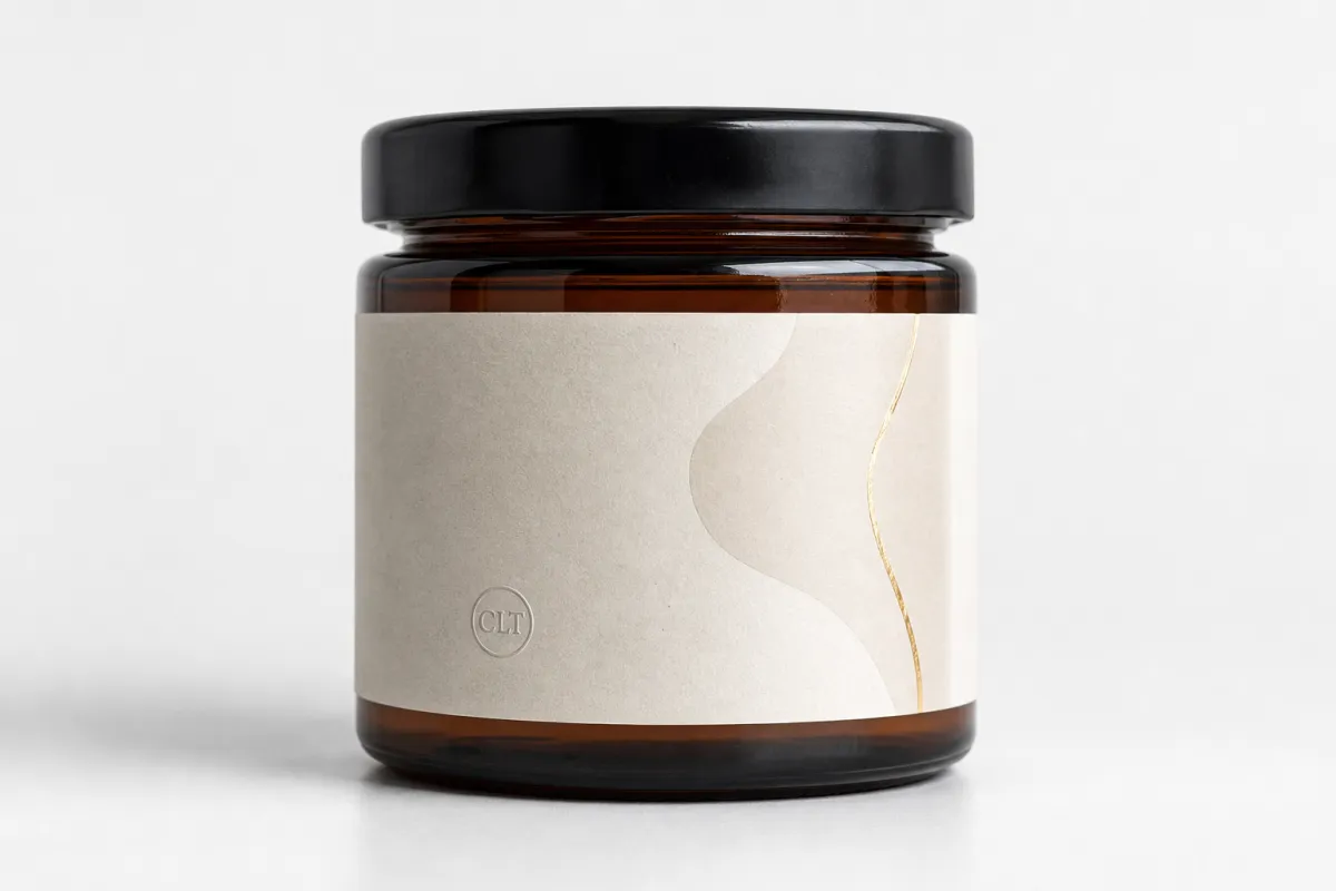
Labels on jars are not just identifiers. They are part of brand identity, package branding, and the larger product packaging system that shapes how a customer reads quality. A matte paper label can suggest a handmade pantry item. A crisp film label can feel cleaner and more premium for cosmetics. A metallic accent can move a candle or specialty sauce into a different price tier. The label becomes a signal, and the signal has to be clear enough to trust at a glance.
Custom Jar Labels for Branding: Why They Matter
A jar is a strange little stage. Unlike a carton or a flat sachet, it gives you a rounded surface, a shoulder, a seam, and often a view of the product itself. That makes Custom Jar Labels for branding unusually sensitive to contrast and placement. A design that looks polished on a screen can fall apart once it wraps around glass or plastic. A logo that reads cleanly in a mockup may become awkward if it lands too close to a curve or crosses a seam. I have seen a great concept get weaker simply because the usable panel was smaller than the designer assumed.
The shelf reality is harsher than many brand teams expect. In a grocery aisle, specialty market, or candle boutique, a shopper may spend only a couple of seconds deciding whether a jar deserves another look. That means custom jar Labels for Branding are not decorative extras. They need to communicate category, scent or flavor, use case, and price position fast. A customer should be able to tell whether they are looking at salsa, honey, a face mask, or a premium preserve without leaning in.
From a buyer’s point of view, that speed matters because the jar is usually part of a wider retail packaging story. If the label looks generic, the product can feel cheaper than it is. If the label feels too busy, the item can feel overdesigned and hard to trust. Brands sometimes get tripped up here: they design for the internal review meeting first and the shelf second. Custom jar labels for branding work better when both needs are handled in the same design, not treated like competing priorities.
There is also a pricing effect that is easy to underestimate. A jar with a well-executed label often reads as more valuable than the raw ingredients or fill cost would suggest. That matters in foods, candles, cosmetics, condiments, and specialty goods, where visual presentation can shift perceived price by a meaningful margin. A label with strong hierarchy, good contrast, and a finish that matches the product promise can make a modest item feel premium. The reverse is true as well, and it happens fast.
For brands building a full system, custom jar labels for branding should sit alongside the rest of the visual language instead of fighting it. The same logic should connect with Custom Labels & Tags, broader Custom Packaging Products, and, where relevant, the unboxing experience created by secondary packaging. When the jar label, outer shipper, and insert card speak the same visual language, the product feels more intentional. That is not fluff. It is consistency, and consistency sells.
One useful way to think about custom jar labels for branding is this: the jar label is the first line of product packaging, and the rest of the package has to support it. A jar can be clear, amber, frosted, squat, tall, wide, or narrow. Each format changes how the eye moves. If the label does not account for that movement, the brand loses clarity. If it does, the jar becomes a compact and highly efficient branding surface.
For brands that want proof instead of theory, browse a few Case Studies and compare how different products use shape, finish, and contrast. The strongest examples are rarely the loudest. They are the ones that look simple because the decisions underneath are disciplined.
Custom Jar Labels for Branding Process, Timeline, and Lead Time
The production path for custom jar labels for branding is straightforward on paper and messier in practice. It usually starts with jar measurements, then moves into dielines, artwork, proofing, sampling, printing, cutting, finishing, and shipment. The timeline is rarely determined by printing alone. Slowdowns often show up earlier, during measurements, approvals, or material selection. A label job that looks simple can still stall if the jar is unusually curved, the design file is not print-ready, or the buyer needs several stakeholder approvals.
Most delays happen because the label is being designed before the container is fully understood. A jar with a shoulder, a taper, or a textured surface needs different assumptions than a smooth cylinder. Custom jar labels for branding should always be built around the actual usable panel, not the full circumference on a spec sheet. If a team skips that step, a design that looked beautiful can end up too tall, too wide, or too close to an edge. That kind of miss is annoying, and yes, it can get expensive.
Lead time also depends on whether the job is being produced as flat sheets, rolls, or part of a broader assembly workflow. Labels on rolls are often easier for automated or semi-automated application, while sheet labels can be useful for short runs or hand-applied products. A typical uncomplicated digital run may move in roughly 5 to 10 business days after proof approval, while more complex custom jar labels for branding jobs often land in the 12 to 15 business day range or longer if finishing, special adhesives, or large quantities are involved. Rush work is possible in many cases, but faster service usually means higher cost and fewer finishing choices.
Sampling is worth the extra calendar time. A test label can reveal color drift, adhesive weakness, or fit issues long before a full run ships. That is especially important for products that face condensation, refrigeration, oily handling, or frequent consumer contact. Packaging tests based on common distribution practices, including ISTA methods, are useful because labels do not fail only in the printer; they fail in transit, in the refrigerator, and on the shelf. For reference, industry guidance from organizations such as ISTA is helpful when teams want to validate how a package behaves under real shipping stress.
From a workflow perspective, the cleanest schedule usually looks like this:
- Measure the jar carefully and confirm the label panel.
- Build the dieline and place the art at actual size.
- Approve a digital proof or physical sample.
- Test the label on a filled jar under real conditions.
- Lock the final version and release the print order.
A label that passes in a PDF but fails on a cold jar is not finished. It is only approved on paper.
That one lesson saves brands a lot of rework. It also protects the launch calendar. When people talk about custom jar labels for branding, they often focus on print quality. In reality, the project lives or dies on timing discipline: how quickly the team measures, approves, tests, and signs off. If those steps are tight, the manufacturing window usually feels manageable. If they stretch, the job becomes expensive and stressful.
Key Factors That Shape Custom Jar Labels for Branding
Material is the first big decision, and it changes more than durability. Paper stock can work beautifully for dry goods, short-life products, or a rustic visual direction, but it is not the safest choice for condensation, oil, or cold storage. Film stocks such as BOPP or other synthetic materials usually perform better under handling, refrigeration, and moisture. For custom jar labels for branding, that choice is not cosmetic. It is functional, and it can save a launch from a nasty surprise.
Adhesive matters just as much. A permanent adhesive is a strong default for most consumer goods, but removable, freezer-safe, and high-tack options are useful in specific environments. A poor adhesive choice can produce edge lift, wrinkling, or residue on the container. If a brand is placing labels on chilled jars or lids that will be handled often, the adhesive should be tested on the actual container and not just on a generic sample card. ASTM peel-adhesion testing, such as ASTM D3330, is often relevant when a supplier wants to compare performance in a disciplined way.
Finish influences perception faster than many teams expect. Matte can read as artisanal, quiet, and less reflective under bright retail lighting. Gloss gives stronger color pop and can help certain sauces, jams, or cosmetic formulas feel more vivid. Soft-touch finishes lean tactile and premium, though they can be more expensive. Metallic details or foil accents should be used with restraint, because too much shine can create glare on curved glass. For custom jar labels for branding, the finish should support the message, not compete with it.
Geometry is another constraint that changes packaging design decisions. A jar with a wide front panel gives more room for hierarchy. A narrow or highly curved jar does not. Seam placement, cap height, shoulder slope, and even the texture of the bottle all influence what will stay readable. I have seen strong designs weakened simply because the font was too light for the available print area. Small jars are especially unforgiving. Typography has to be judged at actual size, not from a monitor.
Compliance cannot sit off to the side either. Ingredients, nutrition panels, warnings, batch codes, barcodes, and net weight need to be spaced properly so the label still feels polished. A crowded layout rarely looks premium. It looks rushed. That is why custom jar labels for branding should be designed with a clear hierarchy: brand name first, product name second, supporting copy third, and regulatory elements where they can do their job without crowding the front. Solid packaging design handles the practical details first, then lets the visual system breathe.
Sustainability is part of the decision process for many buyers. FSC-certified paper is often a useful option for brands that want a lower-impact paper path, and the FSC system gives buyers a recognizable framework for responsible sourcing. Sustainable choices still need to perform, though. A recycled stock that lifts in cold storage is not a win. For brands that want to signal environmental responsibility, the real goal is a material and adhesive combination that holds up while keeping the message credible.
Color and contrast deserve special attention on clear jars. Transparent packaging creates a background that can either elevate or weaken the brand. A pale cream label on a transparent jar can disappear under bright light. A dark label can make a product feel more grounded and premium, but only if the copy remains readable. That is why custom jar labels for branding often succeed when the front panel is designed for distance and the side or back panel is designed for information density. The two jobs are related, but they are not identical.
Practical material matchups
As a quick rule of thumb, paper is best reserved for dry, low-moisture use or a deliberately natural look. Film is better for refrigeration, handling, and longer shelf life. If the product is oily, wet, or likely to be stored in a bathroom or cooler, film plus the right adhesive is usually the safer route. That simple distinction prevents a lot of failures in custom jar labels for branding.
For a broader view of how material choices fit into the rest of a brand system, it can help to compare labels with cartons, inserts, and secondary packaging. A strong jar label is powerful, but it becomes much stronger when the rest of the package shares the same color logic and typography.
Step-by-Step Guide to Custom Jar Labels for Branding
The cleanest way to manage custom jar labels for branding is to treat the job like a small packaging project, not a decoration exercise. Start with measurements. Record the diameter, labelable height, seam location, shoulder transition, and any texture or curvature that could affect the adhesive. If the jar has a tapered body, measure the top and bottom usable areas separately. That extra care avoids a lot of fit surprises later.
Next, decide what the front of the label must accomplish in one glance. Does the product need to sell flavor, scent, benefit, or ingredient quality first? Does the brand want a premium look, a handmade look, or a clean clinical look? Once that decision is made, place the brand name, product name, and key benefit in that order of priority. Secondary information belongs on the back or side. Custom jar labels for branding work best when the hierarchy is obvious.
Then build the artwork at true scale. A print-ready file should include bleed, safe zones, and fonts that remain readable at jar size. If the product is small, it is usually better to simplify than to cram in more copy. One strong visual idea with clear contrast usually outperforms six tiny claims fighting for attention. That is especially true in food and beauty, where the front panel has a lot to carry.
After that comes the proof. A digital proof is useful, but a physical sample is better, and a sample on a filled jar is better still. Test under different lighting conditions, because labels can change personality under warm retail lighting, cool warehouse light, and direct window light. Test condensation if the product will be chilled. Test handling if the jar is likely to be picked up repeatedly. This is the point where custom jar labels for branding either become reliable or get revised.
A simple approval sequence helps keep the process tight:
- Measure the jar and document the usable panel.
- Confirm the label size and shape with the supplier.
- Review the artwork at actual dimensions.
- Approve a sample on the real container.
- Lock the specification for repeat orders.
That last step matters more than many buyers realize. Once a label spec is locked, future SKUs become easier to launch. A flavor extension, scent extension, or seasonal edition can be created by changing a few fields instead of rebuilding the whole package. That is one of the best arguments for strong custom jar labels for branding: they create a flexible system, not just a one-off label.
There is also a strategic link between the jar label and other materials in the brand family. If your brand uses inserts, boxes, or shipping materials, matching type treatment and color behavior matters. A compact label can echo the bigger story of the product packaging and the unboxing experience, which is especially useful for direct-to-consumer lines that want the customer to recognize the brand immediately on arrival. In those cases, the jar label is the first touchpoint, not the last.
For product teams that need a testing mindset, compare two directions side by side. One might emphasize a bold logo and minimal copy; another might use softer type and more ingredient emphasis. Place both jars on a shelf-like surface and view them from arm’s length. The best option is often obvious in that setting, and it tells you more than a mockup does. That is how custom jar labels for branding move from theory into a commercially useful system.
Custom Jar Labels for Branding Cost, Pricing, and MOQ
Cost is never just about the printed sticker. For custom jar labels for branding, the price usually reflects size, material, adhesive, finish, color count, quantity, and setup. A small, simple paper label in a larger run can be very economical. A waterproof film label with a specialty finish and precise die cutting will cost more, but it may also prevent damage, lifting, or reprints. The real question is not “What is cheapest?” It is “What survives the product environment at the best total cost?”
MOQ, or minimum order quantity, is another piece of the puzzle. Many buyers assume the best price always comes from larger quantities, and that is mostly true on a per-unit basis. The tradeoff is upfront spend and storage. A brand that orders 20,000 labels may get a lower unit price than one ordering 2,000, but it also carries more inventory risk. For seasonal or fast-changing products, smaller digital runs can be the smarter move even if the unit cost is higher.
To make pricing clearer, it helps to compare label options using the same specs every time. Ask for quotes on the same size, same material, same finish, same adhesive, and same quantity. If one supplier quotes a paper label and another quotes a film label, the numbers are not actually comparable. That is a common mistake. For fair comparison, the request should be detailed enough that everyone is quoting the same job.
| Label Option | Typical Unit Cost at 5,000 | Best Fit | Main Watch-Out |
|---|---|---|---|
| Uncoated paper label | $0.04-$0.09 | Dry goods, rustic branding, short shelf life | Weak moisture resistance |
| BOPP film label | $0.07-$0.15 | Food, bath, beauty, handling-heavy jars | Slightly higher material cost |
| Waterproof synthetic label | $0.09-$0.18 | Cold storage, condensation, oil, frequent contact | May need careful adhesive selection |
| Premium label with foil or specialty finish | $0.12-$0.28 | Premium candles, giftable foods, upscale cosmetics | Higher setup and finish costs |
Those ranges are not universal, and they shift with quantity, artwork complexity, and supplier capabilities. Still, they give buyers a grounded starting point. If custom jar labels for branding are being used on a high-value product, spending a few cents more per unit on stronger stock or a better finish can be a rational trade. A label that fails after refrigeration or shipping is far more expensive than it looked on the quote sheet.
Hidden costs deserve attention too. Artwork setup, die line creation, sampling, rush fees, special packaging, and split shipments can all move the budget. A brand might think it is buying labels at one price, only to discover that revisions or expedited production changed the real spend. That is why I always recommend asking for a full spec-based quote before comparing options. It keeps the budget conversation grounded instead of fuzzy.
For brands building out broader branded packaging, quotes should also be viewed in context. A label may be one line item, but it is tied to product packaging, shelf presentation, and sometimes Custom Printed Boxes or inserts. If the jar label is the hero and the outer package is supporting cast, the budget should reflect that relationship instead of treating each item as a separate island.
Common Mistakes With Custom Jar Labels for Branding
The most expensive label mistake is choosing the wrong stock for the product environment. If a jar is chilled, oily, wet, or handled frequently, a label that looks fine in a dry office can fail in the real world. Edge lift, smearing, and adhesive residue are all avoidable, but only if the material and adhesive match the use case. This is where custom jar labels for branding need to be judged by performance, not just appearance.
Another common issue is designing for style without respecting contrast. It is easy to make a pretty label that performs badly at shelf distance. Thin fonts, low-contrast colors, and crowded layouts can make the front panel harder to read than it should be. On a jar, that risk increases because the curved surface distorts the eye. A good packaging design is not the same as a busy one. The strongest custom jar labels for branding often look simpler because they prioritize hierarchy.
Measurement errors are surprisingly common. Teams sometimes measure the full jar circumference and assume that number equals label width, but that ignores seam placement, taper, and the usable flat area. A label that wraps too far can wrinkle. A label that is too tall can interfere with caps or shoulders. Small jars are especially sensitive. If the dimensions are off by even a few millimeters, the result can look sloppy. That is a hard problem to hide on transparent packaging.
Skipping test applications is another costly shortcut. A proof can tell you whether the art is aligned, but it cannot tell you whether the adhesive will hold after condensation or whether the colors remain readable under cold case lighting. The test should happen on the actual jar, with the actual fill, and ideally in the actual storage condition. That extra step protects the launch and keeps custom jar labels for branding from becoming a reprint story.
Consistency problems also show up across product families. A brand with five jar flavors or scents may accidentally create five unrelated label systems. That weakens brand identity. A stronger approach is to build one template that flexes across variants through color, naming, or icons while holding the same type hierarchy and logo placement. That way, the shelf reads as one family instead of five separate ideas competing for attention.
Timeline mistakes can be just as damaging as design mistakes. Waiting too long to approve the artwork, source the right stock, or lock the label spec can trigger rush fees and compressed review cycles. A rushed label often becomes a compromised label. The smarter move is to treat custom jar labels for branding as a production process with checkpoints, not as a last-minute finish. That mindset usually saves both money and stress.
Expert Tips and Next Steps for Custom Jar Labels for Branding
Before requesting quotes, build a one-page spec sheet. Include jar dimensions, label size, material preference, finish preference, adhesive requirement, quantity, and target launch date. That document does two things. First, it helps suppliers quote accurately. Second, it helps your internal team stay aligned. Custom jar labels for branding move faster when the decision criteria are written down early.
Test in real conditions, not on a desk. Put the jar in cold storage if that is where it will live. Hold it under retail lighting. Pack it in a shipper if it will be e-commerce sold. A label can pass one environment and fail in another. That is why actual-use testing matters more than a visual approval alone. For packaging buyers, the cost of a sample is tiny compared with the cost of replacing a whole run.
If the team is stuck between two directions, run a small A/B comparison. Compare matte against gloss. Compare a darker background against a lighter one. Compare a bold front panel against a more minimal layout. Then place the jars where a shopper would actually see them. That setting reveals shelf contrast far better than a monitor does. It is a small test, but it often settles debates quickly.
Think ahead to line extensions. If the brand may add flavors, scents, or seasonal editions, build a template now that can flex later. A stable grid, repeatable logo placement, and consistent type scale make future launches easier. This is one of the practical advantages of strong custom jar labels for branding: the system can grow without forcing a redesign every time the SKU count changes.
If the project sits inside a larger brand refresh, tie the label back to the full packaging system. The same visual language should show up on shipper boxes, inserts, and related branded packaging. That is where the unboxing experience becomes more than a nice phrase. It becomes a consistent sequence of cues that reassures the customer they bought from the right brand. For teams that need a broader packaging roadmap, the relationship between label design and secondary packaging is worth mapping early.
For companies that want a practical next-step sequence, keep it simple: measure the jar, gather artwork, request a spec-based quote, approve a sample, test the label, then place the order. That sequence may sound basic, but it prevents most of the problems that derail label programs. I would also add one more step: document what worked. The next time custom jar labels for branding are needed, that record shortens the approval loop and improves consistency.
There is one final point worth making. Custom jar labels for branding are strongest when design, durability, and timing are treated as one system. If the label looks right but fails in transit, the system fails. If it survives but does not sell, the system fails in a different way. The brands that get this right are usually the ones that respect the label as both a visual asset and a technical component. That balance is where the value lives.
For a deeper look at how labels fit into the broader packaging mix, the product pages for Custom Labels & Tags and Custom Packaging Products are useful starting points. If you want proof of how packaging choices shape results, the Case Studies page shows how different formats support the same basic goal: make the product easier to notice, easier to trust, and easier to buy.
Bottom line: custom jar labels for branding work best when they are measured carefully, printed with the right stock and adhesive, and tested before launch. Start with the jar itself, not the artwork file. Get the usable panel, the product environment, and the finish right first, then build the design around those facts. That approach keeps the label honest, and it helps the jar look worth picking up, opening, and buying.
What size should custom jar labels for branding be?
Measure the jar's flat label panel or usable curved area, not just the overall circumference. Leave room for seams, curves, and top or bottom margins so the label applies cleanly. Use a sample print before final production to confirm the size works on the actual container.
Which material is best for custom jar labels for branding in moisture?
Choose film or synthetic stocks when jars may face refrigeration, condensation, oil, or frequent handling. Pair the stock with an adhesive rated for the product environment so edges do not lift over time. Test the finish on a filled jar, because moisture performance can differ from shelf to shelf.
How long do custom jar labels for branding usually take?
Lead time depends on proof approval, quantity, finishing, and whether the label needs special materials. Simple digital runs can move faster than complex jobs with custom finishes or large quantities. Add extra time for sampling if the jar shape is unusual or the label must survive cold or wet conditions.
What should I include in a quote request for custom jar labels for branding?
Send jar dimensions, quantity, material preference, finish preference, and application method. Include artwork status, target launch date, and any durability requirements such as freezer-safe or waterproof use. The more specific the request, the easier it is to compare pricing and timeline accurately.
Can custom jar labels for branding work on small jars?
Yes, but small jars need tighter typography, simpler layouts, and carefully measured label dimensions. Keep the most important brand message on the front panel and move secondary details elsewhere. For very small containers, test readability at arm's length and under retail lighting before ordering.

