Custom kraft labels do a lot with very little. On a plain paper bag, they become the brand mark, the product cue, the seasonal note, or the last piece that makes the package feel finished. That is why they show up in bakeries, cafés, boutiques, gift sets, and subscription orders. A plain bag is cheap and flexible. A good label gives it a point of view.
The appeal is practical, not romantic. Labels let buyers keep base bags in inventory and change the message, artwork, or SKU without reprinting an entire run of bags. They also keep the packaging program cleaner for Brands That Need different versions across product lines. One label system can sit across multiple sizes of bags, cartons, and inserts without turning the warehouse into a mess of one-off items.
The part people underestimate is the spec. Artwork matters, but the real outcome depends on paper, adhesive, finish, and how the label behaves on the actual bag stock. A label that looks fine in a mockup can wrinkle, lift, or read too dark once it meets a brown kraft surface and a real packing line.
A clean label on a plain kraft bag often looks more premium than a crowded full-print bag, as long as the stock and adhesive match the surface.
Custom Kraft Labels: What They Do on Plain Paper Bags

Plain kraft bags stay popular because they are economical, easy to source, and available in enough sizes to cover most retail and food-service needs. The tradeoff is obvious: they are blank. Custom kraft labels fix that fast. They give the bag a branded face without forcing a buyer into full custom printing or a larger minimum order than the program actually needs.
That flexibility matters in day-to-day packaging work. A bakery can run one neutral bag and use different labels for pastries, bread, and gift items. A boutique can keep unprinted bags on hand and apply labels only after a sale is ringed up. A café can move from standard takeaway bags to seasonal promotions without changing the whole packaging spec. The label becomes a controlled variable, which is exactly what a good packaging system needs.
There is also a supply-chain advantage. If the design changes often, labels are easier to update than printed bags. A logo refresh, ingredient change, QR code update, or holiday message can be handled with a new label art file rather than a new bag order. That reduces stale inventory and makes reorder planning less painful. For brands that run many SKUs, labels also help standardize packaging across product families without making every package look identical.
Used well, they sit in the middle ground between plain supply and full custom manufacture. That middle ground is usually where the savings and the speed live.
How the Labeling Process Works on Bag Stock
The process starts with three things: bag dimensions, label size, and the way the bag is handled. A supplier cannot spec the right label by artwork alone. The panel width, fold lines, gussets, handles, and closures all affect where the label can land. If the bag is hand-packed, that matters even more because the application flow determines how much tolerance the label really has.
Proofing is the next step, and it should do more than check spelling. The proof is where proportion, alignment, contrast, and die line fit get confirmed against the real bag size. A design that looks balanced on a screen may sit too high, cut into a fold, or feel oversized once it is placed on kraft stock. If the bag panel is small, the label often needs to shrink more than the designer expects.
Surface type changes performance. Uncoated kraft usually gives decent initial tack because the surface is dry and fibrous, but it can vary from bag to bag. Coated paper is smoother and often easier to label, yet some coatings reduce bond strength if the adhesive is not right. Recycled bag stock can be less uniform because fiber content and dust vary. The same label can behave differently across those surfaces even if the art is unchanged.
Application conditions matter just as much. Pressure, dwell time, temperature, and contamination all affect bond quality. A label applied to a dusty bag, or one handled with oily fingers, will not perform like a label applied in a clean packing area. If the line runs cold, near a loading dock, or in a humid room, test under those conditions instead of assuming a standard sample is enough.
For buyers who want environmental alignment, ask about FSC-certified paper or verified chain-of-custody sourcing. If the bags and labels need to survive shipping stress rather than just shelf handling, it also helps to think about packaging as a single system. Resources such as the FSC site and ISTA testing guidance are useful reference points when the material choice needs to be defensible, not just attractive.
Paper, Adhesive, Finish, and Shape Choices That Matter
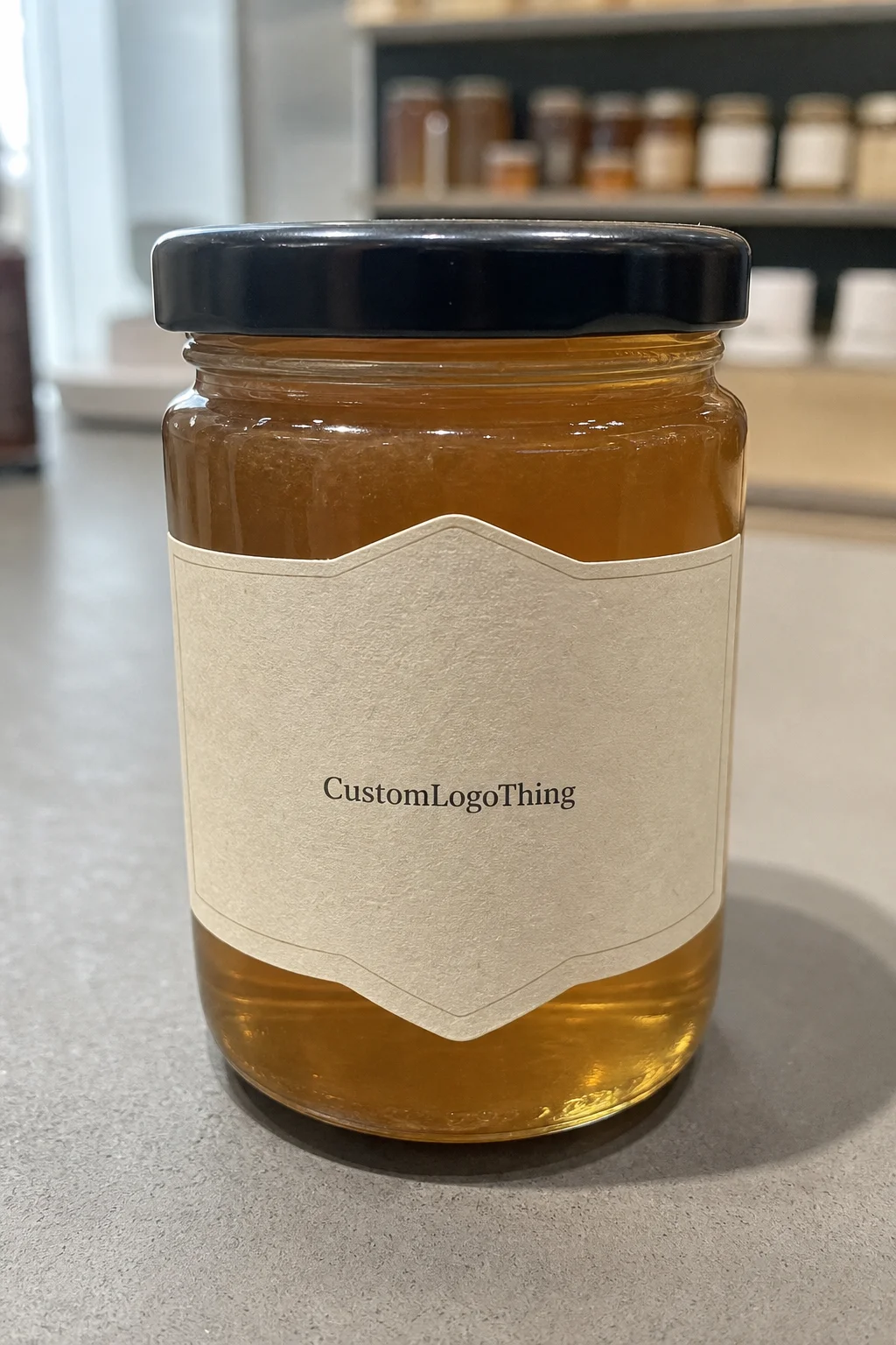
Facestock changes the look right away. Natural kraft-look paper keeps the label in the same visual family as the bag, which usually reads well for bakeries, cafés, and gift packaging. White paper gives stronger contrast and sharper detail, especially for fine type, barcodes, or small legal text. Coated stock improves print clarity and color density, but it can look more commercial and less tactile. On kraft bags, simple artwork often works best because it respects the substrate instead of fighting it.
Adhesive choice is where projects often get under-specified. Permanent adhesive is the default for most bag applications because it stays in place during normal handling and retail use. Removable adhesive has a narrower role: temporary promotions, internal routing, returnable packaging, or places where the label must come off cleanly. Freezer-safe or low-temperature adhesive is only necessary when the label will be applied cold or stored in chilled conditions. If those conditions do not exist, paying for specialty performance is wasted money.
Shape affects both cost and application speed. A rectangle or rounded rectangle is usually the easiest format to produce and apply. Rounded corners help reduce edge lift on bags that are stacked tightly or handled often. Custom die-cut shapes can look distinct, but they add cost and can slow down hand application because workers need to orient each label correctly. That is fine for a premium campaign; it is less useful for a high-volume packing line where speed matters.
Finish should support the design rather than compete with it. Matte is usually the safest choice for kraft because it avoids glare and keeps the label grounded. Gloss can make color pop, but it can also feel disconnected from a natural bag. Varnish helps with scuff resistance. An uncoated finish gives a softer, more paper-forward look, which can work well for brands that want the label to feel closer to the bag itself.
For a practical comparison, this table shows the choices that usually change the quote and the experience in use.
| Option | Typical Use | Approx. Cost Impact | Practical Note |
|---|---|---|---|
| Natural kraft paper, matte finish | Bakeries, cafés, gift bags | Lower to moderate | Best fit for an organic look and simple artwork |
| White coated paper, matte or gloss | Retail packaging with fine type or logos | Moderate | Crisper print, stronger contrast, less rustic appearance |
| Recycled paper stock | Sustainability-led programs | Moderate to higher | Can vary more in texture and surface appearance |
| Permanent adhesive | Most bag applications | Baseline | Best for standard packing and shelf use |
| Low-temperature or freezer-safe adhesive | Cold storage or chilled pack-out | Higher | Only needed when the environment truly demands it |
Cost, Pricing, and MOQ: What Changes the Quote
The quote for custom kraft labels usually comes down to six variables: size, shape, print coverage, stock, adhesive, and quantity. Quantity matters most because setup gets spread over more pieces at higher volume. A run of 5,000 labels nearly always costs more per unit than 25,000 labels, even if the artwork is identical.
For planning, a simple paper label on a kraft-friendly stock might land around $0.08-$0.18 per piece at moderate volume. A more complex contour cut, premium stock, or specialty adhesive can move that closer to $0.15-$0.30 per piece. These are working ranges, not fixed quotes, but they are useful for budgeting before a supplier sends pricing.
MOQ affects more than unit price. It also affects inventory risk. A lower price can still be a bad deal if it forces you to buy far more labels than you will use before the next seasonal change. That is common in retail packaging programs where the artwork changes often or when a label is tied to a short promotion. The cheapest unit cost is not always the smartest buy.
Most savings come from simple decisions:
- Use a standard rectangle or rounded rectangle instead of a custom contour cut.
- Keep the color count low if the design is text-heavy.
- Choose one label size that works across several bag sizes.
- Use one label across multiple SKUs instead of creating a different version for each item.
There are also line items that buyers sometimes miss. Proofs may be included, but physical samples often are not. Rush work, special testing, and premium shipping can all increase the total. If the bag finish is unusual or the surface is recycled and inconsistent, ask for a material sample before approving production. Catching a mismatch at the sample stage is cheaper than reworking a finished order.
If the label order sits inside a broader launch, it can help to align it with the rest of the packaging schedule through Custom Packaging Products. That keeps artwork, quantities, and ship dates from drifting apart.
Process and Timeline: From Proof to Shipment
A realistic schedule starts with spec review. After the buyer sends artwork and bag details, the supplier should confirm the structure, stock, and application method. That step can take a day or two if the information is complete. It takes longer when the bag material is vague, the artwork file is off-spec, or the application method is still undecided.
Proofing follows. This is usually the point where delays show up. If the file needs resizing, text correction, color adjustment, or a die line change, the schedule moves. That is normal. It is also why a clean brief matters. A good proof does more than show the label; it checks whether the label fits the actual bag panel and whether the important elements still read at production size.
Once the proof is approved, production timing depends on material availability and complexity. A straightforward label job can often move in about 10-15 business days after approval. Custom shapes, specialty adhesives, or new tooling can push that longer. Shipping adds another variable, especially during holiday peaks or when the destination is far from the production site.
Rush service can compress some of the timeline, but it does not remove every step. Artwork still has to be approved. Materials still have to be on hand. Special testing still takes time. If the labels support a launch, holiday assortment, or multi-location rollout, build extra time into the plan. The schedule is only useful if it survives the real world.
One simple rule helps avoid problems: do not let the label arrive after the bags. That sounds basic, but it happens often enough to matter. A packaging system works only when the parts arrive in the right sequence and the line has enough time to set up.
Common Mistakes That Cause Wrinkles, Lifts, or Waste
The biggest mistake is sizing by eye. A bag panel that looks large in a design file may be interrupted by folds, seams, gussets, or handles once the bag is in hand. Measure the finished flat panel, not just the nominal bag size. Leave edge clearance so the label does not bridge a crease. Labels that sit too close to a fold tend to lift at the corners sooner.
Skipping a real application test is another expensive error. A label can stick perfectly on a clean sample and still fail on the actual bag because the stock carries dust, recycled fiber variation, or a light coating. If the line runs cold or humid, that difference gets bigger. A bench sample is useful, but it is not a substitute for testing the real combination of bag, adhesive, pressure, and room condition.
Design can create waste too. Small text often disappears on brown kraft stock, especially when ink coverage is light. Low contrast makes logos look muddy. Busy graphics can make the label feel less premium, not more. On kraft, strong typography and enough breathing room usually outperform dense layouts. The label has a very short read time, so clarity matters more than decoration.
Operations can ruin consistency just as fast as bad artwork. If placement rules are not written down, one shift may apply the label low and another may place it high. That creates a run that looks uneven across the shelf. A label is part of package branding, so application discipline matters. The instructions need to be simple enough that a packed team can follow them without guessing.
If the package will travel through shipping channels, consider transit stress too. A bag that only sits on a counter has different requirements from one that gets tossed into cartons and moved through a fulfillment center. Peel testing, handling checks, and plain common sense all help, but the fastest way to confirm performance is still to test the actual bag-and-label combination under real use.
Expert Tips and Next Steps for a Cleaner Spec
Start with contrast. Dark ink on kraft is usually the safest path, especially for logos, product names, and small copy. If the artwork needs a border, keep it thin and purposeful. That helps the label feel deliberate without making it busy. Kraft packaging rewards restraint. The substrate already brings texture; the label should sharpen the message, not drown it.
Request a material sample if the bag finish is unfamiliar. That is the fastest way to see whether the adhesive grabs properly and whether the facestock looks right against the brown tone of the bag. If the line is sensitive, ask for a press proof as well. It costs less than a production correction and gives a better read on how the print behaves on the chosen stock.
Standardizing label sizes is another practical improvement. If one or two formats can cover several SKUs, reorders get easier and application stays consistent. That matters for seasonal programs because the team does not need to relearn placement every time the assortment changes. It also reduces dead stock when the next collection lands and the old art is no longer useful.
The cleanest specs are the ones built around the bag, not just the artwork. Include the finished bag dimensions, surface type, quantity, application method, target ship date, storage conditions, and any temperature concerns. If the order is part of a larger rollout, include the rest of the packaging schedule too. That gives the supplier enough context to Choose the Right paper, adhesive, and finish without guessing.
Used properly, custom kraft labels are a low-waste way to turn plain bags into retail packaging that looks intentional. They add identity without locking a brand into full print. They also leave room for inventory flexibility, which is usually the part that matters most once the packaging starts moving through a real operation.
What size should custom kraft labels be for paper bags?
Measure the finished flat panel on the bag, not just the nominal size, because folds and seams reduce usable space. Leave enough edge clearance so the label does not catch on a crease, handle, or closure fold during packing and use. If the bag is textured or recycled, test one sample before locking the final size.
Will kraft labels stick to recycled or textured paper bags?
Usually, yes, but adhesive choice matters more on recycled or textured surfaces than on smooth paper. A higher-tack or temperature-appropriate adhesive may be needed if the surface has dust, fiber variation, or a light coating. Test pressure, dwell time, and room temperature before approving production.
What affects the price of custom kraft labels the most?
Quantity usually has the biggest effect on unit cost because setup is spread over more labels at higher volume. Size, shape complexity, color count, adhesive type, and finish also change the quote. Rush service, samples, and special performance requirements can raise the total even when the base price looks low.
How long does production usually take for kraft labels?
The schedule usually starts with proof approval, and that step often determines whether the order stays on time. Simple jobs move faster, while custom shapes, special adhesives, or material testing add time to the calendar. Shipping distance and seasonal demand can extend delivery, so build a buffer if the labels support a launch or promotion.
Should I print on the bag instead of using a label?
Printing works well for large, stable runs, but labels are better when artwork changes often or multiple SKUs need flexibility. Labels also reduce inventory risk because standard bags can carry different versions without new bag inventory for each design. If speed, version control, and easier reorders matter, labels are usually the more practical choice.