Buyer Fit Snapshot
| Best fit | Custom Kraft Packaging Labels projects where brand print, material claims, artwork control, MOQ, and repeat-order consistency need to be specified before quoting. |
|---|---|
| Quote inputs | Share finished size, material target, print colors, finish, packing count, annual reorder estimate, ship-to region, and any compliance wording. |
| Proofing check | Approve dieline scale, logo placement, barcode or warning zones, color tolerance, closure strength, and carton packing before bulk production. |
| Main risk | Vague material claims, crowded artwork, missing packing details, or unclear freight terms can make a low unit price expensive after revisions. |
Fast answer: Custom Kraft Packaging Labels: Design, Cost, and Timing should be specified like a repeatable production item. The safest quote records material, print method, finish, artwork proof, packing count, and reorder notes in one written spec.
Production checks before approval
Compare the actual filled-product size with the drawing, then confirm tolerance on folds, seals, hang holes, label areas, and retail display edges. Reserve space for logos, QR codes, warning copy, and material claims before decorative graphics fill the panel.
Quote comparison points
Review material grade, print process, finish, sampling route, tooling charges, carton quantity, and freight assumptions side by side. A quote is only useful when the supplier can repeat the same color, closure quality, and packing count on the next order.
Custom Kraft Packaging Labels: Design, Cost, and Timing
Plain kraft packaging has a kind of blunt honesty to it. Left untouched, though, it can also read as unfinished, like the package is still waiting for its last step. A well-made label changes that quickly, and custom kraft packaging labels are often the simplest way to turn a basic mailer, box, or pouch into packaging that feels intentional, branded, and ready for a customer’s hands. The brown surface is part of the charm, but it also changes how color, contrast, and readability behave, so the label has to do more work than it would on white stock.
That is why custom kraft packaging labels matter so much for brands that want flexibility without committing to a full custom print run on the package itself. They can carry product names, shipping details, ingredients, seasonal promotions, and compliance copy while the underlying package stays simple. In practice, a good label on kraft often does more for presentation than a busy full-color treatment fighting against the material underneath it.
Most buyers want the same three things: a label that looks good, a price that makes sense, and a lead time they can actually plan around. The good news is that custom kraft packaging labels can usually deliver all three when the size, stock, adhesive, and artwork are chosen with the real package in mind instead of guessed at the last minute. That part sounds obvious, but in my experience it is exactly where a lot of packaging jobs go sideways.
Practical rule: on kraft stock, the label has to carry both the message and the contrast. If the type is too light, the finish too glossy, or the shape too busy, the package looks less premium, not more.
What Custom Kraft Packaging Labels Are
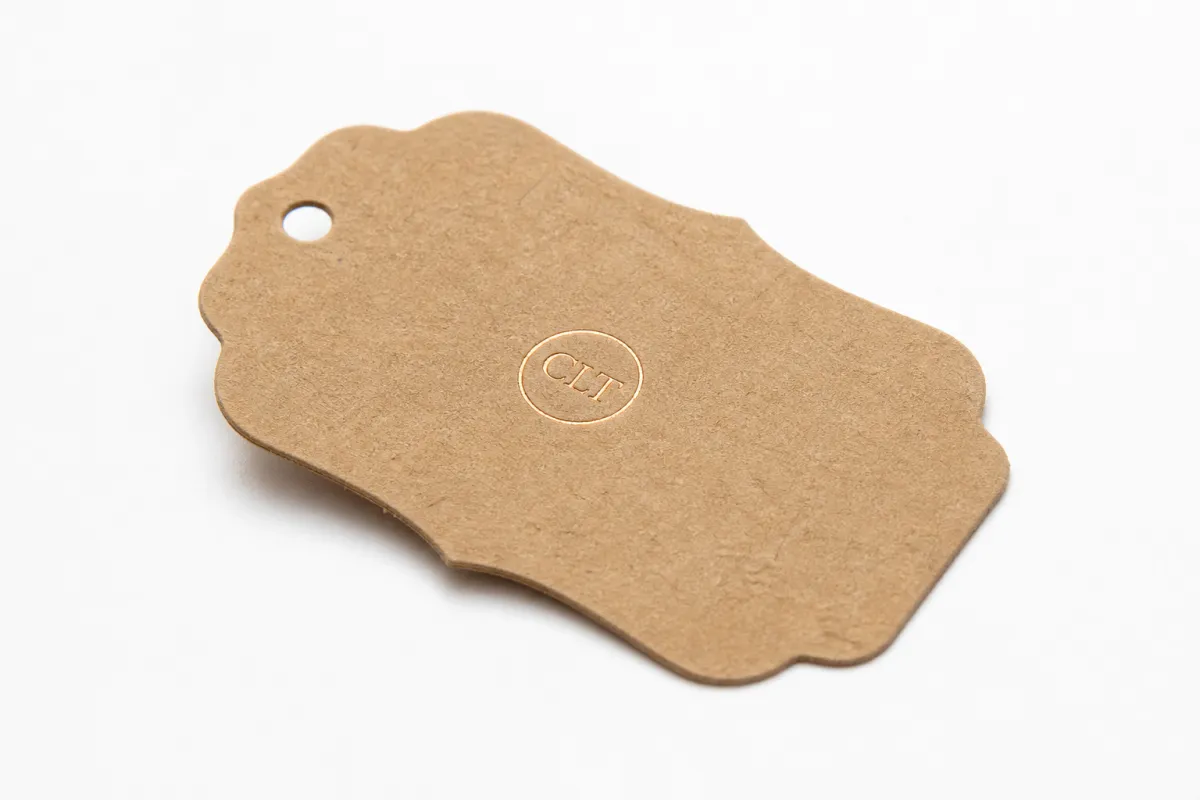
Picture a plain kraft mailer sitting on a table before the label goes on it. It has texture, yes, and a pleasant recycled feel, but it still reads like a blank working surface. Once a label lands in the right spot, that same box or pouch starts to feel like branded packaging with purpose. That is the real value of custom kraft packaging labels: they give a package identity without forcing the whole package to carry the print load.
Kraft stock brings a natural brown tone, visible fiber pattern, and a warmer visual temperature than white paper. That changes every design decision. Dark inks usually hold up better than pale ones, thin lines can disappear, and muted colors need enough contrast to stay legible at arm’s length. A design that looks refined on a bright white label can look faded on kraft, which is why custom kraft packaging labels need to be built for the substrate rather than simply placed on it.
These labels do more than decorate. Brands use them for product names, shipping marks, batch codes, ingredient callouts, warning icons, QR codes, and seasonal messages. On Custom Packaging Products, labels often sit beside cartons, mailers, and inserts, and they are frequently the fastest way to update artwork without reprinting every box. That kind of flexibility matters for small launches, limited runs, and fast-moving retail packaging programs.
One detail gets overlooked often: a small, well-placed label with a clean shape and a matte finish can look more premium than a large, full-color treatment that competes with the kraft surface. Kraft already brings texture and warmth, so the label does not need to shout. It needs to frame the design and give the eye a clear place to land. In that sense, custom kraft packaging labels are often a stronger brand move than a more expensive full-package print job.
From a buyer’s point of view, the appeal is straightforward. You get lower setup costs than full custom printing, easier reorders, and the ability to change details like SKU names or seasonal copy without redesigning the entire package. For companies testing new products, building a farm-to-shelf look, or refreshing package branding for a retail line, custom kraft packaging labels are a practical middle ground between plain stock and fully printed packaging.
How Custom Kraft Packaging Labels Work
The basic workflow is simple, but the details matter. First, you choose the label stock, adhesive, size, and finish. Then the artwork is prepared to fit the label shape and the kraft background. After proof approval, the labels are printed, cut or kiss-cut if needed, inspected, and shipped in rolls, sheets, or stacks depending on the application method. That is the everyday path for custom kraft packaging labels, whether they are being applied by hand or through a semi-automated line.
There are three broad material paths. Paper labels are common because they feel natural and are easy to print at a reasonable cost. Film labels, such as polypropylene or polyester, bring more moisture resistance and better durability, which can matter on cold storage, handled shipping packs, or products that may see condensation. Textured options can add a more tactile, artisan feel, especially when the label is part of a handcrafted retail presentation. With custom kraft packaging labels, the finish choice usually depends on whether the goal is rustic warmth, a cleaner retail presentation, or extra durability.
Adhesive selection is not a side note. It is one of the decisions that makes or breaks the job. A permanent adhesive works well for shipping boxes, retail cartons, and packages that should stay labeled for the life of the product. A removable adhesive is better when the label needs to come off cleanly later. Freezer-safe or high-tack adhesives are useful for harder environments, while tamper-evident construction adds another layer of security. On rough recycled stock, dusty corrugate, or curved jars, the wrong adhesive can cause lifting at the edges, and custom kraft packaging labels will look sloppy even if the print is beautiful.
Shape and size affect both appearance and workflow. A rectangular label makes barcode placement easier and usually wastes less material. A circle or custom die-cut shape can feel more premium, but it may also slow application slightly and reduce usable print area. For corrugated boxes, mailers, jars, and folded cartons, the label size should support hierarchy: logo first, product name second, details third. That structure keeps custom kraft packaging labels readable even when the package is stacked on a shelf or moving through fulfillment.
Artwork needs to be built around the brown background from the start. Bold type, dark inks, simple icons, and restrained line weights tend to hold up best. Light beige, pale gray, and delicate script can disappear on kraft, especially under store lighting or during mobile scanning. If a brand uses custom kraft packaging labels as part of broader packaging design, the label should be tested against the actual box, pouch, or mailer, not just viewed in a design file on a bright monitor. I have seen plenty of “perfect” layouts fall apart once they hit the real material.
Custom Kraft Packaging Labels: Process and Timeline
The production path for custom kraft packaging labels usually starts with discovery. That is where the label size, application surface, quantity, and use case get defined. A shipping label on a corrugated mailer needs a different adhesive and durability profile than a product label on a folded carton. If the package will sit in humid storage or pass through refrigerated handling, those conditions should be documented early. Clear specs save time later, and they prevent expensive rework after proofing has already started.
- Discovery and spec review: confirm the packaging surface, label size, application method, and target quantity.
- Artwork prep: set the dieline, bleed, type size, barcode quiet zone, and any special finishes.
- Proofing: review a digital proof or a sampled physical proof for layout, copy, and color intent.
- Print setup: prepare the press, plates if needed, and finishing equipment.
- Production and inspection: print, cut, check registration, and verify adhesion and trim quality.
- Packing and shipping: stage rolls or sheets for the application line, then freight the order.
Where do delays happen? Usually in the same three places. First, the dieline is incomplete or the wrong size. Second, color expectations were never documented, so the proof looks “off” even though it matches the file. Third, the artwork needs revision because the copy is too small, the logo is not high enough resolution, or the barcode cannot be scanned reliably. These are common issues with custom kraft packaging labels, and they are almost always avoidable with a cleaner brief.
Lead time depends on quantity and complexity. A simple digitally printed run may move quickly once the proof is approved, while a larger order with specialty adhesive, a custom die, or a layered finish needs more room in the schedule. For a lot of projects, 12 to 15 business days from proof approval is a realistic production window, with freight added on top. If the labels are needed for a launch, it helps to build a buffer, because custom kraft packaging labels often depend on the fastest part of the process being the part the client controls: proof approval.
Sampling is worth the time. A digital mockup can show layout, but it cannot tell you how a matte label behaves on rough kraft, how a logo reads across a fold, or whether the adhesive grabs properly on recycled stock. A physical sample catches those issues early, which is especially helpful for custom kraft packaging labels used across multiple SKUs. The more variable the packaging system, the more valuable that sample becomes.
If the labels are being used for shipping performance rather than just shelf appearance, it is smart to reference industry test methods and not guess. The ISTA test standards are a useful benchmark for package transit expectations, especially if the labels must survive abrasion, handling, or repeated movement through fulfillment. For brands that also care about forestry sourcing on other packaging components, the FSC system can help clarify certified paper options and chain-of-custody expectations.
Custom Kraft Packaging Labels: Cost and Pricing Factors
Pricing for custom kraft packaging labels is usually driven by five main variables: size, quantity, material, adhesive, and finishing. A bigger label consumes more substrate, a higher quantity spreads setup costs over more pieces, and specialty materials or adhesives add cost because they are either more expensive to source or more demanding to run. If the label has a custom shape, extra lamination, metallic ink, or a heavy coverage area, the price moves up again. That is normal, and it is why quote comparisons need context rather than a single line number.
Volume matters a lot. At small quantities, setup and proofing are spread across fewer pieces, so the unit price is naturally higher. As the run gets larger, the price per label usually drops. That does not mean the largest run is always the best choice. If the product is seasonal, if the artwork may change, or if the package line is still being tested, smaller custom kraft packaging labels runs often make more sense because they reduce inventory risk and keep the brand flexible.
Standard sizes are usually easier on the budget than fully custom dimensions. The difference may seem minor on paper, but a slightly larger label can create more waste on press and take longer to apply by hand. A simple 3 x 2 inch rectangle can be economical for a logo and SKU, while a shaped 4 x 4 inch label with a cutout may demand more material and handling. For custom kraft packaging labels, size should follow the artwork and application method, not the other way around.
Here is a practical comparison many buyers find useful. Prices are indicative ranges for a 5,000-piece run, and they will move with print coverage, adhesive, and supplier setup, but they give a realistic starting point for planning custom kraft packaging labels.
| Label Option | Best Use | Typical Cost at 5,000 | Notes |
|---|---|---|---|
| Matte paper label | Retail boxes, pouches, mailers | $0.06-$0.10 each | Natural look, good for simple branding and moderate coverage |
| Textured paper label | Artisan, handmade, premium packaging | $0.09-$0.14 each | Better tactile feel, usually less ideal for fine detail |
| Matte film label | Moisture exposure, handling, longer shelf life | $0.08-$0.13 each | More durable, cleaner edge quality, less paper-like |
| High-tack adhesive label | Rough kraft, recycled corrugate, curved surfaces | $0.07-$0.12 each | Adhesion matters more than appearance on difficult stock |
| Custom die-cut label | Distinct package branding, premium presentation | $0.10-$0.18 each | More tooling and setup, strongest visual identity |
Quotes should be compared apples to apples. Ask whether art support is included, whether proofs are part of the price, whether shipping is separate, and whether a reprint allowance exists if the first run has a print defect. For custom kraft packaging labels, a slightly lower unit price can become more expensive if the quote leaves out finishing or freight. I would rather see a clear line-by-line estimate than a headline number with half the job hidden in the fine print.
One more thing: application method affects labor cost, even if the label price looks attractive. If your team applies labels by hand across several SKUs, a label that takes two extra seconds per unit can add up fast. On 10,000 pieces, that difference is not trivial. Good custom kraft packaging labels should be priced alongside the labor they save or consume, especially in retail packaging and fulfillment-heavy programs.
Step-by-Step Guide to Choosing the Right Labels
Start with the packaging surface, because the substrate drives the rest of the decision. Corrugated boxes, coated paperboard, glass, and poly mailers all behave differently. Kraft mailers are often slightly rough, which means adhesive choice and label flexibility matter more than they would on a smooth carton. If the surface is dusty, recycled, or curved, custom kraft packaging labels need a stronger bond and a layout that tolerates a little distortion.
Next, decide what the label must do. A product label may need a logo, name, net contents, ingredients, barcode, and a color cue for the SKU family. A shipping label may need only basic routing data and a brand mark. A seasonal sticker may be mostly decorative. The right size follows the job. If the label is too small, the hierarchy gets crowded. If it is too large, it can overpower the kraft surface. Good custom kraft packaging labels leave enough room for the eye to move through the information in a sensible order.
Then choose the finish. A matte finish usually feels more natural on kraft and fits well with eco-conscious or handcrafted positioning. A soft gloss or subtle film finish can work if the brand wants a cleaner retail presentation. Textured materials can add depth, but they are not always the right choice for fine type or barcodes. In many cases, the most effective custom kraft packaging labels are the ones that quietly support the package instead of competing with it.
Color and contrast deserve a separate check. Brown stock absorbs and changes how certain colors appear. A warm gray, pale tan, or soft green can disappear faster than expected, while deep black, dark green, navy, and rich burgundy usually perform better. If the artwork includes a barcode or QR code, make sure the contrast is high enough to scan cleanly. That is especially true for custom kraft packaging labels used on retail packaging where speed at checkout matters.
A proof checklist saves a lot of trouble. Before approving a run, confirm the dimensions, bleed, trim line, copy, barcode quiet zone, application direction, and how the label will sit on the package. I also recommend checking the label against an actual production sample of the box or pouch, not just a render. A package can look perfect in a file and still feel off once the label is on the real substrate. That is why custom kraft packaging labels deserve a physical signoff whenever possible.
If you are building a larger packaging system, it helps to keep the label spec consistent across the line. A master spec sheet can live beside your Custom Labels & Tags orders so every reorder uses the same width, stock, adhesive, and finish. That consistency becomes even more valuable if you also run Custom Printed Boxes, because the label and box should look like they belong to the same family, not two separate design ideas.
Common Mistakes With Kraft Labels
The biggest mistake is assuming every adhesive works on every kraft surface. It does not. Rough recycled stock, dusty corrugate, curved jars, and low-energy films all behave differently. If the label lifts at the corners or slips after application, the whole package looks rushed. That is why testing matters so much for custom kraft packaging labels. A quick sample on the real packaging is worth more than a lot of design debate.
- Weak contrast: light inks and thin type can vanish on brown stock, especially under store lighting.
- Tiny copy: small text can become unreadable once the label is applied to a curved or textured surface.
- Wrong finish: a glossy label can feel out of place on a rustic package line.
- Slow application: shaped labels or awkward sizing can create labor bottlenecks during packing.
- No physical sample: approving art without a test piece hides problems until production is already underway.
Another common problem is overdesign. Some labels try to do everything at once: logo, pattern, story copy, ingredients, QR code, social icons, and promotional text. On kraft, that can become muddy very quickly. The brown background already adds visual texture, so the label needs more restraint, not less. The strongest custom kraft packaging labels usually have a clean hierarchy and one clear reason for existing.
Labor gets underestimated all the time. A label that looks easy to apply can become a bottleneck when the team is doing thousands of units by hand. If each application takes just a few extra seconds, that adds real hours across a production day. This matters for launch kits, subscription boxes, and seasonal retail packaging, where custom kraft packaging labels may need to be applied across several SKUs at once.
There is also a tendency to skip the application direction check. That sounds small, but the orientation of a label on a mailer flap, carton lid, or pouch seam changes how the brand is read. If the package is opened from one side and the label is applied from another, the hierarchy can feel backward. Good custom kraft packaging labels are not just visually right; they are physically right for how the box or pouch is handled. That sort of thing sounds minor until a stack of finished packs lands on the packing bench and everybody notices the mismatch at once.
Expert Tips and Next Steps
If you are starting a new package line, order a small test batch first. A sample proof or short run can reveal whether the adhesive grips, whether the finish suits the kraft tone, and whether the artwork survives real handling. I would rather catch those issues on 200 labels than 20,000. For custom kraft packaging labels, early testing is often the cheapest insurance you can buy.
Build a simple spec sheet and keep it with the order history. Include label dimensions, substrate, adhesive, finish, application method, target quantity, storage conditions, and desired lead time. That way, your reorder is not dependent on memory or screenshots. A clean spec sheet is especially useful if your product packaging changes through seasons or if multiple people place orders for the same line of custom kraft packaging labels.
Keep one master design where possible. Then create SKU variations by changing text, color accents, or batch information rather than rebuilding the artwork from scratch every time. That approach lowers the chance of errors and makes reprints faster. It also supports brand consistency across branded packaging, especially if labels are paired with inserts, shipper marks, or custom printed boxes.
Confirm storage and handling conditions before the labels arrive. Heat, humidity, and dust can affect adhesive performance and edge cleanliness. If labels will sit in a warehouse for a few weeks, ask about shelf life and recommended storage temperature. For custom kraft packaging labels, even a perfect print run can be undermined if the rolls are stored badly or exposed to moisture before application.
Here is a simple action checklist I recommend:
- Audit the current box, mailer, or pouch surface.
- Define the label’s job: brand, shipping, ingredients, promotion, or compliance.
- Request a quote with quantity, finish, and adhesive clearly stated.
- Review the proof on the actual package, not only on-screen.
- Approve the sample before full production.
- Plan the next reorder before the first one is gone.
If you are building out a broader sourcing plan, it helps to review all the pieces together instead of treating the label as a separate purchase. Labels, cartons, mailers, tapes, and inserts should work as one system. That is the difference between a package that merely closes and a package that feels intentional from first touch to unboxing. For that reason, custom kraft packaging labels should be treated as part of the whole packaging design, not an afterthought slapped on at the end.
Frequently Asked Questions
How do custom kraft packaging labels differ from white labels?
Custom kraft packaging labels are designed around a brown, textured substrate, so contrast and finish matter more than they do on white stock. White labels usually reproduce bright colors more cleanly, while kraft labels create a warmer, more natural look that fits handmade, eco-conscious, or rustic branding. The tradeoff is that some pale colors and fine details lose visibility faster on kraft.
What affects the cost of custom kraft packaging labels the most?
The biggest cost drivers are quantity, size, material, adhesive, and finishing. Custom shapes, heavy ink coverage, textured papers, and high-tack adhesives can all raise the unit price. Smaller runs of custom kraft packaging labels also cost more per piece because setup and proofing are spread across fewer labels.
How long does the process usually take for custom kraft packaging labels?
Timeline depends on artwork readiness, proof approval, quantity, and print method. Simple digital jobs can move quickly once the file is ready, while larger or more complex runs need more lead time. Fast proof approval and clear specs usually shorten the schedule for custom kraft packaging labels more than anything else.
What adhesive should I use for kraft packaging labels?
A permanent adhesive is common for shipping and retail packaging that needs to stay in place. A removable adhesive is better if the label may need to come off cleanly later. For rough or low-energy surfaces, choose a higher-tack option, because custom kraft packaging labels have to bond to the real packaging surface, not just the ideal one.
Can I order a small quantity of custom kraft packaging labels?
Yes, many suppliers offer lower MOQ options, especially for digitally printed work. Small orders are useful for launches, seasonal programs, or testing a new package format. The tradeoff is usually a higher unit price, but custom kraft packaging labels in small quantities can still be the smartest choice if you want flexibility and lower inventory risk.
If you want the short version, keep the design clean, test the adhesive on the actual surface, and treat the label as part of the whole package system. That is how custom kraft packaging labels stay practical, good-looking, and cost-aware at the same time. Get those three pieces right, and the rest usually falls into place without much drama.

