Buyer Fit Snapshot
| Best fit | kraft sleeve box programs that need sleeve tolerance, logo proofing, and repeatable retail fit where brand print, material, artwork control, and repeat-order consistency matter. |
|---|---|
| Quote inputs | Share finished size, material target, print colors, finish, packing count, annual reorder estimate, and delivery region. |
| Proofing check | Approve dieline scale, logo placement, barcode or warning zones, color tolerance, and any recyclable or compostable wording before bulk production. |
| Main risk | Vague material claims, crowded artwork, or missing packing details can create delays even when the unit price looks attractive. |
Fast answer: Custom Kraft Sleeve Boxes with Logo: Sleeve Fit, Board Grade, and Print Proof should be specified like a repeatable production item. The safest quote includes material, print method, finish, artwork proof, carton packing, and reorder notes in one written spec.
What to confirm before approving the packaging proof
Check the product dimensions against the actual filled item, not only the sales mockup. Ask for tolerance on folds, seals, hang holes, label areas, and retail display edges. If the package carries a logo, QR code, warning copy, or legal claim, reserve that space before decorative graphics fill the panel.
How to compare quotes without losing quality
Compare board or film grade, print process, finish, sampling route, tooling charges, carton quantity, and freight assumptions side by side. A lower quote is only useful if the supplier can repeat the same color, closure quality, and packing count on the next order.
Custom Kraft Sleeve Boxes With Logo: A Practical Sustainable Guide
Custom kraft sleeve Boxes with Logo can do something many packaging formats cannot: they make a product feel intentional without shouting for attention. That works because people judge packaging in layers. Texture lands first. Fit lands second. Graphics come after that, and often much later than brands expect. A sleeve gives the logo a defined place, frames the product, and keeps the design focused.
That restraint matters for brands trying to balance shelf presence, freight efficiency, and material use. A sleeve usually uses less board than a full printed carton, ships flat, and can make unboxing feel cleaner. It can support branded packaging that feels considered rather than crowded. Candles, cosmetics, apparel, specialty food gifts, and premium ecommerce kits often benefit from that quieter approach. The package still has personality; it just does not spend all of it at once.
Most packaging buyers want the same two things: protection and presentation. Sleeve packaging is one of the few formats that can deliver both without adding much visual noise or unnecessary bulk.
The tradeoff is simple. A sleeve is not a cure-all. It works best when the product already has a solid inner carton, tray, or insert. If the structure underneath is weak, the sleeve cannot rescue it. That distinction is where good packaging decisions usually start.
Below, the focus stays on how the format is produced, what changes price, which materials actually behave well on kraft stock, and where brands tend to make avoidable mistakes. If you are comparing custom printed boxes, trying to lower packaging waste, or improving package branding, the details should help you ask better questions before you place an order.
What Are Custom Kraft Sleeve Boxes With Logo?
A kraft sleeve is an outer wrap that slides around a tray, carton, or rigid box. Think of it as the visible layer that ties the pack together. The sleeve carries the branding, product name, and sometimes a regulatory panel or short product story. The inner structure does the heavy lifting. That division of labor is what makes the format so useful.
For products with a natural or understated look, the effect can be strong. A candle in a glass jar, a soap bar in a paperboard insert, a compact clothing set, or a specialty snack pack often reads better with a restrained kraft sleeve than with a glossy full-coverage box. The material feels direct. The brand message stays legible. And because there is less artwork fighting for space, the product itself can take center stage.
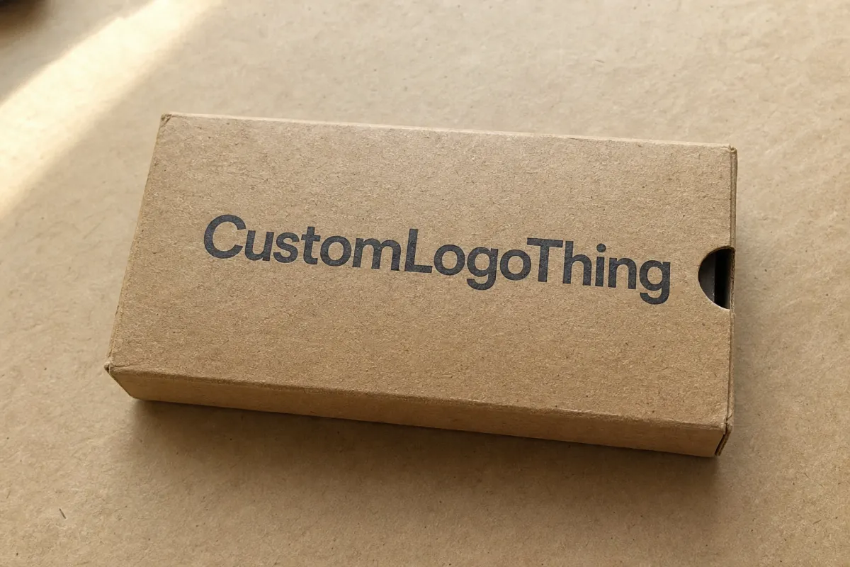
There is also a practical design reason to choose sleeves. The visible surface is smaller, which forces better editing. That is a strength, not a limitation. One logo, one short line, and one finish choice can do more than a crowded front panel covered in claims. On kraft stock, simplicity usually prints with more authority than over-explaining does.
Logo placement becomes especially important on brown board. Dark ink, a single spot color, or an embossed mark can look grounded and premium. Thin strokes and pale neutrals are a different story. They can disappear into the fiber texture. If the brand identity depends on delicate detail, the logo may need a bolder version for kraft applications.
There is a sustainability case here too, but it should be handled honestly. A sleeve often uses less board than a full custom printed carton, and in many projects that reduces material weight. That does not automatically make the package sustainable. Finish systems, adhesives, coatings, windows, and mixed materials all change the picture. The sleeve can still be the better choice, but only if the full spec supports the claim.
In practice, custom kraft sleeve Boxes with Logo work best when the product already has a stable internal pack. They work less well when the sleeve is expected to solve sizing, protection, or merchandising problems on its own. Fragile, heavy, or awkwardly shaped products still need structural engineering first. The sleeve comes after that decision, not before it.
How custom kraft sleeve boxes with logo Are Produced and Delivered
The production flow looks straightforward from the outside. In reality, every stage has its own chance for delay. A sleeve project usually begins with a brief: product dimensions, box style, artwork files, order quantity, and the finish the brand wants. From there, the supplier checks the dieline, confirms print placement, and prepares a proof. If the structure is custom, tooling may need to be prepared before full production starts.
- Brief and measurements: The supplier needs the exact outer dimensions of the tray or carton, not just the product size. Even a small mismatch can create a sleeve that drags, bows, or rattles.
- Dieline setup: The flat layout defines bleed, fold lines, glue areas, and safe zones for the logo, barcode, and copy.
- Artwork proofing: The printer checks color build, barcode clarity, line thickness, and how ink will sit on brown kraft stock.
- Sampling or prototype: For launches that matter, a sample helps confirm slide fit, shelf presence, and how the sleeve interacts with the inner carton.
- Printing and finishing: The board is printed flat, then die-cut, creased, and folded. Depending on the design, it may be embossed, foil-stamped, spot UV coated, or left natural.
- Packing and shipment: Sleeves are usually shipped flat to save space, which lowers freight volume and makes storage easier.
Lead time depends on how much custom work the job needs. A straightforward sleeve with a one-color print and an existing dieline can sometimes move from proof approval to shipment in roughly 10 to 15 business days, depending on plant capacity and routing. Add a custom size, sample approval, or specialty finish, and the schedule often expands to 3 to 5 weeks. If the order needs new tooling, unusual board, or several proof rounds, the window can stretch further.
The biggest delays are usually ordinary, not mysterious. Artwork revisions, missing dimensions, late finish decisions, and sample approvals that sit untouched for days cause more trouble than the press itself. In packaging procurement, “fast” and “ready to ship” are not the same thing. A supplier may be ready to print, but if the logo still needs correction or the carton size is still under discussion, the job stops there.
Assembly should stay on the radar as well. Sleeve boxes are often applied during packing, so the fit has to suit the labor process. If the sleeve is too tight, operators fight it. If it is too loose, it can shift during transit. The right design considers both the visual result and the speed of the packing line. That is where many mockups fall short.
For brands working around a launch date, it helps to ask for a schedule that separates proofing, tooling, manufacturing, and shipping. That makes the real bottleneck visible. More often than not, the delay comes from decisions, not machinery.
When sustainability claims are part of the brief, ask how the board and finishing system affect disposal. The EPA recycling basics page is a useful reference for understanding how consumers encounter recycling instructions and why add-ons can change the outcome. Paper fiber may be recyclable, but foil laminations, plastic windows, and hard-to-separate coatings can complicate the picture quickly.
Material, Print, and Structural Factors That Matter
Material choice is where many sleeve projects quietly succeed or fail. Kraft is not a single stock; it is a group of board options with different fiber content, surface texture, and print behavior. Virgin kraft board usually gives a cleaner surface and more consistent strength. Recycled kraft can support a lower-impact story, though color variation may be greater from batch to batch. Coated kraft sharpens print detail, while uncoated kraft preserves the raw texture many brands want.
For most products, the choice starts with weight and handling. A lightweight soap bar or candle sleeve may use 14pt to 18pt kraft board or a similar paperboard weight. A heavier retail set may need thicker board or a more rigid inner carton so the sleeve is not asked to hold shape on its own. The sleeve should feel snug enough to stay in place, but not so tight that it scuffs corners or wrinkles during assembly.
Printing on kraft stock has its own logic. A four-color image that looks crisp on white SBS board may soften on brown kraft. That is not a defect. It is what the substrate does. If the logo relies on fine detail, it may need heavier strokes, higher contrast, or a simplified version. Black, charcoal, deep green, and dark brown often perform well. Pale neutrals, light gray lines, and hairline type can vanish into the paper.
Several print methods are worth comparing:
- Flexographic printing: useful for simpler artwork and longer runs, with efficient setup on repeat jobs.
- Offset printing: better for higher-resolution graphics, layered brand elements, and tighter color control.
- Foil accents: helpful when a logo needs emphasis, though foil can raise cost and make recycling claims harder to support.
- Embossing or debossing: ideal when tactile branding matters more than heavy ink coverage.
Structure matters just as much as print. A sleeve with the wrong friction level can cause problems during packing and shipping. If the inner carton has a very smooth surface, the sleeve may slide too easily unless the fit is adjusted. If the carton is oversized or the sleeve panel dimensions are off, corners can buckle. Those defects may be tiny on screen and obvious in a warehouse.
A good sleeve also respects movement. If a customer opens the box and the sleeve catches, tears, or drags on the edge of the inner carton, the package feels cheap even if the print is beautiful. That is one reason experienced buyers ask for a physical sample before approval. On a shelf, the difference between “snug” and “annoying” can be a millimeter.
Finishing choices should follow the brand promise. A matte uncoated sleeve communicates a natural, tactile feel. A soft-touch coating can create a more luxurious first touch, but it may complicate recyclability claims or add cost. Spot UV on kraft can create contrast, though it usually works better on a small area than across the whole sleeve. If the brand wants an eco-luxury expression, restrained embossing and strong typography usually age better than decorative effects stacked for attention.
Fiber sourcing can matter too. If you need a chain-of-custody claim or want to reference responsibly sourced fiber, review the standards at FSC. Certification does not make a package sustainable by itself, but it does give procurement teams a clearer paper trail. Buyers often underestimate how much confidence comes from documentation that is current, specific, and easy to verify.
When material, print, and structure line up, the sleeve does its job quietly. It adds branding, supports product packaging, and keeps the visual language focused. That is usually a better outcome than a box that tries to prove everything at once.
Cost, Pricing, MOQ, and Quote Factors
Pricing for sleeve packaging is not mysterious, but it is easy to misread. Buyers often compare two quotes that look similar on the surface and miss the details that changed the economics. Board grade, size, print coverage, die complexity, finishing, and order quantity all matter. Shipping destination matters too, especially if the job is time-sensitive or moving on a palletized freight lane.
A smaller run almost always costs more per unit because setup work is spread across fewer boxes. That is the core MOQ logic. If a project needs new tooling, proofing, and a custom dieline, the fixed costs do not disappear just because the order is smaller. They simply get divided by fewer units. A 1,000-piece order is not a failure; it is just less efficient than a 5,000-piece order when the same setup is involved.
Below is a practical comparison to set expectations. The numbers are typical ranges, not guarantees. Final cost depends on dimensions, color count, finish, and freight.
| Option | Typical MOQ | Approx. Unit Price | Best For | Main Tradeoff |
|---|---|---|---|---|
| Simple kraft sleeve, one-color print | 1,000-3,000 | $0.18-$0.38 | Soap, candles, small ecommerce sets | Limited decoration, best with strong logo design |
| FSC kraft sleeve, two-color offset print | 3,000-5,000 | $0.28-$0.58 | Retail packaging, premium everyday goods | Slightly higher setup, better print fidelity |
| Embossed or foil-accent sleeve | 5,000+ | $0.55-$1.20 | Gift sets, launch programs, upscale product packaging | Higher cost and more finish planning |
| Sleeve plus insert or window feature | 5,000+ | $0.65-$1.40 | Fragile items, display-driven retail packaging | More components, more assembly time |
There is a reason one-color sleeves are so common: they can be visually disciplined and economical at the same time. For many brands, a dark logo on kraft is enough. Once the design starts asking for multiple finishes, the budget rises quickly. Spot foil, special inks, and lamination do not only add material cost; they also add production time and approval steps.
Quote accuracy improves when the request includes the right information. A strong RFQ should list the exact outer dimensions, product weight, preferred board type, print colors, artwork format, quantity, shipping address, and desired delivery window. If the brand also needs retail-ready boxing or nested packing, say so early. Those details affect labor assumptions, and labor is often where packaging costs move the most.
Cost and sustainability are linked, but not in a simplistic way. Using less material can lower spend, yet the cheapest sleeve is not always the right one if it compromises fit or shelf appeal. A box that tears during assembly or looks weak in store can cost more in lost credibility than it saves in board. Smart procurement treats the sleeve as part of the product experience, not just a line item.
If you are comparing suppliers, ask for a base quote, a low-finish quote, and a premium version side by side. That comparison makes the tradeoffs visible. Often, the jump from “simple” to “premium” is not just a few cents; it is a different packaging strategy altogether. That is useful information, because it tells you whether the brand is choosing among variants or quietly choosing among business models.
Step-by-Step Guide to Ordering the Right Sleeve
The safest way to order sleeve packaging is to start with the product, not the artwork. Measure the item, confirm the inner carton or tray, and define the packing sequence before design begins. If the sleeve has to wrap a box that is still changing, the packaging brief will drift. That usually leads to reproofing and avoidable delay.
- Measure the actual packaged product: Use the outer dimensions of the tray or carton, not the product alone. Account for closures, flaps, inserts, and any irregular corners.
- Define the sleeve's job: Decide whether the sleeve is mostly for branding, tamper indication, merchandising, product grouping, or a combination of those tasks.
- Choose the material and finish: Pick a kraft grade, ink system, and finish that match the brand tone and the handling environment.
- Plan the artwork around print reality: Build in bleed, safe zones, barcode space, and high-contrast logo placement. Brown kraft needs stronger contrast than white board.
- Request a sample or prototype: This is especially useful when the fit has to be precise or the sleeve must align with a printed carton underneath.
- Confirm production and freight details: Approve the timeline, quantity, carton packing method, and shipping arrangement before the run begins.
Artwork is where many brands overcomplicate things. A sleeve is small. Every extra phrase, icon, or pattern competes with the logo. Strong packaging design usually benefits from one focal point, one supporting message, and room to breathe. If a customer can understand the product in three seconds, the layout is probably working. If the sleeve needs a paragraph to explain itself, it probably needs editing.
It also helps to think about the user journey. Will the customer remove the sleeve before opening the package? Will the sleeve stay on the shelf while the product is displayed? Will retail staff need to scan a barcode on the outer wrap? Those questions affect panel layout, glue tabs, and even how the pack is nested. A sleeve can be attractive and still fail if it ignores how the box gets handled in real life.
For launches that matter, sampling should not be skipped. A good prototype reveals things renderings hide: corner crush, print contrast, slide resistance, and how the natural kraft tone changes the final color. If the sleeve is meant to sit on a shelf with other custom printed boxes, the sample also helps you judge whether the tone reads premium or merely plain.
When the sleeve sits inside a broader sourcing program, keep the process organized by tying it back to your larger custom packaging workflow. If you are comparing structures, sizes, or finishing options, our Custom Packaging Products page is a useful place to see how different formats fit into a single packaging plan.
One operational detail gets overlooked more often than it should: store finished sleeves flat in a dry area with stable temperature and modest humidity. Kraft board can pick up waves if it is stacked badly or kept too close to moisture. That may sound minor, but a slightly warped sleeve slows packing and lowers perceived quality. Packaging that is easy to assemble is more valuable than packaging that only looks good in a rendering.
Common Mistakes Brands Make With Kraft Sleeve Packaging
The first mistake is visual overreach. Kraft stock already has character, so brands sometimes add too much copy, too many colors, or dense graphics that fight the material. The result is not premium. It is crowded. A sleeve should work with the substrate, not against it. Bold typography and a restrained layout usually carry more authority than a busy composition.
The second mistake is ignoring dimensional drift. If the inner carton changes during product development, the sleeve spec has to change with it. A half-millimeter difference can matter once board thickness, fold lines, and assembly pressure enter the picture. A sleeve that looked perfect in a mockup can loosen after a few runs if tolerance stack is not managed carefully.
The third mistake is weak contrast. Pale colors can vanish on brown kraft, and fine lines can fill in or disappear depending on the print method. This becomes a problem when brands use the same logo system they would use on white corrugate or coated paperboard. Brown stock needs stronger choices. It rewards decisive design and punishes indecision.
The fourth mistake is making sustainability claims faster than the package can support them. A sleeve may be paper-based, but the finishing system still matters. Heavy lamination, plastic windows, mixed-material inserts, and hard-to-separate adhesives can limit recyclability. That does not mean those features are forbidden. It means the brand should know exactly what it can and cannot claim.
The fifth mistake is forgetting production realities. A sleeve can look excellent in renderings and still slow the packing line because it is too tight, too delicate, or awkward to orient. Packaging teams sometimes focus on retail appeal and forget the labor downstream. If every unit takes an extra few seconds to assemble, the real cost shows up in fulfillment.
- Too much content: the sleeve becomes a brochure instead of a branding layer.
- Unclear sizing: the box fit is guessed instead of measured.
- Low-contrast artwork: the logo disappears into the kraft texture.
- Overpromised sustainability: the claim outpaces the material spec.
- Poor warehouse planning: flat packs are stored badly and arrive warped.
There is a deeper pattern behind most of these errors. Teams treat the sleeve as an aesthetic add-on rather than a functional part of product packaging. That is understandable, because sleeve design is visually immediate. But operationally it behaves like a system component. It has to fit, print, stack, and ship as part of the whole.
If a brand avoids those traps, the sleeve does something interesting. It makes the packaging feel less forced. That understated effect is one reason custom kraft sleeve boxes with logo often age well in the market. They do not depend on trendy decoration. They depend on proportion, texture, and restraint.
Expert Tips for Better Branding and Smarter Next Steps
Keep the design disciplined. One strong logo placement is usually better than three competing messages. One clear promise is usually better than a paragraph of claims. The best sleeve graphics often look easy because the hard decisions happened before print ever began. Good package branding is not about decoration volume; it is about clarity under pressure.
Use contrast with intention. Kraft stock rewards dark inks, bold type, and simple geometry. If the brand wants a natural look, it can still stay legible. If it wants a premium look, it can do that too, but the route usually runs through spacing, finish, and alignment rather than saturation. A dark logo on warm kraft can look more refined than a full-color layout that tries to show everything at once.
Compare material grades before you commit. A recycled board may fit the brand story better, but a virgin kraft option may hold fold lines more cleanly or offer a smoother print surface. Ask for samples of at least two board types and two print approaches if the order is large enough to justify it. That small comparison can prevent a costly mismatch between expectation and reality.
Think through the customer's hand, not just the camera angle. Does the sleeve come off easily? Does it protect a label underneath? Does it leave room for a barcode, batch code, or ingredients panel if the product needs one? Those details matter more in retail packaging than most design decks admit. A beautiful package that slows checkout or confuses staff is not actually finished.
For teams building a launch checklist, the sequence is simple:
- Lock dimensions and structure.
- Finalize the artwork and logo files.
- Approve the sample under real lighting.
- Confirm quantity, lead time, and shipping method.
- Verify storage and packing labor before goods arrive.
That checklist sounds basic, but it protects against the most expensive mistakes. It also keeps the project grounded in what the packaging is supposed to do: protect, present, and support the sale. When that order is respected, the sleeve becomes a smart tool rather than a decorative afterthought.
One final point for brands comparing suppliers: ask for written clarity on board type, print method, finish, and recycling implications. The best vendors can explain those items without drifting into vague promises. If the answer is specific, it is usually trustworthy. If the answer is vague, the sample becomes even more important.
Practical Takeaway
For many launches, custom kraft sleeve boxes with logo are where sustainability, visual discipline, and budget finally meet. They are not the right choice for every product, but when the fit is right, they can simplify the package, sharpen the brand, and reduce unnecessary material use without sacrificing shelf appeal.
If you are planning a sleeve order, start with three decisions and make them in this order: lock the outer dimensions, choose the print method based on the kraft surface, and approve a physical sample before production. That sequence prevents most fit issues, most print surprises, and most avoidable delays. It is the difference between a package that looks good in a deck and one that behaves well in the hand.
FAQ
Are custom kraft sleeve boxes with logo recyclable?
Often yes, if the sleeve uses recyclable kraft board and avoids hard-to-separate plastic add-ons. Coatings, foil, laminations, and adhesive choices can change that answer, so recyclability should be confirmed at the material level rather than assumed from the word "kraft." If sustainability messaging matters, ask for the spec sheet in writing.
What is the best logo style for custom kraft sleeve boxes with logo?
Bold, simple marks usually print best on kraft because contrast matters more than fine detail. One-color logos often look cleaner and cost less than complex multi-color artwork. If the logo includes thin strokes or small type, request a sample first so you can see how it reads on brown stock.
How long does production usually take for kraft sleeve boxes?
Simple runs can move quickly, but custom sizes, sample approvals, and special finishes add time. A straightforward order may be ready in roughly 10 to 15 business days after proof approval, while more complex projects often need several weeks. Ask for a timeline that separates proofing, manufacturing, and shipping so the schedule is easier to manage.
What affects the price of custom kraft sleeve boxes with logo the most?
Size, material grade, print coverage, finishing, and order quantity have the biggest impact. Higher MOQ usually lowers unit cost because setup expenses are spread across more boxes. Adding embossing, foil, inserts, or windows raises cost quickly, especially if the project needs new tooling or multiple proof rounds.
Do kraft sleeve boxes protect products well?
They protect best when paired with a snug inner tray or carton and accurate sizing. The sleeve itself is mainly a branding and containment layer rather than a heavy-duty protective shell. For fragile products, the inner structure should handle impact and stacking, while the sleeve handles presentation and identification.

