Buyer Fit Snapshot
| Best fit | Custom Label Sleeves for Jars projects where brand print, material claims, artwork control, MOQ, and repeat-order consistency need to be specified before quoting. |
|---|---|
| Quote inputs | Share finished size, material target, print colors, finish, packing count, annual reorder estimate, ship-to region, and any compliance wording. |
| Proofing check | Approve dieline scale, logo placement, barcode or warning zones, color tolerance, closure strength, and carton packing before bulk production. |
| Main risk | Vague material claims, crowded artwork, missing packing details, or unclear freight terms can make a low unit price expensive after revisions. |
Fast answer: Custom Label Sleeves for Jars: Design, Fit, and Cost should be specified like a repeatable production item. The safest quote records material, print method, finish, artwork proof, packing count, and reorder notes in one written spec.
Production checks before approval
Compare the actual filled-product size with the drawing, then confirm tolerance on folds, seals, hang holes, label areas, and retail display edges. Reserve space for logos, QR codes, warning copy, and material claims before decorative graphics fill the panel.
Quote comparison points
Review material grade, print process, finish, sampling route, tooling charges, carton quantity, and freight assumptions side by side. A quote is only useful when the supplier can repeat the same color, closure quality, and packing count on the next order.
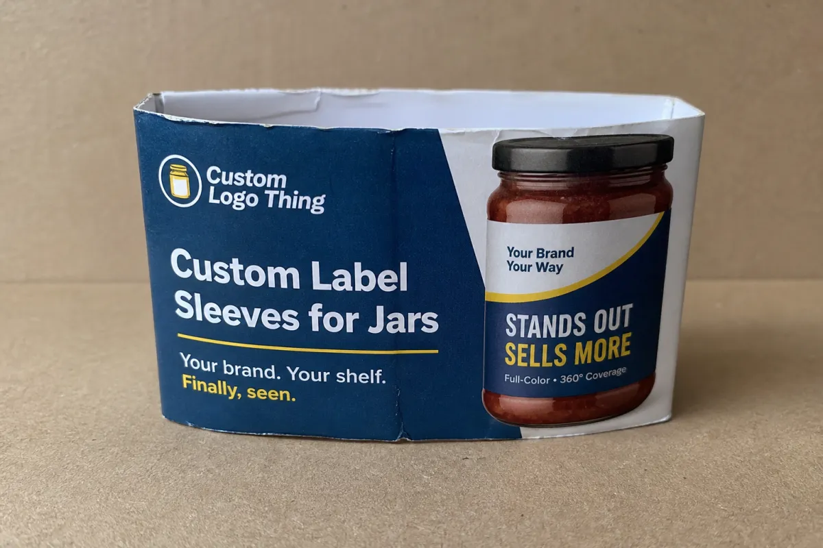
Custom label Sleeves for Jars solve a very ordinary problem that keeps getting expensive. A product line grows. The jars change size. The labels stop lining up. One jar looks packed, another looks underdressed, and the whole shelf starts to feel like nobody checked the final version. A sleeve fixes that mess with more print area, better brand control, and a cleaner packaging system without forcing a full jar redesign.
That matters because shelves do not give brands much grace. Shoppers glance, decide, and move on. They are not reading your brand manifesto. If the logo is easy to spot, the product name is clear, and the jar looks planned instead of improvised, you already have a better shot. That is what custom label sleeves for jars do well. They pull a product family into one visual system and keep the packaging from looking like it was assembled during a fire drill.
A sleeve is not magic. It is a design decision with a production bill attached.
Why custom label sleeves for jars fix the shelf problem
Most jar brands begin with a standard label and then run straight into the wall. One SKU gets taller. Another gets wider. A third has a shoulder that eats half the front panel. Suddenly the line no longer reads as one brand. The graphics get squeezed, the copy gets cramped, and the shelf display starts looking scattered. Custom label sleeves for jars solve that by giving the packaging a continuous surface to work with instead of a tiny front panel and a wish.
That extra surface is useful for more than cramming in copy. It gives the design room to breathe. A sleeve can hide awkward blank zones, balance shoulders, and make different jar shapes feel deliberate. The jar stops fighting the artwork. The whole thing starts looking like a system. That is the real value here. It is packaging design that keeps the line coherent while the product catalog keeps changing underneath it.
If you are comparing sleeves with other branded packaging pieces, the shelf should decide the answer. A label identifies. A sleeve identifies and organizes. Small difference. Big visual effect. A sleeve helps the line feel more mature because the brand mark, copy, and product story can sit in a cleaner structure instead of battling a curved surface for attention.
There is a speed advantage too. Reworking a container is slow and expensive. Sleeves let you add flavors, seasonal runs, or new jar sizes without rebuilding the whole system. That makes them especially useful for retail packaging that needs consistency across a family of products. If the rest of your line uses Custom Packaging Products, sleeves help the jars match the same overall look and keep the packaging language from drifting.
My rule is simple: if the jar shape is doing half the visual work, the label should stop making life harder. That is the point where custom label sleeves for jars earn their place. They are practical, not ornamental. Good. Packaging should be useful.
How custom label sleeves for jars actually work
People use the word sleeve loosely, which is how specs go sideways. In plain terms, a sleeve is a printed wrap that covers part or all of a jar. Depending on the build, it may be paper-based, film-based, heat-shrunk, pressure-sensitive, or folded into a band that closes around the container. Some sleeves are mainly visual. Others carry ingredients, barcode placement, branding, and compliance copy across multiple panels. Same family of packaging. Different jobs.
The real issue is not the label vocabulary. It is what the sleeve has to accomplish on the jar. A tall glass jar can use the full wrap and keep the design from feeling chopped up. A jar with wide shoulders can use a sleeve to keep dead space from swallowing the layout. A product line with multiple flavors or scents can use sleeves to keep each SKU distinct without blowing up the brand architecture. That is hard to do with a tiny front label and optimism.
- More shelf space: You get a larger surface for brand, ingredients, directions, and barcode placement.
- Better shape control: Sleeves can visually calm shoulders, curves, and taper changes.
- Cleaner SKU families: Multiple jar sizes can stay tied to one design system.
- Stronger storytelling: There is room for origin notes, product claims, and instructions without cramming the front.
Sleeves still need discipline. A small fit error can twist the artwork, leave a gap, or buckle where the jar narrows. A seam in the wrong place can make the whole piece look cheap, even if the print is excellent. That is the part people skip when they are excited about the graphics. Bad sizing will beat good design every time. The jar does not care how nice the concept deck looked.
Sleeves also create a stronger visual block from a distance. That helps in grocery aisles, specialty food shops, gift stores, and any retail packaging setting where the customer is scanning fast. A wrap can outperform a flat label when the jar itself is part of the selling job. The container becomes part of the display, not just the thing holding the product.
For brands that need a simpler baseline before moving into sleeves, Custom Labels & Tags can still make sense. Straight-sided jars with light content often do fine with that route. Curved or awkward jars usually do not. The container will tell you which path is less painful.
Choosing material, finish, and sizing for the best fit
Material choice sets the tone before anyone reads a word. Paper gives a softer, more natural feel and works well for artisanal food, spice, bath, and wellness packaging. Film, including polypropylene or PET-based constructions, handles moisture better and usually makes more sense for cold storage, kitchen use, condensation, or oily hands. Specialty stocks can bring texture, metalized impact, or extra durability, but they also raise cost and reduce forgiveness. No surprises there.
Finish changes how the package lands. Matte reads calmer and more restrained. Gloss is brighter and catches light harder, which can help in crowded retail packaging. Soft-touch can feel expensive and intentional if the brand story supports it. If it does not, it can feel like you were trying too hard. That is rarely a good look. Packaging design works best when the finish supports the product instead of trying to rescue it.
Before artwork gets approved, the jar has to be measured properly. Not close enough. Properly.
- Height: Measure the usable labeling area, not just the full jar.
- Diameter: Check the widest point and any taper below the shoulder.
- Shoulder shape: Wide shoulders can steal print space fast.
- Seam allowance: The overlap or closure zone needs room so the sleeve sits flat.
- Application conditions: Heat, moisture, refrigeration, or handling all affect performance.
That last point gets ignored way too often. A sleeve that looks fine on a proof can behave badly once it hits real life. Condensation changes adhesion. Oily hands change scuff resistance. Steam changes edge stability. If the product lives in a kitchen, deli case, or refrigerated display, the construction should match that environment, not a perfect office sample with flattering light.
For paper-based programs, ask whether FSC-certified paper is available if responsible sourcing matters to your brand story. For durability and shipping performance, ask what has been tested and what has not. A glossy finish can look sharp on a desk. If it scuffs the first time it touches a case pack, that is not premium. That is just shiny trouble.
Seam placement matters too. Put the seam on the front panel and the layout can feel split. Put it in the wrong back-panel position and barcode placement gets awkward. Sizing, overlap, and seam planning belong in the artwork conversation from the start. Leaving them for production day is how people end up doing expensive cleanup work.
Custom label sleeves for jars: process and timeline
The production process is straightforward, which makes sloppy prep even more annoying. Good projects move because the buyer sends complete information early. The usual flow is simple enough: gather jar specs, build or request a dieline, place the artwork, review the proof, approve a sample if needed, print, finish, and ship. It sounds easy until somebody uses a web photo instead of the actual container dimensions. That is how timelines get stupid.
- Inquiry and specs: Send jar height, diameter, shoulder shape, material preference, finish preference, and quantity.
- Dieline setup: The sleeve layout is built around the actual container dimensions, not a guessed template.
- Artwork prep: Copy, barcodes, regulatory content, and logo placement get mapped to the sleeve panels.
- Proofing: You review color, panel placement, seam location, and any technical notes.
- Sampling: If the shape is unusual or the launch matters, request a physical sample or mockup.
- Production and finishing: Printing, die cutting, coating, folding, or heat application happens after approval.
- Delivery: Finished sleeves ship for application or assembly, depending on the format.
Where does the timeline slow down? Usually in the same places every time: unclear jar specs, missing copy, artwork revisions, color approval delays, or a sample that exposes a shape issue nobody caught on screen. Simple runs can often move in about 10 to 15 business days after proof approval, but specialty materials, multiple versions, or complex finishes can push that to three to five weeks. Add more time if the project includes new SKUs. Every extra version gives someone one more chance to spot a typo at the least helpful moment.
If the jars are glass and the product is shipping through distribution or e-commerce, ask about transit testing. ISTA methods are commonly used to check packaging performance under vibration, drop, and handling conditions. That does not mean every sleeve needs formal lab testing, but if the packaging will travel far or get stacked hard, it is reckless to assume the first sample will survive the real route without a check.
Speed mostly comes from preparation. Send exact measurements, print-ready files, and the launch date you actually care about. A clear brief saves more time than a stack of polite follow-up emails. If you want the sleeve to support the rest of the product packaging system, do the setup once and do it right.
Cost, pricing, MOQ, and quote basics
Pricing on custom label sleeves for jars comes down to the same boring but unavoidable things that shape most packaging quotes: material, print coverage, finish, shape complexity, and quantity. A simple sleeve on a standard jar is one thing. A premium film sleeve with multi-color print, matte coating, and a tight fit around a shoulder jar is another. The quote changes because the work changes. Not because anyone feels whimsical that day. Manufacturing still follows rules.
As volume goes up, unit cost usually comes down. Setup costs get spread across more pieces, and the press run becomes more efficient. At lower quantities, the opposite happens. A 500-piece test order can make sense for a seasonal launch or a pilot run, but the per-unit price usually sits higher than a larger order. That is normal. MOQ exists because setup work does not vanish just because a brand wants to test the market with a tiny batch.
| Option | Typical use | Common unit range | Strength | Tradeoff |
|---|---|---|---|---|
| Paper-based sleeve | Dry goods, natural brands, lighter shelf presentation | $0.12-$0.30 each at 1,000-5,000 pcs | Warm, approachable look | Less moisture resistance |
| Film sleeve | Cold storage, handling, higher durability needs | $0.10-$0.24 each at 5,000+ pcs | Better resistance to moisture and scuffing | Requires tighter spec control |
| Premium laminated sleeve | Gift sets, upscale retail packaging, heavy brand impact | $0.18-$0.40 each depending on finish and coverage | Stronger shelf presence | Higher setup and finish cost |
Those numbers are not universal, and anyone pretending they are should not be trusted with your budget. They are still useful for planning. Expect setup fees, proof fees, sample charges, and shipping to appear in the final quote. A clean quote should list the dimensions, substrate, print method, finish, color count, quantity, setup costs, and whether the sample is included or billed separately.
One thing buyers miss a lot: do not compare quotes unless the specs match. One supplier may be quoting a paper wrap with simple print, while another is quoting a film sleeve with lamination and tighter registration. The cheap one may not be cheaper once you account for reprints, fit issues, or a finish that looks flat under store lighting. Compare like for like. Anything else is just price theater with a spreadsheet.
For the best result, think about sleeves as part of a larger package branding system. If your line also uses Custom Packaging Products for cartons, inserts, or shipper packs, the jar sleeve should match that visual language instead of freelancing on its own. If the whole family of product packaging feels cohesive, the brand looks more expensive even when the materials are modest.
Common mistakes that make sleeve labels look cheap
The fastest way to waste money is to treat the jar like a flat sheet. It is not. It curves, tapers, reflects light, and changes shape more than most design teams want to admit. The first mistake is measuring from memory instead of using the actual jar with proper tools. A tape measure is fine. Calipers are better. A guess is how you end up with visible gaps or artwork that lands halfway up the shoulder.
The second mistake is cramming too much into the sleeve. If every centimeter carries a logo, claim, ingredient line, QR code, flavor callout, and decorative flourish, the result looks busy, not premium. A sleeve gives you more room. It does not give you permission to say everything at once. Good packaging design leaves breathing room. Bad design uses every inch and then acts surprised when the jar looks cheap.
- Ignoring seam placement: The seam can ruin symmetry if it lands in the wrong place.
- Forgetting barcode rules: Barcodes need clean placement and enough contrast to scan reliably.
- Skipping legal copy checks: Ingredients, warnings, and net contents have to fit without forcing chaos.
- Choosing finish by screen mockup only: Lighting, condensation, and fingerprints change the real look.
- Rushing proof approval: Mistakes that hide on a flat monitor get louder on a curved jar.
Color causes problems more often than people expect. A tone that looks expensive on screen can read muddy, harsh, or dull in hand. Jar material, adhesive, ambient light, and coating all affect the result. The safer move is a physical sample whenever the sleeve carries most of the brand story. That matters even more in crowded retail packaging categories where everything is fighting for half a second of attention.
Do not assume the same sleeve artwork behaves the same across different jar sizes. A layout that feels balanced on a short jar can look stretched on a tall one. A narrow jar may need a stripped-back version of the same design. A master artwork system helps here. It keeps the family recognizable without forcing every SKU into the same bad fit. If the brand also uses Custom Printed Boxes, keep the typography, color logic, and logo hierarchy aligned so the whole range feels intentional instead of patched together.
Most cheap-looking sleeves are not cheap because of price. They look cheap because someone skipped the boring steps. Measurement. Fit. Seam planning. Proofing. Boring is where the quality lives.
Expert tips and next steps before you order
If you want the sleeve to do real work, start with hierarchy. The brand mark should be readable from a distance. The product name should be obvious without squinting. The secondary details can live lower on the panel or on the back section. That sounds basic, because it is. Basic is usually what gets skipped when someone tries to cram a full sales pitch onto a curved jar.
My practical advice is simple: build one flexible design system that can move across sizes. Use one master brand language, one font family, one color logic, and a few controlled variations for flavor, size, or product line. When the line expands, you do not want to redesign from scratch every time. You want a sleeve family that scales without losing clarity. That is how package branding stays consistent while SKU count keeps climbing.
Before full production, ask for a mockup or sample. Especially if the jar shape is unusual, the finish is premium, or the sleeve carries important claims. A sample lets you see the seam, the overlap, the contrast, and the real-world fit before you commit to a run. It is far cheaper to adjust a proof than to discover a problem after 3,000 pieces are already printed. Amazing how that keeps happening.
Use this checklist before you place the order:
- Measure the jar: Height, diameter, shoulder shape, and taper.
- Request a dieline: Make sure the artwork fits the actual construction.
- Confirm material and finish: Paper, film, gloss, matte, or soft-touch.
- Check the copy: Ingredients, net contents, barcode, warnings, and claims.
- Ask for a sample: Especially for new shapes or premium retail packaging.
- Review the quote against the same spec: No apples-to-oranges comparisons.
If you are still deciding whether a sleeve is the right move, compare it with the rest of your system. Sometimes a simple label is enough. Sometimes a sleeve is better. Sometimes a sleeve plus a matching carton is the smarter path. The right answer depends on shelf pressure, handling, moisture, and how much visual space the jar actually gives you. That is the difference between packaging that looks assembled and packaging that looks like it belongs.
If you are about to order custom label sleeves for jars, the safest path is also the least glamorous one: measure the actual container, confirm the seam location, ask for a sample, and compare quotes only after the specs match. That sequence saves money and prevents the kind of problems that show up after launch, not before it. Packaging rarely fails because the concept was weak. It usually fails because the basics were treated like an afterthought.
Are custom label sleeves for jars better than full-wrap labels?
Sleeves work better when you need more visual real estate, multiple sides of content, or a stronger premium look. Full-wrap labels can be cheaper and simpler for straightforward packaging, especially on standard straight-sided jars. Choose sleeves when shelf impact and branding flexibility matter more than the lowest possible unit cost.
What measurements do I need for custom label sleeves for jars?
Provide the jar height, widest diameter, shoulder shape, and any taper so the sleeve can be built to fit the actual container. Send a physical sample if possible, because photos miss small shape changes that affect fit. Ask for the required overlap or seam allowance so the final sleeve does not twist, gap, or buckle.
How long do custom label sleeves for jars usually take?
Simple jobs move faster when artwork is ready and the jar specs are complete from the start. Add more time for sampling, complex finishes, multiple SKUs, or approval rounds that come back with edits. If launch timing matters, build in extra buffer for proofing and shipping instead of assuming the first sample will be perfect.
What affects the cost of custom label sleeves for jars the most?
Material choice, print coverage, finish, order quantity, and complexity of the sleeve shape drive the biggest pricing changes. Lower quantities usually raise unit cost because setup work is spread across fewer pieces. The best quote is the one that matches your actual spec, not the one with the lowest headline number.
Can custom label sleeves for jars work on curved or oddly shaped jars?
Yes, but the sleeve must be measured carefully and the construction has to match the container shape. Curved, tapered, or shouldered jars often need more testing than standard straight-sided jars. A sample run is the safest way to confirm that the sleeve sits cleanly and does not distort the artwork. That is the whole point of custom label sleeves for jars: fit the container first, then make it look good.

