Buyer Fit Snapshot
| Best fit | Custom Logo on Rigid Cartons projects where brand print, material claims, artwork control, MOQ, and repeat-order consistency need to be specified before quoting. |
|---|---|
| Quote inputs | Share finished size, material target, print colors, finish, packing count, annual reorder estimate, ship-to region, and any compliance wording. |
| Proofing check | Approve dieline scale, logo placement, barcode or warning zones, color tolerance, closure strength, and carton packing before bulk production. |
| Main risk | Vague material claims, crowded artwork, missing packing details, or unclear freight terms can make a low unit price expensive after revisions. |
Fast answer: Custom Logo on Rigid Cartons: Design, Cost, and Timing should be specified like a repeatable production item. The safest quote records material, print method, finish, artwork proof, packing count, and reorder notes in one written spec.
Production checks before approval
Compare the actual filled-product size with the drawing, then confirm tolerance on folds, seals, hang holes, label areas, and retail display edges. Reserve space for logos, QR codes, warning copy, and material claims before decorative graphics fill the panel.
Quote comparison points
Review material grade, print process, finish, sampling route, tooling charges, carton quantity, and freight assumptions side by side. A quote is only useful when the supplier can repeat the same color, closure quality, and packing count on the next order.
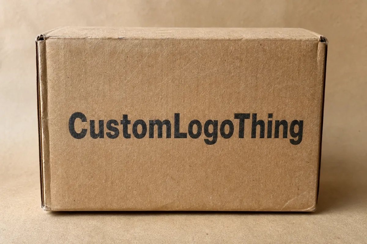
Custom Logo on rigid cartons sounds simple until you follow the build from board to wrap to finished box. Most of the branding is not printed directly on the thick shell. It usually lives on an outer wrap, a sleeve, or a label panel that is applied to the structure underneath. That one detail changes color accuracy, finish selection, unit cost, and turnaround more than many buyers expect. If you are comparing branded packaging for cosmetics, candles, electronics, gift sets, or retail displays, this format can create a premium look without unnecessary material waste, provided the structure and decoration are chosen with discipline.
That is the part buyers feel before they can explain it. A rigid carton gives the product a firmer first impression and a cleaner unboxing than a folding carton. It also helps the item hold shape in transit and on shelf. Used well, it becomes part of the branding rather than a disposable shell. A cosmetics buyer preparing a holiday launch may care most about shelf presence; a subscription brand may care more about repeat shipping performance. The same box can serve both, but only if the brief is specific. If you want to compare structural options while you read, the category on Custom Packaging Products is a useful place to review formats side by side.
Custom logo on rigid cartons: what they are and why they sell the idea
A rigid carton starts with dense chipboard or greyboard, then gets wrapped in printed paper, specialty stock, or an uncoated cover sheet. The board supplies the strength. The wrap supplies the visual identity. In hand, the result feels solid before the product is even placed inside, which matters when a brand is trying to justify a higher price point.
Most Custom Logo on rigid cartons do not print the logo directly on the board. The mark usually appears on the outer wrap, a label panel, or a printed sleeve applied to the shell. That creates more control over the surface, which matters for sharp edges, consistent color, and finish options such as matte, gloss, soft-touch, foil, or spot UV. It also lets the texture support the brand story instead of competing with it. A clean foil mark on a quiet matte wrap can feel more expensive than a loud multi-color layout with too many effects.
Rigid cartons make sense when presentation, protection, or perceived value matters more than the lowest possible packaging cost. Folding cartons are lighter, cheaper, and easier to ship. Rigid cartons are heavier and more labor-intensive, but they signal care. That tradeoff is acceptable when the product price, brand position, or gifting value makes the extra spend believable. Luxury cosmetics, candles, jewelry, watches, premium electronics, apparel boxes, and food gifts use this format for exactly that reason. In practice, the box often does part of the selling before anyone reads the copy.
The selling power is real. A rigid carton can make a product feel collectible. It can slow the opening moment by a few seconds, and those seconds carry weight. A $40 item feels more deliberate. A $200 item feels more complete. That effect comes from proportion, print control, structure, and finish choices that work together instead of shouting for attention.
- Best for: premium presentation, gift packaging, fragile products, and retail packaging that needs shelf presence.
- Less ideal for: very low-cost SKUs, commodity products, or items that cannot support extra packaging spend.
- Main value: stronger perceived quality, better protection, and a more memorable unboxing.
“A rigid carton should feel intentional the moment someone picks it up. If the proportions are off, the finish is noisy, or the logo is fighting the structure, the premium effect disappears fast.”
How custom logo on rigid cartons is made
The build has three core parts: the rigid board structure, the printed or finished wrap, and any insert system that keeps the product stable. Add closures, magnets, ribbons, windows, or trays, and the box becomes a small piece of product engineering rather than a simple container.
The board is usually die-cut from greyboard or chipboard. Standard premium cartons often sit around 1.5 mm to 3 mm thick, though some gift boxes go thicker when the hand feel needs more weight. Once cut, the board is wrapped with printed paper or specialty stock that carries the logo and graphics. If the inside must look finished, the interior may be lined or wrapped too. None of that is flashy. It is the part that decides whether the carton opens cleanly or feels rushed and uneven. On higher-end launches, buyers often notice the inside edge first because it is where poor assembly shows up.
Decoration methods shift by quantity and visual goal. Offset printing usually wins on larger runs and tighter color control. Digital printing works well for short runs, faster changes, or projects that need flexibility without heavy setup. Foil stamping adds metallic emphasis when the logo needs to stand out immediately. Embossing and debossing create tactile detail. Soft-touch lamination gives the surface a velvet-like feel, while gloss lamination makes colors read brighter and suits bolder retail packaging.
The artwork process follows the same basic path regardless of the decoration method. The dieline comes first. That is the flat layout of the carton. Artwork is then placed on the dieline with bleed, safe zones, and seam placement in mind. After that comes a proof. Many projects also need a physical sample. Full production starts only after approval. Buyers who skip those steps usually pay for it later through misaligned logos, weak corner wraps, or a seam cutting through the brand mark.
Technical details matter more on rigid cartons than many people assume:
- Seam placement: the wrap joint should land where it will not interrupt the logo or key copy.
- Safe zones: keep important text away from edges, folds, and corners.
- Bleed: extend artwork beyond trim so the finished box does not show white slivers.
- Corner wrap: thick board changes how artwork lands near edges, especially on dark or detailed designs.
- Lid seam: on two-piece boxes, the lid and base can shift slightly in production, so centered logos need proper allowances.
If the box will ship through ecommerce or distribution channels, ask about transit performance early. A pretty carton that crushes in transit is not premium. It is just expensive regret. Testing programs from ISTA help when the carton needs to survive drops, vibration, or longer shipping routes. For material sourcing and responsible forestry references, FSC remains the cleaner path for paper-based components. Neither label fixes a weak structural spec, though. The carton still has to be built correctly.
Design factors that change the look and feel
The logo never works alone. It sits inside a physical structure, and every structural choice changes how the brand reads. That is why rigid carton design is part graphic design and part box engineering.
Size and proportion come first. A tiny logo on a large lid can feel timid. An oversized logo can swallow the surface and make the carton look like it is trying too hard. A calm, well-balanced proportion usually does more for premium perception than piling on effects. Many strong carton designs leave more breathing room than buyers expect. A buyer may think the lid looks empty on screen and then find that the physical box feels elegant in hand. The scale changes once the package enters the room.
Board thickness affects more than durability. Thicker board feels more substantial, but it also changes corner behavior, edge sharpness, and shipping weight. A small jewelry box may work well at 1.5 mm to 2 mm. A larger gift set or prestige product may need 2 mm to 3 mm to feel right. Push thickness too far just because it sounds premium and the result can be higher freight, stiffer folding behavior, and cost that does not buy much.
Finish choice is where many brands overbuild the carton. Matte finishes feel modern and restrained. Gloss finishes feel brighter and more assertive. Soft-touch finishes feel premium, but they can scuff if the carton is handled constantly. Foil and spot UV both add contrast, yet heavy use of both on the same box can push the design into loud territory. One strong effect usually carries more authority than three competing ones.
Brand complexity is another trap. Multiple colors, fine type, gradients, and textured wraps can start fighting each other. A simple logo in one color often performs better on rigid cartons than a crowded print design with five visual ideas on the same face. That is especially true when the carton is small or interrupted by hinges, magnetic closures, or ribbon slots.
Product-specific needs matter just as much as the logo. If the carton needs an EVA tray, molded pulp insert, cardboard partition, foam cradle, or window cutout, the logo has to work around those functional elements. A lid that looks beautiful but lets the product rattle is not good packaging. It is expensive decoration with a short shelf life.
For brands making sustainability claims, paper sourcing and material choices should be documented. That does not require a plain or dull carton. It does mean the wrap, board, insert, and adhesive strategy need to match the claim being made. If recycled content, FSC-certified board, or a lower-plastic build matters, say so early and verify what the factory can actually produce. Fancy language does not fix a weak spec. A clean sample and a clear bill of materials do far more.
Practical rule: choose the structure first, then the finish, then the logo treatment. Reverse that order and the project often gets redesigned after the proof, which costs more than it should.
Cost, pricing, MOQ, and quote drivers
Pricing on Custom Logo on rigid cartons comes down to the same few forces every time: size, board thickness, print method, finish complexity, insert requirements, and how much hand assembly the design needs. There is no honest flat rate that covers every project. A simple lid-and-base box with one-color branding is not the same job as a magnetic closure gift box with foil, embossing, and a custom tray.
The cleanest way to think about it is this: setup-heavy packaging costs more per unit when the quantity is small, then becomes more efficient as volume rises. That is why MOQ matters so much. Many rigid carton suppliers set a higher minimum order quantity than folding carton suppliers because the production sequence is more labor-intensive and the materials are less forgiving.
One common mistake is blending setup costs and unit costs into one vague number. Those are separate things. Tooling, cutting, proofing, and press setup can make a 250-piece run look expensive. Spread the same setup across 1,000 or 5,000 units and the unit price starts making sense. If one quote seems high at a low quantity, that is not a trick. It is the math showing up early.
| Rigid carton option | Typical use | Approx. unit range at 1,000 pcs | Price pressure | Lead time impact |
|---|---|---|---|---|
| Simple wrap, one-color logo, no insert | Jewelry, samples, small gifts | $1.10-$2.20 | Lowest | Short |
| Printed wrap, soft-touch laminate, basic insert | Cosmetics, candles, premium retail packaging | $1.80-$3.80 | Moderate | Moderate |
| Foil stamp, embossing, custom tray, magnetic closure | Gift sets, electronics, prestige launches | $3.50-$8.00 | High | Longer |
| Specialty paper, complex insert, multi-part assembly | High-end branded packaging with strong shelf impact | $5.00-$12.00+ | Highest | Longest |
Those numbers are broad ranges, not promises. A 250-piece order can land above them. A 5,000-piece order can come in lower. Regional labor rates, freight, duties, and warehousing can move the final landed cost as well, and those items are often left out of early conversations. The real question is whether two quotes are built on the same assumptions. If one supplier quotes 2 mm board with soft-touch and an EVA tray, and another quotes thinner board with no insert and simpler packing, the numbers are not comparable. They are barely speaking the same language.
When you compare quotes, line them up on the same spec sheet:
- Dimensions: exact outer size and inner fit.
- Board grade and thickness: chipboard, greyboard, or specialty board, plus thickness.
- Print method: offset, digital, foil, or mixed decoration.
- Finish: matte, gloss, soft-touch, uncoated, or laminated.
- Insert: none, paperboard, EVA, molded pulp, foam, or custom tray.
- Packing method: flat packed, assembled, wrapped, or kitted.
- Shipment terms: factory pickup, freight included, or delivered pricing.
If you are narrowing options, the product range on Custom Packaging Products helps you compare what is structurally possible before you chase the lowest number. That saves time and keeps you from asking for a luxury format at a budget-spec price, which is a fast way to burn a week.
Production steps, timeline, and lead time
Rigid cartons follow a fairly predictable sequence. The work stays orderly when the brief stays orderly too.
- Brief: define the product, dimensions, quantity, finish target, and shipping destination.
- Dieline: confirm the carton structure and exact layout.
- Artwork layout: place the logo, colors, copy, and legal marks onto the dieline.
- Proof: review the digital mockup for placement, spelling, and seam logic.
- Sample: approve a physical sample when the project needs structure or finish verification.
- Production: print, wrap, assemble, and attach inserts or closures.
- Quality check: inspect dimensions, color consistency, glue lines, and logo alignment.
- Packing and shipment: pack the finished cartons, then ship them without crushing half the batch in transit.
Simple projects can move from artwork to proofing in a few days if the brief is tight and the logo files are clean. More often, sampled rigid cartons need one to two weeks before production even begins. After approval, production can take another one to three weeks depending on quantity, finishing complexity, and how much hand assembly is involved. If the box needs custom inserts or magnetic closures, add time. If the color has to match a difficult brand tone, add more. If the launch date falls near a holiday shipping peak, add even more, because freight and factory schedules rarely behave the way a spreadsheet suggests.
The fastest way to slow the schedule is to change artwork after the proof stage. Buyers do it all the time because the first mockup reveals flaws that were easy to miss on screen. Fair enough. Every change after proof creates more back-and-forth, and sometimes a new sample. A straightforward project can turn messy fast once revisions start bouncing around.
There are a few ways to shorten turnaround without weakening the carton:
- Send vector logo files instead of low-resolution images.
- Lock dimensions before artwork starts.
- Approve one version instead of running the design through five opinion loops.
- Keep the finish list short and specific.
- Build in buffer time for sample review and freight.
One more practical point: freight is part of lead time. The carton may finish production on schedule and still miss launch because the shipping leg was underestimated. That happens more often than buyers admit. Nothing dramatic is required for the delay; a stack of small timing slips is enough.
If you are shipping into retail, distribution, or ecommerce fulfillment, ask whether the carton should be tested against a transit standard. An ISTA-oriented test plan is not overkill when the packaging has to travel and still look good on arrival. The box can be elegant and still fail the job if the structure cannot survive the trip. A launch team that learned this the hard way usually only needs one damaged pallet to respect the point.
Common mistakes that make rigid cartons look cheap
Rigid cartons are unforgiving in a few predictable ways. The mistake list is not long, but people repeat it anyway.
Designing before the dieline is confirmed is the first one. A logo can look centered on a screen and still land awkwardly across a seam or corner once the wrap is applied. The carton is a three-dimensional object. Treating it like a flat poster is how expensive surprises happen.
Over-finishing is the second. Too much foil, too much spot UV, too many type sizes, and too many “premium” effects can make the box look busy instead of elevated. Luxury packaging is usually quieter than people think. It wants restraint. If everything is shiny, nothing feels special.
Weak contrast is another common problem. Dark logo on dark wrap. Thin metallic type on textured paper. Small text under a heavy soft-touch laminate. All of these can look sophisticated in theory and invisible in practice. If the logo cannot be read from arm’s length, the branding job is not done.
Poor quantity planning is the classic MOQ mistake. A buyer wants a luxury rigid box in a tiny run and then acts surprised when the quote reflects a setup-heavy job. The supplier is not exaggerating. The format simply carries more labor and more material. If the volume is small, the per-unit cost will behave like it.
Ignoring fit and function is the one that hurts most. If the product rattles inside the carton, the packaging failed. If the lid bows, the closure misaligns, or the insert collapses, the box is still wrong even if the logo looks excellent. Good product packaging protects the product, not just the photo.
There is also the quieter mistake of choosing the wrong surface for the brand personality. A high-gloss carton can fit beauty or tech. It may feel wrong for natural skincare or handmade goods. A soft-touch black carton can look elegant for one brand and flat for another. The finish needs to match the product story, the sales channel, and the price point. Otherwise the package branding feels borrowed.
Here is a blunt test: if you stripped the logo off the carton, would the structure still feel like it belongs to the product? If the answer is no, the design may be doing too much while saying too little.
Expert tips and next steps for a better carton
The strongest rigid cartons usually follow one rule: pick one hero effect and let the rest of the design behave. A foil logo on a matte wrap can do more than a box packed with gradients, patterns, UV spots, and embossed slogans. The eye needs a destination. Give it one.
Keep the logo readable from arm’s length. That sounds basic, but plenty of premium cartons fail there. Thin strokes, tiny type, and low contrast all look more refined in a mockup than they do on an actual shelf. Premium packaging still has a job to do. If the brand mark cannot be seen quickly, the box is missing one of its main tasks.
Ask for two samples when possible: one plain structure sample and one printed sample. The plain sample tells you whether the board thickness, closure, and insert fit are correct. The printed sample tells you whether the color, finish, and logo placement are right. One sample rarely answers everything. That is how people approve a problem because one detail looked good in isolation.
Before you ask for pricing, build a quote checklist. It keeps the conversation focused and makes the quotes easier to compare.
- Product dimensions and weight
- Desired carton style
- Target quantity or MOQ range
- Logo files and brand colors
- Finish preference
- Insert or tray requirement
- Closure type
- Delivery window and shipping destination
If you sell across channels, think through how the same box behaves on shelf, in a gift set, and in transit. That is where some designs win and others get exposed. A carton that looks elegant in a studio photo may be awkward to pack, expensive to ship, or too fragile for repeat handling. The strongest version of this format balances appearance, protection, and cost.
For buyers who want a cleaner path, the sequence stays simple: measure the product, gather the artwork, define the minimum quantity, request a sample, compare quotes line by line, then approve the proof only after checking seam placement and color. That sequence is not glamorous. It is how you avoid paying extra for mistakes that should never have reached production.
If you are choosing among Custom Packaging Products for a launch, let the carton structure support the brand promise instead of chasing the longest finish list. One good logo placement, one strong material choice, and one clean closure often beat a pile of effects. That is especially true for custom logo on rigid cartons, where the construction itself does some of the selling before anyone reads the copy.
The practical takeaway is straightforward: start with the product dimensions, decide what the carton must do in transit and on shelf, then pick one finish that fits the price point. After that, confirm the dieline, seam placement, and insert before you approve artwork. Used well, custom logo on rigid cartons give a product a better first impression, a cleaner unboxing, and a more credible premium position. Used badly, they become an expensive box with weak branding. The difference usually comes down to a disciplined plan, not a bigger print budget.
What is the best printing method for custom logo on rigid cartons?
Offset printing usually works best for larger runs when you need strong color consistency and smoother finish quality. Digital printing is better for shorter runs or faster artwork changes. The right method depends on quantity, color control, and how much finish complexity you want, not on habit or whatever was used last time.
How much do custom logo on rigid cartons usually cost?
There is no single honest price because cost depends on size, board thickness, finish, insert type, and quantity. Small MOQs usually carry the highest unit cost because setup is spread across fewer boxes. Ask for tiered quotes at several volumes so you can see where the unit price actually falls.
What MOQ should I expect for rigid cartons with a logo?
Many suppliers set higher MOQs for rigid cartons than for folding cartons because the build is more labor-heavy and the setup takes longer. The practical MOQ depends on the finish, insert, and whether the project uses standard or custom components. If you need a short run, expect a higher unit price and fewer decoration options.
How long does custom logo on rigid cartons production take?
Simple projects can move quickly, but custom rigid cartons usually need proofing, sampling, and production time. Special finishes, inserts, and approval changes can add days fast. Build in buffer time for sample review and shipping so one delayed approval does not derail the launch.
What files do I need for a custom logo on rigid cartons quote?
Send a vector logo, box dimensions, quantity target, finish preferences, and any insert or closure requirements. If you have brand colors, include PMS values or approved references so matching is less painful later. A clear brief reduces revisions, speeds up proofing, and makes the quote far more accurate.

