Buyer Fit Snapshot
| Best fit | Custom Logo on Shipping Tubes projects where brand print, material claims, artwork control, MOQ, and repeat-order consistency need to be specified before quoting. |
|---|---|
| Quote inputs | Share finished size, material target, print colors, finish, packing count, annual reorder estimate, ship-to region, and any compliance wording. |
| Proofing check | Approve dieline scale, logo placement, barcode or warning zones, color tolerance, closure strength, and carton packing before bulk production. |
| Main risk | Vague material claims, crowded artwork, missing packing details, or unclear freight terms can make a low unit price expensive after revisions. |
Fast answer: Custom Logo on Shipping Tubes: Branding That Travels should be specified like a repeatable production item. The safest quote records material, print method, finish, artwork proof, packing count, and reorder notes in one written spec.
Production checks before approval
Compare the actual filled-product size with the drawing, then confirm tolerance on folds, seals, hang holes, label areas, and retail display edges. Reserve space for logos, QR codes, warning copy, and material claims before decorative graphics fill the panel.
Quote comparison points
Review material grade, print process, finish, sampling route, tooling charges, carton quantity, and freight assumptions side by side. A quote is only useful when the supplier can repeat the same color, closure quality, and packing count on the next order.
A Custom Logo on shipping tubes does more than put a mark on a mailer. It turns a plain cylinder into part of the brand story. Sometimes that tube sits on a desk for a week. Sometimes it gets shoved into a studio corner and opened hours later. Sometimes it goes through receiving, sorting, and a few too many hands before anyone checks what is inside. That is a lot of work for one piece of packaging. It should do more than look like office surplus.
For a packaging buyer, the tube has two jobs. Protect the contents. Identify the sender. A plain kraft tube can handle the first job. A branded tube can handle both. That is the real value of a Custom Logo on shipping tubes: better presentation without turning a shipping project into a design theater production. The goal is balance. Clear branding. Durable print. A unit cost that makes sense. If the tube looks intentional instead of improvised, it has done its job.
Why Shipping Tubes Deserve Better Branding
Shipping tubes get handled more than most teams expect. They move through production, staging, fulfillment, mailrooms, front desks, and receiving docks. They are often seen before anyone checks the label. That means the outside of the tube shapes the first impression just as much as the product inside. In ecommerce shipping, that is even more true. The package may be the only physical brand touchpoint the customer sees for days.
A plain tube says, "I am a container." A branded tube says, "Someone cared about this shipment." Buyers notice that difference. They read packaging as a signal of care, consistency, and operational discipline. A tube with a clean logo, a clear return address, or a simple brand pattern feels finished in a way a naked brown tube never quite does, even when the contents are expensive.
Shipping tubes sit in an awkward but useful middle ground between product packaging and logistics packaging. They are not retail cartons on a shelf. They are not just shipping shells hidden under tape and labels. For brands sending posters, blueprints, textile swatches, sample rolls, or campaign graphics, the tube is often the entire visible package. In that setting, package branding stops being decorative fluff and starts doing practical work. The outside has to look good and be easy to identify. Fancy. Useful. Rare combination.
Branded tubes also cut down on confusion in busy environments. A receiving team may sort dozens of similar tubes in one morning, and a distinct color, logo, or printed identifier makes the right package easier to route. That sounds boring because it is boring. It also saves time and reduces mix-ups. The same logic applies to recurring programs, seasonal drops, and subscription-style shipments where the packaging becomes part of the customer's expectation.
There is another reason buyers keep coming back to branded tubes: the package tends to stay visible. A poster tube is not a one-and-done shipper that disappears under void fill. It is a cylinder people carry around, stack upright, or leave on a counter. If your brand sends work that will be opened in an office, studio, print shop, or retail back room, the outside of the tube becomes part of the customer experience long before the contents are unrolled.
"A tube with a logo and clear identification does not just look better; it gets handled better, because people can spot it faster and trust what they are seeing."
If your broader package branding already uses custom printed boxes, inserts, and labels, a branded tube helps keep the system consistent. It also fits neatly beside other formats like Custom Packaging Products, Custom Shipping Boxes, and Custom Poly Mailers when a brand ships different product types under one visual system.
What a Custom Logo on Shipping Tubes Actually Is
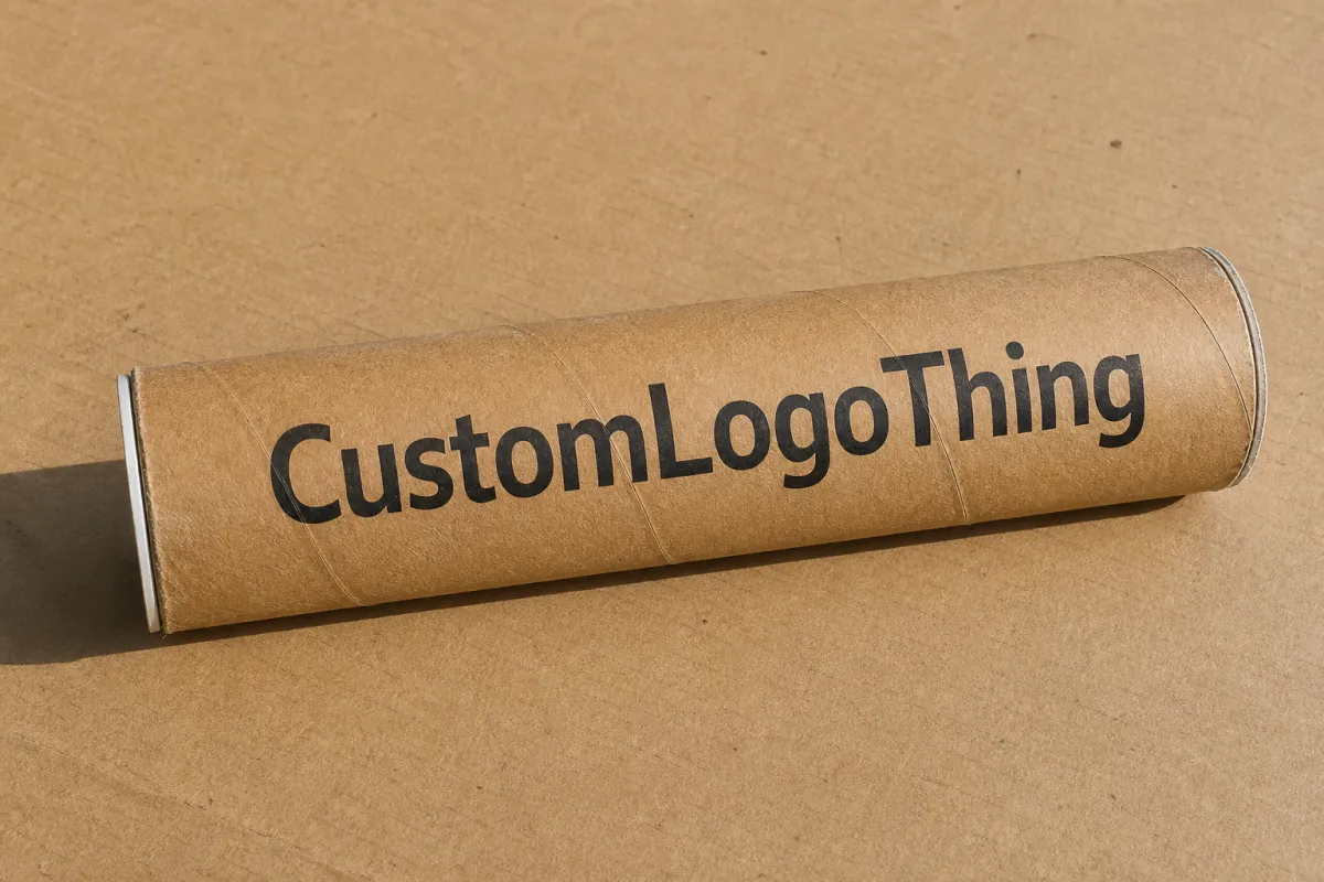
A Custom Logo on shipping tubes usually means one of four things: direct printing on the tube body, a pressure-sensitive label, a full-wrap graphic, or a smaller branded mark placed near the seam, cap, or center panel. Sometimes the decoration is simple: a one-color wordmark and return address. Other times it gets more involved, with a repeated pattern, QR code, handling icons, or a full sleeve that wraps the cylinder from end to end.
The right format depends on the job. A design studio sending posters may want a clean logo and bold color block that reads well in photos. A manufacturer shipping technical drawings may care more about identification, part numbers, and handling instructions. A retail brand mailing rolled textiles may want the tube to feel closer to retail packaging than a commodity mailer, which can justify a more finished printed surface.
Tube construction matters more than first-time buyers expect. Paperboard, fiberboard, and laminated tubes all react differently once ink, adhesive, or coating enters the picture. A natural kraft tube tends to absorb more and can mute color. A white-faced or coated tube usually gives better brightness and clearer detail. Fiberboard is often tougher in transit, but the print surface and finish options may differ from a smoother presentation-grade wrap.
There is also a difference between branding meant to be seen up close and branding that has to work across a warehouse floor. A tiny logo may look elegant on a sample table. Put that same tube in a cart with five other rolls and the mark may disappear. That is why experienced packaging teams think about presentation and logistics at the same time, instead of pretending the whole world is a mood board.
- Direct print fits best when tube sizes and brand colors stay consistent across larger runs.
- Labels work well when artwork changes often or order volume is lower.
- Full-wrap graphics create the strongest visual impact, but they need tighter artwork control.
- Spot branding near the seam or cap works well when the goal is clean, economical identification.
Think of it this way: a tube can act like a miniature billboard, a shipping identifier, or a premium presentation piece. It does not need to do all three. The decoration method should match the job, not the fantasy version of the job. A direct print may be enough for internal transfers or recurring B2B shipments. A label might be the smarter answer for campaign tubes that change every quarter. A full-wrap approach makes sense only if the extra visual real estate actually serves the business.
Design, Materials, and Print Methods That Shape the Result
The geometry of a tube changes how artwork behaves. Diameter affects how much of the logo stays visible from a front-facing angle. Length determines whether the design repeats, stretches, or sits in one panel area. Seam placement can interrupt a graphic, and cap style can hide or expose key elements if the art runs too close to the ends. A flat mockup helps. A curved proof helps more. If the logo crosses the seam, the tolerance needs to be checked before anyone signs off.
Material choice matters just as much. A natural kraft surface gives a warm, utilitarian look that works for brands aiming for an earthy or handmade feel, but it can dull light colors and make fine detail harder to read. White-faced paperboard or coated stock usually gives cleaner color reproduction and better contrast, which matters for logos with light tones, gradients, or small typography. Specialty wraps can deliver a more premium look, especially when the brand wants something closer to retail packaging than a plain shipper.
Different print methods bring different tradeoffs:
- Flexographic printing is often a strong fit for higher-volume runs with simple color counts and repeatable artwork.
- Digital printing works well for shorter runs, variable graphics, and faster design changes.
- Pressure-sensitive labels give flexibility when the tube base stays the same but the branding needs to change by campaign, region, or product line.
- Foil or embossing can add a premium signal, though it usually raises setup complexity and cost.
Finish choices affect both appearance and wear. Matte softens glare and feels more understated. Gloss sharpens color and makes logos pop. Soft-touch and specialty coatings create a tactile, premium impression, but they need testing for abrasion resistance because tubes rub together during transit and staging. In a busy supply chain, scuff resistance is not a luxury detail. It is the difference between a crisp tube and one that arrives looking like it lost a fight with a conveyor belt.
Good artwork setup saves time and money. Vector files in AI, EPS, or PDF format are preferred because they hold clean edges on curved surfaces. Small text needs breathing room, and contrast should be strong enough to survive a brown kraft substrate or a slightly uneven seam. A safe zone around caps, seams, and trim edges protects critical brand elements from distortion. If the tube must include regulatory copy, handling icons, or a QR code, those pieces should be tested at actual size before approval.
For brands focused on sustainability signals, material sourcing deserves attention too. If recycled content, fiber sourcing, or certified paper matters to your program, ask for documentation tied to recognized standards such as FSC. The Forest Stewardship Council covers responsible forest management and chain-of-custody tracking, which can help verify fiber sourcing. That is not the same thing as a recyclability claim. Recycling still depends on the substrate, coatings, adhesives, and the local recovery system. For transport stress, vibration, and handling logic, testing guidance from ISTA is worth reviewing, especially if the tube will travel with fragile rolled goods or premium printed collateral.
One practical rule holds up across almost every program: the simpler the design, the easier it is to keep colors consistent and the less likely the tube is to show production variation. That does not mean simple has to mean dull. A sharp one-color mark on a good stock often looks more confident than a crowded layout trying to prove how hard it worked.
Process and Timeline: From Artwork to Production Steps
A good tube program starts with information, not decoration. The supplier needs dimensions, estimated quantity, logo files, preferred colors, placement notes, and a clear sense of what the tube is shipping. A tube for rolled posters behaves differently from one for apparel inserts or textile samples, and that affects both the structural choice and the decoration method. A buyer who sends a vague brief usually gets a vague quote. Then everyone acts surprised when the proof does not match the expectation.
The usual workflow is simple enough, assuming the brief is not a mess:
- Discovery and project review.
- Structural check of the tube size, wall strength, cap style, and print area.
- Artwork preparation and color review.
- Digital proof or mockup approval.
- Sample creation if the project is new or color-sensitive.
- Production.
- Packing, case configuration, and shipment.
Speed usually depends on how clean the input is. Final vector art, exact dimensions, and clear placement instructions can shorten the process quite a bit. Missing fonts, low-resolution logos, and uncertain Pantone targets slow everything down. So do late-stage changes to tube diameter or cap style, because those changes can alter the printable surface and force a layout recheck. A 2-inch tube and a 3-inch tube are not the same canvas, even if the sketch looked close enough on a screen.
Lead time varies with the method. Simple printed branding on an established tube structure may move in about 12-15 business days after proof approval, while a fully custom wrap with special finishes can take longer, especially if sampling is required. Short runs can sometimes move faster in digital workflows, but that depends on the plant schedule and the complexity of the art. Reorders are usually quicker once the setup is locked and the spec sheet is stable.
Planning matters if the tubes are tied to a launch date, trade show, catalog drop, or recurring fulfillment cycle. A common mistake is treating packaging as an afterthought and expecting the tube to arrive a few days before goods start shipping. That leaves no buffer for art corrections, sample review, or freight hiccups. A safer move is to work backward from the ship date and build in room for one revision cycle and one physical proof if the branding is new.
If the tube is part of a broader branded packaging program, keep the same approval logic across all formats. The logo files, color targets, and messaging hierarchy should match what is used on custom printed boxes or inserts, so the customer sees one coherent system rather than a pile of unrelated packaging pieces. That consistency matters even more in ecommerce shipping, where the package is often the first physical expression of the brand.
"The fastest tube jobs are the ones where the customer already knows the dimensions, the logo files are clean, and the approval path is simple. Most delays come from the brief, not the press."
Cost, Pricing, and MOQ Considerations
Pricing for a branded tube is shaped by more than size. Quantity, print coverage, number of colors, finish level, tube material, and setup requirements all move the number. A single-color logo on a standard kraft tube may be relatively economical, while a full-wrap design with metallic ink or a specialty coating will cost more. The math is not mysterious. More decoration and more setup usually mean more cost.
Minimum order quantities vary by method. Direct printing and custom wrap programs often have higher MOQs because setup has to be spread across the run, while labels can give more flexibility for smaller quantities or changing artwork. If the brand is testing a new product line or seasonal campaign, labels may be the smarter starting point. If the tube will be reordered often and the visual identity is stable, direct print can make better long-term sense.
Below is a practical comparison buyers can use when they are sorting out options. Exact numbers will shift by supplier, size, and specification, but the pattern stays fairly consistent.
| Decoration Method | Best Fit | Typical Setup Range | Typical Unit Cost Trend | Notes |
|---|---|---|---|---|
| Direct flexographic print | Higher-volume repeat runs | $150-$600 | Lower at scale | Good for one- to two-color branding and consistent tube sizes. |
| Digital print | Short runs and complex graphics | $100-$450 | Moderate, often higher than flexo on large volumes | Useful when art changes often or sampling speed matters. |
| Pressure-sensitive label | Flexible or lower-volume programs | $75-$250 | Moderate, depends on label size and coverage | Simple to change for campaigns, regions, or variable data. |
| Specialty wrap, foil, or embossing | Premium presentation | $250-$1,200+ | Higher | Best for standout package branding, but it raises complexity. |
For a rough working budget, a simple branded tube program might land around $0.20-$0.45 per unit on larger runs, while more premium or complex versions can climb higher depending on coverage, finish, and substrate. At smaller volumes, unit cost usually rises because setup gets divided across fewer pieces. That is why a buyer comparing quotes should always ask what is included in the number: proofing, plates, setup, freight, carton packs, and any special packaging configuration.
Cost control does not require making the tube dull. It usually means being disciplined. A strong logo, one or two colors, and a carefully chosen material often look better than an overdesigned layout that forces multiple print passes. If the business runs both shipping tubes and other packaging formats, it can also be worth aligning artwork across Custom Packaging Products so the same design work supports multiple SKUs rather than living in a lonely little silo.
Another useful way to think about price is through lifecycle. If the tube is a one-time campaign piece, a lower-cost label or digital route may be ideal. If the tube repeats every week for months, a better setup cost can pay back through lower unit pricing and fewer production headaches. The right answer depends on volume, reorder frequency, and how much visual weight the tube needs to carry in the customer experience.
Common Mistakes to Avoid When Branding Tubes
The most common mistake is designing for a flat screen instead of a curved cylinder. A logo that feels balanced in a proof can look stretched, cut off, or awkward once it wraps around a narrow tube. That problem gets worse when the artwork sits too close to a seam or crosses a cap line. A curved proof, even a simple one, can reveal issues that a flat mockup hides.
Color mismatch is another frequent problem. A brand may expect the same shade to appear on kraft, white, and coated tube stock, but the substrate changes the visual result. Kraft absorbs and warms the color. White stock brightens it. Coated stock can sharpen contrast and make saturated colors appear more faithful. If exact brand color matters, a proof or sample is the place to catch the difference, not the production line.
Overcrowding the design is a mistake that shows up constantly in first runs. Teams try to fit a logo, a tagline, a QR code, handling icons, social handles, and return information onto a surface that really only supports two or three clear communication points. The result is visual noise. In most cases, a tube works better when it carries one strong identity cue and one practical message, such as a return address or product description.
Another issue is abrasion. Tubes are not treated gently in larger order fulfillment operations. They get stacked, shifted, dragged, and nested. A finish that looks elegant on a sample but scuffs easily in transit can leave the final product looking tired. That is why scuff resistance, overprint varnish, and coating choices deserve real attention. If the tube is likely to ride through busy sorting, ask for a handling or rub test before approval.
Brands also overlook what happens after the shipment leaves the building. If the tube will be opened in an office, studio, or retail back room, the outside should still look clear after transit wear. A logo placed only on the most exposed panel may be gone by the time the customer sees it. Strong package branding assumes the parcel may travel through conveyors, carts, bins, and stacks before it reaches the recipient.
Finally, some teams forget that a tube is part of the larger packaging system. If the outer box, insert, and label language say one thing, but the tube says another, the program feels disjointed. A branded tube should support the same visual logic used across your custom printed boxes or other shipping formats, especially if the brand ships multiple product categories in parallel. That consistency is what makes the system feel deliberate instead of improvised.
Expert Tips and Next Steps for a Stronger Tube Program
If the goal is better results without turning the project into a six-month identity crisis, start small and build from there. One tube size, one core message, and one stable artwork version are enough for the first run in many programs. Once the structure and print method are proven, seasonal variants or campaign graphics can be added with much less risk. That approach keeps the packaging design focused and makes future reorders easier to manage.
Ask for a sample or short run when the material, finish, or print process is new. Seeing the curve, color, and handling in person often reveals details that digital proofing cannot. A sample also helps internal teams agree on what "good" looks like before a larger order is committed. For a branded tube that will be seen by customers, sales teams, or retail partners, that extra step can prevent expensive surprises.
Create a simple spec sheet and keep it updated. It should include the exact tube dimensions, cap style, substrate, artwork files, color targets, placement notes, approved proof date, and reorder history. That document becomes especially useful when someone new takes over the account or when the company expands into other branded packaging formats. Good records are the quiet difference between a repeatable program and a one-off job.
It also helps to think beyond the tube itself. The same customer might see a branded shipping tube, a matching insert, a return label, and a branded outer carton in the same order. When those elements are coordinated, the whole package feels more intentional and more valuable. If your line also uses Custom Shipping Boxes or Custom Poly Mailers, keeping the visual system aligned creates a stronger overall presentation.
For brands with sustainability goals, ask questions early. Is the board FSC-certified? Is the design compatible with recycling streams in the intended market? Does the coating or label adhesive change the recyclability story? The exact answer will depend on the substrate and the local recovery system, so this is not a place for assumptions. A cleaner, simpler structure often helps the environmental profile while also lowering production risk.
Most of all, treat a tube as part of the packaging system rather than a decoration project. The strongest custom logo on shipping tubes programs are the ones where branding, protection, and fulfillment logic all line up. If you need a practical starting point, lock the tube dimensions first, choose the substrate second, then build the artwork with a seam-safe layout and a real proof. That sequence avoids most of the expensive mistakes before they happen.
Frequently Asked Questions
What is the best way to add a custom logo on shipping tubes?
The best method depends on quantity, artwork complexity, and the tube material. Direct print is often a good fit for larger repeat runs, while labels can be a smart choice for lower-volume or changing artwork programs. If the tube needs a more premium presentation, ask about coatings, foil accents, or a specialty wrap so the finish matches the brand goal.
How much does a custom logo on shipping tubes usually cost?
Pricing depends on tube size, quantity, number of colors, finish level, and the decoration method. Larger quantities usually reduce unit cost because setup is spread across more pieces. The fastest way to compare quotes is to ask what setup fees, proofing, freight, and packaging configuration are included, since those details can change the real landed cost.
How long does it take to produce branded shipping tubes?
Timeline depends on artwork readiness, proof approval, sample needs, and the printing method chosen. Simple tube branding can move relatively quickly, while full-wrap graphics or special finishes usually take longer. Having final vector artwork and exact dimensions ready at the start often shortens turnaround and reduces revisions.
Will a logo look the same on kraft and white shipping tubes?
No, the substrate changes how color appears. White stock usually gives brighter, cleaner color reproduction, while kraft creates a warmer and more natural look. If brand color accuracy matters, review a proof or sample before production so you can judge how the logo behaves on the actual board, not just on a screen.
What should I send my supplier for a custom logo on shipping tubes quote?
Send tube dimensions, estimated quantity, logo files, preferred colors, and any finish or placement notes. It also helps to share what the tubes will ship, whether that is posters, apparel, prints, or another rolled product. The more complete the brief, the easier it is to get an accurate quote and a realistic lead time.

