Buyer Fit Snapshot
| Best fit | Custom Natural Kraft Boxes with Logo projects where brand print, material claims, artwork control, MOQ, and repeat-order consistency need to be specified before quoting. |
|---|---|
| Quote inputs | Share finished size, material target, print colors, finish, packing count, annual reorder estimate, ship-to region, and any compliance wording. |
| Proofing check | Approve dieline scale, logo placement, barcode or warning zones, color tolerance, closure strength, and carton packing before bulk production. |
| Main risk | Vague material claims, crowded artwork, missing packing details, or unclear freight terms can make a low unit price expensive after revisions. |
Fast answer: Custom Natural Kraft Boxes with Logo: Material, Print, Proofing, and Reorder Risk should be specified like a repeatable production item. The safest quote records material, print method, finish, artwork proof, packing count, and reorder notes in one written spec.
Production checks before approval
Compare the actual filled-product size with the drawing, then confirm tolerance on folds, seals, hang holes, label areas, and retail display edges. Reserve space for logos, QR codes, warning copy, and material claims before decorative graphics fill the panel.
Quote comparison points
Review material grade, print process, finish, sampling route, tooling charges, carton quantity, and freight assumptions side by side. A quote is only useful when the supplier can repeat the same color, closure quality, and packing count on the next order.
Custom Natural Kraft boxes with logo have a habit of changing a buyer's mind in about five seconds flat. I remember one procurement manager at a candle launch review in Portland, Oregon who arrived ready to specify glossy white cartons for a 180-gram soy candle line. Then he picked up the kraft sample from the 5,000-piece test run, turned it over twice, and kept rubbing the side panel with his thumb like the paper was giving him career advice. Honestly, I get it. The unbleached fiber, the dry surface, the restraint of it all - it can feel oddly convincing before the box is even opened. Packaging does not usually get credit for that kind of psychological nudge, but it absolutely earns it.
On production floors from Dongguan, Guangdong to Shenzhen, I have watched the same pattern repeat in slightly different costumes. A candle brand in Oregon wanted retail packaging that felt handmade but still held up during parcel delivery, which is harder than people think and mildly annoying if you are the one revising the dieline at 11 p.m. A snack brand in Shenzhen needed a package that looked spare on shelf, carried a barcode, ingredient panel, and shipping label, and still did not look like a tired shipping carton pretending to be fancy. Both started with Custom Natural Kraft boxes with logo, and both ended with different structures, different board grades, and different print methods. That is the part buyers tend to underestimate. The look matters, yes, but the structure and logistics decide whether the box is useful or just photogenic. If you want to compare formats early, the Custom Packaging Products catalog is a practical place to start.
The sections below cover what kraft boxes actually are, how they are made, what Drives the Price, and the mistakes that keep showing up in review rounds. I also cover where Custom Natural Kraft boxes with logo tend to work best for candles, soap, apparel, subscription kits, bakery items, and gift packaging, plus the situations where a different board or finish makes more sense. Natural-looking packaging can appear effortless from the outside. Under the hood, it is usually a stack of very specific decisions, some of them tiny enough to make a designer mutter into their coffee, especially after the third proof on a Thursday. That is kinda the whole point: simple packaging is usually doing more work than people realize.
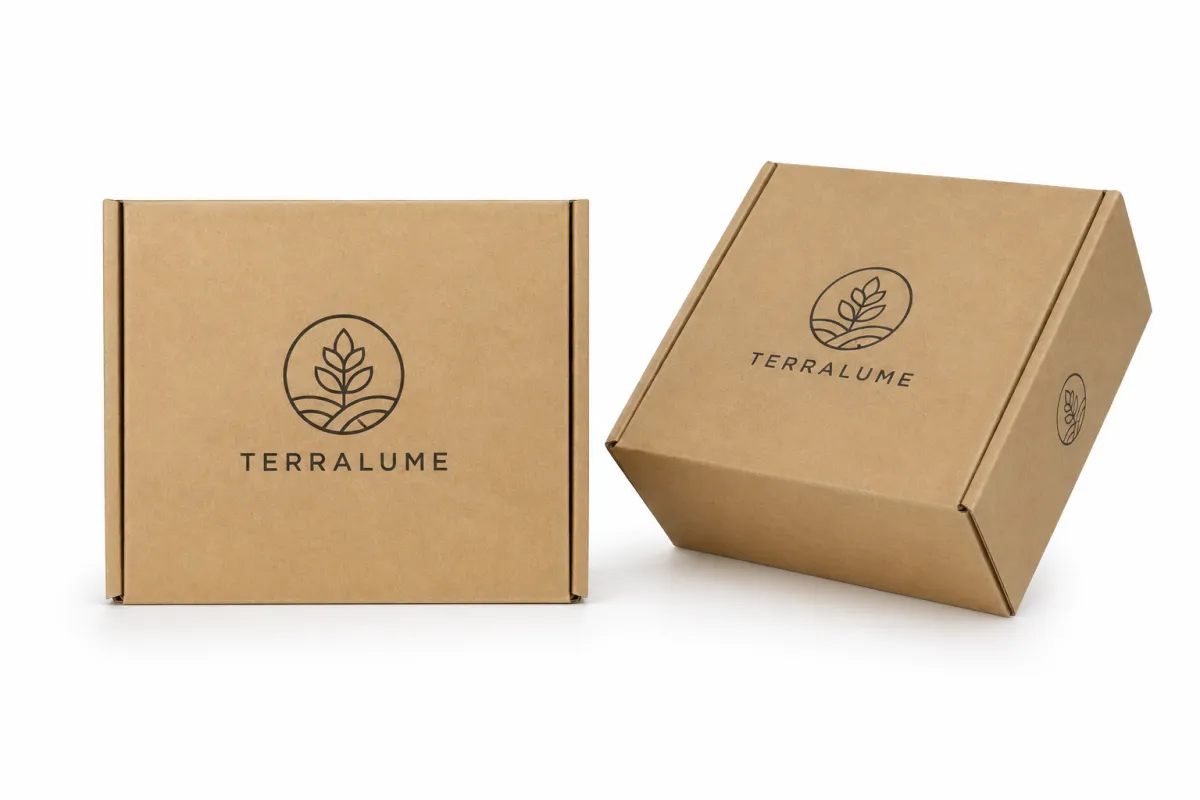
What Are Custom Natural Kraft Boxes With Logo?
At the simplest level, custom natural kraft boxes with logo are paper-based boxes made from kraft board, kraft liner, or corrugated kraft stock that keep the paper's brown, fiber-visible appearance instead of bleaching it into a bright white sheet. That brown tone is not just a color choice. It shifts the emotional register of the package. White stock can read as polished or sterile; natural kraft often reads as grounded, tactile, and more human. I have seen shoppers interpret that texture as proof that a brand is not trying to shout over them. Oddly enough, that restraint can make the package feel more premium than something louder, especially on a shelf with 20 other cartons.
Natural kraft gets its character from the fiber showing through the sheet. In folding cartons, the board often sits in the 300gsm to 400gsm range, and a common retail spec is 350gsm C1S artboard laminated to a kraft outer wrap for a sharper logo edge. In mailers, it may be single-wall corrugated board such as E-flute or B-flute with kraft liners. In rigid boxes, the kraft is often the outer wrap rather than the structural core, which is usually 1200gsm to 1400gsm grayboard. The right format depends on product weight, shipping method, and how much abuse the box has to survive before it reaches the customer. A 180-gram candle does not need the same construction as a boxed apparel set or a 1.2-kilogram gift kit. I have seen brands overbuild these boxes until they felt like they were shipping engine parts from Detroit.
These boxes show up everywhere once you start noticing them. Candles use them because the surface supports handmade positioning without looking stage-managed. Soap and skincare brands use them because the material aligns with a natural story without drifting into craft-fair territory. Apparel and subscription kits use them because the inside can work as hard as the outside. I have also seen custom natural kraft boxes with logo used for stationery, pet treats, limited-run product packaging, and bakery items where the box needs to feel like part of the experience rather than a disposable shell. That part matters more than many teams admit out loud, especially when the product is sold at $18 to $42 a unit and the package has to justify the margin.
The logo changes the entire mood of the package. A plain kraft box can be useful, sure, but a well-placed logo turns it into Custom Printed Boxes with an identity buyers recognize from across a room. The mark does not need to yell. On kraft, a clean logo in black, white, deep green, or a single metallic accent often looks stronger than a crowded full-color panel. The paper already does visual work, so the artwork should not fight it. That is one reason custom natural kraft boxes with logo can feel premium even when the print is minimal. The box does not beg for attention; it just quietly gets it, which is a useful trait when the carton sits next to five other brands in the same 36-inch retail bay.
Brands still misread kraft from time to time. They treat it like a cheaper substitute for white stock. It is not. It is a different language with a different accent. If your brand story leans on sustainability, craft, small-batch quality, or low-intervention design, kraft can fit with unusual precision. If the box is too small, too busy, or badly printed, the material will not rescue it. Texture helps, but it does not cover a weak spec. I wish it did. It would have saved me several blunt emails, including one about a 2 mm flap misalignment that turned a tidy sample into a packaging argument.
"We do not need shiny," one skincare founder in Austin told me during a prototype review for 10,000 units. "We need something that feels honest when it lands in the customer's hands." That sentence became the entire brief for their custom natural kraft boxes with logo.
How Custom Natural Kraft Boxes With Logo Are Made
The production path begins with substrate choice. A converter might build custom natural kraft boxes with logo as a folding carton, a rigid box wrap, or a corrugated mailer. Folding cartons fit lighter products and retail shelves. Corrugated mailers are better when a box has to survive parcel handling. Rigid boxes cost more, yet they bring the heavier hand-feel many premium brands want. The board choice affects everything that follows: ink holdout, folding performance, edge crush, and whether the package feels crisp or soft in the hand. One wrong substrate and the whole thing feels off, like wearing dress shoes on a hiking trail in Banff.
Then comes the dieline. A dieline is the structural map of the box, and it catches bad decisions early. The logo has to sit clear of folds, glue tabs, and cut lines. Barcodes need quiet space. Fold areas need enough tolerance that the print does not crack or shift during assembly. I have seen a beautiful artwork file ruined because somebody placed a logo 4 mm too close to a score line. On screen, it looked centered. On the sample, it looked like it was trying to escape the box. I still remember staring at that proof and thinking, "Well, that is not ideal." A 3 mm bleed and 1.5 mm safe zone would have prevented the problem.
Printing on kraft brings its own set of constraints. Flexographic printing is common for corrugated runs and can be efficient at scale, especially in places like Dongguan, Foshan, and Yiwu where high-volume carton plants turn overnight shifts into a routine. Offset printing gives finer detail and often suits folding cartons. Digital printing helps with shorter runs, prototypes, and quick revisions. White ink, spot-color systems, and overprint methods behave differently on brown kraft because the substrate absorbs and warms the color. A pale blue that looks crisp on white may turn muted or dusty on kraft. That is not a flaw. It is physics, plus a little paper moodiness and a lot of absorbed pigment.
That is why custom natural kraft boxes with logo should be judged on samples, not only on renderings. On a render, the color sits on a perfect virtual sheet. On the real board, the fibers, pressure, coating, and ink density all change the final tone. I have seen deep black logos print beautifully with a simple one-pass method, while a pastel design needed a white underprint and a second pass just to stay legible. The screen can be a liar. The sample is where the truth usually shows up, sometimes wearing muddy shoes from the production floor in Suzhou or Ningbo.
Finishing comes next. Some brands keep the surface raw and uncoated because that preserves the paper's dry, natural feel. Others choose aqueous coating or matte varnish to reduce scuffing during shipping. Embossing and debossing can add a tactile detail without flooding the box with color. Foil can work too, but I only recommend it when the brand wants deliberate contrast, because too much shine can fight the grounded look that makes kraft attractive in the first place. A little shimmer can be elegant. Too much and the box starts acting like it wants to be a nightclub flyer in Miami instead of a candle carton.
If the box has to survive transit, appearance cannot be the only test. I have asked suppliers for compression data, drop-test thinking, and pack-out guidance more than once. For transport discipline, methods from ISTA are worth knowing, especially for subscription kits and retail orders that move through parcel networks. A 32ECT corrugated mailer can pass basic transit handling for a 2-kilogram kit, while a 275# burst-tested box may suit heavier units. The box may look calm on a shelf, but it still has to survive the trip through the sorting machine that seems designed by someone with a grudge.
Sampling, proofing, production, finishing, and packing each take their own time. A simple digital prototype may be ready in 3 to 5 business days, while a larger run with tooling, special inks, and assembly can move at a different pace. For standard folding cartons, production is typically 12-15 business days from proof approval, while complex rigid sets often need 18-30 business days. That is why custom natural kraft boxes with logo are as much a manufacturing decision as a design decision. The art direction matters. So does the actual factory schedule, which never seems to care about your launch date unless you build in a 10% buffer.
What Drives Cost and Pricing for Custom Natural Kraft Boxes With Logo?
Pricing starts with the structure. A folding carton, a corrugated mailer, and a rigid setup box live in different cost bands. The board grade matters too. A 350gsm C1S artboard carton does not price like a 32ECT corrugated shipper, and neither behaves like a wrapped rigid set with 1200gsm grayboard beneath it. When buyers ask why two quotes for custom natural kraft boxes with logo differ by 40% or more, the answer is usually hiding in the board, not the logo. I have had that conversation more times than I can count, and the logo is almost never the expensive part.
Quantity changes the math fast. Setup costs, tooling, proofing, and prepress get spread across fewer boxes on a short run, so the unit price climbs. A 1,000-piece order often costs much more per box than a 10,000-piece order, even if the artwork never changes. I have seen a quote move from roughly $0.42 per unit at 1,000 pieces to about $0.15 per unit at 5,000 pieces on a simple kraft carton in Dongguan, with the gap driven mostly by setup dilution and print efficiency. That kind of spread is normal, not unusual. It is the part of packaging economics that makes perfect sense once you see it and mildly hurts when you pay for it.
Decoration is another major lever. A single-color logo printed cleanly on kraft is usually simpler and cheaper than full-bleed art, multiple spot colors, white ink coverage, or foil stamping. Special finishes add labor. Embossing adds tooling. A matte aqueous coating adds a step. Even the way the logo is placed can change the quote if the printer needs extra setup to align artwork around windows, inserts, or die-cut shapes. Custom natural kraft boxes with logo look simple, but they are not always simple to produce. Simple is often an optical illusion held together by a lot of technical competence and a lot of cardboard.
Some costs hide in plain sight. Dieline setup, sample production, shipping, inserts, hand assembly, and minimum order requirements can make two offers look similar on paper while landing very differently in reality. A supplier may quote a low unit price and then attach separate charges for plates, proofs, freight, and export cartons. Another supplier may fold those costs into one number. If you do not ask, you will not compare apples to apples. You may end up comparing apples to a fruit basket with a hidden invoice taped underneath, which is a very specific kind of packaging disappointment.
For brands still in the research stage, a plain comparison helps. It forces the discussion into specifics instead of optimism. The numbers below are illustrative, but they reflect the pricing patterns I see regularly for custom natural kraft boxes with logo from factories in Guangdong, Zhejiang, and occasionally Los Angeles for rush digital work.
| Box Option | Typical Use | Typical Unit Price at 5,000 Pieces | Typical Turnaround | Notes |
|---|---|---|---|---|
| One-color kraft folding carton | Soap, candles, small retail items | $0.15 - $0.28 | 12-15 business days from proof approval | Best when the logo is simple and the design stays minimal |
| Two-color kraft mailer with inside print | Subscription kits, ecommerce, apparel | $0.32 - $0.58 | 14-18 business days from proof approval | More print setup, but stronger unboxing value |
| Rigid kraft wrap box with special finish | Gift sets, premium launches | $1.35 - $2.90 | 18-30 business days from proof approval | Higher material and assembly cost, stronger shelf presence |
If you want cleaner quotes, ask suppliers whether the price includes proofing, tooling, shipping, inserts, and any assembly fee. I have seen brands save a week of email back-and-forth by requesting those five details up front. If you are comparing product packaging options, the Custom Packaging Products page can help narrow the format before you request numbers. A supplier in Dongguan may quote differently from one in Los Angeles or Ho Chi Minh City, but the line items should still be legible.
For eco claims, precision matters. The U.S. Environmental Protection Agency has useful material on sustainable materials management at EPA sustainable materials guidance. That matters because "kraft" is not a magic word. Sourcing, coatings, inks, and disposal conditions all affect the final story. A recycled-content claim only helps if the spec supports it, and I have seen too many brands discover that after the marketing copy was already drafted. That sort of scramble is not fun, especially when the printer has already locked a 6-color form on the press.
Step-by-Step Process and Timeline
The cleanest projects start with product specs, not artwork. I ask for exact dimensions, target weight, shipping method, and whether the product ships flat or assembled. A box for a 180-gram candle is not the same as one for a 900-gram apparel kit, even if both are sold as premium. If the internal space gets guessed instead of measured, the box may crush the product, shift too much in transit, or waste material that should have been trimmed away. Guessing is expensive. Measuring is boring and correct, which is usually a decent trade when you are paying for 5,000 cartons.
Once the dimensions are fixed, the design team decides where the logo belongs and what the package should communicate. Minimal, rustic, premium, and retail-ready are not interchangeable. A minimal box may use one deep-black mark centered on the front panel. A rustic version may keep the kraft visible and add a small line illustration. A retail-ready box may need panel hierarchy for SKU, ingredients, and barcode placement. Strong packaging design starts with those choices, not with a pretty mockup that nobody can manufacture without cursing into a keyboard in Dongguan.
Sampling is the moment that protects budgets. I have sat in client meetings where a render looked perfect, then the sample revealed a closure that was too tight, a logo that sat too low, or a print tone that looked brownish instead of black. That is not failure; that is the point of the prototype. On one soap project in Kuala Lumpur, the first sample showed a glue flap that interfered with the inner tray. The fix added only 2 mm to the side panel, yet it prevented a batch-level problem that would have been expensive to correct later. Two millimeters is a tiny measurement. It is also the difference between "great" and "why did we do this twice?"
The production sequence usually looks like this: prepress and proofing, material preparation, printing, die-cutting, finishing, folding and gluing, then final inspection and packing. Each step can create delay. If the artwork needs revision, prepress stretches. If the substrate is backordered, material prep stretches. If the box has a specialty finish or hand assembly, the line slows further. That is why custom natural kraft boxes with logo should be planned with a schedule buffer, especially for launch deadlines. Packaging has a way of turning one small revision into a whole afternoon, then quietly asking for more time.
Here is the timeline framework I give clients who want an honest expectation rather than a sales promise:
- Artwork and dieline alignment: 1-3 business days for simple work, longer if the structure is new or the logo has fine linework below 0.5 pt.
- Proof review and revisions: 2-5 business days depending on how many departments must sign off, including legal or compliance.
- Sampling or prototype: 3-7 business days for standard setups, more for custom rigid packaging or multi-part inserts.
- Production: 7-20 business days depending on quantity, print method, and finishing, with 12-15 business days common for a 5,000-piece carton after approval.
- Packing and freight booking: 2-6 business days depending on destination and shipment mode, with ocean freight from Shenzhen to Los Angeles often booked separately.
That schedule is not a guarantee. It is a reality check. Simple digital jobs can move quickly, while a 15,000-piece order with foil, insert printing, and manual pack-out can take much longer. If you are ordering custom natural kraft boxes with logo for a launch or seasonal drop, build the calendar backward from the ship date, not forward from the first quote. That one habit prevents a lot of late-night panic and at least one unnecessary team meeting in a room with bad coffee.
Common Mistakes That Hurt Kraft Packaging
The first mistake is low contrast. Kraft is warm and brown, which means pale beige, soft gray, and thin type often disappear. I have seen brands choose elegant letterforms that looked graceful on a white mockup and unreadable on the actual board. If the logo has to carry the package, it needs weight. Strong black, deep green, white, or a well-chosen metallic accent usually performs better on custom natural kraft boxes with logo than delicate pastel tones. The paper is not trying to help your pastel mood board, and a 2-point stroke will not survive daylight or warehouse LEDs.
The second mistake is guessing size. A box that looks balanced on a screen may not protect the product in real life. Internal dimensions matter. Wall thickness matters. Closure style matters. I have seen a brand pay for 2,500 boxes that looked beautiful but left too much empty space, which made the product rattle and scuff the outer corners during shipping. A few millimeters can change both fit and unit cost. That small gap can create a surprisingly large mess, which is a charming way to discover a spec problem after you have already approved the dieline.
The third mistake is overloading the panel with copy. Kraft has a natural, tactile feel, and the material usually looks best when it can breathe. If every side is crowded with claims, ingredients, icons, and paragraphs, the result feels busy instead of intentional. I know brands want to explain everything, but the box is not a brochure. It is packaging. The best custom natural kraft boxes with logo often say less, not more. Restraint is not laziness. It is editing, and editing saves ink, plate area, and a surprising amount of visual noise.
The fourth mistake is skipping a real prototype. A digital proof can confirm color placement and artwork accuracy, but it cannot tell you how the board folds, how the corners meet, or how the texture changes the print. I learned that lesson during a supplier negotiation in Guangzhou, where a client wanted to skip sampling to save a few hundred dollars. The printer showed me two finished samples instead. One had a slight misalignment on the front flap. The other was clean. We chose the second, and the client later told me that one sample probably saved them from a warehouse headache. I still think about that every time someone says, "Do we really need a sample?" Yes. Yes, you do.
The fifth mistake is finish mismatch. A glossy coating can feel out of place on packaging that is supposed to read as earthy or restrained. Too much shine can make the box feel like it belongs to a different brand. If your story is about paper texture, craft, or low-intervention materials, let the kraft stay visible. Let the surface do some of the work. That is the advantage of custom natural kraft boxes with logo; they do not need decoration overload to feel finished. In fact, over-decorating them can make them look confused, especially under 4000K retail lighting.
One more issue shows up often: sustainability claims that do not match the spec. A kraft box is not automatically recyclable in every market, and it is not automatically FSC-certified just because it looks natural. If you need sourced fiber credentials, the chain matters. The Forest Stewardship Council at FSC is one place to verify sourcing claims before you print them on the box. I would rather sound cautious than have a brand explain a sloppy claim to a customer later, particularly if the run was 20,000 units and already on a boat.
Here is the short version. Do not let the brown surface trick you into underthinking the structure. Good custom natural kraft boxes with logo come from good measurements, honest print choices, and a prototype reviewed in daylight, not just inside a design file. If the sample looks right on the table and still looks right under warehouse lights, you are probably in decent shape. If it fails at both, the fix usually starts with the board spec, not the logo.
Expert Tips for Stronger Branding on Kraft
The strongest kraft packages respect the material. I tell brands to use fewer colors and let the paper carry some of the identity. One well-placed logo can do more than five decorative elements. On custom natural kraft boxes with logo, the substrate is not a blank canvas; it is part of the design language. If you cover every inch, you lose the character that made kraft attractive in the first place. That is a trade I rarely see pay off, particularly on a box that will be opened once and photographed on a phone at 11 a.m.
Typography deserves special care. Bold sans-serif type usually reads better than thin serif work on brown board, especially at small sizes. Generous spacing around the mark helps too. A logo does not need to be large to feel confident. In fact, a smaller mark with more breathing room can feel more premium than a giant logo printed edge to edge. That is a useful lesson for package branding because restraint often reads as confidence rather than hesitation. There is a difference between calm and timid, and packaging can tell it immediately from three feet away.
Color choice matters more than most teams expect. Black is the obvious option because it contrasts cleanly. White is excellent if the printer uses a proper underprint. Deep green, navy, and charcoal can work when the brand wants a natural but more refined palette. A single metallic accent, used sparingly, can also help a box feel intentional. I have seen a tea brand in Portland use one copper foil line on a kraft carton and get more shelf attention from that small detail than from any full-color illustration they had previously tested. One line. That was enough. Packaging can be stubbornly simple like that.
Think beyond the outer panels. Inside printing can create a better reveal, especially for ecommerce and gift sets. A short message on the inside lid, a branded insert, or tissue in a matching tone can turn a simple carton into a more memorable unboxing moment. That does not mean adding clutter. It means using the inside space with purpose. Strong product packaging often has one quiet surprise tucked inside, like a 30 mm logo repeat on the lid or a single message printed in 100% black. Too many surprises and it starts to feel like a party nobody asked for.
Testing should happen under real conditions. Shelf lighting can wash out muted ink. Parcel abrasion can scuff a raw surface. Photographs taken by customers can shift the color temperature and make the logo appear warmer or cooler than it looked in the studio. I always ask clients to test samples under warehouse light, daylight, and phone camera flash before approving the final run. Custom natural kraft boxes with logo have to work in the wild, not only in mockups. The box that looks great in a design deck and terrible in a phone photo is not done yet.
If you are unsure whether to prioritize speed, price, or presentation, decide that early. A faster digital run will not behave like a premium rigid set. A lower-cost mailer will not feel like a gift box. There is no perfect format, only the one that fits your product, channel, and budget. For many brands, that fit starts with the right Custom Packaging Products option and a clear brief. I would rather see a realistic brief than an ambitious one that collapses under its own wish list, especially if the brief is being quoted by factories in Shenzhen, Toronto, and Monterrey at the same time.
One practical rule I use: if the logo still reads from three feet away, the box is doing its job. If it only looks good from six inches away, the design may be too precious for retail or shipping use. Custom natural kraft boxes with logo reward clarity. They do not reward confusion. Kraft is not the place to be shy and decorative at the same time, and it certainly is not the place to hide a brand mark under a pile of ornamental lines.
Next Steps for Custom Natural Kraft Boxes With Logo
Start with a one-page packaging brief. Include product dimensions, quantity range, target budget, shipping method, and the exact logo files you can supply. If you send vector artwork in AI, EPS, or PDF format, the printer can usually work faster and with fewer corrections. If your colors are brand-critical, add Pantone references or a clear CMYK target. That one document can save days of back-and-forth when you request quotes for custom natural kraft boxes with logo. It can also spare everyone a round of "wait, which green did you mean?" at 4:30 p.m.
Then decide what the first order is supposed to prove. Is the goal speed? Low unit cost? A premium retail presence? Those priorities often lead to different material and print choices. A 2,000-piece test run for a new candle line should not be built the same way as a 20,000-piece seasonal refill program. I have watched teams get stuck because they wanted the cheapest box, the fastest box, and the prettiest box all at once. Usually, only two of those can win on the first round. Sometimes only one, which is not thrilling, but it is honest and usually cheaper by at least 18%.
Ask for a sample or prototype before you approve volume. Judge it against the product itself, not against the digital render. Check the closure, the print tone, the panel spacing, the barcode readability, and the way the box feels in the hand. On a client visit in Dallas, I watched a founder hold a prototype for less than ten seconds before pointing to a panel that needed 3 mm more room. That tiny call saved the project from a reprint. Good instincts often show up faster than spreadsheets, which is inconvenient for spreadsheet fans but true.
Shortlist vendors by clarity, not charm. A good supplier should explain whether the quote includes proofing, plates, tooling, shipping, and any assembly work. They should also tell you whether the structure they recommend is for retail packaging, ecommerce, or display. If they cannot answer those questions cleanly, they may not be the right fit for custom natural kraft boxes with logo. Packaging is complicated enough without bringing a vague vendor into the room, especially when the vendor is quoting from three time zones away.
One more suggestion: run a small pilot if the product is new. I have seen too many brands commit to a full production batch before they know how the product behaves inside the box after a week in transit or a month on shelf. Pilot runs reveal practical problems. They also reveal whether the branding lands the way you hoped. That is especially useful when package branding depends on texture, not only on color. A brand can fix a lot with a pilot. It can also avoid a very expensive "well, that was unexpected" later, which is a sentence nobody wants to say in front of finance.
When you are ready, move from research to sample request, then from sample request to production quote, then from quote to pilot run. That sequence keeps risk lower and decisions cleaner. If you stay disciplined, custom natural kraft boxes with logo can give you the exact mix most brands want: natural looking, commercially practical, and memorable without trying too hard. That combination is harder to find than it should be, which is probably why kraft keeps getting another look from candle brands in Oregon, skincare teams in Austin, and packaging buyers in Guangdong.
How much do custom natural kraft boxes with logo usually cost?
Pricing depends on box style, size, material thickness, print method, and order quantity. On a 5,000-piece run, I usually see a one-color Kraft Folding Carton land around $0.15 to $0.28 per unit, while a rigid gift box can move into the $1.35 to $2.90 range. Custom natural kraft boxes with logo become more affordable per unit as the run gets larger, especially when the artwork stays on a single plate and the factory is in a carton-heavy region like Dongguan or Yiwu. Ask whether the quote includes setup, proofing, shipping, and inserts so you can compare suppliers on the same basis. If you skip that part, the cheapest quote can become the most expensive one very quickly.
What is the typical turnaround for custom natural kraft boxes with logo?
Simple orders move faster than custom structural packaging or specialty finishes. For standard folding cartons, I usually see 12-15 business days from proof approval to production completion, with another 2-6 business days for packing and freight booking depending on destination. Sampling, proof approval, and production each add time, so I advise building in a buffer before launch or shipment. If timing matters, ask the supplier which step is likely to become the bottleneck for custom natural kraft boxes with logo and whether a prototype can be fast-tracked. I would rather hear a realistic timeline than a cheerful fantasy with freight attached.
Are custom natural kraft boxes with logo really eco-friendly?
Natural kraft can support a sustainability-forward look because it often uses less bleaching and can be easier to position as low-waste packaging. The full impact still depends on the board source, coatings, inks, and whether the box is recyclable in your market. Do not assume "kraft" automatically means green; verify the material spec and finishing choices before you print the claim on custom natural kraft boxes with logo. A box can look environmentally friendly and still be poorly sourced, which is not a flattering contradiction, especially if the board came from mixed fiber without certification.
What file type works best for a logo on kraft boxes?
Vector files such as AI, EPS, or PDF are usually best because they stay sharp at any size. Transparent backgrounds help if the design must sit directly on brown kraft without a white box around it. Share brand color specs and font files too, so the printer can match the artwork accurately on custom natural kraft boxes with logo. The cleaner the file, the fewer opportunities for the printer to guess, and guessing is where expensive surprises start. I also recommend a 1:1 dieline overlay in PDF so the logo can be checked against folds before plates are made.
Can I order custom natural kraft boxes with logo in small quantities?
Yes, but the per-unit price is usually higher because setup costs are spread across fewer boxes. Digital printing and simpler structures are often the best fit for small runs, especially in North America where a 500-piece pilot can be worthwhile for a first launch. If you are testing a product, start with a smaller quantity and confirm fit, color, and durability first; that is the safest way to approach custom natural kraft boxes with logo. A small run feels cautious, but it is a lot less painful than discovering a structural issue after thousands of boxes are already printed.
If you remember only one thing, make it this: kraft rewards clarity. A good box size, a clean logo, and a sane production plan can do more for a brand than an expensive finish with no purpose. I have seen that lesson hold up in small workshops, large converters, and client meetings where everyone thought the answer was to add more decoration. Usually, the better answer is to remove noise. That is why custom natural kraft boxes with logo keep winning for brands that want packaging to feel honest, commercial, and memorable all at once. The best versions do not try to disguise the paper; they let the paper do part of the selling. If you want the box to work hard, start with the right board, keep the logo readable from a few steps away, and only add finish where it earns its keep.

