Buyer Fit Snapshot
| Best fit | Custom Padded Mailers for Sample Kits projects where brand print, material claims, artwork control, MOQ, and repeat-order consistency need to be specified before quoting. |
|---|---|
| Quote inputs | Share finished size, material target, print colors, finish, packing count, annual reorder estimate, ship-to region, and any compliance wording. |
| Proofing check | Approve dieline scale, logo placement, barcode or warning zones, color tolerance, closure strength, and carton packing before bulk production. |
| Main risk | Vague material claims, crowded artwork, missing packing details, or unclear freight terms can make a low unit price expensive after revisions. |
Fast answer: Custom Padded Mailers for Sample Kits: Finish Comparison should be specified like a repeatable production item. The safest quote records material, print method, finish, artwork proof, packing count, and reorder notes in one written spec.
Production checks before approval
Compare the actual filled-product size with the drawing, then confirm tolerance on folds, seals, hang holes, label areas, and retail display edges. Reserve space for logos, QR codes, warning copy, and material claims before decorative graphics fill the panel.
Quote comparison points
Review material grade, print process, finish, sampling route, tooling charges, carton quantity, and freight assumptions side by side. A quote is only useful when the supplier can repeat the same color, closure quality, and packing count on the next order.
A custom Padded Mailers for Sample kits print finish comparison sounds like a small spec decision. It is not. The finish changes how the kit feels in hand, how it survives shipping, and how much you pay every time you send one out. It also changes the story the package tells before the recipient opens it. First touch matters. Packaging people know this. Everyone else learns it after a shipment arrives with scuffed corners and a sad-looking logo.
Sample kits need more discipline than a plain shipping mailer. They are protection and presentation in the same object. That means the finish has to do real work, not just look nice in a mockup. Pick badly and the mailer starts reading cheap, wearing down fast, or quietly inflating cost. Pick well and the package feels intentional before anyone gets to the insert card.
For brands building a broader packaging system, the mailer finish should sit alongside the structure and print method, not after them. Start with Custom Packaging Products if you are mapping the whole line, then compare lighter shipping formats like Custom Poly Mailers before you commit to a padded build that needs a stronger presentation finish.
Why Finish Changes Everything on Sample Kit Mailers
Artwork gets the attention. Fine. But on a sample kit mailer, the finish decides whether that artwork feels polished or merely printed. Matte can make a simple logo look restrained and expensive. Gloss pushes color harder and gives the package more retail-style energy. Soft-touch brings the kind of feel people notice immediately, which is useful until the budget gets involved.
Finish also changes what happens after the mailer leaves the studio. A piece that looks clean under controlled lighting can come back with seam rub, corner wear, or fingerprints if the surface is too delicate for the route it travels. Sorting tables, tote bins, delivery sacks, warehouse racks. None of them care about the render. They will all test the surface in their own way.
Sample kits get judged fast. Buyers do not separate the outer mailer from the contents in their head. The mailer is part of the sample. That makes the decision less about taste and more about the job the package needs to do. Does it need to signal luxury? Keep costs under control? Survive rough handling? Support a consistent brand story across a rollout? Those answers point in different directions.
If the finish looks great in a proof but rubs off in transit, the spec is doing theater, not packaging.
The useful comparison is not “which finish looks nicest?” It is “which finish gives the right mix of appearance, durability, and unit cost for this exact sample program?” That question is less glamorous. It also saves money and a lot of post-launch regret.
Custom Padded Mailers for Sample Kits Print Finish Comparison
A custom Padded Mailers for Sample kits print finish comparison comes down to four things: visual impact, scuff resistance, tactile feel, and production cost. Get those four right and the choice gets a lot clearer. The finish will not rescue weak artwork, but it can make good design land with more authority.
Most buyers compare matte, gloss, soft-touch, spot UV, and foil. Substrate matters just as much. Kraft paper, white paper stock, recycled stock, poly outer layers, and bubble-lined constructions all change how ink sits and how the surface reads. Digital printing on a short run behaves differently from offset printing on a larger run, even when the artwork file never changes.
The same design can look sharp on one mailer and flat on another. Dark logos on matte white paper can feel restrained and premium. The same artwork on a high-gloss white surface can feel louder and more retail-driven. Neither one wins in every case. They solve different problems, which is usually the part people skip until they are staring at samples they do not love.
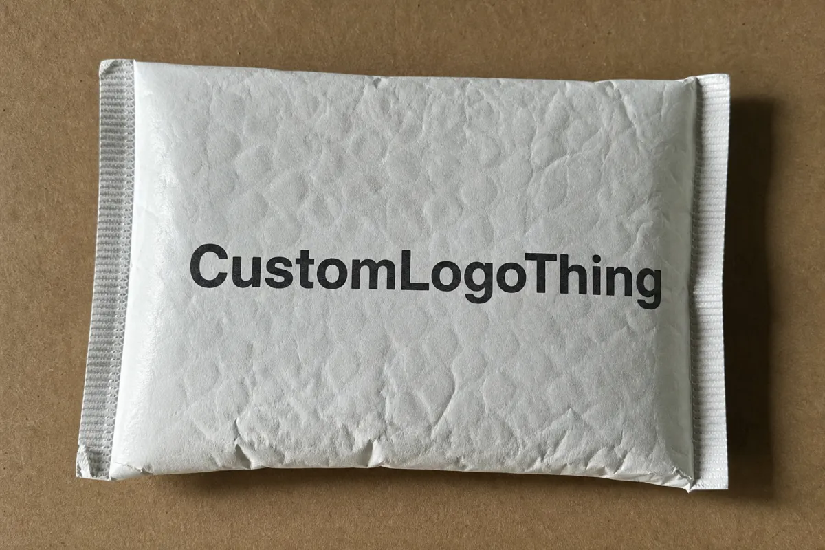
For a common sample kit build, buyers often start with a 6 x 9 in or 7 x 10 in padded mailer on 350gsm C1S artboard with a PE bubble lining or EPE foam insert. For a heavier kit with bottles, swatches, or folded collateral, 9 x 12 in mailers are more common because the extra width keeps the inserts flatter and reduces corner crush. The finish has to fit the structure. A nice coating on the wrong build is still the wrong build.
Here is a practical table buyers can actually use:
| Finish | Look and Feel | Durability | Typical Added Cost | Best For |
|---|---|---|---|---|
| Matte coating | Clean, restrained, less reflective | Good scuff resistance, hides fingerprints fairly well | About $0.03-$0.08 per unit at mid-sized runs | Premium branding, understated sample kits, dark artwork |
| Gloss coating | Bright, vivid, higher shine | Moderate; shows marks more easily than matte | About $0.02-$0.06 per unit | Retail-style impact, color-heavy designs, punchy logos |
| Soft-touch lamination | Velvety, high-end, tactile | Strong feel, but can show wear if handled roughly | About $0.08-$0.20 per unit | Luxury samples, executive kits, higher perceived value |
| Spot UV | Gloss accents on selected elements | Good on accents, but not a full-surface shield | About $0.10-$0.25 per unit | Logos, patterns, and selective branding emphasis |
| Foil stamping | Metallic, formal, attention-grabbing | Can be durable, but depends on application quality | About $0.12-$0.35 per unit | Premium launches, gift-style sample kits, limited runs |
The figures above are directional, not a quote. MOQ, print coverage, substrate choice, and setup method can swing them hard. For example, 5,000 units of a 7 x 10 in mailer with one-color black print on 350gsm C1S artboard may land around $0.15-$0.24 per unit with a simple matte or gloss finish. Add a soft-touch laminate and the same order can move closer to $0.22-$0.38 per unit. Add spot UV on a logo and a buyer may see another $0.10-$0.20 per unit on top. Still, the table is more useful than the word “affordable,” which tells you almost nothing until the invoice arrives.
Print method matters too. Digital printing usually handles lower quantities and variable artwork more comfortably. Offset printing often wins on unit economics once the run gets large enough. Specialty effects can add extra steps either way. So the real comparison is finish plus print process plus substrate versus the shipping and brand result you need.
How Print Finishes Work on Custom Padded Mailers
Finishes get mixed up all the time, which is how buyers end up comparing terms that do not mean the same thing. Ink is not finish. Coating is not lamination. Varnish is not just a synonym for shine. On custom padded mailers, the vocabulary gets sloppy fast.
Inks lay down the color. Coatings change sheen, scuff behavior, and moisture resistance. Varnishes can protect or decorate, depending on the system. Laminations add a film layer and usually improve durability and tactile control. Specialty effects like foil and spot UV are less about protection and more about contrast, emphasis, and the little visual hit that makes someone pause.
Substrate shapes the result just as much. Kraft paper absorbs color and softens it, which can work beautifully when the brand wants a grounded, practical feel. White paper stock gives stronger contrast and tighter color accuracy. Recycled stocks can show fiber variation and a less uniform surface, which some teams love and others reject immediately. Poly outer layers improve moisture resistance and can make graphics pop harder, though they also shift the feel away from paper-based packaging.
For a common production spec, a mailer might use 350gsm C1S artboard on the outside with a 60gsm or 80gsm bubble liner inside. Another route uses 250gsm to 300gsm kraft face stock if the brand wants a more natural look. If the kit needs more crush protection, an EPE foam layer or a thicker bubble liner can keep the contents from bouncing around. Finish choice should follow the structure. A glossy coating on thin board can still feel flimsy if the shell flexes too much.
Good finish work makes the package look cleaner under normal handling. Logos sharpen up. Solid color blocks stop looking patchy. Edges feel more deliberate. Seam wear is less obvious where the mailer flexes during packing and shipping. The same artwork can look more expensive without any change to the artwork itself. Packaging has a lot of tricks like that. Most of them are legal.
The catch is obvious. Some finishes look excellent on a proof and then punish the buyer later with fingerprinting, mark transfer, or too much glare. Sample kits cannot afford that kind of mismatch. The recipient should feel confidence the second they pick up the mailer. If the surface already looks tired, the brand message starts fighting the packaging instead of moving through it.
For shipping durability and testing language, the methods from ISTA are a useful reference point. Nobody needs to become a standards nerd for fun. Still, the chosen finish should survive rubbing, stacking, vibration, and drops without looking trashed before the package is even opened.
Key Factors That Decide the Best Finish
Durability comes first. Sample kits get handled more than design teams expect. They are loaded, sorted, stacked, slid around, and opened by people who are already deciding whether the brand feels credible. A finish that looks elegant but scuffs early is a weak trade if the mailers travel through several handoffs.
Branding impact comes next. Matte usually feels quieter and more controlled. Gloss has more energy and works when bright color and shelf-like visibility matter. Soft-touch leans upscale and can make even a simple mark feel expensive. It can also look out of place if the audience is casual or the shipping route is rough. The finish should match the way the brand speaks everywhere else, not just the way it behaves in one proof.
Readability matters more than people admit. Dark backgrounds can swallow text if contrast is weak. Heavy ink coverage can muddy a surface. Fine lines, small QR codes, and legal copy all need enough separation to stay legible after coating or lamination. If the sample kit sits inside regulated packaging, that legibility issue stops being cosmetic very quickly.
Fingerprint resistance matters too. Glossy surfaces show smudges more easily, especially on dark colors. Matte hides them better, though not perfectly. Soft-touch feels excellent in hand and still picks up wear from repeated handling. A sales team carrying kits to demos will care. Direct-to-customer shipments may care less, but the mailer still needs to survive the warehouse side of the process.
Sustainability deserves a real answer, not a sticker. Some coatings and laminations make recycling harder, especially when the construction mixes materials too aggressively. Brands that want to stay close to paper recovery streams should factor that into the finish choice. FSC-certified sourcing helps on the material side, and the FSC site explains what the certification actually covers. If recycling is part of the pitch, the mailer should not quietly work against it.
For many buyers, the decision is not premium versus cheap. It is whether the finish supports the business case. A sample kit that helps close higher-value accounts can justify a more expensive finish. A high-volume replenishment kit with thin margin usually cannot. That tradeoff is not exciting. It is just the part that keeps packaging from turning into a money leak.
- Choose matte when you want controlled sheen, better fingerprint hiding, and a clean premium feel.
- Choose gloss when color impact and visual pop matter more than a quiet finish.
- Choose soft-touch when the sample kit is high-value and tactile impression is part of the pitch.
- Choose spot UV or foil when a logo or pattern needs emphasis without coating the entire surface.
- Check recyclability before approving specialty coatings on a paper-based mailer.
Cost, Pricing, MOQ, and Unit Cost Tradeoffs
Pricing catches people off guard because the cheapest finish on paper is not always the cheapest outcome. A basic gloss might save a few cents and then cost more through scuffing, weaker perceived value, or a reprint. Custom packaging is full of those little traps. The unit quote looks tidy. The real workflow is not.
MOQ changes the math fast. At 1,000 units, specialty finish cost gets spread across fewer mailers, so the premium rises. At 5,000 units, a matte or gloss finish on a standard sample kit mailer often sits in a more comfortable range because setup gets diluted across the run. At 10,000 units and above, offset printing usually becomes more attractive, especially on repeat programs with the same art. Same finish. Different scale. Very different mood.
Common pricing drivers include plate or setup fees, coating setup, extra pass charges, artwork coverage, color matching, and whether the mailer needs a white underbase on a dark substrate. Digital printing can be friendlier on short runs and less efficient on large volumes. Offset printing can run the other way, with a larger setup but better economics later. The finish should be compared inside that structure, not pulled out and judged alone.
For a standard sample kit quote, buyers often see the shell priced separately from the finish. A 350gsm C1S artboard shell with bubble lining might price one way, then matte lamination, gloss coating, soft-touch film, or spot UV gets added as a line item. That helps buyers see what the decoration actually costs. It also helps when comparing a paper-based mailer against a poly outer option, which often has a different feel and a different price curve.
Here is a practical way to think about the ladder:
- Basic matte or gloss usually sits at the low end of finish cost.
- Soft-touch often moves into the middle or upper-middle tier.
- Spot UV adds cost because it requires selective application.
- Foil tends to be one of the pricier options, especially for small runs.
- Specialty recycled or compostable constructions can raise material cost even before finish is added.
For sample kits, the right question is simple: how much brand lift does the finish create relative to the extra spend? In a high-value sales cycle, an extra ten or twenty cents may be trivial. In a high-volume program with thin margin, the same amount can sting. Context wins every time.
When you compare quotes, hold everything else constant. Same substrate. Same size. Same artwork coverage. Same quantity. Same proofing method. If the only variable is finish, the quote becomes a real comparison instead of a bundle of hidden changes wearing the same label. That is how buyers avoid paying for a nicer-sounding spec that came with different paper stock attached.
| Run Size | Matte | Gloss | Soft-Touch | What Usually Matters Most |
|---|---|---|---|---|
| 1,000 units | Lower setup pressure, but still not cheap | Close to matte in many quotes | Can feel expensive fast | Setup fees and proofing cost |
| 5,000 units | Often the most balanced choice | Usually easy to justify | Becomes more realistic | Unit economics and handling durability |
| 10,000+ units | Strong cost control with good appearance | Efficient if artwork is high-contrast | Less painful per unit, still premium | Total spend, freight, and QC consistency |
Process, Timeline, and Lead Time for Production
Finish choices affect schedule more than teams expect. The basic flow looks simple: brief, artwork review, proof, approval, production, shipping. Nice and tidy. Real production behaves less politely. Finish choice can add another sampling round, a color correction pass, or a curing step that pushes lead time out by a few business days.
Simple matte or gloss finishes usually move faster. They need fewer special steps and are easier to QC. Soft-touch, spot UV, and foil often require extra setup or drying time. Multiple passes can change how the shop stages the run. That does not always mean a long delay. It does mean nobody should pretend the schedule is a spreadsheet fantasy.
Proof approval is where speed gets lost. If the first proof shows that dark artwork on a chosen substrate needs a stronger underbase, or if the gloss reads too aggressive, the team may need revisions. One revision cycle is normal. Three revision cycles on a low-MOQ order can wreck a launch calendar. That is not a manufacturing failure. It is planning getting sloppy.
A practical rule for sample kits: build buffer time into the schedule. If the launch date is fixed, do not wait until the last week to finalize the finish. A buyer who wants a premium result and a predictable ship date should lock the spec early, especially when the mailer supports a sales event, tradeshow, or product rollout with a hard deadline.
As a rough planning range, simple custom padded mailers often land around 12-15 business days after proof approval for standard runs, while specialty finishes may stretch to 15-25 business days depending on quantity and QC requirements. A run of 5,000 pieces with a matte or gloss finish often sits near the lower end of that window. Add soft-touch, foil, or spot UV and the schedule usually moves up because the finish needs extra setup and more inspection. Freight is separate, and international shipments add their own delays. Logistics never misses a chance to be inconvenient.
If the kit includes inserts, labels, and outer packaging, approve the mailer finish alongside the whole pack. A shiny outer layer next to a dull insert can feel accidental. If the project also includes custom printed boxes elsewhere in the line, keep the finish logic consistent enough that the brand feels coherent without making every item look identical.
Step-by-Step Finish Comparison for Sample Kits
A good comparison process is boring in the best possible way. Start with the kit itself. What is inside? Who gets it? Is it a launch kit, a sales sample, a press drop, or a distributor package? The answer changes how much visual drama you need and how much abuse the mailer has to survive.
Next, rank the priorities. Some brands want maximum visual impact. Some care more about shipping durability. Some need the lowest possible unit cost. Most need a mix of all three. Put them in order before asking for samples. If everything is a top priority, nothing is.
Compare finishes on the same artwork, same substrate, and same size. That is the only fair test. A gloss sample on one material and a matte sample on another proves that materials differ. Which they do. That still does not answer the real question.
If the kit contains fragile items, ask for a build that matches the contents. A 6 x 9 in mailer with 20 mm bubble may work for flat swatch cards and a brochure. A 9 x 12 in mailer with a thicker liner may be better for glass vials, sample jars, or stacked inserts. The finish cannot fix a weak structure. It can only make the structure look better.
The table below works as a simple decision matrix:
| Finish | Brand Feel | Durability | Cost Pressure | Production Speed | Best Use Case |
|---|---|---|---|---|---|
| Matte | High if the design is restrained | Good | Low to moderate | Fast | Clean, premium sample kits |
| Gloss | High for bright artwork | Moderate | Low to moderate | Fast | Color-heavy, retail-style mailers |
| Soft-touch | Very high | Moderate to good | Moderate to high | Moderate | Luxury sample kits |
| Spot UV | High if used sparingly | Good on accents | Moderate to high | Moderate | Logo emphasis and premium accents |
| Foil | Very high for the right brand | Good if applied well | High | Slower | Limited runs, gift-style kits |
Do not stop at an untouched sample. Test the mailers after a little abuse. Stack them. Rub them lightly. Look at them in office light and daylight. Carry one in a tote. Check whether the finish still holds after a few minutes of normal use. That matters because the recipient will not see the package in a showroom. They will see it after transit, which is a less flattering environment.
Ask for side-by-side proofs or physical samples with the same artwork. Comparing two finishes at once makes the differences obvious. Memory is a lousy test tool. The best option usually becomes clear the moment the buyer holds both pieces. The weakest one tends to reveal itself through fingerprints, glare, or weak contrast on the table.
A final check is brand consistency. If the sample kit sits inside a broader retail packaging system, does the mailer finish match the rest of the package branding? A hard gloss mailer next to a matte insert card can feel disconnected. A restrained matte mailer with a sharp logo and one accent treatment often feels more deliberate.
Common Mistakes, Expert Tips, and Next Steps
The biggest mistake is choosing finish from a screen. Screens lie. They lie well, which is part of the problem. A render cannot show fingerprints, how dark colors behave under coating, or how a finish looks once a mailer has been folded, stacked, and shipped. If the order matters, a physical sample is not optional.
Another mistake is paying for a premium effect nobody will notice. Not every sample kit needs foil. Not every mailer needs soft-touch. Sometimes the smartest move is a clean matte finish with strong print contrast and a solid structure. That still looks premium when the design is disciplined. Quiet packaging can work hard if the details are right.
Buyers also forget to test the finish after handling. That is where some glossy surfaces and soft-touch coatings show their limits. If the sample kit goes through sales reps, warehouses, or trade show prep, handling marks matter more than the first impression in a box. The first impression is the easiest one to fake.
Here are the habits that save money and stress:
- Compare at least two finishes with the same artwork and the same substrate.
- Ask for a handled sample, not just a flat proof.
- Confirm whether the quote includes setup, coating, plates, or finishing passes.
- Check lead time with proof approval already assumed, not before it.
- Verify whether the chosen material supports the sustainability claim you plan to make.
If sustainability is part of the brief, do not stop at the word “eco.” Ask what the substrate is made of, what the coating does to recyclability, and whether the finish conflicts with the recovery stream. That is the boring part, and that is usually where the expensive mistakes hide. If you want a practical reference for recycling claims, EPA guidance at epa.gov/recycle is a useful place to start.
The next move is straightforward. Shortlist two or three finishes, request quotes with the same specs, approve physical samples, and lock the spec before production starts. If the kit ties into a launch, leave buffer time so the finish choice does not become the thing that pushes the schedule off a cliff.
For most brands, the right answer is not the fanciest finish. It is the finish that makes the custom Padded Mailers for Sample kits print finish comparison work for brand, budget, and shipping reality at the same time. That is what people remember when the package arrives looking right. The practical takeaway is simple: compare finishes on identical samples, test them after handling, and choose the one that survives the route without losing the brand story.
FAQ
What is the best finish for custom padded mailers for sample kits?
Matte is often the safest choice if you want a clean premium look without too much glare. Gloss works better when the artwork needs bright color and strong visual punch. Soft-touch or specialty finishes make sense when the sample kit is high-value and the extra cost fits the budget. For a typical 5,000-piece order on 350gsm C1S artboard, matte or gloss often stays in the $0.15-$0.24 per unit range before specialty add-ons.
Is gloss or matte better for sample kit mailers?
Gloss usually makes colors brighter and more eye-catching, but it can show fingerprints and surface marks more easily. Matte hides handling marks better and feels more restrained, which is why many premium brands prefer it. If the mailer will travel through rougher shipping conditions, ask for a handled sample instead of trusting a flat proof.
How much does the print finish change the price?
Basic finishes usually add the least to unit cost, while specialty coatings and tactile effects add more. Setup fees, MOQ, and artwork coverage can matter as much as the finish itself. On a 5,000-piece run, matte or gloss may add only a few cents per unit, while soft-touch, spot UV, or foil can add roughly $0.08-$0.35 per unit depending on coverage and setup. The cheapest finish is not always the cheapest outcome if it leads to reprints, scuffed mailers, or weaker brand perception.
What is the usual production timeline for custom padded mailers?
Simple finishes generally move faster because they need fewer production steps. Proof approval, color adjustments, and special coatings can add time to the schedule. For standard runs, production often lands around 12-15 business days from proof approval. Specialty finishes can stretch to 15-25 business days depending on quantity, drying time, and QC requirements. If your sample kit launch date is fixed, build in buffer time before you approve the final finish.
Can I compare multiple finishes in one custom padded mailer order?
Yes, but only if the supplier can handle split runs or staged production without causing excessive setup costs. Mixing finishes in one order can complicate QC and slow down the schedule. For most buyers, it is smarter to compare finishes in samples first, then choose one final production spec. If you need to test more than one option, keep the size, substrate, and artwork coverage identical so the comparison stays fair.

