Buyer Fit Snapshot
| Best fit | Custom Pouch Labels for Skincare projects where brand print, material claims, artwork control, MOQ, and repeat-order consistency need to be specified before quoting. |
|---|---|
| Quote inputs | Share finished size, material target, print colors, finish, packing count, annual reorder estimate, ship-to region, and any compliance wording. |
| Proofing check | Approve dieline scale, logo placement, barcode or warning zones, color tolerance, closure strength, and carton packing before bulk production. |
| Main risk | Vague material claims, crowded artwork, missing packing details, or unclear freight terms can make a low unit price expensive after revisions. |
Fast answer: Custom Pouch Labels for Skincare: Material, Adhesive, Artwork, and MOQ should be specified like a repeatable production item. The safest quote records material, print method, finish, artwork proof, packing count, and reorder notes in one written spec.
Production checks before approval
Compare the actual filled-product size with the drawing, then confirm tolerance on folds, seals, hang holes, label areas, and retail display edges. Reserve space for logos, QR codes, warning copy, and material claims before decorative graphics fill the panel.
Quote comparison points
Review material grade, print process, finish, sampling route, tooling charges, carton quantity, and freight assumptions side by side. A quote is only useful when the supplier can repeat the same color, closure quality, and packing count on the next order.
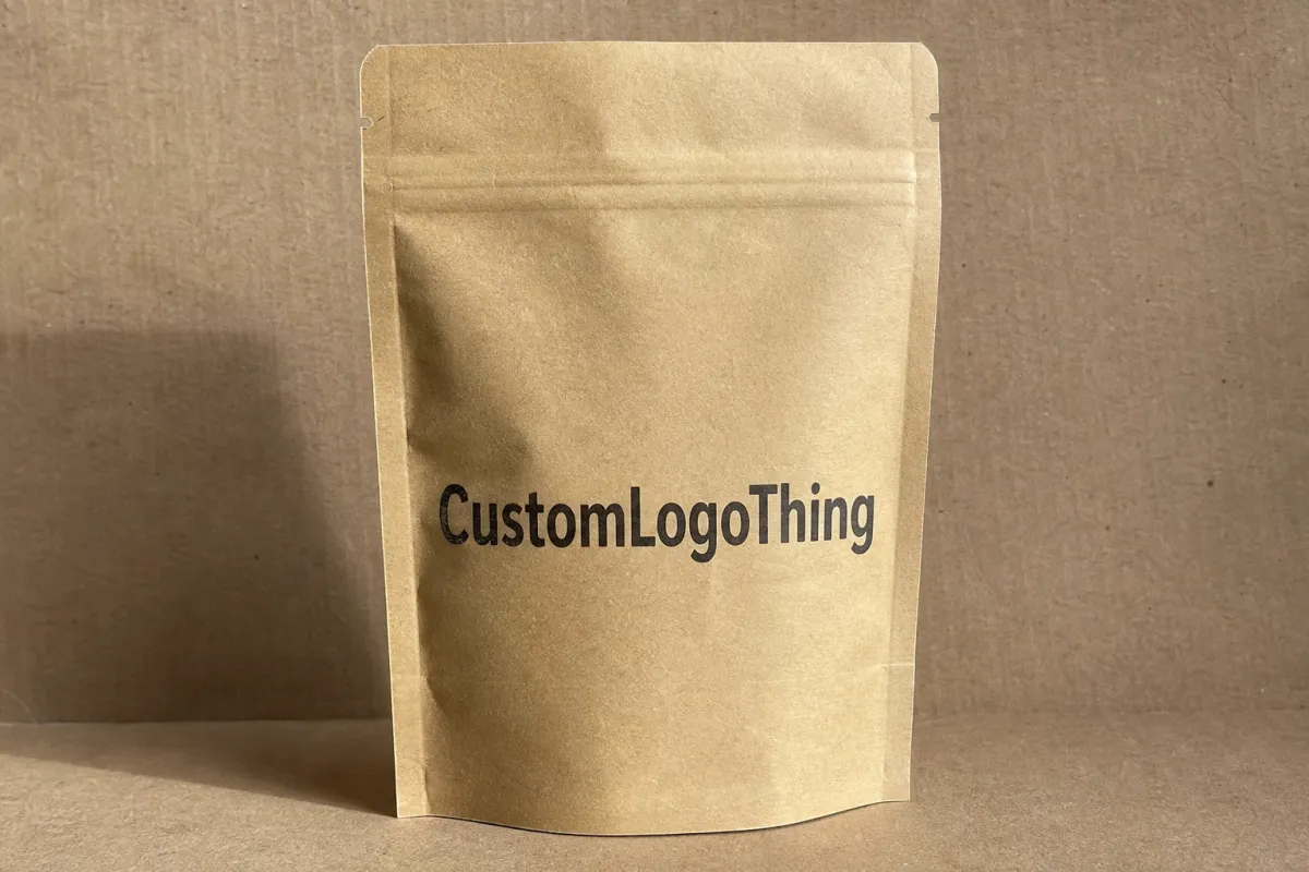
Custom pouch Labels for Skincare have a small footprint and an oversized job. They identify the formula, carry the brand voice, survive handling, and still need to look polished enough to earn attention on a shelf, in a spa basket, or in an e-commerce unboxing. That is a lot to ask from a flexible package. The label is never just decoration. On a pouch, it is part of the packaging system, and every choice from adhesive strength to finish affects both how the product performs and how the brand is perceived.
For skincare brands, pouches are often the sensible choice for samples, refills, masks, cleansers, travel sizes, and spa-use products. They save space, ship efficiently, and open the door to short runs or fast formula changes. But the surface is less forgiving than a rigid bottle or carton. The front panel flexes. The body can wrinkle. Oils, moisture, and repeated handling can expose weak materials fast. If the packaging needs to look clean, feel intentional, and hold together through distribution, the label strategy deserves the same attention you would give to the rest of the package.
The best pouch label is the one that still looks right after the pouch has been filled, sealed, packed, shipped, opened, and handled a few times.
What custom pouch labels for skincare really do
Custom pouch labels for skincare do far more than name the product. On a soft pouch, the label often acts like a tiny billboard, a compliance panel, and a tactile brand cue all at once. That is a tall order for a surface that may flex in transit, pick up condensation in a bathroom, or rub against other products in a bag or carton. A well-made label helps the package look finished. It also keeps the brand from running into the usual problems that make retail packaging feel cheap: blurred type, peeling corners, weak contrast, and awkward placement.
The first step is to define the label’s real job. Is the priority brand recognition, ingredient and regulatory information, SKU differentiation across a product line, or a limited launch that needs speed without changing the pouch structure itself? A label for a bright retail shelf may need stronger contrast and a more premium finish. A label for a spa backbar may need fast application, batch coding space, and very clear readability for staff. Different goals lead to different substrate choices. The brief gets easier to write once the use case is specific.
It also helps to separate direct-printed pouches from applied labels. Direct printing can work well at high volume, especially when the artwork is fixed and the same structure will be used for a long production cycle. Applied labels are usually better for short runs, frequent formula updates, multiple scents or variants, and launches where the base pouch stays the same while the graphics change. That flexibility is one reason many skincare buyers choose labels for seasonal packaging and evolving product lines.
Skincare behaves differently from dry goods because the pouch is often exposed to lotions, oils, humidity, and repeated handling after purchase. A serum or cleanser pouch may not be submerged, but it may still spend time in a steamy bathroom or a travel kit where it rubs against harder objects. So the label has to survive real use, not just a tidy studio mockup. In practice, the best label systems balance shelf appeal, legibility, application speed, and durability instead of treating design as a purely visual exercise.
From a packaging buyer’s point of view, the label is part of the workflow too. If a label is hard to align, hard to read, or inconsistent from batch to batch, it slows packing and creates waste. If it is easy to apply and looks unified across the line, it supports the whole packaging design system and makes the brand feel more established, even on a small pouch format. That is why many brands pair pouch labels with other coordinated assets like Custom Labels & Tags and Custom Packaging Products to keep the line visually consistent.
There is also a subtle branding effect that gets underestimated. A pouch with the right label finish can read as clinical, botanical, luxury, or functional depending on typography, color, and surface treatment. Buyers make those judgments quickly. In skincare, trust and quality are often decided in seconds. The label is not the whole story, but it is one of the fastest ways to communicate whether the product feels like premium retail packaging or a rushed private-label item.
How the process and timeline work for pouch labels
The production path for pouch labels is straightforward once the inputs are organized. It usually starts with measurements and usage details, then moves into artwork prep, proofing, conversion, printing, and shipment. The part that surprises new buyers is how much time gets lost when measurements are vague or artwork is built before the actual pouch structure is confirmed. A label that fits a flat spec sheet may still miss the live area once the pouch is filled, sealed, and flexing on a table or in a shipping carton.
Artwork prep is where many launches either get cleanly organized or start to drift. Good files should include bleed, safe area, final copy, barcode placement, and notes for metallic ink, clear film, white underprint, or variable data such as lot codes and expiration dates. If a label needs to wrap around a curve or stay clear of a zipper track, spout, or heat-seal edge, those constraints should be in the file from the start, not discovered after proofing. The more complex the pouch, the more useful it is to map the panel first and design second.
Proofing is the checkpoint that prevents expensive surprises. This is where color shifts, tiny type issues, barcode problems, and panel fit problems get caught before a press run begins. It matters even more on skincare because the visual language is often subtle: clean neutrals, soft greens, light creams, and quiet contrast can look elegant in a comp, but turn muddy if the finish, film, or lighting are not considered carefully. A proof should confirm not only the artwork but also the practical fit on the actual pouch shape.
Typical timeline drivers include quantity, number of SKUs, specialty finishes, Custom Die Cuts, and the speed of internal approval. If the line has six scents or variants, and each one needs slightly different copy, the schedule can move from simple to complicated quickly. Simple repeat orders with locked artwork may move faster than first-time runs because there is less back-and-forth on compliance, color, and layout. New launches usually need more time for sampling, internal review across branding and operations, and final signoff.
For transit and distribution planning, it is smart to think beyond the print room. Labels that will travel through e-commerce channels or national retail distribution may benefit from testing expectations similar to what the ISTA standards are designed to evaluate: vibration, drop, compression, and handling stress. That does not mean every skincare pouch needs formal certification. It does mean the packaging should be judged with real-world abuse in mind rather than only a desktop proof.
Most buyers benefit from building a rough timeline like this:
- Day 1-2: Confirm pouch dimensions, copy, quantity, finish, and label placement.
- Day 3-5: Prepare artwork and send the first proof.
- Day 5-8: Review proof, correct copy, and confirm final approval.
- Day 8-15: Print, convert, and finish, depending on complexity and inventory.
- After production: Inspect the shipment, store labels flat and dry, and test application on live pouches before full rollout.
That timeline is not fixed. A repeat order may move faster, while a new launch with several SKUs, specialty film, or serialized data can take longer. The safest planning assumption is simple: the more custom the custom pouch labels for skincare are, the more time you need for proofing and approvals.
Materials, adhesives, and finish choices that matter
Material choice is one of the biggest factors in how pouch labels behave. Paper can be cost-effective for some secondary uses or dry applications, but many skincare pouches perform better with film-based stocks because they resist scuffing, moisture, and contact with product residue more effectively. That matters for items such as cleansers, exfoliators, masks, and refill pouches that may be squeezed, stacked, or handled many times before they are discarded.
Adhesive selection is not just a glue decision; it is a compatibility decision. The right adhesive depends on the pouch film, surface texture, fill temperature, storage conditions, and whether the package flexes frequently. A glossy film pouch, a soft-touch laminate, and a textured recyclable-facing surface can all behave differently. If the adhesive is too aggressive, it may distort thin films or become difficult to apply cleanly. If it is too weak, corners may lift or labels may slide when the pouch is compressed.
Finish choice changes both the look and the feel of the package. Gloss usually boosts color vibrancy and gives a bright retail look, while matte can soften the appearance and reduce glare under strong store lighting. Soft-touch can create a more premium tactile impression, especially for high-end facial care or spa-oriented lines, but it may also show wear differently than a harder varnish. For a brand building a calm, clinical, or natural identity, finish selection is often as important as the artwork itself.
Clear labels, white underprint, and metallic effects can all support a more premium skincare presentation, but they need to be planned carefully. Clear film can look elegant on a well-matched pouch color, yet it can also make fine text harder to read if the background is busy or the white keyline is too thin. Metallic accents can add visual lift, but they should not overpower ingredient panels, warnings, or barcode areas that need straightforward legibility. Good package branding usually feels intentional because the decorative elements support the information hierarchy rather than fighting it.
Sustainability questions come up often, and rightly so. Some brands want recyclable-facing materials, reduced ink coverage, or paper sourced from certified forests, while others care more about durability and lower waste in production. The right answer depends on the full package system, not just the label. If the pouch structure is built for a certain end-of-life path, the label material should be selected with that in mind. For paper-based components, certification guidance from FSC can help buyers make more informed sourcing decisions, though it is still important to verify the whole package construction and local recycling realities.
Here is a practical way to compare common label options for skincare pouches:
| Option | Best Use | Durability | Typical Price Influence | Buyer Notes |
|---|---|---|---|---|
| Paper label with standard adhesive | Dry secondary packaging, short promotional runs | Low to moderate | Lowest | Can work for limited use, but not ideal for moisture or heavy flexing |
| BOPP film label | Most skincare pouches, travel sizes, refills | Moderate to high | Moderate | Common choice when scuff resistance and clean appearance matter |
| Clear film with white underprint | Minimalist branding, premium lines, transparent design effects | Moderate to high | Moderate to higher | Looks refined, but text and contrast need careful planning |
| Soft-touch laminated film | High-end skincare, gift sets, luxury retail packaging | High | Higher | Strong tactile appeal, but usually best for hero SKUs |
| Specialty adhesive for flexible film | Curved, squeezable, or travel-heavy pouches | High | Higher | Worth it when lifting or edge failure would cause rework |
There is no universal best choice. A budget-sensitive line may need a practical film label with a standard finish, while a prestige serum pouch may justify a more refined surface and adhesive system. The real question is whether the label supports the product’s position in the market and survives the way the pouch will actually be used.
Cost, pricing, MOQ, and quote factors
Pricing for custom pouch labels for skincare is usually built from a handful of moving parts: size, shape complexity, material, finish, print method, quantity, and whether the order includes variable data or specialty setup. A small label with simple copy and a standard rectangular shape may be relatively economical, while a custom die-cut label with soft-touch lamination, metallic accents, and multiple SKUs will naturally cost more. The biggest mistake buyers make is comparing two quotes that are not built on the same production assumptions.
MOQ matters because setup costs have to be spread across the run. When a brand orders a short quantity, the time spent on proofing, press prep, and conversion does not disappear; it is just divided among fewer pieces. That is why unit pricing is often higher on small runs. For many skincare brands, the tradeoff is still worthwhile because the line may be changing quickly, or the product may be tested in a limited market before a larger rollout.
As a practical range, simple film pouch labels in moderate quantities may land around $0.06-$0.15 per label, while more premium constructions with specialty finishes, tighter tolerances, or variable data can move into $0.15-$0.35+ per label, depending on size and order volume. Those numbers are directional, not a promise, because coverage, shape, and finish can change the economics quickly. A large run with a simple format can cost significantly less per piece than a short run with three or four variants.
Brands can often reduce cost without losing impact by standardizing label sizes across multiple SKUs, limiting specialty finishes to hero products, and keeping the design template consistent. If every SKU in a line uses a different shape, different stock, and different copy structure, the production process becomes harder to manage and more expensive to repeat. Consistency across the line also helps the brand look more polished, which is useful in both retail packaging and e-commerce presentation.
It is also smart to Request a Quote that separates material, setup, printing, finishing, and shipping. That makes it easier to compare options fairly. A lower total price may look attractive at first, but if the quote hides a weak adhesive, slow turnaround, or expensive reprint risk, the real cost can be higher. A detailed quote gives buyers room to decide where to spend and where to simplify.
For brands balancing labels with other packaging line items, it can help to think about the full product packaging budget. A slight increase in the label cost may be worthwhile if it prevents a return, lowers application waste, or helps the product present better alongside Custom Packaging Products that already set a strong visual standard. Packaging usually works best as a system, not as isolated parts.
Step-by-step guide to ordering skincare pouch labels
The smoothest orders start with a clear brief. Before artwork is finalized, gather the pouch dimensions, fill state, storage conditions, brand goals, regulatory copy, and whether the label needs to cover an existing design or fit a new pouch format. If the label will be applied at a co-packer or in-house packing line, include that operational detail too. The application method can matter as much as the artwork because it affects placement tolerance and speed.
Measure the live area carefully. That means accounting for seals, gussets, curves, zipper tracks, spouts, and any area that changes shape once the pouch is filled. A pouch that seems roomy in a flat mockup can get surprisingly tight after product goes in, especially if it is flexible and only partially full. The label should stay clear of high-movement zones, because bridging a seam or heat seal is a reliable way to create wrinkling, lifting, or a crooked visual line.
When building the artwork, arrange the information hierarchy in order of how people actually scan the package. Brand name first. Product name second. Benefit statement next if the line needs one. Then size, ingredients, directions, warnings, and any batch or barcode fields. Skincare buyers often read quickly, so the layout should answer the main question almost immediately: what is this product, who is it for, and why should I trust it?
Proofs should be reviewed under the same conditions the package will face in use whenever possible. That means checking the file on-screen, but also looking at a printed sample or a press proof if the project is important enough. Color can shift under lighting, and a beautiful neutral on a monitor can look too warm or too gray on a film substrate. A real-world proof helps the team judge whether the product still feels aligned with the rest of the branding.
If you are moving toward production, a practical ordering sequence looks like this:
- Confirm pouch dimensions, fill weight, and label placement limits.
- Choose material, finish, and adhesive based on the pouch surface and environment.
- Prepare final artwork with the correct bleed, safe area, and variable data fields.
- Review and approve the proof after checking copy, color, and fit.
- Test apply a short run or sample batch on the actual pouch.
- Lock the file, confirm quantity, and schedule delivery around launch needs.
- Create an internal receiving and storage plan so the labels stay flat, dry, and organized.
That may sound straightforward, but the details matter. Brands that treat the pouch label like a true packaging component, rather than a last-minute print job, usually get better shelf consistency and fewer delays. It also keeps the launch process cleaner across branding, operations, and compliance teams, which is especially useful when several products are going live together.
Common mistakes that hurt shelf appeal and adhesion
The most common failure is choosing a label based on appearance alone and then discovering the adhesive is wrong for the pouch film or the storage environment. A label can look perfect in the design file and still fail in the field if the pouch has a low-energy surface, if the fill temperature is high, or if the product leaves residue around the label area. In skincare, especially with oils and creamy formulas, the physical behavior of the package matters just as much as the art direction.
Another frequent problem is overcrowding the layout. Small pouch surfaces can tempt teams to add every possible claim, certification, usage note, and marketing line. The result is a busy panel that feels less premium and is harder to read. A cleaner hierarchy usually performs better, especially in retail packaging where shoppers only have a few seconds to scan. If the label tries to say too much, the most important message gets buried.
Pouch movement causes trouble more often than buyers expect. A label placed too close to a heat-seal edge, across a seam, or over a flex point may wrinkle after filling or during transport. Even if the label initially sticks well, repeated squeezing can stress the edges and create a worn look. That is one reason a test application is so valuable; it reveals how the pouch behaves when it is no longer flat and untouched.
Color mismatch is another hidden risk. Many skincare brands want clean whites, muted botanicals, pale blues, or soft neutrals because those tones communicate purity and care. But those shades can drift if the substrate is not suited to the artwork or if the proof is reviewed under the wrong light. A brand can lose a lot of perceived quality from a small shift in warm or cool balance, especially if the line is meant to look refined and consistent across multiple SKUs.
The operational mistake that causes the most regret is skipping a real test cycle. A label may look great in a studio, yet behave differently at production speed, on humid days, or after sitting in inventory. That is why many packaging teams treat the first physical application as part of the approval process rather than an afterthought. It is a small step that can prevent a costly reprint later.
For skincare companies building a wider packaging system, it also helps to think about the label in relation to other materials in the line. A pouch label that feels carefully tuned should still sit comfortably beside folding cartons, sample cards, and other branded packaging assets. Consistency across those pieces makes the product line look planned rather than assembled in pieces.
Expert tips and next steps for launch-ready labels
A simple one-page spec sheet can save a surprising amount of time on future reorders. Include pouch dimensions, label size, substrate, finish, adhesive type, copy requirements, barcode area, application notes, and any storage warnings. Once a SKU has a clean baseline, reorders become faster to approve, easier to compare, and less likely to drift away from the original intent. That kind of documentation is especially useful for growing brands with several products in circulation at once.
Short test runs are worth asking for if the pouch film, skincare formula, or storage environment is new. Even a small sample can reveal whether the label sticks cleanly, whether the finish reads the way you expected, and whether the application process is practical for your team. If the product is destined for a humid retail environment, a spa, or a subscription box, test it in a way that reflects the real use case rather than a best-case scenario.
Planning around operations matters just as much as planning around design. If a product needs batch coding, seasonal artwork changes, or back-stock storage, the label program should support that from the beginning. It is easier to build in space for variable data than to force it later. It is easier to standardize two or three label formats than to manage a dozen one-off layouts that create confusion in production.
Branding and compliance should work together, not in separate silos. The cleanest skincare labels are usually the ones that make room for required copy without letting it dominate the front panel. If the ingredient list, warnings, or directions are hard to read, that becomes a trust issue. If the product looks polished but leaves out necessary information, that becomes a compliance risk. Good package branding gives both priorities a place.
Before launch, use this final checklist:
- Measure the pouch and confirm live label space.
- Review the final copy for ingredients, warnings, and claims.
- Choose a material and adhesive suited to the pouch surface.
- Request a proof and inspect it under real lighting.
- Run a test application on the actual package.
- Confirm quantity, delivery timing, and storage plan.
- Keep a reference file for the next reorder.
If you want a label system to carry the line cleanly from launch to reorder, think in terms of repeatability. The strongest custom pouch labels for skincare are not just attractive on day one; they remain legible, aligned, and consistent across shipments, seasons, and product changes. That is the standard worth aiming for. Measure carefully, Choose the Right substrate and adhesive, confirm the proof, and test the actual application before committing to volume. Do that, and the label does its job without turning into a production problem later.
Frequently Asked Questions
What are custom pouch labels for skincare usually made of?
Most are made from paper or film stocks, but skincare pouches often perform better with film because it resists moisture, scuffing, and oils more effectively. The adhesive should match the pouch surface, since glossy films, textured laminates, and flexible spout pouches all behave differently. A finish like matte, gloss, or soft-touch can also change both the look and the durability of the label.
How long do custom pouch labels for skincare take to produce?
The timeline depends on whether the artwork is ready, how many SKUs are included, and whether specialty finishes or custom shapes are needed. Proofing and approval usually add the most time when a brand is reviewing copy, color, and fit on the actual pouch size. Simple repeat orders can move quickly, while first-time jobs usually need extra time for testing and final signoff.
Will custom pouch labels for skincare stay on flexible pouches?
Yes, if the adhesive and material are chosen for flexible packaging rather than rigid containers. The label should avoid seams, high-flex zones, and heat-seal edges that can cause lifting or wrinkling. Testing on the actual pouch is the best way to confirm adhesion before a full run.
How can I lower the cost of custom pouch labels for skincare?
Use one label template across multiple products when possible and keep specialty finishes limited to key SKUs. Ordering larger quantities generally lowers the per-label price because setup costs are spread across more pieces. Clear, efficient artwork and fewer variations in size or shape can also help reduce production complexity.
What should be included on custom pouch labels for skincare?
Include the brand name, product name, net contents, ingredients, directions, warnings, and any required regulatory copy. If needed, reserve space for barcodes, batch codes, or expiration details so operations can stay consistent. The layout should prioritize readability, because skincare buyers often scan the label quickly before they inspect the details.
For brands that want a label system to stay practical as the line grows, the smartest move is to treat the pouch as part of the full packaging design, not as a blank canvas that gets corrected later. Measure carefully, choose the right substrate and adhesive, confirm the proof, and test the actual application before committing to volume. Done well, custom pouch labels for skincare support the product, protect the brand, and make the whole package feel ready for retail from the first shipment onward.

